Typophile

Palimpsest, contemporary text font

Igor Freiberger

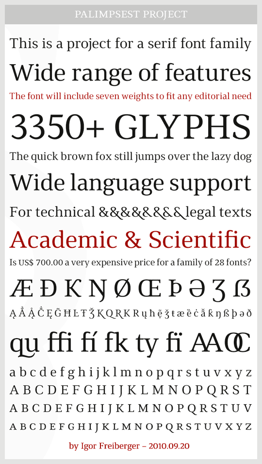
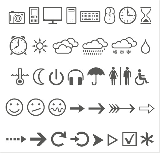
Updated description: this is a contemporary serif family I'm working on since January 2010. It was initially just for personal use, but the project grow up to embrace complete Latin, Cyrillic and Greek scripts, besides phonetic alphabets, arrows and dingbats.

It's a text font and the family is planned to have several weights in roman and italic versions. I believe it will be released in early 2013.

Goals:

1. it must be suitable for books and magazines, with more contrast than contemporary typefaces like Meta Serif, Greta Text or Stuart.

2. it must be clean and legible, with high x-height, generous counterspaces and reduced ornamental elements.

3. it must produce a strong horizontal impression, with well defined lines like the ones achieved with Guardian Text, Utopia or Charter, for example.

4. it must be adequate to academic, legal and technical texts with harmony between usual text, numeric data and acronyms.

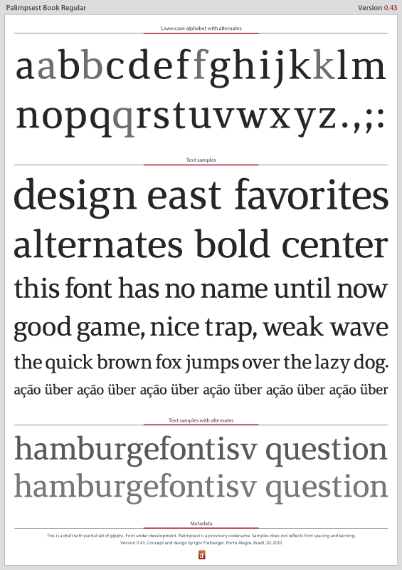
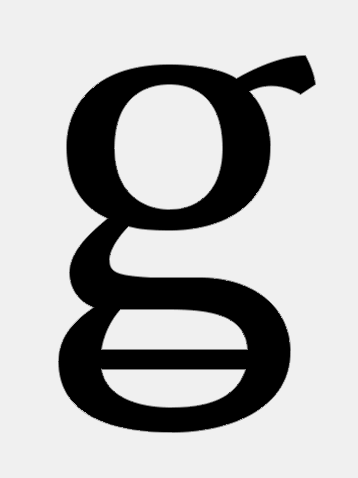
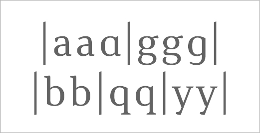
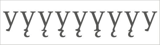
Many glyphs have alternate designs, as |a|b|f|g|q|y|W|Ж|К|. Target sizes are 9 to 32pt. Small caps are taller than usual. Petite caps are also included. Numbers, currency symbols and related signs are available in 10 variations. Palimpsest is a codename.

Comments are very welcome.

Historic
2010.01: lowercase a-f, h-j, l-u.
2010.02: lowercase complete, marks and basic diacrits.
2010.03: uppercase complete, punctation, European languages.
2010.04: small caps, numbers, non European languages.
2010.05: figurine variations, bullets, dingbats, fine-tuning.
2010.06: many symbols and additional language support added.
2010.07: numbers and currencies in ten styles.
2010.08: general revision, mathematical operators, symbols.
2010.09: combining diacritics and precomposed glyphs.
2010.10: spacing, African languages, dingbats, fractions.
2010.11: support for many non-European languages and IPA.
2010.12: complete revision, UPM set to 2048.
2011.01: dozens of glyphs added to increase language support.
2011.02: first Cyrillic and Greek drafts.
2011.03: linguistic additions. Glyph naming revision.

Workflow
Initial lowercase design was made in Illustrator CS4.
Further development was done completely in FL Studio 5.
Final work will need FL Studio 6 due to the large number of glyphs.

AttachmentSize
Version085.pdf309.55 KB
Especials.pdf22.25 KB
Version0968.pdf271.59 KB

Igor,
Nice start. So far it's feeling very tight. Look very closely at the negative spaces in between the letters and remember to design those too.
Why start in Illustrator?

Thanks David. I'll follow your advice and observe in detail the negative space. I'm designing in Illustrator because I know this app well while I'm a novice in FL.

While it can at times require all your patience to go from an environment where you are comfortable and in control—to one where you are again a novice—in this case it's worth it. Here's why: FontLab requires you to make certain decisions about point type and placement while drawing; the same decisions that Illustrator more or less makes for you. FontLab gets you in the habit of drawing glyphs using the simplest construction possible. This is important for making malleable glyphs that you can adjust as context requires, also keep in mind rasterizing, hinting, and interpolation should you choose to interpolate.
Another reason for using FontLab for drawing that isn't obvious at all until you do it, is its silent emphasis on thinking about type as a system of interdependence. The decisions about how to space a glyph are best made while the glyph is still being drawn—in the context of the other glyphs around it. As you use it, you'll grow to appreciate its handling of curves, one of the prominent nice things about the software.

Thanks again, David. You convinced me. Actually, I already tried to keep the vectors simple at IL, with both nodes and handles at integer positions. Handles are also almost all orthogonal (0º/90º).

When possible, I tried to follow a 4x4pt grid because 4 is the minor common divisor between the two systems of type measure (1000x2048) and this may help a later version destined to screen with TT hinting. Anyway, this is just a strange idea I had, not sure it causes practical results.

But it must be better to do the entire job in FL for the reasons you did explain so clearly. As I'm a hobbyist type designer, the extra time FL may demand now is manageable and surely it will pays off later. Thank you very much.

Hi Igor,
Looking very nice indeed! Cudos!

I find that the lower and possibly upper diagonal on /k/ feels a bit too thin, especially compared to other diagonals.
I think /x/ leans a bit too far to the right, maybe broadening the base to the right will fix that.
/w/ stands out a bit because the middel part doesn't reach x-height.
Maybe /,/ and the middle part of /s/ are a bit too heavy?
The finial on /y/ looks a bit out of the ordinary...

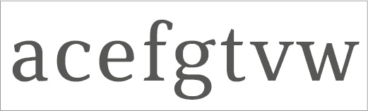
I like the fact you've designed a very subtle mix of sans and serif, like in /a/ and /f/. It reminds me of Stone Informal, although that's more a mix of roman with cursive.

Finally, let me say that I admire the systematic way you have planned this project. This reflects on your design. I just guess you're a systematic guy!

Hoped to be of any help!
Kind regards,
Jean Paul

Jean Paul,

what an eye! You did mention exactly the glyphs more difficult to me, besides /g/. I'll post a new version soon and the issues you pointed will be addressed, although I still not know what to do with the /y/ terminal. As I'm avoiding round terminals, this /y/ needs a non-round shape.

Actually, I try to be systematic but sometimes the chaos prevails. :-)

You're right, this design tends to be rational and systematic. The glyphs themselves are not particularly beautiful as the purpose is to produce a clear and even colour. Now the challenge is to follow the planned agenda.

These letters go together really really well, great job on your consistency.

Really love your the alternate /a/.
The /e/ looks a tad bit wide (mostly the top part).
Right serif on the /f/ might need to be extended to balance it a bit.
Your /r/ is too light for my liking.
Might want to try more undershoot on the /u/.
Base of the /t/ looks too flat. Maybe curve it up a bit?
Descender on the /y/ seems shorter than the others.

Can’t wait to see some updates!

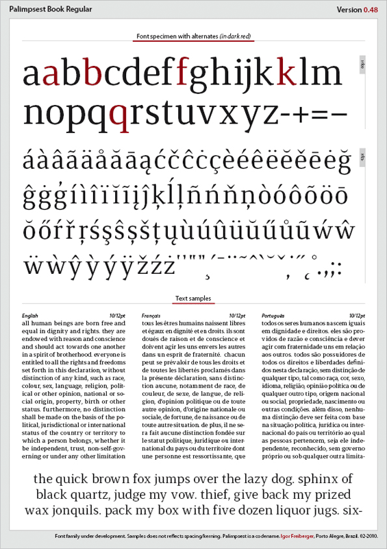
Updated version, now using FontLab and with lowercase diacritics added (almost all already available, a few ones still need revision). All the changes in glyph design were small, except in the middle of /w/. I also inverted the alternates.

Changes
/e/ botton curve matches /c/, top curve a bit tighter.
/f/ larger right serif.
/k/ ticker diagonals.
/r/ terminal and arm are thicker.
/s/ central portion a bit thinner.
/w/ higher middle, near to x-height.
/x/ right upper diagonal repositioned.
/y/ descender slight bigger, less round and using overshoot.
Marks a bit smaller.

The PDF sample is available in the first message.

Hi Igor,
How is FontLab working for you? Is it as easy as Illustrator? What version are you working in? I'm seriously considering buying FontLab...

I fail to see the difference between regular /k/ and alternate /k/... Furthermore /w/ is missing from the alphabet. I still think the lower diagonal of /k/ should be heavier, as well as the arm of /r/. Try extending the lower right serif on /r/. /w/ is much better like this. I feel as if /t/ is too narrow.

Those text samples, can you make them aligned to the left in stead of justified? It helps with looking at spacing.

To be honest, I like the alternates better than the regulars, but that's personal...

Sorry! The PDF has some mistakes. It's now updated, with the correct alternative /k/ and text aligned to the left. I'll do more tests about the questions you pointed in /r/k/t/.

Actually, I'm always in doubt between these alternates and regular glyphs. :-)

About FL, I sent you a personal message.

Hello, Igor-

A formidable start.

But you should really check your control points after bringing your glyphs from AI to FontLab; while AI has pretty much limitless scale, FontLab works (by default) with 1000 x 1000 scale. And a shift of just one unit could look bad in small sizes.

I would suggest you learn to draw glyphs in FontLab instead of AI.

This is just my opinion, and I'm pretty anal about these things.

Anyway, a very nice start.

@ Andrew: sorry, I forgot to let a public thank you, just sent a private message. But your kind words are very important, a great input for this project!

@ Tomi: wow, to hear this from the man behind FS #1 is really great! Thank you very much.

I'm still migrating from IL to FL. Now, part of the draw proccess is made in IL, part in FL. I still feel FL lacks some resources, as a way to scale design to a given measure (in pt, not in %). But I see this flow causes additional work and may produce errors. Time to take a deeper journey in FL. :-)

Hi Igor,
This has a really nice feel to it. I love the style of the serifs and think this is going to work really well.
Here are my observations, take with plenty of salt ;)

I think the lower terminals of c and e (and perhaps t) are a little undecided.
g looks a little wide I think.
Ear of g and arm of r (and bottom of y) could be stronger, and r perhaps wider.
Some counters are slightly bumpy; I think this is just a matter of refining what you have rather than changing the shapes.
I love your acute and grave! Tilde looks a little shallow, dieresis has the dots perhaps too wide? Cedilla isn't quite there yet. Comma could be a more interesting shape: something like the quotes or acute?? I think I'd rotate the quotes slightly too.

Have you started drawing the caps and numerals? I'd really recommend doing those before doing too much more on the lowercase. I find that solutions to uppercase often help resolve difficulties in the lowercase.

Wow, how did you learn and create this very magnificent, elegant and glamorous font? It ssems you're typograph. But I'm not and won't be typograph. I'll be foreign languages teacher and translator and graphic designer and system analist because I love foreign languages and computer and Internet. I come searching and testing the fonts who interest more me. I'm very fanatic by fonts. You're really very intelligent and creative! Will you public the font on font shops sites? When?

Thanks Bendy! Another great feedback.

I immediately agreed with most of your observations. This shows how important is to have a fresh eye critisizing the work. After hours doing and redoing a glyph, you becomes very used to it and tends to think it's OK.

Now I'm in a crossroads. I just began to design uppercases and agree it must be better to have them to solve problems already found in lowercases. But I'm also in doubt about the weight of the font.

While designing in IL and FL, it looked OK for the regular version (main stem=84). But the generated OT prints lighter than I want (and also is lighter in InDesign and PDF text samples). This difference may be due to hinting. As the auto tool in FL is not enough, I did manual hinting to /a/n/ glyphs with optimal results.

Thus I think the next step is to hint at least some glyphs to get real tests and then choose the general weight. After that, I'd create the UC set. What do you think?

Anyway, the next update will took a while because I'm migrating the whole project to FL.

Thanks for your kind words, Gustavo. Actually, this begun as a project just for personal use. But it's growing and may be released. Anyway, there is a large track until it becomes usable.

At a glance, type design seems to do with intelligence and creativity. But it's a highly technical work which demands a lot of hard work. Hinting and kerning are precision jobs made mostly by hand. The same about different weights.

Hope you manage your time in order to achieve all these goals. To like fonts is very useful to a translator/foreign language teacher because you can understand the OT resources and language support a font can hold.

Hello Freiberger!

To like fonts is very useful to a translator/foreign language teacher because you can understand the OT resources and language support a font can hold.

I agree with you. I always need some fonts for pleasing my sight.

Would you give me your font family? (lol) I'm kidding (joking). I prefer to buy than to ask for because I know every typopgraph isn't generous and doesn't like to give or lend some fonts to anyone. I'm sorry for having said it, but I'm very reasonable.

Gustavo,

Type designers cannot be generous with their work. They make a living from that!

It's like to ask a taxi driver to give you a free trip because you love his car. Or for me to ask you a free book translation in a near future because your translations are good and I'm a literary addict.

It's not a question of be generous or not, but simply to be paid by his/her work. This is why you'll get some adverse responses when you ask a font for free in a forum where most of participants are type professionals.

Happily, there are lots of good free fonts available nowadays. Take a look on this thread: http://www.typophile.com/node/67693. Ex Ljbris fonts are especially good and are getting big success. You can also create an account at MyFonts and download good fonts for free.

Anyway, you give a good idea. I'd like to offer one style/weight of this font for free when (and if) it would be ready. But it's not a generous act, it's just a marketing plan! :-)

Hello Freiberger!

Good evening!
Here it's very cold and autumn is arriving. Wow! I love cold days and winter. Winter is very comfortable with me to study for university entrance exams!

It's like to ask a taxi driver to give you a free trip because you love his car. Or for me to ask you a free book translation in a near future because your translations are good and I'm a literary addict.

If you were taxi driver and a woman asked you to go right to where she works, if you were in love with her, would you give her a free trip? (lol)
As for the free translation, 4 years ago, at my school, the couple searched for me at the school inspector room, they asked me to translate their papers into Portuguese, when I translated and finished, they asked me how much they might pay me, I was so generous and I told them — they didn't need to pay me because it was a free translation, so they were only two papers.

It's not a question of be generous or not, but simply to be paid by his/her work. This is why you'll get some adverse responses when you ask a font for free in a forum where most of participants are type professionals

I agree with you, so Tomi from Suomi was very negative with me when I asked a free download of Neo Sans, one of my most favourite fonts. I confess I don't like or I'm afraid of asking the people type professional, I mean, typographic designers because they would be egoist and negative with me.

Happily, there are lots of good free fonts available nowadays. Take a look on this thread: http://www.typophile.com/node/67693. Ex Ljbris fonts are especially good and are getting big success. You can also create an account at MyFonts and download good fonts for free.

It's true. But I don't like few right fonts that they offered at Best Free Fonts post. I prefer Genitium, Galette and Titilium. I've already created an account at MyFonts before I came here by first time. There's only 423 free and legal fonts at MyFonts and I've already downloaded some of them. Only more or less of 5 of 423 fonts are good, other less of 423 aren't good or are worse and ugly. At Fonts.com and Linotype.com, there's no free downloads, all the fonts are paid.

> Only more or less of 5 of 423 fonts are good, other less of 423 aren't good or are worse and ugly. At Fonts.com and Linotype.com, there's no free downloads, all the fonts are paid.

Of course. If someone has spent the time making a font beautiful, you should expect to pay them for their time. I'm not sure you appreciate the work involved in creating high quality fonts. It's not a matter of type designers being egotistical — fonts are their work and their value needs to be recognised.

Freiberger, why didn't you answer my post?

Gustavo, I already said what I think about type designers to be generous. We don't agree on this. And it's an off-topic question.

I mean, typographic designers because they would be egoist and negative with me.

Perhaps there is a language barrier here. I'd like to believe you don't actually mean what you are saying.

That said...I realize that this will cause a riot...but really?!?!?

If you are serious about design, typography and type design (!!!) you are speaking to your future peers... is this really the impression you want to make???

Wow, I've officially joined the ranks of annoyed typophilers.
That's what I get for being an addict.

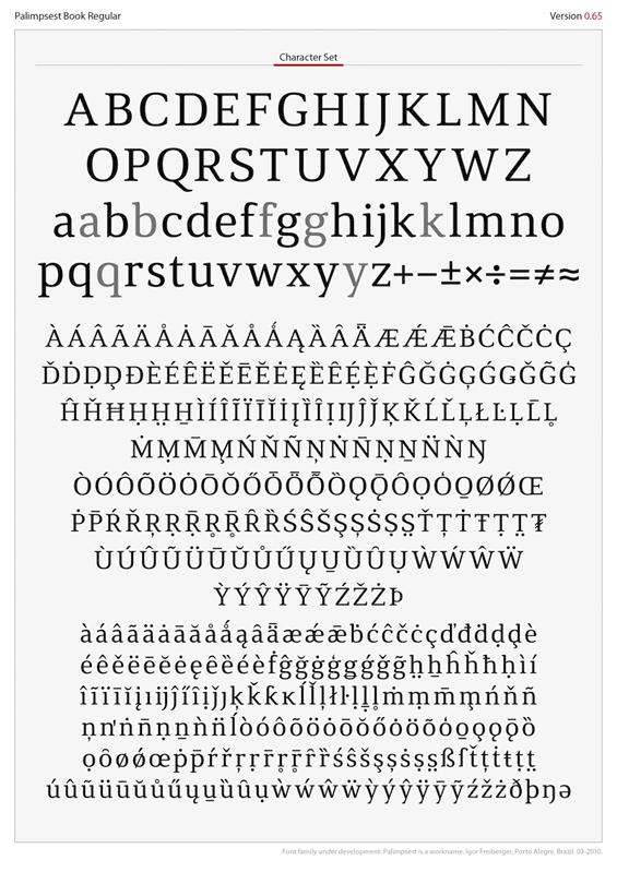
NEW VERSION, NOW WITH UPPERCASE ALPHABET.

The updated PDF (first post) shows version .065 with the whole character set and also sample texts in various sizes.

Please note the font has no kerning by now, just sidebar spacing. Hinting was made with AFDK autohint tool.

I'm unsure about some glyphs, especially /B/R/K/S/.

After some improvement in lowercase and uppercase, I plan to create remanining glyphs (numbers, marks, dingbats, auxiliary characters, currencies, small caps and petite caps) until June. By August I hope to have the regular font kerned and hinted.

Hi Igor,
You're going great here I think! I'll take a closer in-depth look this week.

In an earlier post you said you were struggeling with /y/. Last week I might have come up with a possible solution: why not make the terminal on /y/ like you have on /j/?

Hi Igor,
Great job! Nice and readable.
"Comments are very welcome." So I have some doubts (the nuts and bolts ;) Your acute, Polish kreska and Hungarian umlaut have the same slope. I don't think that's right (in particular Polish kreska ought to be steeper than French acute, and French acute steeper than Czech čarka). Hehe, what a mess...
In lslash 'slash' might be shorter (a notch) on the left side (your choice).
Ogoneks in UC Aogonek and Eogonek should be shifted left a bit.
Ogonek in lc eogonek should be shifted right a bit.
BTW your ogonek looks somewhat anaemic;)
There are some tips here: http://typophile.com/node/66141, especially the last is valuable.
Best wishes

@ Jean Paul: thanks again! I never thought about this /y/ possibility. It surely deserves a try. I already made a 0.66 version with better /R/S/Æ/Œ/ and other small improvements.

@ JanekZ: I was trying to use just one ogonek design, but this proved to be wrong. As you pointed, the /e/o/ connections must be different than /a/i/u/ and UC ones. Also, lc and UC positions and weights differ. Nothing better than a native-speaking to see these errors. Thanks a lot!

And I need to learn these subtle differences between acute, kreska and umlaut. If the font does not becomes good, at least I will discover so much about diacritics. :-)

To be precise: "I was trying to use just one ogonek design" - that's OK. The only problem is in connections. Another useful thread: http://typophile.com/node/39060
BTW you should check the design of ogoneks and theirs connections in Lithuanian and Native American languages...
Athabaskan language studies http://books.google.com/books?id=G6J7Tki_WBcC&pg=PA349&lpg=PA349&dq=Clay...
English/Navajo Glossary of Legal Terms: http://www.navajocourts.org/
Samples from site: http://www.statemaster.com/encyclopedia/Ogonek#Languages_that_use_the_og...
Example in Polish:
Wół go pyta: „Panie chrząszczu,
Po co pan tak brzęczy w gąszczu?”
— Jan Brzechwa, Chrząszcz

Example in Lithuanian:
Lydėdami gęstančią žarą vėlai
Pakilo į dangų margi sakalai
— Vincas Mykolaitis-Putinas, Margi sakalai

Example in Älvdalen Dalecarlian:
"Ja, eð war įe plåg að gęslkallum, dar eð war slaik uondlostjyner i gęslun."
— Vikar Margit Andersdotter, I fäbodlivet i gamla tider.

Don't ask me how to pronounce these texts ;-)
http://en.wikipedia.org/wiki/Chrząszcz, click "The Polish original"

Best wishes

Thanks again, JanekZ. A lot of very precise information. Never thought ogonek has so many issues.

What I mean when said just one ogonek is to have just one combining glyph in the font. So, I can insert it as a component in composites as agonek, ogonek etc. This is not possible as connections are different.

Anyway, I have a remaining question: how to have a combining ogonek (Unicode 0328) to work generically if connections are variable? I already have uppercase and small caps combining diacritics, but these does not addresses the ogonek issue.

I'll point out very quickly that on the round letters, the ogoneks are too far to the left and the cedillas are too far to the right. Perhaps you can slightly modify the shapes as well as the position to make them look more centred.

Updated version 0.73.

Main changes:
01. added numbers (lining, oldstyle, small caps and petite caps).
02. included complete small caps set.
03. added support to Vietnamese and other non-European languages.
04. improved diacritics, especially Polish and Lithuanian ones.

The PDF now has sample texts in English, Portuguese, German, Spanish, French, Dutch, Polish and Finnish.

The numbers still need a lot of adjustment –their stems aren't normalized and doesn't fits well by now. I changed the connections to ogoneks, especially in /A/. Some characters are still lacking, as Schwa or Pinyin translitaration glyphs.

I'd like to hear about the general feeling the font has. Is it consistent? Are the stems adequate when upper and lowercase are side-by-side?

I plan to add four other weights, one lighter than this and three bolder. Each one will have its own bold, italic and bold italic styles. So the family will actually holds 10 weights in five subfamilies. Many months of work to go.

Please be aware this version still has no kerning.

And a special thanks to JanekZ and Jongseong for the observations.

This looks lovely.

• The 'a/A-ring-acute' isn’t really necessary.
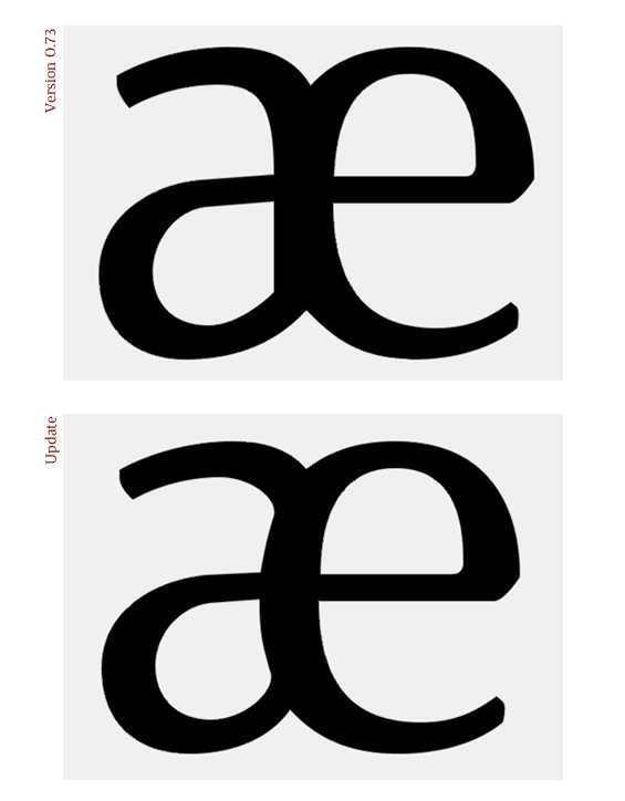
• The 'a' bowl in your 'æ' looks a little wierd to me. Have you considered letting the inner counter follow the 'e' curve instead?
• I really like the looks of your lowercase 'g', but I keep thinking it might benefit from a little more air in between the eye and the tail.

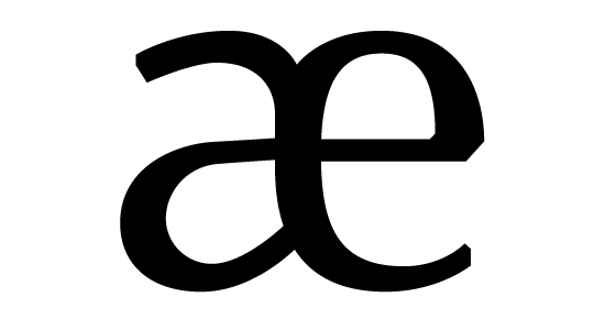
Thanks, Frode. It's always amazing to hear from native speaking about the glyphs I don't know very well. Here is an /ae/ update, what do you think?


A crude example, but I’m talking about something more like this.

Thanks again! Now I get exactly the criteria.

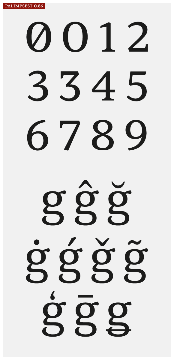
I did post a new PDF. Now the version is 0.85, with 10 figurine variations: lining, oldstyle, small caps, petite caps and uppercase, each one in proportional and tabular sets.

Numbers plays an essential role in this font (as already said in the first post). It's my aim to keep an even and horizontal effect. Actually, I believe numbers are distracting in most fonts. Lining figurines tends to be very tall and oldstyle tends to seem misaligned in a technical text with large number and acronym usage.

I changed the /r/ terminal and begun to include ligatures. There are also arrows, bullets and asterisks. Punctuation is complete and varies to uppercase and small caps. I also included an alternate /3/.

Petite caps are incomplete so they are not in this specimen. Still lacking: some dingbats, chess figurines, swashes and indexes (negative type inside geometric contour).

This version is still unkerned. This will be the last job, to be done in June.

An online flash demo is available at this page.
It's still somewhat crude sample, but it gives an idea.

I think the alternate g could be braver. The gap in the tail will disappear too much.
Otherwise this is looking great, I don't have any more suggestions for the moment! :)

Thank you very much, Bendy. I changed a bit the alternate /g/.
I'd appreciate any comment about the lining numbers and the alternate /g/ set:

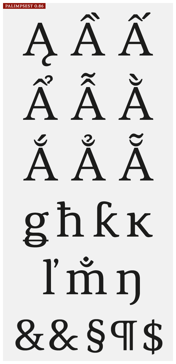
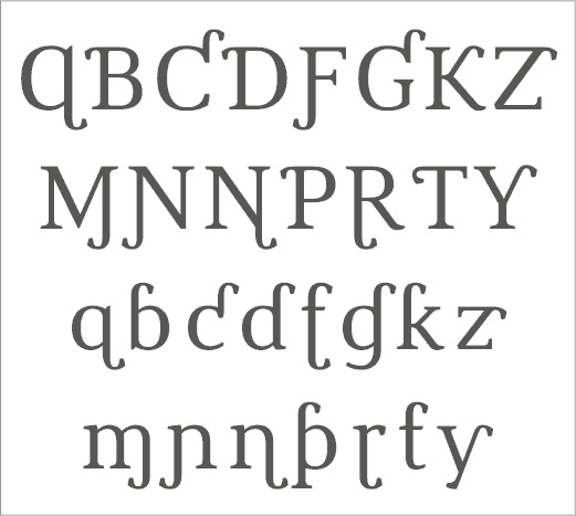
I'd like to hear from Typophilers about these special characters (basically, Vietnamese diacritics and some European ones I don't know very well). There are also /m/+candabrindu, two ampersands and some others.

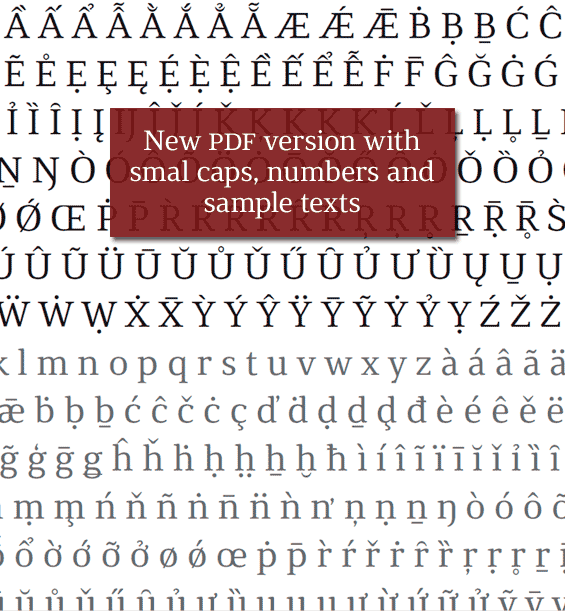
You can see a large set of this characters, including all Vietnamese ones, in a new PDF I included in first post (Especials.pdf).

The regular weight will be ready late June. I plan to release a free basic version at MyFonts in early July (this is, with just the basic Western 256 characters). What do you think?

Well done on your hard work, that's all I'd like to add.

If you add U+0331 Combining Macron Below and make it work with lowercase g then I’ll be your friend for life. The Tlingit orthography requires K, k, X, x, G, and g with U+0331 and there are precious few fonts that support that diacritic in any reasonable way. I note you’ve got U+1E34 Latin Capital Letter K with Line Below and its lowercase counterpart. Those, along with the other characters “with Line Below” decompose into the base Latin forms and U+0331. U+0331 gets used in a few other Native American orthographies, like in Kwakʼwala (née Kwakiutl) and Coast Tsimshian where it occurs below A and a.

The lowercase h with circumflex and with caron could have alternate forms where the diacritic is shifted to the right and lowered so that it sits above the leg like the dot above. You could use the caron and circumflex for lowercase since it is narrower.

Do you plan on implementing IPA at some point? If you do, let me know and I can advise. As a linguist I’m a daily user and I’ve seen a lot of poor designs for IPA letters.

If you implement U+0332 Combining Low Line then make sure that adjacent pairs connect to each other. It’s supposed to be a textual equivalent of underlining. It should *not* act like U+0331 and be independent. It’s amazing how many font designers seem to have completely ignored the quite explicit instruction in the Unicode standard: “• connects on left and right”.

Hope to see more soon! Doing the all the Latin diacritics is somewhat of a thankless job, but I assure you that people like me really do appreciate good work.

1985: thank you very much.

James: your input is very valuable. I have interest to include correctly designed glyphs for many languages, but most of them are unknown for me.

Actually, I first planned to include just Western and Central European support. Then I begun to understand these diacritics from Polish, Welsh, Sami and so on. Later I begun to include more and more language support, as Latin Azerbaijani, Quíchua and African, besides extensive Maths symbols. Now I'm considering if the font will have Greek and Cyrillic. It never stops! :-)

U+0331 and U+0332 are already in the font. U+0332 is made from underline so its length must be OK. I know these combining diacritics needs to be positioned with GPOS, but this is still obscure to me.

How must the macron bellow be positioned with g? I made a try:

I saw a font with an OT feature to replace combining diacritics + glyphs with precomposed glyphs. Is this useful for linguists? Which combinations must be replaced to avoid bad diacritical positioning? Any advice on this is very welcome.

I'll surely include these alternates you suggested.

IPA is not planned, but I'm open to ideas in this area. If I add this, must I include all glyphs from the Unicode IPA table?

Actually, IPA and all these languages support makes sense just if the overall design is handsome and legible – and I still unsure if this font will become good enough to a commercial release. Although it seems a fair idea to add another option to the field, this must be a very well done option –otherwise it will be better to use other available fonts.

Thanks again. Further comments woud be very much appreciated.

The macron should be positioned below the bottom of the lower bowl, and it should not touch the descender at all. It may have to stick out below the lower boundary of the font, but people who need diacritics below letters with descenders will need greater leading anyway so usually overlap with following lines isn’t a problem. The version you’ve shown is instead appropriate for U+10E5 Latin Small Letter G with Stroke which doesn’t involve a macron below.

A problem with U+0331 that many fonts have is that the diacritic is not the same distance from the baseline as it is in the “... With Line Below” characters. The two are supposed to be canonically equivalent according to the Unicode standard, so the diacritic should look exactly the same whether it’s part of a precomposed character or whether it’s added to some base character. Since U+0331 is a horizontal line it’s very striking when the distance from the baseline is different from one letter to the next, as in this example of Mac OS X’s current versions of Palatino and Times Roman as well as Victor Gaultney’s Gentium which gets it right. (The screenshot was taken from Mac OS X’s TextEdit.) The example also shows where the macron below should appear beneath the lower bowl of the lowercase g.

If you implement IPA you should definitely do all of the symbols in the IPA extensions block, as well as the spacing modifier letters and the combining diacritical marks. The diacritics need to be tested for positioning with every IPA symbol. Check the IPA chart to see how the basic diacritics are used, but note that any symbol can have more than one diacritic depending on the narrowness of the transcription. You don’t really have to worry about the ligating tone letters (U+02E5 ... U+02E9), people who want them will use one of the SIL fonts (Doulos SIL, Charis SIL). I recommend not doing any of the “Overlay” diacritics since they’re not supposed to be used according to official Unicode doctrine. You might just use the spots as placeholders for the overlay glyphs used in constructing other characters.

If you want to do a really good job on diacritics with Latin letters and phonetic transcriptions, I recommend looking at the three fonts from SIL, namely Gentium, Doulos SIL, and Charis SIL. Those serve as great examples of how to properly handle a wide variety of diacritics in different combinations for a very large repertoire of languages and transcription systems. The requirements are quite different from ordinary European orthographic needs, and the SIL fonts are carefully designed to fit the needs of linguists and many minority language orthographies.

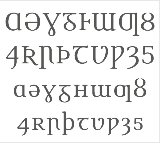
I forgot to mention that IPA also requires a couple of lowercase Greek letters. The absolute necessities are U+03B2 Greek Small Letter Beta, U+03B8 Greek Small Letter Theta, and U+03C7 Greek Small Letter Chi. Other ones that get used frequently in linguistics are uppercase and lowercase gamma, uppercase and lowercase delta, uppercase and lowercase pi, uppercase theta, uppercase and lowercase sigma, uppercase and lowercase omega, lowercase alpha, lowercase lambda (counterpart to U+019B Latin Small Letter Lambda with Stroke), and lowercase rho.

The “with Palatal Hook” letters in the Phonetic Extensions Supplement are not used anymore, but they may be necessary for quoting older linguistic work. The superscripts in that same block are definitely in use, as are the diacritics in the Combining Diacritical Marks Supplement just afterwards.

Hey Freiberger!

As you're specialist in Law, please visit my topic at my track, click in "Why do the clients have pleasure in violating the EULAs' rules?" and give me your opinions.

Your font is very elegant, legible and modern. Are you Brazilian? I know Rio de Janeiro and Sao Paulo, they're fabulous cities. Rio de Janeiro is like San Francisco, Los Angeles and Miami and Sao Paulo is like New York and Tokyo.

Do you like soccer? I was so admired when I saw Brazil wininng very well North Korea and Cote d'Ivoire at the FIFA World Cup 2010 site.

As you are Brazilian and have the most beautiful serif font of all the serif fonts, the Brazilians and Brazil must be proud of you, and America, Europe and Latin America will recognize Brazilians are very creative in arts and culture.

James: thanks again for these valuable informations!

It seems the only case of macron-bellow-descender is |g|. My solution for this issue is to create a precombined glyph with properly postioned macron bellow and then to add a line of OT code to replace g+uni0331 with the precombined g. In some languages, to type g+uni0331 could produce the uni10E5, so the code must declare which languages to consider.

Could you help me on this indicating the languages where g+uni0331 is used? I know almost nothing about Native North American languages.

IPA is definetively an idea to follow. I'll consider your orientations and also take a close look at SIL fonts.

Important: as a lingusit, do you consider the design of characters and diacritics is good enough?

.

Kevin: thanks for your kind words, but I disagree with you about this being the most beautiful serif font here. Minion, William Caslon, Utopia, Novel, Stuart and Collis, to name few ones, are far superior than mine. But it's very nice to hear you like it.

About Brazilians, I think we are creative but still have a long way to build some typographic tradition (with some notable exceptions, as Cruz's work and the Intellecta Design from Paulo W). About the cities, I prefer smaller ones –like Curitiba and Porto Alegre. SP and Rio are very huge!

I'll answer your topic about EULA and piracy.

Your solution to g + U+0331 sounds good to me. However, I do not suggest having U+10E5 be related to g + U+0331. The Unicode specification does not say that U+10E5 should decompose to anything. Having it be produced by some other combination would thus violate the intent of the specification.

I didn’t review all the orthographies of all the languages of the world, which would be an enormous task that I would never complete. :) But I did look at several orthographies in the Pacific Northwest of North America which I know use underscore diacritics in their orthographies. Here’s a list of those letters which occur with such diacritics:

Tlingit (Revised Popular orthography): GgKkXx
Haida (Alaskan orthography): GgKkXx
Coast Tsimshian: AaGgKk
Nisg̱aʼa: GgKkXx
Gitksan: GgKkXx
Kwakʼwala (Uʼmista orthography): AaGgKkXx
Squamish: KkXx
Thompson (Bouchard orthography): GgG̓g̓KkXx
Senchothen (SENĆOŦEN): KNWX

Dakelh (aka Carrier) also uses underscore diacritics, but because it uses them in combination with digraphs it benefits from the U+0332 Combining Low Line which is specified by Unicode as connecting between letters. Dakelh has the following with U+0332: Dz dz S s Ts ts Z z.

There may be other languages in North America where underscore diacritics are used, but the concentration of use is definitely in the Pacific Northwest.

In practice people seem to be confused between U+0331 and U+0332, with some people using the latter where they should probably be using the former instead. With time this will probably sort itself out, but it is best to support both. When one uses U+0332 I would imagine that it would be better to have the underline run through the descender of the g rather than below it, following the Unicode specification that the U+0332 connects between adjacent glyphs. This dissimilar behavior would help users realize the difference between the two diacritics, which otherwise appear quite similar.

So far, I’d say that the diacritic designs look pretty good so far. It would be helpful to see them used in the context of a few texts in various languages. You could look at the proof sheets for Huronia from Tiro Typeworks for some examples.

Thank you very much, James. All the languages you list will be supported as I'll include the needed diacritics for them –especially the g+uni0331.

I'm doing the roman weights by now. There are seven regular weights and seven related bolds. So it will be a family with 14 weights. Because of this I did not post any new sample for a while.

The task is somewhat huge and I also included support for African languages which use Latin script. So (at least for the first font version) I decided not to include Cyrillic or Greek. IPA is still possible, let´s see if I have enough energy for it.

I believe within a month I'll have enough material to post samples of these weights and also more examples in many languages –something between 140 and 160 would be supported, all Latin-based scripts.

Hi Freiberger!

Very good gob! It works great on text, congrats :)

Some things I see:

- "g" in text i find it weard that the upper ring is that small, I would make the ring bigger, becouse the white space of your letterforms are pretty big. Besides, it feels funny that the tail eye is bigger than the ring eye.

- "f" the version without serif feels weard, I think you can make the top curve more like the "j" or "t"

- "acutes" might be kind of thin and to the left, but to affirm that I'd have to see it printed.

- Like the "k"!
- "s" perfect.
- "g" alone is perfect.
- "y" love that serif!
- Nice numerals!

Congrats on all that signs,
I'll be checking them soon.

:)

Thank you very much, Fernando.

Top curve of f is one of my doubts since the beginning. I did several experiences but not used the same curve from t until now –actually, f follows a and n curves. It deserves a try.

You made a very interesting observation about g; I will also do more tests on this.

About acute and grave, I see there are two styles of positioning, both found in several fonts. Some designers made they almost centralized in relation to the letters, like in Meta. This is the more common criteria. Other prefers to dislocate the diacritic toward its own direction, as in Minion. The second approach is very characteristic in Slimbach's fonts.

Working on texts with many accented characters, as in Portuguese, I find the second style much more appropriate than the centralized one. The accent becomes more organic, with a kind of flow coherent to its direction. Accents in Meta, for example, seems rigid and heavy –especially in A, which works terribly.

Anyway, accents were revised and the sample available now still does not show the improvements I made. I'll add new samples soon and hope the acute will be a bit better.

In another thread you asked about the glyph-set needs for specialized academic typesetting. Here is one area that I have some experience with.

For ancient Roman epigraphy, you need most of a basic Latin alphabet, both uppercase and lowercase with dots underneath. Most diacritical forms do not need dotted equivalents, but the vowels with acute accents do (albeit rarely). Usually this is done in roman type, but I've seen it with italic also. I think (in terms of software compatibility with the feature) this can now all be done with the combining dot under (U+0323) and mark placement, although some of them are visually equivalent to characters in the Latin Extended Additional block. You also need the ancient symbols block (U+10190 to U+1019B), the old forms of Roman numerals (U+2180 to U+2188, and probably the rest of the Roman numerals in Unicode for compatibility), and some miscellaneous letters in Latin Extended-D (U+A7FB to U+A7FF) and elsewhere (U+2132, U+214E, U+2C75, U+2C76). For at least the lower Roman numerals (I, V, X), and possibly all of them, you need two forms, with and without overscores. People also use a plethora of different shapes of brackets, including some that resemble U+02F9 and U+02FA (but functioning as brackets rather than as tone markers). Finally, it is sometimes important to note reversed letters, so a reversed (flipped right-to-left) Latin alphabet would also be useful. No doubt I'm forgetting some important things, but this gives you the highlights.

Since you aren't including Greek, you don't have to worry about all the additional glyphs you would need for ancient Greek epigraphy!

Now I honestly do not think this is worth your time from a commercial point of view. This is a very specialized topic. If you produced a typeface with really good coverage for Latin epigraphy, you might sell an extra 5 or 10 licenses, but that wouldn't pay for the time it would require to make all those glyphs. Also, for topics like ancient history publishers generally prefer typefaces that are what might be called "updated old-styles", such as Sabon and Minion, rather than more contemporary styles such as your design.

Thank you very much, David. Your information is very valuable. I need to know about these glyphs in order to decide if they must be included or not –and your message helps a lot on this.

Actually, I don't think this font family would sell more than 1-2 licenses each month. There are so much options these days and it's hard to get good exposure. But I'd like to turn this font a real solution for those who will be using it. Anyway, maybe the scope needs to be a bit tighter.

I'll soon post a new sample.

The aogonek is far better then eogonek, which is too fat at the joint (v. 085).

Thansk again, Marcin. I changed ogonek the way you suggested. A new version is underway with hundreds of new glyphs and improvements.

Hey Igor,

Anything exciting coming up from the Palimpsest Project? This might sound strange, but I've been so excited to see this released since I first posted back in February. I really hope you publish it because I can see it being an amazing text face (it already is!). I'm hoping to use it someday to set a book of my brother's short stories. I can't pinpoint why I'm so attracted to this typeface, but I think it's very very great.

Sidenote: I noticed you're from Porto Alegre, so I have to ask... are you a fan of Internacional or Grêmio? Or not a big football fan?

Hi Andrew. Your message is a great spur to me.

Actually, the project is running normally during all this time. But I did not post new PDFs because I still need to complete the language support –and don't want to show an incomplete result.

Let me explain: I decided to make this font support all languages which use Latin script. This is a huge task as it includes all Unicode blocks for Latin, besides some IPA glyphs. There are also many glyphs outside Unicode so I did some research about less known languages and its alphabets.

As I included petite caps and swashes, each character has five glyphs –uppercase, lowercase, small caps, petite caps and swash. Thus, the project is going far away the 3,000 glyphs with support for more than 200 languages and transliterations schemas. This is still under construction.

BTW, some other parts are complete. All glyphs already made in June were revised and improved. Numbers and associeted figures Punctuation varies accordingly to case and is complete. Arrows, bullets, chess figures and Roman numerals are also ready. Ornaments, dingbats and enclosed numerals are 40% OK.

I still not decided if IPA and APA will be supported in the first version.

Thank you very much for your kind message. It will be a pleasure to know you used this font to lay out your brother's book. Hope the font plays as good as you expect.

Sidenote: my team is Internacional, reigning Champion of South America. It seems you like soccer a lot to know about our local teams!

I uploaded a new PDF sample just to give an idea about actual development.

Just a little note to say I'm very excited to see the progress here. Can't give a full crit right now but let me come back to you in a couple of weeks. Keep it up!

Hi Igor,
To anwser your 'hidden' message, I don't think $700 (€525) is much at all, perhaps even cheap! You've probably checked out some prices at MyFonts, but compared to, let's say Versa which contains 'only' 740 glyphs, it's still cheap. Versa is €955 ($1.275) and consists of 20 fonts, not 28.

Thanks, Bendy. I'm very glad to know about your interest. In a couple of weeks I'll have interesting news to post.

Jean Paul, you found my "subliminal message"! Nice. Probably, this font family will be priced some point between US$600 and US$800 (a bit higher if I include IPA/APA). I actually think it has so many features the price could be higher, but thus it would become hard to sell licenses.

Hi,Freiberger, how are you fine? I am looking forward for the great release to public your project. Between, like always, can you take a look in my first project to make a "sans-serif" here http://typophile.com/node/75053 ?

I am doing a "sans-serif" because the serif fonts are things to genius like you...

Hahaha! Nice joke, Paulo. But I think large serif families are things to mad people, not genius. :-)

I was out of type business for some days, so it took so long to post comments about your new sans. It promises a lot. I also must congratule you for the much awaited Penabico release.

Nice pic, Igor ;-)

Hey Igor, this is looking great. I love the way you're making such an effort to get all these uncommon glyphs correct.

I'm looking at Version 085. Here are some questions...I'm not familiar with some of these but here's what strikes me:
• The curves on cedilla look a little loose...I'd make it more like the bowl of 5. You're definitely more familiar with this one than me though.
• /hcircumflex/ did you see the thread here? It looks like the diacritic may be too close to the stem?
• /iacute/ and /jjacute/ diacritic is sliding off?
• Dots of dieresis look widely spaced.
• /ohorn/ is the horn big/dark enough?
• /Thorn/ has a different bowl to /P/?
• Bar of /Tbar/ is quite high?
• /Khook/ looks a bit hungry, like it's overstretching the arm to grab the next letter...would it be appropriate to bring in that arm slightly to rebalance?
• Similar thing with /Uhorn/; I'd shorten the right serif to bring the horn into balance, I think.
• Any chance of including yogh, hwair and wynn? I don't know why, but they might be fun to draw :)

Bendy, as usual your observations are very precise and wise. Thank you very much!

Right now, diacritics are under final revision and the problems you saw may be corrected soon. I also added variations for many diacritics, as dieresis and macron narrower for |i|j|f|l|t|, underline to match each base glyph and different sets for lc, UC, small caps and petite caps.

Khook needs additional work not to be confused with a backhoe. Hope the next version fix it. I'll also take a close look at horn.

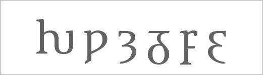
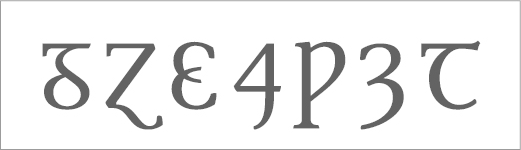
Hwair, wynn and yogh are already in the font:

More weird glyphs: Hwair, Wynn, Yogh, Insular G, Insular F, Tresillo.

As I'm not a good designer, these glyphs took some time to draw –and I'm still not sure if they don't need an overall revision. Lowercase are also present:

The same in lowercase set.

Lowercase thorn uses p as base, but Thorn has a different build. I don't remember if Tbar suffered changes since version 0.85. This is how it is by now:

T bar and Thorn.

I’m not sure about your insular G/g. In the samples I’ve seen, the lower part would never seems so o-like. I think the shape of the hook should be more of a s, and, most of all, it should start at the (left of) centre and not a the right. But surely Mr. Everson (http://www.typophile.com/user/6281) could give more informed advice.

Cool! I was thinking the Thorn might need to have the same bowl as the P. I like the current form but it might look a bit too Cyrillic?

I also think the insular g could be tweaked. This page shows some examples near the bottom. There are also some yoghs there, I think the central beak needs to slope downwards a bit more...it's a weird shape and yours looks a bit like a 3.

Also, where did you get the idea for the Wynn to descend? I haven't seen that before.

One other possible glyph is Vend, which I hadn't heard of before getting obsessed with arcane letters.

Maybe "H" needs to be wider. Give it a try maybe.

I was lucky to show insular G here. Thanks to your observations I could avoid a terrible design (it was based on Unicode table, which I learnt has bad examples of insular glyphs). After your notes, it could be improved a lot.

The same with wynn. I enhanced its belly and keep the angled descent just for lowercase. There are some fonts with this kind of descender, but the uppercase seems better with the traditional straight serifs.

Yogh is still 3-like, but its much more inclinated now. Top segment is not straight anymore. Other glyphs were also updated. Some are in this small sample:

Insular G and other unusual glyphs, updated version.

About vend, it will not be included in version 1.0. The mediavalist segments of Unicode blocks were left for a future version. Although there are lots of very interesting glyphs there, it's so much work and I want this font not to be an opus posthumous. ;-)

So, thank you very much, Riccardo and Bendy.

Dusan (tourdeforce), thanks for you point about H. I narrowed it in a recent revision but it may gone very far and now needs a small adjust. I'll do text print tests to be sure how would be the ideal size.

Just to add one more sample, these are the lowercase alternates in definitive design (well, sort of):

>I want this font not to be an opus posthumous. ;-)

Hah, yes, that's a good point.

About the alternates...the /b/ and /q/ with spurs especially are very nice and if you're running out of space I think you could be more selective. I guess it's a matter of testing in body text at different sizes.

… Unicode table, which I learnt has bad examples of insular glyphs

Unicode tables have much more bad glyphs than just insular ones.
“We encode characters, not glyphs” :-)

I second Ricardo’s comment on the insular g’s bowl. The capital of it is much more better by now. Mind the weight distribution.

vend: the bowl may be more slender.
insular f: still a bit narrow
tresillo: upper part a bit stiff… look at c.
That crossing at the Tresillo disturbes me. I just gave it the glyph of 0190.
Thorn: well, a more P-like bowl may be better in the end.
uncial T: weight distr. of the round part: the gravity might lay a good deal lower.
Capital Yogh looks quite good.

Finally allow me a general remark. Have you ever done writing exercise with a broad nib pen …? If not, give it a try. You’ll find it will help *tremendously* with candidates such as insular whatsoevers, tresillos, quirkstrokethroughs, weirdturnarounds …

Enjoy it.

I really like the overall feel of the font. Seemsa like this really has a great deal of potential, however, there are a number of things that bother me. I'm no pro, so feel free to ignore my comments. Although I see you're already pretty far in the design process I noticed a couple of things in the lc, which I want to share.

The curve at the top of the bowl in /a/ is not smooth. It looks as if there's a straight part in it. I think it will look better if you take away the in-between nodes and extend the control points at the top towards the left.

The c seems about to fall to the right. I think you should higher the top-right part and maybe also move it to the left a bit.

I think the finial in /e/ is too short.

The f is original, but adding a serif to the top would probably be better for legibility

The eye of g seems a little too dark to me

The top of t looks fragile. Perhaps move the node at the very top to the left?

The serifs on the inside of x are probably too 'smooth' to stop ink from filling the space between the serifs and the diagonal strokes. The serifs on the capital X look better to me.

I'm not sure about the flat bottoms of v w V W. It looks as though they were cut off. I don't think there are many serif typefaces with v's and w's like yours.

Anyway, it's still a great typeface. Good luck!

Firstly, I must apologize for the lack of updates and answers –especially to Bendy, Andreas and Jasper, who kindly made observations which I'm answering just now.

Bendy: you're right, I ran out of space. Even using mark and mkmk OpenType features to build up diacritical combinations, I'll need more room than FL Studio 5 can give me. But the 6,000 glyph limit will be increased in its next version –and probably FL6 will be release much before I could complete the font. So, no problem here.

Andreas: I carefully considered all your points and hope the glyphs are better now. Your suggestion about pen exercises is very good. I plan to do this to improve curves and flows –by now, the font is designed directly on screen, without any paper/pen support.

Jasper: I really appreciate your detailed and insightful critique. Of course, I did not ignore any comment in this thread, all them helped me a lot. Some problems you noticed were already fixed and many others were addressed.

Top of |a| was actually not flat, but the curve was so subtle it may cause this impression. Now it's sligth rounder and the same treatment was applied to some other glyphs, as |Ɛ|Ʒ|ɛ|. There are also improvements in |g|t|f|c|e|C|G|O|, not to mention all the other Latin Blocks (Extended A, B, C and D).
I just disagree about the flat bottom of |V|W|v|w|. This is quite common and there is a number of fonts with this approach –Bembo, Miller, Arno, Utopia, Freight, Glosa, Le Monde, Orbi, Kepler, Tabac, Tanger, Andron and so on. It's more typical to modern and clarendon styles, and less common between garaldes and venetians. Anyway, I improved a bit the colour of |w|.

Some samples to follow:

Improved lowercase glyphs.

Improved extended Latin glyphs.

Improved glyphs with hooks.

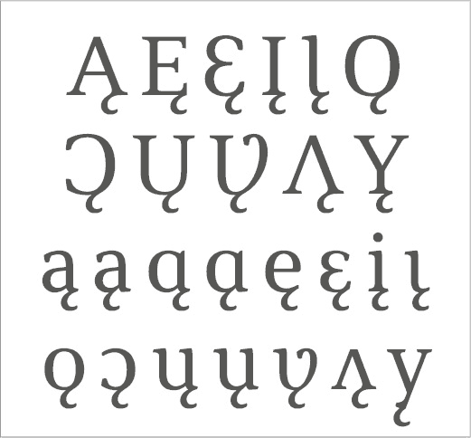
Ogoneks are tricky. Although a good amount of instructions about ogonek design is available (especially from Adam Twardoch), each ogonek is a particular issue as the connection with base letter is almost always different. Another problem is Native North American languages, where the preference is to link ogonek to bottom middle of |a| and |u|.

While most ogoneks work well, lowercase y with ogonek is terrible. Unhappily, I don't see any solution to improve this awful combination.

All this was considered in this set of ogoneks:

Ogoneks.

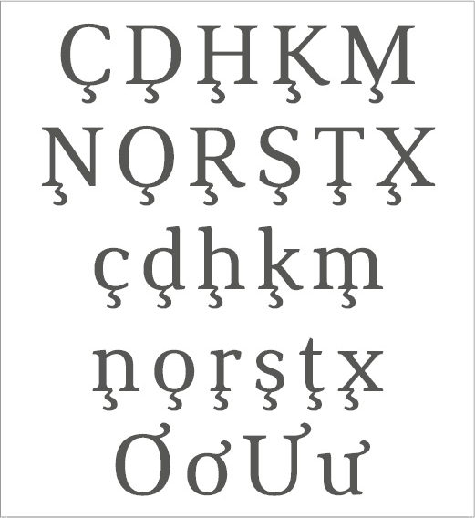
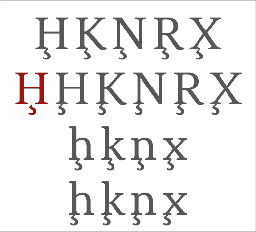
Cedillas are much simpler than ogoneks when you work with the usual |C|S| with cedilla. But to make M with cedilla I needed a special connection. And there are letters like N or H with cedilla, without a base where to hang the diacritic.

Usual solution for Hcedilla and others is to center the diacritic with the first stem of the base letter. I tested this and didn't got satisfied. In this beta version my provisory solution is to connect them to the right serif of first stem.

Not sure if this is better. I'd like very much any feedback on this:

Cedillas and horns.

Horns. As you can see above, in the last line there are |o|u| with horn. I'm glad with this design as it keeps both horns at the same height and they connect smoothly with the base letter. Horn size also seems adequate and legible.

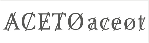
Slashes. As discussed in another thread, in some less known languages |a|c|e|t| can receive a slash as a diacritic. I was initially trying to use the same slash from |Ø|ø|. Later, I learnt the diacritical slash is different from that used in Ø: it's steeper and goes beyond height and base lines.

These glyphs are far from beautiful, but this diacritic does not leaves much room for a nice design:

Slashed letters.

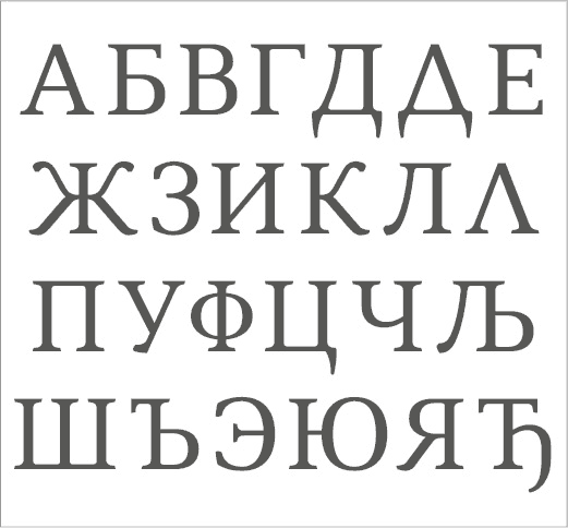
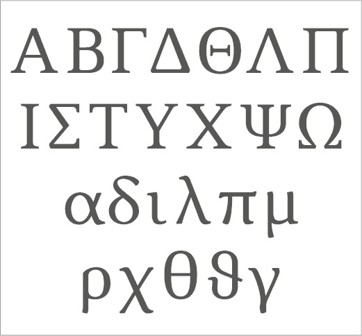
Main new at this moment is the inclusion of Cyrillic and Greek scripts –both in early draft by now. Cyrillic gone further as it's much more natural to me (and I understand some words of Russian, but no one of Greek).

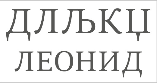
I cannot achieve a good terminal for the first leg of |Л|Љ|. Also note this partial sample shows alternates De and El for Bulgarian. About Greek, I still need to develop its ductus to design good lowercases:

First Cyrillic draft (partial set).

First Greek draft (partial set).

Just for fun, a sample of dingbats and arrows:

Some dingbats and arrows.

For purely aesthetic (and “flowing”) reasons, I would see cedillas better hanging from the left serif of the right stem (especially on letters like n).
Also, for y-ogonek, either you create a right serif from which the ogonek can hang, or make it hang from the left, balance be damned! ;-)

Thanks, Riccardo.

I guess cedilla is not used at right stem because |K|k|R| would need another kind of link. Anyway, I cannot find further info about this.

There is also the possibility to use hanging centered cedilla, a solution adopted in some fonts. I dislike it: these cedillas may be easily confused with comma accent at small sizes –not to mention the apparent nonsense to have a linked diacritic hanging from the air.

More samples:

Comparison with cedillas at center of left stem.

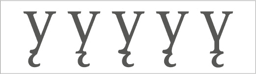
About y with ogonek, this glyph really bother me. I did more tries. None appear to be good, but the fourth one seems prefereable:

A sad necessity: ugly y with ogoneks.

Here is a better sample to evaluate Cyrillic |D| and |L|:

Sample with Cyrillic |D| and |L|.

Freiberger, I prefer the second H cedilla (second link). I also prefer the letters K, N, R and X because they're beautiful and perfect.

I prefer the second y cedilla, because it's better.

Congratulations. You did hard work for a year?! Wow!

When will you finish your fonts family? How much will you sell the fonts family per dollars?

Thanks, Kevin. The font became much more complex than my initial plan and it will take about 18 or 24 more months to get ready.

Arghn, Freiberger, 2 years?! Oh my God, poor of you! MyFonts, Linotype or FFonts must pay the most expensive price you because of your work of 2 years.

Igor, have you tried removing the left serif on the bottom of the y? (Keep the right one for the ogonek to start from.) EDIT Or perhaps it's permissible to flip the ogonek to the top and have it coming out of one of the arms?

I was also going to ask people's opinions about Hcedilla and Mcedilla. Have you seen this glyph in use anywhere?

Thanks, Bendy. I will try your ideas for y and post samples later. About letters with cedilla, I remember |C|S|+cedilla are part of various alphabets while |M|+cedilla is used just in Marshallese. I don't remember where |D|E|L|R|O|T|+cedilla are used, but I have this in my notes. The others appear in several transliteration schemas:

|H|: transliterations from Arabic, Indic and Cyrillic scripts;
|N|: transliterations from Cyrillic and Indic scripts;
|K|: transliterations from Georgian and Cyrillic scripts; and
|X|: transliterations from Cyrillic script.

Note: opinions about Cyrillic letters are welcome.

Additional information about letters with cedilla: Dcedilla is used in Livonian, Lcedilla in Marshallese and transliteration from Cyrillic script, Ocedilla is also used in Marshallese.

Back to Yogonek: here are more drafts. By now, I think the first one is the better choice.

Drafts of y with ogonek.

Regarding your comment about tabular fractions (http://typophile.com/node/75357#comment-435393), there are a couple of threads mentioning them:
http://typophile.com/node/41191
http://typophile.com/node/28608

Thank you very much, Riccardo. These information will help me a lot. It would be great to have arbitrary nut fractions, as refered in Chartwell release thread. Maybe this is possible combining OT substitutions and mark/mkmk positioning.

Really nice font, reminded me somehow of Melior. I like the y's where the ogonek sticks out a bit more to the right. I like the bottom of the 4th from the right, but not the top. Top should be like the ones before it.

How was it switching to fontlab vs. illustrator? I've decided to do that too... illustrator is maddening in that if you're designing on a grid, it subtly moves the letter without warning. I.e. the base of the letter was on 0, suddenly it's on .002. The height of the slab was 40, suddenly it's 39.999.

Just a humble opinion I shouldn't write in the first place.

Ok first of all: This is a really great looking font. Hats down to you Freiberger. And to say the least this is one of the most glyph complete font (if not the most). I don't think that even Adobe produces this many glyphs in their Pro versions.

On the other hand I question this decision to make it so very much complete, because on one hand your font has been completed long ago (probably 10% of your time) in a sense that would cover >90% of all Latin writing languages. The remaining 10% is now taking you the other 90% of time. I don't think you'll be able to compensate this 90% of time spent on seldomly used letters.

Do you think you'll be able to finish all seven weights (28 fonts alltogether as you talk about) in 3 years (one has passed by and you're talking about 2 more)? US$ 25 per font is still not cheap even though they're very VERY glyph complete.

I think you're over-engineering this a bit too much. But you should know best. And regarding your alternates. I guess you can't decide which ones to keep so you're keeping them all. Maybe that's not the best way of doing it. Choose only those that best fit this family. Think of the sheer amount of ampersands in the family. 1 is standard, 2-3 is nice 4-5 is great, 5+ is overwhelming.

But put all these aside: Wow! This font (when finished) will definitely define put you in the typographic space.

Robert,
… one of the most glyph complete font (if not the most). I don't think that even Adobe produces this many glyphs in their Pro versions

Adobe is certainly not the measure here. I made the experience, when users seek for a font offering both typographic quality *and* great character coverage, they usually end up with Andron (if I may say so).

Surely Igor’s admirable work will be on of the very, *very few* typefaces challenging me.
Great!

Igor, you may conſider to reviſe your ß-glyph. In Italics, an ſ_s underſtanding is OK, but in an upright font its ſhape ſhould *not* reſemble ſ_s. This is but a much repeated misunderſtanding. The ß is neither a ſ_z nor a ſ_s, it’s a ſ dreaming of being a ſeahorſe.

This is even more ambitious and certainly more scholarly than my Agamemnon project. I just started obsessively filling in glyph slots, and am paring it back severely for a release. Best wishes on your success with this and on finding a fair price point.

So your glyph-count reached 6000+ - that is impressive. You really want to create One Font To Rule Them All.

Now, how about optical sizes and different widths?

But seriously, I hope you consider pricing and licensing in a way that pays off for you, as your face has almost no competition.

Congratulations.

Somehow I'd missed this! Very cool. Especially since, unlike
virtually all fonts with very large glyph sets, it Does Not Suck. :-)

So is it finished?

hhp

I'd be curious to know the status of this as well. I'm very envious of your project and I hope (someday) my project may be half as good.

Anybody knows the outcome of this lifelong endeavour?

It appeared to me lately that he is working on Cyrillic parts.

Sorry for the lack of updates but I had very limited time to invest in type projects since early 2012. This scenario will remain the same during about one year from now –so real news are expected just to 2014.

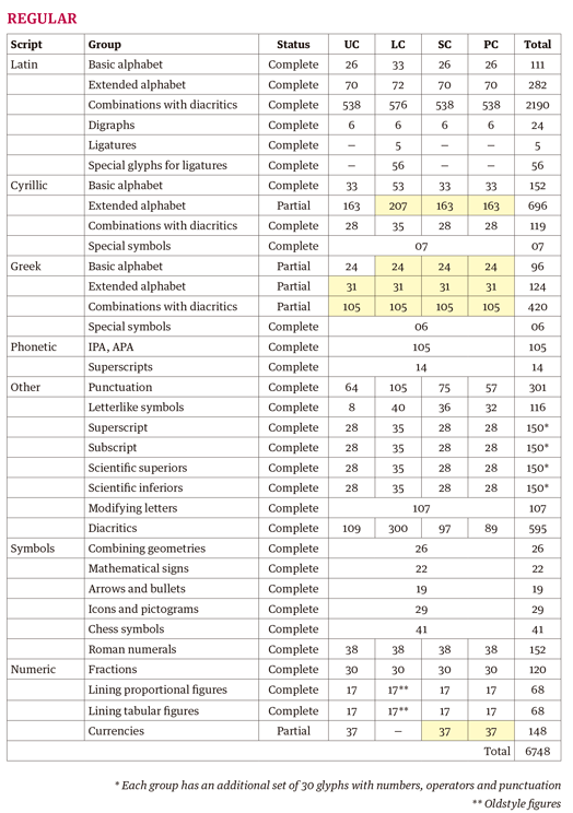
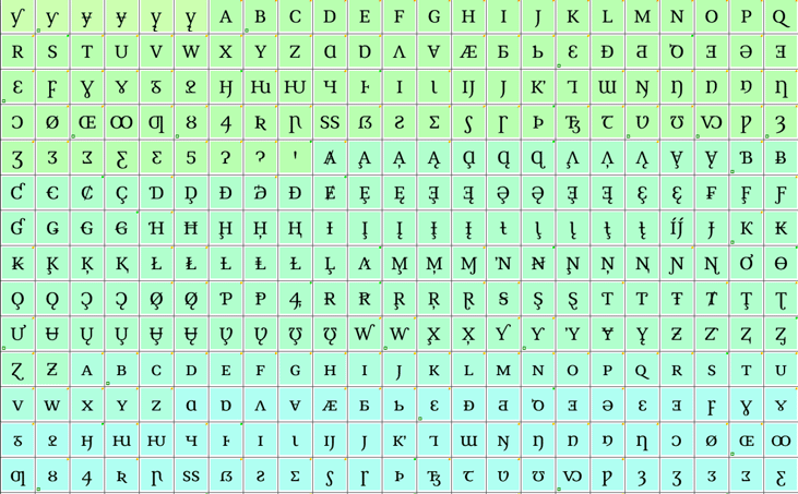
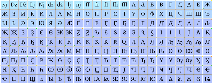
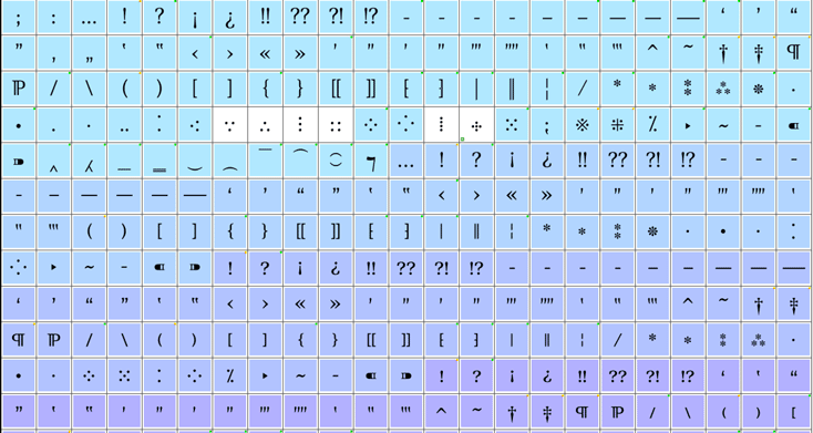
Anyway, the development continued, although slowly, and the regular style is mostly ready (yellow groups are the incomplete parts):

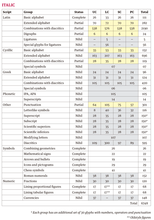
In table columns, UC, LC, SC and PC means uppercase, lowecase, small caps and petite caps. Italic style is also underway:

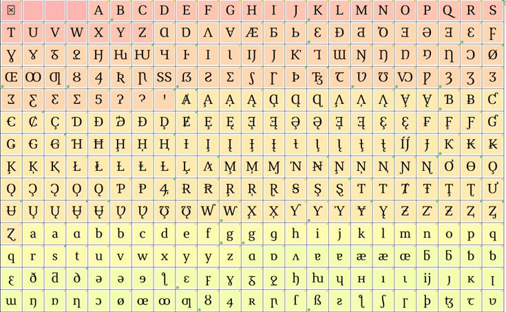
I know just a specimen would give a good view of the font, but for now I do not have an updated one. So these captures may give an idea (sorry for the large width):

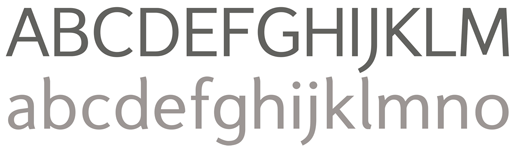
Besides this, I also started a sans serif font to work as companion for this project. They share the same glyph set and main proportions. Its basic Latin alphabet is ready. A sample:

I like the sans; its proportions are clear and open, easy to read, nicely humanist. I'm undecided about the curve at the top of the tall letters, though: they seem too... playful? They match the n-letters, but they're functional there (opening up the notch). The bottom of the stem of b should be opened to match the n. Maybe the bottom of the e might want to go out a bit, so that it isn't so clearly just a cutaway from the o. But again, it's nice, clean work.

Igor, having seen your comment in the Build forum I came over here to review your progress and I am very glad to see that this is still in development, if temporarily on hold. This is great work and if you had not already reached the conclusion, well worth pursuing a commercial release for when you are ready.

Thank you, Karl. It is very good to hear that. For sure, this font family will be completed and released, although not soon.

Jafo, thank you very much for the critique. I mostly agree with you. The top curve seems a bit fancy and there are several adjusts to be made in curves. When I come back to design it, I will consider these points.

Captured from web.archive.org on 24 Jan 2015. view this capture