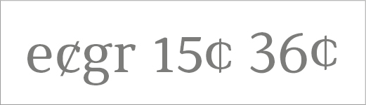
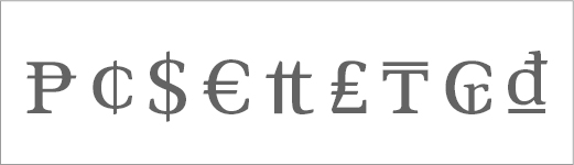
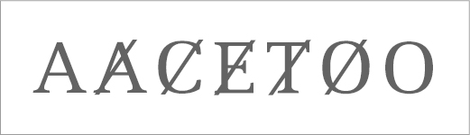
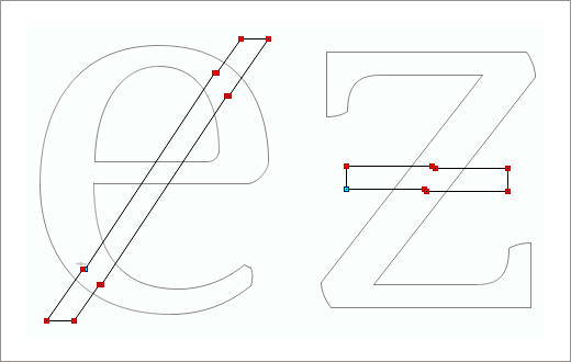
Slash as a diacritic is almost only known to produce Øø. For these glyphs, there are specific design recommendations (slash would be centered and its extremes would match or be near the O extremes). Here are the Øø from the font I'm preparing:
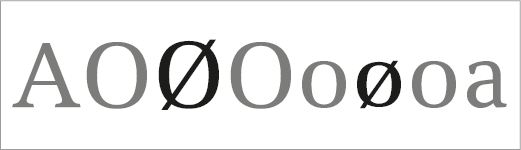
Slashed Oo.
Although much less common, there are other characters with the diacritic slash, as A, C, E and T. But in all fonts I verify, slash applied to these letters is clearly different than the Øø. It is usually steeper and goes well beyond baseline/caps height.
You can find a list of fonts with these characters here: A, C, E, and T.
Maybe this is due to the angle of Øø slash, which produces bad results for AaEeTt, whose widths are smaller than Oo. It also cannot be centered exactly without causing some undesired overlaps.
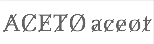
I made some tests and decided to also use a different slash for these letters, as found in other fonts. But I'm quite unsure if this is the better solution:
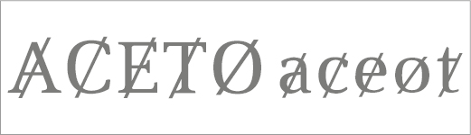
Slashed letters.
What is your opinion?