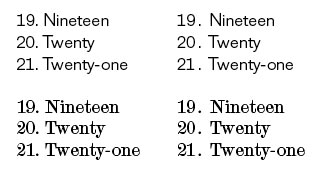
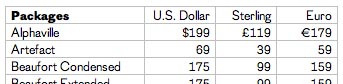
A question for those of you who use tabular figures: What characters do you need to have on consistent tabular widths?
Numbers, of course.
What about period and comma -- are these important to have on the same width? Generally, I would expect them to line up on themselves, so if period and comma were the same width as each other, would they need to be the same width as the numbers?
What about colon (for times)? Semicolon?
Is it important to have a space specially fitted to the tabular width?
Is it important (or useful) to have tabular fractions? On the same width as the numbers, or is it enough that they all be on the same width across fractions?
Arithmetic operators: + – × ÷ = < > ±, etc. ?
Monetary symbols? Percent? Section symbol? Parentheses, braces, and brackets?
There seems to be a wide variety of implementations among OpenType fonts with the {tnum} feature, so I'd be curious to hear from users -- designers who actually make annual reports and financials and timetables . . . what else? -- what they expect/need from their tabular figures.
-- Kent.