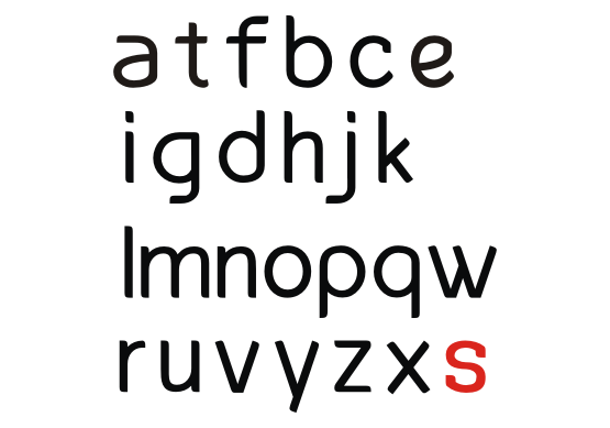
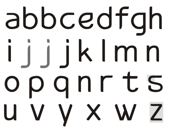
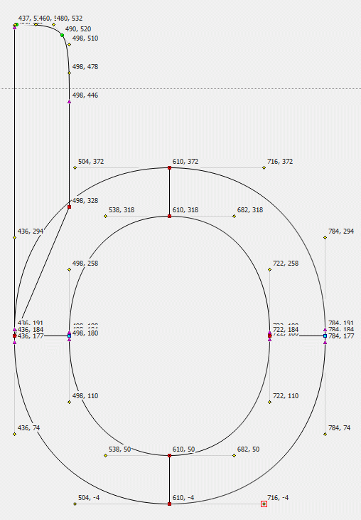
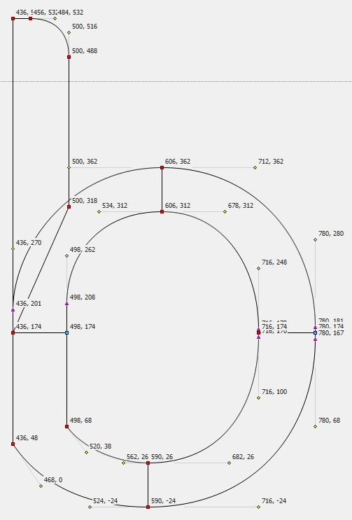
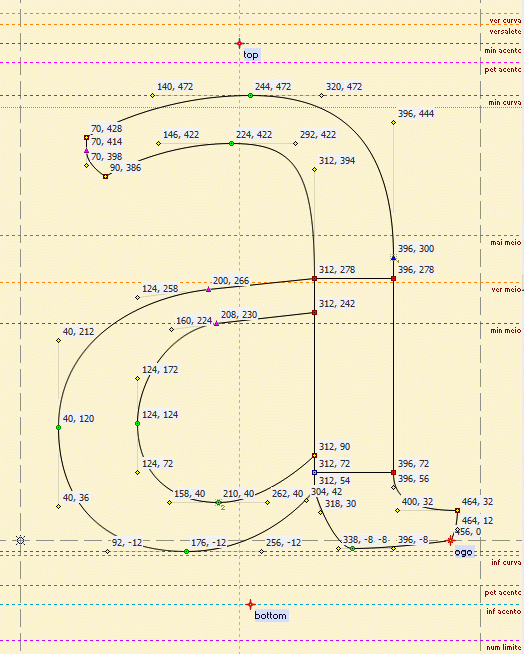
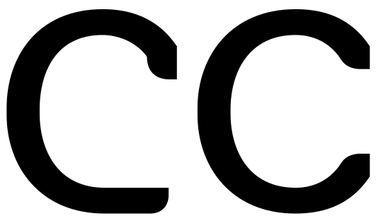
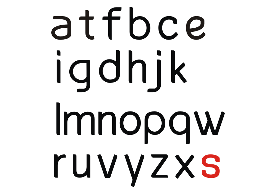
Ok I'm gonna be honest with you. h, the first l m n u v w x y z have potential. The rest is simply ugly. Start all over again from the glyphs with potential and forget about the weird serifs you made in a, c, e, etc. Also forget about the weird curves you made in the bottom of the f, bottom of the second r, bottom of the first stem in the second m.
The best way is to learn sans-serif, is to study sans-serif. Read books (I never did this. Not a must.), but mostly, LOOK! Have a very close look at all the nice sans-serifs you can find and figure out why the designer made certain choices.
First real critique on the glyphs with potential: z looks top-heavy, w should be flipped, y maybe a tail curving to the left?
It's also important, to think of the purpose of your font. print, web, or both. text, display or both. Don't start with the other styles untill you've had some really positive comments from others.
Don't let this discourage you. My first designs were very ugly and this really does have potential. I found the most important thing in typedesign is to never be sattisfied. With the help of all typophilians and a lot of hard work you'll get there.
Jasper de Waard, amateur typedesigner.