Hi.
Most people in linguistics that I know use Times New Roman or Computer Modern for their manuscripts. (Although I do know one person that uses Minion.) I find that Computer Modern is too light for photocopying or printing 2up.
Does anyone have any recommendations for something better for the body text? Basically, the manuscripts would be PDFs on a website that may be read on someone's computer or printed on standard university laser printers or home inkjets. The font must have small caps, italics, and probably bold variants. Although I wouldnt mind, the font should probably not be too "fancy" so as not to distract from the context of manuscript.
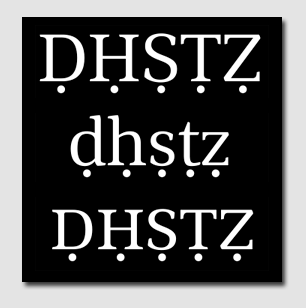
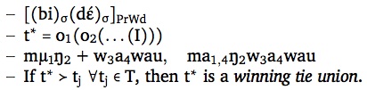
Additionally, I plan to use Charis SIL with the body text font since it appears to be the only font that has a large enough range of phonetic characters (IPA or not) and phonological symbols (Greek sigma & mu with combining diacritics). I dont expect the body text font to cover an adequate range of phonetic symbols in Unicode. These phonetic bits would usually occur in figures but also sometimes interspersed in paragraphs. Also, I plan to occasionally typeset mathematical equations in floating figures. Currently, I just use the default math font of LaTeX. (I write my papers in XeLaTeX, actually.) And, so far, I use Apple Symbols for logic symbols and Zapf Dingbats for the pointing hand arrow (which is used in Optimality Theory tableaux). These fonts just came with my computer.
I understand that it is nice to use a sans serif for headings, titles, and the like, no? So, if anyone has a recommendation for that or if I should just not use a sans serif at all.
From reading here, I see that Minion is a good no nonsense type of font that pairs well (if not boringly?) with Myriad, but Minion is also somewhat compressed for one column on a 8.5x11 size paper. And, Kepler is designed for scientific writing, so maybe this is good? I thought that Warnock is very readable but perhaps it is too modern? A phonetician has told me that the Hoefler Text that ships with Apple computers is too fancy for his taste (the italics and the square brackets, especially), so not that.
Anyway, I just wonder what a professional would do to make a technical linguistics article very readable and nice looking but not distracting.
Thanks in advance.