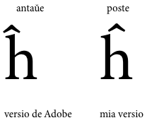
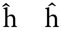
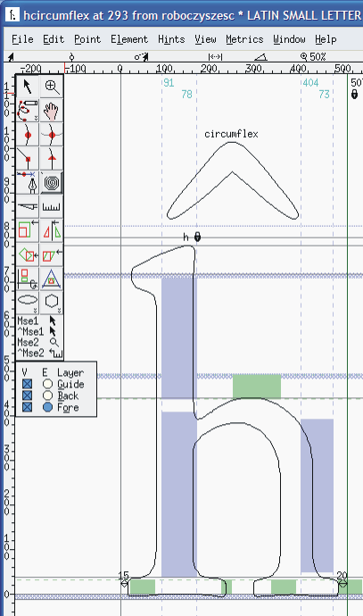
I know this has been discussed here once before. But, I just noticed that the circumflex of h-circumflex in Adobe's Minion Pro family is misplaced. It is aligned over the left stem; it should be aligned over the center of the entire letter, which means it may also need to be raised a bit, as well. As far as I know, Esperanto is the only language that uses this letter. I print Esperanto text quite frequently, and Minion Pro is the font I prefer to use. However, h-circumflex is by far the least used letter in Esperanto, so it's only while adding an OT feature to better support the language (for my own use, of course) that I happened to notice the misplaced circumflex.
I've been reading (and writing/speaking) Esperanto since I was 14, and in over 40 years of reading it, I've very rarely seen an h-circumflex designed with the accent over the stem, and when I do, it looks very strange. So, type designers, for what it's worth, please center the circumflex of h-circumflex over the entire letter. Also, in case anybody's interested, I just created a simple OT feature that supports the 2 common methods that many Esperantists use (unfortunately!) to type the Esperanto accented letters (Ĉ Ĝ Ĥ Ĵ Ŝ Ŭ ĉ ĝ ĥ ĵ ŝ ŭ) when they don't have direct access to those characters: the x-method (Cx Gx ... cx gx ...) and the h-method (Ch Gh ... ch gh). For my own purposes, I've also created a keyboard layout (for Mac OS) that allows me to access those characters via option+letter.