Typophile

Dutch baroque book font, Cyrillic and Greek scripts, italic

Jan Żurawski

Hi Typophiles,
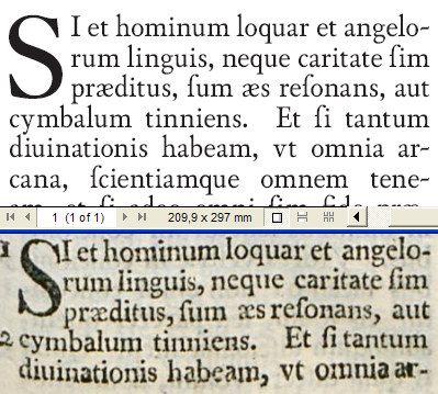
In july I bought the book printed by Elzeviers in 1661. (here you can find some details). After a short research I realised there is no any fonts based strictly on types used by Elzeviers[8 pt] available now. [edit: except DTL Elzevir, but based on 14 pt /Augustijn Romeyn/ not text]
So... I decided to make a font (first in my life :D
Font under working name VanDyckBoek is intented as typeface for books. The shapes look up to printed letters set at about 8 pt.
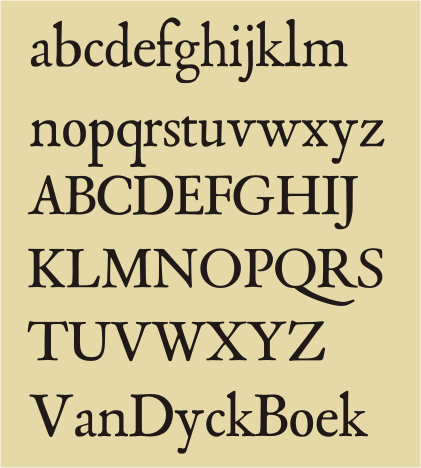

I have attached my first attempt here. I'm particularly concerned about inconsistencies in stroke widths/contrast, overshoots etc and overall look of these letters. At this moment there is no numerals; italic and titling version are in future plans.

Every your opinion is highly appreciated.

Jan Żurawski

Update: Greek script. See this file: http://dl.dropbox.com/u/19437300/kor13.png

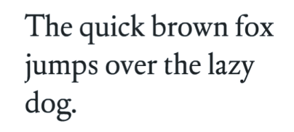
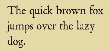
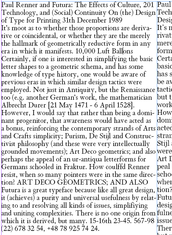
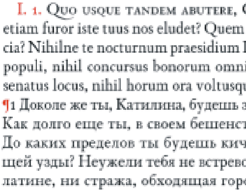
[10.09] Very rough version in text:
[Dec 25, 2010] Four fonts: Zero, One, Two and Three in new png files:
[Dec 27, 2010] Sidebearings set the same in all fonts, so now it almost fits
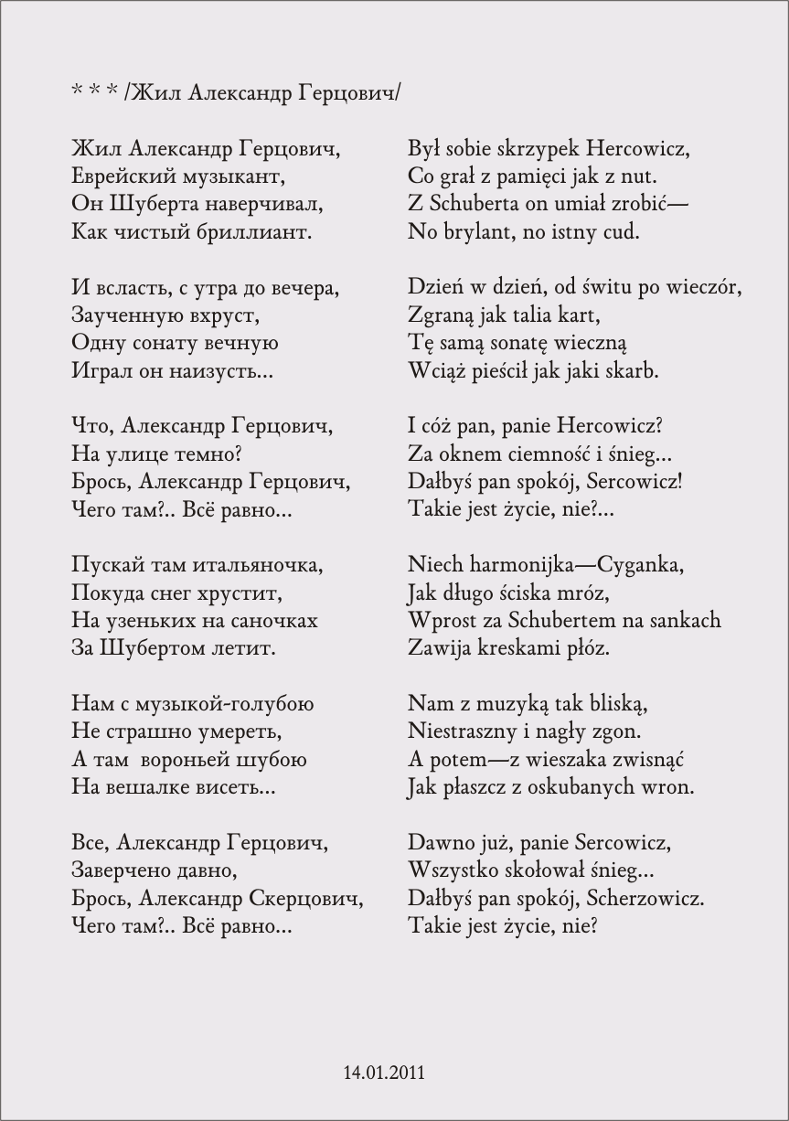
[Dec 31, 2010] Cyrillic added - see hercowicz3.png. As a bonus this beautiful song by Ewa Demarczyk http://www.youtube.com/watch?v=dzV9Fa9v8Bc&feature=related text Osip Mandelsztam, translated by Wiktor Woroszylski
[JAN 21, 2011] Some amendments, 6th line: old...new. file 21_01.png
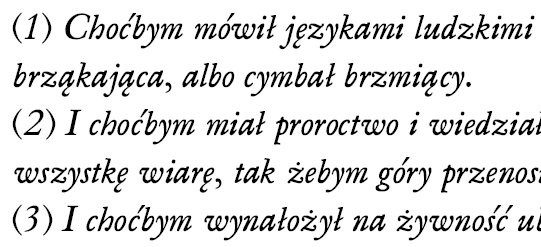
[MAR 26, 2011] 36.png italic, Polish text
[APR 15, 2011] curiosity - VanDyck on screen 09.png and 42.png (Nightly 6.0a1, Win XP)
[JUL 22, 2011] Biblia Sacra
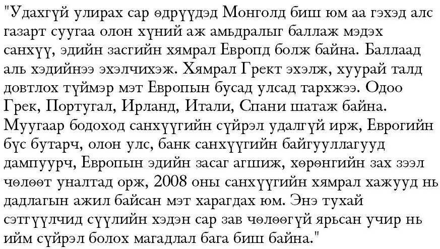
[DEC 07, 2011] Mongolian

AttachmentSize
roboczy_deklar.pdf36.76 KB
roboczy_deklar1.pdf232.9 KB
osf.png42.81 KB
text.png60.75 KB
markaurelius11.png437.98 KB
markaurelius12.png439.28 KB
markaurelius13.png438.25 KB
markaurelius14.png441.18 KB
hercowicz3.png121.74 KB
21_01.png63.93 KB
2.png28.76 KB
28.png237.07 KB
36.png24.23 KB
09.png11.35 KB
forum.png6.19 KB
BibliaSacra.png178.09 KB
poczatek20.jpg111.34 KB

Hi Jan,
It looks great!

Not to discourage you, but Dutch Type Library issued Elzevir in 1992.

Don't let this discourge you and keep going!

Hi Jean Paul,
Thanks for your interest.
>Also Our Type's Custodia, Van Dijck MT and Berthold's Van Dijck (not available now).
Here are Elsevier Book and my trial:


They are similar, that's true. It is no wonder, because they share common standard - Elseviers' books. The qustion is whether they are considerably different and whether it is a good idea to make new full OT font like this.

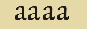
Update: lower case "a" alternaties. The last one is more close to the original (I hope...)

[pdf attached]

I like it! I like the irregularities in it and ink details, good character.
It is on the narrow/condensed side though, and bit tightly spaced..
but the a's are lovely (the ones on the right more so)!

Hello Angus!
I am very glad you like my effort. I tried to reproduce the shapes of the printed letters made by Van Dijck; >good character< acknowledgement to Van Dijck and Elzeviers! It's important to me that I should avoid the sameness of the glyphs, though I want them to be consistent in the spirit.
[Letter-spacing is in a very preliminary stage. I will increase tracking by 5% or more.]
The fourth "a" is the basic now (see the last pdf in the first topic).
BTW I think the glyph "a" 'makes' the font, like (beautiful IMO) Stempel Garamond vs. (ugly, again IMO) Apple Garamond.
best wishes
Jan Żurawski

nice. it's pleasantly more legible. Only now, the bottom half of the a looks heavier compared to the rest.
And I would have a closer look at the lower case o, it doesn't quite fit the rest, imho.
there are probably more issues with it, which makes it all that much more fun to get right, doesn't it

good luck!

Looks great, keep going with it!

Angus and Brian,
Thanks a lot for your kind words. I am working on some opentype-features: roman numerals, fractions and the like. I think this design will be for 12pt, much simpler and a bit thicker for 6-8pt and thinner, more delicate design for 16pt and above.
A bit refined version could be seen here: http://typophile.com/node/74955 , the work is going on...
Best

Great! I have a critique on that newer design - the numeral 5 looks a bit wide and stiff for the rest of the glyphs, and the 3 is a bit light. I'm assuming the numerals are still a little rough.

I'd love to use this font.

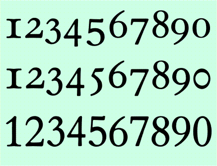
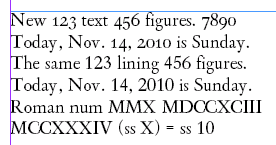
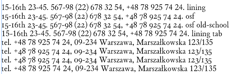
Numerals: OSF before, OSF after and tabular.


Hope a bit better.
"I'd love to use this font." Could you put over what you like in it? Your opinion will help me in next steps.
Thanks for reassurance.
greetings
J

Sure. The main thing I like about it is that, while it captures the feeling and some quirks of an old Dutch baroque typeface, it also does so smoothly, but still without being stiff, or not serious enough.

Hi Janek. A great work so far.

As long as I understood, your goal is to keep some degree of inconsistencies and imperfections one finds in original print which inspired this revival. So differences in stems or curves are intentional and you will not do a normalization (as one finds in Elsevier Book or other "cleaned" fonts).

Anyway, I think your |f| could benefit with bigger contrast –I mean, to make the curve thinner. Serif in upper leg of |k| also must be heavier to be compatible with serifs at top of |v|w|y|. Terminals of |s| could also be a bit bolder to keep overall design, marked by a kind of dot gain in old printing.
About OSF, I prefer the first set. Surely, |5| needs to be narrower, as Brian pointed, but the new design conflits with |3| in the bottom leg –it may have the same kind of opening ratio. I also think this style of |5| is very much calligraphic and hard to read. I may be wrong, but I believe in 17th Century Dutch school already established a nice trend to be more and more legible instead of the ornated and artistic approach one finds in French and Italian typography during much more time. So a less "stylish" approach seems more coherent with the remainning glyphs, IMHO.

I also prefer the first OSF |0|. This is a very personal question, but I always disliked OSF 0 with inverted flow/contrast. I undestand this was made to differentiate |0| from |o|, but the |0| becomes strange for me. Your first |o| is perfect.

I got impressed how good the font print and reads. Keep the great work.

(I sent you a PM about Roman numerals.)

Thanks a lot guys. I want to finish my figures soon, so some new alternatives:


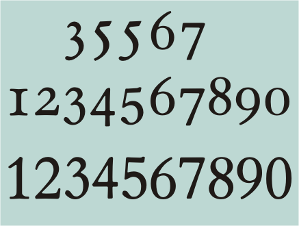
top: 3 and 5 "Elzevier style", middle new OSF set, bottom: lining numerals (no changes)
"I got impressed how good the font print and reads" I will get a closer look on printouts this weekend. Some new improvements soon...
Every comment, as always, highly appreciated.

I prefer the new OsF set (of course) but the "Elzevier style" |3| and |5| are beautiful (especially the second |5|) and maybe you can keep them as alternates.

It seems that OsF |6|9|0| are a bit lighter than |1|2|4|. Anyway, you are working with unequal stems so this probably is not an issue.

To say more, I'd like to see a PDF sample with text where figures are largely used.

Thank you very much.
New pdf attached - all lc glyphs are revised.
Next steps: revising UC and figures, bearings and kerning, alternatives: JjRQ, OT features etc. It will take some days by next revision.

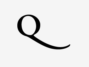
The only thing I can add from here is to mention the swash of the capital /Q/.
It seems a bit lengthy as well as a bit too fat.
Possibly, its just the angle that disagrees with my eyes.


This is Garamond Premier Pro with the alternative tail.
I like this tail for the smooth transition, I guess.

Hope that helps

Hi Matt,
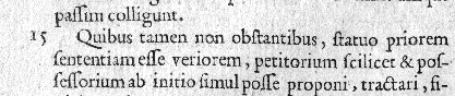
Thanks for your comment. Here is my source:


There isn't much place for such dainty tail... I'll think about it as UC letters are still under way. Will post Q, Q.alt and numerals/OSF soon.

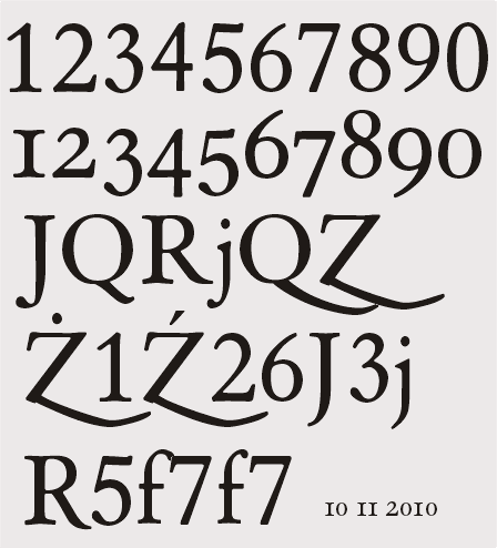
New numerals and OSF and some alternatives.


modern figures
OSF
standard JQRj, Q.alt, Z.alt
Ż.alt,1,Ź.alt,2,6,J.alt, 3, j.alt
R.alt, 5, f, 7, f.alt and 7
Alts: R and f help avoiding collisions with some characters.

@JanekZ that makes perfect sense. I really don't have a huge background of knowledge to go on but it is nice to see the reason you have done what you did.
excellent work, by the way

OSF and Roman numerals in real world:


Roman numerals from 1 up to 5999 as stylistic set (thanks George Triantafyllakos!).
BTW it is normal that working ss' are in []?
Next step: roman num (lc).

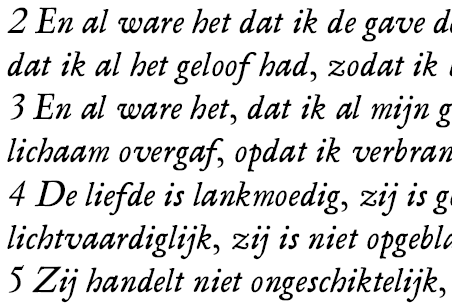
Thats how my Van Dijck looks today: (12/13 pt)


On the right the same text set in Georgia. What a huge x-height!

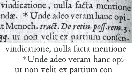
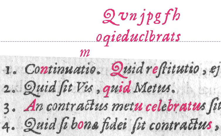
comparison: original and some words in Van Dijck*


* Any hints for the name?

Paleis, Titus, Het Loo, Rijn.
those are my ideas.

excellent work so far.

Thanks, I'll think about it...
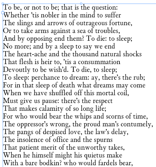
Attached new pictures, OSF and part of "To be or not to be"

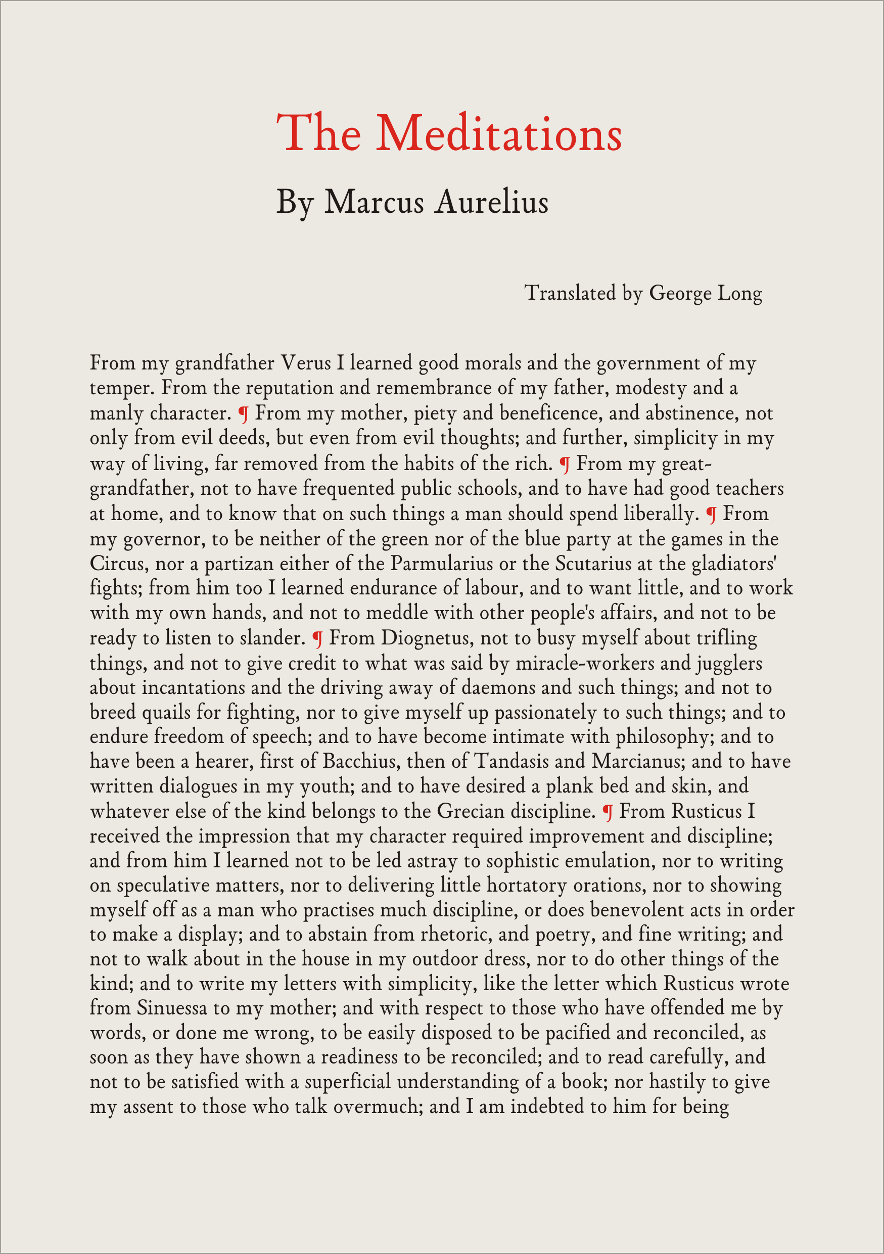
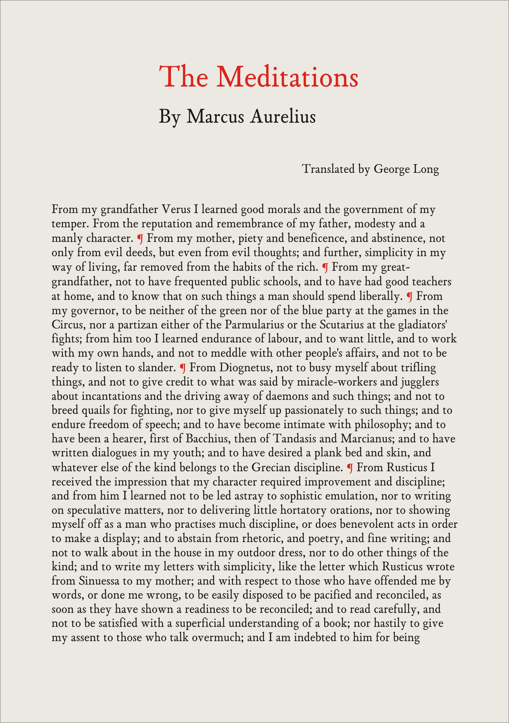
Three fonts: a bit lighter (Zero), basic (One) and a bit thicker (Two) used in new png files attached in first post. Any comments?
Best
Janek

I want to say something, but my brain loops on "I want..." and my mouth is full of drool.

Update: Four fonts (grades or whatever) and some minor tweaks.
Reynir: something more specific?
Best

I would suggest, though, that the OSF numeral one be given a leaning roof so it won't get mistook for a small-cap I.

All the same, it's definitely one more for my "I want this more than sex" list.

Already fixed: "I"-like osf one is a stylistic variant (see http://typophile.com/node/73413#comment-439584 ), as well as long-tailed R and Q.
If you want to do some beta-tests drop me a line.
best wishes

Tempting, but I'm just a run-of-the-mill type otaku who does most of his reading in a web browser. Would be murder on the poor face.

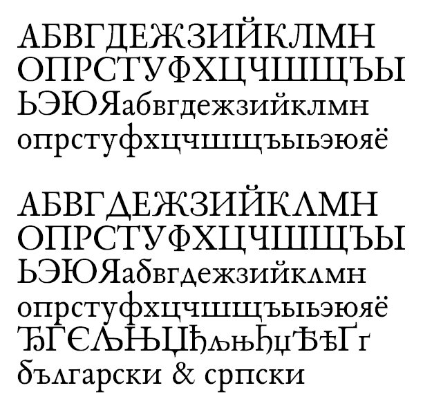
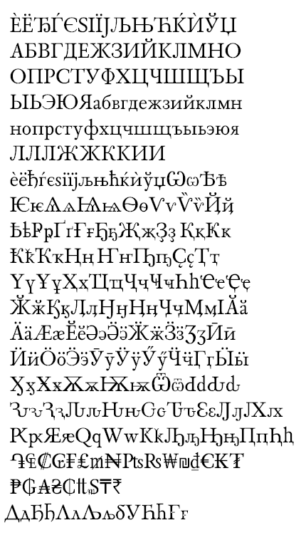
Update: today Cyrilic script.

Congratulations, Jan! Your font is developing very quickly and with high quality. Your Cyrillic seems very good to me, although I'm not an expert on this script. Some small points:

1. |U| tail may benefit from more room, which can be achieved with a bit higher V vortex.

2. |Pe|, |tse|, |sha| and |shcha| are somewhat wide.

3. The bolder diagonal of |ha| seems to be very heavy besides other stems.

I see the second set targets Bulgarian and Serbian. I don't remember if Ukranian also have some different glyphs from standard Cyrillic.

Keep the good work!

Thanks Igor. After some days of preparing the Grazhdansky Shrift I need some break and fresh eye. One thing bothers me: as far as I know there is no Serbian support in inD (so I used Bulgarian "locl" for both).
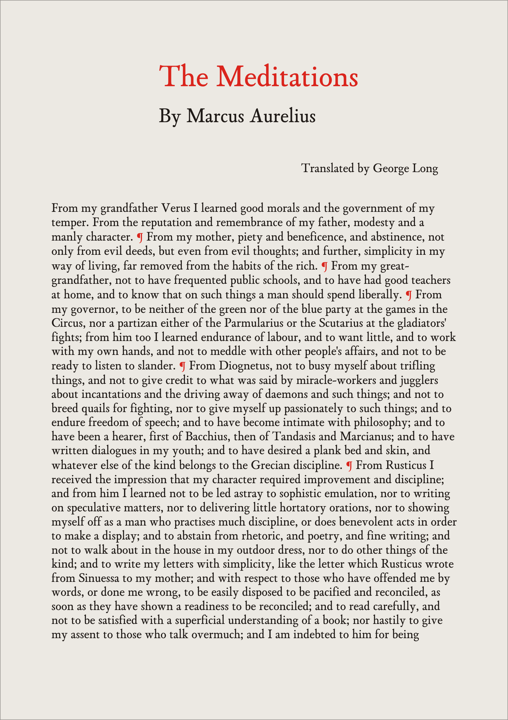
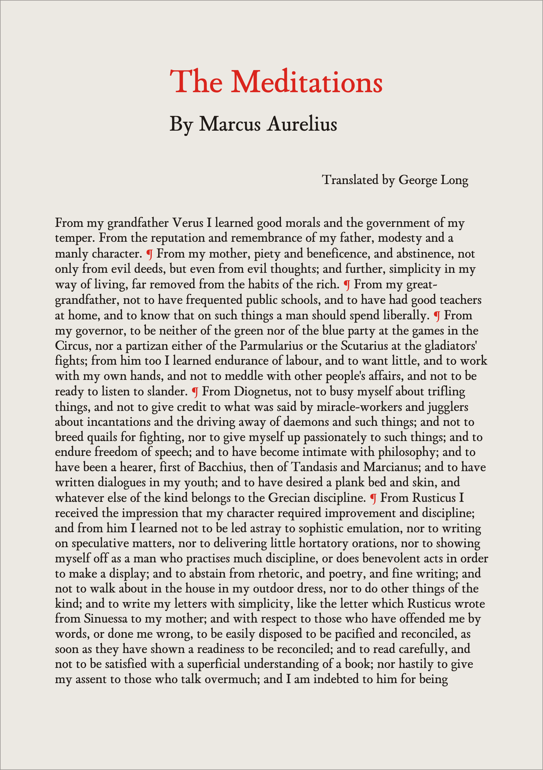
Did you look at MarkAurelius png files side by side?

Best
J

Ooh, Cyrillics. I think a lot of it looks pretty nice; I enjoy the /che/, and the /be/ is nicely executed. However, I must critique, since this is the critique section. Let's see...

I think the left leg of your Russian /el/ is too big; ideally it shouldn't stray all that far outside of the box made by the rest of the character. Sometimes it has to, but in this case I think the very long style doesn't really fit with the rest of your font. (Especially look at it side-by-side with the ball on the bottom of /ze/, which I think is actually pretty nice, though maybe, maybe it could afford to be a bit bigger.) I feel like it shouldn't recurve upward, and the ball should just point to the left; at least, that's what I would do, but go with your heart. This goes as well for /Ka/ and /Zhe/. Also for those two, the bottom legs are distractingly Bodoniesque, by which I guess I mean vertical. I think they'd fit your style better if they were more diagonal. I second what Freiberger said about the too-wide characters, and I would also probably add /te/. I wonder whether the serifs on /te/ (and /ghe/) are big enough, too. Speaking of serifs, the spike on the bottom of /dzhe/ seems to me more characteristic of the rest of your font than the ones on /shcha/tse/Dzhe/. The stress is a bit weird on /eh/ from being made out of a mirrored /c/ shape, and lastly I think the left serif of /Tviordiyznak/ should match the left serif of /T/.

(By the way, there's a typo in италяьянского in the fourth stanza, my very elementary Russian proofreading skills tell me.)

Cool stuff!

Thank you! I will do the second revision soon, but 300 glyphs require some time...
Ad Ka Zhe and eL: probably I will do them like you suggest (like Kurbatov's Lipsia or Kudriashov's Encyclopaedia). It is funny that Grazhdanka looks a bit lighter on a page than Latin!
BTW: итальяночка - Gypsy girl (at least in Polish translation) [typo in my source, thanks]

Probably my Cyrillic set will cover these languages:
Indo-European Group
..Slavic Languages: Russian, Ukrainian, Belarusian, Bulgarian, Serbo-Croatian [cyr], Macedonian
..Iranian Languages: Ossetic, Kurdish [cyr], Tadzhik
..Romance Languages: Moldavian [cyr]

Altaic Group
..Turkic Languages: Uzbek, Uighur, Kazakh, Turkmen, Kirghiz, Azerbaijani, Tatar, Bashkir, Karachay-Balkar, Kumyk, Nogay, Karakalpak, Altaic (Oirot), Khakass, Tuva (Soyot), Chuvash, Yakut (Sakha)
..Mongolian Languages: Mongolian [cyr], Buryat, Kalmyk
..Tungusic-Manchu Languages: Evenki (Tungus), Even (Lamut), Nanai (Gold)

Uralic Group
..Finno-Ugric Languages: Mari-low, Mari-high, Mordvin-Erzya, Mordvin-Moksha, Udmurt (Votyak), Komi (Zyrian), Komi-Permyak, Mansi (Vogul), Khanty-Vakhi: -Kazim -Shurishkar
..Samoyedic Languages: Nenets (Yurak), Selkup

Caucasian Languages: Abkhazian, Abazin, Adyge, Kabardian-Circassian, Avar(ic), Lezgin, Lak(i), Dargwa, Tabasaran, Chechen, Ingush

Sino-Tibetan Group: Dungan

Paleo-Asiatic Languages: Chukcha, Eskimo (Yuit) [cyr], Koryak (Nymylan), Nivkh (Gilyak)

Cyrillic updated. I altered K, L, Zhe and some more glyphs, see new hercowicz3.png. Please remember it is my first attempt...

New update: see 21_01.png
Best
J

Yanek,

Some more feedback on your latest Cyrillic attempt from a native speaker (http://typophile.com/files/hercowicz3.png):

/ш/ is too definitely wide, consider compensating width
/б/ doesn't look "right" — should be bent more
(http://commons.wikimedia.org/wiki/File:%D0%91_Cambria.svg)

/л/ the hook seems too long thus generates unnecessary white space. You can also extend the upper serif to compensate this.

/И/ There are two types of designs for this glyph. Taking into acocunt the pointed-nib nature you should use this double-serif design
http://en.wikipedia.org/wiki/File:Cyrillic_%D0%98.svg
/Ч/ bowl a touch wider

I can say more, if I see a pdf.

Also, the widths of letters need harmonisation. I would advise comparing propostions of Cyrillics to Kis

Hope my comments were useful

Update: itlic - 28.png shows 1 draft ;) 2.png italic first time in use.

Janek

Hows your font doing? Any foundry interested?

Hi Gary,
Proper word is "trudge", I think. Due to the help of some very kind Typophile fellows Roman is early beta. On the other side Italic is still in its infancy. I tried to use quadratic Beziers in first corrections, but it is extremely difficult and inappropriate at this stage.
"Any foundry interested?" I didn't ask, nobody answered ;)
My idea (reconsidered) Family will bundle: Roman in four grads, Italic (probably the same), Bold and BoldItalic. Roman with coursive Greek (as in 17th century texts), Romans and Italics with Cyrillic of course.
Two samples (ca 11/13 pt, photo)


Best regards
Janek

quick and dirty Bold ;-)

Not sure that bold is quite bold enough!

Make your logo BIGGER!
you are welcome:


Bold is now +36, so thickest grad will be in half between normal grade and Bold (in other words SemiBold). It could be OK, I suppose. [thickness: Roman 96, Bold 144]
edit: a bit misleading, but yes 12+12+12=48 - the middle 12 is +12/-12 ;)

How did you make your bold? You say quick and dirty – is it simply a fontographer generated change weight command.

15 minutes bold: http://typophile.com/node/72791#comment-423128
In FontForge: 1) scale vertically 1000% 2) style, change weight 3) scale vertically 10%. When verticals gain weight by 12 em, horizontals by only 1 em.
Of course this way is good for quick evaluating and require subsequent editing/grinding and adjusting sidebearings.
BTW vertical size of glyphs changes a bit, so you need to a) pinpoint the desired height b) evaluate needed scaling factor (e.g. 9.8% or 9.9%, Nota bene: I want bold to be a bit [e.g. 5 em] bigger).
Edit: everything is in "Fontographer: Type by Design" by Stephen Moye http://www.amazon.com/s?ie=UTF8&keywords=Fontographer&rh=n%3A5%2Ck%3AFon...

Jan,
your Cyrillic letters и,н,ф,ш - seem to be much too wide. Remember, that counters of "double" letters, like ф, should be a bit narrower than Latin ones (eg. p). Probably also т and ч should be a tad tighter?
Make a trial and compare the greyness of your new Russian text with that shown above.

Cześć Marcin,
Zwężałem te litery już kilka razy...
I made comparison between Kis (Cyrillic by Yefimow, ParaType) and my font, and to my astonishment the same text occupies the same space !?
Here VanDyck Latin and Cyrillic side by side:


The grayness seems to be similar. BTW there is ca 20% letters more in Latin text (43/36) - the same in ParaType pdf.

Late to the party. This has really evolved with stunning speed into a very elegant and readable face. Well done!

Eye of the g looks a little light to me. And while a matching bold in a face of this vintage will always look just a little anachronistic (at least to me), I think your bold would seem less algorithm-y if it had more thick/thin contrast.

Thanks for your encouragement!
"Late to the party" - then you can see it from very first clumsy drawings :) Slowly all that mess becoming a face - not a set of letters.
"g" now looks that way:


I will think abut it.
BTW I needed bold as my browser uses this font and artificial bold looks terribly, so better this one than nothing. Of course it is not a way to make a finished font...
And thanks all again.

HI Jan What I meant was did the computer alone make your bold whichI now know is not the the case. Have you tried making a mm font and generating instances to see which bold is strong enough to stand out, but can also be used as an independent face.

"did the computer alone make your bold" No, particularly the result in one cycle is not good, much better in three smaller.
"Have you tried making a mm font" No, I tried the function "Merge fonts". MM seems very complicated and don't work for me in FontForge :(
My trial run:


The third is extrapolation between Medium and Bold > Thin (a bit fishy)

Middle weight is best. The top looks like it's an unedited computer generated bold. Would you say you have kept the original feeling of your type? I'm not sure. I'm running into the same problems myself.

"The top looks like it's an unedited computer generated bold" because it is.
It is a reference when I want to make slight variations of my basic font, and as such works quite well. I'm planning to edit/polish the Bold to the real thing and then I will be able to generate any weight between Book and Bold plus even extrapolated Light(not as extreme as this one above).

I was also unable to get MM to work in Fontforge... Can't anyone get it to work!

I am not sure if the Light is a good idea, at least now. It is better to observe how the Regular behaves in real print, on various papers in different sizes. Your typeface has some contrast, and finding the minimal stroke width in the Light will be crucial, if the font has to be used in the real world.
It is great to have many weights, but I would see (as a designer, not a type designer) rather an UltraBlack, than Light in your font, if you want to go further than just making a revival.

Thanks a million :)
First sketch of Greek script attached at the opening post.

.

spam !

I made a CALT feature to resolve ugly f-space-T combination:

lookup caltlookup {
  lookupflag 0;
    sub [\f ]' [\space ] [\T ]  by [f.altnarrow ];
} caltlookup;

see: http://typophile.com/node/90561

To me the neutered "f" is uglier (both functionally
and aesthetically) than the previous not-so-bad space.

hhp

I agree.

OK. John Hudson made it right (and simple): small negative kerning space/T,W,V,X,Y and positive f/space.
BTW positive kerning is an oxymoron, I suppose.

I'm slightly concerned by the apparent optical unevenness of the baseline, some of those overhangs might be too small or too large. Otherwise it's looking nice!

Thanks, Johan!
It is shabby rendering. A bit spooked I checked it out:


Hope the baseline IS even... BTW the overshot is 12 for UC and 10 for lc. [1/1,000]

Those overshoots at a bit modest for text sizes.

hhp

I made quick research: 8 fonts designed for text, 5 fonts are in 8 to 11 band and 3 fonts in 14-23. So my font is in the mainstream; should be well. I belive, at least.

Yeah, could be, especially since you're x-height is small.
Could you name the fonts? I'm curious.

hhp

Not details at hand as it didn't interest me then. The newest one - Brill 14/14, x-height 406, while mine 12/10 x-height 441.
BTW no such data somewhere? I'm curious too.

Captured from web.archive.org on 16 Apr 2015. view this capture