Dear fellow typophiles,
Criticising Ben Mitchell's great Eternal Italic made me realise how little knowledge I have of italics. For some reason, I've never been very fond of them. Even for calligraphy, I've always preferred upright romans. Probably something genetic.
So I thought it was time to put a little ink to that white spot on my typographical mind map. (Not literally. All my typefaces start with mouse in hand and no clear idea. I've found that construction by improvisation is the best method for me.)
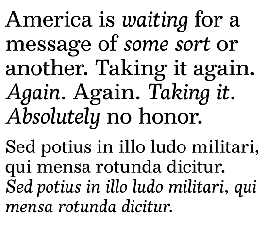
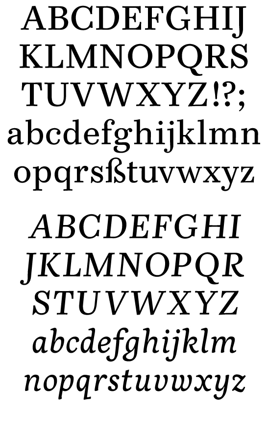
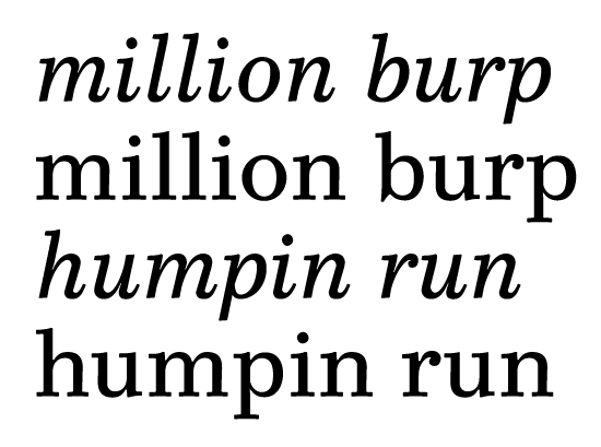
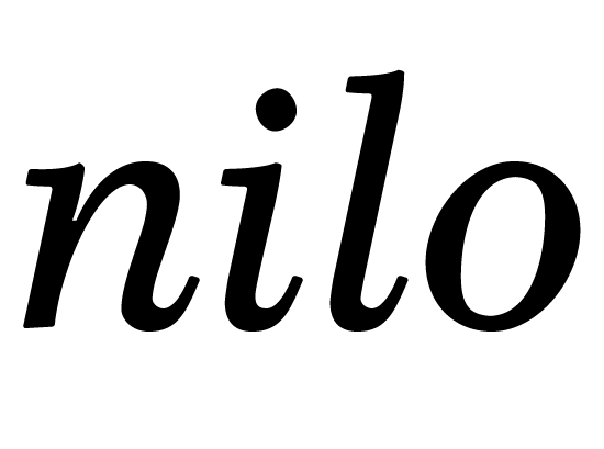
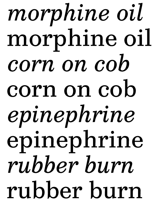
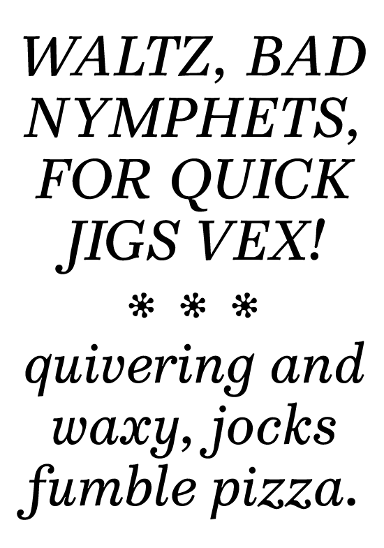
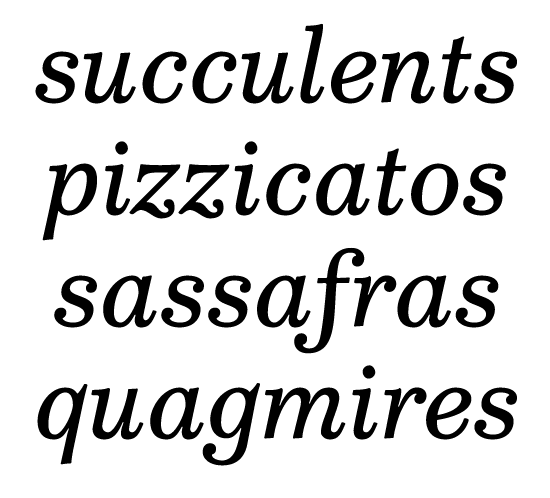
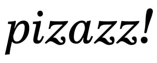
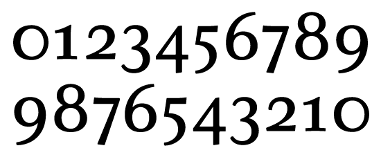
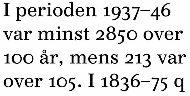
So here is a rough draft of my first attempt at an italic. Simultaneously, I drew a roman companion, based on a few glyphs I made earlier this summer. Of course, I think the roman is vastly superior to the italic. I really need criticism and help.
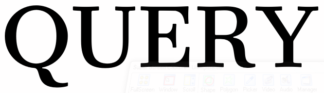
Although the roman is rather Didone in stress (but transitional in detail), I've made its italic with a slant of only 10 degrees, just to make things a little easier. (And I must say I find extreme italic slant rather unappealing.) The capitals are even more upright, at approximately seven degrees. They are also deliberately much less italicised than the lower case, I want them to work in all cap settings. Perhaps I'll make some alternate caps later.
This definitely does not mean that I've abandoned work on Ethos. (But perhaps I've abandoned Schola. I don't know if I like it anymore.) I just need to do something else for a while. Drawing more than 3000 sans serif glyphs is a little ... tiring.
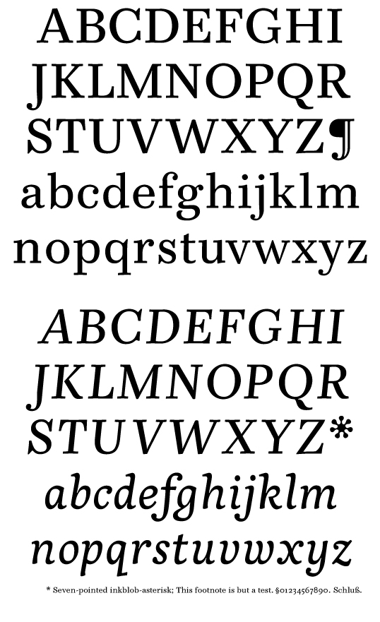
So please, I need your help on these two creations. They're both unpolished, and ready to go in new directions. The name is but a joke, but it's a nice name, I think.
| Attachment | Size |
|---|---|
| mondegreen1.pdf | 256.91 KB |
| mondegreen2.pdf | 255.78 KB |
| mondegreen3.pdf | 255.56 KB |
| mondegreen4.pdf | 35.68 KB |
| mondegreen5.pdf | 240.84 KB |
| mondegreen_specimen.pdf | 59.67 KB |