Dear Typophiles,
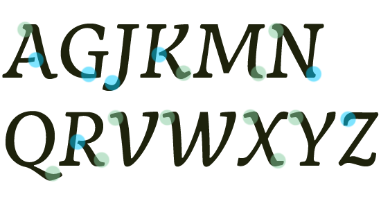
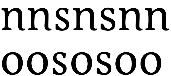
Here's my first attempt at creating an italic companion for my Eternal font. I have decided to make it into a nice dark type for smallish sizes. The roman version will need to be rebalanced with sturdier serifs and thicker hairlines, plus maybe one or two structural changes to fit with this new italic.
I'm aware that certain letters are not quite working yet...and the spacing is a bit atrocious.
The text sample is 9 on 12pt, please ignore punctuation which was slanted from a very early version of the roman.
I gather there is some optical correction needed on the slant angle for some letters and have de-slanted the f by 2 degrees to see...looks like g and j need a similar treatment.
Looking forward to hearing your opinions :)
| Attachment | Size |
|---|---|
| Eternal Italic.pdf | 426.46 KB |
| Eternal Regular and Italic.pdf | 494.08 KB |