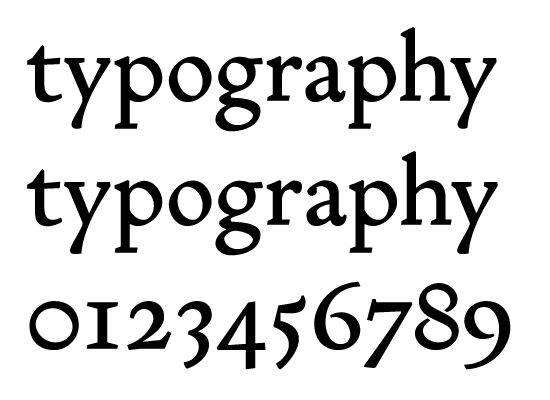
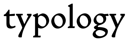
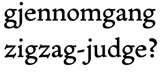
This is my second attempt at typeface-drawing. I have no typographical education, so this is a didactic project rather than a typeface intended for actual use – I'm just trying to learn the basics of type design through self-study and experimentation. That's why I've chosen the renaissance model for the letters, and that's why this is intentionally not a very original design – and probably a very untrendy one.
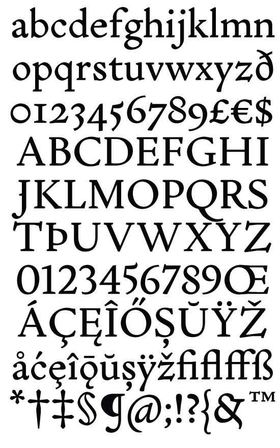
It's a very constructed typeface, the proportions of the O and the o are used as a template for almost everything, except for the numerals, which are built from the lower and upper case zeros. (The lining numerals are intentionally upper case in height, I know this is wrong, but I want them to be used exlusively with upper case, not as tabular figures.)
This typeface is intended for nine or ten points, I will make several versions adjusted for larger sizes (and probably one smaller size) when I'm done with this base design. No small caps yet, and I've just started drawing the italics. That's ... difficult.
I'd be very grateful for any kind of criticism. I really want to learn.
| Attachment | Size |
|---|---|
| schola.pdf | 177.08 KB |
| schola_210309_mod.pdf | 169.49 KB |
| text.pdf | 44.87 KB |
| schola_220309_update.pdf | 177.31 KB |
| schola maior.pdf | 184.71 KB |