Typophile

Mint

Bendy0 votes

Hi,
Here's what I've been working on for the last week, taking a break from Eternal (in the serif crit section).

I started with the intention of creating something very crisp and clean, following the current trend for roundy corners. I wanted the shapes to look slightly experimental, so tell me if they work or don't work yet.

I wanted a large x-height and non-descending caps to work for small sizes and for screen use. It was a struggle to fit the tail of the g in there, and I had to break the rule with Q a little. I've got only autohinting at present, and need to work out how the off-verticals will work on screen (for example M anti-aliases rather badly).

Strangely, it somehow looks like there's a bit of Optima in there, which I've only just noticed. I don't have numerals yet. Hate drawing numerals.

I'll refrain from picking out individual characters for now to see what you guys think first.

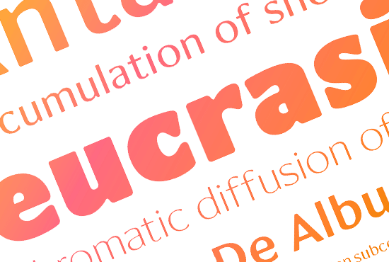
PDF icon Mint_0.pdf PDF icon Minttest2pdf.pdf PDF icon MintPDF3.pdf PDF icon MintPDF4.pdf PDF icon Mint Semibold.pdf PDF icon Mint Family.pdf PDF icon Mint Ultralight and Ultrablack First Draft.pdf PDF icon Mint Ultralight and Ultrablack First Draft_0.pdf PDF icon MintUltrablack.pdf PDF icon MintUltrablack_0.pdf PDF icon Mint Weights.pdf PDF icon Mint Weights_0.pdf PDF icon Mint Hamburgefonts.pdf PDF icon Mint Hamburgefonts_0.pdf PDF icon GreenSquare.pdf PDF icon GreenSquare_0.pdf PDF icon Mint Booklet.pdf PDF icon Mint Booklet_0.pdf PDF icon Mint Specimen May 2011.pdf

strangely or not, i fancy the thing it looks like modern version of optima, with good innovation! nice start!

Wow, a side project! Cool!
This is very interesting, Ben. Mmm.

I had a slight Optima association too at first glance – I think it comes from the large "M" with its flaring stems. Other glyphs have a very current flavor (something in my brain says PSY/OPS but without having a clear association to any one font – maybe a hint of Eidetic [Modern]?).
I think this contrast between more conventional and more experimental forms can be felt throughout the font, in the way you handle the contrast, or how "independent" the counterspace looks (oh here I go again…). Like, I'm quite intrigued by the counterspace in say the "a" and the Ss, and that feels quite "new". And oh I dig the asymmetric "U". Other glyphs seem to have a more conventional concept of contrast and stroke (like the bpdq). "M" and "N" might even feel a little quaint in this context? A pretty interesting mixture, this.

Though of course this is just a spontaneous impression from a distance;
I'm looking forward to that PDF! Please post one soon. :-)

Har, hi Nina! :) Thanks for your encouragement! It's funny I hadn't actually had Optima in my mind until I hit 'submit' for this thread. I'm glad you both like it anyway :D

You're right, I did look at Eidetic Modern! But that looked a bit scraggly to me so I didn't stay too close to its design. In fact the M and N were the only ones directly influenced by it. I guess the g is similar too.
It's really interesting you mention the independent counters, as I had some ideas from that Legato thread to shape the inner and outer contours differently. I'm not sure how effective it is in improving readability as I haven't set a block of text to try it out yet.
I'm wondering about shaping the SE corner of the U a bit more cornerly. Like on the base of the b.

Yeah great stuff. I dig how the white space seems to "creep in" on the black in this "g".* Some interesting figure/ground (or advancing/retreating) action. I have no idea what this would do for readability (one reason why I screamed for a PDF ;-) ), but it sure looks exciting up close. Makes me want to use it for display at about 200pt ;-)

* At least South of the bowl – then the ear looks "normal" again.
Btw, might there be a slight left lean to the tail? Maybe try extending the terminal a bit further to the left, and/or bringing the right side down a bit? (Edit: on second thought, maybe not. Really hard to judge without context.)

I'm pretty excited about this. But Ernestine's calling… I'll be back ;-)

I can't seem to attach the pdf to the first post. Will try again tomorrow. Sorry! :(

FYI, link doesn't work.

Wait a minute – aren't you in Europe? Welcome to the night owls' club ;-)

oh, yah, working on weekend hours!
let's see what i can do with the pdf.

I like it, but I'll wait for that PDF to work to take a proper look at it. :)

Ben, maybe message an admin?
Alternately, I guess you could try posting a blog entry and trying to attach it there, then link from here.

Thanks, Nina, already e-mailed someone. I tried attaching it on my Eternal thread but not listing it there, that was the link that didn't work. Bums. We'll have to be patient :)

Is my pdf working now? I do hope so! :)
I switched to Firefox.

Yeah, the PDF works!
Here are some thoughts. Though you might need more salt with this than usual (I'm in a bit of a sleep-deprived state).

I really like the direction of this, but you know that already. :-)
Before getting into details, I think I have two "bigger" questions.

The first is how big a factor the idea of "independent counterspace" should be in the overall design. It's quite strongly present in some glyphs (like the "g"), more subtly present in others (like the "O" or "U"), and not very much there in the angular glyphs (where I'd imagine it's also hardest to pull off, at least if you want to keep the stems somewhat straight [see below]).
That may be a factor in what I said earlier about some glyphs feeling more "experimental" than others. I'm thinking that there should be some reconciliation between (a) counters that feel "active" and creeping in on the black, like in the "a" or "s", and counters that feel more like they're just there because that's how the stroke goes (like in the "n"); or (b) terminals that feel like "terminals" of a "stroke" (like in the "@") or those that feel like (this is exaggerated) the rest of the black after the white has taken what it needs, like in the top of the "a".
Though this is where salt comes in; because personally, I'm quite interested in, and excitable by, designs with "active" whitespace, like your "g" (I've come back here multiple times just to look at its tail up close. I would want it on my wall, life-sized) – but that might not be what matters most to you in this font!

The second question is about target usage/size. Isn't saying this is "for text, display and web" almost like saying "for everything"? I wonder if it isn't incredibly hard, if even possible, to make it work its best in text and on screen, and look its best in display.
As it stands, I personally think [as I said above ;-)] much of the special appeal of this font lies in the finer details of the contours, which of course only come out at large sizes. It makes me a bit sad to picture this on screen, where all of those subtle details will disappear into antialiased pixels… like I said above, I'd personally rather picture it large. Also, I feel it looks more "novel" at large sizes, since its "current" flavor depends to a degree on details. For instance, before you posted the "g" large (seems I can't stop talking about that glyph eh?), I was wondering if its architecture wasn't rather serious-serif-text-font-like for screen use, and didn't catch on to its exciting details at all.
As for readability at text sizes, I wonder how much the "independent whitespace" action does for it (and this is more of an open question than an informed statement), since most of it happens in smallish details rather than the overall concept – for instance, your verticals are still vertical. (Referring back to Legato, the way I understood it was there the idea of "independent counters" was directly connected to breaking the "picket fence" of straight verticals for better cohesion of word-images. So that's something else than you are doing, I'd surmise.)

I'll get back to details later… need to sleep. ;-)
But this: the name rocks. Feels spot on.

Wow! Gosh, what a lot of words! Thank you for this. Been playing with the numerals and have a delicious 4. I'm playing with rotated counters and making things like the Z less uniform (but not twiddly!)
Yes, a life-sized g!
I'll have to come back to your comments tomorrow as I also need to sleep. ¦)
I wasn't sure about the name at first, wanted it to be more subversive; but now I like it, and it does fit really well. Crisp.

Oh, yes, when I say 'text display & web' I mean short passages of text, subheadings and the like. I thought the large x-height and wide proportions would be good for funky websites. But you are right, it shines better at massive sizes!

"what a lot of words!
[…] a delicious 4"

Oh! Nice. It's really not all about quantity. :-)

Yeah that is a yummy 4! I wonder if some of that could carry over to the "A"/"V"/"W", which I find a bit boring frankly (what happened to the rounded inside corner that you have in the "N" &c.?). But yeah, don't make them "twiddly". :-)

Yes. Wait for the next exciting iteration (not done yet)!

Of course. Please remember to sleep. (I know how it is!) :-)

This is a great sans. I love it.

If I dig for something to improve about it, about the only thing I can say is that the lowercase t or its crossbar seems a little too short or something. I can't decide if I feel the same way about the f. Maybe I'm just tired, though.

It's great.

I'll post the other numerals in a bit. Why do they take me ten times longer than the alphabetic glyphs?

To answer Nina's ideas:

Re the active counters, I wanted there to be a tension between the white and black, created through sometimes the white 'winning' and sometimes the black. That's why the white sometimes spills over and sometimes follows the ductus. I think if the counters were always eating the black it would somehow dissolve the overall solidity?
But anyway, I'm hoping the black and white can look independent but yet equal in strength. (Both equally active)

There was some post somewhere here (I think) that said stuff about how some fonts look greyer than others, independently of the weight of the glyphs. It was more to do with how the shapes of contours and counters lock together affecting the crispness/contrast...wish I could find that. There were pictures of letters from different fonts of similar weights but some looked far clearer and sharper than others. I know there's been some admiration of how well Helvetica 'locks' the counterspaces within and between letters. (I don't claim I'll be able to achieve anything quite so bold here!)

Re terminals, I'm going to redo the @ so the white space somehow is more active in the terminal. I might open out the apexes of VW etc to be slightly squared off like on the M. And of course the strokes need more flaring.

I'll have a look at heightening the t.

Thanks!

I am hoping other people will comment on this as well!

"…sometimes the white ’winning’ and sometimes the black. That’s why the white sometimes spills over and sometimes follows the ductus. I think if the counters were always eating the black it would somehow dissolve the overall solidity?"

That's quite possible, yeah. Except maybe if you decide to make it an experimental display face and stop worrying about readability in text.

Your "battle" imagery sounds like a Westernized notion of Notan*. ;-)
And right now it is a battle, much like you describe it; more of a to-and-fro between competing partners than an active, tension-based balance. Even without bringing in such "big" concepts, I'm wondering about consistency I guess. To me say your "n" looks like it belongs in a different font than your "a" (by a difference of a few em units mind you); I guess the big question is how much you want to even things out, even with the premise of this being somewhat "experimental".

To actually adress some glyphs:
I think that "Q" is looking a bit prude. :-) I might try making the tail short but strong, [very close to] horizontal, and cutting into the bottom of the bowl (not sticking in, more like the counter having a (near) straight horizontal on the bottom).

As you might guess, I love your spur-less "b", and of course I have to ask if you've tried that for the "q" as well? :-) And actually, also the "u". Like you said, I'd be curious too to see if it even works in the "U".

Your "c" and "e" look to me like they have an underbite?

I like the curve in the SW corner of the counter of the "P" (etc.), and am wondering how/if it would work in the hmn.

Your "K" and "k" (for example) show that you're giving the verticals a lot of respect, which might make these straight and angular forms a bit boring in the overall context. I'm wondering if you might try playing with the straightness of the stems a bit. (Though this is precisely where I'm biased, because if you want to optimize this for screen use, you should probably introduce less detail strangeness and near-to-straightness than if it's a display face.)

--
Oh, I'd be interested in reading that other thread you mentioned, if you can find the link.

Yep. That curve on the counter of the P is a good fit for the n. I'm not so sure about the a.

I tried the spurless q, didn't work. I think I didn't try terribly hard as I liked the dq design. Might try again. Will also give the U and u a go. I think it might impair the u's readability. Especially small.
Yes, c and e do need a dentist. (This really only took a few nights' work so lots of the shapes are significantly sketchy so far!) The Q is another one of those needing a makeover.
I'm not sure what you mean about K and k :?
Oh, my numerals also need lots more work but here's a glance so you get an idea. You don't need to tell me 2 should also be in that queue for cosmetic surgery.
Alas, I was searching for that other thread and I can't even remember if it was here on T-phile. Sorry, will keep a look out.

I had something like this in mind for the VW and perhaps others.

I think what you show in the MNW is something like what I meant about the Kk. Now there's whitespace pushing in. Before it looked a bit like you had a concept of active white space, but didn't really know how to apply it to the straights/angulars, so those got more "exact"/"normal" compared with the more "free-flowing" curvy glyphs.
What are you doing in the "H"? Can't see anything (except on the outside of the stems). The counters look as peaceful as a mountain lake in the dawn. ;-)

Btw I really like your "4", but if that's where your "2" is going (I think it's intriguing), you might even try a "4" with a slightly curved diagonal? :->

"This really only took a few nights’ work"
You know, that impresses me beyond belief. Let me apologize if I'm being too anal about details already.

Ha! No, the H is pretty unsophisticated. I just put it there for the proportions. Somehow there needs to be balance and I can't see how yet. I'm worried it'll end up like Template Gothic if I start adding curves at all the corners. Actually that was another font I have been looking at a bit. It's not the look I want here. I really want it to stay 'clean' and already the M and N look slightly subversive! I think W works though. Think I need to move some inflection points.

>“This really only took a few nights’ work”
Ok, so what I meant was the constructing only took a few nights. I have been puzzling over a few of the letters and forms like the serif on a in my head for a few weeks. What a funny world in my head! :)

Details...yes, no the feedback is great. I'll try to keep up with you! There are so many things to fix. It seems we have different approaches to letterbuilding. You seem to do one or two letters at a time and figure them out in relation to the other existing ones. I think I'm just plunging into the whole lot and then joggling the hastily-made letters until they eventually look nice together with no real appreciation of the background and theory of type design. But it works for me ;) Creativity's a funny thing.

The only reason the 2 looks so wacky is I can't easily draw straight spined ones. I like the bottom and top and have to figure out the middle.

Here's a go at the K. I tried making the connection have curved counters but that was too much. There had to be other ways to break up the straightness, so the two sides of the nonvertical stroke are now more independent. Left is the original one.

Does anyone else dislike the G?

Overall, I think that this is more promising than Optima. Good stuff!
The numerals seem more expressive than the letters, though.
Where can I see the G, btw? The PDF is not linking for me.

The pdf link at the top on the original post should be working now.

Well, there is something about the G and the e that fights together. My 2¢

Does anyone else dislike the G?

I didn't think about it before, but I would think about getting rid of the spur completely--I feel like it eliminates some opportunity for playing with curvature/counterspace dynamics, which are a strength of the typeface. Alternatively, you might play with smoothly extending the curvature all the way up to the arm; right now to me it feels like the spur sort overwhelms that part of the G--I feel like it's "covering up" something rather than being part of a single form.

I don't know--now that I look at it again, the spur seems to add some consistency vertically--e.g., with H, E, F, etc. The inside of the G still bothers me though.

Looking good! The bottom of 'j' looks a little too quaint for the font IMO. I would definitely try a tailed 'U'.

What would it look like to introduce some of the unparallel contour independence in 'Z' to the horizontals of other letters like 'E' and 'F'?

I like those 4:52 changes to 'K'.

t: Curve into the tail looks a little weak and out of character. It starts to high for one thing. Flip the n 180 and compare the transition.

r: Looks like a chopped off n. It's decent, but could use more weight in the terminal, and possible a slightly lower join.

e: a tad wide, and back leaning.

zZ: More flair in the arms

v: too wide.

JL: too wide. The poor people LJUBLJANA!

ij: Dots a tad too small. Check to make sure they are the same size, they appear to hint differently. Also, conisder raising them a tad.

round letters (o b d p q) consider a touch more squareness inside, and a little more width.

@: I prefer the a to sit on the baseline for harmony with the lc. You can make it align with caps via case-sensitive forms. LC is more likely Blahblah@blahblah.com

H: tad wider?

It would be helpful to see a text setting that is more representative. Paragraphs various point sizes, starting at text sizes. As always, these are suggestions.. your instincts are obviously very good so listen with a grain of salt! :-)

Wicked! These are all really helpful suggestions.

I'm already working on some of those idiosyncrasies like making the Zz more flared and copying that over onto the EF for example.

I'm especially interested to see what might happen if the counters on obdpq are more square as that would obviously make them very much independent of the base.

Will get back to you with the results. Thanks :)

So here's what happened to e:

The crossbar is slightly lower, and the terminal is now left of the corner.

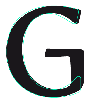
And G went this way:

>t: Curve into the tail looks a little weak and out of character. It starts to high for one thing. Flip the n 180 and compare the transition.

Interesting. Actually I rotated the n by 180 degrees and the curve on it has a larger radius (both inner and outer curves of the n are highlighted in red).

Still, I have added more rigour to the t curve and you are right it looks better with a smaller radius and more weight on the tail.

I can't decide (and this goes for the whole font) whether the terminals should be vertical or slanted and if slanted whether they should all be cut at right angles to the curves or something else. I actually prefer the angle the original t is cut off, though the terminal is not heavy enough. So many choices! :)

So I wasn't happy with that last one and tried again:

I think my experiment with U crashed.

Green dots show the original one. The other 4 are all different.
And I'm not convinced about the flaring arms of E either. Maybe too much?

I flared the thins on Z, reduced the flare on E and N, went back to the original U but tweaked the curve and made the right stem flare, and added a question mark.

It's suddenly reminding me of Peignot, slightly, with the vertical stress and letterforms.

I actually like the upper right U in the U-experiment image. I don't know if it's necessarily better than the original, but it's worth exploring.

Of the variants of U, I like the one with the true tail best, but your tailless U looks great. I see Peignotesque flavor here too (particularly the A). To my eyes the Z's tapers get a touch too thin.

The "U" experiment is interesting. I agree with Jelmar about liking the top-right most (and also about not being sure it's better; but it is intriguing). Though I'm not sure if the "corner" shouldn't come down a tiny hint more (but not as much as in the bottom-left one, the corner seems too black there?).

"Z": Agree it is a bit much, but it *rocks* :-)
Maybe you could try something like this in the "M" too?

This is evoving into a delicious typeface, I'm really sorry I haven't paid attention to it earlier, guess I was too deeply into my own work. The lowercase t is really glorious now, and the new Z is marvellous. However, the M doesn't quite match the N, Z, V and W in terms of "whitespace-creeping", perhaps you should gnaw a little on the middle peak and hollow out the armpits slightly more. I would have put some more weight on the middle stroke of the E, and perhaps slightly more tapering on the I and l. I'm really looking forward to see this further developed.

>hollow out the armpits slightly more.

hahahahahahahaha! Oh goodness! That's the funniest thing I've read on Typophile!

Here's what I did with U.
I'm gonna keep the left one as the normal U, as the slightly flared right stem echoes the other caps. I might include an alternate. Nina's suggestion is on the right; the middle one is a kind of halfway stage. I like the asymmetry but it does kind of remind me of Dax/Barmeno. And I can't flare the right stem with the 'corner' there, it looks very odd.

I'm enjoying making this. Here are the numerals with a bit more work done.

Here's a quick try with the A and M (gnawing the armpits)
I think they work nicely.

Great stuff, Ben.
I think you're on a good way to lose any Optima connection too, FWIW ;-)

Yes, that looks fab. Do you think the center point of the M wants to go a little to the left?

Yes, you're right. Thanks :)

If you do include a "quasi-tailed" U alternate, do you think it should be a little wider? To my eye the different shape calls for a wider counter.

Yes, nice observation. I wonder why that is.

New a on the right.

I like the reinforced verticality the top terminal provides.

Yes, that new a is good. But is that straight vertical terminal just a little too stiff? Do you think a slight rounding could work?

Do you mean to shorten the straight end of the terminal so the 'corners' have a larger radius? Or get rid of the straight section and have a teardrop ending? Hm, will see what I can try.

Here's the new d on the right. Is is too fat? I added 20 units.

Here's the a experiment.


I think I prefer number 2, without the rounding. It fits better with the other letters? I tried tilting the terminal the other way in number 4. It might work next to an r, as a contextual alternate. But if this is a display face it would be quite distracting I think.

Number 2 would be my favorite too. #3 gets a bit too "lyrical" maybe?
Though seen next to the "S", I wonder if your original "a" (that's the one on the far left, yes?) doesn't still match the font best. Hm.

Btw, might there something wrong with the weight of the "y"? It looks a bit heavy here.

Yes, y is dark. I can perhaps thin the left arm but the real problem is the dark patch where the tail joins, and I can't reduce it without changing the premise of active counters. I'll see what happens when I gnaw the top counter.

Yes, the original is on the left; it does fit well with S. Difficult to compromise.

Would a notch under 'y''s left stroke (like Meta, for example) be too "stroky," or could that be achieved as an "active counter"?

I agree about 'a' #2, though #3 is not bad.

Gee, this is difficult. Isolated, I think the second and third a both work well, but I have to agree that the original's direction suits the face best. How about a compromise between the original and number three, by marginally increasing the radius of the no. 1 terminal and making the top shape slightly more curved? Er, this is just thinking aloud.

I'd have to vote for the original a. It seems more consistent with the other letters. Number 2 is good too, though.

Ok so I'm not sure whether I should continue on this.

Seeing a lorry (truck) today, I suddenly got a bit worried some letters are really close to Miles Newlyn's (much more polished) logotype for Sainsbury's supermarket.


It seems the logotype has subconsciously been in my head all along. The proportions, x-height and even the shapes are almost identical!

I'm not sure if a full glyph set would have been developed for Sainsbury's, but I don't agree with plagiarism.

The choices seem to be:
1. Keep developing Mint as a natural process and not pay attention to the similarities with Sainsbury's; after all every font is somewhat derivative;
2. Keep developing Mint but intentionally differentiate it from Sainsbury's; this may risk altering some of the things that I really like about it.
3. Stop work on it?

So, typophiles, please help! What would you advise? :S

I don't think they look that close. Keep going on your own.

«El futuro es una línea tan fina que apenas nos damos cuenta de pintarla nosotros mismos». (La Luz Oscura, por Javier Guerrero)

That's reassuring. I got maybe a bit over worried: it's not cool to copy.

Bendy, designing type is really exciting, but your experience is what I find the most difficult aspect of it: we pick up visual cues all the time, below the conscious level, and they may surface at any time. On the other hand, people thinking about type share some trends, so it's quite possible that you will do something that others will do almost simultaneously, without any copying. With so many people working on type design nowadays, it would be a miracle if you'd get to the finished, polished stage of any of your fonts without a confrontation like this. Just keep going, you approach is original enough. See where it takes you. Best of luck.

That is really good advice. It's just a bit disappointing to realise what you think is your idea perhaps wasn't as original as you thought! Thanks :)

You're welcome. Looking at the G again, did you consider something like this?

I did try that, with a bit of a round corner, think it may be a good solution. Will post a revised pdf with the 'gnawed' counters and better cohesion later so you can see what you think of the G. It looks narrow too, for a slightly extended font. Thanks :)

That Sainsbury's logo looks clumsy and sluggish next to your elegant letters. I'm confident you'll make your typeface what those letters wish they were. Keep up the good work!

Actually I quite admire Newlyn's work on the whole. This must have been designed to withstand printing at small sizes on packaging, not as a display face.
Nevertheless your comments are good to hear! Will keep going with this, watch this space. Thanks :)

Yeah, I would also just keep developing it.

I've had something like that a while back too, when I was designing a serif typeface. I had been working on that one for over a year, and somewhere in the end of that year influences from another typeface creeped in subconsciously. In the end it looked too much like the other typeface, but luckily I had some backup .vfb's from before I was influenced by the other design. So I could basically pick it up from there.

New pdf at the top. In a bit of a rush! Hope it works. Look forward to hearing comments!

I know you're going for wide, but that y strikes me as unfittingly big. Maybe just raise the intersection a little to mitigate the counter size?

Tittles a touch too low?

Bottom half of ampersand could be wider.

b's bowl seems much more dynamic in shape than that of d/p/q.

I wonder if these flaring strokes will pose problems for the intended uses of screen/web. I get jaggies galore looking at it on screen now. That comes down to hinting I suppose, which remains unfortunately opaque to me yet (which I'll have to figure out for my own font soon).

K, k, Q, and q are just great!

Yup, hinting's not going to be fun. Let me know if you come across any how-to-hint instructions anywhere!
I'll have a look at the tittles. The y is driving me crazy. I didn't want to have the whitespace cut into the bottom like in Meta (I did that trick in Eternal too) but it means there's a lot of black under the join, which is why there's a lot of white above. Hm, will see what bringing the join up does. I can't get b right. If it has a circular bowl the bottom join looks rubbish, but yes the sheared bowl doesn't quite fit with the other glyphs. The same was true on q but looks ok there I think. I'm still not quite sure about the Q's tail. Ideally it shouldn't descend at all, so I might bring it up a bit (but then it crashes into other letters unless it's shorter, then it looks stubby. I tried curved tails in all directions and it definitely looks better straight.)
Thanks :)

Ben, thank you for making the "g" so prominent in your newest PDF.  ;-)

I feel your pain about the "Q", too many options in that glyph! I think yours is pretty cool, though something about it seems a bit goofy/uncomfortable to me. It's almost like the tail was a bit… self-conscious. OK, that doesn't make sense. Maybe if it was slightly heavier?

The "q" I love to bits! I think it's beautiful.
And the "b" is very different indeed. Maybe it could be just a bit wider at the bottom? Its NE "pull" seems a bit extreme. It also looks rather narrow as is.

Speaking of widths, in "zephyrs" I wonder if the "h" is a hair narrow compared to the (voluptuously round) "p"?

I'm not sure about the "k", it feels pretty… flamboyant? :-)

Your "s" is great! I'm envious. ;-)

Agree about the "y", I'd try just raising the left diagonal to make the bowl smaller.

"z" strikes me as a bit too light in text ("pizza").

BTW, sorry bout not saying anything about your Sainsbury incident yet. I was sick and pretty incoherent, so haven't been posting too much. For the record, I agree that yours is more interesting. The Sainsbury type is nice, but seems a bit more sleek and forgettable. In any case, please keep going: It's wonderful to see this evolve.

Yep, thought you'd like a nice big g!

I'm really pleased the q is going down so well. I really want the b to be attractive too. Gosh, it's such a multidimensional balancing act with all the widths and shapes and weights and flares and goodness knows what else. I wonder if I've over-extended the dp and q. The z does look light.

This is a good place to be. Thanks everyone :)

"Gosh, it’s such a multidimensional balancing act with all the widths and shapes and weights and flares and goodness knows what else"
Hell, yes! And the most evil thing is how you can't even isolate the variables. Like, you change an angle on a diagonal and then it looks like the whole thing is wayy too narrow. And then you change it back and then it's too heavy. And then you put in a trap and then it's just bumpy. Argh.
Now if it wasn't so addictive… and beautiful… :-)

Very good name for the typeface :D

Thanks :)

I'm having trouble getting some of the letters to fit. I can't tell quite what's wrong with them so can anyone suggest why they don't fit?

G. It still looks freaky and I can't tell why. Is it too wide? Is the crossbar too high? Is it the odd SE curve?

Q. The tail. Most fonts with similar proportions seem to have a tail that dangles off the bottom, but I really don't want that style. Has anyone seen other fonts with a horizontal tail like mine?

b. Yes, it does have a twist that needs resolving. I think I can play with that and see what happens.

1. I can't get an effective head serif on it. I wanted a wide shape there but it looks very much like a tilted 7. I don't want foot serifs on it but perhaps I should try that?

The other things I've noticed are the incorrect stress on # and the £ needs much more of a curved spine. I'm not sure the comma is the right shape.

Craig, I wonder if the top of the ampersand should be smaller, rather than the bottom getting bigger?

I'm hoping the spacing on this will be easier than on Eternal, as there aren't serifs and the straights are straight.

Taking a break now :)

Some horizontal Q's:
Univers and Avenir and Serifa
Rotis Sans and Semi Sans
Corbel

I wonder if the top of the ampersand should be smaller, rather than the bottom getting bigger?

Maybe so, or maybe a combination of the two.

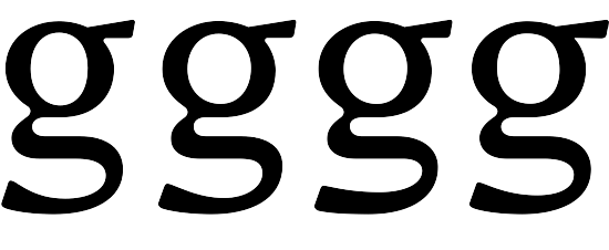
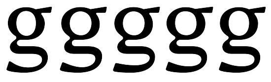
So I fiddled with the ear and bowl of my g:

And the tail of Q, which because it was lower than the baseline, made the glyph look tall rather than wide.

More soon :)

new = g with the curvy underear and Q with the higher tail? You may have to fit "before" and "after" labels into these animations! (Actually I find animations easy to see changes but a bit more difficult to evaluate.)

Sorry, that's right. :)

Ok, so there's a new pdf up top. I started generating the punctuation, symbols and extended Latin glyphs, and even thought about alternate caps which may or may not work. I'm much happier with G and Q, and have tweaked bdpq and widened o a lot. Minor changes on £, zero and e.

I realise I need to go back to the numerals again. Especially their sidebearings. After looking at Praxis I redesigned the 7 too. Like it.

Apologies for the overlap on some of the composites.

How's the spacing looking overall? And are K and k still looking too interesting? ;)

Anything else that isn't quite working?

Good progress!

Overall spacing is too tight to my taste.

Are O/o thicker on the right than the left?

Period and comma should be quite a bit bigger, I think. Apostrophe and its relatives, too.

Squircular copyright is cool!

b's looking good.

I think your big wide figures are working quite well and mesh with the caps well, too.

Is pertenthousand really a glyph? :-) Array of bullets is great.

Okay, I've got to say this and then duck the shoes thrown by Nina and you - I'm not convinced by the g. :-\ I think my hangup is the weakness of its SE corner, or the too-great contrast between that thin and the thickened quasiserif terminal at the SW. Plus is looks relatively narrow. It's just jumping out to me in text as a wrong sort. (All of which is not to say that it wouldn't still look great blown up and hung on Nina's wall. :-) )

Thanks Craig! Good to have some crit :)
If I said this was not intended to be a font for body text would your suggestions about the period and comma and spacing be different? I'm thinking of Mint as a display font, also suitable for web and short runs of text. That's because it works well at large sizes but also the clean simple shapes and smooth counters render well on screen at 10-13 point (even at this unhinted stage). (Admittedly I need to figure out some fix for the jaggies at larges sizes on screen.) Perhaps I've misrepresented my intention by setting it in paragraphs on the pdf. I think I'm more inclined towards narrow spacing but if it's even narrow for display use then I'll add some more air in there and beef up the punctuation.

>Are O/o thicker on the right than the left?
It's possible, though not intentional. I did it purely by eye and haven't measured anything. Is the degree of optical correction necessary for symmetry the same for everyone?

I wasn't too sure about the squircular copyright, but will leave it for the time being.

Numerals. Hm. There's something about them that's not quite working, especially the 1 and 2. Good to hear you think they mesh well. I like that word.

Here's a preview of the alternates in context:

Awwww! You don't like g?!? It seems to me to follow the same pattern as s and the contrast is about the same as o, maybe a bit too much you're right. Maybe I can tug some of the weight of the crossbar down into that SE corner. You know, looking at it now, it looks kind of light next to the other letters. I originally designed it bigger then shrank it down so maybe that's where the weight has gone. As for widening it, I think the head would become too oblong. Somehow I'm reluctant to change it but you could be right, it could take the font to a whole new level. I don't like killing my babies...waah!

Yes, if this is truly a display font then the punctuation size and spacing might be fine. And I probably would change your specimen accordingly.

And yes, I would say first thing to do on the 'g' is give that SE corner more weight - that may very well be all it needs.*

I forgot to mention one other thing before - I'm bothered by the low crossbar of 't'.

*Did you consider offering an alternate 'g'? I think your b/d/p/q have wound up among the best and most characteristic letterforms of Mint, so I'd be interested in seeing what you could do with a one-story 'g'.

OK, finally got a coherent bit of time to look at the new PDF! This is cool stuff, Ben.
Overall, I love the level of detailing. It seems very carefully designed. Like, there's even a lil' curve where the ogonek connects! Sweet.
I wonder how large the "g" will be in the next sample. ;-)

Some detail thoughts (salt to taste):

– No shoe-throwing on my part, but yes I still like the "g". I'm not married to every coordinate of every node, it's mostly the white space in the tail, esp the join, that just kills me. Overall, the glyph still looks good to my eyes (but what do I know!)
– I now wonder if the top-right of the "s" isn't recoiling a tiny hair.
– The "fl" ligature looks very nice!
– On reading, I'm not sure if the bottom terminals of the "c" and "e" don't jump out a bit much. It might just be my bad printer, that or my eyes are a bit type-tired.
– Spacing: Looks mostly quite good to me. I'm thinking your straight-straights could be a bit looser – look at "verticillasters" in the bottom paragraph, the "ill" seems to create a bit of a dark spot?

– Something looks strange about the "C" compared to "G" and "O" – might it be a bit narrow?
– I'm not sure the way the "Q" pulls up its right-side belly to accommodate the tail doesn't look a bit cramped now. :-/ In any case, I think it looks wide.

– I dig your cap eszett. It has an interesting balance of being angular and rounded.
– There might however be a problem with your lc eszett: Seeing it next to the longs, it looks like it stops short of ascender height? I'd say that's a bad idea – it tends to "look wrong" to Germans. I would just make it ascend all the way – they do look like they're too massive, but I believe Germans don't mind that. :-\
– Your eth is really nice. Making a bold version may be problematic though. I think you have enough room to raise the crossbar a bit.
– Dieresis: I would probably move the dots a bit farther apart (mind collisions in stuff like "fä" though). They might well be a hair smaller too. Don't make them *too* small – but they definitely don't need to be equal to the tittle.
– I'm personally no fan of the cap alternates (they look very 70s to me), but that's so subjective that you really shouldn't care.

– Numerals are cool. I love the new "7"!
– One thing I'm unsure about is the bottom-left of the "2"; might be a bit too roundy? Dunno.

– The asterisk is nice! I only wonder about its strange rotation. It looks a bit like it's spinning around. :)
– Your guillemets seem more boring than they need to be. Maybe they can borrow some features from the asciicircum (? the thing next to the pilcrow).
– I love the @ sign! Looks great.
– Currency signs look sweet. I'm wondering if the Euro could be a bit wider? But that's probably connected to "C" above.
– Punctuation: I agree with Craig that some of this should be a bit more distinct/bold/big. The comma seems especially small, as do the apostrophes / single quotes. And at smaller sizes (like in your 8pt sample), the semicolon looks too similar to the colon. I think these thingies could also be spaced a bit farther away from whatever precedes them, to stand out more (especially important for reading on screen, I presume).

Now I'll lean back and enjoy watching this proceed. It's really sweet. I mean… seriously crisp and refreshing! ;-)

Thanks Nina, really useful detailed observations...I'm sure I can get the g even bigger, if I zoom into its tail next time :)

Glad the 'crisp and refreshing' idea seems to have turned out well.

Not sure what happened with lc eszett; I thought I made it with an f originally but it seems to have shrunken badly. Thanks for helping with the dieresis too...I'm not really used to how it looks. 2 is my Achilles heel. Something about the glyphs that open to the left makes them really tough.

Someone mentioned the spinning asterisk on Eternal before, I think it might be a trademark glyph for me ;)

I think @ turned out good too! I did try different guillemets more tapered but they looked rubbish somehow. I'll include them in the next pdf so you can see what I mean.

I'll enlarge the punctuation and see what can be done about f_i which was more an experiment than a good idea.

I think I preferred the & with loops more equal in size. I might try a classical shape for it as an alternate too. Something like in Barmeno, which has a good ampersand. I don't somehow like my question mark either. Perhaps the same story as 2.

I didn't miss your comment about a bold version...hah, well! I'd love to try it :) Once I'm happy with the Medium, I'll do a Craig and post some ideas so you can advise what kind of bold and/or italic to tackle next.

I like the idea of a monocular g. Will consider it for an alt.

Thanks guys, good crit :D

I'm rather pleased with the way g.alt has turned out:


And I've widened the standard g, made the whole thing a bit heavier and put more weight into the tail.

Really nice typeface!
Maybe you could try to turn over the top of the 5, like the 7. ;)

KUTGW! :)

Kind regards,
Martijn van Berkel

On the g.alt, nailed it! :-)

Man, those are some seriously nice "g"s. Wow. Yum!

The regular "g" looks a bit angrier now. Probably the determined ear coupled with the new tenseness of the tail? Or maybe it's just me.
In any case, I really like it. I even like the new one. ;)

Angry? I wasn't aiming for angry! Actually I was aiming for cool. Oh dear :/

Ben, mind the salt!
Maybe "angry" was a bad word. But I would say it looks more "determined",
more self-confident somehow, more assertive. In a good way. The old one
was a bit "limper".
But maybe I'm just listening to too much angry music at the moment. ;-)

I think the tail is a bit too squared on the right side. I'll loosen it up a bit and perhaps do reversed contrast (exciting!) so the parallel horizontals are heavy.

The 2 needed a larger top counter, I think:

Thanks for all the encouragement everyone! :)

I think a more "bubbly" round counter for 2 is a fitting idea, but that SW corner isn't working, IMO. Did you try an outer contour that's angled instead of curved? Kind of like Z's bottom but more acutely angled - or better, take your M and rotate it 90 degrees CCW and use the (new) bottom as a guide.

Plans for 'g' sound intriguing...

Thanks Craig, think perhaps I got somehow attached to the interesting bend there at the bottom. Something like this?

I really want the binocular g to work. Here's my latest experiment.


On the left is the original that we thought wasn't quite working.

So I widened the bowl and made the tail thicker. Then Nina said it looked kind of angry. I thought the tail looked a bit boxy.

So I tried again and the one on the right shows what happens if the tail goes thick-thin-thick. Look at the shape of the bottom counter to see the difference most acutely.

Should I try something else?

Aw Ben, I'm sorry to say this, but I'm not a fan of that new "g". I think it looks
a bit… clumsy? with all that horizontal action. And the end of the tail seems confused. :-(
Looking at this, I think I still like the original one best (and very much!).
The tail of the middle one seems maybe too rigidly horizontal, and the third one even more so, and I'm not sure that helps the glyph.
But hey, maybe that's just me. You know the bicameral "g" really is my darling favorite glyph in this fine font of yours, so I admit I'm biased!

Ok one last try


The last one is more like the original in the shape of the tail, but with a gentler flaring towards the terminal, and with a wider bowl.
This could go on forever...

And number 5 has the tail of number 4 and the head of the original, but slightly slightly wider.

Hey, that last one may be it!!!

re: the '2', yes, I think that revision looks quite good. The thinner diagonal and thicker base is happier than the reverse, which had looked a bit like the base was being smashed down.

edit: oops, we crossed posts. by "last one" I meant #4, which I still would vote for as the best.

Nina, you said I'm not sure the bottom terminals of the “c” and “e” don’t jump out a bit much.

Do you mean they're too heavy or the wrong shape or what? How do you think I should fix it?

Ben, I'm not sure. It was a vague impression, or more like a question, that popped into my mind as I was reading the sample text. If you look at the 8pt text, second paragraph, the word "section" caught my eye in a weird way – it seems the bottom terminals of the "e", "c", and maybe "t" as well (but mainly the former two), especially here that they appear all next to one another, might be a hint too prominent, maybe in terms of how far they're curving/sticking up into the counter? They just somehow seem to attract the eye more than I'd expect them to, like they're trying to tell me there's something important going on there when in fact, I was expecting them to just be there. If that makes any sense.
In any case, it may well be (a) just me, (b) just my printer, (c) me being a bit type-blind.

Re your "g"s, I think #4 is definitely better than #3, but in #5 and #1 the countershape of the bowl looks quite a bit better to me… So if you don't want the original one, I'd vote for #5, but I'm actually not sure I don't still prefer the original one. :-\
Again, lotsa salt (especially without context)!

So I've made some changes...actually I've kind of lost track of what I've been working on. Mostly minor tweaks and drawing alternates/latin extended/ligs and spacing.

The full stop and comma are larger, I think they need to be even bigger though.

A non-type friend made an interesting comment that the spacing was quite loose at large sizes. I was very surprised that someone with no background in fonts would firstly see the space and secondly notice how the relationship changes with optical size...is he right?

I'm still not over the moon with numeral 2.

And please give feedback about the diacritics. The acute and grave look too far left and right respectively I think.

Please have a look through and see what you think. Be picky!

Many thank yous :)

This is working very well. Have I mentioned it looks fantastic in all-caps settings?

letters
- these are in great shape
- does X need a little less offset at the intersection?

numerals
- I'd take a look at five; it looks a bit like it has its chest puffed out
- do you or will you have eighths as standard fractions (I'd think they'd be at least as useful as fifths)

symbols
- I agree that period and comma could be still bigger
- I really love the giant quotation marks
- I also love the bullet options
- do you have a masculine ordinal in the font?
- guillemets look nice. are those two different kinds of singles?
- what's the deal with the triple quotation marks?!

ligs and alternates
- alt a and g look good. I like Th too
- f connections to ascenders (b, h, etc.) look very good
- crossbar ligatures might work well - it'd be helpful to see them in a text setting
- here's where you start to lose me, I hate to say: I'm not a fan of the "historical" tied ligatures for this font. They seem way too Old World.
- likewise, the descending 'f's seem poorly fit for this font.
- and likewise, the funky alt diagonal caps seem logo-ish and strike me as taking this font in an entirely different and less promising direction.

extended Latin
- most standard accents look very good to my eyes
- curved overhead diacritics (e.g. breve) seem too flat and too wide to me
- cedilla doesn't match the character of the font nor what I think of as a standard shape
- lslash looks a bit dark and/or tight
- oslash needs lightening I think
- is that a florin sign between the schwa and the accented 'g's, and if so, should it be up with the currency marks?

spacing
- I think your wordspace may be too wide
- straight-straight spacing looks rather tight in spots (e.g. dju in "Adjust," li in "lightly")
- r-comma needs kerning but I suppose most of that is still ahead of you

Keep up the good work.

Woo! Great detail Craig, thanks!

>it looks fantastic in all-caps settings
I'm glad you think so. Something isn't quite working for me but I can't tell what. I have a vague feeling most of the uppercase is on the narrow side compared to the lc?

Does it bother anyone that the upper terminals on the 2 and three don't match?

Yes, I'll do sixths, sevenths and eighths...didn't get round to them yet.

I wasn't sure what I was doing with the guillemets, they are two kinds and I don't know which is best. I prefer the tapering idea but it's still not there.

The triple mark is U+2034 Triple Prime. I guess it's more for maths and isn't really very useful.

I got the idea of the descending fs (and the layout of page 2) from looking at a font called Viceroy. The diagonal alternates and dligs were an experiment before I came across it, however, and may not have been my best idea. I'll tidy them up and see how they look. They could be useful for logos?

I don't read Romanian or other languages that use breves. I'll look at other fonts to see proportions. What sort of cedilla would you expect? I'll fiddle with all those other bits, good stuff.

On the cedilla, I'd like to see it come up more at the end - more similar to the bottoms of 3/5/g.

Differences at the top of 2 and 3 don't bug me a bit.

Working on the spacing for all the straights.

Do you think the curly brackets need squaring off on the terminals...and the tilde?

This is exciting stuff, Ben. I like it a lot!
I kind of lost track of where we were too… but here are some thoughts.

Letters:

My favorite glyphs are "g", "q", "Y" and "@". Great stuff.

I think the counter of "y" still looks slightly large.

I don't know if we've talked about this before, but looking at the huge "Mint" the "t" suddenly strikes me as a bit alien, because the intersection of the stem and crossbar is all angular, whereas the "M", "i", and "n" are all rather roundy. I dunno – have you tried rounding one or two of those corners? Maybe the top-left? Or am I being obsessive?

There's something bugging me about the "G". At first I thought it's the length of the crossbar, but now I think it's the fact that its contrast pattern diverges from "C", "O", and such – the axis seems quite a bit more diagonal, which mostly means the bottom-left gets too bold (and the top-left a bit too light); is this intentional?


I agree with Craig about the straight-straight spacing but other than that, the spacing looks pretty good to me.

*

Numerals:

I wonder if numeral 3 is leaning left very slightly? Might just be me (or context) though.
But the different terminals of 2/3 don't bug me either.

*

Ligatures / Latin Extended:

f_l is just yummy.

The dligs are interesting. The first c_t I came across had me a bit confused because it's so unexpectedly oldstyle. I really dig the "weird" ones involving tittles (they make interesting negative space too, especially the i_t).

I wonder if the "e" part of the "ae" glyph could be a bit narrower? The whole thing looks a bit out of balance.

Your ring (as in aring) looks light.

The eth looks great, but makes a bit of a dark splotch; I think they always do that to a degree, but you might be able to alleviate it a bit by pulling the top(-right) of the bowl down a bit to make more space for the crossbar. Making a bold of it might be hairy :-\

*

Punctuation / symbols:

I like the huge quotation marks too. There's something Cooper-ish about them (that's a good thing)

I think I may be to blame for the guillemet stuff, I vaguely remember asking if they couldn't be tapered. I like the second variant of the single ones better I think.

The "registered" mark may be suffering from an optical illusion where the top-left of the circle seems to cave in, as if it's attracted by the top-left corner of the "R". Maybe push it out a tiny bit? (Wow, really getting into details now :) )

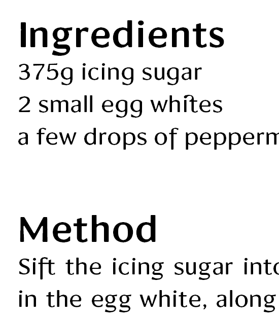
Might the fractions be a bit light? In the recipe the "1/4" looks a bit thin.

*

Keep up the great work, Ben! It's exciting to be following this.

Thanks Nina! You know there was something bugging me about C and G, and I think you've put your finger on it.

I might try a tiny curve on the t. The original idea was that since it's two strokes they shouldn't bend into each other, like on the f and eth. But then I've curved the corners on Euro and A and others so I'm breaking my own rules already. I'll see how the t goes. And that will probably mean I'll look at the f too.

Otherwise I'll have to go through all of your and Craig's comments carefully later on. Off out for a late breakfast now.

:)

I have nothing to critique. Just wanted to say that this is looking great!

Oh! Thank you! :)
Here's a preview of Mint bold. Or semibold, not sure yet.

New pdf attached, the first iteration of Semibold. Before I head off in a bad direction, I thought I should post for crit. I've kept the outer curves the same where possible and added the weight on the inside mostly, and I hope that doesn't make it look too condensed. I've just done numerals and alphabetic glyphs to start with, so let me know if you think I'm heading off in a good direction or not. Oh, and I know the spacing is terrible. I just copied the sidebearings of Medium directly, which didn't quite work as neatly as I expected! The worst looking glyph I think is g, which needs to have a wider tail I think.

In the Medium, which I've included for comparison, there are now numerator and denominator numerals. I fear I haven't got the weight right...please let me know what you'd do with them on page 3. How are the fractions?

I've also added some more dings, squares and really luxuriant double quotes. The line of circular glyphs at the bottom of page three goes zero.denominator, lc o, uc O, zero, zero.numerator, ordmasculine, degree, ring. I'm not sure about the relative sizes...anyone?? And I can't get happy with the section mark, if anyone can suggest what's wrong with it that would be marvellous!

I've realised I need to open up the space between the bars on Euro etc. And I'm still experimenting with the eth.

Nina, check out the crossbar on t (medium).

Hey nice! This looks yummy.
("Medium" and "Semibold"? What's next, a Demi? ;-) )

I haven't made bolder weights yet as you know, so I'm afraid I can't really comment too much… But I like how you've mostly kept the "strangeness" very subtle in the bolder cut; it's not too quirky but still quite characteristic. I think the contrast and weight feel quite nice. It does look a bit narrower but I personally don't think that's disastrous. (Although it's kind of hard to tell. Could you maybe post a sample with text in the Medium that has stuff highlighted in the Semi? Or are they not meant to be combined directly for emphasis?)

Yeah, "g"'s tail looks a bit cramped. I was more distracted though by the "e" – it has a bit of a Dracula-esque underbite to my eye :-)  Dunno, you might want to not scale up the terminal so much, especially if there's going to be a Bold, too.

*

"t": what a minuscule curve! I actually didn't see it in the printout (blush). Do you feel it does something (good/bad)?

Section mark: I think maybe the middle counter is too disconnected from the rest of the glyph shape – it looks like it's sitting on top of the black (or white in this case ;-) ). Too much rounding, maybe?

I have no idea re the relative sizes of those ball shaped things (or the size/weight of the small numerals!). I hope someone will offer some thoughts on that.
But those new super-fat double-quotes are kickin'!

New pdf at top...Here you can see I've started on the Ultrablack and Ultralight which came out really interesting, I hope you'll agree! I love the effect of all weights together


Sorry about the hellish colours, I don't know what I was thinking!

Anyway, normal service will resume shortly...

Exciting stuff!
I'll wait for a fuller specimen to do a character-by-character crit.
I'm curious - what's your method/tools for generating the weights? Are you interpolating somehow?

This is seriously yummy stuff Ben! How exciting.
Yeah, it seems like you slightly OD'd on the summery-icecreamy colors :)

There seems to be an especially big weight difference between the Light and your Regular (er, Medium). Are you planning to add another weight or two between them?

And, the ultrablack "e" looks either very sad, or very angry. I think it just snarled at me. Heh.

Hi Craig, glad you're as excited as me! From the Medium, I created the Semibold manually by globally thickening the forms by a set amount. I added the weight on the inside space in most cases and then tweaked the proportions and curves. That's why I wasn't sure whether it had turned out too condensed. (In fact I think some letters like a still need widening.)

From there, I extrapolated by defining an MM weight axis and cranking the slider up to max. (In fact I had to do this a few times to get the really heavy weight.) And then the opposite for the Ultralight. Of course the results were really dodgy in some cases and FL broke a few of the glyphs beyond recognition...oddly the simple glyphs like doublequote and lc m went completely haywire. So I needed to fix quite a lot: the round terminals and especially the spurs needed some work, most of the curves needed smoothing, the arched counters (hmnu) had all got misshapen, some counters had imploded and again some of the glyphs had to be widened.

The ultralight is presenting the most difficulty. The thick and thin stroke widths have to harmonise of course, but the most tricky thing is that the premise of this font is the 'independent' counters...but in a light weight, the stroke edges are much closer together and have to relate and not seem independent.

There may be the possibility of a hairline weight with monoline strokes but that obviously wouldn't be able to have independence. I wonder if from there one could put on slab serifs and start a companion face. Ooh, so many wonderful possibilities!

Would you say this is a humanistic sans or something else?

Hi Nina, we cross posted. You're right I'll probably fit in another weight or even two between the Medium and the Ultralight...perhaps a regular and a light. I was thinking of finishing with the Ultralight first so I have something neat to interpolate from.

Yes, e is very definitely a wild animal! I can't really see a way to avoid that but keep it in context. Any ideas? Or maybe it's not a bad thing to have a few wild animals anyway?? I worry my numerals will look a bit rabid :]

very lovely ... i would buy it

Hey, thanks. Glad you like it :)

I really dig those Ultra Black and Light weights.

Thanks Jelmar, the encouragement from everyone is really helping with these beastly weights.

Well I've added the latest pdf with the Ultralight and Black weights. The spacing is still Very ropey in the black, and I need to widen the caps more, like KNRWX which aren't black enough. I haven't given up on the two-storey g but it's certainly a challenge. Previously I thought the ultralight was hardest but I think the black is the most in need of special ideas. I'm having trouble getting enough weight on the G withough closing up the counter...think more width may help.

Anyway, enjoy the summer mangoes ;O

Ultralight comments:
- Is the crossbar of T a touch light?
- n is looking too narrow to me compared to most of the rest of the lowercase
- r looks narrow and has a high join. Tough to find a balance of meshing with the similar letters (hnm) but also satisfying the particular and peculiar needs of an r, isn't it?
- where k's chevron and stem meet could be higher?
- I know you want that big ol' counter in y, but I fear it's sticking out too much in text; optically the join looks well below the baseline, which is jarring. I'd raise it a bit.
- does the top of a turn too sharply into the stem?
- lots of great letters here; I really like d, s, w

Ultrablack comments:
- the verticals look wide relative to the other strokes (i, for example, looks very fat in comparison to surrounding glyphs)
- is there a happier relationship to be found between f's hook and the tittle in the fi ligature?
- y needs work. the narrowest part (the tail before the curve) looks too narrow. Would you consider an Emi-style, u-like y for this weight? (your one-story ultrablack g looks great and could offer a model for such a y)
- agree that (the right side of) K isn't black enough
- you may want to widen RPB (and maybe D) to allow wider counters
- I especially like the c (great counter shape!), g, z, and L

I think creating this extreme weights was a brilliant idea. It's amazing what different personalities the different weights take on, while retaining a family resemblance. When this thread started this seemed like an interesting little "side project" as Nina called it, but now I think you nearly have a tremendously appealing and useful family. Great work.

This face is just *beep* nice! :D

Some comments:
- 3 seems to lean a bit to the left.
- Ultralight "p", "q" and "y" seems to wide.
- I think some Ultralight glyphs needs a further inktrap (or how do you call it). See the M or N.
- Aren't the hungars wrong side out? I though they were // instead of \\.

BTW: Do you like fruit? :P

Kind regards,
Martijn van Berkel

Ben, did you happen to catch any of the Wimbledon coverage? The Center Court scoreboard font looked Minty to me!

(Sorry, Centre Court ;-) and here's a pic with lowercase.)

I used to love watching Wimbledon, it's so engrossing once you start you have to follow the whole thing. These days I don't have a tv so didn't see any of it.

Doesn't that look like Optima? But maybe I could licence Mint to them for next year!

Taking a rest from beziers...using all my creativity at work on the annual brochure...will return with fresh eyes in a month or two. I'm glad you like the extreme weights, they're actually proving rather difficult to resolve. Like the widths of the counters on the ultrablack and getting the strokes even on the ultralight...and I haven't quite decided how to treat the flaring strokes like on the y for the ultrablack. Still it's going to be exciting to go back to it later. I really want the 2-storey g to work somehow but that's *really* going to hurt! ;)

Well so I posted the latest iteration of the Ultrablack.

Some of the letters are not resolved satisfactorily yet, I think. I'm especially unsteady with the caps: ADGMNRWX. I think it's the counters that are not right. Any suggestions would be very welcome ;)

I wanted to make a two-storey g but as you can see there isn't space to make it dark enough...still keen to try so does anyone know of a similarly-fat g I could learn from?

Otherwise, I'm pretty happy with the lowercase...except perhaps w and x.

My numerals are weird beasts...5 and 6 need a bit of a rethink. 3 is a curious shape.

Not done much with the spacing so that's why it looks a little jiggly.

Time for another break! ;)

I think the letters you expressed concern about are actually working pretty well (except the 2-story 'g', which frankly I would abandon for this weight).

Most unsuccessful glyphs to my eye are 'v' and 'y'. 'y' as I mentioned before is too thin at the join, and moreover the rate at which the diagonal right side falls away will make avoidable holes (see "yu" in "yummy"). 'v' is similar, though less bothersome. I wonder if you'd consider a different 'v' shape, one that started with a vertical - imagine if a white triangle was removed at the stem corner from your 'u'.

It would be nice if you could get the 's' wider, though I can see the difficulty of that.

'l' looks like a shape I was drawing with MacPaint in 1985 - and I love it!

'3' is somehow squinty. Perhaps '9' and definitely '5' are too bottom-heavy.

'@' is too clogged and black. Perhaps a two-stroke-width solution like you have in copyright would work there?

'k' could use a hair more weight on the right half?

'b', 'r', 'm' are great! 'm' captures that "independent countershape" concept well.

Any way you could do your preview pdfs with black letters? My b/w laser printer doesn't work with these colored letters very well.

Keep up the excellent work!

Hey, I found an ultra heavy font with a 2-storey g: Tesla Dynamo, which I really like! Craig, does the y strike you as too much descending on the left?

>I wonder if you’d consider a different ’v’ shape, one that started with a vertical - imagine if a white triangle was removed at the stem corner from your ’u’.

Sorry, don't understand :(

I really like y, will see what happens making the join heavier. s...yes I don't think it'll go heavier, without losing its tension, but would be nice to try.

This is roughly what I meant:

Hey, the Ultrablack looks yummy. (Though I'd second Craig's request for black/white PDFs; I have a color printer but it can do higher res when it's b/w only, which makes a difference for type.) Some quick impressions:

The weight of your curves vs. straight stems might warrant some fiddling around. For instance the "p" seems too bold esp. on the right side.
Actually, it also looks too wide (especially seen next to the "b" or the "o" – compare width of counters). And it's *very* perky compared to your other bowl-and-stick letters… jumps out a bit. But maybe that's just me.
You might also look at the "d" (especially its bottom-left) in this context.

The "e" looks a bit sad/droopy. I wonder if it could get a bit more of the "bite" and zest of the "c"?

Good luck with the "g". I for one would love to see you explore the two-storey idea further (hm, could it be an idea to make the bowl flatter to make more room for the tail – possibly rotating the counterspace in the bowl to be wide rather than tall?).
The one-storeyed "g" seems a bit heavy in the descender; also, did you try making its top-right a bit tighter/more_pronounced, = less "soft"/curvy?

Micro stuff: in the counter of the "u" (also see "n", "m", etc.), the transition between the straight and the curvy parts seems like it could be smoother.

I'm not sure the cap Eszett works – its bottom-right looks too lowercasey (too close to lc eszett, and to "s"), and its top-right possibly too pointy. But I don't claim to be an expert on that character.

Your ampersand seems to be slightly leaning right?

- Don't just mind the salt as usual, but also some rust; I've been gone for a bit.
In any case, keep up the great work. It's exciting to see this evolve.

Hey Nina, you're back! Will look forward to seeing your photos on Flickr!
Thanks both for your feedback, am rather busy painting t-shirts but will resume on Mint in the next week or so. The bowl and stick letters have been giving me problems and I'll look into getting more bite into the e...I closed its mouth a bit for a counter matching the other counters but it does need to speak a bit louder I think.

>make the bowl flatter to make more room for the tail – possibly rotating the counterspace in the bowl to be wide rather than tall

A very interesting idea...

I've posted an update of work so far on Mint, in black and white, as I'm shortly off on holiday and won't be doing much for a few weeks.
I've designed a few glyphs of the thinnest weight and just interpolated the intermediates between the Light (previously ultralight) and Medium. The five alphabets are the Light, Medium, Semibold, Extrabold and Ultra, and the Extrabold is the most unpolished (I think it was an extrapolation from the Medium).
Do you think the weights are staggered evenly between the extremes? And is the family coherent between its weights? My particular concern now is that the Ultrablack (which was not extrapolated but drawn by hand) is in a different key, much like the weights of Gill Sans? G M N and W look particularly unrelated and too wide but I'm not sure how to get enough weight onto them without making them wide or the counters too small. I wonder if I should make the counters a different shape, more like a vertical slice than a wedge.

Hi, nice to see progress. :)

However I'm not an expert, here are some comments:

- I think the join from the thin "a" (top-left) is a little too fat.
- The difference between ExtraBold & UltraBold is bigger than the difference between other weights.
- The UltraBold $ looks a bit leaning to the left, compaired to the normal "S".

KUTGW! =)

Kind regards,
Martijn van Berkel

How did you decide on which weights to make? Did you space them equally numerically, or by some other system?

Yeah, the Ultra sticks out. I mean it seems visible that it's drawn a bit differently in detail. I wonder if adding another weight between the Extrabold and the Ultra would help tie it in; there really is way more of a weight "gap" there.

Or it might be a different strategy to not try to make the Ultra an integral part of this tight little family at all, but release it separately as "Mint Display", Titling, Ultra, Super, Crazy or some such, maybe with a Super-Ultra-Thin counterpart? Just a thought. Go enjoy your vacation :)

PS: For shame. Did I forget to mention this is looking yummy?! I'm very much looking forward to seeing this completed.

Hey hey,

Ok, think I was approaching it backwards. Originally I thought the Ultra black would be a bit of a crazy super tiddly display weight, and I'd made the other weights manually by thickening the Medium and extrapolating...the results were a bit variable as we saw today. Now I tried interpolating from the Medium to the Ultra and come up with very acceptable results. There are three intermediate weights in between. Have a look at the new pdf! ;)

So the drawn weights were the ultralight, medium and ultrablack, the others are interpolated. The thin was extrapolated and needs more work but I've had a quick tweak so it's not too lumpy bumpy.

Nina, if we put these weights into maths terms, if we have ultralight at 0, medium at 1 and ultrablack at 2 then the weights go 0, .33, .66, 1, 1.25, 1.5, 1.75 and 2. The thin was at minus something.

Now I really need to pack my backpack ;)

Perhaps I should merge the light and book into something in between?

Did you notice the ultrablack g? How does it work? I squished its head.

This is impressive! The whole family looks much more harmonious now. I share your doubts about the ultralight--medium range, three weights would probably be better than four. The heavy end gradation is however perfect now, I think. New black "g" is jolly good. Have a nice holiday!

Blended those two weights into a new 'Light' but still think they're pretty close together. Perhaps just need one intermediate between Medium and Ultralight?

Bag is packed; back in 3 weeks ;)

Right.

I'm midway through the kerning after sorting out my problems with kerning classes and now also have a nice routine for arbitrary fractions. All this coding is rather unexpectedly complicated. The superior and inferior numerals are quite heavier. I'm not sure still whether I'm happy with the shapes of 2 and 3. They'll always be my weakest glyphs I fear.

Spacing is improved and some glyphs have been slightly tweaked. (Following Craig's suggestion ages ago I've pulled up the join on y at last.) Ampersand is switched with the previous one as an s.alt. I've added LOTS of precomposed diacritics (yes I know some of them need the contours merging) and Mint now supports over 40 languages!

Six months after starting this project, it's beginning to look like Mint Medium might be done by the end of the year! I'm quite excited by that idea!

Please have a look at my new pdf (Mint Booklet) and tell me how well you think it's coming along, or how badly. I'm interested to hear whether you think the overall colour is even or if there are glyphs that might need looking at.

Please forgive the Th ligature spacing. I thought I'd turned off the auto ligs for that sequence.

PS Thanks Sindre for your latest specimen of Neutrogen/Ethos which inspired the design of my latest specimen. :)

This isn't a full critique but here are some observations to consider, in no particular order:

- The weights look nice together.

- There may be too much contrast between thick and thin in the Light weight. It looks spotty and uneven on my printout. (The unremarkable resolution of my printer probably doesn't help.) In some ways "Light" and "Stressed" work against each other; maybe the contrast should really back down to nothing as the stroke weight hits the light extreme.

- On the counters of the bowl-and-stick letters, did you ever consider doing something different with the stem-side edge of the counter? E.g., in a d, the right side of the counter rounds into a vertical that aligns with the left side of the stem above. Since "independent countershapes" is part of the concept here, might there be room to do something different with that counter edge?

- t's crossbar has always seemed too low to me (I'm looking at "transitions of vortices")

- is the terminal of y's tail a little too exuberant, esp. the curl up on its top side? That might flare out too quickly; compare the bluntness of Q's tail. y also has a little rightward lean but I don't know that that is a problem.

- In bigger settings, the u looks too narrow to me, particular near round letters ("Quezon," "Époque"). n also looks a touch narrow. But at text sizes both look fine. Not sure what to do with that...

- In the numerator/denominator size, 5 looks too chunky maybe. 7 may be a bit too serpentine in that size, too.

- Top of fl ligature looks limp.

- Are you going to have fl/fi ligs for the light weight?

- In the language specimens, is there a rogue capital Thorn in the second-to-last line of the Icelandic paragraph? And looks like there's an extra space before a comma near the middle of the Croatian paragraph.

Ben, have you seen Meadow? - I just came across it and was reminded of Mint.

Yes! I found it about a week after your previous post and kept the pdf for reference. It's very interesting. I especially like the waviness in the italics. Another one I found was Tesla Dynamo, which I thought might be a helpful pointer for the ultrablack weight.

Not sure what I'm doing with Mint actually. Part of me wanted to optimise it better for 10pt sizes: heavier hairlines and bigger spacing, but part of me was attracted to the unusually high contrast in a sans design. Does this mean I have to do two cuts and never finish either of them? ;)

Just dropping by to tell you that your Mint is even better than I remembered it. And I remembered it as darn good. I advise to keep it as it is, in my opinion, this is more of a mid-range font than a small size font anyway. Finish it, release it, and make a small size version as a 2.0 project, perhaps only for the core weights. This needs to be released. Your last specimen booklet is even greater than the one that inspired it. (Boy, I look forward to designing real specimen books for my typefaces when they're all finished.)
Did you sort out the weight distribution?

I've created a new pdf to show progress. The regular weight is pretty much done, except for some kerning I think. No more drawing at least!

The other three weights are still only alphabetics, so I'm hoping for some critique before filling out all the punctuation and assorted jumble of other glyphs.

That mu descender seems very slanted to me (though I don't have a lot of mu experience....)
Are there any standard ligatures in the fonts?

Yeah I'm not too familiar with the mu either, I'll need to find out from somewhere what the preference is!

Standard ligs — not connected. I figured they'd be too much in a sans face, so there's a slight shortening of the f's crossbar and the spacing is a little different. Connections are in the dlig feature, along with the really unusual ligs, which I may move into an hlig feature (not sure if this is always supported, so maybe another stylistic set?)

And I haven't forgotten about your observations above, Craig. I'll have a close look at each of them. Thanks.

Looking at the fat weight, I think there's too much taper in the arms of /E/ and /F/. All those clashing angles look awkward.
I expected the counters in /K/ to be fully round, like in /X/.
What happens with /gj/?

Do your descending alternate /f/s descend too far?

I still don't quite get the historical ligatures (and takeoffs therefrom) in a typeface like this, but I guess they don't do any harm.

Sometimes I think the contrast in the ultralight works and sometimes I think it doesn't.

Interesting observations. I'll see what other solutions exist for the fat E and F. Do you think the bold has the same problem? Could it be that those shapes are also too wide?

K: do you think the unexpectedness contributes in a cool way or a buggy way? One of the premises was to sometimes let the black 'win' and sometimes the white.

gj collides in a major way, but I don't personally mind that.

Descending fs: these reach the bottom of the other descenders; I guess that's another feature that's not really necessary?

I really wanted to keep the stress in the ultralight, it's such an important part of the other weights and I think distinguishes it a bit — I can't think of many light stressed sans faces.

Other questions:

Is there any logic to my currency symbols; some have the bars removed across the centre, and I generally prefer that, but not sure if that model would work in all of the other (unfamiliar) ones?

Tilde: too big?

Guillemets: too heavy?

Stacked diacritics (Vietnamese): relative sizes ok?

Ornaments: enough? What others would be nice? (Oh, I said the drawing was done already.)

Kreska: big enough?

Interesting observations. I'll see what other solutions exist for the fat E and F. Do you think the bold has the same problem? Could it be that those shapes are also too wide?

Well, I'd say it's less bothersome in the bold. The closeness of the differently-angled top and bottom contours of the counters in the fat adds to the clash. It kind of reminds me of pick-up sticks - did you ever play with those? I don't think the width is part of the issue.

On the /K/, I guess every other wedge shaped counter is round-ended (except for here and /R/), so it looks a little like an inconsistency to me.

Do you work full time in type design as this looks very good. Apart from anything the feel it has of being over exposed or photographically enlarged from a printed speciman is really fresh. You will be publishing this I'd say.

Captured from web.archive.org on 9 Nov 2017. view this capture