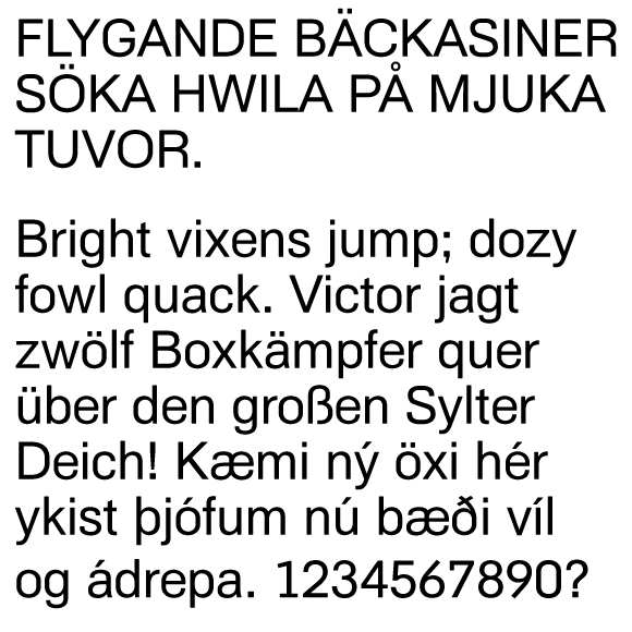
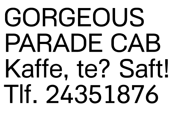
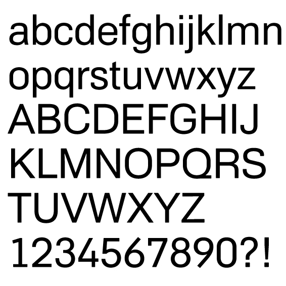
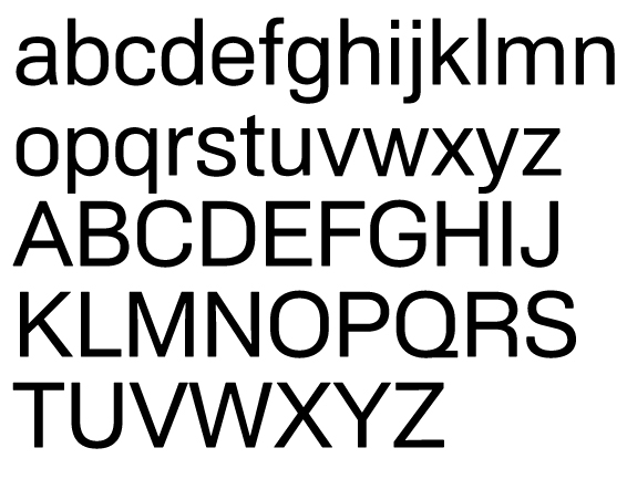
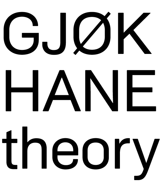
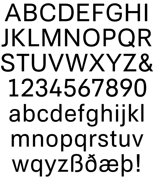
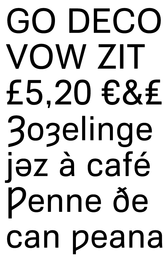
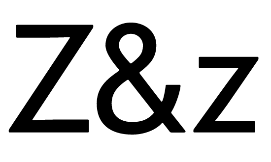
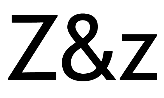
This started out as a quick contribution to the Arial Type Battle. The typeface still shares the metrics of Helvetica and its impostor, and it is my first attempt at drawing a complete sans serif. That's a lot harder than drawing a serif, I think.
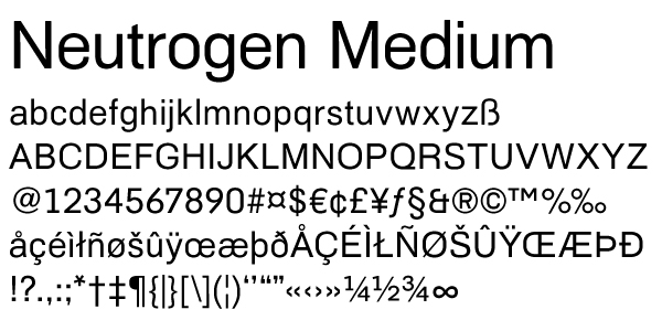
I'd like to release this typeface from its Arial/Helvetica metric imprisonment, and make a light, a bold and a black, and italics for the three lighter weights. Do you think it will be worth the effort? I'm very unsure if Neutrogen is but an exercise, or if it deserves to be developed and used. Please tell me what you think.
| Attachment | Size |
|---|---|
| neutro.pdf | 72.23 KB |
| neutro2.pdf | 192.54 KB |
| neutro4.pdf | 179.46 KB |
| neutro5.pdf | 169.36 KB |
| ethos_regular.pdf | 162.63 KB |