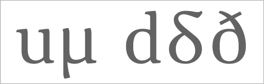
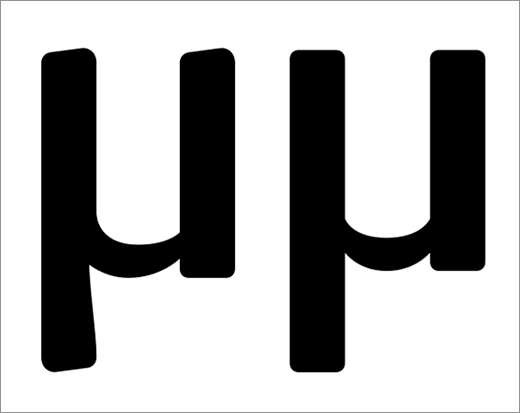
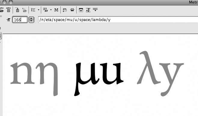
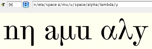
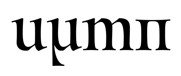
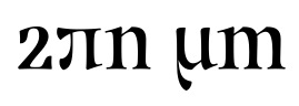
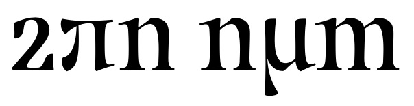
I'm wondering how to correctly draw the Greek character μ. Upon inspection, many fonts' μ's look like a u with a leg pasted on like this:

This doesn't look right to me, but I'm new to this stuff. Is this how it's supposed to work? It seems like there should be some stroke thinning where the leg descends.