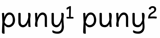
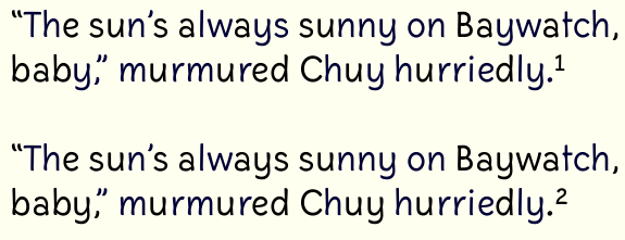
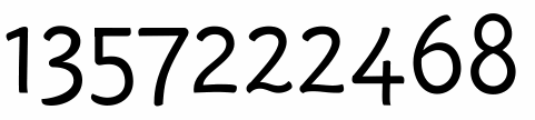
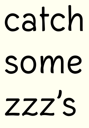
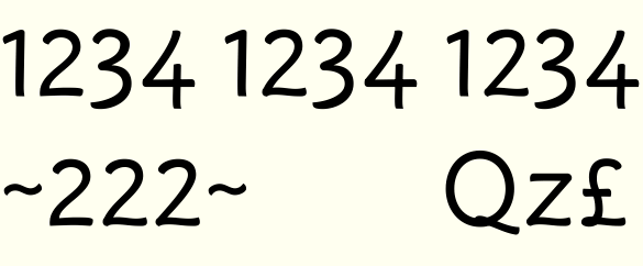
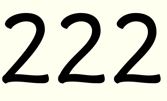
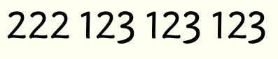
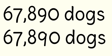
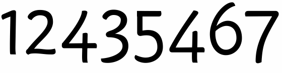
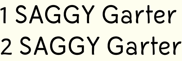
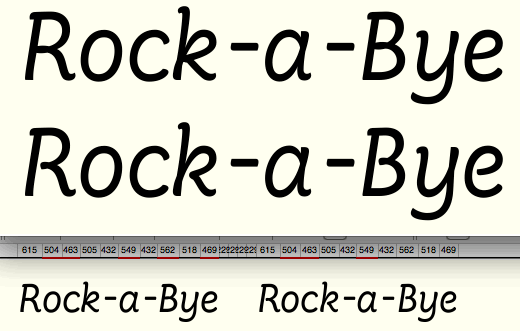
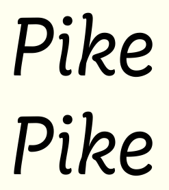
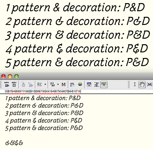
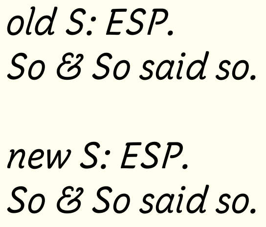
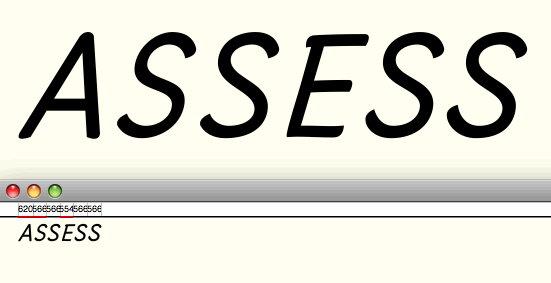
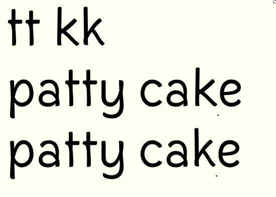
Here's the present condition of my first font. I've been blogging about it on Typophile but I thought I'd do a post here in the critique forum and specifically invite feedback.
(pdfs attached below)
Thanks in advance for your thoughts.

Here's the present condition of my first font. I've been blogging about it on Typophile but I thought I'd do a post here in the critique forum and specifically invite feedback.
(pdfs attached below)
Thanks in advance for your thoughts.

what’s your intended use?
I'm looking for something that will work in smallish sizes (say, 10pt up to subtitle size), and is comfortable enough for middling-length texts, such as sidebars or captions. Maybe places where one might otherwise use running italics? I think the "handwritten" voice of this might work well for pull-quotes. It looks to me like it also might work as an alternative to "architect" fonts (or Comic Sans!), where a somewhat casual, but not condescending, style is desired.
This started as formal experimentation so the potential uses are more "emergent" than intended from the get-go. If it would be beneficial for the design to define its uses more precisely and if there are good practices for doing that, I'd welcome that feedback too.
It looks good, but needs more unity. I like the bumps that come from the cursive styling, they give the letters a very friendly tone. I do think that this could make a great face for running copy in the same way Palatino Sans is.
The majuscules feel much more formal and machine-made than the minuscules; s, v, w and x have the same stiff feel. There are also letters that get a little too informal—a feels a little sloppy with its left lean. And k is distracting in the same way that the r is in Palatino Sans.
I would also consider doing more with stroke terminals. The tapering round descenders on j and y are gorgeous. Coming up with a system for angled/tapered terminals throughout will really push this face up a notch.
Last, throw together some ligatures or contextual alternates, at least the f-ligs, just for visual punch. I realize that your letters don’t crash, but this face is just begging for some cool ligatures.
Thanks, James and Paul, for the helpful comments. I appreciate the time you spent looking at this. I've uploaded a new pdf that includes some of your suggestions heeded.
The majuscules feel much more formal and machine-made than the minuscules;
The more formal caps are intended - I'm trying to pull off something like this (in terms of formal caps and more cursive minuscules):

I may have to abandon that conceit if I can't get it to work, though.
s, v, w and x have the same stiff feel.
Agreed; I've softened v, w, and x, and will take a look at s.
There are also letters that get a little too informal—a feels a little sloppy with its left lean.
Yes, I'm not terribly happy with that a. I'll try to clean it up. I'm trying to retain a bit of the "loopiness" in the stem on the right, but reconciling that with the top curve is proving difficult. A single-story a is much easier to meld with the style, but if I can get it to work I'd prefer a two-story.
And k is distracting in the same way that the r is in Palatino Sans.
I wondered if I would get away with that!

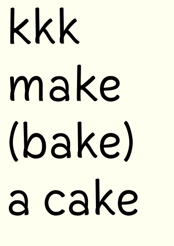
knock is closest to working, no?
I would also consider doing more with stroke terminals. The tapering round descenders on j and y are gorgeous. Coming up with a system for angled/tapered terminals throughout will really push this face up a notch.
Excellent - that will be my next big project for this.
Last, throw together some ligatures or contextual alternates, at least the f-ligs, just for visual punch. I realize that your letters don’t crash, but this face is just begging for some cool ligatures.
Another good idea. I've added fl, fi, and ti. The latter two connect at the crossbar. Will ponder more.
well without much of a purpose given for this to satisfy, all i can really say is that the g and k bother me,
k discussed above. I've reverted to the original, one-story g in the latest pdf. Not as fun but more fitting to the face, I suppose. Maybe I should pull the descender around a bit further.
I'm not sure whether to have another go at the two-story g. Was its problem that it was poorly drawn, too busy, or just the wrong flavor for the font?
as do the differing approaches towards triangular corners (A, M, Z).
I've now chopped the points off of A, W, and V to match N, M, and Z. Question: does a pointy vertex in the middle of M and W look weird?
…’m trying to pull off something like this…
It could work, but doing so could limit the use of the font to special projects by ballsy designers. Which allows me to segue to my next point. I think that you would be well-served to really nail down a pen theory behind this design. The majuscules have a the mechanical feel of letters constructed mechanically to idealized humanist proportions. Most of the minuscules have the feeling of the same proportions realized with modern felt-tip or ball-point pens. But then there are the occasions where a flexible nib pops out—y, h, and u. I’m not sure that all of these can be reconciled into a single design that doesn’t have the cacophonous feel of Makela’s Dead History. Of course, there’s a place for that kind of feel, but I don’t think that’s where you’re going.
What you could do here is create the basis for a larger typographic system similar to ITC Stone. Looking at your second specimen I see how this could turn into a fabulous informal text face with a companion sans to use for titling.
knock is closest to working, no?
Definitely.
I’ve added fl, fi, and ti.
They’re fun and they add a nice touch of class.
I do prefer your single-story g. I don’t know if a two-story g could fit into these proportions, but it’s still worth exploring.
This is really helpful criticism James.
On nailing down a pen theory: I have developed these letters as a monoline (which I guess corresponds to a felt-tip), and then I began thinning strokes where they merged to reduce black spots. I wasn't thinking of a pen-front, but rather of the kinds of adjustments you see in Futura for example. But now that you point it out, the "cursivity" of this letter construction is probably going to make a "pen theory" unavoidable. Maybe it's just a matter of starting the thinning closer in - perhaps I made what should be an "invisible" optical adjustment at too large a scale.
Connecting with your previous comment, would a pen theory dictate the terminals? (Which I'd suppose would mean felt-tip = round?)
From the start I've wanted this font to have a crispness - to read as something more sturdy than a scanned handwriting font.
Re: caps, would you suggest I'd have to add the cursive bumps and loops to the majuscules if they are to fit in with the minuscules? I didn't find that very satisfactory in my sketching. (In fact, that exercise was a real lesson for me in just how different in character the Roman caps and Roman lowercase are.)
Here's my newer, restructured 'a' (in "aardvarks"):

New pdf on first post (loopysample4.pdf) shows status as of today. I've started some of the kerning now. Which glyphs need rethinking? Does the leg of the 'R' stink? Are the crossbars of AEFH too gimmicky? Any color balance problems jump out? Other suggestions?
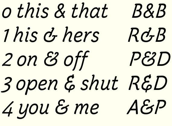
Without much reason other than the challenge, I've made oldstyle, monowidth figures for this. (I'm still very dissatisfied with the '1'.) What would be the most useful kinds of figures in a font like this?
I love the font. It really reminds me of handwriting, only more polished. The only things that really jump out at me for now are the masculine and feminine ordinal indicators (ª and º). Also, the 'tt' ligature seems somewhat wide.
As for the R and AEFH, I think that the leg of the R sticks out a little too far, but I like the crossbars on the A E F and H. The oldstyle '1' also needs work--it looks like it's about to fall over to the left.
What would be the most useful kinds of figures in a font like this? Well, I would think that alternatives would be a nice addition. Because (to me) it feels like a handwritten font, a single-story 'a' would be nice, as would other common variants seen in peoples' handwritings (a crossed 'z', a serifed 'I', etc.)
Thanks a bunch for the compliment and ideas - very helpful.
Still need to work on the R and 1.
Here's some alterations including some alternates you suggested.
How do I code these into FontLab? I have added glyphs and named them "a.alt" etc., but how do I set it up with OpenType to give applications access to them?

Craig,
Just butting in – you know to take my comments with a rock of salt!
This is much fun to look at, and quite likable (and interesting to see
how the "handwritten" flavor is oozing into lots of tiny details).
A few semi-random impressions:
In the caps, the "T" feels a bit wide.
Have you tried a "W" with no crossing strokes and a lowered apex?
I'd consider softening / taking back the—quite acute—angle in the join of the alternate "g". I like the idea; but it may be trying too hard to make a point.
I know it's intentional (and probably also hard to do otherwise), but I'm somewhat put off by the contrast between the caps and the minuscules. The caps feel classical, almost "stately" in their proportions, whereas the lowercase is a lot more playful.
On a detail level, how about playing with the tail of the "Q" a bit?
(And possibly, the leg of the "R"?)
Also, the bottom-right of the "G" feels stiff in context of the whole alphabet.
Or it may help to think not from the stroke, but the overall proportion, to make the caps a tad less "classical" and more "casual". (While your minuscules have a strong hand-written feel, I don't know anyone who writes their caps with classical Roman proportions.)
I'll be curious to see how this goes on. :-)
>How do I code these into FontLab? I have added glyphs and named them “a.alt” etc., but how do I set it up with OpenType to give applications access to them?
You'll need to use a Stylistic Set.
Open the Opentype panel and click on the + at the bottom.
You'll get a box with the words 'feature xxxx {'
The next line says 'sub by ;'
You need to put in the substitutions you want in there. For example to substitute a with a.alt it should read 'sub a by a.alt;'
If you want to add more substitutions, simply repeat the line below with the next letter you want substituted.
The last line needs to close the ss01 tag so again replace the xxxx with ss01.
Then click on the compile button. (looks like pages)
On the preview panel, you can now try your Opentype out by going to the Opentype features tab and selecting ss01.
Well, that's the way I've done it and it seems to work. Check the FL manual though, as I'm a beginner too :)
@altaira
That's so helpful, thanks!
I've added a W with lowered vertex, made the original high one the W.alt and trashed the W with overlapping strokes, which was just silly in retrospect.
I softened the angle in the g.alt. I brought back that original g when I got excited about adding stylistic alternates, but I never updated it with how the rest of the font had evolved, so thanks for catching that. I think it still needs work.
I changed Q, R, and G as you suggested, and threw in K, too. Better?
Lastly and most importantly, thanks for the additional nudge to abandon the classical proportions conceit for the caps. I've been banging my head against the wall trying to "casualize" the caps through strokes and details, but it makes sense at least to try altering the proportions. I'll try that out and see what happens.
@Bendy
Thanks, that's helpful. Do I want the tag to be ss01 or salt? Is ss01 (etc.) used in cases where there's more than one alternate? (Part of my difficulty in figuring this out is that I don't have InDesign or the like to see how these work in layout applications.)
I think that depends if you want all the alternates accessible at once (salt) or to create different stylistic sets to switch on and off different alternates in groups(ss01).
You should also put in the {} the name of the feature in real words, so for example:
feature ss01 { # Stylistic Set 1
as the first line
I've only learned from opening up other people's fonts and seeing how they've done it...probably a fairly good way to learn but means I'm not 100% sure; hopefully others can help.
"Better?"
I like the changes you've made. But do you? :-)
Not sure about the spur on the "G". I'd possibly try something like what I did
to the "b" in my font if you remember; just raise the join off the baseline.
But that may just be me. :-)
FWIW, if I was you (and if you're not doing this already), I'd print out a ton
of glyph samples of everything you have (outlines filled in, no nodes showing),
stick them up on a large empty wall (maybe shuffle them into different combinations from time to time), and just look at them whenever you happen
to pass by. For me, that seems to help for "spontaneously" spotting things
that may not be quite cogent yet. & possibly, think some more about the concept
and how it can "ooze down" into the details (for one thing, if you're trying
to make the caps more casual, I'd also go with less exact/circular rounds in the
"O", "G" etc.).
And of course: add salt to everything I'm saying.
I like the new "Q", but keep wondering if more can not be tried/done with that tail… Maybe have it grow out of the curve with sort of an overlap like you have in the bottom of the lowercase "n", "a" et al.? Though that might get too cute.
Play around :-)
Thanks again, Nina.
I've made some printouts and will look through them. Already I've seen an idea for the concept "oozing down" to the details - making suggestions of a loop in the middle of B and R (like the K already had). They are pictured below.
I've also played with the Q some more. I like the idea of the tail coming out of a loop from the right side. Below is the result - I like it but I wonder if that big black part at the bottom will be too spotty in text. I experimented with disconnecting the left side at the bottom (like a cursive form of Q, "2-like") but couldn't get a solid looking letter out of it.
I also experimented with a much loopier G but that got cartoonish rather quickly.

Oh, nice "Q"s. #4 reminds me an awful lot of Bree, but maybe that's just me.
I like Bree, I'm just not sure this matches your font; #3 or especially #2 might jive with your typeface better, though I don't know if that #2 wouldn't clog in text. Maybe with a bit less overlap it might work better? (Kind of like in "B", "R", "n", where you didn't completely double the weight at the overlap?)
*adding salt as usual* :-)
I like #2 in this last one - but I'm not sure if it bests #3 of the previous - because at smaller sizes the "bump" of the tail (at the top where it connects to the bowel of the q) may look like an imperfection in the font, thus why I think the loop would help mitigate this. But...like I said, #2 in this last one looks pretty good too.
(Can't help commenting on this, even if I'm not trying to climb too high on that "top posters" chart … :-| )
I think this is really nice with the dropping tail! Would need to see it in context
to fully judge how it fits in, but it seems to be much in keeping with the character
of your font. (Though I'd be curious to see how the "bumps" behave at text sizes, too.)
Hmm. It looks like both would work well. The loopless Q doesn't appear "flawed" like I feared. I kind of like the casual quirkiness that the looped Q provides but either approach works well. Perhaps include a stylistic alternate? Nice work - it kind of reminds me of Tekton (don't worry - it's quite different! - I mean the casual feeling is similar).
Posted an updated pdf up top showing status as of today. Since the last one I've added lots of OpenType features. There are now four sets of figures (combos of lining/oldstyle and tabular/proportional). I'm thinking about having the f ligatures standard and the t ligatures (tt, ti) discretionary.
Loopless Q above will be standard, with looped Q as an alternate. Added a nondescending J as an alternate, some lining versions of currency marks, and generally tweaked a huge number of glyphs.
Quickly, before I go to bed, there are two things I noticed when I looked briefly at the new PDF:
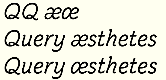
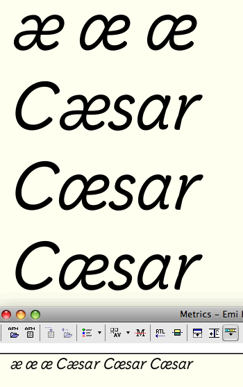
1. Your 'æ' still has the tail of the 'a' included in the glyph. Now, this is fairly unorthodox, and it begs the question: was it intentional? I'm not exactly sure how this character is normally written by hand, but I was under the impression that it is composed of one stroke.
2. The slashes on 'Ø' and 'ø' are at different angles, which drew my eye.
Besides that, I love how this font is turning out. Good job!
What's FN? :-)
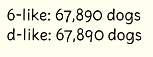
This is funky. Seen in context like this, the second ("a-like") version looks better to me, more balanced; in the first (upper) version the "a" part of the "ae" looks kind of… flattened. On the other hand, seen close up the "a-like" version looks pretty weird, as the crossbars of the "a" and the "e" don't connect… hm.
Have you checked the "ae" glyph in other fonts where the top curve of the bowl of the "a" joins the stem in a downwards curve? I can't think of one off the top of my head :-|
Both of the "ae"s look a bit cloggy in the middle. But I guess that's the kind of stuff that's hard/impossible to judge from a screengrab.
That's true. Here's the versions from the fonts others have identified as the closest in style to this one: Auto 3 Italic, Flora, and Tekton.

What if I raise the e's crossbar so it's no longer a near miss?

Or should I just work on making the curves of the continuous-crossbar version more pleasing?
@altaira: FN I think is the UN in Danish. I thought that text would be familiar to you!
Oh, that text. Yeah, I haven't been dealing with it in anything but (lowercased) English yet :-)
I can't be of much help with the "æ" I'm afraid (don't we have any Danes around?), though I'm thinking that on a broader scale, this decision may come down to
how closely you want to adhere to a hand-written (hand-writeable) model, which would probably favor the continuous stroke; though you already seem to be subtly departing from that in places in search of a more refined type æsthetic (couldn't resist that one!), like in the terminals and, not least, probably the shape of the
lc "a" itself.
To me, the y looks better with the higher join, perhaps because of the tail already giving weight below, whilst the u looks better with the low join...but do you want them to be identical or just harmonise? Also, do you want to change the h, m, n joins to match?
Regarding the æ, I prefer 4 but it's not a character I am terribly familiar with. What we need is a Dane, Norwegian or Icelander! I don't have any cursive examples.
I think your quotes/comma could descend a bit longer and be less angled.
The £ could have a lower crossbar and possibly a non-vertical stem (tilt it to the right?)
Thanks for the good insights, Bendy.
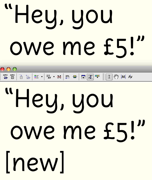
Below see the changes I made. The one marked "new" has:
- the higher join of the y but lower of the u. You're right that they don't have to match, and that y's tail in fact encourages different treatments. The high join may yet be too high; I may look for a compromise between these y's. As for the h/m/n, no, I don't wanna change them! I think that way up the branching works better.
- longer quotes and commas
- a much more felicitous pound sign - thanks for calling that out for me.

Felicitous! Indeed! Looking good :)
You've thinned the join on the y and that looks good, though you could be right about bringing the join down a bit. Think the u join needs a bit of thinning too?
The square brackets might look a bit light?
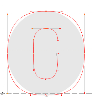
I wonder if the form of the o could be a bit stronger, as in making the beziers more superelliptical (just a bit though)
You’ve thinned the join on the y and that looks good, though you could be right about bringing the join down a bit. Think the u join needs a bit of thinning too?
I'll look at that u.
The square brackets might look a bit light?
Originally I had all brackets (square, parentheses, curly) about the same stroke width as the letters. I recently lightened them but maybe that was a mistake.
I wonder if the form of the o could be a bit stronger, as in making the beziers more superelliptical (just a bit though)
Can you clarify "superelliptical"? Do you mean more square? (Diagrams on the Wikipedia page show both diamond- and square-like shapes).
I like the changes. You've made the 'hat' of the 1 shorter too. The 2 is much improved too.
I'm wondering if the curves on the 2 and z are a bit strong; the base of the £ has a perfect amount of curviness. My concern is that such a pronounced curve is too detailed/delicate for a font based on quick pen strokes, which is why the straighter section in the middle of the 2 works better than the previous version, to my eye.
I'm a fan of the narrow z, so this seems perhaps too wide, but I think that's a personal preference.
Can you post a pic of the three versions of e big enough to see the detail? I'd consider keeping the original e, and agree with the 'monkeywrench' comment above...in handwriting we tend to draw e and o in different ways, with different start points, so although they're both basically ellipses, I don't feel they need to match...
I'm enjoying this font.
I think you're right about the curves being too dramatic - in fact I had tried to iron them out but was struggling to make it look nice. It's a great idea to go to the base of £ for inspiration, as I was happy with the way that turned out. I'll try that.
Here's the 'e's:

Left: original
Center: change I made when making the 'o' more superelliptical
Right: compromise between the previous two
Right one gets my vote too. I agree with your reasoning for it, and it looks good.
I find 2 one of the hardest shapes to get right. All that space, with a curve that kind of looks like a line too, then figuring out what angle the heavy stroke falls. :/
Just looked back at the pdf. I think 4 would benefit from a rework as well. The crossbar is quite high and the counter looks small. What if the diagonal stroke was convex instead?
O, nice. I like the center one (just to complicate matters ;-) ), but the right one looks good too (a tad more top-heavy maybe? The center one looks a bit more balanced to me – then again, I'm still very far away from making numerals, you know).
Does that bottom look a bit thin though, next to the "3", or is the "3" a bit heavy? I'm basing this on the smaller sample you posted so it might just be some sort of rasterization problem.
Why oh why didn't I perfect these figures before I generated tabular versions, and lining versions, and tabular lining versions, and small caps versions, and superior versions, and fractions... X-P
@altaira: you're right, fixing the weight on that 3 is on my list. And speaking of boneheaded me, I just spent half an hour fussing with a 'd' to get it to look like a '9', without even thinking of the 'q' which is already there!
@Bendy: I'm finding all the figures really tough, and '2' is among the toughest. I'm glad to feel like I'm making progress on this. I'll look at '4' again.
I can't thank you guys enough for your eyes and opinions on this!
FontLab just crashed so I think that's a sign to get back to my other work.
>FontLab just crashed so I think that’s a sign to get back to my other work.
Oh, that's not fun...
>While I’m on figures, any opinions on these nines?
I do like the playful unsophisticated straight-back 9 and it does fit the handwriting premise of this font. However, my feeling is that it's a bit clumsy. I think a font can afford to have more harmony than handwriting and look more deliberate and settled. Stick with the curvy one.
You could include the q/d style one as an alternate?
I personally like the spur on the G, and feel it contributes to the cursive flavor. The G without the spur is beautiful, but it seems more abstracted to me, and less hand-written. (I don't see how I could slow my pen down to make such a precise turn, and if I could, then why the overdraws on the lower-case letters.)
One thing that does catch my eye, however, is the transition from the lower curve to the spine of the S. It looks somehow off. Maybe if the spine were a slight tiny teeny leetle bit more horizontal (by raising the right end), it might look better.
I agree the spurless G is too precise for this font. The new S is really attractive. But I think some of these adjustments are starting to move away from the handwriting premise and making the script more formal and refined, more careful and slower writing rather than quick style which gave rise to the overlapping loops. I think you may need to make a choice. You have to trade off individual letters looking super with the whole harmony between the characters looking super. Hope I'm being helpful and not annoying :)
It's only when you see things 'in action' that you can really tell whether they work or not.
Craig, do you think the new 4 fits better with the other numerals? I think the counterspace is much more in tune with the letterspacing.
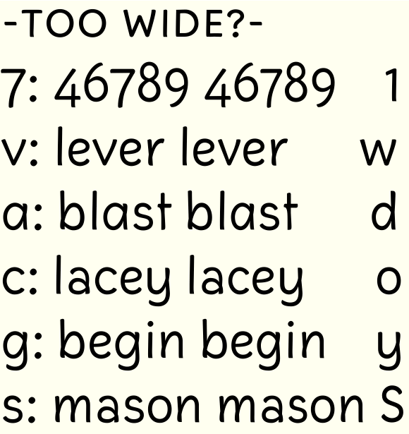
Do you think 7 might be a bit wide?
Can you post a new pdf? I wonder whether some characters might be still a few units too wide (a.alt, c, g, s and v)?
@SebastianWolf: thanks for the compliment and feedback. I'll look at those weights of ascenders and descenders.
@Bendy: This is all good advice. I do think the 4 is a better fit and I'm happy with it; I just never dreamed anyone would consider it sexy or loveable!
I've posted another pdf (loopysample9.pdf) in the first post with some of these recent changes that are going to stick. Also, here's what those glyphs you mentioned might be wide would look like a little thinner (on the right in each pair). This is just quick and dirty narrowing to help determine need. (These changes are not reflected in the pdf.)

(And did we do a variant with a flick to the right on the tail?)
I don't think I did, did you?
But seriously, I just was looking with chagrin at that tail in that sample. I just changed it from a flattened terminal (like the bottom 'l', for example) to a curved one (like the top of 'l'), but it still looks awfully dumb all of the sudden. I could experiment with a flick. Do you have any ready examples in mind? (The ascender of 'b' isn't so bad, right?)
Craig, I personally feel that curve on the descender of your "q" is too soft. I think it should be more of a flick than a curve. (Remember the salt.)
Re: examples, for some reason I feel like listing some semi-randomly picked, right-facing "q" descenders (I've become quite a fan of these!).
Handwriting/calligraphic fonts with right-"flicking" "q" descenders:
Sanvito Pro
Kallos ITC
Mama Script
Tekton Pro
Lucida Calligraphy / Lucida Handwriting / More subtle: Lucida Casual
ITC Bradley Hand
Medici Script
FF Child's Hand
Cascade Script
Lemonade ICG
Other fonts: ITC Berkeley, Hiroshige, Parisine Plus; Patria
Some historically-influenced examples:
Carolina, based on the Carolingian Minuscule; Arnold Boecklin; Auriol
I was going to post some actual historical samples, but I need to make a phone call first. :->
Yeah, some of my first sketches were more upward flicks, like #2 and #4 here:

Did I dismiss promising possibilities prematurely? Wouldn't be the first time. Should I keep working on #4?
Lastest pdf up top (loopysample10.pdf) shows status as of today. I've made a ton of tweaks. Some of the more prominent (or at least the ones I can remember now) are:
- Slimmed down some "secondary" strokes like bar, slash, the short strokes on currency symbols, diacritic slashes, etc.
- Added a little more curve to some of the horizontals like top of T and Z, bottom of E and L, etc.
- Knocked the vertical part of the fives off-vertical
- Removed W.salt
- made many of the dots (e.g. period, colon, bullet, tittle, umlaut) more (but not entirely) circular
- redrew ear of g.salt
- addressed some of the weight problems and wonky curves
I also changed the hook of the f, and with that, much of the ligature setup. Instead of the old ligatures that had that f hook stretch to bridge with ensuing ascenders (fl, fb, etc.), I have designed an alternate f with a slightly shorter hook to go before those letters. The ligatures that connect with the crossbar (of f or t) are the only ones that remain, and are all discretionary.
Here are my reactions to the latest PDF:
1) Wow. This is looking nice!
2) I like the f-ligatures, and I think they work well here.
3) Now that I see it in context, I think the ß is too wide.
4) The tabular 0 (both lining and hanging) is too wide.
5) Looking at the French, I wonder if your apostrophe needs more curvature.
6) There is no number 6.
Emi? Cute!
And, welcome to the "E-named fonts club". :-)
I printed this out, and tried looking at it as if I'd never seen the font before. And I must say, this is incredibly amiable and seems to be working very well indeed. I'll admit that I'm not usually a big fan of "handwritten" fonts, but I do like yours a lot! The tons of work you've put into this really show, as does the joy of making it.
Here are some things that struck me:
There might be some weight issues with certain glyphs, but I can't be quite sure since I'm still battling my printer. Particularly, I'm wondering if the top of the "8" is too light (especially compared to the ampersand, which looks very nice); the small cap "A" in the Latin sample looks a bit dark and the tilde on the "a" in the Portuguese, very light. The percent sign seems rather light too. But like I said, that may or may not actually be in the font.
I like the "Q" a *lot*.
Your guillemets (both single and double) seem rather mechanical. I wonder if they could have more of that handwritten feel.
I agree with Steve that the eszett feels too wide. I think it's especially the bottom part – it sorta looks too much like a truncated "s".
Ligatures and "f" alternates look great!
I think the apostrophe is fine.
The accents look better, but I'm wondering if they're now tapering too much towards the thin end? They look really pointy, which isn't really something you have in the rest of the font. That makes them look a bit aggressive in context.
Btw I think the circumflex could benefit from not being quite as flat, and it doesn't seem to share the contrast of the "straight" accents?
The asterisk is lovely.
I'm quite excited about this. What a nice font.
I've just noticed how well the caps work. Would it be too horrible to widen the W and pull the middle up slightly but not to the top? It looks a bit shrinky I think.
The lc of course looks great too!
Emi looks really wicked in comparison to those other fonts and even against Myriad, which I very much admire. Good work!
The same new a.salt and g, with a little more context.

In my opinion, 2 has very nice forms of a and g, but they perhaps don't quite fit so perfectly as the number 1s. I think 5 fails a bit as the NE corner looks a little clogged, but 1 has larger counters there. 2 could also be a bit reminiscent of Comic Sans, though of course much pleasanter. 5 has lost some of the springiness in the top arches, which gave 1 the vitality and made the a and g harmonise better with d and b.
I think this works a lot better than before, Craig. It's still quite soft-feeling and the difference in width between the two bowls is characteristic, but I think it works.
FWIW (from Wikipedia):

I don't know how deep you want/need to go into this; it may just take too much time and effort to do a super brilliant unbeatable eszett, as it's not a letter you are usually confronted with – and then it's kind of a "minority glyph" ;-). I think yours is definitely readable and even rather charming, so you might just leave it as is.
But do make sure the bottom doesn't close up / clog at smaller sizes.
"I’ve raised it to match the tittles"
That's not absolutely necessary. I agree the umlauts were a bit low before, but they're not required to be on the same height as the tittle, in fact they're often a bit lower (since they're usually a bit lighter too, which yours are as well). I'd move yours down a tiny hair if I was you.
FWIW: http://www.altaira.de/posted/tittles_umlauts.pdf
The new ß is cool and looks quite handwritten! I'd make it a little narrower though. Also, this might just be the antialiasing, but the curve in the top-left (where it bends right after the doubled stem) looks like it could use some smoothening.
If anyone is still dropping by this thread (which has gone cold as I shake in fright at the though of figuring out kerning punctuation and hinting):
If you had this font, what would you most want to accompany it:
a) an italic (sloped, with even more "cursivity")
b) a straightforward bold
c) a bold that introduced more contrast (much earlier experiment along those lines is here.
d) a thin
Which of these would you find most useful (or, more bluntly put, which would make you more likely to purchase an Emi set)?
(p.s. please notice there is no "e) all of the above" option...)
Good to hear from you and Emi!
Hmm, I think I'd probably like a bold, but I'd prefer the contrast-less type.
Might just be me though.
I wonder if there could be a sort of accompaniment that is more scripty (maybe connected? narrower?), but not necessarily slanted. Maybe in terms of having a mini-family ranging from more "handwritten" to more "type-like"? Dunno, just an idea.
Or, how bout a Display cut? (Maybe a thin one? Or a fat one?)
Ooh, I don't know. That contrasty bold does have a nice flavour, but admittedly it is quite different. I'd be very interested to see the straightforward bold and I think it would be more useful than a thin for example.
In your example it's interesting how some letters look already quite nice without too much extra work (like the abu and g) but others (like the refo and s) seem to need much more careful boldening.
It would be also really interesting to see an italic. What about making a couple of mock-ups, for the italic and bold, just your hamburgefontsiv glyphs so we can see which is more interesting?
I agree it seems lovely. I'm really liking this.
One thing I'm wondering about is the angle of the leg of the "k"; I wonder if it would "flow" more if it were steeper, and perhaps with more of a curve at the foot? Not sure.
The curve on the bottom of the "f" seems a bit lumpy (and the "j" too actually), but that may just be the GIF.
Oh, and I love the tittles!
Looking forward to a PDF.
BTW, what happened to the poor animal? ;)

Oh, I actually liked the u-with-descender-shaped "y" a lot. Are you going to leave it in as an alternate? In any case, I think the new one might be a hint too dark.
I'm not going to talk you out of an ezh-shaped "z" – I'm a big fan of the form. But I believe it should be an alternate only, and I think the proportions are a bit off. At least the way I know the shape, I'd expect the middle point way above the baseline: example (but maybe this is not what you meant? Hmm.)
I think right now it looks a bit like an unhappy compromise, like a normal "z" with a swash or something.
I like the new "k", although I can't tell if it works better from this distance.
"c": It looks surprisingly "geometric". How about making it narrower and maybe the top curve tighter than the bottom, kind of like in the "e"? Maybe play around with the vertical position of the left side extremum?
Re the "r": That "rice" example looks like it may be good to test the "ri" and "n" for confusability. Or the "rn" and "m".
Yes, I'd try a straight descender on the f. Or make the curve taper slightly. It looks dark at the bottom.
I like the curly k!
I was also going to say you might need to raise the knee of your z off the baseline. I wonder if rather than a straight top and diagonal whether the whole shape could be much more curvy...more like a 3...fluid to go with the speedy felt pen feel?
If you're going with the straight y, maybe try putting a curl on the bottom of the descender like you've done with the leg of the k?
I think the top of the c could be narrower, like the top of the a. The bottom might be ok as it is.
[Edit: Oh, Nina just said that already. Hm. Good good :)]
I think with the a, it's the counter that looks funny. It might be worth rotating the counter anticlockwise a few degrees...just a guess though really. The whole right side of the glyph looks slightly slightly too light I think? I think it's hard to say without playing with the nodes. The answer will come naturally.
The clamored-for pdf has arrived, attached to the first post. Just shows lowercase italic. I haven't yet added the f-ligs.
For the caps I'm thinking of doing very little to the skewed caps from the regular font - maybe just adding a serify top to B/D/P/R, and making the loopier Q standard. I think less "swashy" caps will rein in the curviness of the lowercase and leave the possibility of all-cap italic settings viable.
But of course I'll have to see how it looks and decide from there.
One thing that I would like to point out with respect to the y is that its style differs from that of the unitalicized font. In the regular face, the y appears to be a "u-with-descender" (as altaira called it); however, your italicized version is a "straight y". It might be nice to have a "u-with-descender" as an alternate or something... I dunno, I'm just spitballing.
I think the curvy one may fit better with the other letters.
Your t is looking great, just the right amount of swoosh. I think if you applied similar terminals on e.g. a,b,h,i...it would harmonise really well; their curly toes are slightly too tight in my opinion. If this was real writing, the t would have been written faster, it looks nice and energetic. Does that make sense? :)
The top of c is fine now, but the bottom terminal needs to come on or become more vertical or something.
Since you've taken some of the curve off the bottom of the f, would it be a nice balance to add more of a curl on the top end? (Like you did with the tail on y)
It's looking good :)

On the a's: I think version 3 has just the right amount of quirkiness but still maintaining a harmonious balance with the rest. So I approve of your preference! For the i - yeah I think 3 works best, again it has just the right amount of quirkiness but still maintaining a good balance with the rest of the letters.
As for swashes - I don't think this is the right font for that - but I could be proven wrong. Excellent work Craig.
On the a’s: I think version 3 has just the right amount of quirkiness but still maintaining a harmonious balance with the rest. So I approve of your preference!
Thanks for the feedback. The fourth 'a' was actually my "fixed" one - do you think that one goes too far in smoothing out the lines?
Yet another question for all: Any point in considering a cursive structure of 's'? Here's an attempt. I'm not sure it's reading like an 's' yet.

That's a difficult question, re the "s". (For the record, I find all these detail questions pretty hard to answer – but highly interesting.)
Personally, I find the cursive "s" form harder to read, and in a way it seems to call for a connected treatment, which I guess you don't want to do. Dunno, I think I'd stick with the upper one. (BTW, is it possible that it's a bit lumpy where the spine meets the upper curve, I mean on the bottom of the upper uh, bowl thing, on the left? [Sorry about the lack of concise wording here.] But maybe it's only the rendering.)
I like your swashy "B" a lot BTW! But I'm suspecting it may be over the top for this font, especially since your roman caps are pretty neutral/factual. Hmm. Maybe as optional alternates? I must admit I'd hate to see you throw away that "B".
With the a's, I like the stem on number two and the flick of number four. The stem on four seems to be coming away too much from the bowl, whilst the flick on two seems too tight. Does that make sense?
With the i's, I'd like to see something in between one and three. I hope that's not a finicky thing to say. :)
I think the nodes on s where the top curve joins the spine need to retract slightly down the spine. Keep the bcps where they are though.
I like the idea of a loopy version; your B and cursive s are fun. Perhaps it's a different member of the Emi family.
Is it me or do you seem to have slightly reversed contrast? I noticed it on the a and t.
@altaira:
Personally, I find the cursive “s” form harder to read, and in a way it seems to call for a connected treatment
Those are exactly the conclusions I was coming to.
@Bendy:
With the a’s, I like the stem on number two and the flick of number four. The stem on four seems to be coming away too much from the bowl, whilst the flick on two seems too tight. Does that make sense?
I thought that's what #3 was, more or less. Hmm. I'll push some more points around and repost.
With the i’s, I’d like to see something in between one and three
Hmm, maybe a "flag" structure with a rounder top? I'll see what I can come up with.
Is it me or do you seem to have slightly reversed contrast? I noticed it on the a and t.
I think that may be an artifact of my lazy skewing process to generating the italics. I have a lot of cleaning up to do on the stroke weights, and terminals, too.
So glad to have you guys weigh in on this!
Yeah, let's all do a FontStruct party next time :)
Aargh, this is really difficult.
I think in your smaller examples, I like #8 better than #3, which seems to have a bit too much going on at the x-line. Although I don't quite want to give up on liking #6 – it's slick. (But yeah, maybe it's too slick.)
The more I stare at them, the less I can tell. :-\
But hey, once you've got the shape right you can do similar things with the other letters :)
Hm, I'm starting to like number 1 too (sorry!) I think actually it's less busy like Nina said.
I wonder if there's anything to be said for taking a marker pen and seeing what other things come out naturally when writing letters like this.
I don't think it looks too much like R, but perhaps if the return stroke were more parallel with the outstroke, it would look less so. And I think open is the way to go, in keeping with the more-or-less rapid writing flavor of the family so far. (If you want the connection with the stem to be so precise, then I'd go with a two-stroke k, which will also move it away from the R issue.)
Oh, the second "R"/"B"/"k" are very nice indeed! The whole thing flows so nicely.
Strange, in this comparison the "old" version looks almost stiff and uncomfortable – which it didn't seem like at all previously! Great improvement, to my eye at least.
I'd agree about leaving the "e" closed though.
What about the "P"?
Thanks. I definitely think that was the most attractive glyph of them. I worried that it might be too elaborate for the face, but then I think an ampersand can bear to be a little more baroque.
In addition to cleaning up the weights, I reshaped italic 'S' with a steeper spine.
1) Do you agree the new 'S' shape looks better?
2) Must/should I make a corresponding steepening of the lowercase 's'?

New pdf posted up top (loopysample11.pdf) shows progress, most recently on the italics and generating diacritics.
I'd welcome input on everything, but maybe particularly on the alternates.
Presently, Emi has these stylistic alternates:
I in regular and italic (without and with crossbars)
J in regular and italic (descending and baseline)
a in regular (double and single story)
g in regular (single and double story)
q in regular (tailed and straight descender)
t in regular (straight stem and curved)
y in italic (curvy and straighter)
z in regular (without and with crossbar)
z in italic (baseline and descending)
Which of these have value? I'm thinking of dropping the alternate regular g and z.
Also, right now I have the "crossbar ligatures" coded as discretionary (DLIG). (They are listed on the last line of the character set listing in the specimen.) Should I go ahead and force them on everybody (and enable them for everybody) by making them LIGA instead, or are they too weird (or is the answer different for different combinations?
Your italic is looking really nice there :) In fact so is the regular!
Here are my thoughts.
Italic:
I love the k. I think you could transpose its leg onto the Q, which to me doesn't quite work strongly enough.
The stem of q looks thin. And to some extent the same goes for g.
Compare S and O and you'll see O looks quite thin in the SE and NW. S looks a bit heavy all round.
Comparing U and V makes me think U needs thicker uprights.
I think æ should have a one-storey a.
Regular:
I prefer the t with the tail. I prefer the lower height on it too. Perhaps the original t could be shortened?
Square and curly brackets look narrow.
After all that discussion about your q, I think now I prefer the straight descender one.
The strokes on @ look thinner than the other glyphs.
I might consider making the arms on k steeper with the leg joining the arm rather than joining the stem. In comparison to n or p, the gentler slope of the arms looks a bit disharmonious.
Crossbar on £ looks as though it could go down and right a bit. (Especially on the SC and lining versions)
I know the Euro is supposed to have sheared crossbars but to me I think in this font they need blunter ends.
÷ fell down a bit somehow.
I'm really liking this. I'm really pleased how well it stands up next to Myriad, as I think I mentioned before :)
Thanks so much Ben for the feedback. I'll get right on the changes!
I was leaning the same way on the q tail, actually. I think I'll save the flick for the italic.
When you say "square and curly brackets look narrow," you mean the overall glyph, right (not the stroke weight)?
My very first attempts at k (back on p. 1 of this thread, changed maybe before you even joined the conversation) were the structure you describe, but the arm came out of the stem way too high. I think there's promise for that structure but drawn with a more conventional shape.
Ok, I prefer the lower t, but I know other people prefer them to be taller. What about a middle height? (It's only a small difference :)
With the k, I think the lower leg could start lower and have a gradient similar to the original, but I think the top arm looks really nice, especially with the link at the bottom.
The tail on the Q isn't quite as steep as I meant but I like it a lot! Keep it.
Perhaps the ae needs to have the top of the a starting higher up on the e. I can't think of any other way. It doesn't quite look like an oe at this size but at small sizes you might need to make it more distinct.
OK, I'm here. I tried to look at this like I'd never seen it before, so here are a bunch of semi-randomly listed comments. (Whoa, this got a bit epic)
I'm in love with your italics! Where the roman is amiably nonchalant and "human-handed", the italics bring in a level of self-confident, refined elegance that's just lovely, and amazingly enjoyable (without losing the connection to the roman though!). Great work. (I may have said this before :-) )
It still puzzles me that when I look at some (if not most) of your italic glyphs up close – like the "s" above, or the "j" – there's a hint of reversed stress that seems unusual. But in text, it works/reads beautifully, so that probably means don't change a thing. :-)
My favorite glyphs are the italic "k" and "q". Regarding what Ben said about the "q", I agree the flick on the tail works better (= would probably be expected more) in the italic than the roman, but I for one like it in the roman too.
I also really like the alternate "z"s in the roman and the italic. And the alternate italic "y". I hope all of these can stay. (Dunno about over there, but in German it's quite usual for people to cross their "z" in handwriting, so to me the crossed "z" makes a lot of sense here, as a device to make it look more handwritten, whereas the normal "z" would look more typographic.)
There's some minor lumpiness to your italic "m" I think. Specifically, the top-right of the first counter.
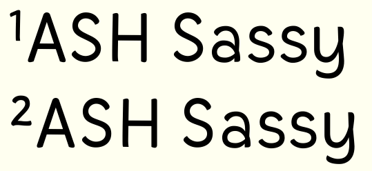
Your eszett is in danger of being dark in the top-left, but I'm not sure how to fix it.
The word "the" (of all things) looks strange in your italics :-(. I suspect it's either the relative widths ("t"'s foot being too wide compared to "h") or spacing (in terms of making the "t" tighter on the right side).
To my eye, there's some spacing weirdness in your examples of contextual "f" substitutions – in "offhand", the "fh" seem much closer than the "ff". Might you be overdoing the "whee, I can space this closer now" effect from the narrower "f"? :-) (I've been guilty of that…)
Looking at your roman again, I'm not sure about some of the cap proportions (which I admit is uncool to say *now*, but it just struck me). In DUCKLING and QUIZZICAL, the "U" looks rather narrow to me. Maybe the "A" (and "V") are also a bit on the narrow side? Not sure.
There's some minor curve wobbliness in the oldstyle "3" methinks, in the bottom.
Your commas and apostrophes are great. I'm envious :-)
Don't forget to kern your punctuation. ("NEAT -O")
The small caps seem a bit smallish to me seen next to the lowercase, but that might just be me. (BTW, there's a lc eogonek instead of a smallcap in the Polish sample text, not sure if that's a problem in the font or the setting?)
And I think something went wrong with the spacing of your italic fractions.
*
Diacritics:
Your tilde is enviably nice.
Your accents are quite light. Is that intentional?
Also, you seem to have found the only coherent Hungarian sample text without hungarumlauts ;-). But I see you have some. They're a pretty strange shape in the small caps – I believe they're supposed to relate to the acutes, but I'm not sure.
Regarding the ogoneks, have you seen Adam Twardoch's how-to?
http://www.twardoch.com/download/polishhowto/ogonek.html
I'm not quite sure but it looks like the one on your "a" exceeds the width of the base glyph on the right, which seems to be a no-no.
(BTW also see what he says about zdotaccent, where the dot should be the same as the tittle apparently.)
Your italic lslash seems a bit stiff. I think I'd model it after the italic "l" (at least that would seem logical – but I don't read Polish so mind the salt).
*
Really unimportant stuff:
Your "fj" lig and your italic dollar sign aren't merged. :-)
I'm beginning to eagerly look forward to seeing this out in the wild. It's really quite nice! And holds up impressively well against those other fonts in your sample. Very nice work. :)
[EDIT: That new italic "Q" rawks!]
New pdf. (loopysample12.pdf) Can't believe it's been a month since I posted.
Many changes (though none terribly dramatic). Some include:
- Added a Th ligature
- Tinkered with a's bowl, some stem baseline terminals
- Resized the smallcaps a little bigger - how does their size look to you now?
- I think I thickened some accents - do their weights look okay? (I also wonder if some should be steepened...)
- Many of the other fixes and corrections y'all suggested.
I think I need to review the spacing on the italic.
I'm still hoping for feedback on whether the crossbar ligatures (and now, I suppose, Th) should be DLIG or LIGA.
Maybe I'll be able to get some feedback on Emi from the masters at the TypeCon crit session!
The new pdf looks great! I'm glad to see that you chose that æ-ligature over the œ-esque ones. In my opinion, it's best to go for clarity because ambiguous characters are a real pain when reading. The only thing I wanted to point out was in your sample text for Hungarian: the 'õ' should be changed to 'ő' and the 'û' should be 'ű'. Tildes and carons are not part of the standard Hungarian orthography.
Thanks Wesley. I pulled that text off of Project Gutenberg, and I was *wondering* why my diacritics with "hungarian" in their name made no appearance! I'll fix it.
Talked to Chris Lozos (dezcom) about Emi today at Typecon - he's helped me to realize I should probably start over completely on the spacing and kerning. 8-\
There's some faulty spacing at the root: a string of nununnuu for example looks all uneven; and I've lost confidence that my kerning classes (made by a couple of runs through with FontLab's tool) are complete and appropriate.
I haven't nuked anything yet and perhaps I don't need to, but there is appeal in the idea of a fresh start...
In the meantime, I sought some guidance on Emi from Matthew Carter, Akira Kobayashi, John Downer, and Gerard Unger. !! I sat down with them for about 10 minutes at the sign-up crit session at TypeCon. I'm hoping video will be available soon, both to share with you guys and to review myself, as I was rather freaked out and probably missed much of what they said. If my memory serves correctly, though, it went well! :-)
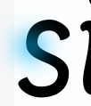
I think there is a bulge in the area that I have highlighted, or maybe the "diagonal spine" is thinner than the rest of the letter. It appears to me in both large and small settings. Get out the calipers :-)
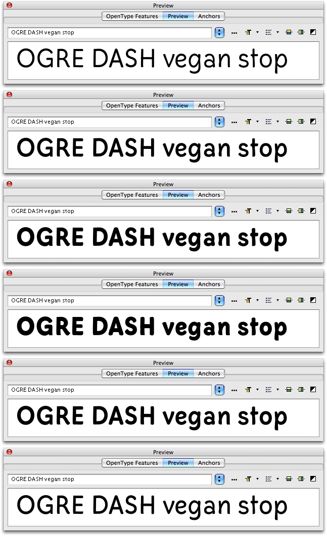
Sorry if I am wrong but it stands out to me. It just looks more harsh than smooth or fluid.
Michael
There is a wonderful little oblong paperback out there by HZ (with a marbled cover). It is an instructional book he did for Rotring. In it is a modulated sans that is very beautiful, and yours has hints of it. If you can secure it, it is called Calligraphy, it might be very helpful to you as you hone this font. It is available in French, Spanish, German and English... and probably won't cost you more than 10 or 15$
Michael
Edit: if you cannot find it I will scan the page for you.
I've attached a pdf to the first post which shows an experiment suggested by Gerard Unger at the TypeCon crit. The critics thought the italic was working better than the roman, and he suggested taking the italic design and tilting it back upright. So the latest pdf shows three versions for each language specimen: roman, uprighted italic, and italic. (Note that I did do any cleaning up of the shapes - the uprighted italic is just a raw re-skewing.)
Next to the uprighted italic I think the original roman looks pretty clunky now. On the other hand, replacing it with the uprighted italic would lose much of the range of the typeface family.
Thoughts?
I faced a similar thing with Eternal, after starting the italic, I realised the roman looked less convincing...I put it down to the lack of experience when I drew the roman first...and then stopped working on it :(
However, with Emi, I actually think there's room for both. Your upright italic looks really lovely because of the dynamism introduced with the strokes more connecty. The original roman looks quite sturdy in comparison. Somehow the forms in the new roman seem to gel better, I think.
Ah! This will certainly be interesting to see. I'm finding I need to work on Mixteca's bold in the same font file as the roman so I can compare them directly in the preview window. I'd started with bold separate and the widths and heights looked fine on its own but on comparison found that it was very much not fine...
Well I wasn't doing it with MMs. I started with the medium, thin and the bold in separate .vfbs and then realised that switching between them didn't really allow me to compare them simultaneously. I realised I'd added/taken away the weight to the interior of the forms, and therefore the thin needed condensing and the bold needed expanding to get the counters back to where they should be. Also the relative heights needed compensating (smaller for the thin and larger for the bold).
What I'm doing now is pasting glyphs from the thin/bold into the medium so I can have /n.thin/n.medium/n.bold in the preview window together. Once I'm happy with the proportions I'm then pasting them back into the right .vfbs for final tweaking. I'm sure there must be a better way.
Captured from web.archive.org on 23 Jul 2019. view this capture