I've been working on my collection for 15 years, and I know I'm not the only one out there who does this obsessively.
Out yourself and we can all do it together!
I've been working on my collection for 15 years, and I know I'm not the only one out there who does this obsessively.
Out yourself and we can all do it together!

I collect business cards and have a few friends that save them for me also. I do have a rival in Memphis who has an amazing collection organized in notebooks; one notebook for wooden cards, one for metal cards, one for plastic cards, etc.
There are a few organizations and small conventions too.
You are not alone my obsessive friend.

There are also two large Flickr pools:
http://www.flickr.com/groups/artofthebusinesscard/pool
http://flickr.com/groups/bizcard/pool
They are low quality, but there are some real gems that I haven't seen in other places.
I wonder, If you like, whoever reads this thread, perhaps you could scan and upload your own business cards.
That could create an absolutely wonderful thread.
Think of it as a dance-off, only instead of settling it with dance, we settle it with business cards.
(I think I may need to talk to my therapist about this)

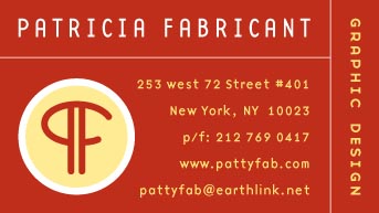
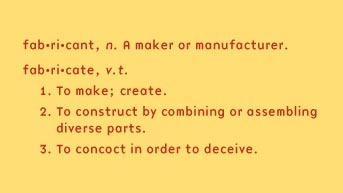
Didn't need to scan them - they were already electronic.
Now that I found a place to print them cheaply (but good quality) I feel more license to change them periodically. Altho I have 500, which should last me the rest of my life.
My friend Jason Prini sent me this link about how to make a business-card catapault. Impressive.

I’ll play—would love to see others’ work.
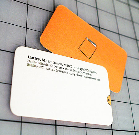

As an age of empires freak, I have to have a cardapult.

mark nice work
how long have you been in buffalo?
im in the falls and just getting out of school so was wondering the route you took to get where you are today
American Psycho business card scene. It had to be done.

I didn't realize how popular the pronunciation guide thingy was. I had designed some business cards for New York Organ Donor Network a while back that used a dictionary entry for the word “donate”. It was very well received, but unfortunately the project never panned out.
Mark, it looks like you could use a new cutting mat!

Some of my favorites from my collection
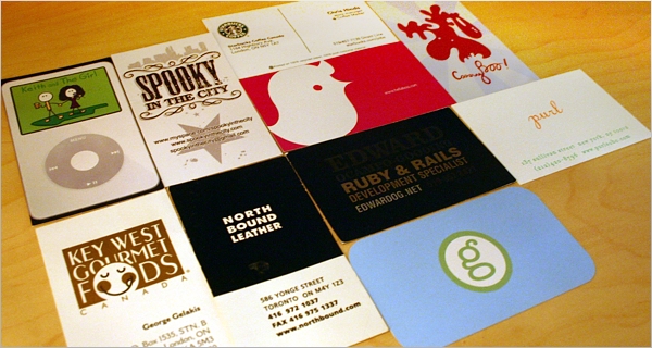
> Planetary gear calling card.
Wow.
I get tons of business cards, and whether they are drab and uninspired or brilliamntly designed, almost all share one quaslity: they are almost impossible to read because they are set in type so tiny it makes the fine print of an insurance policy compare favorably with the NYTimes Large Type Edition. There is, I imagine, nothing to be done about the people who design such cards but the people who print them ought to speak up to their customers--and maybe even suggest that the backs of the cards be printed in a very plain design using a typeface that scans readily.

My roommate's fresh-off-the-press cards. Olde-timey.
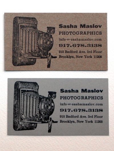
@ gillo: Why the two versions? Two kinds of stock?
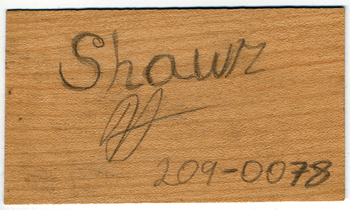
One of my favorites from my collection. Probably the best example of vernacular design I have ever seen. I was at the farmer's market one morning speaking with a cabinet maker. I asked him if he had a business card so he grabs a scrap of wooden veneer that he uses for inlays, pulls the carpenters pencil out from behind his ear and writes down his name and number. Efficient, environmentally conscious, appropriate and cost effective. And he didn't even need to hire a brand strategist.

LOL
Yes, the two versions are just different stocks. Actually most of the cards were printed on a nice thick white blotter-type paper, the others were just playing around. We liked the brown ones best (kraft-utility paper duplexed to my very favorite discontinued purple Wausau Royal Complements 100lb cover stock, which has nothing to do conceptually with the design of the card but I happened to have laying around, having recently been experimenting with the mysterious art of bulk paper lamination).
Aesthetic inspiration/encouragement found here—this site bearing witness to the long history of business card collecting...
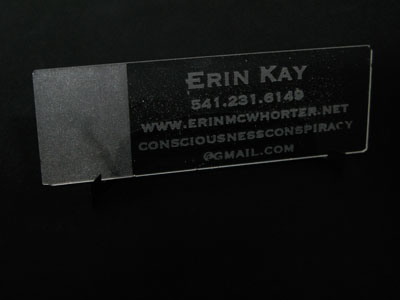
My other roommate's card. It's a glass slide...no she's not a scientist, just a sculptor. She admits that glass is somewhat impractical for a business card.
A real estate business card that Hardin designed for his wife. I still prefer #2.
This one may not seem like much, but I think it is an excellent example of letterpressing that doesn't take over the card design. Subtle, but still adds a ton of character.

I'm a big fan of "kiss impression" myself. Letterpress that
you can see from across the room is way too garish for me.
Here's my current card:
http://www.flickr.com/photos/48413419@N00/4121700633/
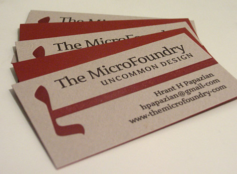
hhp
Do you have a shot of card's back ?
{An edit brought this post ahead one spot.}
Actually the back of the card in that photo is the solid burgundy you can see in there, between the three face-up cards. The face is a paper that was too thin for a business card - but I just liked it and wanted to use it. So then I found a thick paper of a matching color and stuck it to the back! I think the result was better than what I thought I was getting myself into... I also did this design on a thick ecru stock that didn't need a backing. On that one you can see a faint show-through of the impression. Which to me is embarrassing. So I also did it on a thin version of the ecru paper, and added the backing. I also did one on peach paper. The first generation card (see the other Flickr photo) I did on half a dozen different papers, but no backing.
This BTW is my favorite thing about letterpress: the process is very custom and iterative. On the fly you can try different papers, impression pressures, number of inkings*, etc.; and it's all under your hands - no mystery print shop decisions between you and the object that represents you. What most people laud about letterpress - that it's "organic", "irregular", "warm" and whatnot - doesn't do much for me. On the other hand, I do have this crazy theory that letterpress text does in fact enjoy greater readability than offset, due to the gentler edges of the letterforms (assuming nothing greater than a kiss impression).
* Changing your mind about the ink color is a pain though!
hhp
Ah, so you got the front laminated to another piece of paper. That's why I asked - how you managed the letterpressing imprint on the back :)
Alex, yes, it's two different paper stocks.
Luckily it's not too obvious from the edges.
BTW, if you want the back to have a color without
sticking two sheets together, you could always just
print the back with a solid color. You will however
get some color/texture variance that way.
hhp

These are my letterpress business cards. I designed them also as a small type specimen.
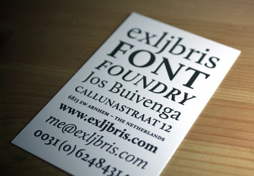
@hrant - I did the lamination for one of my cards before, but I decided to show my originality and glued Plike to Touche, two stocks that are way too different. The poor thing didn't take that lightly and once the cards were cut, they bent. They could be un-bent back to flat by hand, but doing that for 200+ cards was not fun.
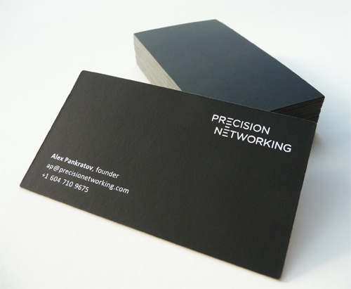
http://www.flickr.com/photos/37230902@N04
@Jos - Beautiful card. What's on the back ? :)
By the way consider submitting your card to cardobserver.com, it generates a respectably steady stream of traffic, plus you will be in a very good company there.
@ hrant: re the truncated lines on your last post, are you pulling a bowerbird on us?
zing!

What is
a bower-
bird, Cris-
topher?
:o)
…
-=®=-
Alex, I had some curling in mine. Fortunately I was expecting it so I tested things out with one sheet first. Luckily the two paper stocks were close enough that leaving the sheets between some heavy books -before cutting them- did the trick.
BTW, I love that dark gray of yours.
And the measurement lines in the logo really worked out.
Christopher: what truncation? You mean my manicured right rag?
hhp
What’s on the back ?
Nothingness ;)

Hi Hrant whats the type on your business card?
Patria, in various weights - one of mine.
And the logo is made from the Armenian "eh" in my Roupen.
hhp
hats off

@ Jos Buivenga:
Man that's a lovely business card!
Love it.
Great! Thanks.
Gary - thank you.
hhp

With all due respect pattyfab, your electronic card is quite badly dithered, seems a shame, you would be disappointed with that quality in print, I am sure.
That's just JPEG artefacts, in what must be merely a "preview".
(BTW, "dithering" is when too-few colors are intermixed to create
the illusion of more colors; this happens typically in GIF images.)
hhp
I may be wrong on the technical details, but I'm sure you see my point, it's not an attack! How the card is presented here in this forum is not reassuring. Agree?
I really had no intention of causing offense!
If you mean that she should have used GIF, I certainly agree. With two hues in there, you only need 32 individual colors (16 shades x 2 hues) to get an optimal rendering.
In fact GIF is typically very nice to type. JPEG is illiterate.
hhp
Indeed, you put it much better.
You know what I miss BTW? Websafe colors. It was this nice little craft,
getting optimal results. I guess it's like old-timers missing the exacto knife.
hhp
Mine's better…
:o)
-=®=-
To me, Paul Rand's card says: "I'm almost dead."
hhp
ILoveTypography.com guy's business card. Check out these beautiful edges !

Letterhead / business card designs. About 80 great ones here: http://www.youthedesigner.com/2009/12/22/83-crazy-beautiful-letterhead-l...
Another really well designed and letterpressed beauty.
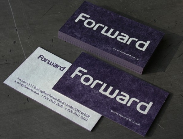
http://www.beastpieces.com/2010/02/forward-blotter-business-cards/
Is there a way to delete an accidental post yet?

@Christopher Dean: I suggest just editing the post to say something like “[Delete Accidental Post]” and an Admin/Janitor can come along and clean it up at some point.
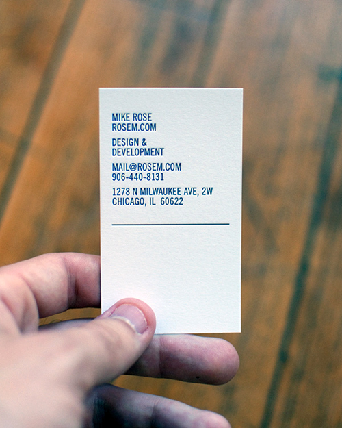
Mike Rose's Letterpress business card
Is there a way to delete an accidental post yet?
No, but keep trying.
:o)
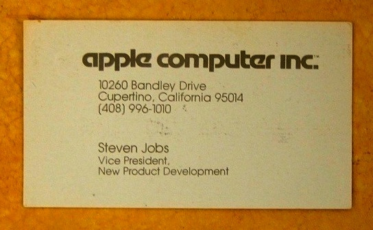
> paul-rands-business.html|Paul Rand's business card
I know that was posted months ago, but I want to mention that the black border was NOT part of his card.
His card was apparently photographed on a black surface, and the cropping gave the false impression that the card had a black border. Unfortunately that same misleading photo has been reposted on multiple sites.
You, guys, may want to check out this wonder - http://www.murmure.me/communication-design/contact-2.0.html. Thermosensitive cards.
If you're handing your card to somebody in person, you can connect using much better tools than a piece of dead tree: your voice and your face and your handshake. Plus having to have great handwriting is an affected burden.
hhp

Slickest business card I have seen recently was one that could fold into a plane.
Hi everyone,
I'm new to typophile. Here is my card.
Please feel free to give your opinion, critique and suggestions.
Ravi

Apart from the fact that it is an incredibly low res photo that looks like you made it in MS Paint, the only major things I could recommend is not putting your phone number sideways, and you might want to consider not using small caps for your name.
Thanks BrettR.
I created it in InDesign and the image is an export from the pdf file.
Actually on the side, in addition to phone no. it has email and portfolio link.
Do you have any particular advice reg using and not using small caps in the business card?


The use of small caps in this case clashes with the use of lowercase.
But I like the phone number sideways :-)

The kerning in 'Ravi' is pretty all over the place. Look at the space between R and a, a and v, v and i.
> Please feel free to give your opinion
Perhaps you should've looked around a bit more and not ask for a critique in a clearly unrelated thread. There is a whole section dedicated to the critique of designs.
Fourty five fresh new business card designs from inspiration feed.

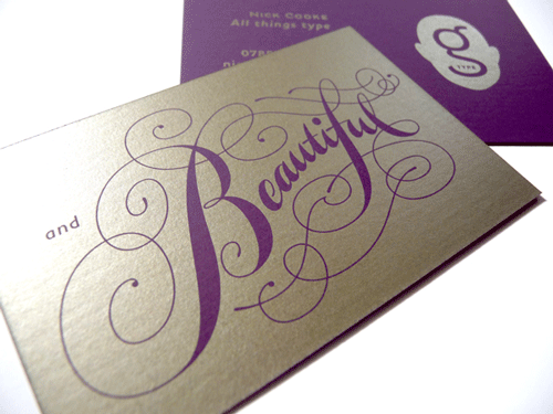
New card.

.

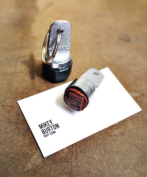
Does anyone know how they could make their own keychain BC?
Hmmm, or a portable car lighter thingie, so you can burn
your info into stuff! Hey, we are talking about "branding"...
hhp
Tis true.

Cool. Thanks for sharing.
> Does anyone know how they could make their own keychain BC?
Here is the company that makes those tiny rubber stamps:
http://www.crankypressman.com/printery_bindery/custom-inspector-stamp-pr...
> Is the traditional business card dead?
Every sales rep I meet still hands me one.
But definitely declining in use. Used to be that the first thing everyone did in a meeting was exchange business cards. I see that happening less and less. It's easier to exchange info electronically (such as by copying and pasting contact info from an email).
"Is the traditional business card dead?"
I don't think so. There is still a big demand for business cards, especially that it's easier to order from online printing companies. I believe that business cards still represent "official business" between and among professionals. Many changes on business cards, I can say, are found on the added contact information (email address, others have Twitter or Facebook profile names) and on the evolving designs, stocks and coatings.
Agreed. Saying “business cards are going to become obsolete now that we have computers” is about as absurd as saying “paper is going to become obsolete now that we have computers.”
They aren't obsolete now, but their use is declining, especially among younger people. Eventually we'll reach the point where using them will seem unusual or quaint.
That doesn't mean they'll disappear entirely. But I think that someday it'll be unusual to be handed one. Unless maybe they're replaced with a new technology, such as physical cards that are perhaps the same size as current business cards but can transfer their info electronically, or display a video presentation, or whatever, but still be cheap enough to be considered a throwaway product.
Ultimate guide to business cards from Cool Infographics.

The way information can transferred just changes the way we handle business cards, and since their shape/size/etcetera was dictated by limitations, which are slowly changing, we'll just have a different way of handling them. The physical aspect plays an important role, so it's not as if they will disappear. In this current-day pool of twitter-puke and facebook-ism you might even say the value of a business card has increased.
But you can play a lot more with the definition of what a business card is, since the contact information which is placed on it isn't that important any more. On my last exposition my business cards were A2 posters folded to a tiny size (using thin stock), which with digital printing was quite cheap. This way I could give someone a lower quality, but usable, piece of my work, which I must say, worked really well in gathering interest.
These days when I give "regular" people a business card
they become visibly impressed, which to me is a bit comical.
hhp
“On my last exposition my business cards were A2 posters folded to a tiny size”
Can you share a photograph of this? Sounds fantastic.
Here's a card I picked up at a little cafe last week. U nique indeed.
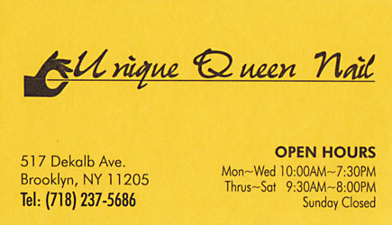
On Thrusdays they pull your nails out a bit to leave a nice gap.
hhp
For Christopher, here some pics. Mind you there aren't of the best quality.
The cards are a series of six, with each different posters on the front, and different projects on the back. Always listing the project placed on the poster, but also two other projects (usually it was one typeface/type experiment, one book, and one random work (a series of etchings or such)
Fully folded
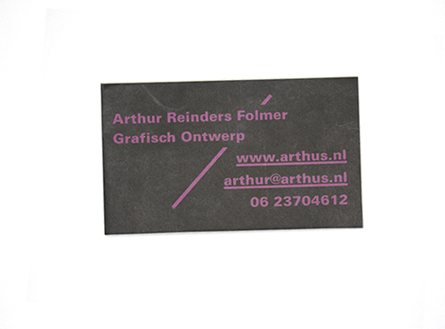
Folded out further
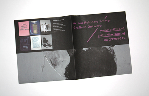
Back
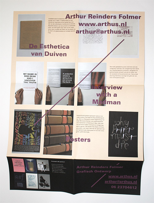
Front
30 examples of very original business card designs from New Design Blog (NDB).
30 typographic business cards for inspiration
Actually, most of these are crap.
Cool! What’s it do?
Carries owner's name and contact information, blinks pretty lights when touched.
Sweet. That’ll be $10,000 please ;)

Hello all - this is my first post on this forum.
This thread is right up my street, some nice cards on show.
I also have quite a collection of cards, but I only collect letterpress / foil cards - the cheap mass produced share-a-sheet cards hold no interest, no matter how clever the design :)
- David
Not even intaglio engraved ones? :)
> the cheap mass produced share-a-sheet cards hold no interest
Are you referring to ALL cards produced by offset printing? Or just ones from poor-quality print shops?
I think Letterpress1964 is referring to the Avery style perforated cards.
Yes you're probably right Chris.
@apankrat : What is this link referencing? It appears to go to an empty page about QR codes?
Well, it is in fact empty. Nobody uses QR codes except for designers designing them into their designer pieces.

The printer of those Rainbow cards deserves a round of applause.
Tim
“except for designers designing them into their designer pieces.”
Aaaa, now I get it. A joke. Good one!
> Nobody uses QR codes...
I think they're rather ugly, but I'm seeing them increasingly in signage, point-of-purchase displays, advertising, and occasionally in printed pieces (brochures, business cards, etc).
When used properly they can serve a good purpose. For example this summer I was at a garden center and many of the flowers had tags with QR codes so you could get additional info about them, which was genuinely useful.
I was handed a Colorplan 910gsm b/c last week by a designer - this is now the thickest in my collection - duplex dark grey and cool grey - blind embossed (debossed), orange and grey foils with orange edge painting.
I often produce cards on 700gsm, but I think the 910gsm is maybe too thick - just my opinion.
- David
Trajan always looks good to me...(artwork supplied by client)
This card is Colorplan 540gsm, duplex dark grey/pristine white.
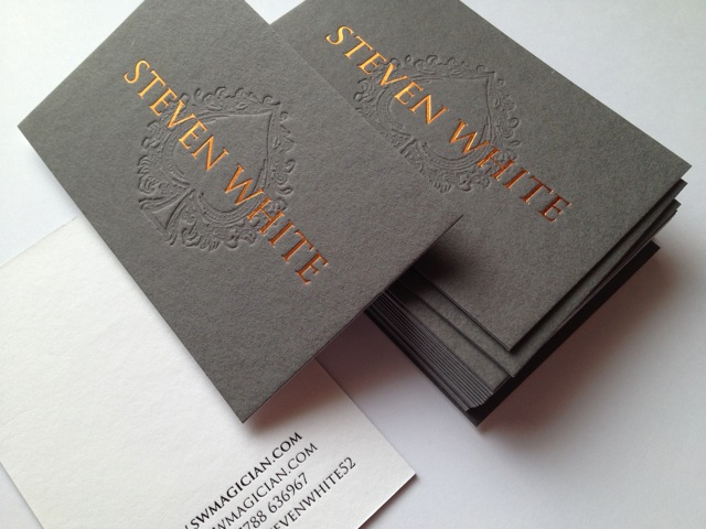
Hello James
Yes I was referring to all cmyk cards printed by the online print sellers - they print by the "share-a-sheet" process - normally 20 different cards at a time - which is why they're so cheap.
I'm afraid no litho or digital cards are collectable for me - imo they don't have any character, just flat and boring - no matter how good the design. Also the fact that they are all normally printed on the same standard 300/350/400gsm white coated card (plus matt lam) doesn't add any interest - although if spot gloss varnish is added it can give them a lift.
I find it odd that a designer spends a lot of time fine-tuning his artwork and then has it printed by the quickest/cheapest process so it ends up "just another business card".
Whereas all letterpress and foiled business cards printed on extra thick (540/700gsm) natural grained board are a piece of art that most people appreciate and will want to keep.
deeplyimpressed.co.uk/
Best wishes - David

Hey Chris I just found an vast letterpress resource called Lovely Stationary http://lovelystationery.com/ . Lots of business cards shown done out of material I'd love to get my hands on.
n.
Hi Everybody
Here's a card I printed recently - artwork supplied by client.
The card is G F Smith Colorplan Dark Grey 700gsm, with white and red foils + blind embossed (debossed) logo - I call this style "de-embossed".
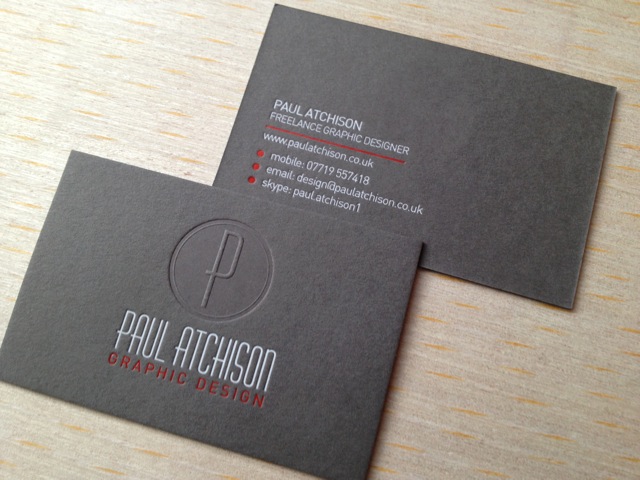
- David
Debosed is the design term, but in sculpture, what you did would constitute a bas-relief.
Maybe gold is a bit old fashioned but when used sparingly I think it looks really classy.
This card is G F Smith Colorplan duplex Natural/Dark Grey 700gsm - with black, white and satin gold foils.
Artwork supplied by design agency.
- David
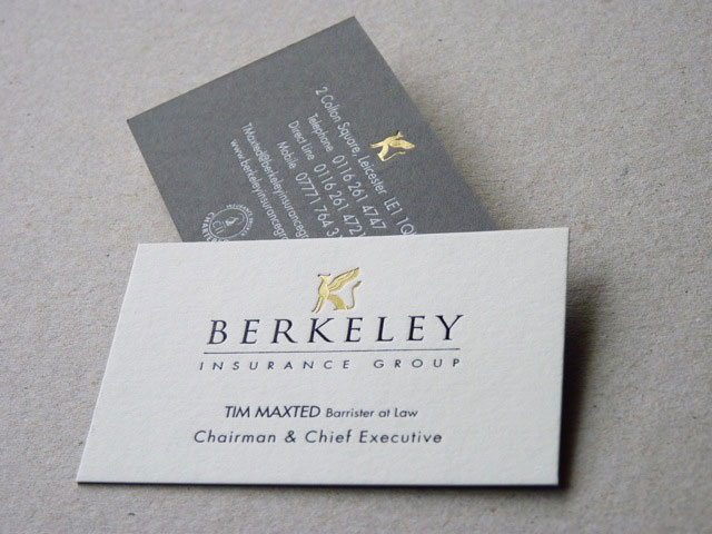
David, with all due respect. Posting your own work here looks nothing more than a self-promotion. These are well done cards, but they aren't exactly notable. There's plenty of card gallery sites that will be happy to feature them (carddsgn.com, cardobserver.com, there is a couple of great business card design groups on Flickr too).
Do you have the Flickr URLs ready to mind? That sounds like it could be a fun browse.
The Art of Business Card and The Business Card groups. If you are done with these and have some steam left, search "business cards" within Groups, there are some specialty groups too.
apankrat - thank you for your comments/opinion.
I had thought of asking Chris Dean if he minded me contributing a few photo's to HIS thread but assumed he would let me know if there was a problem.
I will not post any further photos unless Chris tells me it's ok.
- David
I only started the thread. Personally, I don’t believe anyone “owns” a thread. In an instance like this, I think it’s acceptable to post examples of one’s work. In fact, if everyone posted examples of their own work here, it could be quite rich indeed. But apankrat does raise a valid point. There are instances where people can cross a line into the realm of primarily self promotion. Actually, it’s more of a greyscale. In this instance however, I think we’re OK. As long as it’s something members are mindful of.
In an effort to keep this thread about business cards on topic I have started a new thread — Posting or promoting? — where we can discuss this in greater detail.
Business/name cards of famous people, including Isaas Asimov, Einstein, Disney, Castro, Jobs and Gates (older ones) -
http://www.flavorwire.com/364847/the-fascinating-business-cards-of-20-fa...
I have posted my card already on a thread where I asked for help designing it, but now that it's done I wanted to add it to the hall of fame here. I hope you like it.
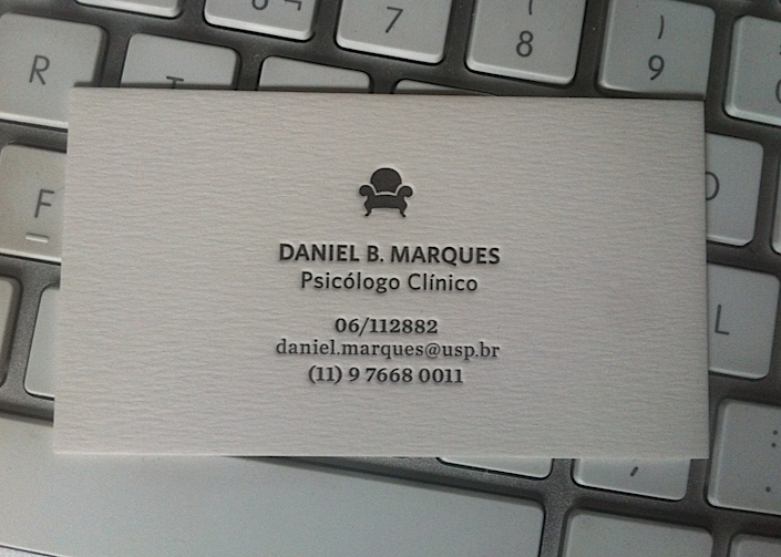
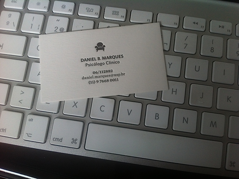
What stock is that?
Two sheets of Rives Tradition Natural White 250g duplexed together.
Very nice Daniel - perfect weight...
3D superhero business cards
Impressive, but they seem to be more like figures than cards. Where does the business card part fit in? Perhaps something got lost in translation?
I guess now that business cards are not [seen as] practical, they're free to become what letterpress has: sensationalistic.
hhp
Captured from web.archive.org on 25 Feb 2015. view this capture