Long time lurker, first time poster. I'm anxious to post my work and receive your gentle but honest critiques, so I will try to be brief.
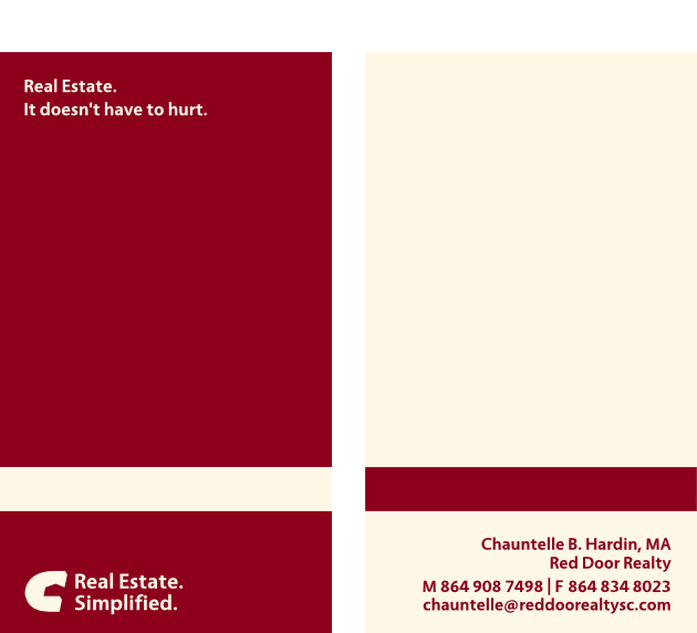
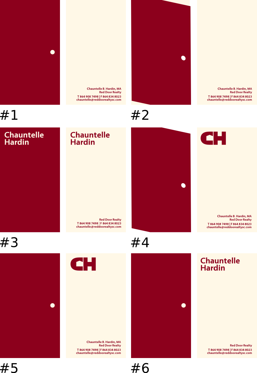
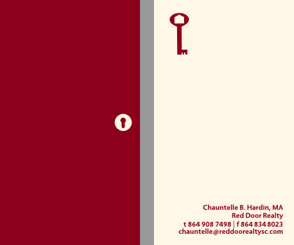
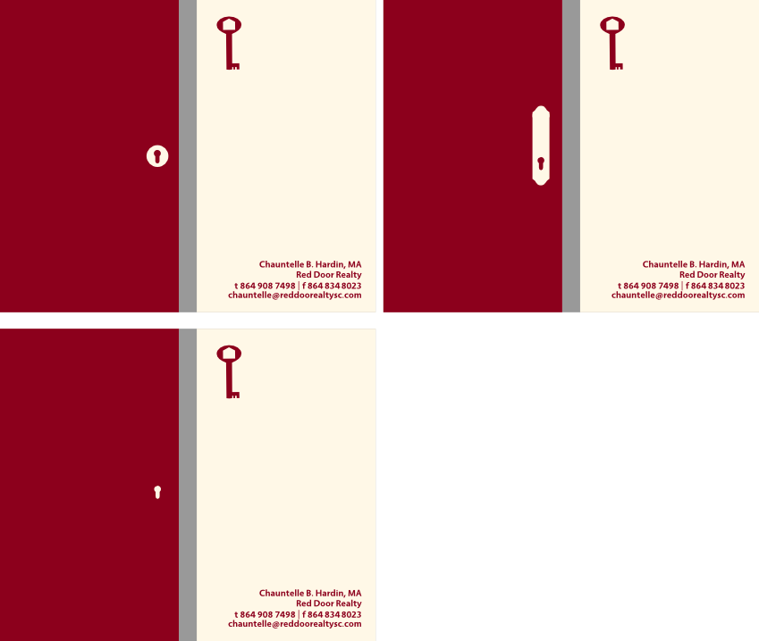
The attached image represents my latest attempt to design a business card for my wife, who is a real estate agent. I wanted her card to be direct and to the point (like she is), but also clean, polished, and professional in appearance. The logo on the reverse of the card is meant to be the letter "C" with (I hope) the image of a stylized house in the negative space adjacent.
Honestly, I don't think it's that bad, certainly in comparison to other real estate business cards I've seen, but not bad is not the same thing as good.
So, what do you think? Do I have something here, or should I throw it on the digital bonfire and start anew?