Hello all.
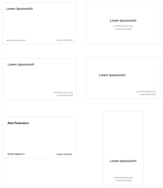
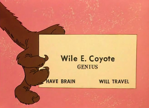
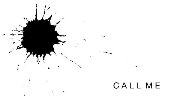
I'm having these printed this week and have finally settled on a design I enjoy, but I'd like another set of discerning eyes on it if possible! I do freelance, but I work in a number of fields, so I didn't want a card that played up one over the other. I also tend to write small notes to the people I exchange with, so having an airy card is important for that. So it basically became a matter of font selection.
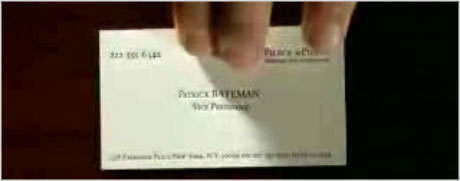
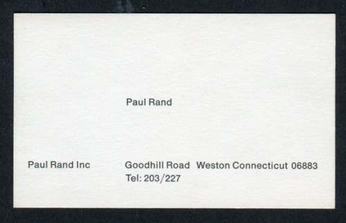
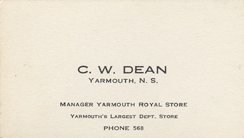
My inspiration were vintage cards from the 40's - 60's. Those 3 decades are obviously very different so I ended up narrowing my focus to a more late-50's/60's kind of look with ITC Blair and initially Futura which I swapped for Avenir.
Just curious if there are any glaring typographical problems with this design. Also, if you have any simple ideas for this kind of style I'd love to hear them.
Thanks guys.