
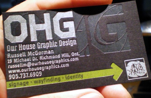
printing by AG Letterpress
printing by AG Letterpress

Ahhhh too many things!
penn

I have to agree with Penn. I assume Russell posted it here for an honest crit, so 'here goes':
I applaud the designer for reaching out and doing a card on black stock. It would have been stronger, however, as a simple 1/0 offset job, on a non-linen stock. Perhaps if it were without the house icon, without the second ghosted/textured (foiled?) background version of OHG, and without the signage•wayfinding•identity+yellow arrow combination. It may work as a showcase for AG Letterpress, and the various printing tricks they can execute. The design itself, however, has too many elements. The combination of extra elements, multiple printing methods/inks, and a textured linen stock combine to make this into a 'supercard'. Also, It looks like it may have been trimmed very tight on the left of the OHG. If those unnecessary elements were removed, and a simpler execution used, the designer could then take advantage of the extra breathing room. On a larger piece, such as a large outdoor sign, it might be possible to include all these elements, but on something as small as a business card, it's just too much.
Steve

Yup - while its all very clever from the printers point of view, for me its just too confused....
Too much in an 8x5 space
Disciple your design - pick one or just a couple of the elements and thin it all out.

I'm guessing Russell was just excited about it and wanted to share it.
It is always exciting to get something personal back from the press.
Miss Tiffany's right. Just a bit of show-n-tell. :o)
... It's sort of bit late for me to be asking for a crit, 'cause they've already been printed and paid for, but I'll go with "super-card". My day job calls for lots of tight and sparce so in my freelancing, I like to "cut loose" a bit where I can and this card works quite well for me in that regard.
There is, by the way, only one printing method involved. I lit the photo to high-light the impressions left by the press.
-=®=-
I'm just glad to be here!!!:)

Captured from web.archive.org on 15 Feb 2013. view this capture