
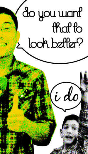
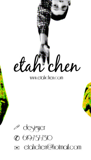
The one of the green guy is the front. the one with the information is the back. its a graphic design business card. what do you guys think? Thanks for any input.
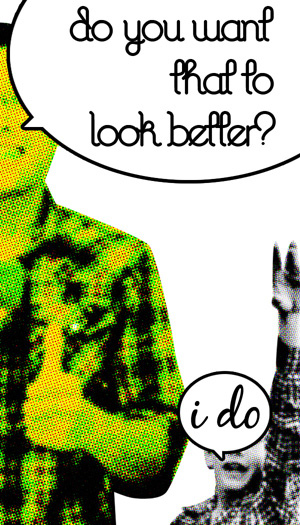
The one of the green guy is the front. the one with the information is the back. its a graphic design business card. what do you guys think? Thanks for any input.


Hi Etah!
The basic idea is kind of fun and leisure. However I would use some better typeface for "I do" and the backside of the card.
The info text (and symbols) in the bottom will scare clients away. Just make it as simple as possible. That would make a good contrast to the fun approach on the front. Had a brief look at your site and I think also that putting a title like "Artist/Graphic designer" would make a true impression. Well just my personal thoughts. Good luck!
Cheers
Thanks a lot Stefan. I don't really know what you mean by "better font". So I just chose another font. And you're right about making the back more simple to read.

I don't want to sound as if i am on my high horse but descibing what you do as a graphic designer as making stuff "look better" undermines both yourself and the wider graphic design profession.
Will
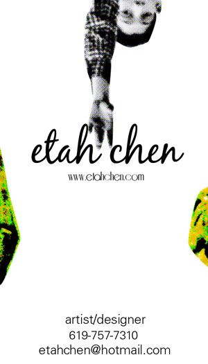
Etah, looks better now. A few things though. Why choose lower case "e" and "c" in your name? Also I would lower the name
a bit and put you web address at the bottom with the same typeface as the rest of the contact info. Maybe rise that whole
text a tiny bit from the edge. Changing the "hotmail-address" would also give more respect from clients.
Wlll, a bit of humour/irony can't hurt?! I often see graphic design as a "good wrapper". For example, if ha book has a terrible content, the client still would like to have a good looking cover. Now either you accept that and make a good cover or you say "no thanks". You (hopefully) have the choice of say no if, it doesn't fit your ideal, moral etc.Also, as a designer you will not be blamed for the content, product etc. You will be judged by your design. right?
When I worked with advertising, I could very well be judged in a broader sense because I was sometimes involved in the design, strategy, statements etc. And of course in some cases things can't just look good. Getting involved in a logo design means (for me at least) it has to look great, be logical, practical, economic and be able to work in a wide range of environment.
Cheers
/Stefan H

A thread about business cards. It's from a while ago.

Quirky. I like it, but I suspect that I am not in a majority. Also I can see problems with an initial impression it makes if someone is to pass your card to a third person. This card needs to be given away with a comment and in person. Otherwise its quirkiness may get mistaken for a cockiness.
Will, I know what you mean. I wrote that because that's how I feel about myself as a designer, not because that's how I feel about graphic design as a whole. I'm still a beginner, so I didn't feel I could say something greater than that.
I was just trying to put my personality into this card instead of making it serious looking. so maybe that's why it's quirky and cocky looking.
Thanks a lot for your help guys.
I changed the E and C into upper case, but is there really a difference? I just liked the lower cases better for some reason. And I didn't know there was something wrong with hotmail. But I guess I'll have to get a new email then. haha.

Etah,
I think it's pretty funky now. Head over to the printer ;-)
Cheers

@etahchen:
You can use this to set a Gmail using your own domain. Using a free email account look less professional nowadays.
Just some food for thought... I'd suggest slightly kerning your contact info. It's pretty tight. I'd also put something else besides dashes in your phone number. I dig the rest of it.

Sweet business card.

I like the concept, but...
What are the pukey green/camo blobs on the edges? I want to think they are part of the the shirt from the front, but I don't know.
Also, the b/w kid's hand is shaped more like a pig's foot. Maybe you can try finding a better hand?
I see way too maybe typefaces, especially for a business card. IMHO, this demonstrates creativity but doesn't showcase your ability to effectively use type.
Double Post. Sorry.
really? dang. i already had these printed! ahah. and yes, the green blobs are front the shirt from the other side. thanks for the suggestions sch2525
Captured from web.archive.org on 22 Apr 2015. view this capture