Dear Typophiles,
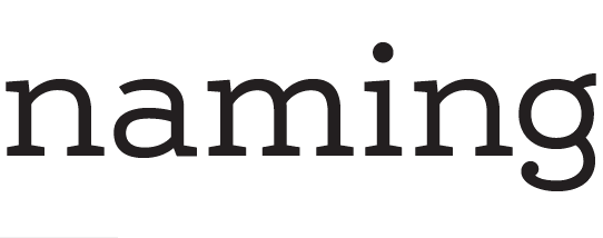
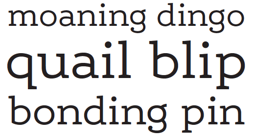
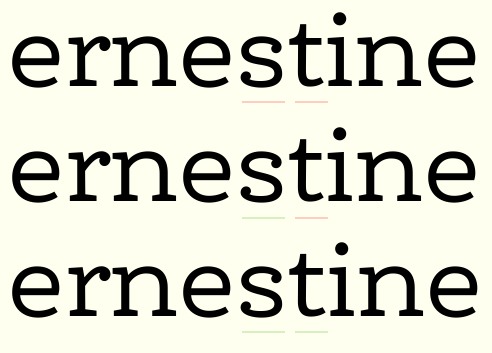
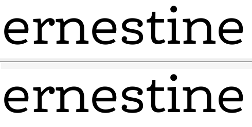
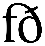
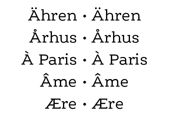
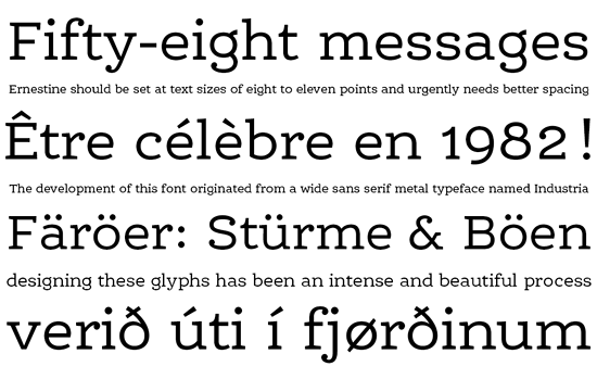
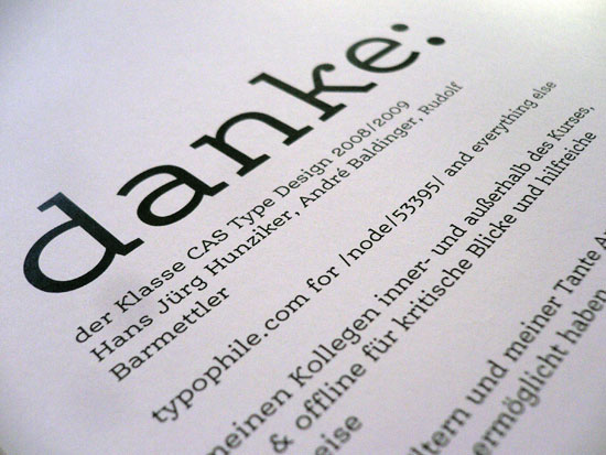
Here is the first version of the lowercase alphabet of my first typeface*, Ernestine**. Backstory is here.
* I have made a little family of bitmap fonts before, but I'm not counting this here because Curves Are Hard.
** See below.

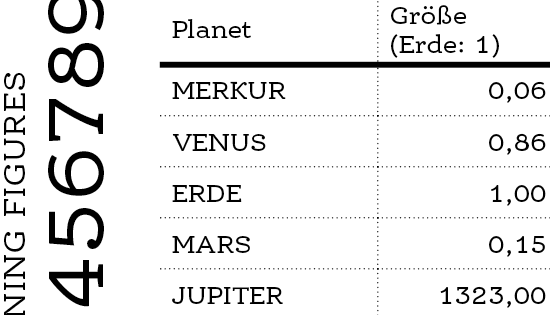
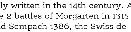
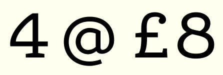
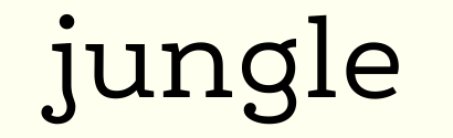
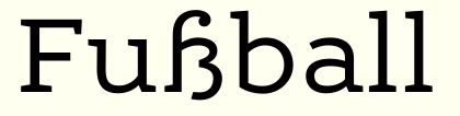
The intended use for this is twofold, my main focus being small text (thanks to Hrant, as well as Hans Jörg Hunziker in class, for bringing this idea to mind); the other, possibly, display: The plan is to first finish this "base" cut shown above, and then deduce two additional optical sizes from it, which will likely be of more practical use than the base itself. First, an optically corrected small size cut with more weight & looser spacing; intended point size is 3 to 8*. And second, if time permits, a display cut with less weight & more detail.
* Some quick experiments with ink traps, opened counters, and the like revealed that this can be surprisingly legible at 3pt, and rather comfortable at 4.
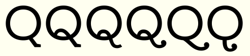
I'd be very grateful for crits, and any opinions really. I've been *very* immersed in this over the past couple of weeks or so, so I presume I don't really see most of the issues myself. (I must say a monoline typeface really seems to be quite a beast to try to tackle, too.) Spacing btw is still quite preliminary.
** Oh, and the name. Ernestine is the working title that I kind of got stuck on. I think it matches the feel of this rather nicely, but the word looks uh, suboptimal (very long, and somewhat boring) when set in the typeface, so I'm open for different naming ideas that would also look good. :-)
So, I'm throwing her out there. Please don't hold back, and don't be gentle for the sake of it: I'm trying to learn, and I'm wanting to actually make this usable.
—Nina