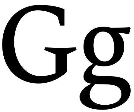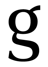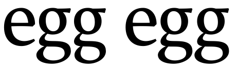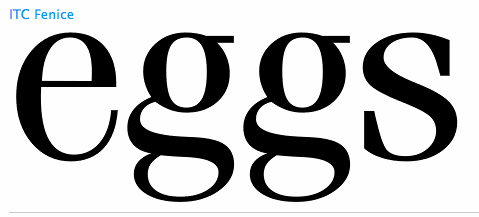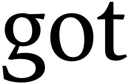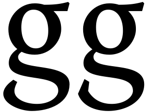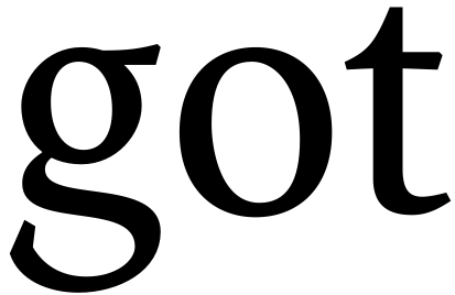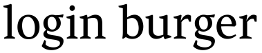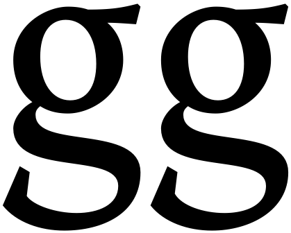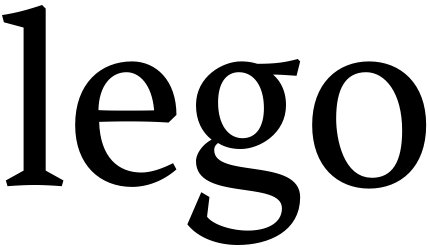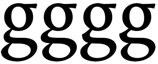
Hi, TPh's! This is a glyph I've been working for a while and need some help in deciding which trend to follow, if there's one:
---excuse me by relating the image---
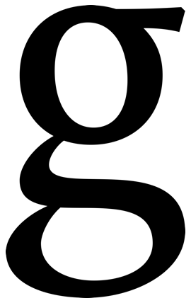
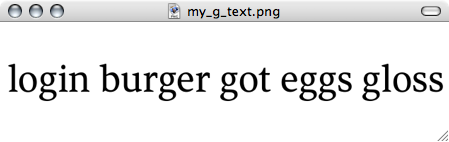
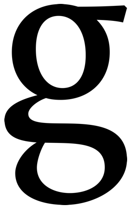
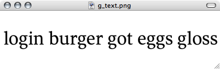
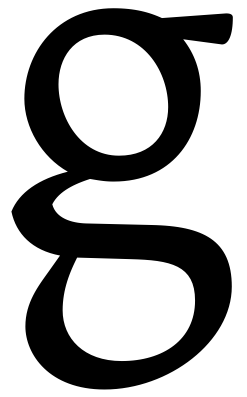
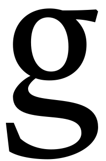
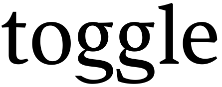
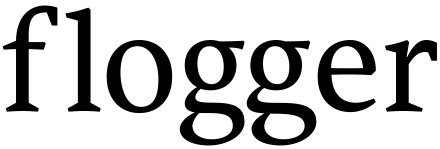
- #1 is the most 'normal', being the loop dominates the width
- #2 is a variation I like: the link is wider than the loop (which is narrower) by its left side
- #3 is similar to #1, except for the inflection in the link
- #4 –quirky– is similar to #2 (narrower loop), but the sharp link
Forgive the noticeable imbalances: it is the shape as a whole what I'm trying to choose among these.
I guess the upper counter and the ear work fine for a text font, even though I need to refine the contrasts and the overweight in junctions, but there'll be time to.
Here I post a PDF for better inspection.
MarS
| Attachment | Size |
|---|---|
| my_g.pdf | 2.52 KB |
| my_g-evolution.pdf | 1.61 KB |
| Typophile.pdf | 38.71 KB |
| KindaTest.pdf | 41.71 KB |
| SpringKindaTest.pdf | 42.05 KB |