Typophile

Eternal (New Thread)

This thread ran to 4 pages of replies and only 3 were recovered, so replies are missing.

Bendy

Hi

I thought fellow typophiles might like to see the attached pdf for the most recent iteration of my Eternal font.
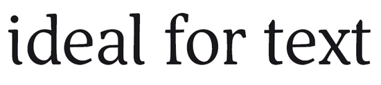
I think I'm finally beginning to crack the numerals: gosh they've been a struggle!

Please feel free to crit!

Specifically I'm not sure if the small caps are dark enough.

Also, I'm wondering about certain shapes: M, B, Q, T, Z, a, f, x, y, Ae and Th.

I realise some of the shapes are not merged where contours cross. Not sure what happened to the threequarters fraction. Also some of the accented characters need to be recomposed with the current base characters.

Is Uhorn allowed to have its serif missing like that? Does the contextual alternate r work?

Does the spacing work? What about the smallcap spacing?

Thanks a lot :)

AttachmentSize
Eternal Regular Feb 2009.pdf480.32 KB
Eternal Regular Feb 20092.pdf871.1 KB
eternaldummy.pdf409.78 KB
alternateajry.pdf416.59 KB

hmm..is it me or the PDF has some problems...some letters are missing.

António

Um, not sure. It works ok for me even when restarting Internet Explorer. Anyone else got problems with the pdf?

Hmm...now its OK.
Will check it and post my comments.

António

Looks really elegant. Very nice.

I like the Th. The leg on the M could be toned down a bit more to make it more consistent with the R or X, for example, but I do like it the way it is.

I feel like the baseline is a little uneven in the text samples--the v and w seem to hang down a little too low, for example.

Why Thai?

Thanks for the comments. I'll check that baseline once I've printed out some larger samples, and see what can be done with the M. I wondered if it was too narrow perhaps too?

Ha, I thought Thai would be a big challenge, with all sorts of combining marks and interesting shapes. Also because I can speak some Thai and know the language more than others aside from English.

I'm really enjoying where you've gone with this one... looks good! (was going to note the intersection issues but you already know those.)

I really enjoy. Looks very nice.
My comments go to:
The "i" terminal has a point in the middle (not sure if this is the correct english) that I dont find in any other terminal. Error or something that you want?
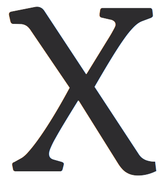
I also think that the "x" is to "broken" when compared to "X".
Congratulations!

António

This is quite nice! A rare combination of handsome forms and
compelling flair. The only lc glyph that's not working is the "t".
And I'd make the "Q" much more special than that!

I'll try to find time for a fuller crit.

hhp

Thanks Hrant; I know you're not keen on chirographic stres so it's great to hear your positive words! The way you mention the lc as mostly working makes me think I need to spend more time on the uc. Would you like a swashy tail on the Q? Is it the top of the t that bothers you?

Antonio, yes, I don't know when that point appeared in the tail of the i but it probably needs to get lost. Thanks for pointing out the x. I think I've pushed the limbs too far apart.

I'm making the smallcaps a few units heavier and increasing the sidebearings. Also I had lots of discretionary ligatures in an old version which need redrafting.

Thanks very much guys :) Please do give me your worst!

> The way you mention the lc as mostly working makes
> me think I need to spend more time on the uc.

Actually it's just that I spent more time (but not much
yet frankly) looking at the lc, and that's because the lc
is 95% of text.

hhp

Nice to see a new iteration of Eternal.

But you know what, I will refrain from posting any crits at this moment, so you can get some valuable ones from other poeple than James and me... ;)

This is looking pretty good.

Two small things jumped out in a first look:

1) Seems there are overlapping paths for the crossbars of t and f, and perhaps their ligatures. This is visible at some zoom levels in Acrobat 9 when the overlapped sections reverse out.

2) To my eye, optically the S and s seem to lean just slightly to the left. Given the traditional Roman forms being used, I'd think they should either be balanced, or if they lean, go ever so slightly to the right.

Cheers,

T

Hi
Jelmar; yes :) good to see at least you're still following the progress of this one.
Thomas, also yes. I have quite a lot of overlaps which I should have merged before posting the pdf, sorry!
I'll take a look into those Ss and push the top over a unit or two.
That's once I've fixed the x, which I've ripped to pieces right now...

I've changed the top of the t, added some subtle curves to the x and sheared the s slightly.

't' is much improved.

'x' still is very distracting - in fact the curves (though handsome in themselves) only add to the torquing that comes from the offset not aligning optically.

I'm not sure about the 'A' crossbar not connecting. I fear that reduces the versatility of this font quite a bit. ('B' & 'R' are fine on that score, I think.)

Tail of the oldstyle '3' looks kinda limp!

Should the lead-in serif of VXY be flatter (like that of UW)?

t...yes since starting on the italic I've been able to work backwards and use some of the features there to make the regular work better. That was the original t but obviously needed a rethink. Good.

x...oh dear! I wondered why it still looked like the arms were too far apart even though I'd brought them inwards. Think I need to come back to this one!

VXY, I don't know. The serif needed tension with the heavy stroke. On those letters the stroke is rotated so the serif seemed to fit best rotated too. I'll have another look at that.

Thanks for the comments.

Ben,
your font is very nice, charming and comfortably legible.

Texts are easy to read and vibrant, so one experiments the delight of reading by –paradoxically– ignoring that the type face contributes or, even better, produces that feeling.

I agree with Craig about the crossbar of the uc A (and probably the same for the ∆), and the optical disalignment in the uc/lc x –glyphs which however I loved, the same as delicious D, R, U, V, W, Y, Z, n, v, w, z and old style numerals–; I think the thin stroke gap (very noticeable at a large size) should not exceed one quarter of its width.

I also believe like Hrant, that your Q could be more quirky; I enjoy the correction made to the t: now it absolutely fits the elegance of its sisters.

Nevertheless, your work is really amazing for both brain hemispheres.

Let us know when it's for sale.

[Just a minor thing, beyond the design: the æ/Æ and Œ/œ are not exactly ligatures in the original meaning of the word, but distinct letters; by the other hand, the German ß is a real one –long s over round s–, with the notable fact that the ſ (long s) does not exist anymore in German.]

MarS

PS: Next time, merge outlines, please; it's a shame not to enjoy so wonderful creation because of bad PDF rendering. BTW, at some scales, Acrobat seems strangely to miss some characters, as António told before.

I suppose it'd also be helpful to address your questions!

Specifically I’m not sure if the small caps are dark enough.

They do look very slightly light in color, but they also seem large to me, so adding weight might make them too loud. It's kind of a tricky question with this font, because your lowercase is (I think) more condensed than your uppercase: should the small caps likewise squeeze together like their short brethren or should they retain more typical width like their cap antecedents?

Also, I’m wondering about certain shapes: M, B, Q, T, Z, a, f, x, y, Ae and Th.

B, a, and f look great to me. Those other caps aren't easy to find in your text setting so they're harder to judge.
More space between the T-part and the h-part of 'Th' might be helpful.

Does the spacing work? What about the smallcap spacing?

Letterspacing looks too tight all around to me (maybe smallcaps especially). Difficult to read, though, because I think the wordspacing is too large. This in turn is difficult to judge because you have fully justified the paragraphs, so maybe that excess space is in part due to the layout stretching the lines. But even in the most crammed line, I think the letters looked too bunched and the space between words relatively too large. What's a rag-right paragraph look like?

Hi Marcelo, thanks for your positive comments! I'm glad you like my font!
I did wonder about the crossbar on A, but initial comments when I posted the start of this font were positive about the disconnected stroke, so I left it. Perhaps it needs to evolve again.
It's interesting you like the D as that was one that didn't really seem to work for me. What do you like about it in particular?

>I think the thin stroke gap (very noticeable at a large size) should not exceed one quarter of its width.

Do you mean I should reduce the gap in the B and R by a quarter or to a quarter of its current width?

I hadn't thought of this as saleable! I wouldn't have a clue how to do that (it's my first font) so when I'm nearer completion I'll need someone to help with that I guess :)

Yes, I did wonder if Ae and Oe should count as ligatures. I'll move them into the latin extended set and get the sharp s moved into the ligatures section! Thanks.

Sorry sorry sorry about the overlap problem. I like to keep the outlines un-merged until I'm sure they are finalised!

Can you tell me what outlines are missed in Acrobat (I haven't noticed any problems) and I'll check the unicode indexes.

:)

Craig, thanks :) I'll set block text in all caps and mixed case rag right later on.
I'll have another tweak of the Th. I was playing with a rather nice gj ligature as well. Hopefully there is some language where that can be used!
I just noticed yesterday the word spacing too. Good to have my thoughts confirmed. I'll knock a bit off there.
Thanks,

Be careful with experimental ligatures - once you get going you can really generate a logjam of custom characters to draw. ;-)

should the small caps likewise squeeze together like their short brethren or should they retain more typical width like their cap antecedents?

That's a good question, Craig. Looking at the PDF, I think the small-cap A is definitely too wide. I think condensing the small caps might just be what the doctor ordered.

Aah! Yess! Interesting solution: making the small caps more condensed will give text more melody I think. I was sticking to the convention of widening the proportions for small caps but I think they should be the same proportions as the caps or perhaps a bit narrower!

Craig. Yes. A while back I created a lot of useless and ugly ligs which have since been deleted. I promise I'll only keep the pretty ones! Yesterday I was puzzling over f with igrave and iacute; that's a tough call!

This has charm and some nice drawing. I think it has some craft problems, though, that need to be resolved to make it work in text.

The verticals are, I suspect a little too light. And for sure the spacing is too tight for text sizes. When I zoom in on the 'in' combo, for example, I see that the space between letters is only 80% of the width of the n counter. In Minion, which is a tightly spaced text font, the space between two n's (stem-to-stem) is 95% of the width of the counter--actually the amount that Walter Tracy recommends in his great "Letters of Credit".

Handling the widths of your mnh is tricky with the hooked right foot. I wonder if the h or n are a trifle wide. The m to me is definitely cramped. It is hard to judge these things, though, with the letter spacing so tight.

The light verticals go with the tight spacing to make this very good large--though even there it could be a little looser. But the tightness really hurts at text size.

9-12 point is really a different animal than big, and what it looks like best on the screen will deceive you about what is best small.

Hi William, I noticed that as soon as I printed it out the other day! Perhaps this is more a display face after all.
I think I've been looking too long at it on screen and not enough in print. I think the serifs may also need strengthening for small text use. I wasn't intending to do optical sizes so it looks like I have a decision to make!

Do you know the percentage letterspacing vs counter width for the display cut of Minion?

I'll redo the spacing completely. It's good to hear there's a bit of a convention as I was trusting just my (amateur) judgment so far. I'll leave the hnm as they are until the spacing is fixed.

This is exactly the feedback I need, many thanks.

I think overall it is a great, legible font. It reads well and I would have to say you've done a great job with it! What plans do you have for distributing it once you are done with all the tweaks?

Thanks for the feedback. I'm taking one step at a time :) The next step (after getting the spacing and glyphs right) will be learning how hinting works, wondering what else needs to go into a font, and finally working out what this font is good for and getting advice on marketing and distribution (if it turns out good enough to sell). The other thing is that I'd want to have at least the italic ready as well before thinking about licensing.
Fonting is a very painstaking process. I suspect there's still a whole lot of work to do on this!

"I did wonder about the crossbar on A, but initial comments when I posted the start of this font were positive about the disconnected stroke, so I left it. Perhaps it needs to evolve again."
—Nevermind. I just expressed my personal taste.

"It’s interesting you like the D as that was one that didn’t really seem to work for me."
—To my eyes, the lack of the bottom serif makes it originally exciting; in context, it keeps its own balance and elegance. I don't know if you kerned it, but in your sample text, the wide space between the D and the o makes me tend to read "D own" instead of the right word. But probably it's because the entire spacing is very tight (BTW, I'd reconsider this).

"Do you mean I should reduce the gap in the B and R by a quarter or to a quarter of its current width?"
—I was talking about the optical correction in the X/x (the offset between upper and lower segments in the thin stroke).

"Can you tell me what outlines are missed in Acrobat (I haven’t noticed any problems) and I’ll check the unicode indexes."
—I guess it is neither your PDF nor your font indexes, but a random bug in Adobe Reader rendering. Mac OSX Preview hasn't that problem.

If you don't want to sell Eternal, you probably wanted to distribute it among a limited scope of supporters ;-)

MarS

I really agree that the X thin stroke offset is much too large.

T

> If you don’t want to sell Eternal, you probably wanted to distribute it among a limited scope of supporters ;-)

:)
Yes, why not?! Do other people here do that?

I was considering joining up all the disconnected shapes (ABR) as alternates. That would cater for different tastes.

How's this x?

I feel the curvy stroke is somehow distracting...
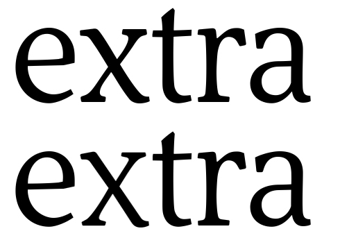
Look at that simple experiment (the upmost image is your original):


Probably it is just matter of slightly shifting the almost linear stroke:

(Sorry, don't wanna be annoying on this)

MarS

Interesting. I did a little experiment measuring glyphs in pdfs...

I've compared the letterspacing with the counterspacing for a handful of fonts as William noted above.

The tightest spacing is in Fedra Serif Display, where the space between two n's is just 63% of the space between the n's legs. Palatino comes in next at 72%.

The loosest spacing is in Enschedé Collis, which is 102%.
Melior LT comes in at 100%

A modern display font (Guardian Egyptian Display) turned out at 77% and fonts with condensed proportions seemed to have wider spacing: Newlyn's Verona and Joanna MT had 91 and 93%

Fonts like Type Together's Karmina, Underware's Dolly, ITC Stone Serif, and Guardian Egyptian Text had ratios of 85-87%.

The median was 89%. Fedra Serif text, FF Olsen and Utopia have this ratio.

Conclusion:
For a text size, I think I'll aim for a 90% ratio of spacing to counterspace, or another 20 units on each side of my n, and see how that looks as a starting point. Putting in the extra space means the serifs look stumpy and will need lengthening.

I'll keep developing the existing font as a display cut and come to the text size afterwards (if I don't grow tired of beziers!)

Thanks Marcelo; I'll try that. My reason for the curves was that the other letters which I like best have slight curves and modulations in them and the wxyz looked a bit flat and mechanical for a humanist-influenced font. I might try also just one curve continuing on both arms rather than an opposite curve on each arm. I'm finding this silly letter really hard, just like o was initially for me.

It's funny because they're essentially very simple shapes and you wouldn't imagine much could go wrong with them! Oh, how many things about type design seem so simple before you start actually developing a font! :)

Ben, I think what works best as far as letter spacing is also affected by how thick the stems are, and how wide the font is overall, as well as the serifs--and the intended size of use.

One way to proceed is to print it out at intended size, and then try tracking it out and in, and see what works best. Because the different factors interact in ways that nobody fully understands, you just need to try variations and use your eyes any your own personal judgment. This is the approach Briem recommends on his web site, and I think it's right.

I would also recommend comparing thickness of stem, normalized for x height, with other faces you admire, and also play with this in your own font, with a limited set of letters, and in print-out look also at the affect on letter spacing.

How wide your n and o are, the weight of their strokes, and their spacing is a lot of the 'DNA' of your font, so I agree with Tracy that it is worth taking time over to make sure you are happy with it.

Got it!
The problem with the initial PDF is that there are some isolated outlines embedded among the text –I mean, outlined text, instead of the font itself– that cause Reader renders unexpectedly; it is probably related to overlapping unmerged outlines within the font.
I apologize myself for distracting from the core point, but I thought it is worth to learn a bit from “artifacts”.
Thanks,
MarS

The median was 89%. Fedra Serif text, FF Olsen and Utopia have this ratio.

For a text size, I think I’ll aim for a 90% ratio of spacing to counterspace, or another 20 units on each side of my n, and see how that looks as a starting point. Putting in the extra space means the serifs look stumpy and will need lengthening.

I’ll keep developing the existing font as a display cut and come to the text size afterwards (if I don’t grow tired of beziers!)

As some were saying in forums elsewhere (about other fonts/types), if you intend to develop this as a text face, I wouldn't be afraid to lean a bit towards tighter spacing.

I had the opposite reaction in terms of spacing from your sample: that if anything the spacing was too loose. I think there was some unevenness or kerning work to be done with the spacing, but I wasn't left with a global impression of it being too loose.

I'm not sure what to say about the x. I like the curvature, but can't decide if I like it more than the more linear route.

> I had the opposite reaction in terms of spacing from your sample: that if anything the spacing was too loose. I think there was some unevenness or kerning work to be done with the spacing, but I wasn’t left with a global impression of it being too loose.

So, first you find the spacing too loose, and then you wasn't left with the impression of it being too loose? ;)

At any rate, a text face will pretty much always need looser spacing than a display face. So since this face was -- as far as I know -- intented for text, the spacing shouldn't be too tight. I think it might either be just right or slightly too tight as it is right now (I'm talking about a few units here). But I'm not an expert on spacing, really. :)

So, first you find the spacing too loose, and then you wasn’t left with the impression of it being too loose? ;)

Sigh...it's been a long day. So I'm losing my capacity for language.

At any rate, a text face will pretty much always need looser spacing than a display face.

I guess there's text and then there's text. Who knows? It's a subjective thing in the end. I like text tighter--I think if it's spaced too much, you lose a certain amount of "chunking".

I agree with you, though, in that it's just about right now overall, with a little bit of wiggle room.

very nice!

> It’s a subjective thing in the end.

You could say it's subjective in the display realm* but when it comes to text you can't let the counters overpower the interletter space. Based on the current preference for tight display setting, it's entirely fair to say "text fonts need to be tighter than display fonts".

* One could imagine a future where people prefer loose titling.

hhp

i often feel that when i read books from the 60's (mostly space opera set in Times or Plantin) they are set quite tight, tighter than book today. is that often the case?

but when it comes to text you can’t let the counters overpower the interletter space

Right--I see what you're saying with that. I guess the issue for me was that, overall, the spacing seemed about right, but there's some unevenness--some of it seemed too tight, but other areas seemed a bit too loose (e.g., "Do" and "ow", as Marcelo points out). Because the more spaced pairs were dragging my gaze, the idea of increasing the spacing equally throughout didn't quite seem right to me--maybe redistributing or something.

i often feel that when i read books from the 60’s (mostly space opera set in Times or Plantin) they are set quite tight, tighter than book today. is that often the case?

I don't know. That's an interesting question. I pulled a pseudorandom sample of books off my shelf. I first, I thought no, but comparing them, the older books do look a little tighter.

> it’s entirely fair to say “text fonts need to be tighter than display fonts”.

Hrant, do you mean looser?

I guess the spacing ended up looking tight because I've read a lot of Plantin and Palatino!

This seems more subjective than I thought. I think what I'll do next is print out at various sizes up to say 144pt, play with the tracking and see which size the font shines best at, then optimise the spacing and stem widths for that. I'll have to trust my eye in the end.

William, yes, I'll look at stem widths too, for the same set of fonts.

I haven't done any kerning yet.

Note that Palatino is really a display face; Aldus is its text companion and--just checking--Aldus has wider letter spacing.

The only real rule here is that you need to look at your design in the final intended size and medium (print, computer screen, phone). Then it's your font, you decide. And next of course customers decide if they want it.

>> it’s entirely fair to say “text fonts need to be tighter than display fonts”.

> Hrant, do you mean looser?

Yes!! :-/ Sorry.

> Palatino is really a display face

Indeed. A very good point, usually lost.

hhp

I hadn't realised Palatino was a display font, given its prolific (mis)use, and thought the other fonts in that series were for titling (E.g. Sistina/Michelangelo).

For a display font, Palatino makes a really comfortable read for longer text.

I'll get back to the spacing now...

Titling and display are kind of overlapping categories. Michelangelo and Sistina are caps-only. It's tricky identifying Palatino in text, because Aldus has forms so similar, you can mistake it for Palatino. It is subtly but decisively changed for text.

I find the shape of the a in Palatino very distinctive. Will certainly keep an eye out for Aldus though now!

Talking of stroke offset, what about the 8? You can also see in the pdf (the bigger offset is in the lining figures and the narrow offset in the oldstyle ones).

Is it falling right slightly or is that me?

Display faces -like Rocky- don't need to be readable; although they do need to be legible, that's a trivial challenge. What they really need to be is aesthetically attractive - which usually means pretty. And superficial formal harmony (things like descenders that are equally weighty) is a long-standing benchmark of prettiness. But that can change (which means it will). Anyway, such harmony becomes a necessary evil of sorts when it comes to readability; it delivers nothing useful, functionally.

The lower you go under the radar of reader consciousness (immersive reading) the more you can drift away from this shallow modernist harmony, and move towards a much deeper, fruitful harmony. Ergo: a text font should have tittles that are a bit too big, descenders of different shape/weight, etc.

> evenness of color needs to be one pole of the design problem

What I was trying to say is that evenness of color is not really a pole at all in the readability realm. I believe it's an absence of divergence; it is divergence that needs to be controlled, and evenness is a byproduct of pulling back divergence by a certain amount.

hhp

evenness of color is not really a pole at all in the readability realm
Really, so absolutely? Wouldn't patchy color distract from the immersive experience as well?

Ben, re the eszett: I think the tension of the outer/inner contours is pretty exciting, though I'm still not sure it needs that rightwards "flare".

Yes, you do have to control the "patchiness". But to me even color is a byproduct and not something to directly strive for, because it doesn't give you anything except prettiness, which is largely moot in text setting.

hhp

Well, Hrant and I have had this debate before, and I don't want to belabor it.

I learned about the importance of even color particularly from Doyald Young's book Fonts & Logos. And I came to the conclusion that uneven color is 'noise' that distracts from detection of letter features, so it is important to readability. Thus it should be one of they key guidelines in type design. All the most widely used text types have very even color--and, I believe, in every script.

Rocky is a headline and titling face and as such readability is important. For other uses readability may be lesser priority for display type, but I think for this usage it is important.

There's some interesting ideas here, thank you.

When I suggested bringing the y more in line with the j, I was thinking that the black blob on its tail was too distracting. I don't intend to make the shapes the same and not even necessarily the weight the same, as I think there can be a good tension between contrasting elements. For me at the moment the y's tail makes the y a bit bottom-heavy on its own and distracting among other letters as the blob is below the baseline.

Hrant said >Totally even color isn’t an ideal, it’s a disease. Evidence? You don’t set a book in a monoline.

I think overall colour of text can (should?) look even, even in a font where the individual shapes are contrasty. I don't want to see books set in patchy text either. The best way it seems to me is a nice balance between where the contrast between and within shapes creates visual melody but the unity of the font assures readability (or do I mean legibility?) That goes back to Nina's point about the soft/hard elements of the particular shapes I'm using. I want distinctive but not distracting.

>Yes, you do have to control the “patchiness”. But to me even color is a byproduct and not something to directly strive for, because it doesn’t give you anything except prettiness, which is largely moot in text setting.

I agree, and I wasn't striving for the y and j to match, just look like they can talk to each other :)

Rocky seems to achieve even colour, although the weights of serifs are different. Hopefully I can achieve something like that in my (text and possibly display) font if I'm clever!

As a practical matter, I think if you look at your j and y in words like "jump for joy, happy" you can judge more easily. I think visually the terminals need to look balanced in the word, as well as in relation to the other parts of their letter. But you want liveliness, or "dance" to use Hrant's nice term, also. That's what Rocky does so well--gets both.

Right. Please tell me what you think is best to do with this r.alt. I developed the outy ear first but then made the vertical one to fit better. Currently I have an Opentype calt substituting the outy eared r whenever it comes before an a, c, d, e, o, q, eth and space.
I am concerned this might give weird results in words with both varieties. Or perhaps not. I've seen other fonts where double letters are substituted through calt with slightly varied shapes to reduce 'visual stutter'. (E.g. an ff lig usually has a wider second f and an ll lig can have a taller second l.)
Is the difference distracting or enriching?
Should I choose just one r or leave as it is? Or something else?


Who thinks what?

Your vertical one looks a little narrower, which might be a slight problem with rhythm. Looking at it printed out at small sizes will help you decide, as some things are more evident at small size (and some less, of course.)

That looks like a nicely sophisticated solution, with the variety doing nothing but helping (for a text face). I might suggest an innie beak (better than "ear" btw) as an alternate companion for the outie, but that might be a bit pushy in "rr" pairs.

Can we see the "rn" for both variants (and maybe for an innie too)?

> Your vertical one looks a little narrower

But that is part of the solution.
BTW, you might vary the rightward foot serif length based on the variant.

One other thing: when/if you make a very dark weight you might discover than the outie no longer works (because the darker the weight the tighter the spacing).

> rhythm

No such thing in a text face.

Or rather: in a text face rhythm is not so superficial.
It might even be invisible - or better put, subvisible.

hhp

More:
- I'd try bowing the thick diagonal in the "M".
- I'm realizing that the "c" might be slighly too narrow (although you don't want it to feel like an "e").

hhp

Would your answers be different if this was a display font?

I wonder if the outy one needs less weight on its beak/snout. I hadn't thought about an innie one. Wouldn't it look like it swallowed its tongue?

Here's your rn both ways.


Gah! I've overkerned the ke.

Ok, so this is what Nina suggested for the cap Sz (the one on the right)

It looks a bit naked and seems to need the slight flare on the top corner to balance with the other serifs on the cap height?

Looking at that sample, I'm wondering why you even need a straight version of the "r" at all... I'd keep it for the display cut.

> Would your answers be different if this was a display font?

Totally.
In a display face you either do no variation or dramatic variation. The subtle variation that can be fruitful in a text face usually looks like a "mistake" during conscious observation.

> Wouldn’t it look like it swallowed its tongue?

:-)
What is this, a zoo?

Dunno, I like it. And it lets you get quite close to the rounds in dark weights without neutering the "r" (which needs all the help it can get).

The cap eszet: I prefer the first one, but I'd keep working on making it more integral, instead of an obvious fusion of two shapes.

hhp

It looks a bit naked and seems to need the slight flare on the top corner to balance with the other serifs on the cap height?

I agree (though I'd want to give due deference to a German reader on that, too).

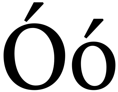
Here's some Icelandic with the thorn and eth. Previously the eth was way too short for unknown reasons, now it reaches the ascender line. Are the shape and colour ok?


And how is the spacing looking?

Not what you asked about, but:

- Is the e-part of the ae overwhelming the a-part? Would more similar shares of the glyph's width be appropriate? (I'm no expert on this character as you well know from my critique thread!)

- Hadn't noticed your accents before - can you soften those up? They seem out of character to me. (Or are you thinking to heighten the fluidity of the letters through contrast?)

Hm, re the cap eszett, I'll have to agree the second one seems a bit weak-topped. Though I still think the first version with a heavy vertical *and* a rather heavy horizontal, with a slim "corner", looks odd weight-wise. :-/

I like your "r"s, though I'll second the call for an "innie". Actually the r/o combination Hrant posted is probably my favorite detail about Patria. Putting an "r" like that next to a round shape and watching it click is a pretty amazing experience.

Oh, regarding your most recent sample, I think the eth looks pretty well balanced (although I'm not sure if people wouldn't expect the bowl to fully reach the x-line).
On the other hand (also not what you asked about) the horizontal placement of the accents seems a bit off - I'd expect the accent on an iacute to "start off" roughly where a tittle would, if that makes any sense; it seems shifted to the left, as does the one on the aacute. My Icelandic is rather poor though so I'm probably not the best person to ask about this.

Eszett: Here's a rough idea (curving the top-right down a bit, with a lil' flare that isn't quite as emphatic). Feel free to disregard; I hope you don't mind me putting up a quick comp:


(Would obviously need more overshoot.)

Ah, that's nice. It's a good shape in itself, though to me, it still looks weak next to the other shapes with serifs up there at the caps line. It's a tough shape and I've tried 12 different versions already, with reversed contrast and all sorts of different structures! It's got the same problem as the ezh shape, in that the contrast has to go somewhere but it's either ending up looking badly formed or wrongly stressed. :< You're right in saying the heavy vertical combined with the heavy horizontal looks funny, that is not a common pattern. I kinda thought it worked ok.

I haven't seen an attractive innie r. They always look unhappy and a bit mean and droopy to me. However, I will try one out. I'm beginning to see Hrant's point about only having the outy though.

Craig, do you mean the shape of the accents is too sharp and needs rounding somehow? And re the ae, I think it's best for it not to be symmetrical. The shapes are simply repeated versions of the a and e fused together. Is that the wrong approach? I don't know.

Nina, the accents are still a bit arbitrary; I don't know an awful lot about placement though I did find an interesting diacritics pdf that I should perhaps read more thoroughly. It seems the acute and grave should have only 30% of their weight across the optical centre of the base glyph.

>My Icelandic is rather poor
Hm, yes mine is rather less than rather poor! :)

Craig, do you mean the shape of the accents is too sharp and needs rounding somehow?

Yes. Did you try rounding the thick ends? Or maybe even just changing one or more of the angles so that it's not so nearly symmetrical down its axis. They just seem very mechanical to me. You might also consider making the size and/or angle of the acute/grave accents that go on caps different than those on the lowercase.

Ok, so spacing turns out to be really fiddly.

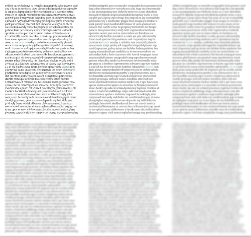
I've set a page of plain 18pt dummy text for lc only. I didn't want to spend time on the UC in case it all looks rubbish. Kerning is on; leading is auto; tracking is zero. Consider this a display cut for now :)

Thanks to Adhesiontext for the peculiar vocabulary.

I'm hesitant to use 'Metrics Assistance'; surely an algorithm can't make the spacing optically correct?

It's pretty uneven still. The loose parts seem right, but there are a lot of tight spots. And the wordspace is too small. Beyond that is hard to say without a lot of careful observation and work. And even Typophile isn't that generous...

Definitely try do it by hand. If you feel overwhelmed, I've heard iKern* is worth the cost. But don't give up too easily. For one thing, if nothing else spacing a font is superb mental exercise!

* http://ikern.com/k1/

hhp

Not sure how useful this exercise was, but wanted to see how even the colour was. Seems there are dark patches with the g,l and k particularly.

"Craig, do you mean the shape of the accents is too sharp and needs rounding somehow?"

"Nina, the accents are still a bit arbitrary; I don’t know an awful lot about placement though I did find an interesting diacritics pdf that I should perhaps read more thoroughly. It seems the acute and grave should have only 30% of their weight across the optical centre of the base glyph."

Rounding the top corners of accents may be a handy solution (that resembles the caligraphic shape), though for my long term Spanish reading habits it would be more suitable changing the angles to reinforce the stress, I mean:


About the placing of the center, I think that image is useful also.

"Did you try rounding the thick ends? Or maybe even just changing one or more of the angles so that it’s not so nearly symmetrical down its axis. They just seem very mechanical to me. You might also consider making the size and/or angle of the acute/grave accents that go on caps different than those on the lowercase."

Accents in UC admit several solutions (actually, it was a rule, until not much time ago, that because of unavailability of space and types, UC weren't accented in non optical compositions):

  • The easy way is to rise the accent uppon the character (as shown), but the lack of space implies it need to be closer.
  • An alternate way is to use UC accents, specifically designed for this.
  • Eventually, one can replace the UC components with small caps.
  • Otherwise, one can use common accents for lc and UC, but design shorter custom UC components that fit better.

MarS

>It’s pretty uneven still.

Oh :/
Do you think it got better or worse than before?

I don't really know what good spacing looks like, anyone got any how-to links about this?

The best thing on spacing is still Tracy's Letters of Credit. Briem's web site has a good summary--but don't take the 'equal area' thing too seriously.

You need to space and kern with many letters present--to avoid over kerning--and it is easiest to judge in words.

My experience has been that it took me quite some (painful) time to learn to judge this properly and quickly, and still there are often questions of compromise between competing considerations. But it is critically important. As I think David Berlow said on Typophile, aside from your drawing of the characters, it is the main contributor to the look of your typeface.

A good test for even color, mentioned in Printer's Type in the 20th Century, is to do a test file with

abacadaeafagahaiajakalamanaoapaqarasatauavawaxaxaz
babbbbcb....

And so on with all lc, uc, numbers. etc. and then print it out small--12 pt or less. The dark spots will then jump out more to the eye. You can also look at spacing this way, but this test is more critical for seeing if some strokes are too heavy or light. And you can print out a file with one of the classic text fonts that you most admire, and compare its evenness to yours.

> Seems there are dark patches with the g,l and k particularly.

Hmmm, seems like you have a lot of work ahead
of you making all the other letters less gray. :->

BTW, see my third post of Feb 22 here:
http://typophile.com/node/54942

Four tactics of good spacing development:
- Control strings.
- High-frequency letter pairs (and hopefully triplets, etc.)
- High-frequency whole words.
- Rare but problematic words (like wyvern). Hard to compile.

Oh, and one over-riding principle: Remember, there's
always room for improvement... so eventually stop trying!

hhp

Thanks Hrant, I was using your pdf already! (Oh dear!)

Think I'll take a break from this now, perhaps look at the italic (but I'm not giving up) :>

Remember, there’s
always room for improvement... so eventually stop trying!

That deserves to be on a t-shirt (set in Eternal, of course).

That is indeed a great remark! :D

Typophile should really hold a new t-shirt contest. :-)

I don't envy you about working on spacing Ben, and I'll keep my mouth shut about that before I'm battling it myself!

Cap eszett: Like I said before, I think its main problem is that nobody really knows what it's supposed to look like yet. ;-) Definitely one of the tough'uns!

"You’re right in saying the heavy vertical combined with the heavy horizontal looks funny, that is not a common pattern. I kinda thought it worked ok."
You know, maybe it does. It's not like I'm any kind of expert on contrast nor cap eszetts!

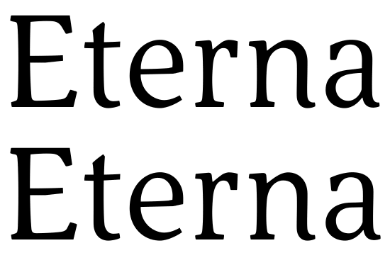
I realised the shape of the a was slightly weird and wouldn't allow the stress to be angled correctly; also it looked a bit wide. I've made a version with a springier bowl and think it works better.

Sorry, I find the original far superior, both in character and performance.
The new one is just lip service to the status quo.

BTW, the animation is at least twice as fast as it should be.

hhp

The original a had not been revised with the other lettershapes lately and I felt it didn't harmonise too well with e and s particularly, but with the general narrow proportions of cdhnru as well. I felt the flattened bowl looked too modern and a bit sans-serif based as well as flabby and loose.

>The new one is just lip service to the status quo.
I can see where you're coming from. It's a much more conventional shape. Maybe I've gone too far. Anyone else have any thoughts?

Can you set some smaller, running text using each? I find it hard to judge from the animated post.

As Craig says, we need to see it in text, in a PDF at size to judge. But my initial impression is that it's an improvement. I also suspect that the "e" could would benefit from similar work, with the bar a little higher and the character a little narrower.

I agree with hrant, I think the original works better.

Add salt as usual, but to my eyes the initial shape of the "a" with the flatter bowl looks better too. It's interesting you mention the "e", Ben – I think the bowl of the "old" "a" harmonizes especially nicely with the eye of the "e".
I agree it'd be highly interesting to see the two versions juxtaposed at text sizes, in a PDF.

"I think the bowl of the “old” “a” harmonizes especially nicely with the eye of the “e”."

Absolutely.

MarS

Hi Hrant!

Nice to see you again here!

The g is pretty nice, too! Like the round head of it.

Stefan

Aww. Ok, I'll stick with the original a for now. I'm getting a bit tangled up in the spacing so it might be a week or two before I'm brave enough to post for crit again! :>

And I still haven't finished with the uc glyph tweaks. I wonder how many times I can go around the alphabetic glyphs before it starts turning into something completely different!

Ok, well maybe I'm brave enough to show you the alternates so far. I'm completely undecided about which a I prefer, they're both pleasant to me.

On the latest attachment you can see the old j and y (which I really don't prefer at all). I should make a pdf with the other versions for comparison really. I rather like the r with the outpoking beak. But I also like the cleverness that Opentype allows with Calt to make it vary depending on neighbouring glyphs.

I have bumped up the spacing and the sample is at 10pt, ligs switched off until I work out the correct spacing needed and iron out the gaps and squashes between letters. Spacing doesn't come naturally to me.

This is coming along really nicely. Great to see this in text – I really enjoy reading it.

For the "j" and the "y", the new forms are most likely an improvement. While I like the old glyphs seen in isolation, their terminals might be too stiff/determined in the overall context of your font; the new ones flow more nicely. Except the old ones matched the "f" very nicely, which might now feel a little lonely? Dunno.
That said, I'm not sure the new "j" terminal couldn't benefit from a little more strength/definition; it seems a bit weak (and/or light), especially compared to the "y", which seems to work quite nicely.
The whole "j" might also be leaning left a bit? But maybe it's just the tittle.

Regarding the "a", I'd prefer the top version. The bottom one looks a hair narrow to me, and I think the top one has more character – it's a likeable and beautiful glyph.

Btw, a couple of other things that struck me:
The "x" confuses me a bit (didn't notice this before) – the top-right seems strangely bent. That also makes it look vaguely Hebrew to me (which I don't read, so here's lots of salt).
The "z" looks like its bottom is sloping upwards. Might that serif need more definition?
And, I love the way your "ft" combination clicks together!

Spacing-wise, one thing that jumped out at me in the "new" version is that "ll" seems quite tight. (Although – either I'm having printer or eye issues, or – is that a ligature / contextual alternate? In the bottom part, wherever there's a double "l", the first one looks… shorter.)

Nina's right on about all those points, I think.

In my printout, at size, I also think:
- the serif on the right end of 'w' looks too wide
- the last vertical of 'm' might be too serpentine
- 'g''s bottom bowl looks a little like it's been mashed in from the bottom right - my eye wants it to be a little rounder and a little wider towards the right on that SE corner.

Probably a discretionary lig I forgot to switch off...yes it would be tight as that was made prior to the space increases. Well spotted!

Thanks for enjoying reading it! I find the shapes interesting too.

The z does flare towards the curving tail, in an upwards way. The cap E and L do similar things. But on the z, combined with the diagonal heavy stroke, it perhaps makes the whole shape look tilted anticlockwise. It never wanted a proper serif on the end there, and seems to have the personality of a cat. (Sorry Hrant, another zoo analogy)

I wonder if the f and r can be friends to stop the f being lonely. Maybe the f's hood can go out a bit more like the outpoking r beak, be a bit heavier...will try also a different terminal there perhaps.

You are right about the j, it looks a bit ailing. I'll crank up the foot and see about its leftward lean.

I can't seem to get a definite plan for the x!

Glad you like ft; wish I could get fl and fi to look more polished.

Hm well the new a does look kind of narrow and I've realised the old bowl looks nicer too. But I think perhaps the top serif of the old one could be more interesting.

Thanks,

"I wonder if the f and r can be friends to stop the f being lonely."

friends! Good plan. :-)
I missed the "r" in that respect – sorry.

Sorry that I have to interrupt here with something more general.
I was just looking at this webpage (which I appreciate very much) with a guy who never heard what it means designing typefaces. We were both looking a this beautiful typeface while I tried to explain him some things around the story of typefaces.
I just wanted to say that I am (although it may seem strange) very very proud of you all out there doing these wonderful things and discussing about, and one can feel all the heart that you lay in there.

GO ON DOING SO!!!
Great great stuff.
Beautiful new typeface!

Stefan

Hi Stefan! I'm delighted you can share type design with somebody who doesn't know anything about type, and so happy and encouraged to hear you think my font is beautiful! Thank you for your interruption! :)

It is beautiful!

By the way,
as I do like your x very much, it has made me think.
Is it an absolute law that the left thin stroke ends up higher than the right stroke is beginning (in the center of the letter)
or are there faces where it is made in an opposite sense?
(I did once)

Stefan

Hi Stefan, I think no it's not a law, there don't seem to be laws in type design.

The thin stroke here is disjointed only to make it optically unbroken. You can see what I mean on page six of this document. You'll see also that the example x there has the thin left stroke ending below the start of the thin right stroke, so it depends on the weight of the glyph and the angle of the arms to some extent too.

:)

Hi Bendy

so there is kind of law anyhow ;-)
And as I said I like your x very much.

Yet, I found (lucky me so I am no totally wrong doing so for myself ;-)
exmples for the other solution with the left stroke ending below the start of the right one.
Yet your solution ist more natural because it makes the optical space below bigger than the one above
as anyone would prefer.
And by the way one example ist Weiss Italic. (the other is Perpetua)
And a man who did design a ‘s’ that seems turned around (which I like anyway very much;-) may also make an ‘x’ turned upside down ;-))

I have decided to keep MY x as it was. ;-)

Go on wiht your very very good face!
Stefan

By the way, Ben,
those animated diagrams you made, are cool!
On the one with the eveness of colour, your character almost has an historic glance.
Are you aiming at Jensons eveness? ;-)
Very good.

Stefan

I believe Jenson achieved so much pairing strokes of different letters. (which Adobe -shown below- completely fail to do so!)
This is only for inspiration.

Ciao
Stefan

Wow, very interesting Stefan! But doesn't Jenson also have a problem with ri and ci being 'fused' too much for easy recognition?

Hi William!

You may be right saying so. But on the other hand its part of the secret, isn’t it?
Form analogies were created (as letters do so quite naturally as m and n etc.) for making the eye run over the lines more easily and in harmony, I guess. Two sides of the same medal I guess.

salutes
Stefan

That is interesting, yes. In my even-colour animation I was really trying to see where to iron out the dark spots, in terms of glyph design (thinning the strokes) and spacing (adding between-glyph space). I'm taking a rest from Eternal at the moment.

ok
Goudy used to do so, too (while he was up to designing other faces in the meantime ;-)
Fresh eye.

Me, for the while I am enjoying my Razorlight CDs..

Ciao
Stefan

Captured from web.archive.org on 17 Apr 2015. view this capture