
Hey all,
I'd love some micro/type-level feedback on this title/subtitle for a book cover.

The overall design (which has colors, and a photo, and stuff) has already been approved;* so this is just the type I'm now working on, which is all custom to varying degrees.
* Actually, I'll have to submit a "prefinal" version of this tomorrow, for inclusion in the publisher's catalog. I'm expecting to be tweaking micro stuff between then and whenever I have to submit the final print files.
The headline was customized from Miso (Miso on top, my headline below):
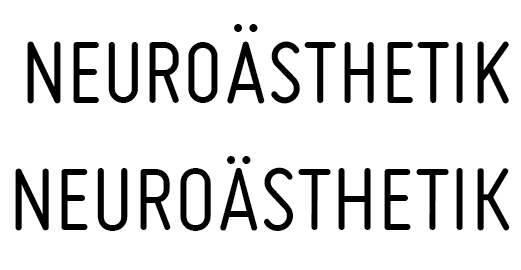
Anything that strikes you as odd/wrong?
(I'm particularly wondering if the "S" is too wonky and/or wide, the "K" too wide, and the "N" too heavy?)
The font in the subline and author's name is my own work-in-progress, Ernestine, in a special cut (slightly heavier, and more display-ish, than the base cut, and the "ft" lig is new).
This is going to be its first public appearance, so I'd be extra grateful for any opinions and comments!
-Nina
| Attachment | Size |
|---|---|
| NeuroCover-TypePreview.pdf | 221.63 KB |


