Hello Typophiles!
What a great place to be. :)
I'm currently working on the digitization of an old metal face I asked about here before. I'm fairly new to type design, just having started the postgraduate type design course in Zurich, Switzerland, so please bear with me ;-).
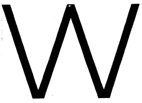
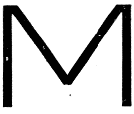
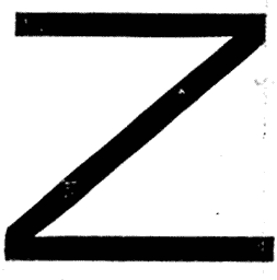
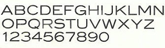
Here is the Uc alphabet:
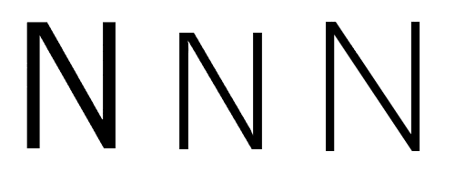
Well, it has these unexpected quirky details. I just spent the entire afternoon trying to figure out the N, the question being that the joins of the diagonal with the left & right stems respectively are solved quite differently (these are my sketches, please forgive any crookedness). And interestingly, the "asymmetrical N" is only present in the original sample from Emil Gursch Foundry in Berlin (1910); Berthold slightly redesigned the typeface in the 1920s and rereleased it with symmetrical N joins. So I guess they were wondering too ;-)
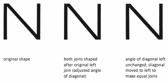
Hans Jürg Hunziker, my teacher in this, told me to change it to make the joins equal. I realized changing the angle of the diagonal runs me into other problems, but found a very "neutral" variation by moving the diagonal a tad to the left.
What I'd like to know, though, is why this may have been solved like this. While I would like to "filter out" some of the weirdnesses that stem from the lead "medium", as well as some of the historical specialties, I would still want my digitization to remain as true as possible to the original typeface, so if the thing with the N was a valid and purposeful design decision, I wouldn't necessarily want to change it.
So, can anyone tell me some reason why this asymmetry in the joins could have been a valid design decision? Does it relate to any of the other letterforms? (I realize the left join, as is, matches the apex of e.g. the A; but when I use this system on both joins, like in the middle sketch, the N looks a bit like it's about to break apart.)
FWIW, whereas Karen Cheng's "Designing Type" does not show any asymmetrically joined sansserif N's, I've checked some other fonts and noticed that Verdana, for one, does the exact same thing – it has a "flatter" or "wider" join on the left and a more "acute" or narrower one on the right.
Thanks a lot for any input!
Nina