Typophile

Semele Roman and Italic, Latin, Greek, Ancient Greek characters and now with numerous alternate lunate sigmas and epsilons.

sasapetrova

I have just uploaded a PDF file with alternate lunate sigmas and epsilons.

I extend my thanks to all those who have posted their comments and helped me so far with their critique.

Semele is a book text typeface. Semele Book or Semele Regular are the weights to be finally used as book text typefaces with the relationship between the cap height and that of the acscenders and descenders readjusted; currently I am working on that.

I would like to add that originally the Semele Latin characters were designed in such a way that they would be the basis for the subsequent design of Old Style Greek characters which — for book text usage in Greek Classical Typography — are always designed in a calligraphic way as in Monotype Greek Upright 90, Greek Times Ten, Times New Roman, Minion and other.

As the typeface will be also used as a Greek book text, its finalized name has come from Greek mythology. Semele (Σεμέλη) was one of the four daughters of Cadmus who was credited by Herodotus with the invention of the alphabet and other useful things.

I would be very happy to read your further comments and critique.

Thanks

AttachmentSize
ThetisLight..pdf21.05 KB
Semeli_Light_Roman_Version_9..pdf46.27 KB
AlternateDesignOfGreekCharacters.pdf174.03 KB
Thetis_Semele_LightItalic.pdf24.85 KB
Which_o.pdf13.15 KB
Semele(Thetis)GreekLightItalicTEXT.pdf127.17 KB
TheConsonantsAtLaw_Loeb_108163_mm1.pdf39.11 KB
TheConsonantsAtLaw_Loeb_pages_394-397.pdf175.35 KB
Semeli(Thetis)LightRomanItalic_Version_10N.indd_.pdf101.62 KB
Hypatia_Problem_313x331_mm.pdf129.66 KB
Hypatia_Problem_170x242_mm.pdf116.96 KB
Semeli(Thetis)LightRomanItalic_Version_15Na.indd_.pdf108.26 KB
SemeleArchaicGreekLetters15N.pdf46.43 KB
SemeleArchaicGreekLettersWithVariants.pdf54.01 KB
Semele Lunate Sigmas and Epsilons.pdf21.38 KB

This is very polished. Nice work! I employed the same serif detail in a text face I designed called Eason. Although I reversed the "pen" action for a more forward motion, though you accomplish this with flaring the stems. Not sure it matters much at text sizes. Here are some pointers, much of it preference:

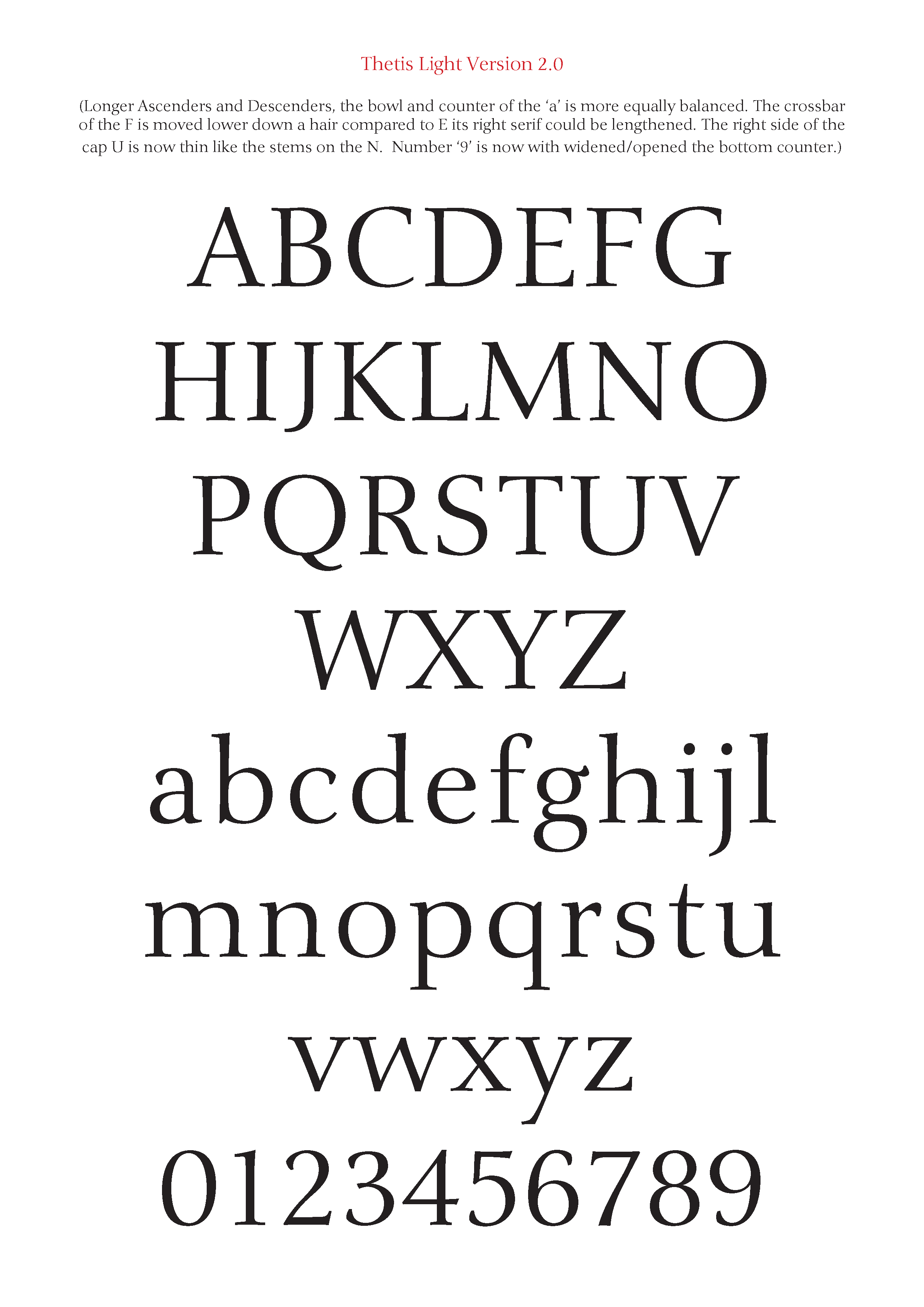
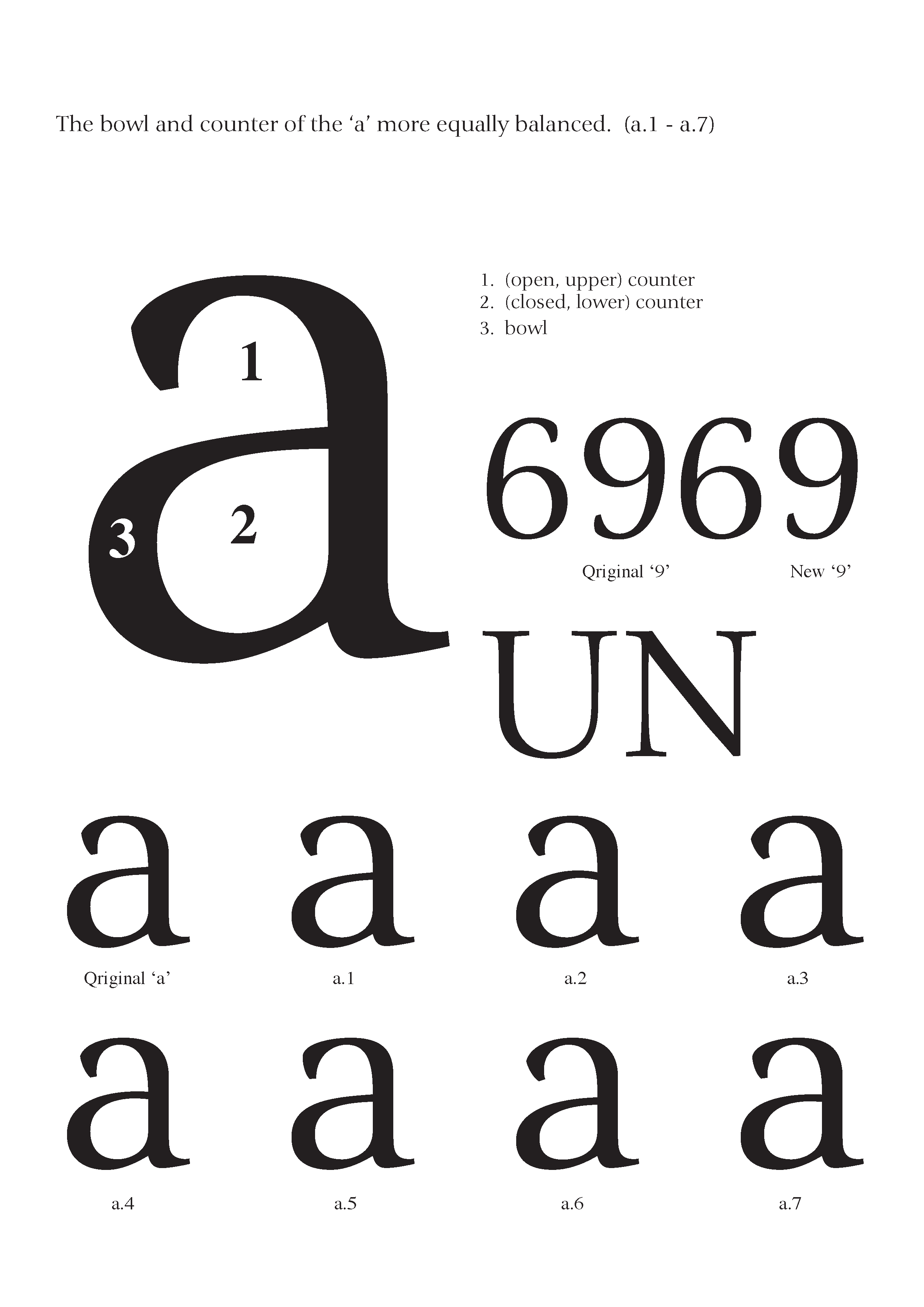
1. I wonder if the bowl and counter of the a shouldn't be more equally balanced.
2. crossbar of the F could come down a hair compared to E and right serif could be lengthened.
3. For a book type you may want a smaller x height (making the ascenders and descenders longer serves the same purpose).

Thank you very much Randy for your critique. I will follow your advice and try out what you suggest in the next version of Thetis.

Two things I forgot to mention. The 6 9 combination looks like it's identical but rotated. The 6 looks ok, but the nine is top heavy to me. I think you'll need widen/open the bottom counter to make it sit better. Otherwise the numerals are quite an achievement. The right side of the cap U is too dark for me. It should be thin like the stems on the N.

Thanks again Randy for your additional critique and suggestions. I have applied them all and I am posting now Thetis Light Version 2.0. In case you notice some more things to be fixed or improved please let me know.

Looking at the numerals, I realized that number 3 may need to look more straight and it should be rotated 2-3 degress to the right. The upper horizontal strokes of 5 and 7 would look better if they were a little thicker. Numbers 2, 5, 6, and 8 should become more refined. What do you think?

I opened the Eason pdf file and looked for a long time at your exquisitely drawn typeface and I definitely love the way you have drawn your serifs so ingeniously.

Very very nice font!

I love your ‘a’s!!

Stefan

I like a.5 best I think as it best balances area 1 and 2 while keeping the flavor of your original a.

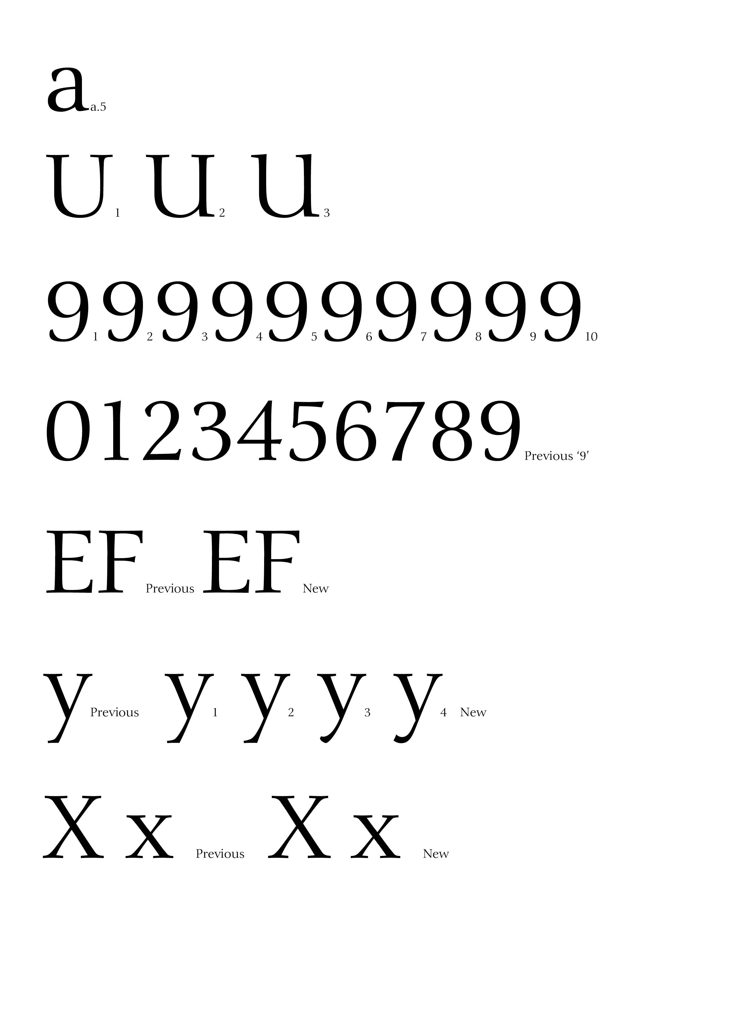
U is better in second picture.

Desc/Ascenders are better.

9 is still not fixed. The closed counter (top) is too small vertically, and the bottom needs more width: the curve of the tail starts too early I think and the end doesn't go far enough left.

F: crossbar even lower. Make the top of the F crossbar at the bottom of the E crossbar. Also the foot serif, right side make him wider or the whole letter will fall over to the right! Also helps a little with the white hole under the F.

y: consider a bit more weight in the end of the tail.

x: cut this stroke ( / ) in the middle and move the bottom left leg to the left maybe 20 em units. Same for cap X

Somehow this reminds me of Diotima, but more suitable for text. Nice job!

By the way..the ‘a’s:

I definitely do not like no a.6.
a.2. is too baroque.
‘Original a’ is too Meta.

I’d go for no a.4

Ciao
Stefano


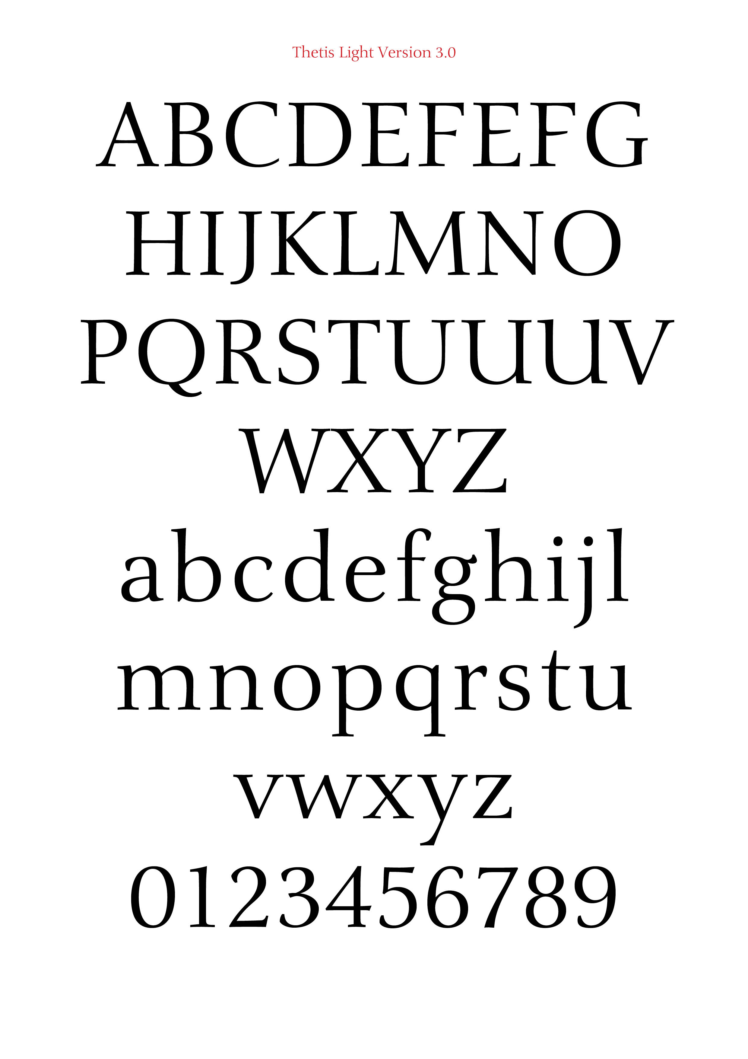
Thanks again Randy. I applied all you suggested as best as I could. I added a few alternate forms for certain characters. Number ‘9’ needs some more redesigning I reckon.

At this point I would like to add that the Thetis Latin characers were deisigned in such a way so that they would be the basis for the subsequent design of Greek characters which - for book text usage - are always designed in a calligraphic way as in Greek Times Ten, Times New Roman, Minion and other. In order to design such a typeface I observed for quite some time Hiroshige, Carmina, Diotima and RTF Isabelle. Are there other typefaces like those?

When one inserts a picture here what is the ideal resolution and size? Is it possible to insert a PDF file instead? I tried for qute some time to create the right kind of image file but it never comes out as nice and sharp as the other image files posted here.

Whenever we are done with the fine tuning of Thetis Roman I could post right afterwards the Thetis Italic which are ready. Please let me know.

Thanks for the “a’s” comments and the critique Stefano. Randy suggested that a.5 is the fittest. The a.4 that is your first choice, is somewhat similar to a.5. Do you have any comments at all about some of the other letters? Please let me know if you do.

By the way how does one go about inserting that square ID image after one’s name here?

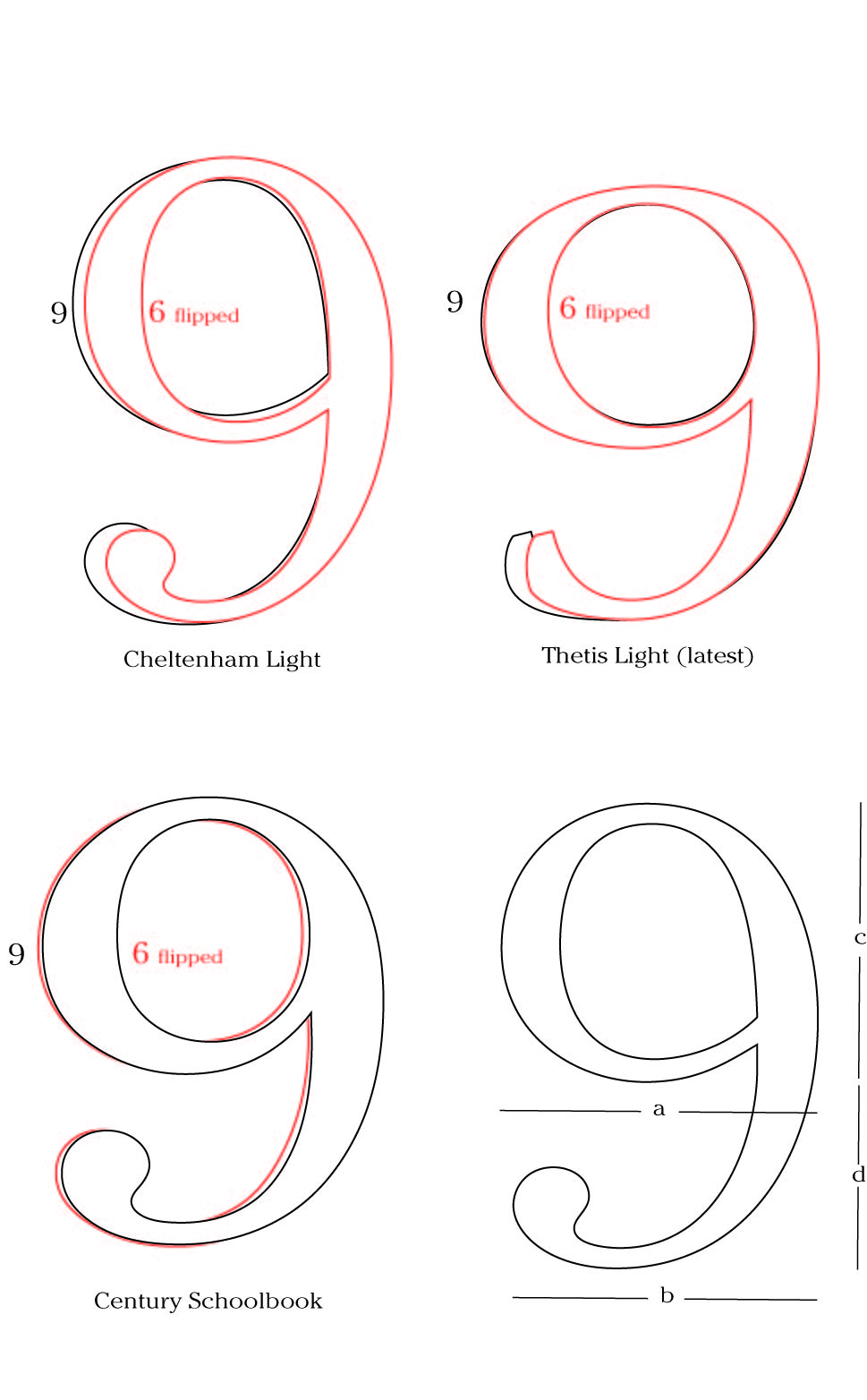
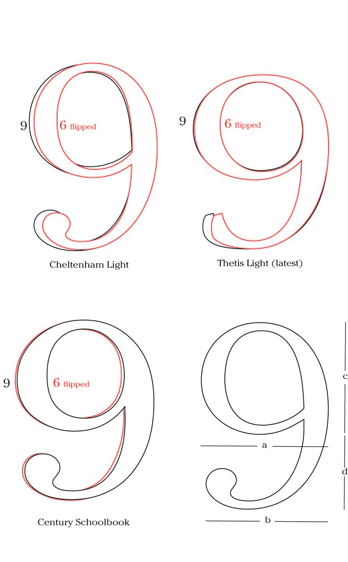
Randy here are two superimposed 6's and 9's (Cheltenham Light and Century Schoolbook) and a diagram with dimensions for the Thetis '9'. so that you can tell me what has to be done next.

Ooooooooops... Randy, the image file that I just inserted does not appear. It is 3M, is it too big or what?

Randy here are once more (I hope that the image was inserted right this time) two superimposed 6’s and 9’s (Cheltenham Light and Century Schoolbook) and a diagram with dimensions for the Thetis ’9’. so that you can tell me what has to be done next.

What's your inspiration for the name. At first I thought it was a typo and you meant to write Thesis which of course is taken. Don't you think the two names are a little close for comfort? Naming is hard. Didn't Jonathan or Tobias write a piece about font naming at some point?

Something else, not sure how you feel about this but check this out: compare the notch on the top left of the n or m to the one on the bottom of the a. I think I would increase the one on the a. Just pull the branching of the counter up a bit. That will keep it more legible in small sizes too.

Thank you Hannes for all comments. You are absolutely right about the name, it is definitely confusing. As the typeface will be also used for Greek book text, the final and name should come from Greek mythology names, it will be probably the name of a nymph, or goddess or a city. I will alter it as soon as it practically possible.

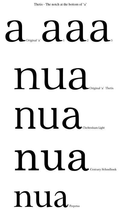
About the notch at the bottom of ‘a’ I will check it out, here are 3 alternate ‘a’s that I came up with after applying your suggestion that it would be better if ‘a’ was redesigned to be legible at small sizes as well.

Hi. We are getting into matters of preference here. You have very good instincts as the typeface shows. Go with them. I don't think we are teaching you anything. We're just expressing our likes and dislikes. This includes the discussion of the 9 and a, plus the alternate forms you suggest. Technically, the xX and F are better now.

Consider letting this rest for a while, and by all means we'd love to see the italic.

Thank you very much Randy, Hannes and Stefan for your help, insights and valuable advice. You gave me the chance to clarify quite a number of points that I wasn't so certain about for the finalization of the design of "Thetis Roman".

I will have to give a new name to "Thetis' as is is quite easily being confused with "Thesis". Like I mentioned earlier the new and final name will come from the Greek mythology.

Randy, as I have written earlier, besides the Latin characters of "ThetisRoman" I have also designed the Greek characters. The same applies for the "ThetisItalic".

Should I send next the Greek upright characters for critique or the italic Latin characters and then follow up with then follow up with the Greek characters for the Roman and the Italic at the same time?

I won't be of much help on the Greek I'm afraid. Maybe start two new threads: Thetis Greek and Thetis Italic.

Natasa, I love 'a' No. 3! Awesome! If I may follow up (please feel free to tell me to back off), I would now compare the treatment you gave to the 'a' with the analog situation in the 'u'.

Hi,

Yes, I think you are right. a No 5 is good as well! It is similar.
Sorry, but I didn’t have the time to come closer to the other ones.
But let me say that at first glance I also enjoyed very much the numbers you made!

Compliments again.
Nice work!

Stefan

The name ‘Thetis’ that I had originally chosen for this typeface is definitely confusing - as Hannes pointed out it is being easily confused with ‘Thesis’. The Thetis Latin characters were deisigned in such a way so that they would be the basis for the subsequent design of Greek characters which - for book text usage - are always designed in a calligraphic way as in Greek Times Ten, Times New Roman, Minion and other.

As the typeface will be mainly used for Greek book text, the final name should come from Greek mythology names, it will be probably the name of a nymph, or goddess or a city. At this point I would like to alter it, and after checking at www.identifont.com, I have come up with the following names that have not been used so far:

Alcmene
Cassiopea
Castalia
Chloe
Danae
Erato
Iphigenia
Ismene
Leta
Leda
Phoebe
Semele

Could you please help me and choose the right name for ‘Thetis’ among the above or even suggest another name for it.

Soon, I will be posting for your critique, ThetisItalic and ThetisGreekRoman and Italic.

Let's see ... Alcmene sounds odd, Cassiopea is a mouthful, Castalia sounds too much like Castilia for my taste, Chlöe surely has already been used right? In any case that sounds like a handwriting font. Danäe is a bastard nymph whose name means "parched" (according to wikipedia) and that doesn't fit. Erato sounds like eratus to me, but this is a full body principal text so... Iphigenia..riiiiiiight. Ismene sounds like it'd be a formal script font. Leta sounds like Star Trek dabo girl, Leda, eh, too short in any case. Phoebe possible and Semele.... wait... perfect. Her Roman name is Stimula, which for a calligraphic Greek version could go perfect. Especially since the light version feels well, light, and agile which could definitely go with a name like Stimula so.... Semele it is. It has a nice timeless look, and the daughter of Semele (e.g. all documents set it in) was immortal. The only downside would be that Semele is not actually a Greek name, rather (again according to Wikipedia) Thraco-Phrygian which might have made it a better suited name for a non-Greek designer and I'm guessing by your profile you're Greek (side note: I could use a critique on my Greek font haha)

In any case, I think Semele works well. Above all to my ears it sounds the least girly-girl (read: Curlz) of the fonts and more like a nice robust formal font (think hot conservative librarian).

«El futuro es una línea tan fina que
apenas nos damos cuenta de pintarla nosotros mismos». (La Luz Oscura, por Javier Guerrero)

Thank you very much Guifa for your suggestions and insights about the final naming of Thetis. Needless to say that as I was reading your comments about the names in my list I kept smiling because I found what you wrote interesting and humorous.
To know more about these names one should read through the pages of the Greek Mythology by Robert Graves, as his leading authority on this subject.
My personal preferences among the names in the list were: Castalia, Erato and Semele. After reading what you wrote and serious consideration I have decided to name my typeface Semele.
Since you say that you could use a critique on your Greek typeface I am posting there today my comments.

Yeah the only main mythology book I went through was a "worldwide" Mythologies book (90% Greek) by some lady. Edith something I think. I'll have to check out his book.

Also re whether you should post italic or the greek next, either works. If your Greek is very close in style to the Roman, that might be better. If it's looser in feel like a lot of Greek-Roman fonts, maybe Italic first then the Greek one. We'll be here to look it over in any case :)

«El futuro es una línea tan fina que apenas nos damos cuenta de pintarla nosotros mismos». (La Luz Oscura, por Javier Guerrero)

Thanks again Guifa for your input. Edith Hamilton is the name of the lady you were talking about, she wrote quite a scholarly Greek Mythology. Robert Graves, on the other habd, wrote about Greek Mythology in an absolutely daring and spiced up style, his writings make a reat reading.

My Greek 'Semele' (aka Thetis) characters are actually very close to the Roman although they are slightly looser in feel tham most of the Old Style Greek Roman typefaces such as Times Ten. Monotype Greek Upright 90, TimesNewRoman etc. So, I will follow your advice in respect to the order that I will be posting SemeleGreekRoman, SemeleItalic and SemeleGreekItalic.

This is a wonderful italic! Extremely well polished. I especially like the small upturn that the E and F have.

Now, as to your alternate characters, I think the f, j, and y should have the same terminal roughly. So you could keep f.1, the j, and y.2, but use a slightly thinner terminal on y.2. Or go with the ball terminal in f.2 and y.1 and make one for j.

z.2 is the better of the Zs for this style, the other two seem a bit heavy since they're not descending.

The tail on m is thinner than the others.

The o seems to be slanted without getting its due stress. By that I mean, all the other bowls have or appear to have a diagonal stress, but the o looks like it has a vertical stress.

2 gets too thing, and 4 might be a bit too thick on its diagonal.

I like that the 3, 5, and 9 have different terminals, but since the rest of the font is consistent with its building blocks, I'd choose one of the three and use the same style. Personally I prefer 9's. 3's is a bit anemic.

I'm guessing it's by design, but just to make sure you intended it, B, D, E, and L have stubbier serifs on their left stems than F, H, K, N, R, T.

I hope that helps. Any chance we can get a sample of text in it?

«El futuro es una línea tan fina que apenas nos damos cuenta de pintarla nosotros mismos». (La Luz Oscura, por Javier Guerrero)

Guifa hi, thank you very much for replying so promptly and in such a great detail.

I agree with you about all you say about the alternate characters. You have made many points about m, o, 2, 3, 4, 3, 5, 9. I have started working on them; also I am checking the ‘stubbier serifs’ inconsistencies between B, D, E, L and F, H, K, N, R, T in order to fix them.

There is one point about which I am not quite clear about. This one “The o seems to be slanted without getting its due stress. By that I mean, all the other bowls have or appear to have a diagonal stress, but the o looks like it has a vertical stress.”

I do understand what your words convey but I am not so sure what to do about it, could you please (if you have the time) send me some alternate drawings showing how the ‘o’ should have been drawn?

I am posting several variations of o’s placed in between a’s in case one of them is what you had in mind. On the other hand there is also the capital O and the character zero, maybe one of them comes morphologically close to what you said about the readjusting the shape of o.

I have also added a text sample of the Semele(Thetis) Italic (the current version without the type-face-lifting that you suggested as it might take some time to do.

Semele, is basically a very beautiful typeface, and its name is very well chosen and quite symbolic.

It does need some more enhancing along the lines that Randy and Guifa suggested. I do have some suggestions myself.

In the Semele Light Roman

The ‘o’ I believe that it should stay as you designed it originally.

The middle bar of ‘E’ and ‘F’ is charmingly novel and well thought of, I would use something similar in ‘f’ and t’ and in the florin.

The leg in capital ‘R’ could have also been designed like the leg in ‘K’. If you keep is as it is then this particular curvy stroke must be redesigned to look somehow more calligraphic and or more uniformly drawn.

The tail of ‘Q’ could be mad a little more emphatic, maybe longer and more horizontal.

I agree with Randy about the ‘a’, a.5 definitely is the best.

Numeral ‘6’ looks a bit crude compared to the well designed and balanced ‘9’, also the bowl in ‘6’ should be 15-25 em higher than it is.

Numeral ‘3’ needs skewing 2-3 units to the right as it looks as if it is tilted to the left.

Numeral ‘2’ the curve-stroke part that joins with the horizontal bar at the baseline could be improved a little more.

That’s all for the moment.

I am quite eager to take a look at the SemeleGreek, the roman and the Italic, could you please post them if they are ready. Also post the Semele Italic when you finish the alterations that Guifa suggested, so that I take a good look at it.

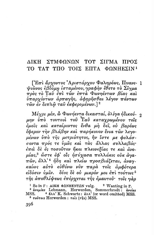
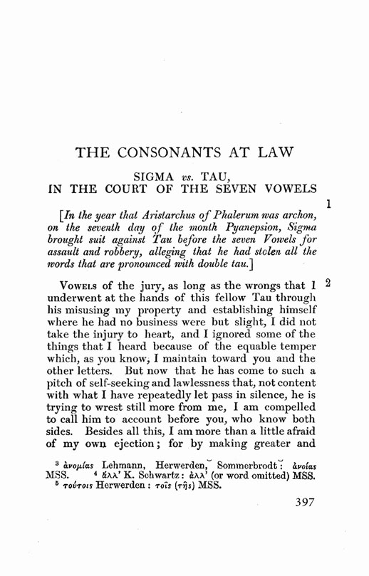
Thank you Nymus for your remarks, I will look into them as soon as I have some time for it. I just posted two pages from Lucian’s ‘The Consonants at Law’ set in the beta version of SemeleGreek and I would love to hear your thoughts about it.

Great idea to choose ‘The Consonants at Law’ the most appropriate among Lucian’s work and set it in Semele Light. It looks quite nice and yet as I happen to have the Loeb edition of Lucian’s work, I compared the same pages with your pages and noticed that you have set the titles and the body text in smaller point sizes.
As far as I can see, the typeface is too light for body text, later on you could set it in Semele Book; the ascenders and the descenders could be increased by 20 -50 em. The Greek Semele Light Italic look as if they are a little wider that the Latin Semele Light Italic, but maybe this doesn’t matter a lot.
Could you please set your pages with the same text and title sizes as in the Loeb edition and also (later on) if possible, in Polytonic (Extended) Greek, so that I can look at them more closely? Plus, it would be quite nice if you add the footnotes and whatever else you have omitted from the pages.
I have just posted to you the two pages (396 -397) of Lucian’s Works from the Loeb edition so that you can see for yourself how I was set typographically.
I would like to take a closer look at the full Greek alphabet.


Hi Nymus,

I just posted pages 394 – 397 from Lucian’s ‘The Consonants at Law’ set it in Semele (Thetis) Light and as close as possible to the point sizes of the original Loeb edition.
I have also posted an updated version 10.0 of Semele (Thetis) Light Roman and Italic with Latin and Greek characters. I haven’t finished yet some of the changes that I had in mind and also all those that you pointed out; It will be done in the near future. Therefore, now you can take a closer look at the design of the Greek letterforms and post your comments.

I like this; it's very elegant. I noticed one small problem, though. The capital theta symbol (03F4) in your PDF looks the same as the ordinary Theta. It has to be clearly distinct, and it's generally expected to have a full-width crossbar. It is intended for use by mathematicians, who (bless their hearts) like to use two different shapes of the same letter as semantically distinct symbols in the same document.

SemeleGreekLight Roman Version 10.0 - Some suggestions(Based partly on your AlternateDesignOfGreekCharacters PDF file attachment)

The pages 394-397 from Lucian’s ‘The Consonants at law’ that you uploaded are very nice, congratulations. You kept to the original layout as best as anyone could. You realize of course that (as Randy pointed out) SemeleLight isn’t good enough as a weight to use it as book text typeface, you will have to design also a Book or a Regular weight for that; also a Bold weight. The Cap height should be increased a little and correspondingly the height of the ascenders and descenders.

In relation to the overall design of the Semele Greek characters, admittedly the typeface is quite nice and polished, some characters are designed excellently and some others could be improved. I have found out that the only Greek typefaces that are universally accepted and admired are all those that are digitized from hot metal types designed by great masters such as Bodoni, Baskeville and others and some of the typefaces that you have in your PDF ‘AlternateDesignOfGreekCharacters’.
All those typefaces have some of their letterform characteristics (hooks, blobs etc) enlarged in ways similar to the enlargement of facial characteristics in caricatures, this keeps the individual style of the typeface quite strong even at small point sizes, this is very important. In the Greek Semele these particular characteristics need to be strengthened quite some more.
In other words the Greel Semele characters need a bit of a little more enhancing in their characteristics and also to have in some characters a novel morphology (like the ones that you did with nu and kappa for Guifa) in order to be universally accepted by typographic scholars and be included in international digital libraries.

In view of all the above my suggestions for enhancing the Greek characters of Semele are the following:

Sigma - Move the middle point 20-30 em to the right and downwards
Phi - Move the whole oval of Phi a little downwards
alpha - Better to use another Oldstylish form (Lambrakis or Optima)
gamma - Make it more balanced vertically
delta - Better to use a more Oldstylish form (Apla or Porson or TimesTen)
epsilon - Excellent letterform
zeta - Keep the epsilon-esque curve-endings but it would be better to use a more Oldstylish form (Apla or Papyrus or Porson)
eta - The eta needs something but I can’t figure it out yet, maybe an Oldstyle form as in Apla or Katsoulides
theta - Make the top and bottom more pointed
iota - make this ‘iota hook’ parts in ALL lower case letters much more emphasized as in Apla, TimesTen, TimesNewRoman or Porson
kappa - You can also use one of the exquisite ‘kappa’s that you posted to Guifa - kappa.3
lambda - Excellent kappa and lambda
nu - You can use instead one of the beautiful ‘nu’s that you posted to Guifa - nu.3 or nu.5
xi- Keep the epsilon-esque curve-endings but it would be better to use a more Oldstylish form (Apla or Papyrus or Porson)
rho - The end of the ‘tail’ of rho should be moved 20-30 em to the right
pi & tau – Excellent
phi - Better to use another Oldstylish form (TimesTen or Papyrus)
chi - Better to use another Oldstylish form (Apla or Katsoulides)
psi - Move middle left curve point 20-30 em upwards
omega – Excellent letterform

I have some to say but no time at the moment. Keep up the good work.

Thank you archaica you are absolutely right, I will fix the capital theta symbol (03F4).

In view of the eminent uplifting the morphology of your Greek characters for Semele Light Italic I am forwarding to you the following list as I think that it might benefit you greatly:

1757 GFSBaskerville
1790 GFSGazis
1800 GFSBodoniClassic
1805 AplaDidotItalic
1808 GFSPorson
1850 GFSSolomos
1917 New Century Schlbk Greek Inclined
1931 Times New Roman Italic
1931 TimesTenGreekUpright
1948 PalatinoItalic
1990 VergikiosScript
1992 SabonGreekItalic
1993 KatsoulidisItalic
1995 GFSOlga
1996 ApolloniaItalic
1999 BookAntiquaItalic
2001 MinionProItalic
2005 GentiumItalic
2005 ArnoProItalic
2006 BucentoroGreek
2006 CF Genesis

The dates that I have attached in front of each typeface name are approximately as exact as I could fathom. it wont be hard to find all these tyepfaces either as Truetype or as Opentype; most of them I am sure that you already have.

It would be a nice idea to extend your AlternateDesignOfGreekCharacters.pdf by complementing it with pages containing 16 of the italics in the above list.

For completing thoroughly all the Greek characters of the Extended Greek in Semele Light it would be a nice idea to add the following two Greek Diacritics:

ʹ ʹ 0374 NUMERAL SIGN
͵ ͵ 0375 LOWER NUMERAL SIGN

And also check the morphology, size (for Greek capitals or lower case characters) and placing of the following diacritics:

᾽ ᾽ 1FBD KORONIS
ι ι 1FBE PROSGEGRAMMENI
ͺ ͺ 037A YPOGEGRAMMENI

Semele has charm and elegance at the same time, and it moves me. I have been watching its development and maturing for quite some time. I liked very much the pages from ‘The Consonants at law’ that you uploaded. Quite a nice theme for setting its pages in Semele. Randy and Nymus are right of course about designing a book text weight for Semele. I am sure you are going to do it sooner or later.

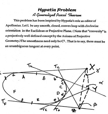
I have a favor to ask if I may. As you can guess from my ID, I collect ‘Hypatian’ memorabilia. Could it be possible to design and set in Semele the page I am sending from the mathematical monograph ‘Hypatia Problem, A generalized Pascal Theorem’? The way that it was set typographically is rather banal, don’t you think so too? The page size is 313 x 331 mm. Please send it if you find the time to do it in the near future as a PDF file.

Thank you very much in advance.

I am adding some more suggestions for enhancing the Greek characters of Semele as I believe that you will find them helpful:

chi – you might base its design on the basic morphology of kappa, just like the Aztec kappa you sent to Guifa.

For the rest of the characters (in case you run out of options) you might straighten up any of the Oldstyle Greek italics from the list that I have already sent you; this is what has be done for some characters in the Katsoulidis typeface, if I am not wrong.

Another option is to interpolate between two characters from the Oldstyle Greek italics and synthesize a innovative letterform.

I am excitedly waiting to take a good look through the pages of your ‘AlternateDesignOfOldstyleGreekItalicCharacters.pdf’.

Hi Hypatia, I just uploaded two PDF files for you, the first one is at the size that you requested i.e 313 x 331 mm and the second at another size (170 x 242 mm) which I found after googling ‘Ferment Press’ and ‘Roy Lisker’ and downloading a number of PDF monographs by Roy Lisker . It would be nice if you could find and send me the test seems to be missing from the page you sent me, so that I include it also.

The resolution of the geometric diagram is not very good, you could redesign it if you wish in Adobe Illustrator and send it to me so that I can update the ‘Hypatia Problem’ PDFs and re-send them to you.

Thank you very – very much Natasha, I loved he ‘Hypatian’ PDF pages enormously. You are right of course, the image resolution of the diagram wasn’t very good, so I am doing what you suggested and I am designing in Illustrator the entire geometric diagram plus all letters (in TimesNewRoman) which you can exchange with Semele. Also, I am looking for the rest of the text on the page so that I can send it to you.

I have had an idea (if it is not much trouble of course) as I did like a lot your Greek-English spread from ‘The Consonants at Law’, could it be possible to have a Greek translation on left and the English text on the right, plus some footnotes to give to the whole thing more charm?

Sending you asap the ‘Hypatia_Geometric_diagram.ai’ and the text.

Re the archaic file. Both me and you have been taking similar approaches to qoppa and sampi. I've found reference of two alternate shapes for them in an old unicode proposal. For Qoppa, the uppercase has been designed as a reversed P (think like Я and R, but with P). For Sampi, it's like a Lambda but with a middle diagonal line going from the middle baseline up into the right arm (sort of like //\ ). That said I prefer the capitals that look a bit more like the lowercas, but I'll probably add the others as an alternate glyph :P

Also for the Ypogegrammoni, I would go with the third or (preferably) forth option in the Semeli(Thetis)LightRomanItalic_Version_15Na.indd__0.pdf file. The other three don't really match the font . Also, in the case of eta, doesn't it tend to go a little more to the left, right underneath the left leg?

«El futuro es una línea tan fina que apenas nos damos cuenta de pintarla nosotros mismos». (La Luz Oscura, por Javier Guerrero)

Hello Natasha, I am sorry if my suggestions for enhancing the Greek characters of Semele proved to be ‘a pain in...’ but it is for the best, I hope you understand...

By the way Yiannis Haralambous has written extensively about Greek Digital Typography in the age of Unicode, go to this link:

http://omega.enstb.org/yannis/pdf/

And download whatever you find useful to you, I highly recommend the following:

aulos-aulos.pdf
ancgreek92.pdf
yannis-greek-samples.pdf

and especially:

amendments2.pdf

The above is unique and highly enlightening to all those designing Extended Greer typefaces.

Keep up the great work.

Hey Guifa, thank you very - very much for your remarks and the link that you sent for the Ancient Greek Letterforms. I read most enthusiastically Boston99.pdf and amendments2.pdf and as I should I will redesign some of the Ancient Greek characters of Semele and I will also add whatever else is pointed out in those 2 PDF files.

You are right about the third and fourth ‘Ypogegrammeni’, and the proper placing of it with eta, I will work on it some more.

I am puzzled about the following topic though: the ‘Koronis’ and ‘Psili’ diacritics look somewhat similar, have you figured out yet how they should be drawn? Are there any links and references at some place about it?

Yes. yes I will add the Greek translation and also include some footnotes, I did some massive googling about it and found quite a number of goodies about the relationship between Hypatia and Pascal's Theorem.ome footnotes, I did quite some ‘googling’ about it and found quite a number of goodies.

I also found some awesome ‘Hypatian’ links that might be of breathtaking interest to you:

http://www.math.ubc.ca/~hoek/Miscellany/Hypat/Play.html
http://www.math.ubc.ca/~hoek/Miscellany/Hypat/Act1.html
http://www.math.ubc.ca/~hoek/Miscellany/Hypat/Act2.html

Hey Natasha, take a look at the exquisite lambda from Aggelos Vergikios calligraphy, it has a descender and NOT an ascender, you might do the Semele lambda that way, try it out and see how it feels like in body text.

You might get some ideas for other lower case Greek letters as well.

By the way Estienne's 'Grecs du Roi' (1544) were based on Aggelos Vergikios calligraphy. In the 'Grecs du Roi', lambda is used alternatively as an ascender or a descender.

Aggelos Vergikios was from Crete, you may google the guy. You will find very many interesting things about him.

Thank you very much Nymus for Aggelos Vergikios lambdas, they are truly awesome. I will certainly try it out.

I wish I had what you send me more clear and in higher resolution, is it possible?

By the way I am stil puzzled about how (and if) 'coronis' differs from 'psili' I posted a query here at Typophile (you too as I noticed) and nobody replied. Can you help me please?

Wow, the links that you sent me about that Hypatian play are trully amazing. I am going to design a Liver d' Artiste for it. Thanks a zillion. And if you agree I want to set the text in Semele. Please let me know what you think about it.

I am sending you later on today the ‘Hypatia_Geometric_diagram.ai’

By the way, I saw your query about the "Coronis and Psili?" anf I googled a bit about it, one of the links that will make things clearer for you is:

www.tlg.uci.edu/~opoudjis/unicode/coronis.html

Hope to hear from you soon. Byeeeeeee.

Coronis and Psili

In view of your question about how coronis and psili should be designed I did some research and here is what I found out. I am sure that you will find it quite interesting.

According to Nick Nicholas a Greek language linguist from Australia coronis is:

U+0343 Combining Greek Koronis [ ̓]; U+1FBD Greek Koronis [᾽]

The Coronis is a diacritic that looks like a smooth breathing, never looks like anything but a smooth breathing (except when it looks like a rough breathing), and can be regarded as a special variant of the smooth breathing. Unicode decomposes U+0343 canonically to U+0313 Combining Comma Above, the smooth breathing. This means that as far as it is concerned, the coronis and the smooth breathing are identical. As we will see, this is correct: while there is a semantic distinction between the two, it is entirely predictable, and Greek typography has never been concerned with distinguishing it anyway.

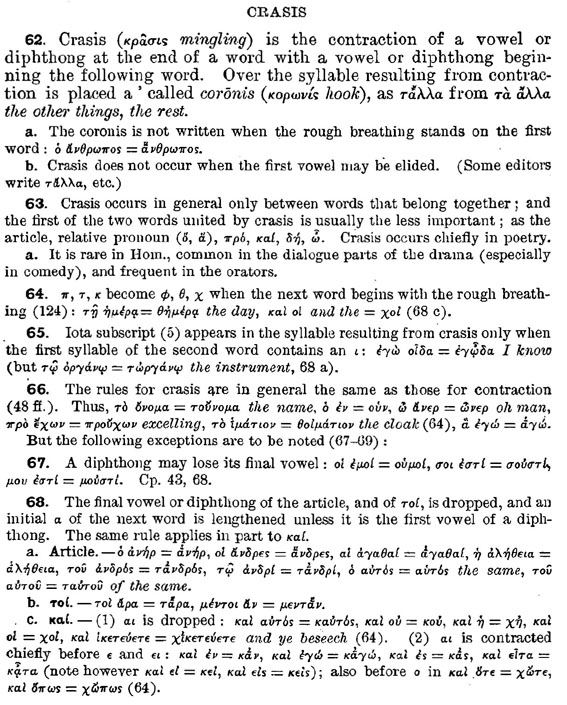
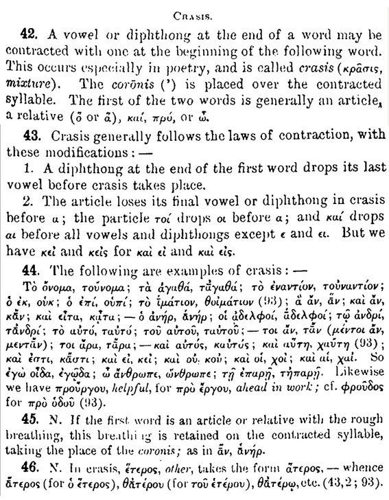
The coronis is the Byzantine device for notating a phonological process in Ancient Greek called crasis, whereby the vowel at the end of a word and the vowel at the beginning of the next word were merged together into a third, new vowel or diphthong:

τὸ έναντίον = τοὐναντίον
τὸ αυτό = ταυτό
ὁ ἐπί = οὑπί
καί οὐ = κοὐ

And that’s all the coronis is. A visual reminder of a breathing mark that is underlyingly there, as the beginning of a new word, but on the surface has been effaced through crasis. Since it is a visual reminder of a breathing mark, it behaves in the way a breathing mark behaves; as you can see in τοὔνομα, ἐγᾦδα and προὔχων, it interacts with other Greek diacritics in the way a breathing mark normally does. So it is typographically identical to a breathing mark, and always has been.

Τhe coronis is a misplaced breathing mark, and its location is predictable: there is no need to have a distinct codepoint for it.

In papyrology, coronis—literally ‘hook’—refers to a dingbat used to mark the end of a chapter or poem. Much bigger than a breathing mark, and unrelated to it.

This undermines the notion that the coronis is a sign distinct from the breathing mark: its distribution is in predictable complementary distribution to that of the breathing mark, and its form as smooth or rough is not necessarily independent of the original mark on the second word.

The reason for Unicode not to grant the coronis an underlyingly distinct codepoint was a blanket agnosticism about diacritics. Diacritics have very different semantics from language to language, and rather than encode each variation in meaning, Unicode has elected to simply encode the shape: if two diacritics from whatever languages look identical, they are deemed to be identical. This runs roughshod over any semantic distinction between breathing marks and coronis; but as I believe I have shown, that distinction survives its elimination as a distinct codepoint anyway.

So. all in all the actual shape of ‘coronis’ is similar to that of the ‘psili’ and occasionally to the ‘dasia’ and placed above a lower case vowel.

I have uploaded for you two pages about coronis and crasis from two Ancient Greek Grammars (Greek Grammar for Colleges by Herber Weir Smyth, 1918 and Greek Grammar by William W. Googwin, 1900) to make things even clearer.


By the way how is the alternate design of the Greek characters for Semele progressing?

Nymus thank you very much for making things totally clear about coronis and psili. The alternate design of the Semele Greek characters is almost finished and I will be posting them soon. Also, I will be posting an extensive amount of alternates of the Ancient Greek characters.

I have a question for you, "should the characters lunate sigmas and lunate epsilons have serifs or not?"

Hypatia thank you very much for the *.ai file. As soon as I find some time I will go on and finish the 'Hypatia Problem' pages.

Natasha hello,
In respect to your question about having a serif or not on the Lunate sigmas and epsilon, I am not sure 100% though. Take a look at Takis Katsoulidis ‘Genesis’ and also at the site of the Greek Font Society:

http://www.greekfontsociety.gr/pages/en_typefaces20th.html

Look for the ‘Majuscule Typefaces’ they do have serifs on the Byzantize style sigma.

I see that you just posted more Ancient Greek Characters with Variant letterforms. They look great. I will take a look at them when I have the time and let you know what I think.

Natasha hi,

I have just noticed that you have been asking Nymus about the lunate sigmas and epsilons. I had some free time so I went to google and look what I found for you:

Lunate Sigma
http://www.tlg.uci.edu/~opoudjis/unicode/letters.html
U+03F2 Greek Lunate Sigma Symbol [ϲ]; U+03F9 Greek Capital Lunate Sigma Symbol [Ϲ]
History
While in the 4th century BC literary papyri still used the ancient angular sigma (Thompson 1912:107), the cursive lunate form had taken over competely by the next century, where it stayed as the unique form of the sigma until the invention of lowercase in the 8th century—and as the capital sigma, for a millenium longer.
The form is called lunate, of course, because it looks like a crescent. Lest my defence of monotonic make me look completely unlettered, let me take this opportunity to reject Haralambous' gloss (§4.2.4) of lunate into Modern Greek as σεληνιακό. That means "lunar", and you can be sure that the lunate wasn't the form of sigma used in the Apollo program. The classical term is μηνοειδής; but since that will make Modern Greek speakers scratch their heads and ask "looks like a month?" (or worse, "looks like Menna, patron saint of Crete?"), one can certainly used σεληνοειδής. This is the post-classical word with which μηνοειδής is glossed in Byzantine dictionaries (Hesychius, Lexica Segueriana, Photius, Suda)—for the sake of the ancestors of Modern Greek speakers who likewise scratched their heads at μηνοειδής.
The word selenoid shows up in English, but only as a mispelling of solenoid (Google: 2350 vs. 681,000), and as the lunar equivalent of the geoid (Google: 22).
While the lunate was banished as a capital letter in the 18th century, it remains familiar to Modern Greeks through ecclesiastical use: it figures in church icons, and in decorative fonts intended to evoke Byzantium (just as epigraphical alpha and sigma——are kept around in decorative fonts to evoke antiquity). It is inevitable, for instance, that the headers of the webpages of the Church of Greece website all have lunate sigmas; what is interesting is that the homepage itself has the Latin word Ecclesia instead. (The point being, of course, that Ecclesia is a Greek word.)

There is a lot more about lunate sigma at the address I gave above, and you can go and read it all if you wish.

Lunate Epsilon

The lunate epsilon is an uncial character, just as the lunate sigma is; the normal lowercase epsilon became usual only in the 12th century. Just like the lunate sigma, the lunate epsilon is a glyph associated in Greece with Byzantium and Orthodox Christianity. Outside that context, the lunate epsilons are best known as set operators in mathematics; they are already included under that guise in Unicode as U+2208 Element of, ∈, and U+220B Contains As Member, ∋. The set operators are in a glyph tradition incommensurate with letter use, and are coded as mathematical symbols (Sm); if the lunate epsilon is to be included as a letter, it would need to have a lowercase letter category (Ll) and a distinct codepoint—which the lunate epsilon does. (The reverse lunate epsilon, on the other hand, has no use in Greek as a character, and its category is accordingly still Sm.)
The Capital Theta Symbol and Lunate Epsilons were proposed in March 2000 to the ISO by the US National Standards Body, as part of the STIX initiative to standardise usage of mathematical fonts. They were added to Unicode 3.1; Ken Whistler has a behind-the-scenes report on the deliberations that went on in accepting them. The lunate epsilons were originally proposed as U+213B Greek Symbol Straight Epsilon and U+213C Greek Symbol Reversed Straight Epsilon. All three symbols are described in the proposal annex as "N: normal or ordinary; e.g., symbol used as a variable." This means that some mathematician out there has used ϵ as a variable—despite the fact that it looks just like a set operator—and ϴ as a variable, but not as a glyph variant of Θ (or U+2205 Empty Set, ∅). ϵ∈ϴ? Well, I guess there's no accounting for taste.
The reason why the epsilons ended up in the Greek block is clear from Whistler's report: ELOT deemed these mathematical characters to be Greek characters—which in the case of lunate epsilon, they more or less are. But just as with the other mathematical symbols: if you're writing a Greek text and want to give it that Olde Bizantine Charme, don't use U+03F5. That's not what it's there for. Agitate for a Unicode uncial font instead.

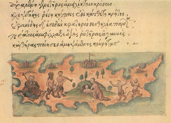
As It came to my attention that you are currently designing more and more Ancient Greek charactersI also found a nice image of some novel looking like characters for you, here it is:

Source: J. Victor Gaultney, Gentium type specimen (University of Reading, 2002), p.14.

Archaic Greek letters

About placing serifs onto Lunate sigma aand epsilon on a serif typeface (as these letters are supposedly Byzantine) take a look at this image:

A picture is worth a thousand words.

Right?

The quote I just used is sometimes attributed to Napoleon Bonaparte, who said "Un bon croquis vaut mieux qu'un long discours," or "A good sketch is better than a long speech". While this is sometimes translated today as "A picture is worth a thousand words," this translation may not predate the phrase's common use in English.

By the way I also found those two images depicting lunate epsilons.

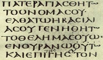
I also found this manuscript fragment from CodexSinaiticus with lunate sigmas and epsilons.

Your Semele is evolving quite nicely; although it is a bit too feminine for my taste I am quite fond of it. I guess that sooner or later you will design also the Cyrillic characters, and then I hope that I will also contribute to its fine-tuning. Keep up the good work. If I can be of any help in the meantime please don’t hesitate to ask.

Hello Natasha, I hope that the lunate sigmas and epsilons that I sent you were of some help, of course you have to alter the byzantine serifs to the Semele serifs.

By the way, I believe that you will have to add serifs also to those two ancient Greek characters that look like the letter M.

As omega suggested, when you are done and finished with the design of the Greek characters you may begin designing the Cyrillic characters, that will be an interesting deign task for you, especially the Cyrillic italic.

Those links that you sent me for the Hypatia play are extremely fascinating and to get an full understanding of it I started reading all about Ancient Greek Mathematics.

Could you give me please a rough estimate when will you be designing the book text weight for Semele?

Between us, it is not really necessary to do all in all what Nymus has been suggesting that you should to, they are just details that you could fix later on, for now just do what excites you most.

Hypatia is absolutely right, Semele has been developed very well and it should be a little boring being stuck with the time consuming facelifting of Ancient Greek characters.

Instead it would be more advantageous to design the book text weights for Semele and test them thoroughly, or even better do as Hypatia suggested and go on with whatever excites you most.

Many thanks to all of you for your help, advice and encouragement. I just finished designing the Byzantine lunate sigmas and epsilons and they look great. I have also face lifted the design of quite a number or Greek characters and made them more distinctive, and I will be posting them soon.

As most of you suggested my next task should be to design the bold weight of Semele.Has any of you any ideas or links that would make this task more productive and less cumbersome? I did search here at typophile but most of what I got was not exactly what I was looking for.

Well, maybe as you say, Nymus is overdoing it a bit with his suggestions, but he has always been very helpful and considerate; and I appreciate this enormously; thank you Nymus.

Hi Natasha. The best link that I have found so far in respect to making a bold weight out of Semele light is the following:

http://www.typophile.com/node/1753

I am looking for some more links even through google, just in case that I may find something and I shall let you know asap.

Some of the things and methods mentioned in the above link may seem highly esoteric to you especially that bit about using the interpolation tool in FontLab, if it is so please let me know and I will do my best to make things clearer for you; or even compose a mini manual for you.

Hi guys, I have just posted numerous alternate characters for the lunate sigmas and epsilons after making a thorough study of the info and images that you Hypatia and Nymus sent.

At the monent I am striving to finish the Semele Regular and I have to admit that it is quite a time consuming.

Omega, thanks a lot for the advice and the links that you have given me. It was somewhat too esoteric for me and I am following a much simpler way; I might use what you suggest at a later time.

Hypatia, I will be sending you soon what you have asked for, thanks for being so understanding and patient with me.

Hello Natasha, great to see you here again. I liked vey much the lunate sigmas and epsilons; as to which of the lot I like best I will take my time deciding that. I am eager to see some of your Semele Regular characters.

If the watch provides entirely quit then it is going to take somewhere around 40 becomes in a very clockwise way thoroughly wind flow them swiss military watch . tissot mens watches With the specific ways of create, the Breitling watch has been constantly not easy to content and create replications. Developments has evolved this, rose gold watches having everyone decided enough, being capable of getting the tools needed to create good quality these reproductions along with cloned Breitlings. This produces equally positive and negative items for any shopper. The most obvious straight down tumble is that it is tough to tell apart an original new coming from a false and this also has developed into ability and also skill byby itself. With a constructive take note consequently in a single at this moment have the funds for some sort of Breitling check out replica breitling bentley gmt watches . , for a large common of those identical dwellings, few know that you will be using a reproduction. , new sea dwellernew style rolex, pocket watches for men replica watches, replica rolex watches franck mueller watches . , rado watch prices . replica tag heuer watches, replica cartier watches, Development 1 replica tag heuer carrera watches ferrari watches . : Widely using of flower yellow metal This current year, ulysse nardin watches nearly every type of different watches introduced the new style throughout flower yellow metal with fantastic portions.

Once in a while, these spambots say something almost coherent. This is not one of those times.

Captured from web.archive.org on 19 Apr 2015. view this capture