Hello everyone,
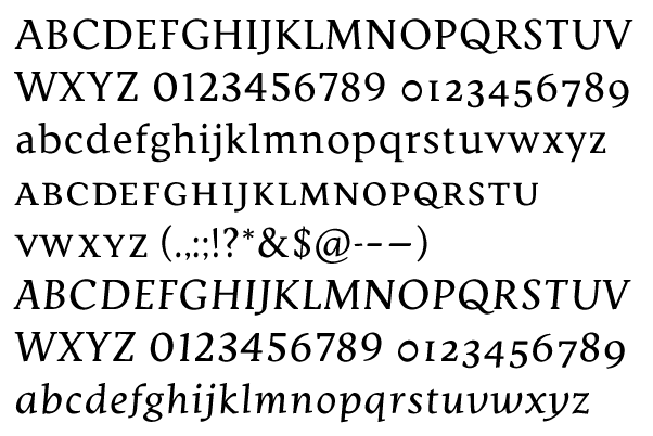
I've been working on this font as part of a semester-long information design project on typography and newspaper design. If everything goes according to plan, it will culminate in the redesign of my college's official student newspaper, The Climax (no, I had nothing to do with the name).
Since I don't have the money to see this on newsprint until I actually use it in the newspaper, I've been looking at what happens in other newspapers when they're printed, and also at how successful newspaper types have dealt with that. As the semester comes to a close and deadline quickly approaches, I would appreciate your critique, both general and nitpicky. As the topic implies, feel free to rip it apart.
Attached is a PDF that I threw together. The first page shows the font in what will be its native habitat; the second, in a normal text setting. Headlines are set in a display font that I just began. You're welcome to critique that as well, but at the moment I'm more concerned with the text.
Many thanks,
David
| Attachment | Size |
|---|---|
| djr_climax12.4.pdf | 476.18 KB |
| djr_climax13.47_1.pdf | 784.8 KB |
| djr_climax13.47_2.pdf | 948.43 KB |
| djr_climax13.47_3.pdf | 738.31 KB |