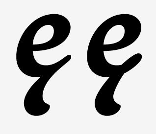
Hi. I'm working on this new font - it's a kind of hybrid between a baseball script and a formal roundhand kind of script, or at least that's how it started. It's taken on a life of its own since then. Anyway, I've just got round to drawing the Icelandic characters eth and thorn. What I want to know is: Is it ok for the crossbar of eth to be extended from th top of the stem in a loop? Had a quick look at other script fonts on MyFonts and found none that treated the eth this way. If there are any Icelandic Typophiles out there, it'd be good to get your opinion. As for the thorn, I'm thinking it looks way to much like a ß because of the loop (which comes from making it out of a b and p). Accents are missing from the text string below because I've not made them yet.
Cheers for looking and thanks in advance for any help