Inspired by this tread, I was wondering if someone could point me out some nice typefaces with an IJ-ligature.
Thanks in advance!
T.
This thread ran to 3 pages of replies and only 2 were recovered, so replies are missing.
Inspired by this tread, I was wondering if someone could point me out some nice typefaces with an IJ-ligature.
Thanks in advance!
T.

Hi T,
I do not know if my Kurversbrug is 'nice' but at least it has the 'IJ' ligature.
http://www.re-type.com/fonts/kurversbrugreg.html
(This tread is just out of curiousity, not with the intention to buy the font)

The Cleartype fonts from Luc(as) -- Consolas and Calibri -- contain them. I think most of his typefaces do.
I think this glyph is re-appreciated again among Dutch type designers now that they can be safely put into OpenType fonts.

Well, it needs to be more then just 'ij' placed together in one glyph for me to find it useful. With that I mean it has to have something extra like 'st' and such ligs have.

Maybe turn the two tittles into a macron, or a tilde.
hhp
Yes I agree Quincunx. What do you mean with tittles Hrant?
Tittle: dot on the "i"/"j".
Fancy-pants word, I know - sorry.
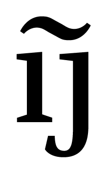
hhp


The usual handwritten/cursive form of 'ij' resembles a 'y' with dieresis, with the end stroke of the 'i' connecting to the 'j'. For the UC 'IJ', I'm not really sure, but I guess a similar approach would be possible.
I must say that for upright romans, I would consider true ligation for 'ij' or 'IJ' as distracting as that for something like 'st' for use in immersive reading.
Ties, is that something you just made or an existing logo?
Brian, I think that if it's done right it can be much better than something
like a frilly "st", not least because it helps properly encode actual language.
hhp
Hrant: Well, I was a bit exaggerating, because I can already imagine the overdone 'ij' ligs drawing far too much attention to themselves. I think I can also picture it done well, though the way I'm imagining it, there need not be an actual connecting line between the ligated elements, and it would only work for certain designs--say, Fedra. Or it would be cool to have Martin Majoor design one for Scala.
I'll wait until I get on my home computer to illustrate what I'm on about...
Hrant: No, that is an existing logo of Heijmans, designed by TBWA/Designers Company
I know a pretty cool one down the street, I'll try to make a picture of it soon.
I think that "h" is gimmicky, but the macron
seems to stand quite nicely for "foundation".
hhp
Your tilde-ligature made me think of this logo. I think it is quite nice, the "ij" reflecting in the "h".
I guess "huisstijl" means something like visual/corporate identity?
I did notice the "h" being a flipped "ij", but what does that mean?
That the houses they build fall over easily? Or maybe it's to emphasize
the company's Dutch-ness, but isn't nationalism taboo in the Netherlands?
BTW, that Koninklijk Instituut voor de Tropen logo is amazing.
hhp
> I guess “huisstijl” means something like visual/corporate identity?
Yes, couldn't think if it in English.
> but what does it mean?
Does it have to mean anything? You interpret the macron as the foundation, I just see it as a line.
[edit]This is why I think the "h" is just as gimmickly as the "ij". But still quite a nice logo.
OK, your edit helps.
> Does it have to mean anything?
Not necessarily - although it's a plus, no?
I guess it could just be pretty - but is it?
The macron being in red seems to have a "special" meaning, and
the "foundation" meaning is the one that came into my own mind.
hhp
> Not necessarily - although it’s a plus, no?
Depends I think. Depends on how litteral it becomes. So I guess it is a plus indeed when you can interpret it as a foundation.
> I guess it could just be pretty - but is it?
I think so too. I think it is pretty in a way.
This was their old logo. Since I study architecture, I happen to bump in the company's advertisements now and then. And I noticed the improvement. That is why it sticked in my thoughts. (One of the goals of logo's.)

In "standard" fonts, ideally I make ij's — pronounced ee-yay for you non-Dutch & Flemish speakers — so that the dots of the i and j components are a standard dieresis. The ij is the modern variant of the ÿ, and if you were to track a word with an ij in it, the ij would not become separated: B . A . K . K . E . R . IJ
Monospace fonts should have ij and IJ, as does OCR-B.
I always create ij's in my types. Sometimes some tweaking of the component forms is necessary, sometimes it's not.
Huisstijl means, quite literally, "house style", which is the Dutch analogue of corporate identity. Often, a huisstijl consists of a beeldmerk — picture mark = icon — and a woordmerk — word mark = logotype.
Cap:
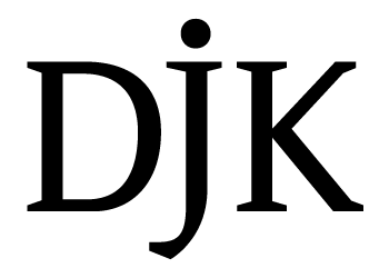
hhp

Regarding the "heijmans" logo, I see it like this:
The "h" is interrupted in a stencil cut fashion. This is inconsistent witt the rest of the word, but since this form is reflcted in the "ij" with a hooked foot on the "i", I, as a non-Dutch reader, interpret it as a stencil cut "y" (since the "h"" prepared me for reading through more stencil cuts), and thereby wind up pronouncing the word more correctly (hey-mans) than I would if I had attempted to through ordinary English phonics (hëzh-mans) rather awkwardly making up sounds for letter combinations usually absent in my language. I don't know if this was intentional, enabling more correct pronunciation by foreigners, but that's how it works for me.
Ah, the stencil effect has to do with construction!
(I think design studios should hire me as a Post-Rationalization Consultant.)
hhp

Speaking of stencils, the upcoming expanded release of !Crass Roots includes about twice the glyphs of the Open version, and uses a method very similar to the previous image.

This is how I would do an 'ij' ligature in a roman text face if I were limited to making a 'true' ligature, i.e. one where the components are connected.
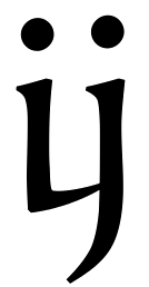
Still, my preferred 'ij' solution would simply be just 'i' and 'j' brought together in a single glyph with minor adjustments to allow them to harmonize. I'm not sure what readers unfamiliar with the 'ij' digraph will make of the above ligature.
And I don't really see how one would make an uppercase 'IJ' ligature of the connecting variety in the same style. I think the components in 'IJ' really should be kept separate, either maintaining their original forms or perhaps modified to suggest an interrupted 'U' as in Florian's example above.
Making the 'ij' resemble a 'y' does benefit the foreigners, whether that is intended or not. In fact, the Dutch often 'internationalize' the spellings of some proper names by replacing 'ij' with 'y', so that the footballing legend Johan Cruijff is better known as Cruyff abroad, and Feyenoord of Rotterdam were originally Feijenoord before they changed the spelling for the benefit of foreigners who trouble pronouncing the original spelling.
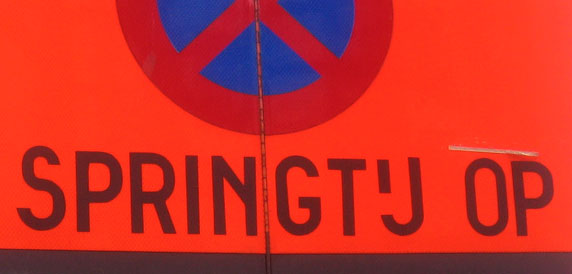
> The UC IJ can look like an “interrupted U”—as this Belgian sign shows.
Yes! That is something I wanted to photgraph as well. Nice.
> Monospace fonts should have ij and IJ, as does OCR-B.
And another font which has got it!

I think that in roman a connected ij-lig is unwanted. It would draw too much attention and interrupt the flow. But italic is a different story: I'd love to see all fonts with fancy connected i-j's. (Doesn't make OT having alts easy? So…)
> This is how I would do an ‘ij’ ligature in a roman text face if I were limited to making a ‘true’ ligature, i.e. one where the components are connected.
That is a very nice 'ij' if you ask me. It's how it is written by hand in Dutch, anyway. If it will work well, I don't know. But it's quite close to how I would imagine a true (dutch) 'ij' ligature.
Sorry, I don't think it's any good at all, because it's
extremely confusable with the y-diaeresis. The fact
that there's some historical link between the two is
largely moot - there's also a historical link between
the "i" and "j", but isn't it kind of a big plus that we
can distinguish between them?! :-/
hhp
The link sounds current, not historical. Once we assimilate the Dutch into the U.N.A., the IJ will be no more. Mwa ha ha .

Surprised no one has mentioned that ij and IJ have Unicode code points... http://www.unicode.org/charts/PDF/U0100.pdf so no OT is required and that they are part of the WGL4 standard http://www.microsoft.com/typography/OTSPEC/WGL4C.HTM so many fonts, esp the bundled ones, contain them.
> ij and IJ have Unicode code points…
And so does y-diaeresis. As in a separate one. Case closed.
hhp

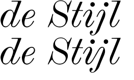
Wanting to distinguish 'ij' and 'ÿ' in print is the reason why I do not advocate a true ligature for 'ij'. But that's the internationalist perspective in me speaking. Yes, of course the Unicode Consortium distinguishes the two, because it is an international standard.
For Dutch use, I don't think there is reason to fear the confusion. In a lot (most?) of Dutch handwriting, 'ij' and 'ÿ' would be virtually indistinguishable precisely because there is no semantic need for distinguishing between the two. 'Y' is not used in native Dutch words, so I'm guessing 'ÿ' would be extremely rare to the point that the 'ij' or 'ÿ' confusion would be a false dilemma when applied to Dutch--the 'ÿ' is a false alternative in Dutch, and in Dutch minds perhaps even considered a variant form of 'ij'. It is nothing like the relationship between 'i' and 'j', each of which has its own independent uses distinct from the other in most modern languages using the Latin alphabet.
This of course does not apply when you want your text typeface to work for languages other than Dutch, in which case 'ÿ' may very well be used.
On a somewhat related note, in setting Dutch a ligated 'ij' distinct from 'i'+'j' would be a plus in that it helps distinguish between the digraph 'ij' and cases where the letters 'i' and 'j' are not part of a digraph, as in words like 'bijou' from the French. So a true 'ij' ligature, while not appropriate for most text setting, may be useful in things like dictionaries or textbooks for learners of the Dutch language.
I'm not sure how useful the concept of a "true ligature" is.
Is mine a true ligature? If not, does that mean the "i" and
"j" are not "true" letters, because they have more than one
part? Also, as Legato demonstrates, ligation can be "virtual",
via the white.
> I don’t think there is reason to fear the confusion.
No too much, I agree; but there's even less reason to revere history.
hhp
Hrant, you're right; 'true ligature' is a problematic term. I just wanted to refer to forms where there are joins between (the black parts of) the components. Yours would be true ligatures in the sense that I was using the term--they are certainly distinct from 'i' and 'j' next to each other.
I wanted to introduce the distinction because the term 'ligature' is ambiguous (although I probably caused more confusion in the process). Was T, in his original question, referring to fonts that simply have glyphs for the 'ij' digraph? Lots of fonts do, but most use forms indistinguishable from 'i' and 'j' next to each other. I surmised he wanted to know about fonts that do more than that.
The 'virtual' ligation you speak of is just another name for the harmonious fitting of the black and white letters, which good designs should be doing anyway between any pair of letters.
>there’s even less reason to revere history.
History? I was basing my suggestion on current handwritten forms. I don't even know if the resemblance between 'ij' and 'ÿ' has a historical basis, and I suspect they really don't--it's probably a chance convergence. I just wanted a form that makes the most sense to the modern Dutch speaker.
Perhaps 'contiguous ligature' or 'joined ligature' might be a better terms. Lengthy, but how often need it be so distinguished?
ij and IJ have Unicode code points…
And so does y-diaeresis. As in a separate one. Case closed
Ha ha ha, right. Because Unicode is The Truth, not a cobbling of backwards compatibilities and porkbellies. I'm sorry Hrant, Unicode is going to have to be around a lot longer before it is the international Rosetta stone.
This of course does not apply when you want your text typeface to work for languages other than Dutch, in which case ‘ÿ’ may very well be used.
I think that language tags make that simple.

Jongseong: Yes, of course the Unicode Consortium distinguishes the two, because it is an international standard.
Actually, Unicode encoded the Dutch IJ/ij digraphs as distinct characters, separate from the I+J and i+j sequences, because they were pre-existing characters inherited from a Dutch telecom standard. For the most part, Unicode does not encode digraphs. But some are encoded for backwards, roundtrip compatibility, as in this case.
For the most part, Dutch users do not use the digraph characters -- although some, like Thomas Milo, certainly advocate its use -- they just type I+J and i+j. So far as I know, the IJ/ij digraph characters are not accessible via the standard Dutch keyboard.
> So far as I know, the IJ/ij digraph characters are not accessible via the standard Dutch keyboard.
No they aren't. Do Dutch keyboards exist? The normal way in Dutch to type an "ÿ" is just "ij". For me, as a dutchman, the uppercase is sometimes odd, not the lowercase. We do type the uppercase as an "IJ" (a I+J), but it sometimes just lookes silly. As in de the river "IJ" (Amsterdam).
Do dutch font users want a feature in their fonts to automatically ligate those, whenever they type 'i', 'j' or 'I','J'? Is 'I', 'j' wanted as well?
Do Dutch keyboards exist?
Yes. There's a Dutch keyboard standard, although apparently relatively few people use it. It is very similar to the US qwerty keyboard layout in the normal and shift states, but has the euro symbol accessible using AltGr+E and some other symbols and punctuation not mapped in the US keyboard.
Choz: Is ‘I’, ‘j’ wanted as well?
Officially, no, because the digraph cases as a unit, so it is always either both letters uppercase or both letters lowercase.
I don't think automatic ligation is the best option because not every 'ij' combination in Dutch is the digraph (even if for 99% of the time it is). The 'i' and 'j' might come from different syllables, or it might be a loanword.
My take: to use special 'ij' and 'IJ' ligatures for Dutch, one should manually search and replace the 'ij' and 'IJ' combinations in the text, taking care to make sure to replace only when the digraph is wanted.
Cumbersome, I know. But unless one has a special reason for distinguishing the digraph and non-digraph combination of 'i' and 'j' (for specialist texts, dictionaries, language learning materials, etc.), I don't see a compelling reason to replace the lowercase digraphs with special glyphs. For the uppercase 'IJ', I can allow that for certain designs a special glyph for the digraph may be desirable.
Thanks Brian, that's excellent advice.
> I don’t see a compelling reason
Readability (via divergence).
Not in a major way, but not much in type is anyway.
We mind the details.
hhp
Nick askes: "Is this ligated ij OK for the normal italic"
I prefer the connecting line between i and j to be an upward move. To illustrate this: the common way to write ij in cursive (handwriting is cursive…) is to basically draw a u and elongate the last downstroke. Am I making sense?
To elaborate on this: Gerrit Noordzij has written extensively on 'writing' as the basis for typedesign and one of the first exercises in his 'course' is drawing 'waves' (up in a slant, down in a semicircle that smoothly turns into the upslant etcetera).
Readability (via divergence).
I hadn't noticed that Dutch people had a problem reading. They have one, very regular digraph in their orthography. English has many, very irregular digraphs, and a couple of trigraphs. Digraphs are a feature of many alphabetic writing systems. Rather than assuming that visual divergence of digraphs assists readability -- really a kind of spelling reform, in which you invent new letters or diacritics based on merging or ligating digraphs --, it seems to me that we should try to understand just what it says about the reading process, and the flexibility of that process, that so many cultures and linguistic groups have adopted digraphs, trigraphs and even tetragraphs as part of their reading systems. The idea that sequences of letters can function equivalently to single letters in the representation of sounds is remarkable. It indicates that unitisation happens quite comfortably in the mind, relative to language and memory, independent of unitisation of written marks. Since unitisation of written marks is so easily achieved -- either through the invention/importation of new letters, ligation or use of diacritic marks -- it is notable that so many different orthographies should have instead adopted the use of sequences of existing letters to represent individual sounds.
Gerrit Noordzij's views have merit in proportion to their distance from type.
> I hadn’t noticed that Dutch people had a problem reading.
People didn't think they had a problem walking before somebody
thought of shoes either. And I'm sure some people preferred to
believe that shoes were a damnfangled idea.
John, let's not get into this again - it's hopeless.
For whoever might need a fix, just use Google to search Typophile.
hhp
> why he thinks ligating the ij might be good for ‘readability
> (via divergence)’ if not to distinguish phonemes.
To distinguish boumas, obviously.
> do you think it might be good for ‘readability (via divergence)’
> to distinguish the ij in marijuana from the ij in hijack?
Not too much, because their boumas are already very different.
But Dutch having many more “ij”s harbors more opportunities.
hhp
Bijna, leuk, buiten, auw, beurtelings, irritatie.
> Inspired by this tread, I was wondering if someone could point me out
> some nice typefaces with an IJ-ligature.
> Thanks in advance!
> T.
I think a short explanation of the distinction of *-eme and bouma unit might be in order. Hrant, go first.
A bouma is a unit of perception of visible language; it’s nebulous, variable, dynamic and subconscious. As opposed to a unit of formal, conscious language, the stuff people think they’re reading.
hhp
What necessitates this being subconscious? Couldn’t be complex, apparently contradictory on the surface, and only forced into the subconcius after conscious effort? And must this contrast with grapheme, Is the definition of a grapheme currently inadequate and unscientific?
From the definition, a bouma sounds as real as “santa” or “microbes”.
> What necessitates this being subconscious?
Speed. Consciousness is too slow.
> ... only forced into the subconcius after conscious effort?
I’m not totally sure I understand you, but if I do: as a rule things go the other way.
> bouma sounds as real as “santa” or “microbes”.
I don’t know how your kids fare on xmas,
but I do envy you for never getting sick.
hhp
>> What necessitates this being subconscious?
>Speed. Consciousness is too slow.
At first. But people learn letterforms slowly, then develop it. And this can be repeated with first exposure to new languages with different diacritics, or with fractur faces, display runes or or other alphabets.
>> … only forced into the subconscious after conscious effort?
>I’m not totally sure I understand you, but if I do: as a rule things >go the other way.
Spelling and multiplication are learned, and then drilled into reflex responses. I’m think Pavlov disagrees with that rule.
>> bouma sounds as real as “santa” or “microbes”.
>I don’t know how your kids fare on xmas,
>but I do envy you for never getting sick.
I’ll get back to you on the first part. :) What I meant was that the concepts of microbial life were once mythic, ineffable, hard to describe consistently and thought of as “spirits”, then innate humors, then “corruptions”, then airborne bugs, etc. We know a bit now, and realize that it is rather complex, but they are real, and have observable functions and limits. With time and observation, they became clear and more real.
Perhaps I should have compared it to a Krakken, that in time “became” a Giant Squid. I am still intrigued by this.
Would you say that a grapheme is made of boumas?
BTW, which do you prefer, the dot vertically centred on the full character height, or on the x-height?
x, with OpenType alternate for all caps settings?
> But people learn letterforms slowly, then develop it.
People learn letterforms slowly, then it “clicks”: moves
into the subconscious. So yes, learning goes that way, but
perception (the application of learning?) goes the other.
> the concepts of microbial life were once mythic ...
Yes, that is our general current state with the understanding of
reading. A term I like to use here is “subvisible”: just like you need
a microscope to see microbes, you need the right “tool” to “see” it.
> Would you say that a grapheme is made of boumas?
Mostly the other way around. A bouma is as large as possible, for speed.
hhp
“Mostly the other way around. A bouma is as large as possible, for speed.”
Click. Got it.
We might actually be getting somewhere.
As I wrote earlier, I think the terms phoneme and grapheme are exchangeable, and the latter term is probably redundant, since both refer to perceptual units in language processing. In the same way that phoneme is used to refer to the mental abstraction of units of both vocal and sign language, so it may be used to refer to the same abstractions in textual language. To the language processing areas of the brain, language-is-language-is-language. But for the purposes of this discussion, let’s stick with grapheme for now, so long as we’re clear that a grapheme is something in the mind and not something on the page.
Now, if we flesh out the notion of bouma and relate it to graphemes in the way that Hrant suggests, i.e. a bouma is made up of graphemes, then it’s clear that we’re looking at a different kind of perceptual unit, a unit in visual processing on its way to being broken down into units of language processing. The bouma, like the grapheme, is something in the mind, not on the page, but it’s being handled by the parts of the brain that deal with visual perception not language cognition. Is this a reasonable statement, Hrant?
So I begin to see how you might make a distinction between e.g. the ij in two different Dutch words based on bouma divergence, but only in terms of adjacent letters, i.e. as part of a larger bouma of more than the single grapheme represented by the ij digraph. Is that the point?
> both refer to perceptual units in language processing.
No; in immersion, neither.
> a bouma is made up of graphemes
Note my “mostly” perviously.
Seeing a bouma strictly as a compilation of graphemes is counter-productive.
> on its way to being broken down into units of language processing.
Broken down, or built up? I’m not sure.
> Is that the point?
I think so. I’m proposing that the linguistic-analysis
relevance of “ij” is secondary and maybe even misleading.
hhp
No; in immersion, neither.
Again: language-is-language-is-language. We don’t have special areas in the brain the process language differently depending whether we are reading ’immersively’ or not. What happens before language gets to that stage, e.g. in vision and in perceptual processing, may be different, but phoneme and grapheme are terms that specifically refer to mentally abstracted units of language; they refer to what we recognise as units of language. Whatever else happens on the page, in the field of sight, in the eye, and in the visual receptors of the brain and the synaptic passage to those language processing areas, at some point you are dealing with phonemes. [Unless of course the phonemic model of language is incorrect, but — very ironically considering your position — the linguists who reject the phonemic model do so on the basis that they consider it a literary construct, i.e. inherently connected to writing and reading.]
Seeing a bouma strictly as a set of graphemes is counter-productive.
I agree. I think of bouma as one or more (usually more) features in a role architecture (to use Peter Enneson’s phrase). So a bouma may be made up of features that happen to correspond to discreet graphemes, or may be composed of fragmentary features from different graphemes. One of the implications of this is that a single grapheme may contribute to multiple boumas (although, practically, probably not more than two).
Broken down, or built up? I’m not sure.
You can’t build up to a phoneme because, by definition, the phoneme is the smallest recognised unit of language that contributes to the identify of a word. But if you think of boumas as package data, you could imagine phonemes being ’recompiled’ from bouma perception. So let’s imagine that the reader ’sees’ two boumas, each of which includes features from a particular phoneme. At some point in word recognition, that information has to be re-organised by the brain so that the phoneme is identified. [Phoneme identity is crucial to word recognition, because the phoneme is the smallest unit of language that contributes to word identity, i.e. if you change one phoneme in a word, you have a different word.] So whatever role boumas play in the perceptual aspect of reading, at some point in the cognition aspect they must be translated into language, either by being broken down into phonemes (in the case of boumas made up of more than one discreet phoneme) or re-compiled into phonemes (in the case of cross-bouma phonemes).
I’m proposing that the linguistic-analysis relevance of “ij” is secondary and maybe even misleading.
That depends on whether, in terms of overall reading speed — i.e. of the combined perceptual processing and language processing operations — there is a net benefit to boumas corresponding to discreet graphemes. There may well be, in which case linguistic analysis would be an important tool in figuring out optimal bouma divergence. And even if there is not a significant gain in correlating boumas to graphemes or grapheme clusters, there might not be any converse gain, i.e. it might not matter one way or another whether boumas correlate to graphemes.
But the linguistic analysis does provide a methodology for approaching super-letter design issues, and I think this thread demonstrates that. We simply wouldn’t be talking about the ij digraph and its possible divergence in boumas if not for the fact that it represents a discreet phoneme in Dutch. And I notice, with significant irony, that all of your proposed ideas for different graphical representation of ij are made in isolation, i.e. not considered as part of larger boumas. As such, I think they’re basically arbitrary, capricious design play. In order to make a serious case for divergence, you would need to identify potentially confuseable boumas involving ij, in which varying the representation of ij would disambiguate the boumas.
Are there any loan words in Dutch that are homographic to indigenous words, but pronounced differently?

Just something came up by expanding TazIII at fontfabrik. By reading a dutch book I was surprised to read the word fijn over and over with a ’fi’ ligature separating the ’j’ form the ’i’. I would have posted it into this treat, but it seems to be closed.
My solution for this problem would be sub f j’ j’ by f ij; and sub f f ij.alt by f_f_ij.alt;. Sure including a language lookup so the Fijians still will have the f_i in front of the j.
The only page I found something about this subject so far was Sorting It All Out.
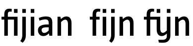
Aseptically if the dot of the ’i’ is swallowed by the ’f’ the wrong letters are bundled together :
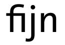

Personally I don’t think the fi j n looks good. The f i j noption is better, or the f ij n in which the f does not ligate with the ij. When the kids learn to read, the popular vowel combinations ee aa uu oo oe ui ei ij are taught as single sounds which happen to be written with two letters. The ij ligature would be better, a u with a long j tail and a dieresis.

> My solution for this problem would be sub f j' j' by f ij;
Did you mean to say sub f i’ j’ by ij; ?
Personally I’d prefer a similar solution used for Turkish, and leave the ’liga’ feature alone. Something like:
languagesystem latn dflt;

   languagesystem latn NLD;
feature locl {

   script latn;

      language NLD exclude_dflt;

         sub f i' j by i.dot;

} locl;
feature liga {

   sub f f i by f_f_i;

   sub f i by f_i;

} liga;
(This, of course, would be unnecessary if people were typing the character ij instead of the characters i and j.)
[Edit: Made small correction to the code]

vanblokland wrote:
When the kids learn to read, the popular vowel combinations ee aa uu oo oe ui ei ij are taught as single sounds which happen to be written with two letters.
But the difference between the ’ij’ and other combinations, like the ones you mentioned is that they are not capitalized together (as T mentioned earlier in this thread). Wich to me suggest that we (the Dutch) ’can’ see the ’ij’ as a single (composit) letterform. I’m not aware of any other character combination, that gets capitalized together, even if they have the same sound as an ’ij’ (’ei’).
ie:
’ijs’ becomes ’IJs’ (translated: ice)
’eis’ becomes ’Eis’ (translated: demand)
Are there other languages where this is common practice? Or other character combinations wich get capitalized together?
edit:
I thought of the Spanish ’ll’ digraph, as I remember it being written capitalized together, but according to wikipedia, that was wrong.
This digraph is considered a single letter in Spanish orthography, called elle. From 1803 was collated after L as a separate entry, but this is no longer done: in April of 1994, a votation in the X Congress [1] of the Association of Spanish Language Academies ruled the adoption of the standard Latin alphabet collation rules, so that for purposes of collation the digraph ll is now considered a sequence of two characters. The same is now true of the Spanish-language digraph, ch. Hypercorrection leads some to wrongly capitalize it as a single letter (“LLosa” instead of the official “Llosa”) as with the Dutch IJ.
source: http://en.wikipedia.org/wiki/Ll
more examples:
http://upload.wikimedia.org/wikipedia/en/e/e2/Leesplankje_van_Hoogeveen_...
note the ’g-ij-s’
http://www.crwflags.com/fotw/images/n/nl~phij.gif
http://www.new-renaissance.com/fonts/gfx/alphabet-oddities/westmonasteri...
earlier discussion about the ’ij’; http://www.typophile.com/node/3807
W[h]ich to me suggest that we (the Dutch) ’can’ see the ’ij’ as a single (composit) letterform.
Very probable, considering the widespread usage of Y instead of IJ, especially in the 19th century.
And some dictionaries and encyclopediae used an extra chapter for IJ.
Also proof of this is that in some regions IJ is pronounced differently, eg ‘ie’ in the East.
(I am talking about the Lowlands, of course).
. . .
Bert Vanderveen BNO
Also proof of this is that in some regions IJ is pronounced differently, eg ‘ie’ in the East.
Actually, I think that is a remnant of the origin of the ’j’ shape itself.
Before the ’j’ was a character, it was an alternative ’i’. A way to tell a ’ii’ from a ’u’, was to make the last ’i’ longer (’ii’ became ’ij’). I believe this was used in much the same way as a ’long s’ was used, at the end of a syllable. An example of a common Dutch word, still in use, which has the ’ii’-sound, but is written with ’ij’ is bijzonder (translated: special).
Thank you all so far.
That ij is a separate glyph in dutch and needs special handling is out of question.
By discussing the case with Luc(as) we decided that Erik suggestion for using
f ij n rather than fij n makes totally sense.
As we are taking care of the glyph-order in the glyph-window in CS3 which is default set on ’sorted by Unicode’ there is a new issue coming up.
If I use sub f i’ j’ by i_j (thanks Ms :) all the ligatures will not longer be placed behind the f. Just a detail but to avoid that i created a f_i_j and f_f_i_j ligature without connection to be used in Dutch, as long ij.alt is not applied.
I would be really interested if someone has a better approach for this problem or a suggestion how to handle it more elegant.
@Florian: funny that I got on the subject by reading a book by Fiep Westendorp in which fijn is written always fi jn. This mad me think about the disadvantages of the nowadays easy and automatic accessed ligatures.
As you proof Miss Westendrop would have known better, but a Dutch book designer just did not think about this issue. Same case on the Dutch system of Mac OS X. A folder with nice pictures will be called fi jn beelden.
a suggestion how to handle it more elegant.
Seems to be similar to the Turkish f_i situation.
For that, a “locl” feature with the use of a special “Turkish i” — identical to the normal dotted i—has been recommended.
So perhaps a “Dutch j” is needed, for use after the letters fi, to kill the ligature.
In the locl feature:
Language Dutch
sub f i j’ by DUTCH_j;
And later, in the liga feature:
ignore sub f i DUTCH_j;
Sorry if that’s not the final code, but just thought I’d mention the idea.
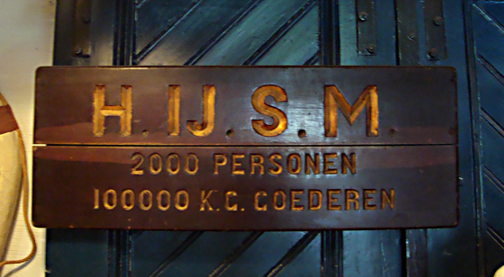
Sorry for the bump, but I recently came across this abbreviation (initialism) for the first Dutch Railway company (HIJSM, 1839-1938) with the I_J put together, which made me remember this thread..
Captured from web.archive.org on 5 Jan 2019. view this capture