Typophile

>>> Type ID Pop Quiz V2.2 - Intermediate Level

Bald Condensed

This is how it works:

  • A complete glyph is published in the Type ID Pop Quiz.
  • Try to identify the typeface. To win, you need to name both the typeface and the weight.
  • Show off your knowledge by casually mentioning additional trivia, like who designed it, when and by whom was it (first) published, and other cool stuff to impress your fellow Typophiles with.
  • The winner produces a new challenge -- a complete glyph, black on white background, presented in a 288 x 288 pixel square, including a R204G000B00 1 pixel border.
  • The person who posts a challenge can't win the next game.

In case of any disputes, I will act as judge, jury and avenging angel of wrath.

If you think this is a little too difficult, maybe try the Entry Level Type ID Pop Quiz first. Too easy? Go to the Expert Level Type ID Pop Quiz.

Good luck everyone, and have fun. ;^)

With respectful thanks to the originator of this utterly useless but highly entertaining waste of time, the often imitated but never duplicated Cheshire Dave.
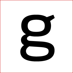
Here's the new challenge. Not too hard, so experienced type IDers please stay away from this one and go to the Expert Level where you belong, you bunch of hotshots. ;^)

I dont know

Say Marc, you can't post a new challenge before you solved mine. Please read the rules, dude. ;^)

Sorry Bald, It's was a little Joke

It wont happen

almost Apex…

maybe Clan? That new one with no italic?

Muzz

Hah, no sweat, I didn't get it was a joke. :^)

Is it?

Oy, Murray, I don't know what happened but I didn't notice your post when I posted my last comment. Yes, you are right, it is FF Clan Wide News byLukasz Dziedzic.

Good one, you're up. :^)

good luck kids!

That's certainly a perky little tail. I can't remember seeing anything of this type with a terminal (or lack thereof) like that. Anxious for someone to get it right.

I think I have an idea who designed this glyph... B^)

Go on mates! Czech it out…

Muzz

ITC Tyfa? I should know my Czech designers better. I've heard nothing but good things about Praha in the last year or so. On that note, I'm anxiously awaiting the day that Škoda starts exporting to the U.S... I'll be the first one in line.

Yes v-6! That one is the Tyfa 1959 GRafotechna version! Your turn......

Muzz

This is my miserable failure moment. I read the directions on posting an image, and had no luck. The black bar with the edit button is evading me. Anyway, until I get it figured out (sorry), here's a link to the image. It's an easy one to get things moving in here.

I helped you out. :^)

Thank you! X^)

Is *that* a cent-symbol?

No, not a cent symbol. Unless you mean my avatar, but that's for another day!

If/when hints are needed, let me know, but this one should be in the bag... it's an obscure reference.

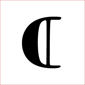
It's a variation on the paragraph symbol, yes? Jenson? Or perhaps some derivative of Jenson like the Doves or Golden Type?

Thats look like an a on the side

Where did v-six go?

Jason got it.

It's the capitulum from Adobe Jenson Pro.
You're up.

(p.s. I was at work trying to find something in our limited font library that would go well with ITC Berkeley).

Jason, you're up! Good one BTW, I would never have found that one.

People, please keep in mind this is the Intermediate Level. If you feel like going really obscure on the glyphe choice, maybe head over to the Expert Level. ;^)

Sorry 'bout that, I figured that would stand out like a sore thumb, it's one of the few of its kind without a descender... but I guess it was so different that it wasn't clear what the glyph was. Also, any alphabetic character from Jenson Pro would've almost gone in the beginner category, except that maybe it'd be confused with Centaur. Anyway, if I end up posting another I'll stay away from the analphabetic stuff.

Regards
Casey

Casey, also don't name your uploaded image what the typeface is ... ;^) I had to bow out of this round because I knew the name of it. (Don't worry, I've done it before too.)

I named the image capitulum, that only hinted at the character, which apparently would've helped anyway.. but yes, I am absent minded enough that I certainly could have done that. You had no need to duck out, maybe the second you saw the image your sub-conscious replaced capitulum with Jenson. That's when you know you're good :)

This might be a piece of cake; basically if you've used this font even once this is going to jump right out at you, but I used it recently so it's what came to mind. Have fun...

Reminds me of Maiola ... but it isn't.

Now that is one typical ampersand -- I know who designed it, but I'm not sure which of his typefaces it is. I think (chronologically speaking) the middle one.

Nope, it's his first design, the one that made him really famous and popular.

BTW In reply to an e-mail Casey sent me -- it's very hard to define what's too difficult for the Intermediate Level Quiz, and I think I spoke too soon. So no worries about posting something like an ampersand, just don't start posting periods or en-dashes, OK? ;^)

Oh, er, that'd be the ampersand in Martin Majoor's FF Scala Italic from 1990. (Tiff, Casey, Muzz – surely you're holding back? I guess it must be nighttime elsewhere in the world...)

Yep, you've got it Ben, you're up. (I figured it was a bit too distinctive to be difficult, but it's just such a great ampersand.)

OK. Should be easy as

Ben, good choice, this one probably doesn't hang out around typophile too much.

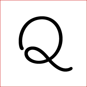
It's Giddyup, Yee-haw!

Don't know if I have to wait for confirmation, but in the meantime, here's a royal new challenge, wonder

Sorry Bart. Yes you're up; it was the Q from Adobe Giddyup Std. I was attempting to move from the sublime to the ridiculous. Nice new challenge there.

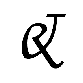
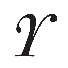
Ooooh, this should be either an italic lowercase r or uppercase Y. Quite beautiful.

It's an italic uppercase Y.

If hints are needed btw, I will be glad to meat demand.

Without any clue, it is really impressive.

Good one, T. Your turn. :^)

oh no. i KNEW i know that Y, i knew it. i've been looking at fleischmann like 2 hours a day lately, thats why! i could've won! ;)

Yes, it's DTL Fleischmann, also known as Kaisers Königliche Fleischmann. (I gave two very tiny clues, but I don't think they were very helpful, so well done!) You're up. :)

Ok, nice, i post a knew one in a couple of minutes.

T.

Ok, here we go:
Good luck

T.

If hints are needed...

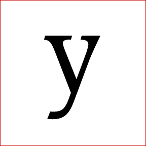
Good one T, I'm out in the dark on this one. I remember recently seeing a similar italic with a similar slope (or relative lack of slope) but can't for the life of me what it was.. Almost seems like something Jan van Krimpen would've done with a few small tweaks. The sharp edge on the bottom serif will haunt me until someone ID's this.

Well, you're hunting in the right direction.

I will be off for a week. I will send the answer to Yves, and give an extra hint over here:

The impressive result [the font] was issued in film form in 1982 by Bobst/Autologic in Laussanne but never effectively distributed.

R. Bringhurst

Have fun!

T.

Hehehehehe, I know, I know! :^P

If this is right, I was closer than I thought!

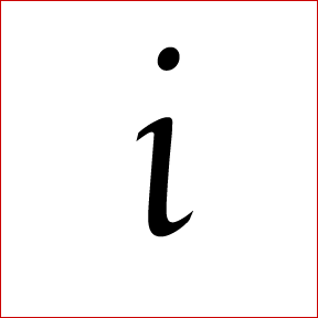
Trinité italic, Bram de Does... even though this would probably be the Enschedé issue and not the Bobst/Autologic release (my pretending-to-know-what-I'm-talking-about comment of the night).

Yup, you've got it -- it's Trinité No. 2 Italic.

You're up, Casey. Make it a good one. :^)

Again, I still can't attach an image (maybe I've been ostracized for too many wrong guesses?) Here's the link until some kind soul comes along and attaches it for me.

http://www.vervesix.com/images/ch.gif

There are plenty of good hints to be had on this one if needed—just ask. Here's a very small hint to start them off.

I felt as if I was commiting a small crime blowing this up to 200pt, there is no display version or titling options.

Here's the picture

Fabulous, thank you.

Wow, nothing but crickets. Here's a big hint to get someone talking.

If you can't recall seeing this font, or if you've only seen it very recently, it's because this is still in beta. Seemed like the logical sequel to my first submission. Also, this meets the guidelines for posting a single glyph. It's a ligature (somehow), so it's two characters but still one glyph.

Is it Arno Pro Regular 18 pt?

Mili, 36 pt, but otherwise, right on.

You're up!

Thank you, Casey, the tip helped a lot.

Here's the next one, hope it's not too easy.

No guesses yet? Come on, you don't need Dutch courage for this!

Lovely. But I've no idea what this is. Lowercase x? Multiplication sign? Uppercase X?

STRADA?

Muzz

It's a lowercase x.

No, it's not Strada.

You might want to wrap yourself in it.

Another tip needed?

Contraceptives like this one.

Gosh Mili, but I think this is a bit hard. I thought it was something by the guys at Underware, but I looked and it doesn't seem to match anything of theirs. Er, going by your hints, is this font called Durex? Latex? or Prophylaxis?
Anyone else?

The previous tip was not so much for the name but for the use of the font. Ben's getting very close with the company who uses it.

Would it be Evert Bloemsma's Cocon Italic (regular weight)?

it is!!!! You're on, Tamye.

I suppose it wasn't as easy as I thought. I've been staring at Cocon for a few months now as a part of a project, so it seems very familiar to me.

OK, see if you can guess this fine face...

oooh, that's nice.

Almost looks like a Goudy italic, but the sharp hook...

I don't want to stall the quiz, so here's a hint. The designer is influenced by both Eastern and Western cultures.

Kobayashi's Vinyard Bold? Or is it swash? I'm pretty sure it's one of them.

Oh, Dan, you're so close. It is indeed Akira's lovely ITC Vineyard. The glyph appears in both the regular and swash variants. But what weight is it? You must choose wisely, grasshopper.

Bold. I shoulda stuck with just bold.

Oh Dan....no...nooooooooo. Check your glyph again - it's a delicate flower...

No Wait! I meant regular! It's so hard to see the large size on Myfonts! The contrast isn't that high, so it can't be the bold. ARGH!

So I win, right?

Here's mine:

you are an eager one :) Yea, I officially declare thee the winner!

Hmm, someone took Joanna and gave it a cocktail...

Gill is too humanist.

Amasis?

Nope. Think small.

Think Anti-humanist.

Wow Dan. The longer I look at it the more quirky and tensile it appears. er, Dutch? van Krimpen (again)? or am I completely off-track?

You haven't read the manuale?

I've looked at so many slab serifs my eyes are going crossed -- I still can't find one that matches the serif with the single. grf.

OK, OK, ITC Bodoni Twelve?

Does that look like Bodoni Twelve to you! Ha! This is designed to be much smaller.

Indeed. ITC Bodoni Six Book cap K.

Bedtime for me -- I'll post both a new Intermediate and Entry Level Quiz tomorrow.

Et voilà. What about this one? ;^)

Think it’s Raleigh Roman

I think you are right, Frank. The floor is yours. ;^)

Ok. Here’s mine. I think it’s an easy one.

I think it's Scala Sans Italic by Martin Majoor.

Correct. Pieter, you’re up.

I hope this one is not too easy...


Good luck!

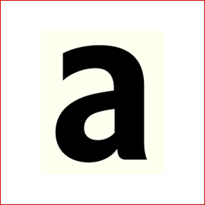
nope, not too easy, even though it made me do a Myriad double-take. Not sure on this one.

I thought it was Transit Bold at first, but the counter looks different.

It's not Myriad or Transit. Bold it is. Hint: the designer also did Chalet Comprimé...

No one? Hint Nº2: The designer is Dutch.

Er Pieter hey I'm sorry... well I'm racking my brains now but it's still not van Krimpen ; ) I went to the House Industries site to look for the lovely Chalet Comprimé but I think the designer is not listed there.

So I took your hint #2 and I thought for a moment it might be the new Neuesans at Ourtype, but it's not that either. I will have to get back to my office for further reference. Anyone else?

Closest I get is Versa Sans. I don't know either.

T.

No, it’s not Versa Sans.
But the designer of Versa, Peter Verheul, was one of his teacher on the academy of The Hague, The Netherlands (= hint Nº3).

And an other glyph from the typeface.

Good luck!

It is shares similarities with Strada. (Still searching.)

Paul van der Laan's Flex?

***********************************************
new release at www.ourtype.com : Parry and Parry Grotesque

Hello Arthur, yes you are right. I think it was an easy one for you!
Now it's your turn! Everything ok?

Pieter

For those who like to see more of Flex:
http://www.type-invaders.com/flex/index.html

Pieter

Hi Pieter! Well, I wasn't sure at first sight, had to check Paul's site. :)

Anyway, mine's not to difficult I think.

No, it isn't... But I'm not allowed to win this game! It has something to do with the royal family isn't it?

That's correct pieter.

I can sense a slight Croatian influence there... ;)

Allright, next try then: Amalia from Ourtype, designed by Nikola Djurek.

One hundred percent correct T.
Your turn!

***********************************************
new release at www.ourtype.com : Parry and Parry Grotesque

new one:

T.

I think it's Mendoza Medium...
Pieter

Yes, nice one Pieter, it's Mendoza, designed by José Mendoza y Almeida. You're up again!

T.

Here it is, good luck!

give us a small hint Pieter!

***********************************************
new release at www.ourtype.com : Parry and Parry Grotesque

Pound sterling signs are notoriously difficult to identify. :^)

Ok... a second glyph from the same typeface...

Fuller Sans Extra Bold Italic?

Hello Linda.
No, it's not Fuller Sans Extra Bold Italic.
Try again.
Pieter

Griffith Gothic Ultra Italic?

Hello Frank,

Yes, It’s Griffith Gothic Ultra Italic.
It’s your turn.

Pieter

Here’s the next one

Share Irony, designed by Ralph Oliver du Carrois. The glyph is designed by Underware especially for the boekenweek. It is available as a free font.

T.

Wow, that was fast. Maybe it was a little bit too obvious ;)

You’re up

I recently came across the blog of Jürgen Siebert, so it is just a coincidence...

This new one maybe tries to be the most self-referential typeface:

Have fun,

T.

It's almost impossible for one to identify an e so 'neutral' as this one...

***********************************************
new release at www.ourtype.com : Parry and Parry Grotesque

I'm almost certain this is 'Neutral Sans', but I can't find it among my bookmarks…

If I recall correctly it's a project done by a Swiss student.

Addition: Think I found it —
http://www.bpfoundry.com/bp/fonts/fonts.htm
and
http://www.letterlabor.de/measurements.php

And the official name is Neutral BP.

That's correct Bert, well done. I think this was a really hard one, so nice found! Neutral is designed by Kai Bernau, at de KABK. You're next I think.

OK, here we go. It's an interpretation of […] by an almost contemporary type-designer.

And there is a personal story involved (but that's not a hint!).

Hello Bert, is it Augereau Roman?

Yeez, Pieter, what's this? What are the other Typophiles going to think? This is almost a Dutch homegame now…

Augereau Semi (not Roman, but who's nitpicking here?) it is.

I bought the family in 1999 and it came on a floppy disk with an accompanying, nice note by designer George Abrams, beautifully written in a classic italic.
Mr Abrams died in 2001. Augereau is the only one of his designs that was digitized during his lifetime, as far as I know.

P, you're next. And I'm off to Rotterdam tomorrow ; ).

That was a very nice story Bert. It is a nice typeface.
I miss the times that you had to wait a few day for the fonts you ordered and that they came on a nice cd of floppy disk, together with printed materials from other typefaces.
Well, it’s my turn again... let’s see...

The new one:

Good luck/have fun!
Pieter

It sure reminds me of Machiarge....

Hello Linda,

No, it's not Machiarge...

Pieter

Licious Script and Moonshine Script are close. But none of them matches exactly.

Is it a font by Nick Curtis?

No, it’s not a typeface designed by Nick Curtis.

Pieter

Is it Leslie Cabarga's 'Casey' ?

Yes Jelmar, it is! Congratulations.
It’s your turn (and again someone from The Netherlands!)...

Pieter

Hehe, yeah. Ok, here's one.

Too difficult? Or just no one here? ;)
I will post a hint later, if I can think of one that doesn't make it too easy.

I find a couple that are close, but not close enough.... :-(

Maybe this glyph is a bit too much alike in different typefaces?
I can post a second glyph if it's needed. I can't think of a hint that does not make it too easy...

Bell MT perhaps?

Nope, not Bell. But MT, yes.

Congratulations Jelmar – it puzzled me badly enough to go looking quite hard; I never would have figured it except for your MT hint.

Is it Dante MT Regular (Monotype Dante Roman)?

{edit: too much information – Mardersteig/Malin 1954}

Haha, nice one. Thats indeed right. Well it's the OT-version, so it's called Dante MT Std and then Regular.

Sorry for the late reply, I could not really load typophile too well the last two days. But you're up, Ben. :)

Yes the internet service has not been good at this end of the planet either. Here you go; should be another easy one.

Is it Albertan Regular by Rimmer?

Yup. Congratulations Pieter, you're up!

This one is not very hard to identify I think...

Something by Peter B'lak?

Hello Bert,

Yes, it’s from a typeface done by Peter Bil’ak (and me... ) :)

Is it Fedra Sans Display Hairline?

Hello Frank,

Yes, it’s Fedra Sans Display Hairline.
It’s your turn.

Yes, it’s Fedra Sans Display Hairline
Nice work by the way.

Next one:

Thanks Frank, I just (well, two months ago) finished the Greek versions of the Fedra Display fonts. I think they are very nice. Especially the Black weights. Not available now, but will be soon.

Pieter

Huh, no answers so far?

Ok. Here’s a clue:
The designer is from Netherlands.

Nordic Light by René Verkaart?

You’ve got it. It’s Nordic Light.

The problem is that I'm not allowed to win the Pop Quiz this time... so if someone has a nice typeface for the quiz...

I do...

When I first looked at it, I wanted to say Benguiat Gothic, but that not it....

Is this designer under 30?

I have no idea if he's under 30. Can't find the data for that. The font is under 30 years old though.

A hint: The font is quite new. The designer has posted sketches of an earlier typeface here on typophile.

Hint 2:
It is a free font...

Ah yes,
Diavlo (Book) by Jos Buivenga.

Ahh, someone, finally!

Good work, you're up.

T.

Will post one shortly...

Ok, here it is. Probably quite easy, but that's no problem after the last one took a while. ;)

Is it Fresco Normal by Fred Smeijers?

Yes, it is.

Pff, I knew it would be too easy. ;)
But I didn't have anything else at the moment.

You're up!

Ok. Here is mine.

hint: the forms of this font are based on a sixteenth-century font

I am getting curious.
Can you give us another hint?

T.

hum... ITC Garamond LT, weight Light-condensed?(although mine does not have ligatures on it, it seems to be exactly the same at size 300)

Hello Paul-Kenji,

You’ve got it. It’s your turn.

@T.
sorry, had a lot of work the last days. so i forgot the running quiz.


The usual.

I think this designer has also designing typeface like Aquarius, Europa Grotesque RR or Quest RR.

That's right.(I mean he did design those you named)

Silverado RR (Red Rooster) by Steve Jackaman?

Indeed. A very elegant font I like quite much(one of my favorites from RR). I'm not sure if you have to specify the weight or not.
If not(in this case not very important in my opinion), your turn, otherwise please specify it.

Paul-Kenji

I guess it’s Silverado Light?

Indeed. Your turn for real then:)

Ok. I hope it’s not too easy...

Hint: It’s not for sale anymore.

Hint2: The designer is from Europe

Is it Metron Light?

Hello Paul,

Yes, it’s Metron Light. Now it’s your turn!

Alright then, here's one:

It has the Fakir-look, but not as good I think.

I think it’s Blaktur by House Industries. But i can’t find a full character set to check it :(

Spot on! Blaktur it is indeed. Your turn.

Ok. Here’s the next one.

Amalia Bold Italic from Ourtype?

It’s Amalia. But it’s not Bold Italic ;)

Hello T.

Perfect match ;) It’s your turn.

I wonder how common this one already is...

It can be a variety of monospaced fonts, but my bet is Consolas Regular.

Yes! Your turn.

That's from an extended unicode set, right?

Looks nice!

It's a i and j ligature, or 'lange ij' as we call it in dutch, I guess.
Figures, since most people participating in this thread are dutch, lol. ;)

It is indeed a Dutch ij combination, the uppercase form that is. :)

This glyph has its own place now in the Unicode Latin Extended-B category, but the font from which it was taken is just a plain PostScript font.

It was designed for a typewriter manufacturer, in a time before Unicode.

Hello Paul,

It’s not done by Wim Crouwel isn’t it?
It’s very nice.

Pieter

It is by Wim Crouwel, one of the icons of Dutch Modernism.

In poking around, I did notice the ligature -- and, coincidentally enough, in an article I've just started setting, where we're running an English translation next to the Dutch original. :-)

Gridnik Bold?

Yes indeed! Your turn, Pieter.

Here it is.

Goeie genade! So it is the ‘Eng’ or U+014A … but it seems to be neither PMN Caecilia nor Lexia DaMa. Some hint, Pieter?

Hello Florian,

Yes, it’s Eng. Hint: The typeface is monospaced.

First I thought ‘Geez, you fooled us with plain ol’ Courier’—but, though some come really close, none of the Couriers I checked is a match (nor any other of the popular typewriter fonts that came to my mind).
Fedra Mono’s ‘Eng’ handles the conjunction of N and J in a similar way—but then that’s not a slab, of course
What I learned from browsing through foundries’ obscure character maps is that the ‘Eng’ often features the minuscule n form in upper case. At least.
I give up. ;)

Hint: Florian is very, very close with Courier but it’s not Courier.

Just to make that clear: Of course I checked Courier New, too—and it’s neither that nor Nimbus, Schreibmaschine, Pica, Prestige Elite … Pieter, that’s a tough one!

It has something to do with Courier…

Werempel! It is Kettler Regular, isn’t it? With a character Myfonts couldn’t come up with, as it’s from the only recently released Extended Latin OpenType Update … You ſ*º∆+¶! ;)

Hi Florian, could you please get in touch with me, as I need to reboot this thread. Five pages is getting way too much. THX

Hello Florian,

Yes, it is Kettler Regular. It is named after the designer of Courier.
Now it’s your turn.

Pieter

Hooray! It’s over here.

Captured from commoncrawl.org on 19 Apr 2015. original URL