Typophile

Millennial Oldstyle: crit welcome

Craig Eliason0 votes

Going to try my hand at a typeface suitable for extended text. Morris Fuller Benton is my mentor.

I'm looking to Century Oldstyle for general guidance on structure and proportion--it's a great model, in my opinion--but I'm drawing this from scratch and departing from the prototype freely in parts.
I envision eventually creating a broad palette of size-specific cuts and weights.

PDF icon MillenialOldstyle01.pdf PDF icon MillenialOldstyle03.pdf PDF icon MillennialOldstyle04.pdf PDF icon MillennialOldstyle06.pdf PDF icon MillennialOldstyle12.pdf PDF icon leadingtest.pdf PDF icon MillennialOldstyle18.pdf PDF icon MillennialOldstyle20-1.pdf PDF icon MillennialOldstyle20-2.pdf PDF icon MillennialOldstyle20-3.pdf PDF icon MillennialOldstyle20-4.pdf PDF icon MillennialOldstyle20-5.pdf PDF icon MillennialOldstyle20-6.pdf PDF icon MillennialOldstyle29.pdf

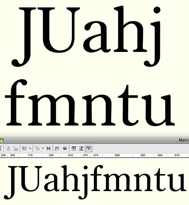
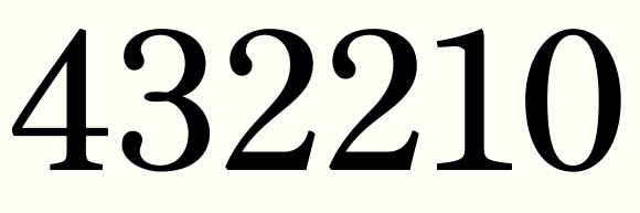
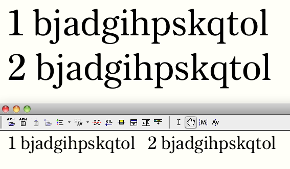
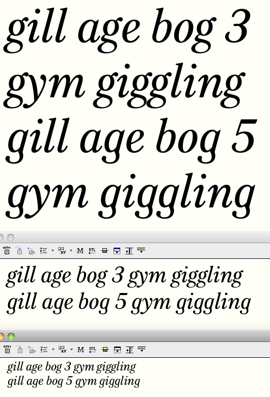
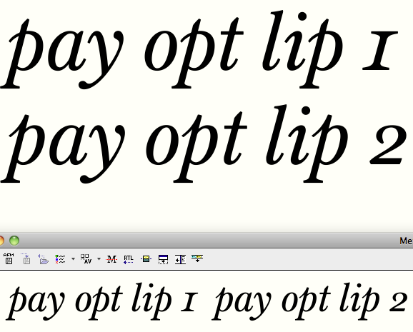
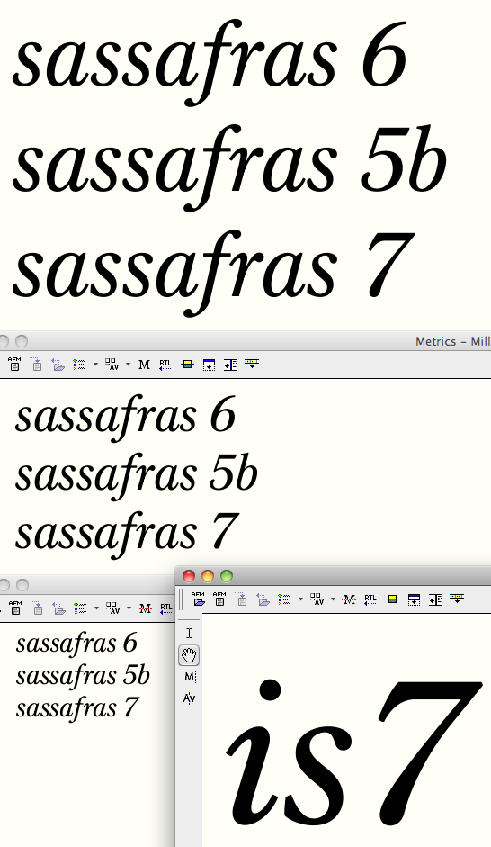
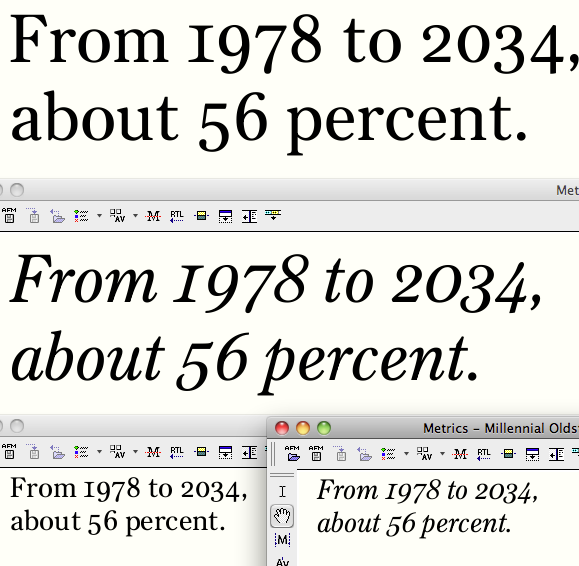
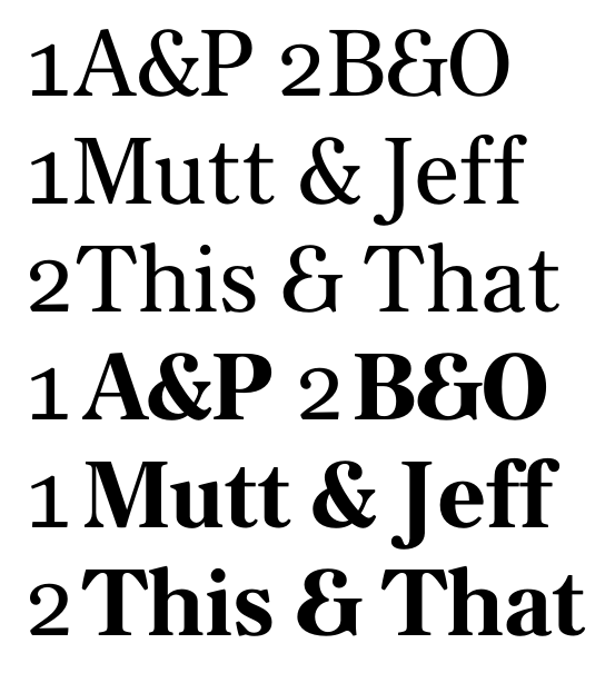
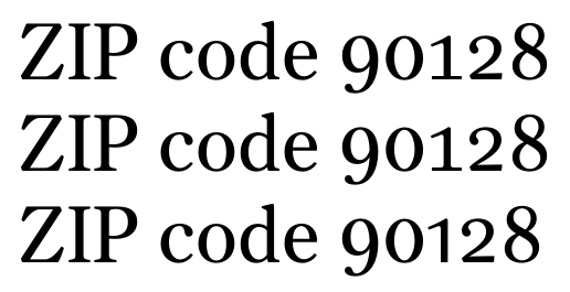
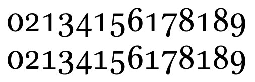
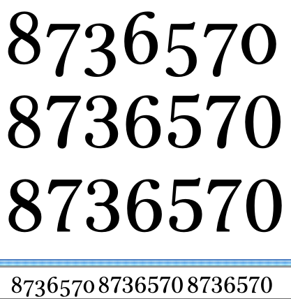
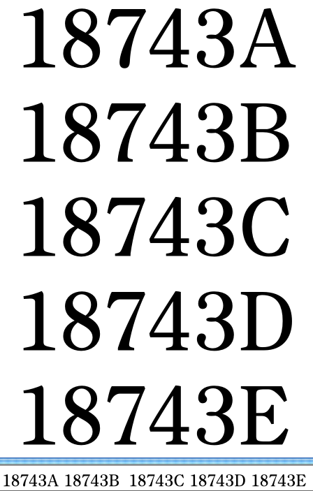
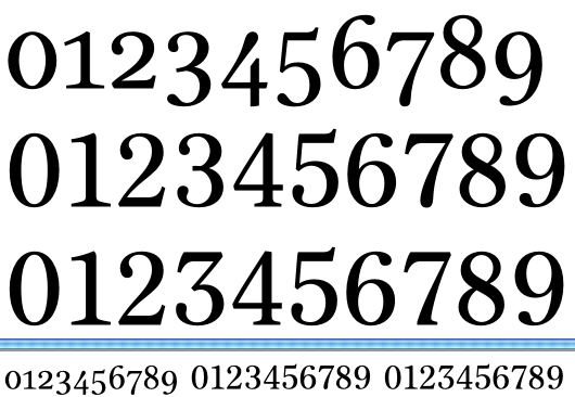
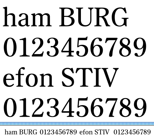
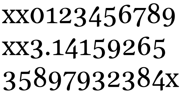
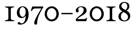
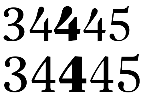
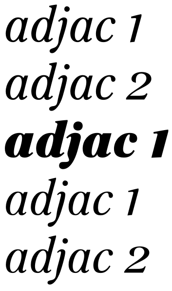
Tabular lining and oldstyle figures. Some slight adjustments since the pdf.

Hi Craig

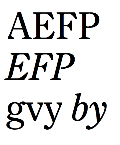
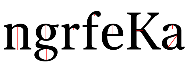
To me |C| and to a lesser extent |c| and |e| jar a little. Elsewhere the stress is pretty much vertical so these characters seem to bulge at bottom left. Also, top right curve in |a| seems a little abrupt.

Cheers
Dave

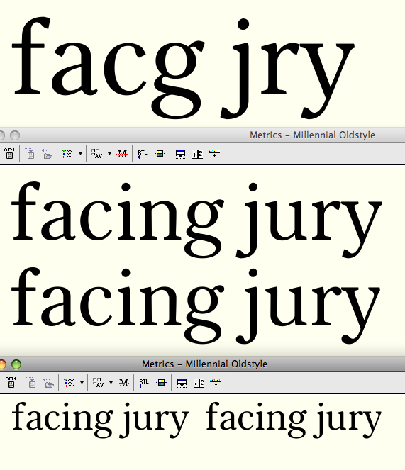
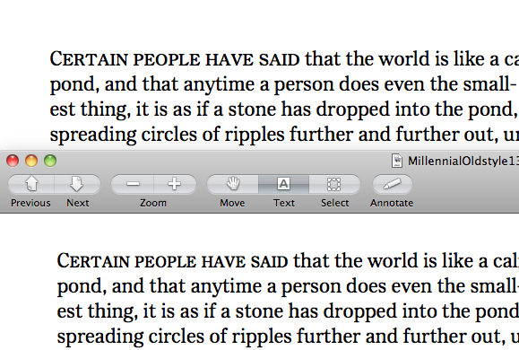
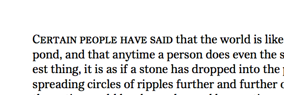
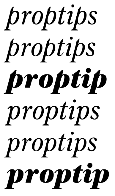
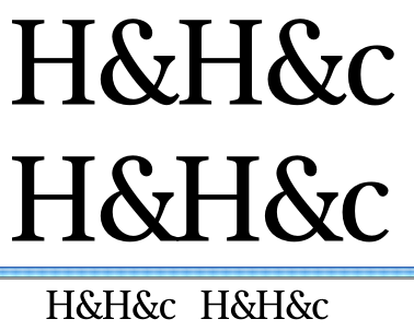
Thanks Dave. This is better, no? (revised is on the bottom)

You know what I think, but this is the best place to say it: this is very polished and seems extremely readable, but it's also difficult to see people noticing it, and if they do, difficult to imagine them thinking it's anything but yet-another-Century. This will sound strange coming from me, but: put more of your personality in it!

BTW, what's with the foot serifs: adnate on the left, and on the right what I call Doric (like in my Maral)? Isn't that too Po-Mo for this context? But hey, it might actually address what I wrote above... If so, why not apply that weirdness to the entire font?

hhp

I’m with Hrant on this one: you could find one peculiar feature wich informs the design (one could be hunting down all the possible quirkiness of MFB’s designs which where “normalised” by subsequent interpretations. A sort of Didot Elder for Centurys).

Or just call it Century Supreme and find the right lobbyist at Washington ;-)
http://typophile.com/node/80989#comment-459396

Lovely work, Craig. I'm enjoying this.

Some observations (remember the salt!)

• I don't understand the serifs! Will their shape be visible at target size?
• Favourite glyphs /b/, /g/, /s/ and /y/.
• R looks a bit top heavy, maybe that's intentional? If so, make it more top heavy?
• Is the lining zero a bit pointy?
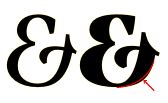
• There's something cuspy going on in the top of the counters of B, E, F, P, R and S (but not D). It's not pronounced enough to be a feature, but is poking my eye just enough to be something. Also check your lovely ampersand, there's a glitch on the arm.
• G may need a pointier spur to harmonise with b, q and @. Is @ a bit too pointy?
• Foot spurs on /d/ and /u/ may be a bit clotty? Perhaps trim the inside of the spur and/or make the notch taller?
• Descender of /j/ may be a bit of a loose curve? Similar story with /f/. Maybe that's just my preference though.
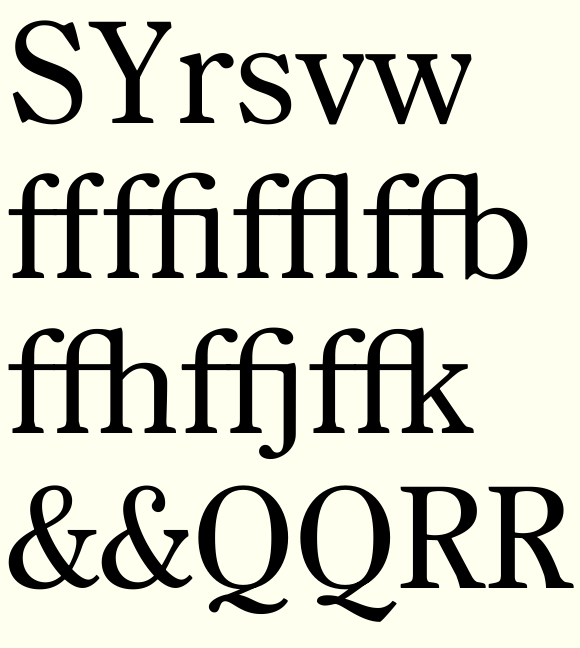
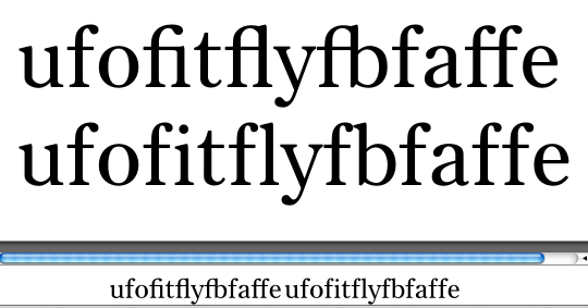
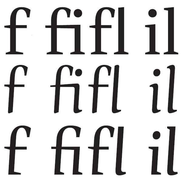
• Foot of /f/ in /fl/ has got mangled.
• Arm of /k/ looks to start a bit high up the stem.
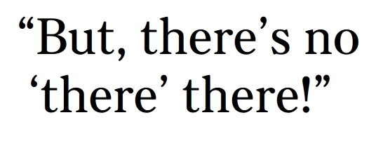
• Comma/quotes I'd make the tail much longer...as you know I obsess about commas!
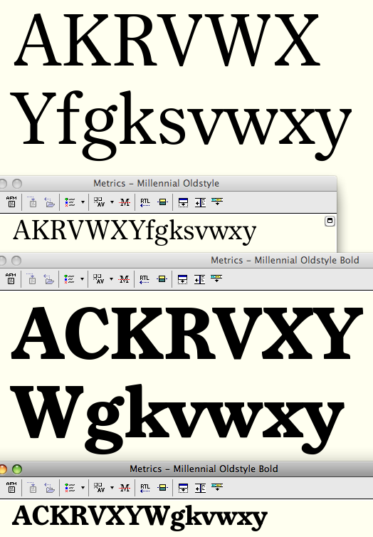
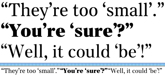
• Bold looks newsy, regular looks booky, somehow, is that because of the higher contrast in the bold?
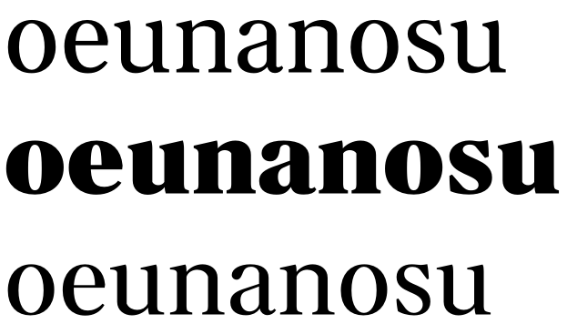
• Check bold /u/'s width. Actually the regular /u/ may also work slightly narrower.
• Bold /g/'s ear may need to move upwards to prevent crashing/splotching.
• Lining numerals are splendid. 6 may need a bigger bowl.
• + is a little meek. Love the %.

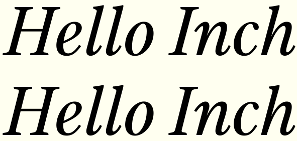
This is what the serifs look like up close: an asymmetrical quirkiness of my own that was one of the ways I thought I was inserting a little personality (but the question of whether they register at size is a good one...) The idea is that the asymmetry could provide a little "warmth."

I am struggling with what form larger-scale personality/originality could take in this typeface. I see the visual logic in the design, so quirks for the sake of quirkiness seem hard to justify. Maybe some value could be added in additional weights, e.g. taking this structure in a much fatter direction...

Ben, thanks for the suggestions!

I like the right side a lot!

hhp


Ironed out top counters of BEFPR.
Fixed ampersand arm.
Sharpened "spur" of G
Softened spur of a in at-sign, and also made the entire glyph smaller. I realized that the "a" inside could relate to the lowercase proportions without having to literally take up the x-height.
Gave more breathing room in notch of d and u (also narrowed u slightly).
Added some length to tails of commas, quotations marks.
Tightened radii of j and f hooks.
Lowered k arm on stem very slightly.
Softened pointiness of zero, and enlarged bowl of six.
Not shown: lengthened strokes of plus, minus, equals.

Ben, by R looking topheavy do you mean the bowl's size large relative to the leg?

R: it's more about the 'black balance' — you could narrow the bowl or add a bit more weight to the right foot by splaying the serif a bit higher. Either way the black would be weighted slightly toward the base of the glyph.

u: to me it still looks a bit counter-centric, I'd bring in the stems a little more, or add more black to the curve.

I've just surprised myself by seeming to be now talking in terms of notan. Someone will be happy.

Ha.

hhp

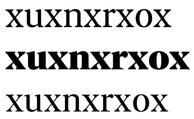
Here's what it looks like if I exaggerate the serif funkiness and propagate it to the rest of the letter.

Starts to look like hand-drawn type.
Of course, at text size this still won't show, so I'm not sure what the point would be. Hmm...

Starts to look like hand-drawn type.
Of course, at text size this still won't show

And in this tension lies the beauty of text faces! :-)

The second 'Renoir' looks a bit too quirky to me. Off coarse it should be more of YOUR personality, but I think a serif like this (underneath) will be visible at your target size. As Ben Mitchell said, "Don't forget the salt". It's just a quick suggestion :-)

It's really remarkable how you can push things around in the glyph window and yet small (and even medium) sized renderings show little or none of it.

A text font from the modern era, in several optical sizes? Your competition will be Consul I assume.

Good luck, looks great.

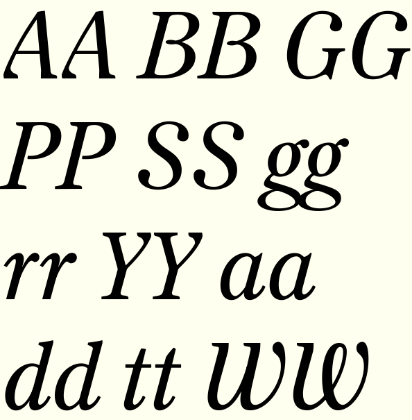
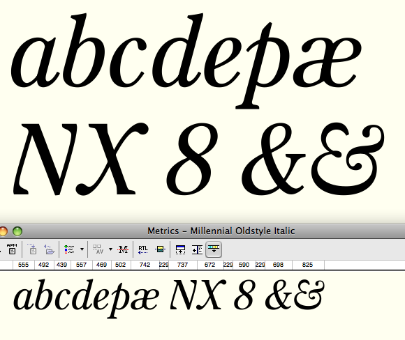
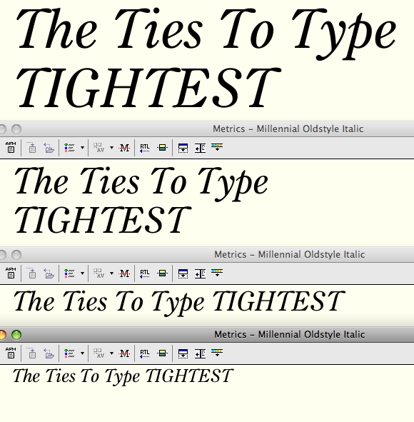
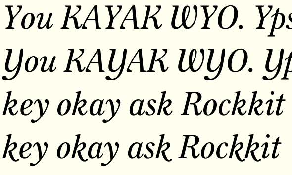
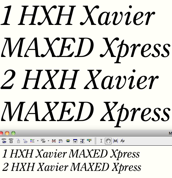
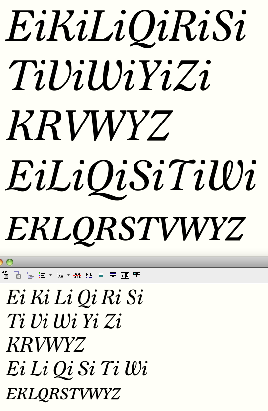
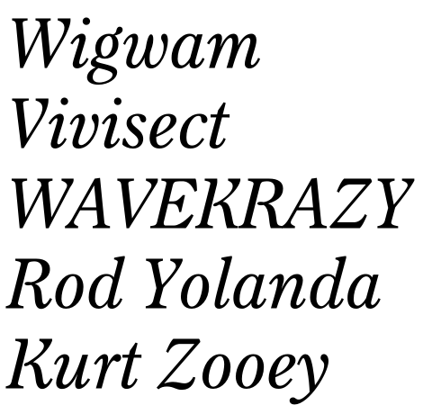
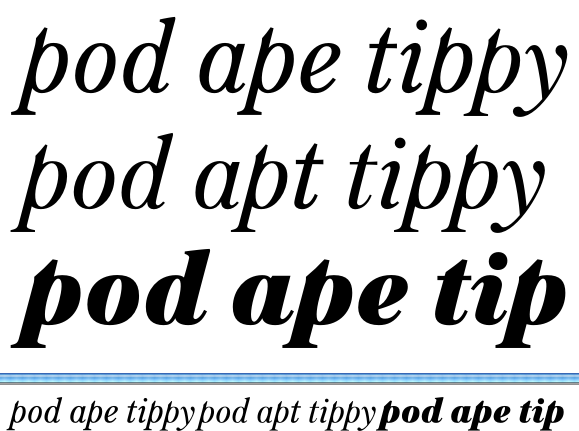
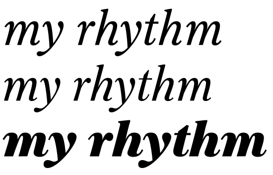
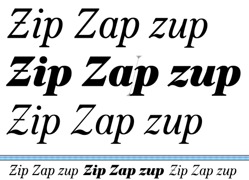
First go at italics.

The Italic caps are certainly one great place to improve on tradition here.

hhp

Affirmative.

I like this! As a type user and not a type maker, these were my observations:

The second 'Hn' you showed on July 1 reminded me of Calluna, with that 'flow' or 'twisting' at the serifs. The whole Museo-to-Calluna thing seen here.

The ampersand has a lean/tilt to it. I've seen that in other Century faces, and it struck me as odd. Is there a particular reason it came to be part of the style of Century?

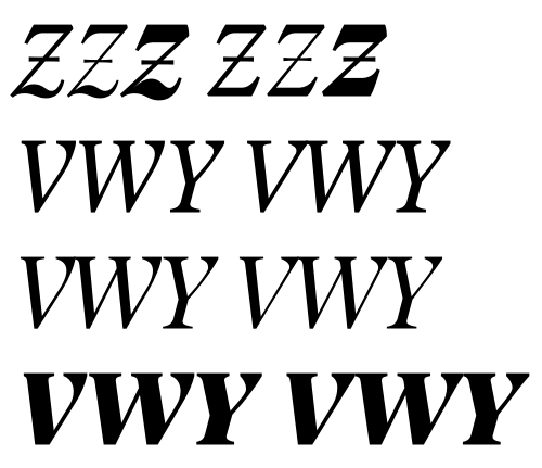
First go at some possibilities for italic caps that go beyond mere slanting. I'm pleased with B and R, and maybe V; the others still need some polish.

@Aaron: Yes, the tilt of the ampersand is something I only noticed in Century when I started this project. Though it looks tilted compared to most "figure-8" ampersands, on second look its basic silhouette is pretty symmetrical, a kind of head and shoulders structure.

Now we're talking! :-)
In fact I think the Roman could stay highly imitative as long as it has an innovative Italic - that would be just the right kind of motivation for a designer to choose the type for a certain type of job.

hhp

Oh wow... I really like what you have going with the Italic... I think I'm on the same page as Hrant on this one... I like the 'teardroppy' terminals on the A, K, V, W, etc...

Thanks for the encouragement, guys. Pressing ahead...


Somehow I both love and hate drawing italics.

Ha, I was hoping for an ascending /p/... :)

The italic caps are interesting, but have you tried the other way around: italic structure and roman decoration?

What types would you point me towards to understand what you have in mind with italic cap structure?


Opened up the letterspacing; made counters in b d p q g a o smaller; made u n m w W wider; added loop to top right of u and top middle of w; some other minor tweaks.

I hate capital U, and I don't think capital G is working.
Still have to go through all and check stroke weights.

Questions that arise with these narrow lowercase forms:
1. Is it okay to keep the caps uncondensed, or will they jump out?
2. The narrow letters make the extenders look shorter. Is this a problem? What relationship should extenders in the accompanying italic have to those of its roman?

Craig: http://www.flickr.com/photos/56183109@N02/5898913258/in/photostream

>Is it okay to keep the caps uncondensed, or will they jump out?

I'd want it to be deliberate either way; make them obviously uncondensed (U, V, W and Y look rather narrow) and have a reason behind it, or draw them all in to match the lc.

Cap G draws attention, looks a bit Ambicase!

>What relationship should extenders in the accompanying italic have to those of its roman?

I read somewhere that the extenders should be visually the same length, which means shortening them slightly to compensate for the slant. See here

Are the stems of U slightly nonparallel?

Wow, interesting caps. (Love the "S" and "X"!)
I'm wondering about those «inside serif» things you're doing on the "K", "M", "N", "A" etc. now; personally I thought the balls were more interesting and stronger (but you know me, I like ball terminals ;). In the first version posted July 2 the balls look a bit like a reference to those very typographic contrasted scripts like Kursivschrift etc. – which seems like a yummy & interesting connection to make. It feels a bit like you're taming that again now, though?

Sometimes it's good to shorten an Italic's x-height too, although
more for reasons of differentiation than apparent length of stems.

hhp

@Frode Thanks for the link, looks great! My B and R already have that loop. I'll do some thinking about how maybe my L could benefit.

I'll have to take a look at how the vertical metrics mesh optically with the roman. Thanks for the link, Ben.

Any of these G descenders an improvement?

@Nina I'm amused that you love the S -- I think it's the most Ernestine-ish glyph!

The teardrops -- particularly at the baseline -- just seemed too soft to me, too Art Nouveau-ish. I suppose I could try my "inside serifs" at the baseline and keep the teardrops above. But another vote against them even above is that they make the K potentially misread as an R. Anybody else have opinions about those terminals?

A different /U/ that abandons the returning construction.
Widened those inner serifs on /AKMN/ (and now /U/ too). Making them less timid, without resorting to Nouveau lachrymals?
Looping /L/ structure inspired by Frode. And then... The same on the /T/, which means dropping the upper right serif. I'm excited about this idea: I like the structure, and I suppose it could make some spacing with lowercase easier. But have I gone too far? :-)

Dude, release this quickly before somebody swipes all the ideas here.

hhp

I love that T! :-) (maybe it’s a little bit short on the right?)

I'm liking the latest L and T. L and K may be too wide tho'?
EDIT: You know, I want the T now to become uncial, with a curved stem rather than straight. Could well be too much!

G: how about following the stress pattern of the /y/ with the tail...make it taper to a thin stroke (just in the desceding part)?

You know, you need only a slight whiff of this in the regular to bind the two together. I’m very much looking forward to the further developement of this.

I’m very much looking forward to the further developement of this.

Me too. It's really getting exciting.

Thanks for the encouragement guys!

Above shows some italic improvements. I've extended the /T/ loop rightward. Also thought I'd try the loop at the bottom of /E/ as well (like /L/). Did some much-needed curve improvement on /m/ and /n/, and /u/. Trying out a simpler structure for /Y/ and /G/ than before.

This shows the roman and italic together. What do you think--do I need to lower the midline of the italic a smidge to make its x-height optically even? Will that screw up hinting if the alignment zones aren't, um, aligned?
I'm attaching an updated pdf to the top post.

Oh yeah, also made some contextual alternates for descender crashes:


I also did a little work on some of the regular serifs to tie them to italic as Frode suggested.

I think some of those near-collisions are just as uncomfortable: mainly g ear vs. y top left serif. You could also give that pair some extra space between the descenders: loosen up the y? How about a ligature for gj in the cursive, or maybe just overlapping letters?

Man, I've been pushing this concept with the cursive capitals for so long :) Great to see you have a whack at it, Craig!

Yes, I would likely kern /gy/ further apart (haven't started kerning at all), but boy is that /gy/ (and /gj/) structure unhappy together! Maybe I can lift the ear of /g.calt/ a touch too.

Maybe pull a Mrs Eaves.

hhp

I was thinking more in terms of a looser curve in the thin part of y, moving the whole descending area east.

Yes, that worked.

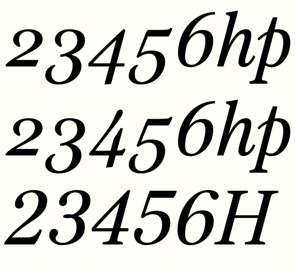
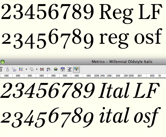
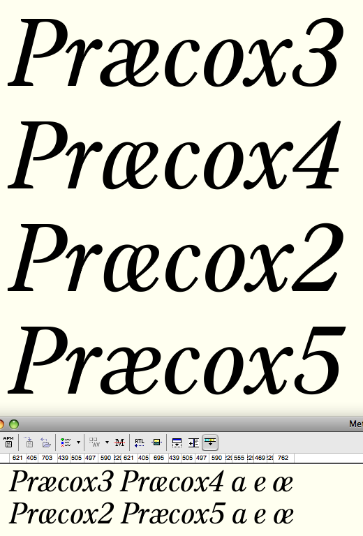
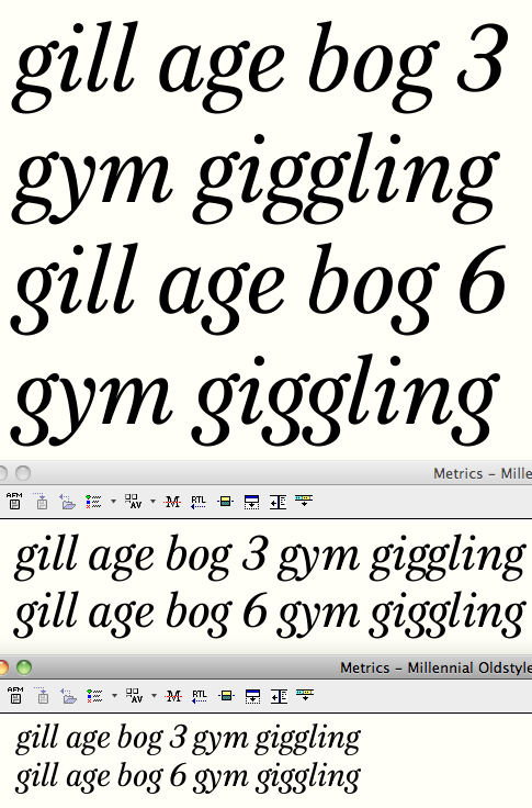
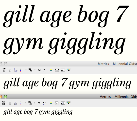
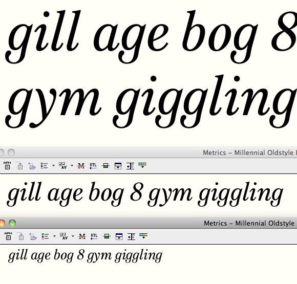
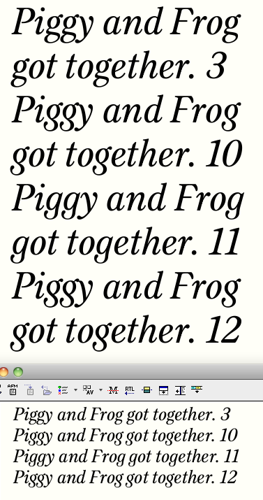
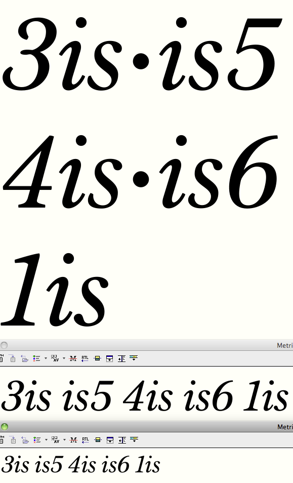
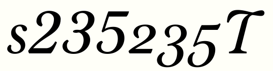
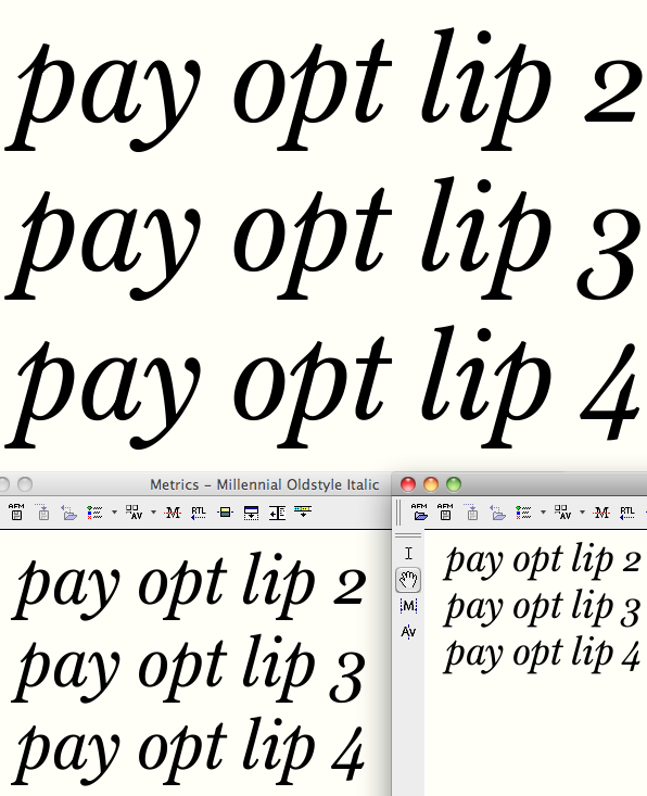
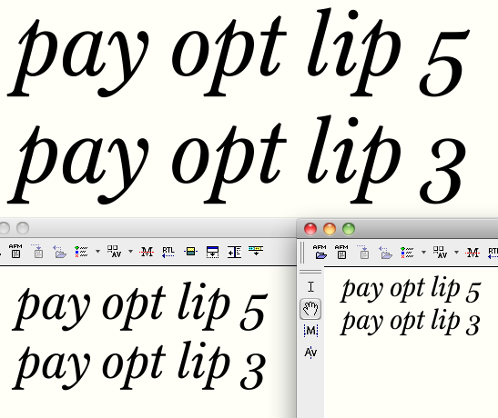
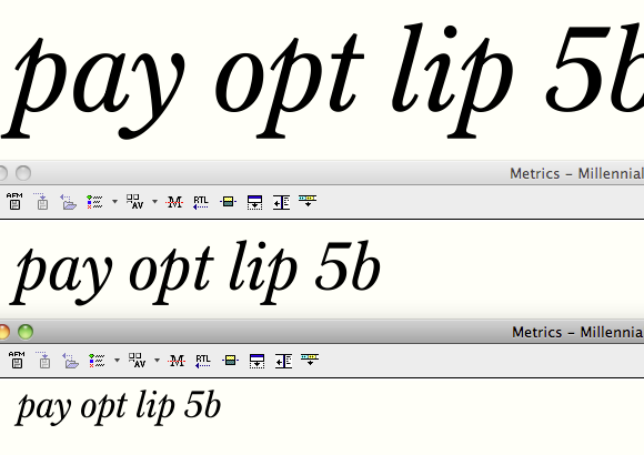
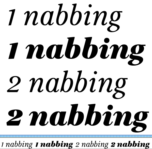
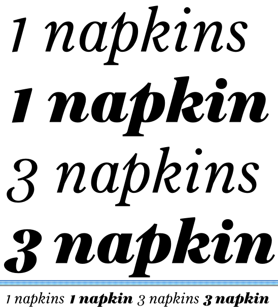
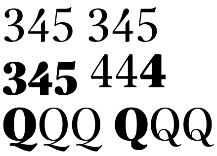
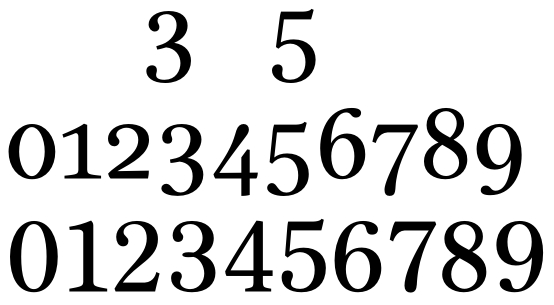
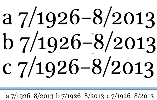
Figures. Redrew roman oldstyle 2/3/5, and created oldstyle and lining figs for italics.

My standard suggestion: give the French-style OS nums a try.
Ascending 3 and 5. It really makes more sense, and would be another
way for this font to stand out. I would even try ascending the 2.

hhp

Just noticed 'Millennial' is missing an 'n' ;)

In 'logjam', your descenders are different lengths, is that from Century? I don't remember noticing that before.

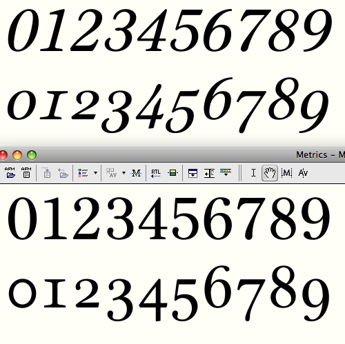
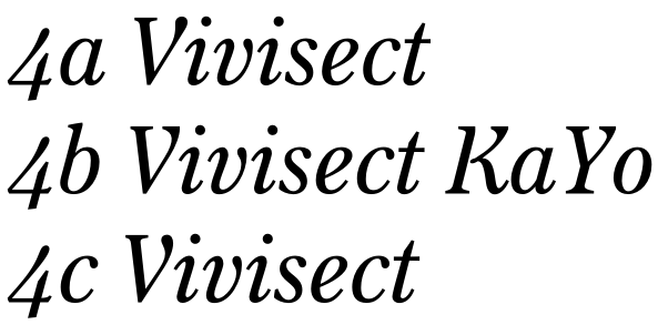
I'm not sold on the ascending 3 and 5, but digging up an old post of yours on French OS figs did inspire me to try an open, semi-descending and semi-ascending 4! (middle row)

My kinda stuff!

hhp

Just noticed 'Millennial' is missing an 'n' ;)

Holy crap, how embarrassing! Thanks for the correction!

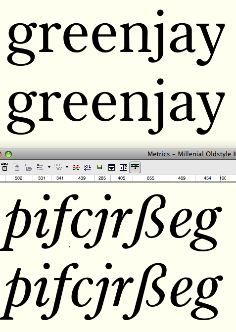
In 'logjam', your descenders are different lengths, is that from Century? I don't remember noticing that before.

No, Century Oldstyle has consistent descender depth... consistently very short!
I decided to deepen it, but my sense was that /j/ didn't look good at full depth (and, in italics, /f/ and /ß/).
But now looking at it again, those shorter descenders (top rows) look stunted, and full depth ones (bottom rows) look okay. What do you think?

I think it's much more elegant with the full length descenders. I'm liking this more and more. You've done the right thing with the arched letters too, and I like the numerals.

I'm looking at pdf03, salt and pepper ready?

• italic y, maybe add a bit of springiness into the downstroke, it looks a little rigid.
• sorry to harp on about the commas/quotes, but I'd make the tails darker still, and longer. I'm not sure exactly what target size you're aiming for, somewhere around 10-11pt?
• counters of /e/ and /o/ at top are rather different; I prefer the /o/, but perhaps it's good to have a slight differentiation for reasons of legibility?
• tail of /Q/ to descend a bit more? Looks perhaps a bit bunched up and danger of clotting (more so in the italic somehow)?
• /W/ looks narrow.
• Italic /K/ did you try the loopy arm thing like on the /R/?
• Spur of /G/ seems to need more prominence — to the baseline? — to make it stable, or a bit more shaped like the spur on /b/.
• Italic /C/ add a bit more to the teardrop (and maybe pull in slightly)?
• Italic /U/ did you try an uppercase version of the /u/?
• Italics overall are delicious.
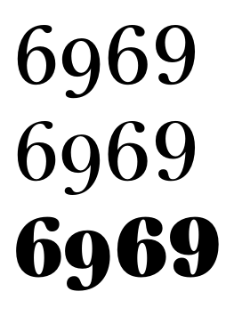
• Oldstyle 6 and 9 look somehow from an older era than the other glyphs. I guess that might be a good thing for 'oldstyle' numerals, but to me they stick out in an odd way.

You're the best, Ben, thanks for taking the time!

I think it's much more elegant with the full length descenders

Agreed.

sorry to harp on about the commas/quotes, but I'd make the tails darker still, and longer. I'm not sure exactly what target size you're aiming for, somewhere around 10-11pt?

Don't apologize, you're completely right! Yes, I have in mind right about that size. This turned out quite big on the em compared to other text faces on my system.

Spur of /G/ seems to need more prominence — to the baseline? — to make it stable

Like what the italic wound up with?

did you try an uppercase version of the /u/

Yes, upthread you can see some hideous attempts along those lines. Maybe I'll try again, as the present solution isn't entirely satisfactory.

I'll get to work on all those suggestions!

• Oldstyle 6 and 9 look somehow from an older era than the other glyphs. I guess that might be a good thing for 'oldstyle' numerals, but to me they stick out in an odd way.

Second row of top window shows new oldstyle 6 and 9 with teardrops. Meshes well with recent changes to OS 2 & 3.
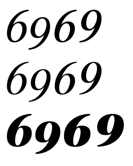
Pointy terminals are still okay in the italic oldstyle (second row of bottom window), I think--do you agree?

I really like the pointy terminals, I'd have those on the lining figs too I think. Also I'd make the roman os 4 the same shape as the italic one, though maybe with a square top or something. Italic os 3 could be a little wide.

Thanks for the good ideas. Top row shows italic lining figures now with pointed terminals (23569). Very bottom row with oldstyle roman figures shows the four--I couldn't get an open construction to look right, but I did realize that the horizontal should be thicker. Some other minor fixes too.

Oh, those swoopy top terminals on the 2 and 3 didn't work for the italic lf?

Wonderful 4. Do you plan to offer an alternate OS 1 (one that actually looks like one ;-) too, right?

Even in this form, it could be neat to shorten the descender of the roman osf 4.

Does the descender of osf 7 have enough weight?

@ Bendy Not really--they require the outer contour to come so far around that it wound up goofy looking when I tried.
@ riccard0 Ugh, I hate trying to draw (tabular) ones. Do you like this one at all?
@ cerulean shortened 4 descender and added a smidge of weight to 7. Thanks for the input!

I like the beaked 1, though the left serif seems a bit too long and/or dark (but maybe is just some screen artefact).
About the zero, my taste isn’t for the ones without contrast, even if I understand the rationale. But then, I think your italic OS zero should retain some of the lack of contrast of the corresponding roman one.

Top shows regular:
- Beefed up comma (and consequently quotation marks, though I scaled those down a bit)
- G with beard
- I love the monoline OS zero (in roman; I don't think I'll match it in italics) but recognize that it's "controversial," so I'll include a stylistic alternate. This pic shows, in order, the letter /o/, the monline zero, and a contrasted zero that (like the lining zero) is more pointy top and bottom than /o/.
Bottom shows italic:
- same beefier comma etc.
- K with looping structure
- latest attempt at /U/. The lowercase returning structure just will not work for me -- looks really heavy. I like this more rigid parallel structure better than the previous.
- /y/ with a more springy downstroke.

Yes, yes. Those amends are good.

I'm looking at pdf04.

• Italic cap K is almost working, but the arm and leg look like independent strokes even despite the join; not sure what to suggest but the movement needs to flow together more.
• Italic Xx need a bit more offset on the hairline stroke.
• Italic D may be too light and/or counter too large, it looks pale overall.
• I'm really loving the italic lc, in the same way I love Baskerville's italic. I wonder if b needs a spur?
• Italic caps may need more space?
• Check right sidebearings of roman Ww?
• This is really great work :)

• Italic cap K is almost working, but the arm and leg look like independent strokes even despite the join; not sure what to suggest but the movement needs to flow together more.

Maybe having the leg come out of the loop at a more upwards angle improves this?

• Italic D may be too light and/or counter too large, it looks pale overall.

It occurred to me that D could have a loop too (which doesn't help the too-light problem, of course, which I addressed by narrowing and adding black to the curve).

This is going to be good. I want it! These are my thoughts on the italics (very much in italics mode myself at the moment, I'll criticise the romans later), based on 04.pdf.

A: Is the thin stroke a little too curved?
B: Are the bowls slightly too slanted-looking? I'd slide their extremas a little down.
G: Something is not comfortable about the right stem, should it be slightly less slanted? Or is the curve on one side-, straight on the other-approach problematic?
H: When I look at the word "Helen" I get the impression that the 'H' is more slanted than the 'l'. Is it just me, or does the upper case need to be one degree less slanted?
N: Looks less slanted than other members of upper case.
P & R: See B
S: Is the upper ball a little to low and/or prominent?
T: Cool! But should that loop be more prominent?
U: Some stiffness in the curve here too?
W: Not sure about the middle serif. Is the middle stroke a little thick/clumsy too?
X: Yes! But needs quite a bit of cross compensation.
Y: Make the thin arm more curved?
Z: Brilliant!
Er ... VWXYZ is quite similar to my solutions for Satyr. I swear I haven't copied you.

a: Great! Should the tail curve be a little more generous? Personally, I'd make a slight ink trap on the bottom join of 'a' & 'd'.
g: Is the beak a little sad?
k: Brilliant!
r: Ball a little small?
t: Not comfortable with the top. I'd make it shorter or less tapered.
u: Oh yes! But more of that loop?
x: Cross compensation again.

Nice job, Craig.
Your Millennial gave me a good reason to come back after years (!) of unmotivated absence.
Greetings to all old friends.
Let's see...

My thoughts on the roman:

A: I really dig the chopped off terminal of A, Y, V, but I wonder if it makes the 'A' fall a little leftward? I would consider letting it lean very slightly to the right as a compensation.
J: Heavier ball?
K: Arm serif cut off to straight? Leg not dark enough?
S: Too black spine? Slightly tall too, is it? Or perhaps that gives it character ... those serifs approximating arrows are cool!
VW: A little black, aren't they?

nmh: Something about their curves seem a little uncertain. Can't quite put my finger on it.
x: Serifs a little black, compare to 'z', for instance.

I apologise if I have repeated other's critique too much.

Thank you so much Sindre!
I've gone through and backslanted all the "vertical" stems of the caps as you suggested, which I think in an improvement.


Here's other fixes along the lines of your suggestions (after is on the right in each pair).

/A/ left side is a little straighter
/B/ bowl extrema lowered. I also rotated the loop in the middle to make it a little springier coming out to the bottom bowl
/G/ alterations to stem
/P/ bowl changes akin to /B/. Did the same to /R/ but forgot to show it here.
/S/ top teardrop raised and reduced.
/g/ ear: does this look any less sad?
/r/ terminal enlarged
/Y/ thin slightly curvier and heavier
/a/ bottom altered: more white space in notch and between stem and tail
/d/ copied changes from /a/ to bottom
/t/ I was struggling with this top: is this different solution better? (and should quasi-ascender of /p/ get the same treatment?)
/W/ What about an open loop?

I'll get to the roman comments later on. I'm so appreciative for the input!

The thick lower-left serif on A (and many others) looks distracting to me.

The first t is fine to my eye.

Second W, defenitely!

Why don't you make the connection of the two 'bowls' in g a little smoother? To me it LOOKS as if you were having a hard time with the contour tools of Fontlab. I guess you like the quirkyness.

Keep going!

Ah, yes! Good improvements. The new slant looks just right. 'A' is superb now. Perhaps the top of the new 'B' is slightly too wide? And maybe the 'G' stem needs to be a little straighter? 't' is much better now, I would make the angle on top less acute, though. New 'W' rocks, but needs some cross compensation, in my humble opinion.

You're welcome!

And maybe the 'G' stem needs to be a little straighter?

Do you mean more upright?

Why don't you make the connection of the two 'bowls' in g a little smoother?

That angularity was a quirk of the Century Oldstyle model that I liked, but perhaps I was a bit too unsubtle in adapting it.

nmh: Something about their curves seem a little uncertain. Can't quite put my finger on it.

This made me smile, as I first suspected this was playful retribution for my too-vague criticism of Satyr's /h/n/m/. But supposing you're serious rather than vengeful, I do see now my humps may be too smooth. How does this look (top is as before, bottom shows a subtle corner at the top right of the counter of /h/m/n/ (and bottom left of /u/)?


And here's the same done a bit more firmly:

Ha-ha, no vengefulness attempted. I just thought those curves were a little indecisive. Last try looks good to these eyes. Personally, I'd nudge the top point of the 'a's ceiling curve ten units to the left too.

Trying those corners in the counters of nearly all straight-to-curve transitions.

Latest pdf (05) shows lots of tweaking. In addition to addressing some of the above comments, the more noticeable changes include:
- beefed up middle arms of E and F in both roman and italic
- lowered roman A crossbar
- narrowed italic y
- made bowl of P taller in both roman and italic
- reduced relative size of top bowl of roman g
- widened and rebalanced roman v and y
- closed aperture of roman c
- brought the straight part of the stem of italic b down lower (and adjusted the whole bowl) - I think this might help anchor the letter as an alternate solution to Ben's suggestion of a spur at lower left.

This is getting darn good, Craig. I have little time now, but I promise I will have a good look at the new pdf this evening (my time). At first sight, the 'E' and 'F' middle arm serifs look enormous now, but they might be just right at target size. 'Avy' mods are just perfect. This is extremely high quality stuff!

Excellent, thank you Sindre. Look at the even newer pdf #06 instead, as it includes subtle but far-reaching adjustments to the italic cap serifs.

This is all very picky.

R: Leg slightly thin? Personally, I'd chose another R model, not fond of the gap between stem and leg. But nothing wrong with it otherwise, of course.

S: Very slight bumpiness on the inside curves.

Y: Slightly thin arm (compared to V)?

r: Should the thin part be ever so slightly thicker?

s: Too thick stem. Look at hot-spots in preguess, nonplussed. I think the 's' almost always needs to be a little too light to look right in context.

vw: I think the apex (is it called that on the bottom too? Anyway, that's what I mean) is too far to the left on both, but that too is perhaps a matter of taste.

w: A little too wide, in my opinion.

The ligatures containing ff are slightly too loose, in my opinion.

Is the ampersand authoritative enough for this typeface? Cross-compensation needed anyway.

Italics:

MN: Too similar in width?

X: Slightly too black, I think. Cross-compensation still needed.

Y: Arm too light?

abcde: Something with the rhythm slightly off in these? 'd' slightly wide? 'b' and 'e' slightly narrow? Not sure about this at all, but I recommend having another look.

p: Too tall?

§, æ, ‰ look slanted.

OSF rocks, perhaps 8 is a little uncompensated.

I think this typeface would be happy to have distinct ampersands in Roman and italics.

Per Sindre's suggestions, for the roman:
S smoothed, Y arm thicker, r thin thicker, s spine lightened, v and w angles changed ever so slightly and w narrowed, ff ligs respaced.
Then, the more exciting stuff: as I'm discerning the emergent personality of this typeface, I think it's time to disembark from the model for those character-filled glyphs R, Q, and ampersand. Pairs show Century-like original left and my new take right.


Italic changes:
how does "abcde" look now? I raised the top of the counter of b and widened it slightly. Then, I think key was to make d's top bowl come into the stem at a downward angle (it was almost perpindicular before. I think this is more graceful and makes the counter rhyme a bit better with those of other letters.
lowered ascender of p, rejiggered curves of ae
narrowed N (I've gone back and forth widening and narrowing this glyph since I created it!)
lightened X and tried again at getting the optical correction right.
adjusted os8 to mesh with the other figs
Then the before and after of a dramatic rethinking of ampersand for the italic.

Sindre, your sharp eye is such a help and your compliments are good fuel for my project. Seriously, thanks!

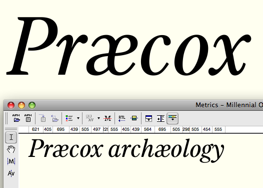
Craig, you Really need to do something about that æ!

you Really need to do something about that æ

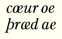
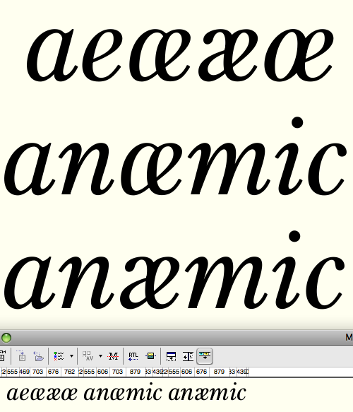
Is it ugly? Does it not read well? Should I use a single story a in the italic ae?

Yes. I’d prefer a single story æ, but in any case you shouldn’t have that straight stem there.

Too humanist for your face, but have a look at the structure in this cursive æ (and œ, for differention):

Better?

Please take my comments lightly (or ignore them if you want, you are clearly better than myself at type design).

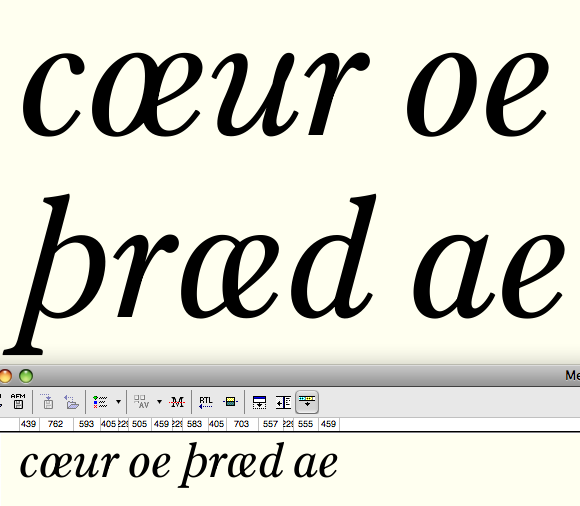
If you're planning on using this for text, I'd suggest adding a little more distinction between the oe and the ae. At small sizes, they might start to look too similar. Also, the stem on the /e/ seems a bit too angular when compared to the /a/ and the /d/.

As a whole, I really like this. The capital italics are fantastic.

If you feel the one-story solution is too humanistic, please do try a two-story version! Your sketch is good. I tried my hands at this, and it’s a hard shape.

Slightly rotated e and some cross compensation made the eye smaller. Also shortened the tail slightly. Sloppy interior, but you catch my drift?

Thanks James. The /oe/ confusion is definitely the danger here. And you're right about the tail.
And thanks Frode--the rotation suggestion helped a lot I think:


œ middle is too heavy.

I knew you were going to say that! :-)
Thinned middle of oe, and more adjustments to ae (middle stroke is more square, connecting thin is a little higher):

If you want to differentiate them even more, you could thin the southwest part of "e" in "œ".

Are there any situations where these two would be together in the same sentence?

Sure. "The æsthetic value of his œuvre is..."
But a better question is: are there single words where
the two could be confused? Here's one: æther vs œther.
And that's nothing - check this out: Færœ Islands. :-)

The æ is really not itself enough now. Classical, shmlassical.

hhp

Ah! :-)

BTW, you know what would be nice? Something I proposed years ago on
Typo-L (and apparently Gary Munch had already thought of): Ae and Oe
diphthongs! Why? Well, what about a book titled "Aesop's Oeuvre"? :-)

hhp

More thinking on the ampersand:

Ohh... can't help but think the second and especially the third of these ampersands might just do great without the arm (with some rebalancing). Dunno if that's your thing but you might give it a go.

What, you mean something like this?


Gotta say, that would never have occurred to me.
Stylistically the arm is the part that relates most clearly to other glyphs in the typeface.

I side question, isn't it considered affected/pretentious to use the æ and œ ligatures in standard English? I've certainly never had cause to use them in British English.

Yes, I've mostly or maybe only seen them used in old, or deliberately archaizing, examples in American English. (That "Amœbæ" article I linked is from 1913.)

Yes, something like that. It might have to become a bit tighter / more rigid to match the overall curvature of the typeface, right now it seems to feel more Plantin or something than Century; and you may well be right that eliminating the most «shared» element of the ampersand makes it harder in a way to make it belong in a typeface (it also makes it less «letterlike» however, which may be a good thing?).
It sure is unusual but sometimes it can work very nicely. (Disclosure: Ernestine's ampersand is like that too. And for due credit: this structure was originally proposed by Hrant (and I resisted rather fiercely at first ... but then it worked so nicely :-)

It needs rebalancing to compensate for the amputation ;)

Nina, do you think it works here? I wish it did, but I'm not so sure...

hhp

Hrant, I don't think the one Craig made works as such yet / not in this typeface. But looking at the three ampersands with arms that he posted before, don't they look promising, as in likely to be able to work without arms? Maybe it's wishful thinking, it just sprung to this mind...

I think his second one was dandy as-is.
Although I'm still "processing" those chopped serifs...

hhp

Reworked curves of the lachrymal version:

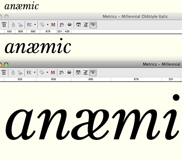
Hi. I don't really like the single story æ. Admittedly I'm not Scandinavian, but in running text I don't think it reads as æ well enough. I get to it and stumble for a second. This could be just that I don't encounter it on a day to day basis, but I prefer the double storey version. To make it more cursive though, have you considered using the bottom of the a bowl to meet the e crossbar (is that even what that part of the e is called?)? Something along these lines:


But with much better curves, obviously...

Crazy, but I think I dig it. The one story style is how it looks in handwriting anyway, so I wouldn’t worry about recognition.

Very interesting idea, Dave!

Great idea for the æ, I think it could really work, especially at smaller sizes it'll be almost invisible to most people that it's a weird shape.

The previous /ae/ and the Rowland /ae/:

The Rowland æsc is officially loved!

hhp

Looks good, I think it will work well at smaller sizes. Are you planning on including both styles?

No, the roman's horizontal e crossbar doesn't need or want this treatment.

It looks too upright; I'll fiddle with it some more.

You need a little offset with the thin stroke, and yes too upright, also curves of e bowl are not quite there I think.

Here I've got it fitting with the other letters better, I think:

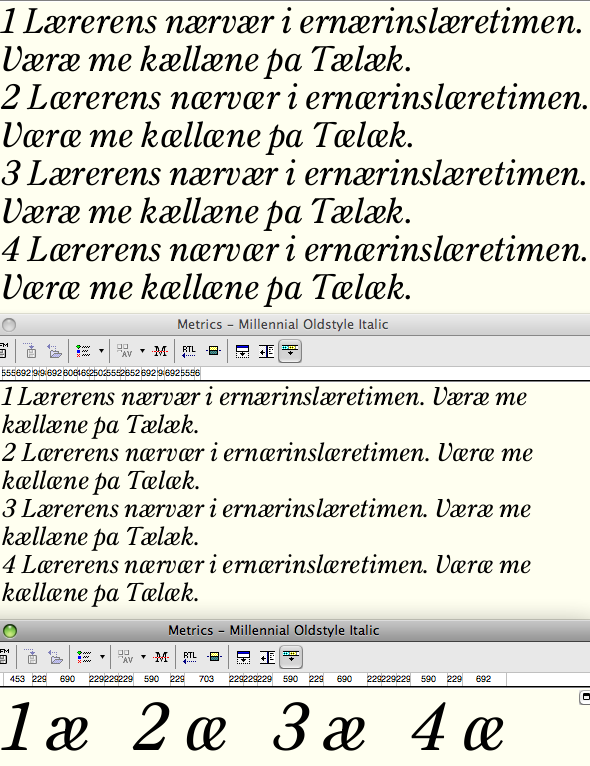
I'm sorry for being a party pooper, but as a reader of several languages where 'æ' is part of the alphabet, I don't find this suitable for text setting. I also think using a two-storey shape where all other glyphs derived from 'a' are one-storey is ... er ... wrong. There is something distinctly uncursive about its shape too (though it is much better in that respect than the 'æ' it replaced), the way those two thick stems meeting from opposite directions is not graceful to these eyes, and that left-turned tear terminal has no precedence in your italics. Lastly, this glyph is somehow two-storey in the back and one-storey in the front. That will not look harmonious in settings with a lot of 'æ's. Try these sentences: "Lærerens nærvær i ernærinslæretimen" (standard Bokmål) or even "Væræ me kællæne på Tælæk" (older Tønsberg-dialect). These examples are extreme, but both makes perfect semantic sense.

I loudly applaud your curved-leg 'R', though, and that last ampersand is brilliant.

More text settings of /ae/ variants. Thanks Sindre for the opinion and the sample texts. First two versions are as before; third removes the teardrop from the Rowland shape; fourth is the traditional shape with some curve adjustments to the "a"


Glad you like the /R/; I was a little unsure about it.

I like 1 best, but then I was bound to say that and I only read English so I can't really speak with any confidence on their legibility to Scandinavians etc. I don't think you need to lose the ball terminal - it's still there in the r and a little in v and w, so that ae isn't completely without company. If it's offputting, you can always just leave it in as a stylistic set.
PS. I quite like having a letter named after me, so thanks for that!

Sindre, the monocular æsc is simply illegible, sorry.
Except in languages that don't also use an œthel.

BTW, I like the sans-teardrop version, because
it makes more of an æsc and less of the "a"+"e".

hhp

Is the R just slightly too narrow? maybe kick out the leg a bit.

Would number 4 look less like an œ if you brought the top right of the a-part down the back of the e a bit lower? Otherwise I like 3, but perhaps the bowl of the a is wide?

Would number 4 look less like an œ if you brought the top right of the a-part down the back of the e a bit lower?

Actually I think making the top of the a-part rounder makes it look more like an o. :-/

Otherwise I like 3, but perhaps the bowl of the a is wide?

I'll do some more tinkering, but that width is serving to (a) preserve some of the italic slant of the overal silhouette of the letter, and (b) giving room for the bottom to come up enough so that the connecting thin isn't too low on the e-side.

I’m thinking maybe it’d be wise to go all the way back to your first binocular version, just without a straight stem. For what it’s worth, of these here nr 2 and 4 definitely reads better. I do think it’s become somewhat too disconnected from the a's shape though.

Okay, 5 is the first style, but with the straight stem and the teardrop removed.

Personally I never had a problem with the original, although I do
like it more now without the teardrop. As for the Rowland* form,
although it seems too mannered (perhaps clashing with the sober
mood of this design) it might be a nice statement to make about
the æsc needing to be its own thing (assuming you believe that).

* Dave, consider it part of the Typophile lexicon. :-)

hhp

Yes, I think for this design this form is probably best. Here with some minute adjustments. (I've also softened the /x/.)


I'll keep the Rowland form in my back pocket for a future, more fitting typeface.

As will I!

hhp

You're all too kind. New version does look better in this font though.

BTW, not for this design, but now I'm wondering
about a variant on the Rowland form, where the top
of the bowl of the "a" does not connect to the stem...

hhp

I think that would look very much like a cursive x

I too applaud this shape and your execution of it. It was good losing that tear, and the joining of the components is harmonious. The blackness is reduced just the right amount too, I think. Have a look at the perceived slant, though. Is it slightly too upright? (Perhaps it must be.)

Sindre, I think if the slant were adjusted to be more like the other letters, it would start to look too much like an /e/ with parts from an /a/ growing out of it.

Overall, I think this new /æ/ looks very good.

Slanting the whole runs into trouble with fitting with letters to the left, but slanting only the "spine" a few degrees improves the glyph.

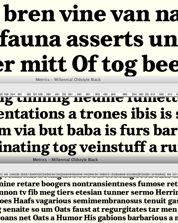
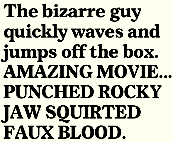
Does this contrast look about right for a bold?


(I see top of /t/ is too light, and /O/ too narrow.)

the top of the /t/ doesn't seem too light to me, it seems that the right side isn't wide enough. Other than that (and the /O/), it seems good to me.

The bold alphabetics.

Taking a look at replacing the teardrops in the roman with sliced-off terminals inspired by some of the italic terminals. Looks a bit more up-to-date (though it's giving me an Optima vibe).

The cutoffs remind me of Calluna, but for this face I'm a big fan of the ball terminals. I think there's enough charm in this face without having too much going on, if you can really polish it to perfection.

Bold looks very nicely executed. The Vv look unbalanced because of the serif treatment, perhaps bring the vertex slightly over to compensate?

I'd bring the leg of R out more. C might need a heavier terminal.

Arms of Xx look a bit skewed, the thin and thick seem at very different angles.

Yeah, ball terminals are better. y in bold looks slightly backslanted to my eyes. z is cool. The g in both regular and bold looks almost like it's reverse stressed in the top bowl. I guess this is because the right hand side's been dropped to make room for the ear, but I'd maybe try making the counter more of a regular ellipse.

or lift the ear up... would probably help solve some spacing problems (gu in bold example for instance)

Thanks for the ideas. Incorporated them here, and also am steering the asymmetrical serifs on the roman diagonals towards something less weird.


In addition to the adjusted diagonal serifs in /A/K/V/X/Y/W/k/v/w/x/y/), this shows...
/R/ leg adjusted in regular and bold
/K/ narrowed in regular
/f/ hood adjusted in regular
/y/ lean corrected in bold
/g/ vertical proportions readjusted and ear raised in regular and bold
/Y/ widened and join lowered in regular and bold
diagonal thicks narrowed on many regular letters

Looking at it now bold /W/ looks heavy, and the balance of the bold /X/x/ is still not there yet.

I think there's enough charm in this face without having too much going on, if you can really polish it to perfection.

Thanks for both the compliment and the advice. Gimmickiness keeps sneaking back in when my faith in the value of a sober text font falters!

Latest version of the italic T

>I think there's enough charm in this face without having too much going on, if you can really polish it to perfection.

Heh, well that's advice that I've recently given myself too :) I think the beauty of this face will be its overall appearance and functionality in paragraph settings, so I'd focus on attaining even colour, rigorous spacing and harmonising letters' widths and heights.

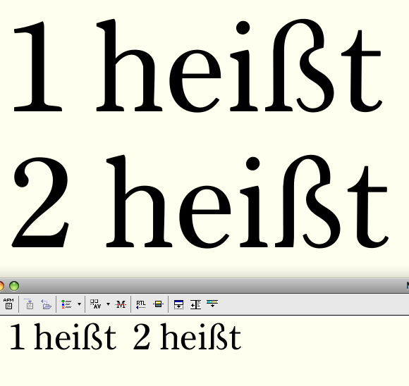
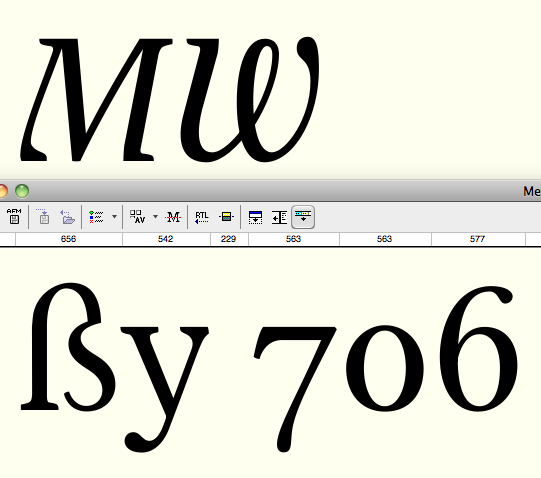
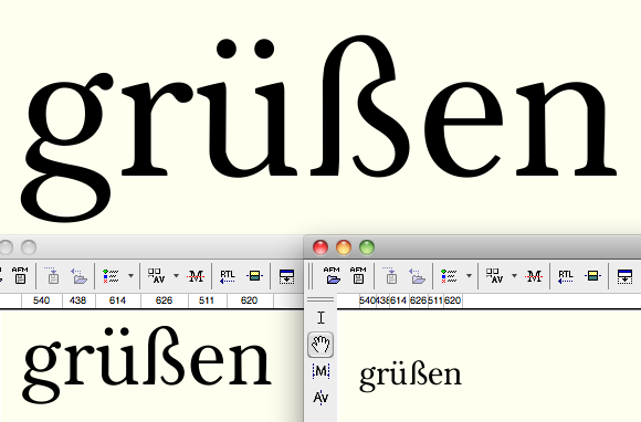
Eszett.


2 removes one side of the serif to accomodate narrowing, which I think it for the better. But does it get too noodly?

I find this letter so hard to judge.


Some subtle changes: gave a little bend to the second thin of italic /M/; lightened italic /W/.
Adjusted top right curve of /ß/; fixed lean of /y/; opened up counter of alternate oldstyle zero.

Whoops, that was my wide eszett that I had rejected. Here's the latest try.

That bold is very bold. Are you making it as a MM font? If so I'd have that as a black and one more weight in between for the bold. Then you get three weights for the price of two! That italic W is sexy.

Yes, the bold is bold; I'd considered calling it extra bold. My idea is that it will serve well as a master and I can make the decisions on interpolated weights when I get there. It may also turn out that I give a little more weight to the regular.

After months of my day job getting in the way, playing with this again.
Trying the descending italic /Y/ again, but it's not working.
Trying a descending italic /k/ leg, which I like--question is, does it fit this face or not?

Yes, it does. But only as an alternate. I prefer the top k, though.

Thinking of abandoning the asymmetrical serifs--here's what the caps look like after the serif revision.


I changed the /R/ and /K/ legs considerably.

R’s leg looks a bit dull to me, almost deflated, especially compared to K’s.
Maybe inverting the lower slope of the bowl (from “descending” to “ascending”) could bring a little more tension to it. But this being a text face, my comment is purely aesthetic.
As for K’s leg, it still looks a bit wide where it joins the arm. But, again, it could just be my astigmatism.

Well spotted. Better?

K is definitely better. R gained rigidity and what it seems like a bump in the intersection, but it could well be a rendering issue. I need to look at it again tomorrow with fresher eyes.

The leg of the R suffers from "pen rotation" at the joint: it gets to thin (e.g. start the inner curve a bit closer to the stem). Also, the state of the connection joining that inner curve of the leg and the middle horizontal is not yet settled: is it a smooth or an abrupt transition?

I'm not sure about the leg's end, regarding both R and K. I would make a more didone approximation in matters of shape (without exaggerating) and flatten those bottom curves a bit. But don't take this comment to seriously.

Maybe the descending Y would have worked if the right vertical stroke had been aligned with the slant angle...

Nice work c:

1 is as above
2 is another go at the previous R leg structure (but with Ricardo's rotation in the middle) and the same adapted to the K leg (which winds up looking kind of Cyrillic). With a rather stiff, ungraceful S-curve it's less elegant than 1 but maybe all the better fit for it! That structure also seems to make managing whitespace balance easier.

I see what you mean about whitespace balance (also about Cyrillic). I think it works better on K (if a bit receding) that on R (it looks a bit too much like a P with an appendage).
Aesthetically, I still prefer the previous, more classic blade-like K’s leg.

Same candidates at smaller sizes:

Man, this typeface features a tremendous amount of refreshing elements. I read about half this page and I had some points of criticism along the process but it seems to be taken care of already. There isn't really anything I would change or improve. I love the fact that this typeface seems to be the warmest Century typeface I've seen yet it remains very clean.

Ahh it seems I only read about half of the first page. I just realized there are another 3 pages. I won't comment on the older pictures, but as for the latest picture I think I prefer #2 though I would lessen the curve a little bit.

Thanks Martin for the compliments and the input!

3 is a variation on two that makes the wiggliness of the leg a little more subtle. I like it.


Also pictured: revised curves (particularly interior contours--the counter is now nearly symmetrical) of /h/m/n/u/.

Subtle is good :-)

Agreed. And here (3) is a version of the R with similar curves, and a more diagonal structure.

Good, but to me it looks a bit unbalanced: R’s bowl rests its weight on the leg, while K’s arm lifts it. (this applies in general, not specifically to your samples)

Do you mean you need more sturdiness out of an /R/ leg, generally?

Not necessarily sturdiness, but, so to speak, more “presence“ (extending past the bowl with part of the leg and not just the foot, for example).
But, as I said before, trust your eyes (and those of others) more than mine.

Yes, what riccardo said. The curve needs to be a bit more sturdy, and the leg needs to extend past the bowl further. I also noticed that the lowercase /m n u h/ don't render very smoothly, where the shoulder meets the stem (on the right). That 3 is beautiful!

Here (4) is a sturdier leg, straighter and further out. I put a little corner in the closed counter that corresponds with the leg. Also lowered the middle very slightly.

Almost there, but the curve is still much less apparant than it is in the K. The angle at the top of the leg could be a bit, just a bit, more towards horizontal. The base of /2/ could extend a little further to the right for more stability as well.

Cheers!

Almost there, but the curve is still much less apparant than it is in the K. The angle at the top of the leg could be a bit, just a bit, more towards horizontal. The base of /2/ could extend a little further to the right for more stability as well.

Cheers!

To me 2 looks ok in that department.

Almost there, but the curve is still much less apparant than it is in the K. The angle at the top of the leg could be a bit, just a bit, more towards horizontal

Hmm, I was trying to make the curve less apparent, to gain the sturdiness it was missing! I think I'm reaching the conclusion that a diagonal leg has to be pretty straight (as #4), or else you get the "P with an appendage" effect that riccard0 was mentioning.

The base of /2/ could extend a little further to the right for more stability as well.

Not sure about that. But I wonder if the top where the teardrop is should come down a little further. I really hate drawing /2/s, maybe more than anything.

Having trouble with uploading pdf's at Typophile, but here's the latest specimen, concentrating on the Roman.

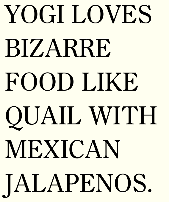
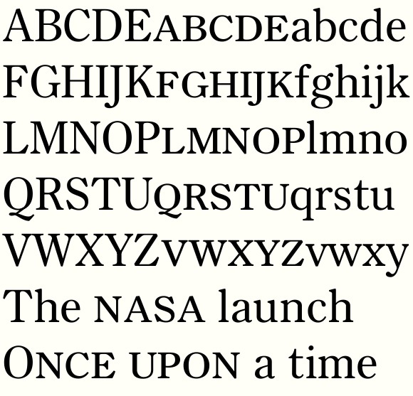
Does this look like about the right height/weight/proportions for small caps?

I like the height and width, but considering your caps are
slightly darker than your lc I'd make the SC a hair darker.
(With "a hair" being exactly 1/2 of "slightly" of course. ;-)

hhp

More towards petite ones...

Yeah, hard to tell like this, but I think they might be a little on the small and light side, also considering how big your caps are. (But maybe that's just me. I personally find many fonts have slightly-too-small smallcaps.)

I think -for a text font- it's better to be on the small side
than the big side (and the darkening I mention would help a
bit). The size they are now would indeed not work for mixing
with the full caps, but to me that's a secondary usage, better
reserved for a display cut of a design.

hhp

> it's better to be on the small side than the big side

Why?
I'm not talking about mixing with caps. I'm talking about acronyms and such in text. Maybe it's just a matter of taste (or I'm misguided) but personally, I often find smallcaps too flimsy and small, looking too much like scaled-down caps.
And then there's the issue of mixing with lowercase, for instance when pluralizing an acronym using a lowercase "s", which with smaller smallcaps isn't differentiated enough.

Because it's better to be too subtle sometimes than in-your-face
all the time. But I guess we need to see a PDF. I'm thinking things
like pluralized acronyms will work as it stands, but needless to say
I could be wrong.

hhp

Taller and darker. A little too tall now, or no?

Much better, definitely. The serifs of /E/'s crossbar are perhaps too dark. Make them a little more abrupt. Just now I noticed that all of your /S/' may need more weight at the top left, and loose weight more slowly in it's way to the top; that would ameliorate the thick-thin transition, which should be more gradual IMO. The /2/ also needs work in the right curve :)

These look good/better to me too. Yes, maybe a hair tall now (but I find it hard to tell by staring at big letters on a screen).

Wish the Typophile pdf upload weren't broken!

Just now I noticed that all of your /S/' may need more weight at the top left, and loose weight more slowly in it's way to the top; that would ameliorate the thick-thin transition, which should be more gradual IMO. The /2/ also needs work in the right curve

I'll look at the /s/s, although I think at small sizes the natural busyness of that form might mean the lightness I have now is appropriate.

Can you give me more direction on what is troublesome about the /2/?

The curve at the right is a bit too thick and for some reason it's axis looks slanted to the left (counterclockwise). But these are just marginal observations. Ignorable, due to meticulousness, if you like.


Here's a new go at the two (as before on left, new on right). I think it's better.

PDF just worked: http://typophile.com/node/89140
Maybe it's the size issue?

hhp

Must have been, because it looks like my reduced specimen went through. Thanks.
They really should fix that limit (or at least change the notice from "max size 2MB" to "max size 130K")!

OK looking at the PDF (MillennialOldstyle12.pdf is the current one, right?) the weight seems pretty good to me, but I have to agree they look potentially a little too tall now… actually maybe even more importantly I wonder if they seem a little too wide, slightly out of character with the overall narrow elegance of the face? It's hard to tell though, don't listen to me too much, remember the salt & all that. ;)
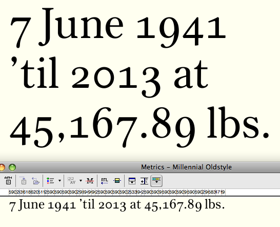
Front (bottom) window shows latest, shorter and narrower. Should probably give a bit more generous letterspacing.

Should probably give a bit more generous letterspacing.

Indeed :-)

same size, respaced.

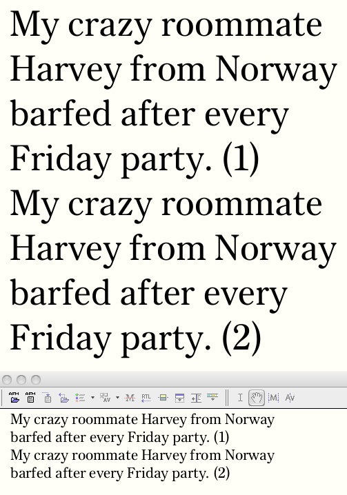
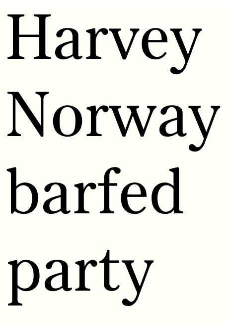
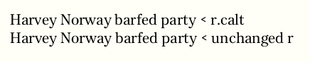
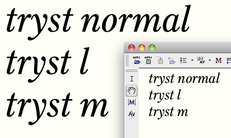
Experimenting with a narrower contextual alternate for /r/, which would appear before /f/t/v/w/y/. (In this sample, 1=all the same /r/, 2=using the r.calt in "Harvey"/"Norway"/"barfed"/"every"/"party.")

Good idea. Or even have three forms (with a longer one, mostly for "ro").

hhp

@hrant
what you're suggesting is easily accomplished by kerning; why bother to make an alternate to preserve excessive white space? It looks as one step forward, but it's one step back ;-)

Kerning? That doesn't make the letter bodies different.

To me white space is excessive only if it's associated
with a disjoin in the letters (weakening the bouma).
An "r" with a longer beak would "virtually join" the
following letter at the top, and the characteristic (read:
conducive to readability) white at the bottom would
be amplified.

hhp

Yes, I think "ro" and the like are situations that kerning can address.
Here I've made the join lower and the right baseline serif longer:


Does my narrow /r/ just make the following letter look too wide? Maybe I should consider truncating the serifs/crossbars of those letters instead of (in addition to?) narrowing the /r/. Nina, we've been here before, huh? :-)

At text sizes, I do think the word-shape is better with the accommodation (top line)

Kerning can certainly address things like "ro", but if you go
to the trouble of having a narrow "r" to accommodate a hard
top-left in the following letter, you might as well take the small
next step of taking advantage of a soft top-left.

> Does my narrow /r/ just make the following letter look too wide?

As you seem to be ending up concluding yourself,
that's a display-face worry, not a text-face one.

hhp

Regarding the narrow /r/, the /rf/ combination seems to stand out the most to me. It might be because the left side of the crossbar is significantly longer than the one on the /t/.

Hmm, given the bracketed nature of the /t/ crossbar, my eye doesn't really need the two crossbars to relate in length (if that is what you are implying).

When I get to kerning I would probably move some of these letters back apart (rv, rw)--does that seem counterproductive? I guess I'll have to wait until then to accurately judge the effectiveness of the alternate in word-shape.

Adding positive kerns to select pairs can make a lot of sense. In fact in
my view round-to-round pairs need a bit of that in pretty much any font.

On the other hand I don't understand why "rw" is a hair tighter than "rv".

hhp

I just meant that I'm doing all this to get the letters closer together, but in the end I'll kern them apart.

On the other hand I don't understand why "rw" is a hair tighter than "rv".

Yeah, that doesn't make sense, does it. I spaced each within strings of nnnvnnoovooo etc., and I guess my eyes weren't consistent from letter to letter. I've fixed it now.

Well, if you end up kerning fewer than half, you're OK. :-)

hhp

On the topic of small caps:

The subtlety is lost if the reader notices them, hence the further from cap height you go the less like capitals they will look. Now small caps are supposed to look like capitals, they just don’t have the function caps normally have: marking the beginning of a sentence.

Capitals should be heavier than minuscles for many reasons, but I consider the primary one the larger counters. An “O” needs to be heavier then an “o” just to look similar. Since small caps are often—and indeed should be—tracked wider than minuscles, there is a certain need for some extra weight here as well. The loose spacing makes them seem thinner than they are. Remember, white and black are intertwined in notan.

I think there are layers of "noticing", and to me the
way smallcaps text works is by saying "I'm in caps"
(subtle, good noticing) without being so big that it
attracts an errant fixation (loud, bad noticing).

hhp

Yes, but if they are too small the subtlety is lost: they suddenly stand out—the exact opposite of what they were supposed to do in the first place. At that point it’s just the designer showing off.

I don't see how they could stand out by not
looking enough like caps. To me the problem
with too small is simply that they look too lc.

hhp

Some subtle alterations: (2=after alteration)
/e/ - brought the bottom terminal rightward. I think that makes it less "self-contained" and gives it better direction towards the following letter.
/y/ - brought the bottom terminal rightward and raised the intersection.
/v/w/y/ - narrowed by bringing the top right terminal leftward, and also adjusted serif there to be wider and darker.

This is late, but I just noticed, sorry: what are the vertical proportions?

hhp

You mean in units?

If you're inclined - but mostly I'm wondering
if the descenders are as long as the ascenders.

hhp

They are about 97% as long.

Hmmm, not a bit much? Especially with the large x-height,
which means it could be set with minimal/no leading.

hhp

This shows (at 2) the descenders shortened just by 5 units (thus now about 95% the length of the ascenders). Any shorter gets kind of stubby. I do think that shortening of descender helps the ascenders not look stubby, and as you say it should facilitate tighter vertical spacing. I've attached a pdf to the top post showing how it looks at 10/12, 10/11, and 10/10.
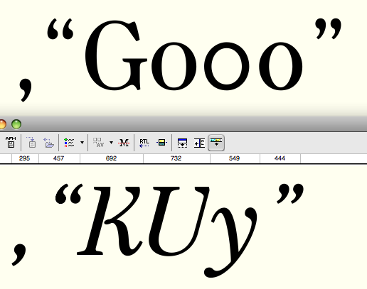
I think it's better now.

BTW, the facilitation of tighter vertical spacing could
be seen as a byproduct of a great good: the proper vertical
distribution of information. Since ascenders play a much
greater role than descenders in the formation of boumas,
it makes sense to give them significantly more room. Yes,
this results in stubby descenders (and you certainly don't
want to go too far) but in my view that is in fact a fruitful
compromise. I myself determine the descender length such
that the "g" looks slightly cramped; if it's too happy then
you're paying a big price elsewhere.

hhp

Thanks Hrant.
Maybe you like the extender proportions of Century Oldstyle, the point of departure for this design? Seems like it was made with the same rule of thumb you mention!

Not just Century Oldstyle* in particular - I think the "old folks"
had a good, unmannered grasp of vertical proportions. Also, since
this is a revival of a classic work-horse I'd suggest that following
conventional wisdom makes extra sense.

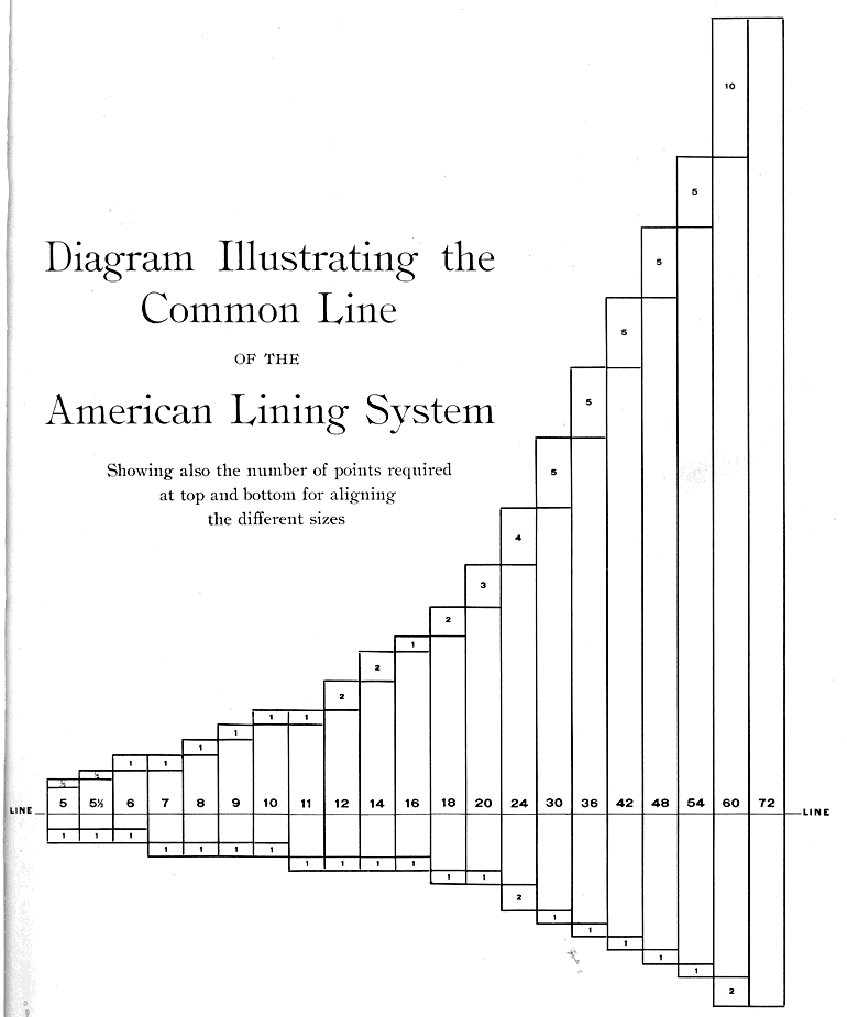
* With ATF having a particular reason for making
their descenders extra short in certain sizes:
http://typophile.com/files/ATF_line_4221.gif

--

So, is this going to end up at FB? :-)

hhp

BTW, if decreasing the descender length is causing the font to
shoot for a lower ideal point size than you'd like*, you might
instead use a lesser decrease and increase the ascenders a bit.

* Also mind the resultant necessary shift in color and spacing.

hhp

Not just Century Oldstyle* in particular - I think the "old folks"
had a good, unmannered grasp of vertical proportions. Also, since
this is a revival of a classic work-horse I'd suggest that following
conventional wisdom makes extra sense.

Hmm, I'm inclined to think the "still older" folks got vertical proportions right, and the "old folks" circa the ATF heyday screwed things up because of the constraints of their setups (like the standardized baseline you cited) and their priority of density over grace in vertical spacing.

And furthermore, for a reinterpretation (not a revival), this seems like an opportune place to distinguish my design (from the already-existing digital versions of Century Oldstyle, e.g.), since it's a place where I see compromises in the original owing to limitations of metal type that no longer confine us.

All that said, I really enjoy this process of coming to understand the logic of historical designs (with your help--thank you) though my own design process. That's why I started designing type!

--

Here's another sample: all the descenders are shortened as above, and the ascenders in 2 are 7 units longer than in 1. I like it.

--

So, is this going to end up at FB? :-)

Do you think it belongs there?

> the "still older" folks got vertical proportions right,
> and the "old folks" circa the ATF heyday screwed
> things up because of the constraints

You have a point, but to be fair the "still older" folks
had a lesser challenge, in terms of not tackling systems
of fonts; you could even say that handling constraints is
a higher level of Design.

Did ATF give up too much grace for the sake of economy
(of space and/or mechanics)? Or maybe they were giving
the much higher frequency of ascenders than descenders
due credit. It's an argument that can go either way I guess.

> for a reinterpretation (not a revival), this seems
> like an opportune place to distinguish my design

Good point.

--

I think #2 above seems quite well balanced, including in
terms of vertical proportions versus color and spacing,
although I might prefer to see it slightly darker.

--

> Do you think it belongs there?

FB is sort of the unofficial inheritor of the old American
foundries, the closest thing we have to an ATF phoenix.
Assuming they don't already have something too close
(or plans for something too close) it seems to make very
good sense. William would be the ideal advisor to you in
exploring such a possibility.

hhp

although I might prefer to see it slightly darker

I've been thinking that for a while. My current plan is to get this weight where I want it, make a point-compatible, much darker font, and decide on weights to release in the interpolated spectrum between them. Perhaps this would wind up being a Regular and one step darker would be a Book weight.

Revised structure of italic /X/ to one that better fits the style of the font. (2 shows revised)

Better. Perhaps it’s just the comparison with the former one, but it looks a bit narrow and/or closed.

Better, but too narrow. I think you could make that swash at the left bottom of E and D more prominent. It works, but keeping it shy spoils the effort.

Thanks, you are right and I think this wider version is better:


Thanks Jasper for pushing me on that loop, which I agree is neither here nor there right now. The image in this post shows a couple of attempts at changing it: the D has a slightly bigger loop, and the E has a change in direction instead. I'm not really happy with any of this yet. To make the feature big enough to be seen, it winds up being a tumor-like loop. In the /T/, the loop stands in for the crossbar+serif, but in /D/E/L/ it's essentially in the place of a mere serif. Perhaps I should abandon the idea for these letters (though that I suppose raises the question whether the /T/ is too much of an outlier).

I like the “change in direction”.

I think what makes it a tumor-like loop is that it's pretty 'round', yet completely closed. Either go all the way and make it an actual loop, much bigger and with an opening, or compress it vertically and extend it horizontally. The latter would make it less dark but more apparant, I guess. The 'change in direction' lacks attitude IMO.

Th width of X is better now.

Throwing some E's against the wall to see if anything sticks:


Thought that wavy bottom in 2nd and 4th lines would be too "pennish" but I think it might be working! Perhaps a tinge too heavy yet.
- -
On another topic: I'm reinstating the full serif at the bottom right of italic /A/.

Yes, 4th /E/ looks ok to me, even though it's not as rigid as the other caps. /T/ is funny, but it definitely doesn't work. How about using the bottom of the 4th /E/ as reference for the top of /T/? /N/ should have at least one straight stem IMO.

How about using the bottom of the 4th /E/ as reference for the top of /T/?

Yes, as soon as I saw that /E/ bottom developing I turned my laptop upside down and tried to imagine it for the /T/.

Okay, here's where these revised italic caps stand:
/F/ has simpler arm to match /E/
/L/ has revised bottom
/A/ has two way serif on right
/T/ top now patterned after /E/ bottom
/E/'s bottom is thinned and the whole letter narrowed since last shown
/N/ has firmer, straighter thin strokes
/D/ has the loop as before

Improvements! /T/ looks good! It looked weird to have the stiffness of the serif at the left, in contrast to the looseness of the loop at the right. As for the /D/, it needs more overshoot (a bit, just 2 or 3pt) at the bottom, now that it's more curved.

I think a similar treatment as on bottom left of E and L would look better on D instead of the loop. The loop feels too small to be a loop and too bulbous to be a serif.

Top: D with loop, lowered to appropriate overshoot
Middle: D with change in direction structure, thin at bottom
Bottom: D with change in direction structure, thick at bottom

Middle one for me. I think the stress in the bottom one is too calligraphic for this typeface.

Meanwhile, minor breaththrough i think.
I was thinking italic Q and Z, though handsome, looked a little old fashioned, so I tried an update (first line below, right is revised).
But looking more closely at that Q tail reminded me that (in Noordzij's terms) the contrast pattern of this typeface is expansion rather than translation. And that made me realize that my recent attempts at adding contrast to horizontals (of E, L, T etc) was hewing more closely to translation than necessary. Keeping the contours parallel was giving them the "calligraphy pen" look that wasn't quite appropriate. So the bottom shows a free-er swelling of those horizontals.

Middle one for me. I think the stress in the bottom one is too calligraphic for this typeface.

Yeah, that one gives a blackletter vibe! I may just revert to a plain serif here, which at this point I think I'd like better than any of these.

More futzing with curves on the /T/, mostly to take some weight off the top part (top/left is before, bottom/right after).


I am thinking I will make more subdued/normal versions of these letters with horizontal strokes (/E/L/T/Z/) to be used in allcaps settings and as the smallcaps.

Here's a go at the caps that will have simplified forms for all-caps settings, which are now used to create the small caps:

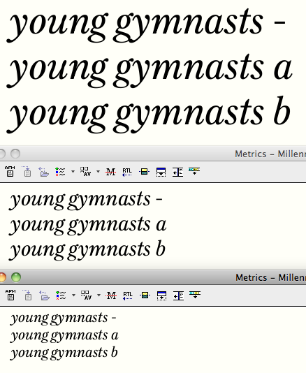
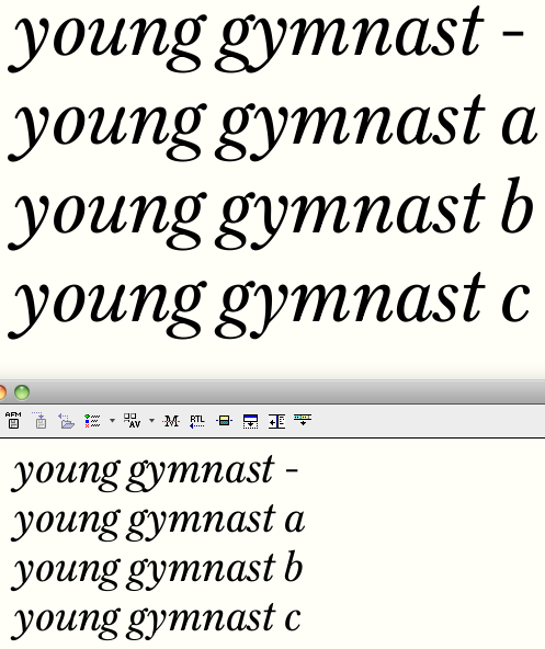
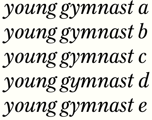
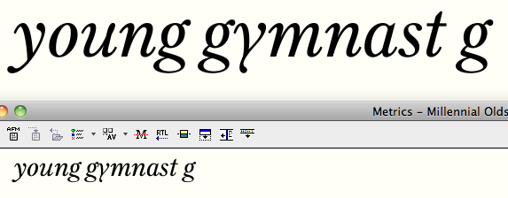
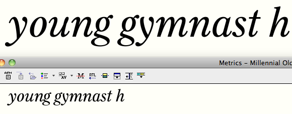
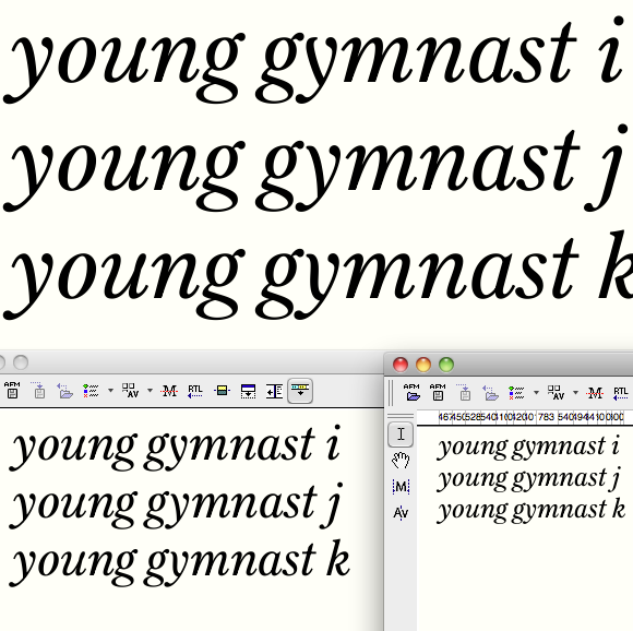
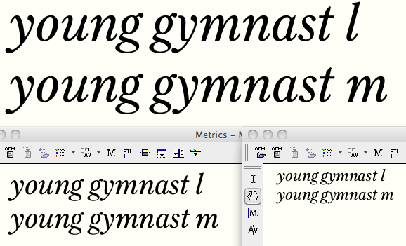
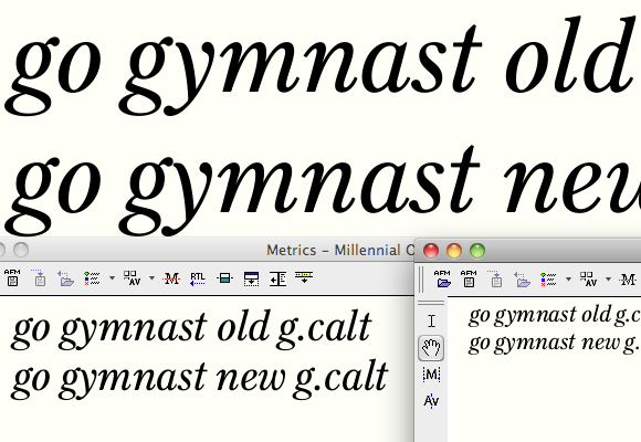
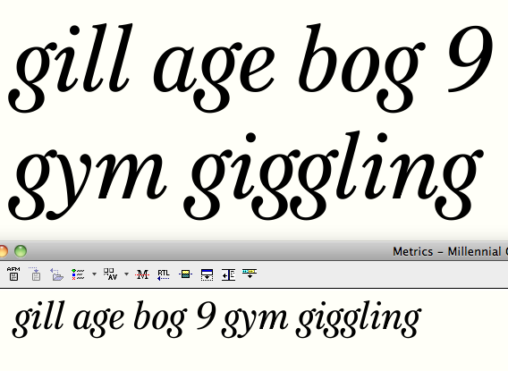
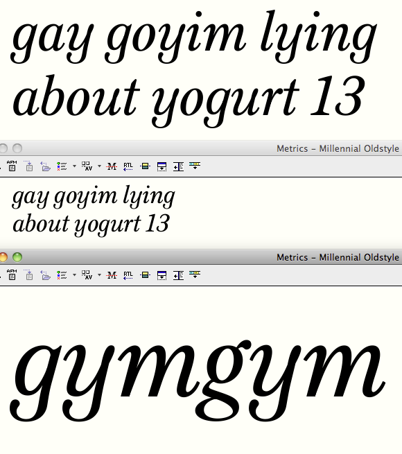
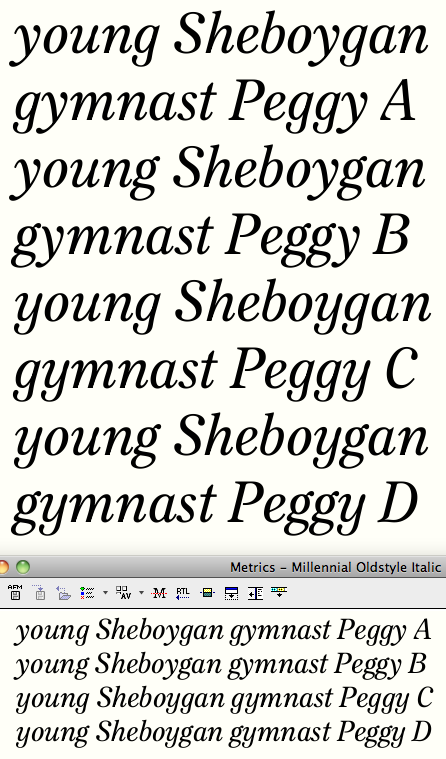
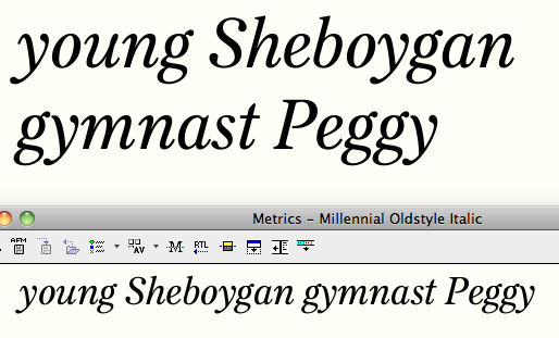
Top line shows crash that happens with stock /g/ followed by stock/y/.
(a) shows existing /g.calt/y.calt/ (in "gymnasts")
(b) shows alternative /y.calt/ with the structure modified to fill in the big gap in the middle that comes from the tops and bottoms of /g/ and /y/ pushing off from one another.


I prefer the elegance of (a) but do you think the gap is a problem with that, and if so, is (b) a solution?

What about using a Fleischmann "y"?

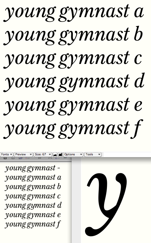
hhp

You mean like this (c)?


Interesting idea!

Yes, that's it (perhaps with more continuity of
"stroke" thickness going down into the descender).
It's a sadly under-used form. But hopefully it will
eventually enjoy the same resurgence as the Koch "g"... :-)

BTW, I know of one font that's used it: Chank's
"Venis", for which I once wrote a positive review,
and immediately got flack for that! Not sure why.

hhp

A more u-shape based italic u would be too much?

A more u-shape based italic u would be too much?

That was actually the direction I went first (here at d), but I thought it was coming out kind of sloppy-looking.


e shows Fleischmann /y/ with thicker tail.

Me, I like the 2nd and 5th ones.
(The 2nd with some thinning at the bottom.)

hhp

BTW, I know of one font that's used it: Chank's "Venis"

:-)

Did you ever consider a one storey g for the italic?

Okay, looking again at (b) I realized it repeats the same problem I noticed above - a kind of deadness to the too-parallel contours. So I played with the shape and came up with this (f).


Strikes me as a surprising and strange shape, but there's something I like quite a bit about it. The questions are, though:
- does it read as too spotty?
- does it fit the face? (or is it too mannerist or something)
(This reminds me a bit of what Sindre is doing with Satyr.)

Did you ever consider a one storey g for the italic?

Not really. I think the binocular form fits my vision of this typeface.

And if I'm reexamining glyphs with parallel contours, then this can of worms is getting messy.
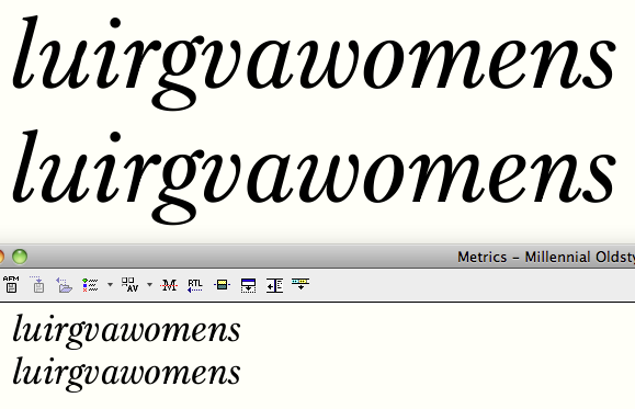
Here (bottom line) is a de-paralleled version of /u/r/v/w/m/n/.

Still regarding y, Fleischmann’s is still alien to me (but of course maybe I wouldn’t even notice it at text sizes). I like the d-version (which, naturally, couldn’t be just a contextual alternate if chosen).

Hmmm… can't say those explorations are uninteresting Craig, but I have to say to my eye they would belong in different typefaces (and that bottom-most "y" does look spotty to me). Dunno, this design seems to rely quite a lot on a certain rigidity, also in terms of parallel outlines, which this is now suddenly undermining; looking at this bottom-most italic, this feels a bit dizzy and undecided to me now. (Indeed Satyr does this kind of thing, but it does it on a global scale: as far as I know it doesn't have any straight lines, and is overall more «organic» and soft and oddly-shaped; I'd imagine this sort of thing gets easier to pull off in such a context.)
But please, mind the salt. It's entirely possible that I'm just not really understanding where you're trying to take this.

I agree with Nina. My advice would be making the italic rigid and rule-following rather than inventive and flamboyant, perhaps even oblique-y here and there.

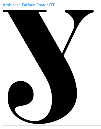
> Ambicase FatFace Poster OT

Ah, it seems I'm preaching to the choir! :-)

That last "y" is very cool, but it's totally out of character.

hhp

Thank you for confirming my suspicions. My method here is open and exploratory, so I'm expecting (and even enjoying) dead ends. I'll file that /y/ away for a future font.
Nina and Sindre, what do you think of the caps I was playing with before we got into the /y/ (reposted here:)


Do you think I can get away with that level of flamboyance? (the mixed-case forms, particularly the /E/L/T/)

I'm having trouble stopping drawing /y/s! :-)
Here's a flipped-tail version of /y/ (this one can go with the conventional /g/).

Personally, I really like the capitals in the first line (the mixed-case ones), The /R/K/E/L/ stand out to me as the most interesting without pushing it too far (or too little, in the case of the /Z/) – but that's just my opinion.

Maybe top right serif of K is a bit big (but I like its "forward against contrary winds attitude ;-).
Not a bad y, the last one, but at text sizes I'm afraid it would be distracting.

Yes, play with the caps, not the lower case. 'WRK' very good, 'ELZ' good, 'T' not so good in my opinion. Such a 'T' is a good idea, but I think for display only, and I would even then make it less subtle. But these are alternates, right? I wouldn't consider them default glyphs for this typeface, to be honest.

I agree on the 'y'. Very good shape, but not for text setting. Your default y is very, very good, though. But I'm worried about 'gy' and 'gv' etcetera, the whitespace between them looks a bit busy and cramped, I think. (But perhaps that's unavoidable in a design like this.)

forward against contrary winds

That's a wonderful verbalization of what I was after!

But these are alternates, right? I wouldn't consider them default glyphs for this typeface, to be honest.

Hmm, I was hoping that I could pull these off as defaults (but use the simpler forms when ALLCAPS is applied).

Your default y is very, very good, though. But I'm worried about 'gy' and 'gv' etcetera, the whitespace between them looks a bit busy and cramped, I think. (But perhaps that's unavoidable in a design like this.)

Aha! This may be the solution:

I don't know… I'd worry that any of these contextual alts might draw more attention to that specific pairing than the gap would.

Since you asked for my opinion on the "cursive" caps: I think they're cool and interesting (like Sindre, I'm least convinced by the "T"); I would also prefer having them as stylistic alts, though. Mainly because the difference in "expressiveness" between them and the "all-caps caps" is so big that they kind of feel like different styles of the same typeface, which I'd worry may seem confusing in situations where all-caps and mixed settings coexist. That, and they're kind of, well, special, so they draw attention. Which should be great for some settings but may be distracting for normal running text (especially in the context of this face which otherwise doesn't strike me as especially "loud", extravagant, or flashy; so they do stand out). And there's maybe also the consideration that not everyone who uses all-caps settings actually uses the All-Caps command… (sorry, I'm being a worrywart!)

Yes! The new y is much better for the /g/y/ combination, in my opinion. My biggest issue, which I forgot to mention in my post last night, was with the ear on the /g/ and its proximity to the /y/.

The idea for the alt /y/ is good, yet I think it would impact consistency/readability: the thick stroke looks kind of brushed, mostly because it's terminal doesn't taper. Try to pull the stroke more "into itself" to produce a curve similar to your default /y/, but flipped. Not sure how it would look, though.

I think the difference in shape between the standard and alternate y is too pronounced. I like option b best, but my problem there is not with the large white space but the crowding around the g ear. Could this be overcome by changing the g ear? Not just here but the standard g also. Or another suggestion- ligature the gy combination so the top left of the y sprouts from the g like an ear. Can't hurt to try.

I did try a ligature before, but that was quite clearly a dead end.
Okay here's three more:
(i) is (h) with a little more finish on the terminal.
(j) is (a) with the transitive serif removed.
(k) is (b) with the transitive serif removed.


I like these last two. (k) fills the interletter white space better, but looks a bit too noodle-y perhaps; I think (j) may be the frontrunner. Opinions?

I like (j).

hhp

I'm with Hrant on this one.

This may just be me but the counter in the /y/ (both the alt and the default), seems a bit small (compared to the /m/n/. The third one seems to better address that issue, to my eye.

I say (k). For me, it's the only one that deals with the white spot. If (i)'s thick stroke would be more curved (from the beginning), it would also do a good job.

Two more tweaks of those last two candidates.
(l) is like (k) but less noodle-y, and with a more delicate join.
(m) is like (j) with some minor curve fiddling (weightier thick, tiny bit wider counter).


I think the question is probably still the same: Is it better to fill the whitespace more evenly, or better to match the other /y/s.
James, you're right that the /y/ counter is narrow. In some ways the structure demands it, but I have pried it open a tiny bit in this image and may try to do more of that.
BTW I realized whatever solution works for the /y/ after /g/ might also work well after /r/.

j is the one I can see as contextual alternate.
k would need to rethink the regular one too.

Edit: the same stands for m and l.

Addressing the spacing issue from the other side: On the top line here's the /y/ version m after the existing /g.calt/ (just as before), and on the bottom line the same /y/ follows a /g.calt/ I've modified to eat up a little more of the interletter space. The new /g.calt/'s upper bowl is pulled out a bit on its lower right, and the bottom bowl is "rolled up" a bit to lessen the white in the /g/'s middle "counter" and to accommodate the incoming /y/ tail. That bowl is narrowed a touch too.


In addition to fitting better, these /g/ alterations actually give a little dynamism to the letter - maybe I should just call this the standard /g/!

I think (l) is awesome... but probably out of character.

hhp

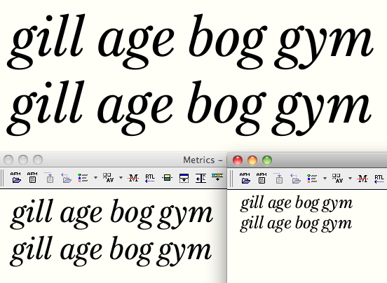
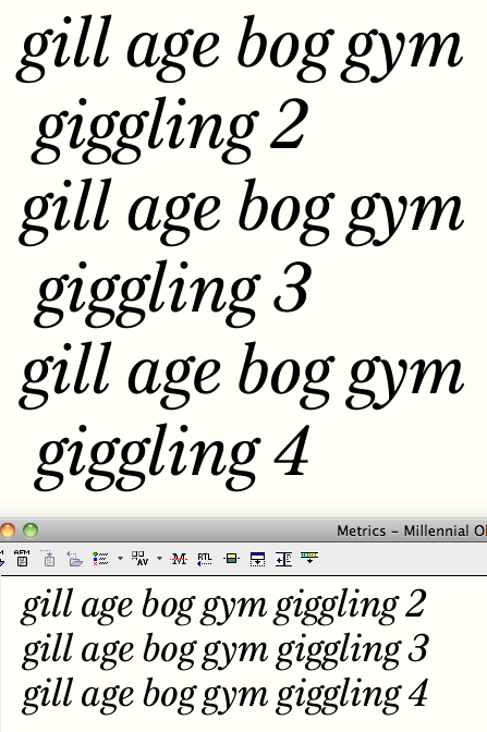
Now looking at the stock /g/.
Top row shows previous /g/ (and, in "gym," the /g.calt/).
Bottom row shows reworked /g/ in all words.
- Bowls are much more even in proportion (instead of tall up and wide below)
- Bottom bowl is much rounder rather than triangular
- Link is a little less angular


This bottom one is probably less interesting, but it may be a better fit in both senses of the word. With it I wouldn't need to include a /g.calt/ in the problematic pairs /gy/, /gf/, /gj/, etc. (though the second letter in those pairs will need to have alternates).

I feel only the top g has the balance to be an italic g. The new g is a skewed roman g; it's stiff and doesn't sit comfortably without the y to support it.

More /g/s.
#2 is the one we just saw on the lower line of the previous post, which I agree has a "skewed roman" look to it.
#3 is a revision that tries to put some of the italicness back in. Its lower bowl has some of the "coat-hanger" triangularity as the one on the upper line of the previous post, but for fit's sake that bowl is not quite so wide, and it is swung up so the top line is more horizontal and the bottom right lifts to accommodate enusing descenders.
#4 is more or less #3 with an open bowl.

Yeah, #3 works! #4 is pretty in a display kind of way, but a fully joined binocular fits the strong text feel of this face better.

I don't know if you closed the discussion about /y/ as I stopped reading nearing the end of this page, but the ones which deviate in the curve from the default character are no good. It should remain consistent. The alternative you came up with in the end is quite perfect but I personally still thing there's a bit too much tension in g_y.

I see you went through quite a process with /y/. I absolutely love the one which reminds one of Satyr, by the way; it's a pity that it doesn't quite fit this typeface. I must ask though, why do you insist on the spectacle /g/ for the italic while your problem with g_y is so easily solved with a one-story /g/? I would love to have the spectacle /g/ as an option but I think I would still rather see a one-story /g/ in the Italic. I love how the ear of the spectacle /g/ interacts with the curved serif of /i/ though (and letters with a similar curve).

As for the spectacle /g/, I'm all for #3. #4 looks too light at the bottom at text size; as cerulean said, #4 is good for a display version.

Beautiful capitals, by the way. Most of the swash caps look good too. I just think the swash /W/ is a bit too flamboyant, and I find the design of the swash /K/ a little odd.

Thanks for the input Martin. Yes, I'm pretty settled on the /y/ that simply has its transitional serif docked, concluding as you did that the ones that varied more from the standard form were too different.

Maybe I'm being too stubborn but I just feel like I want the binocular /g/ to work for this face. That said, I might sketch some ideas for a one-story and see what comes out. It's the stiffness of the binocular structure that feels fitting to me, but maybe I can come up with a one-story that shares some of that character.

Glad to hear /g/ #3 works for you. I think that issue might be settled now too.

What to do with the caps is still up in the air. I was thinking/hoping that the fancier ones could be standard, and the plain ones available as a stylistic set and/or when all-caps is triggered. But it sounds like you guys are seeing them more as swashes, in which case they shouldn't be default--and maybe in which case they, along with the open-bowl /g/, should be set aside for a display cut rather than put into the text fonts at all? (Of course the solution for one of these might be different than for the next--the /T/ is quite different from the /R/, which I can't imagine looks objectionably swashy in normal settings to anyone.)

Can you specify what you find a little odd about the /K/?

Here's a go at a one-story /g/ with a bit of a funky tail. At large sizes at least, I think it looks too contemporary (not classic enough).


Makes the binocular version look cluttered in comparison, though.

That's kinda cute. And it would harmonize with the Fleischmann "y"!

hhp

I also think that /g/ is "cute" as hrant puts it. I do however agree that it looks too contemporary for this typeface, but I think that's mainly the fault of this classical /y/ because the capitals have plenty of 'contemporary'.

If the one-story /g/ reads well at text size but the spectacle /g/ is stylistically more appropriate, then that makes me wonder if it's a good idea to design a hybrid.

> and maybe in which case they, along with the open-bowl /g/, should be set aside for a display cut rather than put into the text fonts at all?
I personally wish these swash caps would remain available for the text face

> Can you specify what you find a little odd about the /K/?
Well, you have this slightly curved tail with a sudden upward stroke. In my opinion that's too contemporary for this typeface; something more classical would work better. But the tail on its own is not bad; it's that the arm is also curved and then has this chunky reverse serif which makes it look even more contemporary. I think it's just the whole curved but blocky look about /K/ and /R/ which I don't see as completely fitting to this typeface.

(as an aside, that /g/ marked #3 in that last image was the wrong one, not the good #3 /g/ from the image before)

Another go at /g/. This is closer, though maybe still a bit too cute and contemporary?

Whoa, that's just freakish.
If you want to make a nice Koch-style
"g", Ernestine's structure might be best.

hhp

Tried a pelican g?

Here's an almost-pelican g:

I think the previous /g/ is pretty cool for display use. That's actually quite what I had in mind when I mentioned the hybrid. At text size I think it's too dominant and creates to much tension.

I quite like the last /g/ but I think it's too calligraphic. Maybe straighten the stem a bit and give it a subtle ball terminal.

Almost-pelican with straighter stem and lachrymal terminal. It took some curve-wrestling because I wanted to try to preserve the bottom counter's proportion and teardrop shape.


Maybe I tamed the stem a little too much.

I like them all, but, until you will do a display cut, I think I still prefer it binocular.

As an aside, I would see Ernestine’s more as a Benguiat g than a Koch one.

Just don't call it a Souvenir "g". :-)

hhp

Here's the freakish hybrid /g/, rebalanced and with a smaller aperture.

Okay, summary of leading candidates for /g/:
#3 is the best shot at the binocular structure
#10 is the freakish hybrid I just showed as #9, with its lower terminal smaller
#11 is my most recent shot at the "almost-pelican" structure (it is #8 with a little more lively stem)
#12 is like the freakish hybrid #10, but has an s-like spine instead of getting pinched thin at the middle.


Those more unconventional /g/s are fun!
Now that's your cue to say I have to stick with #3 if I want a readable text font. Party poopers!

For those of us who believe that the "s" and binocular "g"
are long-lost cousins, that last one is quite tantalizing.

hhp

In my quick handwriting (as when signing my name) my /g/s almost always become descending /s/s.

For me 11 is definitely winning at the moment. I think 3 is ok but looks a little skewed, like it needs rotating a few degrees clockwise. I think the original binocular g was fine until you pushed up the right hand side of the bottom bowl. If you go with binocular, I would try to make y do all the work at fitting with g - more vertical right stem? Top part based on v?

Here, 13, are new versions of both /g/ and /y/. The /g/ is #11 with the bottom terminal lowered a bit, and the /y/ is a new go at a structure based on /u/, borrowing from that /g/ tail.
The very bottom of the image shows the new /y/ following the new /g/ and following an old binocular /g/.

The last image doesn't load for me.

Looking at the previous image, I think the texture is most consistent in 3 but that binocular /g/ does need some work. I quite like 11 but I think the aperture needs to be a bit higher. I honestly think 12 is really cool though. It's difficult to choose one.

The last image just loaded. With this /y/ — which looks beautiful — I don't think the binocular /g/ fits well. Perhaps this /y/ is also a better fit to the typeface. Not sure...

Polished /y/ in two versions and /g/ in two versions (including trying to solve the "skewed" look of binocular /g/).
Here are the possible combinations:
A shows classic /y/ and one-story /g/
B shows classic /y/ and binocular /g/
C shows u-like /y/ and one-story /g/
D shows u-like /y/ and binocular /g/


As has been suggested, I think the u-like /y/ and the one-story /g/ are a team, and the classic /y/ and binocular /g/ likewise. In other words, it's either B or C. I'm leaning towards the more interesting forms of B. Though I wonder if that /y/ will present continual spacing headaches even beyond the situations where I plan the docked contextual alternate (after /g/r/P/)...

A refinement of the classic /y/ with a tightened lead-in serif and larger counter. (Notice how it spaces better in "Sheboygan")


I think I can make this work.

I think the last image is the best option! I think you might also have to strip the /y/ from its serif when it comes after a rounded letter like /o/.

I thought of that, and I'll take a look, though I'm thinking kerning /oy/ yet closer might be sufficient and even preferable.

Latest thinking on my cap variants in the italic
First two lines show default forms of /E/K/L/Q/R/S/T/V/W/Y/Z/.
Third line shows stiffer forms of /K/R/V/W/Y/Z/ that I'd like to put into the caps feature.
Fourth line shows swash forms of /E/L/Q/S/T/W/ that will be triggered by swsh/stylistic set.
Fifth line shows small caps of these caps, which are based on the "stiff" versions as in the third line.

New pdf attached to the first post (or rather 6 new pdf's to circumvent the size-limit bug).
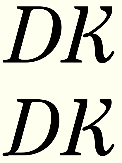
Which /s/?


2 is more tightly wound. I think the raised lower terminal and lowered top terminal might play more nicely with other letters, but the wound-upness is fighting against the italic slope a bit to me. It also looks narrow to me now...

First one "flows" better. And, yes, it looks a tad narrow.

Divergence, including of width, helps readability, as long as
it doesn't pop out to the reader. So "a tad too -anything-" is
exactly what you want. :-)

hhp

Here's two more goes at the /s/. All curves tweaked, but the main thing I'm trying to work out is the bottom terminal. The teardrop of #1 doesn't sit particularly well with the transitive serif of preceding letters. #3 has the /s/ terminal mimic that preceding pothook, and #4 has it reflect it.

I'd say 1 is best.

Wrong answer! ;-)
I'd like the bottom terminal to work better than the teardrop. Here are further refinements on those new /s/ candidates. #5 is a reworked #3 and #6 is a reworked #4.


Among other adjustments, bottoms are rounder and narrower.

6, even if it risks to become a bit top-heavy.
5 seems to sport a sort of lump.

Thanks riccard0, yes, I think I'll go with /s/ number 6.
I take it as a measure of my improvement as a type designer that I'm enjoying drawing /s/, which used to produce nothing but fear and dread in me. :-)

Looking at /Q/, and returning to the possibility of this form I had originally. Which of these work best (with the possibility of having different forms for text and display fonts)?


I think my looping one #1 is lovely but may be too fluid for the rest of the roman. #3 feels a bit dated (or is it retro?) to me, but maybe works best small in terms of quick recognition.

Hi Craig, nice to see this progressing. I still think the beauty of this face is in its well-executed robustness rather than in the more idiosyncratic details; however, I prefer the first /Q/ with its loopy tail. Actually, I'd pull that tail down a bit on the left side, I think it's a bit too close to the bowl and that counterspace will clog. Q is a rare letter so I don't see a problem in its fluidity.

Re the /s/, remember not to consider it in isolation. Your other terminals will need to follow similar patterns. I personally like version 5, but add a bit more weight to balance the top terminal.

Comma: I'd prefer a much longer tail, but as you know I'm particular about commas ;)

And your third Q is growing on me.

#2 looks too sharp.
#3 looks indeed retro, but so does your whole typeface (in a good sense).

Whatever you do, keep #1 somewhere!

Your other terminals will need to follow similar patterns

A similar shape appears in the twos, threes, and fives (and kind of in the swash /T/), but nowhere else in the letters. Maybe the descending hooks of /j/f/ß/ and maybe /y/ could try it on.

Comma: I'd prefer a much longer tail, but as you know I'm particular about commas ;)

Are you looking at the most recent pdfs?
Also, how do the comma and quotation marks relate in your ideal?

I personally like version 5, but add a bit more weight

It's tricky to get more weight on that lower terminal, because the right slope and height are constrained by my intention to mirror the transitive serif of preceding letters. And given that, it's difficult to add more weight without the bottom turning too squarish.

Sorry, should have mentioned which I was looking at: 20-5.

For me (and this could be completely against others' views), the comma and quotes and any other punctuation needs enough presence to show it's a character in its own right. To me they're not incidental. I think quotes need to be smaller than the comma: comma needs the pronounced tail to differentiate from the full stop perhaps.

I didn't see the same terminal carried through to the 2, 3, 5 etc from the new /s/. Re the weight, could there be more on the inside of the terminal, rather than the outside? Or is that what you mean already?

I didn't see the same terminal carried through to the 2, 3, 5 etc from the new /s/.


Sorry, I realize now some of it I added since the last pdf was generated.
(Sheepishly I now realize that you asked after just this back last July! )

Re the weight, could there be more on the inside of the terminal, rather than the outside?

Well maybe there's wiggle room but at the same time that counter wants to be round and smooth.

For me (and this could be completely against others' views), the comma and quotes and any other punctuation needs enough presence to show it's a character in its own right. To me they're not incidental. I think quotes need to be smaller than the comma: comma needs the pronounced tail to differentiate from the full stop perhaps.

So here's another question for you: which size is your /quotesinglbase? :-)

Another go at /s/ number five.
Enough weight at the bottom Ben? Still look lumpy Riccardo?

Lumpy no more for me.
But I still prefer #6's attitude.

(the overshoot looks maybe a bit tame compared to a's, but could be something else.)

But I still prefer #6's attitude.

Maybe #6 for display and #5b for text.

I'm liking the different structure for italic /p/ lead-in/ascender better (#2).

Nice, I prefer it to the former. Only thing is, there’s just a bit too much of a 1 in it.

Only thing is, there’s just a bit too much of a 1 in it

Yeah, I saw that after I drew it. If that's to be fixed I'm not sure how it would be done.

Perhaps trying to create some sort of visual relation between the beak and the upper left curve of the bowl.

While you were writing that I was drawing this:


Maybe #3 does what you said. It also relates to the preceding letter better.

#5 is #4 with the lead-in stroke closer to the stem.

#5.

I agree. Before drawing it I thought that serpentine lead-in stroke would be too fiddly, but I think it's working even--or even expecially--at small sizes. Minor refinements here:


Does the /p/ ascender relate well to that of /t/?

Back to the lower terminal of /s/: here's another solution (#7). Like #5b, the interior contour and end of the stroke are intended to mirror the transitive serif of preceding letters. Where #5b then curved around smoothly, #7 now has a corner at bottom left. It is a similar shape to what appears in some caps (/C/G/S/).

Looking at oldstyle-figure heights

Top line has x-height and extenders matching lowercase. I feel like this is too up-and-down.
Middle line has extenders matching lowercase, larger x-height (at small-cap level).
Bottom line has x-height matching lowercase, extenders half length.

Maybe something between middle and bottom?

Here's an in-between version


Figure "x"-height is at small-cap level. Figure ascenders go to lc ascender height (but appear shorter because of the x-height difference); figure descenders go about 2/3 down to lc descender depth.

Is this figure "x"-height a little too big?

New .pdf attached to first post.
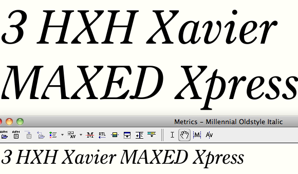
I think small cap height is the way to go. X height feels too small

No cap ß?

Not yet anyway!

I love the way this looks, the italic is especially rather nice, although this might be my favorite "century". Perhaps in the tradition of the Century style fonts, you should also make an extremely short ascender/descender/cap version, for use where you to to set the lines unnaturally close! :D That would be interesting.

That's not a bad idea. In addition to vertical metrics, I think I could also toy with slightly condensed letters without compromising the design too much, to make a version particularly for where space is tight...

Just remembered this thread whilst leafing through Karen Cheng's Designing Type. The section on quotation marks tells us they descended directly from double commas. Looking at the examples, the general trend is that quotation marks are smaller than commas, though there are a couple of exceptions, New Century Schoolbook and Serifa, where they are longer and larger respectively. It seems it's an open choice for you.

BTW, I make my double-quotes smaller than the singles.

hhp


This is quotes made of commas at 94% width and height.


I'm thinking of dropping the f-ligatures in favor of a narrow-hooded contextual f-alternate. Opinions?
(No kerning done yet.)

There are more ways...

Here's what I did in Nour&Patria:

In the first two rows (Patria and Italic) the "fi" is a hybrid solution, since the x-height is rather large. In the third row (Nour's subordinate Latin) the "fi" is traditional, since the x-height is smallish. In all three the "fl" sees no contact between the two letters, and the "el" is trimmed instead of the "f" being neutered. There are many little tweaks (like pushing the tittles slightly to the right) to further balance the compromises.

hhp

Here's what the narrower f looks like in two weights.


In bold and heavier, the stem will make way for the counter. (Is there a name for that kind of /f/j/?)

For the bold and particularly extrabold, the ampersand got too crowded so I devised a new one (labeled 2 here).


My plan was to use form 1 for light weights and form 2 for the heaviest weights. Or should that #2 form be used in all weights? It's more /E/ish--I dunno if that's a problem or not.

I like them both!
(nice bold f, too :-)

I like the new ampersand but maybe as an alternate. It's a bit displayish. I think the crowding in the original ampersand could be solved by bringing the bottom right a bit further to the right.

I also really like both! The second form is perhaps a bit too dark overall, in both the light and the bold weight.

You changed your old-style /1/!

In the bold weight /M/'s middle rests at the bottom, whereas in the lightweight the diagonals meet on a higher point. On the other hand, that makes /M/ resemble /A/ much more.

Ampersands with adjustments suggested (form 2 is lightened at middle of left in all weights, and form 1 in bold has bottom right further right). Maybe both do work in all weights and can just be included as alternates.

You changed your old-style /1/!

Someone on another forum talked me out of using the "I" form as default, but it (and the monoline zero) will still be available as stylistic alternates.

In the bold weight /M/'s middle rests at the bottom, whereas in the lightweight the diagonals meet on a higher point. On the other hand, that makes /M/ resemble /A/ much more.

You mean as opposed to something like this (3)?

You mean as opposed to something like this (3)?

Yes. I think (3) has a more even weight distribution, although (2) seems like a better match.

I think (3) has a more even weight distribution, although (2) seems like a better match

I agree. Hmm. Maybe that suggests the #3 structure for text cuts and #2 for display, since even weight would be a higher priority for text.


Which top of the /1/ works best?

Top one.

BTW, try making the baseline bar more like really long serifs...

hhp

I have serif-like forms for the lining one (and for the oldstyle alternate one too), but I was hoping to make the bar-form work with the standard oldstyle one.


I find ones really hard to draw well.

Maybe just a hint of curve at the bar’s junction, to mirror the one between stem and beak?

Yes, I think even simply making the joins adnate helps. If you think about it, there's no other such junction anywhere.

hhp


Second line shows adnate join.
It occurs to me now another option is to have a plain bottom (third line). The oldstyle four has such a bottom. That may not work for the tabular form (see below), but I like it for proportional oldstyle one.

Adnate join is the way to go for the bottom, but I definitely like the bottomless one too. Maybe give it an angle like the end of the four? You could make the upper side of the stem even with the baseline, letting the lower point extend just a touch beyond the baseline. This might help fix the broken rhythm of the bottomless one a little bit.

Yup, I was just thinking that. I'll give it a try.

Almost a year since the last post in this thread, but still alive!

These are the regular, display, and bold masters of letters that have been most dramatically revised of late.
Most changes have been to simplify counters and make letters that curl and end in a teardrop less tightly wound.
Full updated specimen here:
http://f.cl.ly/items/2446330H1U351c013V1k/Millennial%20specimen%20103.pdf
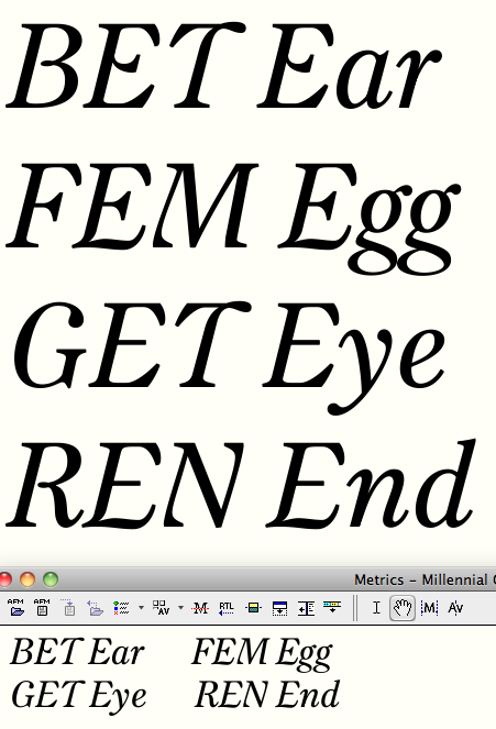
Reconsidering italic cap V and W.


Line 1 shows what I had before. I love that ending teardrop terminal in the lowercase versions (in part because it seems to imply a nice loop leading into transitive serifs of ensuing letters--see "vi") but in the caps I'm thinking its a bit old-fashioned.
Line 2a shows a flat-topped terminal. This is modeled on what I have for the K. Line 2b makes the middle of W less loopy.
Line 3 shows the alternates that I already planned to include, mostly for all-cap settings (CASE will trigger them), in which the rounder forms look terrible.
Thoughts?

Anything but 3. My favorite is 2b.

hhp

I like 2a. 2b is also OK.

Have you tried variant 3 with the teardrop terminals?

Now that you say so, I would also try a variant 2 in which the right serif is less gradual and more abrupt like in 3.

Lex, I think that would make that final thin stroke too weak.
Here are some more options, including along the lines Ben suggested:


I kinda like 4b.

I like 4b, but try curling in the ball in 4a (maybe curling its whole stem).

hhp

I somehow like 5a.

BTW that /5 looks nice!

Curled in (4c):


Also shows the K and Y which 4b matches.

I really like 4a and 4c, but all cap settings may make 4b a better choice. As I think I said before, I think quirkiness should fall under the radar in this sort of design to make it as reliable a workhorse as possible.

That last K looks a bit wide?

I like 4c (just raise the ball up a hair).

I can dig the "falling under radar" thing, but:
- This design needs help standing out.
- Caps (especially low-frequency ones, in Italics too) are a good place to flirt.

hhp

> This design needs help standing out.

To me the italics are quite funky, and with the range of lovely weights, I think it's quite distinctive enough for a text font.

I could be missing something, but: isn't it exactly the caps that are making the Italic funky?

hhp

Ben, do you mean that flat-topped terminal reads to you as too quirky?


Here's the 4b V carried over to the W. I think even with this as the standard V/W I'd keep .case alternates (present versions shown third line: WVKRZY). Looking at them now I think I'll normalize still further those serifs of W.case/V.case/Y.case, and that Z.case seems very light. Obviously no kerning yet!

Does the regular K still look wide in this context, Ben?

Hrm, not too quirky, no. I was trying to mean 4b has a good level of interesting, which might be better for cap settings than 4a and 4c, which I do actually prefer shapewise, but might be too disruptive readingwise.

Hrant, yes and no. The cap shapes have a very nice flavour/quirkiness, distinctive (I meant that in a good way) without being showy. I guess I don't agree it needs 'help standing out'.

K, yes, I think I'd pull the top in; the top counter is rather large because of the curved construction.

I think the little ascender of italic /p is a tad too long/sharp. The lower swash of italic /Z doesn't work for me with that steep inclination (which is first evident in the bolder weights, so the light instance still looks OK). Lowercase italic /z looks much more balanced and confident. Black italic /k is definitely too dark at the top. It needs to open its eye. Maintain the flow you had in the bold weight.

I like that italic /s ;-) Your italic ampersand also looks great, but on the inner top you have a prominent straight-to-curved transition which I don't now if is necessary.

Visual aid for the letters you were looking at:

I think the little ascender of italic /p is a tad too long/sharp.

I think you're right. I had made it to match the ascender of /t/, which, now that I look at it, could also be shortened.

The lower swash of italic /Z doesn't work for me with that steep inclination (which is first evident in the bolder weights, so the light instance still looks OK).

Yes, I think that needs some redrawing. That flip up at the end is intended to match the transitive serifs of /n/ etc., and also appears in /K/ and /R/.

Black italic /k is definitely too dark at the top.

You're right. This weight started as an extrapolation and that loop is an artifact of that.

Thanks for the helpful feedback Lex.

I'm glad I could help :-)

updated /p/t/&/Z/k/


Another option for /Z/ is just using this simpler version which currently kicks in with .case:

It seems much fresher, but maybe goes too far in that direction?

/Z/: Looking at the bold weight of the first version, I think the bottom swash needs more weight to effectively mirror the weight of the top. It looks better than your prior approach. I'm convinced this version would work better in a mixed case setting than the second one.

The second option does indeed kick in with .case. It is firm and strong, but personally wouldn't choose it as a standard glyph. Regarding the glyph itself, I'd say that the top is a bit too wide. I also notice that the top left serif is less slanted than in the other weights, and would consider trying the same for the first (bold) version.

That /k/ now looks better. The same applies to the new /p/.

This will look very good after kerned, there's no doubt about it!

Thanks, agreed.
I find it very tricky to get the weight right on those oddball horizontal thicks (on Z, 2, 4, 5, 7, etc.). The exact same stroke will sometimes look way too heavy and other times way too light.

- - -

Okay, Z/z's with lots of adjustments:

Hi Craig,
Good to see this back in critique. Seems nobody has commented on the roman weights since your latest update to them. I have a problem with the new /a/ and /c/. To my eyes they look awkwardly skewed now that the counters have been opened up. They look like they're diagonal rather than horizontal across the top. I'd held off on commenting on this in case that was a feature that helped in text sizes, but having seen the latest pdf, I still find these letters a little jarring. This is what I mean:


I love the italic ampersand. My only comment would be that maybe the transition out of the curve in the lower right could be less abrupt in the black weight, by pushing it in slightly. Not as much as here, but it shows where I mean:

Elsewhere, lining /3/ seems a little top heavy and slightly leaning to the left because of it.
Small caps thins look thicker than all the other thins?
Small cap /6/ and /9/ look too bold.
Italic /Z/ - I don't think there's enough weight in the bottom crossbar. In all weights but especially the darker weights. I think a less exaggerated wave would help.
I like the Cooper Black style /f/ in the black weight. Maybe there could be more of this in the lighter weights too.
Italic /y/ - the ball terminal feels lower than the left hand side (more pronounced in bolder weights). Also, it feels to me like the body of it dips too far under the baseline. Did you try any ways of cutting that thick stem rather than have it go all the way into the descender? Maybe using the /v/ shape would be good. Also has the added benefit of being easier to space well.
Black italic /k/ I think the eye could be more pleasingly round (at least for display cut):

Overall it's looking really good. Different enough to stand out but not too different that it's unusable.

Thanks Dave for the input!

I have a problem with the new /a/ and /c/. To my eyes they look awkwardly skewed now that the counters have been opened up. They look like they're diagonal rather than horizontal across the top.

Yes, this is admittedly experimental, inspired by the fact that when I loosed the hooks of /f/ and /j/ they seemed a little more up-to-date, so I wondered what would happen with /c/ and /a/. Yet another Benton typeface, Clearface, was another inspiration (though one that takes the effect quite a bit further). I thought it might lend a little dynamism, but obviously if it's catching the reader's eye it should be done away with, or done more subtly. I'll keep experimenting.

I love the italic ampersand. My only comment would be that maybe the transition out of the curve in the lower right could be less abrupt in the black weight, by pushing it in slightly.

Agreed.

Elsewhere, lining /3/ seems a little top heavy and slightly leaning to the left because of it.

I've now made the top teardrop terminal a little smaller in the bold master and did some other tweaks; hopefully that fixes it.

Small caps thins look thicker than all the other thins?

Yes, that's actually because so far I've only drawn the regular small caps (not the display or bold masters) so among display letters the small caps will look clunky.

Italic /Z/ - I don't think there's enough weight in the bottom crossbar. In all weights but especially the darker weights.

What do you think of the revisions in the post above yours?

I like the Cooper Black style /f/ in the black weight. Maybe there could be more of this in the lighter weights too.

I very recently changed the bold /f/ that actually bends back, Cooper style, to one that pinches in from both sides (see below).

Italic /y/ - the ball terminal feels lower than the left hand side (more pronounced in bolder weights). Also, it feels to me like the body of it dips too far under the baseline. Did you try any ways of cutting that thick stem rather than have it go all the way into the descender? Maybe using the /v/ shape would be good. Also has the added benefit of being easier to space well.

Heh, if you go back a few hundred posts in this thread you'll see I tried all kinds of /y/s. I am very fond of the structure I wound up with (despite its admitted more difficult spacing). I have done a little tweaking now, including moving the top teardrop higher and the bottom one rightward as you suggest.

Black italic /k/ I think the eye could be more pleasingly round (at least for display cut)

I don't want to lose that bulge that sort of caps the leg inside that counter, but I have made it more subtle now.


Grateful for your time and eye!

Yeah! All much better in my opinion. Top left of black italic /y/ is looking ever so slightly lumpy (maybe the angle of the instroke is too steep). Ampersand could maybe use a touch more slant. I think the node at the dip of the tilde-like part of /Z/ could be brought up a little, more like it is in the lower case.

Agreed on all points.
Here is a reworked black /y/. In addition to rounding the top of the stem (which I think helped lessen the persistent optical illusion that the teardrop on the other side is too low), I also let the top teardrop thicken more gradually to lend weight to that thin stroke.) Display ampersand given more slope, cap Z bottom thickened towards the right. Also, minor breakthrough with black italic /k/! Lowering the top of the leg considerably allows much more breathing room in the interior of the letter.

All improvements! The /k can still look better. The old /k had a leg which looked good. Its thick-thin transition started halfway down the length of the leg, whereas in the new one it starts from the very origin of the leg. (God is this hard to explain!) Let the strokes encompassing the leg dance parallelly a bit longer.

Dave's suggestion for the eye of /k, which he nicely illustrated in his comment, will IMO definitely make that /k go from looking good to looking great (once and for all!). I realize you want to keep the leg and the eye as two independent components (for the sake of consistency, because the regular shows this feature, as if the pen was "lifted" in between). I think you can keep this feature while also making Dave and me happy. The problem is that the straight edge of the leg seems to be pushing the loop of the eye to the right. Nevertheless, the loop does not necessarily have to join the leg at the very edge. Changing that would concede the loop a bit more concavity, which is what Dave wants.

Hopefully this all makes sense. Otherwise I should follow Dave's example and start drawing more and writing less...

No, I think I understand you perfectly and thank you for pushing me to keep at it. Top is as before, bottom is revised with your input. I'm really liking it.

And still better (revised mostly the counter to match other letters like /n/ better):

Another big change on the italics: I have retracted the transitive serifs quite a bit, particularly on the display cuts (in the caption cuts they remain about the same).


This is before (left) and after (right) the change. Can be seen more clearly in this pdf:
http://f.cl.ly/items/432u452x2t2u0C002W2h/Millennial%20transitive%20seri...
I think this makes the italic look much cleaner and fresher.
I may try cutting back those serifs in the bolder weights even more.
I have yet to make the spacing adjustments (ie tightening the display master overall) that will have to follow this adjustment.

I agree it's an improvement.
What made you do it?

hhp

Nothing particular other than staring at a printed specimen, thinking the italic looked a little fussy and cluttered, putting my thumbs over the beginning and ending of an /n/ and concluding it was worth a try.

Cleaner, definitely. How unexpected! :-)

I like how symmetric letters (/n, /i, etc.) look like after the revision, but can't find the need to shorten the terminals of /e, /c, /k or /t. To me they look worse. Otherwise, I agree it's an improvement in terms of color. Now you have a wonderful /r.

BTW, the dots of the colon are too far appart in all but the darkest weight.

Yeah, I figured I'd have to add back some length to /c/e/t/, but I thought I'd live with these for a bit before deciding how much.
Thanks for the colon tip, you're right.

I agree the changes make for better legibility, but why change the display cut and not the text cut? I'd have thought it would make more sense to do it the other way round.

I can see how my idea might be counterintuitive, inasmuch as you'd think at small sizes you might pare down the inessential details rather than emphasizing them. But my idea is that (like hairlines) the transitive serifs get lost when scaled down unless given a little oomph, whereas at display sizes they needn't be so emphatic to perform their linking function.
This is more a hypothesis than a conviction, I should say.

Interesting idea!

Since building the letters out from symmetrical counters has become a strong theme of the roman, it occurred to me to try out how that would look in the italic. Here's a rough try at symmetrical counters in the italic bowls (/a/b/o/ of second word):


Those counters probably still need to go clockwise a little more.
This "modernizes" the typeface noticeably.
(For comparison's sake here's where the roman is:

It's certainly true that generally an Italic should be at least as funky as the Roman.

hhp

Looking at italic /b/ and letters like /n/


/b/ in 1 has round bottom, /b/ in 2 has spur at lower left
/n/ in 1 is smooth s-shape, /n/ in 2 has a different counter including a corner near the lower right. (/i/ is changed correspondingly).

I probably need the spur on /b/ to anchor it.
As for the /n/, I think this new, stiffer counter fits better with the newly geometricized round counters and with the ideas behind the roman companion. But does that corner become something your eye trips on?

I prefer 1 for the /n and /i, but I like the spurred /b. It pins it to the baseline more. I think the top part of counter in 2nd /n is a better fit with the geometric counters, but the corner is a bit jarring and, IMO, unnecessary.


Thanks Dave, I think you're right.
3 shows a first go at the new counter but with the corner removed.

The new counter approach throws a wrench in my efforts to have an ascending italic /p/. Previous post shows one solution (taken from an earlier version) which I kind of like but it gets too busy esp. at text sizes. Here's a simplified version of same:


but I don't know that that's working well either.

Here (bottom three lines) is what the nonascending version might look like.


That indeed may be the way to go.

I'd go for the conservative approach. To me the /p/ acquires certain stiffness with the so far considered ascenders. The /p/'s you presented back in February a year ago looked reasonable to me. My personal preference would be the baroque, Caslon-style /p/.

To me the /p/ acquires certain stiffness with the so far considered ascenders

I guess you won't much like my carpet-tack variant! :-)


The Caslon-style /p/ works okay but I wonder if it's too quaint, and it's become an outlier with my turning the counters of the other bowled letters to ellipses.

How about this barbed finial? I think this is the best of the ascending non-Caslon ones so far.

I like it!

New pdf specimen. Changes since the last include:
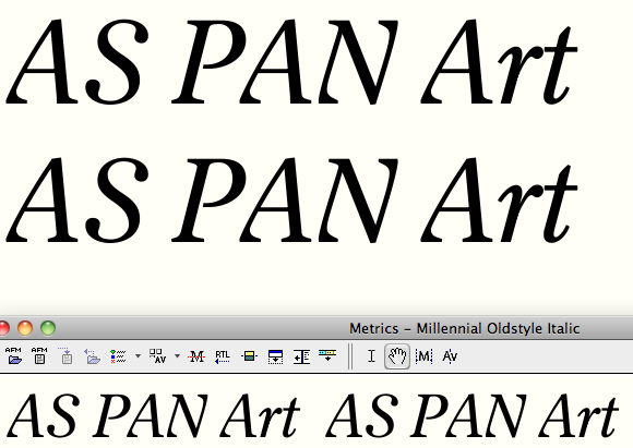
- settled on italic /p/
- added crossbar to italic /Z/s
- changed counters of italic shouldered lowercase
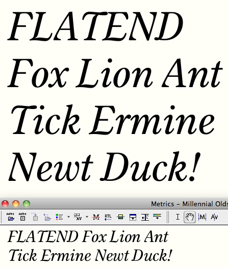
- made fives more consistent
- widened /V/s
- adjusted some italic serifs
Yet to be done:
- draw small caps in all masters
- respace lining figs
- expand character set
- kerning
http://f.cl.ly/items/3H3E3o0B321f0A282Y3A/Millennial%20specimen%20114.pdf


Relaxed the curl at the bottom of oldstyle 3 and 5. Rejiggered weights of 4's strokes. Simplified tail of Q.display (took out the little loop) and tweaked other Q tails too.

Shortened crossbar of the italic Zs. Still might be a little busy, but I like having something there in the middle to add heft to that long hairline. Adjusted last serifs of VWY: still planning on having the "windblown" versions as normal with lowercase, and the more rigid ones on the right triggered by CASE.

Gave symmetrical counter treatment to sixes and nines.

I don't know if that "3" has been like that for a while, but: wow. Even though -to me- it's a novel shape, it still manages to say "I've been doing this for centuries."

hhp

Thanks! The top row shows the way it has been for a while until these last changes, which mainly were relaxing the curl of the bottom.
Middle row is current state of old style numbers which will be the default.
Bottom row is the lining figures. I like that the structure and weight of the figures (and not just the height/vertical alignment) differs between OSF and LF.

Then for the LF I'd consider a "7" with a double-serif base. And if you're feeling brave curve the diagonal of the "4" so it's not so lonely. Patria:

BTW I'd still have a spur on the OSF "2".

hhp

BTW I'd still have a spur on the OSF "2".

Yeah, that was on my to-do list.

Interesting idea on the seven, but I can't get it to be persuasive. The way my seven's stroke tapers and bends, it looks weird to me to grow out of a stem serif.

It looks weird in Patria too. But it feels right. :-)

On the other hand my "7" (along with "2" and "5") has "rationalist" stroke contrast, so it might not work the same for traditional stroke contrast numerals.

hhp


One-way treatment.

But try "1874" too.

hhp


I think I like it but not as much as the lachrymal original. My eye catches on that serif a bit.

Hmm, what about straighter, with a serif on the other side?

I really like the first one-way-serif 7, but the original one fits very nicely too. I guess that means it's just a matter of taste rather than necessity.

The spur on top of 5 could be more definite, I think, looks a bit shy.

I prefer that 7 too, more so than the lachrymal one. I think the serif holds it to the baseline much better. The teardrop version seems a little flighty.

While I'm here... Italic /y feels too light in all weights, especially next to the /p. For what it's worth, I much prefer the non-ascending /p over all versions with ascender, but if you must have an ascender, I think the current treatment is best. Bottom left of /i and corresponding part of /m and /n still a bit kinky. I still can't make myself like /a and /c in the Roman, but maybe that's just me. Display Black /w is gorgeous!

Of those I think I like the leftward-serif one best. But please tell me what's wrong with this:

I guess that means it's just a matter of taste rather than necessity.

Which is exactly the best opportunity to deploy some culturally-progressive ideology! :-)

hhp

Yeah, once I straightened out the stroke, a bilateral serif becomes workable (E, below, is my latest version). But I think I might like this new one, which is the rightward serif and straightened stroke (D).


Bendy, I agree on the five, don't know why I was so wimpy with that.
Dave, I'll look at all those, thanks for the feedback!

I like the last three (and the last one the most).
And now try bending the diagonal of the "4" to match. :-)

BTW that blob in the middle of the "3" looks like an aneurism. Just make it straight - it would keep the "4" company too.

hhp

Yes, I was just thinking that bubbly 3 is not keeping up with the dequaintification this is undergoing. (That kind of little loop is what I just cut from the tail of Q.display). Might even have a go at a straight-topped version, since this seven has gotten more rigid.


top: oldstyle figures (terminals of 2 and 5 are revised)
middle: the old lining figures (3's loop chopped, 5's terminal revised)
bottom: lining figures with new flat-topped 3, leading new 7 candidate, and same 5 as middle row
I'm not sure if the 3 is there yet but I think this might be the right direction to go.

All good, except the flat-top "3" is too mannered (as they almost always are, at least to me). And one nice thing about a round-top "3" is that it keeps the "2" company.

BTW you might want to shear the bottom of the OS "4" (maybe the same angle as the middle of the "3").

hhp

BTW you might want to shear the bottom of the OS "4"

It already is, but clearly not at enough of an angle!

BTW the spine/base join in the OS "2" is probably too dark.
And why not use the ogee form like in the LF?

Isn't the vertical in the "5" too thin?

hhp

And why not use the ogee form like in the LF?

There's less vertical space available for the curve to have room to change directions.

Dave, if I lessen the tilted effect on /a/ and /c/ could they win you back over? This is a revised version in all three masters:


Glad you got me looking at italic /y/ again. This was a letter that I loved the look of, but had to admit it didn't play well with others. So I've straightened out the SW/NE thin stroke, which allowed me to bring the intersection leftward, which ameliorated the spacing problems the older version was posing.

I can live with that new /c, but /a just seems weird. It looks taller at the start of a word than it does in the middle. Maybe shifting that node up a bit on the transition between vertical and curve on the top right would help? Or nudging the topmost node to the right slightly?

y looks better now in terms of weight. the top left of the black one is not as nice a curve as it was before though.

5 May 2013 — 11:41am Old Style Figures

The lower counter of old style 2 is rather small. I would draw 2 a little bit higher without enlarging the upper counter, make the join thinner on the lower side and maybe flip the serif on the end of the horizontal stroke downwards.
It looks as if old style 4 is positioned too low. In many typefaces this is solved by positioning 4 a little bit higher, as a result, the horizontal stroke of 4 does not align with the baseline anymore, but I do not think that causes any trouble.

Thanks, those are good ideas that I will try out. It's funny - I've known for quite a while that that baseline stroke of four will probably need to be raised but it's difficult to force my compulsive self to move it off that line!

In the meantime a different take on the top of lining two and three. I think I like the three but the two isn't as satisfying. And if I adopted this change I guess maybe the teardrops of six and nine have to be revisited.


a shows the oldstyle two from before
b shows my best effort to even out the counters keeping it at "zero-height," which definitely looks better than a.
c shows a version that is allowed to be taller, but not full "six-height." Was this what you had in mind Albert Jan? I wouldn't have thought of this, but I can see how, though vertical alignment doesn't match anything else, the counterspace feels more comfortable with the other oldstyle figures. I might let the oldstyle four go up to that level too (Actually I'd already done something similar with the italic oldstyle four.).
(I tried a full "six-height" version that looked terrible. Also couldn't get a serif on the bottom side of two's terminal to work in this style.)

Note that a properly ascending "2":
- Does have precedents, most notably in some of Gill's fonts.
- I think works better, because: it helps strings of numerals sit less low*; and is more distinct from "z" and "s".

* Which is why I prefer the French-style ascending "3"/"5" scheme.

hhp

Ah thanks, Perpetua is an instructive model, with its "three-quarter" height OS 2. Interesting that the italic 2 doesn't ascend.

LF 2 and 3: I prefer the ball terminal versions, but maybe they'd be better less curly, like the top of 6.
I like the ascending os 2, but maybe somewhere in between b and c would be a good compromise - as it stands, certain numbers might look a bit wavy on top (think 12820) which *could* look like a hinting error. On the other hand, a shorter 2 could make that effect more pronounced. Need to see it in running text to decide.

Oldstyle figures in running text


This shows that two shortened by 1%. It also shows a four that has not only been raised, but also the convexity of its diagonal has been flipped to open the counter.

Maybe my oldstyle extenders need to be reduced a bit overall (lowering top of 68 and raising bottom of 3579)? 5, 6, 7, and 9, at least, probably don't need to be so tall.

From the point of view of an absolute newcomer, I definitely prefer the "closed" OS 4 and the "non-ascending" OS 2. To my non-expert eye, the current OS 2 and 4 provide too much volatility within OS figures and also with respect to running text. Additionally, I think the lower counter of the OS 5 should be proportionally larger that the upper part; in its current form, the OS 5 seems a bit "loose".

And, of course, congratulations for your titanic work on this face.

Unless you do lower the "6" and "8", I think the "2" is too short. Make it mean it.

Love the new "4".

BTW have you considered a zero that doesn't look like an "oh"? But certainly not the stupid "perfect circle" one. My favorite is the one in Whittingham: http://luc.devroye.org/Berthold-GGLange+DieterHofrichter-Whittingham-200...

hhp

At the risk of sounding like a spanner, or a broken record, I don't think this design needs to push boundaries by adding quirks gratuitously. I'm not convinced about the appropriateness of the new 4, and the extra levels of alignment that the 2 and 4 introduce make it feel discordant to me.

How about this:


2 is back to the same height as 0/1.
Descending figures descend less deeply.
Ascending figures ascend less high, except for 8.
Also reined in the new 4 a bit.

Yes, I've tried a bunch of unconventional zeroes (I think we may have even discussed this a few months/pages back). I have a monoline zero alternate currently, as well as an I-like one alternate,


but frankly those might wind up on the cutting room floor I think.

I'm no fan of gimmicks either. It's just that sometimes our conservatism is not justified, and there are benefits to be had in features that might seem unconventional. I remember a discussion on Typophile many years ago where I asked Jonathan Hoefler whether he would consider implementing the French-style ascending "3" and "5"; his reply was something to the effect of "Why would I bother?" That sort of conservatism is very alien to me personally.

Bowing the diagonal of the "4" gives it more apparent size (which is one reason I've recommended Craig do that to the LF "4" as well); making the "2" ascend has at least three functional benefits; and things not lining up is not so bad in a text font.

hhp

Here's lining two and three with their teardrops relaxed a bit.

I've now knocked the OS eight down to the same height as the six. Here are the OSFs in running text:


And here are the lining figs:

(I think the zeroes in my percent sign are too big and tight.)

Looks good.

It would be nice to have a percent sign of the height of the OS "6"/"8" to use with the OS nums.

hhp

That's a good idea.

nonascending vs. ascending italic /p/ in running text.


Some old and new variants of oldstyle four.
a is latest closed form
-- It bows out very subtly. The lining four will be closed for sure.
b is the first open form
-- The danger here is that the counter is relatively too small with the other figures.
c is the recent convex open form with a more open counter
-- I think this solves the counter balance problem.
d is a new still more open construction, now ascending
-- Counter balance works pretty well with this too, I'd say. Looks a little weak at the baseline perhaps.
e is the same as d, but with a semi-ascending and semi-descending vertical position
-- The present italic OS four has this in-between positioning.
f is e with a baseline serif
-- Solidifies the bottom but gets busy in the lower right quadrant.
g is f with a three-way rather than four-way intersection
-- Helps with the busyness but is perhaps too weird.

Maybe c or e is best.

I like b best. There are many options for enlarging the counter - shift top ball terminal leftwards, shift entire diagonal stroke leftwards, lower top of vertical, lower horizontal. However, to me, it looks pretty much ok as it is!

Here is that b four in the three masters with considerable tweaking (with the aim of having it fit in in terms of counter size and vertical alignment).


This structure has going for it that it's easier to make a credible version in the black weight, which I've found difficult for versions c or e.

As you might guess I like version c best. To me the "4" in b looks way too small.

BTW have you given up on the ascending "2"?

hhp

BTW have you given up on the ascending "2"?

I think so; having reduced the extenders of the other figures and tweaking the two's shape, it doesn't look problematically small to me anymore, at least in the weights below black.

Okay, now I think I have the oldstyle four down (last row):

I'd let the descender grow down a tad more. I know it is supposed to be ¾, but to me it's looking cropped.
/8/ looks left-heavy at the top.
/0/ could be rounder/wider IMO.

Rather than lower the four descender, I raised the whole arm part a tad. Adjusted the eight as suggested.
For the zero, the pointiness/narrowness was intentional, to differentiate the glyph from the letter /o/; it does that, but in the process looks unhappy. So: could I get away with a canted oldstyle zero instead, as in the bottom three lines here? I like it!

Interesting idea since the letter "o" is not tilted... Nonetheless to me at least it doesn't work. I really think the Whittingham form is a natural here.

hhp

Stay with the former version, it does work as is.

Would you buy this more subtle version of the same idea?


Hrant, someday I'll put a Whittingham zero in a font, but this isn't the one! Millennial is now invested in the idea of symmetrical counters, and in heavier weights that gets impossible to fudge with that form of zero.

Thought my roman /k/ was too narrow, and realized a little crossbar at the connection could help. 1 is before, 2 is after. Also shows the same treatment for /K/.

Revised the barb serif at the top of /C/G/S/s/ (right side shows new version)
Also added a numero

Added a point to the teardrop of roman /r/'s arm. I think it looks a little more updated, and relates to /n/ more clearly. Does a similar treatment work for /f/ and /j/?


Revised the italic oldstyle figures in line with what I've been doing with the roman (balancing counters, pulling in extenders). Here's where they stand.

It's a matter of preference which terminal treatment you go for. To me it looked well as it was. The pointed terminal departs from the whole terminal approach you had for the roman (/y/, /s/, /f/, etc.). So IMO is neither necessary nor preferable.

Whichever terminal style you choose, the /j/ is too curled at the bottom.

I do like the new terminal 'angle' of the /f/ better; it is more horizontally directed. A rounded-terminal analogon would be nice.

Here's revised /j/s and /f/s--returning to the smooth teardrop, with the more leaning /f/ and a less curled /j/.

For the bold cuts, another option is the serifless bottom (bottom row here).


I had already planned on this as a contextual alternate after /g/q/ to prevent a crash. But maybe it should just be the standard form for the boldest weights.

Sounds sensible to me. I'd maybe keep the teardrop version as a default only for the display cut.

Good idea.

I'm wondering if a considerable retraction of the transitive serifs of the italic is a suitable way to freshen and clean up the italic, which is the direction my revisions of the roman have been taking.


Above: full serifs
Below: serifs of /a/h/i/m/n/r/v/ have been chopped off. (Just a crude sketch: terminals would need cleaning up and more careful respacing.)

I do think the bottom looks cleaner--and I'm actually surprised that the character of the face changes less than I thought it would.

It does look a lot more contemporary. I like it! With the smaller serifs, I think the ascending p definitely has to go.

I myself am certainly partial to anything that demotes cloying pothooks.

hhp

Ouch.

Dave, you're surely right about the p.

Here are some revised treatments of /n/ and /i/:


0 is the original pothooks
1 is just a truncation of 0
2 just makes a point there instead (don't think this works)
3 and 4 are variants that add a corner. If I went with one of these I'd probably change the ascender serifs to correspond.
Here's a closer look:

I think 3 & 4 are the most handsome, but perhaps do they get too "pennish" for this typeface? 4 may be better than 3 in that regard.

Craig, it's been a while since I've looked at this. It's come together well, and I really like what you're doing with the italics.

If you haven't done this already, a good way to look for strokes or terminals that are over weighted is to do aaabacadaeafa... etc with all the letters and 000102030405... with all the numbers. Then print them out at quite small sizes, and any overweight strokes or terminals will pop out to the eye. I suspect that you may find the top of the left open 4 terminal that way, but I'm not sure.

I think the skeleton of 4 but without the 'pennish' notches would be best, so somewhere between 1 and 4. But that's just my opinion. You may have noticed I'm a fan of smooth joins. The cornered ones look more old fashioned to me; too calligraphic.

Bill: Thanks! I've prepared those proofs and will look them over. (I hope I can trust my printer's fidelity to the outlines.) Already I can see most /g/s are too heavy--but that's pretty predictable.

Dave: I'll work up some alternates in that direction, thanks. The other thing I've found is that black weight version of the cornered design is nearly impossible to make persuasive, so that's also pushing me to smooth it out.

Here's that updated smooth version of the transitional serifs, in the three masters.

Looks good!

What I'm losing here is the implied liaison between the departing serif of the previous letter and the arriving serif of the next: in the previous incarnation these pointed towards each other better, particularly in the bold weight. Here /m/s are the old, /n/s are the new:

What I'm losing here is the implied liaison between the departing serif of the previous letter and the arriving serif of the next

Rock on. (Gives the white a chance.)

hhp

Here's a try at bending the serifs towards each other while keeping them short. This shows the revised serifs in /n/m/u/i/.


And on another topic, revisiting roman R leg. I had tried a straight leg before with little success, but I think I had a minor conceptual breakthrough by thinking less about /P/ and more about /K/ (not only for the leg, but also for the way the bowl comes into the leg). 1 is old, 2 is new.

Lots of refining done; here's an updated pdf:
specimen
Small caps need reconstructing, and still no kerning.

I like the new straight-legged |R|. You might want to keep the curved version around as an alternate — it seems to fit with the tear-dropped terminals.

I think the 3rd italic here shows lots of promise, it feels simpler and more open:
http://typophile.com/node/83333#comment-555079

(I could be wrong though.)

I wonder if the lc italic |s| isn't lifting a tad bit too high on it's bottom terminal?

I like the new straight-legged |R|. You might want to keep the curved version around as an alternate — it seems to fit with the tear-dropped terminals.

That's a thought, though it's funny: I spent months adding more and more features to this, and now lately I find myself removing them one by one!

On the italic /s/, I think the whole bottom might be riding high, or maybe rather other overshoots are too deep. Checking my baseline overshoots, thanks.

Could just be that the curves on the lower 's' are less drastic so it looks higher.


On the capital E, checking out possibilities for the middle arm. For the small caps version (see first line) I have long intended to simplify the seriffed arm into a single tapered stroke as I thought the old-fashioned style would seem to busy in the cramped quarters of small-cap size. But now I'm wondering if the full-size cap E might also benefit from the same simplification.
Small:

The one thing that I'm immediately inclined to say is: the middle bar does not have to be vertically symmetrical...

hhp


I like the new bars. Much fresher.

There you go.

hhp

That also gives me a better shape for roman /g/'s ear.

Cool. Try flipping the ear (to "point" up).

hhp

Why does the |r| have that nice pointed teardrop terminal, but the |a| doesn't?

BTW, I like the up pointed ear on the heavier |g|, but not sure about the lighter weight.

Tried it on the /a/ (and /f/, /j/, etc) but didn't have success with it. The way the /a/ teardrop has to come down makes the corner a completely different animal.

/500th post of the thread!

Second-longest Typophile thread ever. Really the longest, since the other one is non-typographic. And it's not just about quantity, since Craig is deriving real benefits. And he's not the only one, in this thread and others like it, as attested at conferences, "best-of" lists, etc. All the snide anti-Typophile naysayers can eat my finial.

As you were.

hhp

Just stopping by to say that /a/ is finally looking better than before. Also, I like the first version of that /g/. Looks natural. The other version doesn't seem to want to “embrace” the next letter.

Hope that I soon find the time to give a more thorough critique on this.

Hmm? Just sharpen the inner piece of the teardrop?

"Just sharpen the inner piece of the teardrop?"
Yes, doing so can look pretty nice but I think it winds up looking too "swooshy" for this typeface. I also put together a barbed top that looks like the top terminal of /C/, but that too didn't feel fitting.

The quotes look too small to me, at least at larger text sizes. And could there be more kerning between baseline punctuation and high quotes?

Here's a closer look at the quotation marks (commas, apostrophes, etc.). I recently made them much curlier which improved them vastly, but I think you're right they could be a little bigger yet.


There's no kerning at all yet, which explains the punctuation spacing issues.

BTW, I like making my single quotes bigger than each quote in the double quotes.

hhp

Here are the quotation marks, commas, periods enlarged a bit. More space between the double quotes too. And I tightened the sidebearings, though obviously I'll still have to rely on kerning to perfect the spacing.

Still on the small side for my taste... but maybe that's just me?

I don't think they need to be fatter, I'd just make the tails longer (by about 50%).

Heh, I had a feeling you'd say that.
Okay, here's still bigger, and allowing more weight into the beginning of the tail for the regular and bold masters). Doubles have yet more space between, too.


It's funny that I'm somehow only able to enlarge these in small increments. With difficulty I'm pushing myself over the conceptual hump that a comma is kinda like a period in scale, when it's really almost more like a lowercase letter.

Latest pdf:
http://f.cl.ly/items/1q3F192H1J3q0y3G3E0z/Millennial%20specimen%20146.pdf
Lots of tweaks since last time, only some of which I can remember
- loosened spacing of italics
- reworked figures quite a bit, including darkening osf's
- added alternate one-story italic g
- still more work on size and positioning of all quotation marks (and comma)
- developed unicase version further
- dropped ascending p alternate, and quaint ligatures
- made ellipsis much wider
- tweaked serifs of CEFGLSTZ

It is not easy giving critique at this stage, but I've had a look at the latest pdf, and here are some thoughts on the base design. I have not had time to look closely at all the weights, I'll get back to it.

I have not read all the posts here, so I will inevitably address things that are already well-addressed. Feel free to ignore any and all comments.

Roman

I'm wondering what the rationale for the sharp inside points of 'f', 'a', 'n' et al is? Is it too subtle to be a functional device, and shouldn't we also see them in the numerals and (more of) the upper case? This also applies to the very short straight line to the west of 'e'.

Is 'a' (very) slightly wide?

Is 'u' slightly tall?

Are 'w' and 'y' a little light and dark, respectively?

Why do 'i', 'l' 'h' et al have sanded-off right-tops?

Why are 's' serifs so dissimilar?

Is the right part of 'V's right serif too short?

Should '&'s arm be straighter?

'five.lining's serif is very heavy, and the top of the curve much lighter than its OSF sibling's. Also, the characters of the two fours are maybe too different for one typeface?

Italic

'a' a little tight at the top junction? Maybe very slightly too upright?

'z' lacks heft, I think.

Something a little stiff or unfluent about the 'u' shape I can't quite put my finger on. Italic 'u's are always difficult.

Unsure about the 'Z' crossbar, also because of uni01B5.

I really like the heavy weights, I especially dig the f/j treatment. But more on that later.

Thanks a million for the feedback Sindre!

On the roman comments:

I'm wondering what the rationale for the sharp inside points of 'f', 'a', 'n' et al is? Is it too subtle to be a functional device, and shouldn't we also see them in the numerals and (more of) the upper case? This also applies to the very short straight line to the west of 'e'.

I can tell you the thinking, though I don't know that it serves as justification. At some point in the development I had the idea of cleaning up all the counters so that they had a simple geometry based on symmetry (so, for example, /b/'s counter is an oval rather that being straight on the stemside). I was particularly intrigued with what this meant for the /n/ (and other humped letters), which if there was to be a corner at the join, there would be a corner opposite, too. But the outer contour would simply arch around smoothly, and the mass as a whole would read as a pretty conventional arch--the corner in the arch would be "subliminal"


From there I decided to see how far the symmetrical-counter idea could be stretched. I wrestled it into the /g/, which I like. It was already there in letters like /e/. For the closed counter of /a/, the symmetry could divide the drop-shaped counter diagonally. The /K/'s counters could be up-down mirror images of each other, at least near the middle of the glyph.
From the /n/ I redrew the /r/ to have the same symmetrical arch underneath. I tried to do the same with /a/ and with /f/, but I probably hit the point of diminishing returns somewhere in there. The /f/ in particular feels like an outlier now. (The conceit is most obvious in "branching" structures which explains why it's less evident in figures and caps.)

Is 'a' (very) slightly wide?

I think it was, particularly in the display master. How's this?:

Is 'u' slightly tall?

It's the same as the similar stem tops in /n/m/r/etc., which raises the question whether they too are too tall. I have now lowered the top point of those stems a few points, and also taken out the bulge of that long segment at the the top. What do you think?

Are 'w' and 'y' a little light and dark, respectively? Is the right part of 'V's right serif too short?

Yes on all counts. How's this:

Why do 'i', 'l' 'h' et al have sanded-off right-tops?

I think I liked the idea of the top angle being a right angle, rather than acute. Almost like a mirror of baseline serifs, though bent over a bit. Does it bug you?

Why are 's' serifs so dissimilar?

I think that detail reflects my efforts to have the face be both classic and fresh. The full barb at the top feels more traditional, the cleaner solution at the bottom more modern, and I think maybe having them both be one or the other carries the letter too far over to that side.

Should '&'s arm be straighter?

What do you think of this?:

five.lining's serif is very heavy, and the top of the curve much lighter than its OSF sibling's.

Agreed on the curves; by the serif do you mean the teardrop at the bottom, or the one at upper right?

Also, the characters of the two fours are maybe too different for one typeface?

Hmm, maybe. If you were to make them more similar, which structure would you work with?

Responses to your italic comments later. Again, I really appreciate the careful look!

Okay, this image shows some italic fixes based on Sindre's feedback:


- /a/ junctions are reworked a bit and counters are rotated very slightly
- /z/ is darker (and leans a little less than it did before)
- /u/ I didn't do anything with yet. I don't mind a little stiffness in this face, though I think it's a pretty homely letter on its own now. It's actually pretty directly a rotated /n/. And both are, again, based on a symmetrical counter (there's a canted, symmetrical, sort of parabolic arc in the counter). I'll probably try some more tweaking. You're absolutely right that italic /u/s are difficult!
- /Z/ in Zap shows the same glyph with the crossbar removed. I think at least in the higher contrast masters (#2 bold and #3 display) that long skinny diagonal gets awfully long without the relieving weight of the crossbar. So if just removing it doesn't work, one option would be giving up on the thin-diagonal structure (i.e. adopting the thick-diagonal structure of the roman). But I like the challenge of trying to get the thick horizontals to work :-)

The symmetrical counter idea is something I've wrestled with too, but I've so far always given it up. That doesn't mean it doesn't work here, but maybe it does the 'f' no favours.

New 'a' width looks just right. But maybe the teardrop in the top example is slightly light?

About the 'u' height: I always end up with the 'u' top serifs slightly different from the 'inmh' top serifs, the left one a little shorter (and therefore a little steeper), the right one a little longer (to close the countershape a little). This approach might make it appear slightly less tall, although it obeys the x height. Just thinking out aloud here. Your new treatment looks better, though.

How's this:

Just right.

Does it bug you?

I'm not sure, but maybe it's a bit strange that the "sanded" stems are (optically) similar to the stems in 'm' and 'n', that are compensated for the tight junction.

Very good new ampersand! Much more in character, I think.

I'd strongly prefer the closed four for this typeface. I really like the open shape, but it is more Didot in character, making it a bit anachronistic in this environment, maybe.

On the /f/, just to throw this out there, this


is what the regular and display masters of the bold /f/ look like. (They are used to generate bold and black interpolations, but they themselves don't appear in the lighter weights, currently.) There's something about them that I kind of like, and I wonder if I could get away with using them (or something like them) for those lighter weights after all. Or does the hook look too miserly? I rather like the idea (again, the challenge) of making a workable /f/ that doesn't make ligatures necessary or ensuing diacriticals problematic.

On italic /Z/:


After all this I'm thinking for the capital, simple is better and the boring contrast pattern of #3 is the way to go. I guess I'm taking the long way to figure out why so many existing fonts follow that differing pattern for /Z/ and /z/.

I guess at least I can recycle that barred form for uni01B5! :-)

Here's a question for you: must a small-cap Z match the contrast pattern of the full capital?

They look a bit weird to me in juxtaposition — I'd expect small caps to follow capital logic. Also, I liked the crossbar in {Z}, but then again, I also like crossed sevens. ;o)

I second Christian. There is no reason not to transfer the capital treatment of /Z/ to the small-caps. I don't think the small-caps should relate to the lowercase.

Bold /G/ has a very upward-pointing upper serif which could be pushed a bit more to the right.

Yes, you're right of course, about both Z and G.
Here's the latest pdf:
http://cl.ly/2p0V3W0R432a
In addition to fixing small-cap Z and G, changes include:
- spaced out double quotation marks
- tweaked italic /u/ and /n/ a little
- tweaked lining /3/
- trying out the single, narrow /f/ (redrawn a bit) for all weights instead of subbing it in for bold only (in both roman and italic)
- trying out closed /4/s across the board
- in the italic, I had a looping structure in the middle of B, R, and K. I've now made a simpler more conventional structure. The looping one will only appear in the display cuts (and not in any small caps).
- settled on italic /Z/ with a thick diagonal. A thin-diagonal one with a crossbar will appear with the SWSH feature.
- probably other things I can't remember

This is just out of curiosity: Why are the hairlines thicker in display light than in all the other display weights?

The only glyphs that at at a causal glance leap out as strange are the italic J and j and small cap J, which is a pity because I like the idea of the structure. They seem to balance very heavily towards the rather straight stem, which has almost no continuation into a tail that in turn is comparatively weedy... Might just a slightly more shallow curve there or a slightly bigger ball terminal make it more balanced?

I thought the display light weight was more persuasive if it was almost monoline, which is why I thickened the hairlines a bit. I should probably generate a test instance with thin hairlines now to verify that early decision was a sound one.

Here's a bit of tweaking of italic /j/ (#0 is before, #1 is after).

I think I prefer 0 for the regular/display, and 1 for the Black. They have more backbone.

Here (#2) is a middle ground between 0 and 1 that I think works.

Captured from web.archive.org on 17 Aug 2019. view this capture