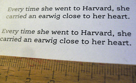
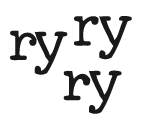
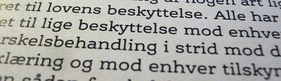
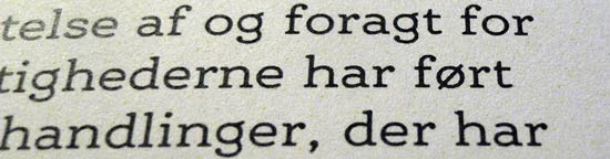
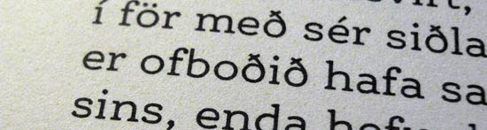
Are there any fonts that use contextual alternates with chopped-off serifs, like the ones below, to prevent crashes and/or enhance "word images", and do you think it makes sense?
I'm doing something similar to my f + ascender combinations, but that seems more conventional than the r + x-line-serif combinations, at least I've seen it done before (and also discussed it with a couple of people), so I'm less uncertain about those.
I'm pretty excited about these, but would love some second eyes/opinions before I take this too far (it obviously is a pretty expandable concept :-) ).

Dunno – are these too "designy"? (Maybe specifically the "rt"?)
Oh, and please excuse the still somewhat wobbly spacing, I'm in the middle of fixing it.