Hello all.
As I learn and read more about type design, one area of continued interest for me is the lowly/mighty serif. It's always facinating to me to see what aspect of their function authors highlight.
For example: Counterpunch by Fred Smeijers
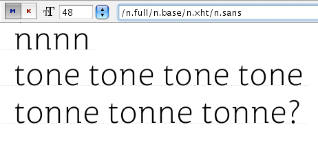
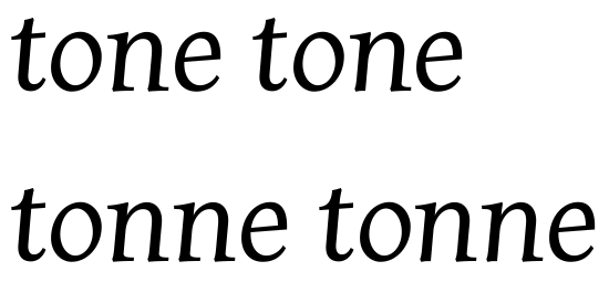
On pages 30-32 (and elsewhere) he talks about how serifs promote good word image by defining the space between letters and the counters within letters. This helps designers as we try to balance the internal and external space. Smeijers suspects it helps readers too ...
I'd like to do a comprehensive read on the topic. Can you recommend credible books or other resources that give insight here?
Thanks,
Randy