Typophile

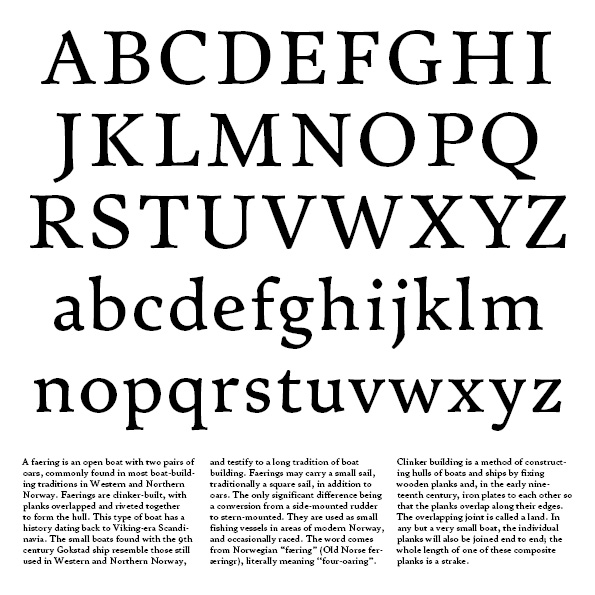
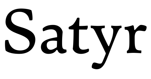
Satyr: No straight lines

Sindre Bremnes

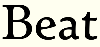
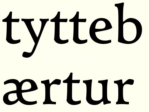
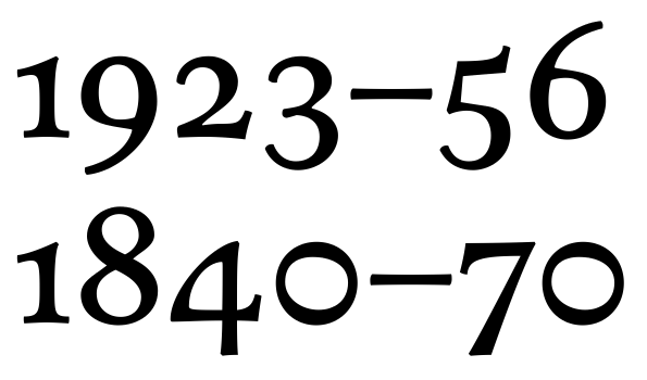
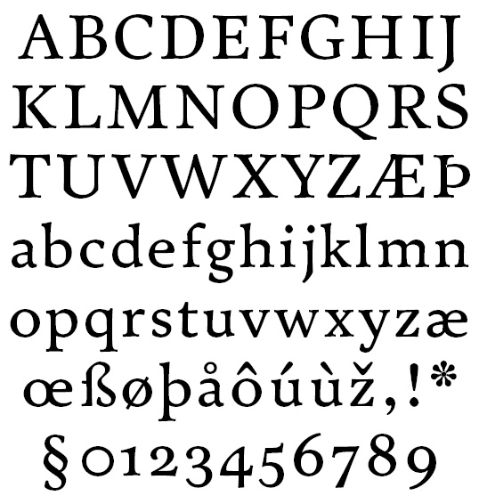
This started as an attempt to draw type with curves only, and soon became an exercise in tension. I drew this several months ago, and had almost forgotten about it, until this post brought it back to mind. I don't really know if this experiment has identity enough to be considered a typeface in its own right. There's a companion italic in the works too, but I want to wait with that.
AttachmentSize
First specimen41.24 KB
Text setting31.99 KB
Revision A–Z, a–z41.14 KB
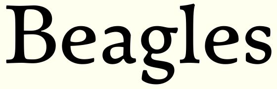
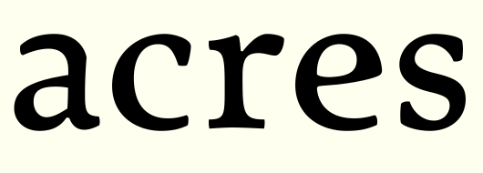
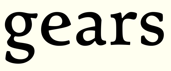
Pangrams (thanks, Craig!)39.04 KB
Testing25.33 KB
Italics32.87 KB

You sir, are quite a talent.

The stroke contrast is a bit inconsistent - especially in the 'a' and 'e', but it looks like a solid, sturdy text face. How does it print?

Thank you for your compliment, sir.

That contrast weirdness with the 'a' (and several other glyphs) is deliberate. Perhaps it's overdone ... I'll look into that.

This is indeed supposed to be a text font, 8 points its intended size. The typeface, if developed, will have additional optical sizes of 10, 12, 18 and 60 points.

I haven't printed it yet, and I'm ashamed to admit that I don't have access to a decent printer.

Glad you're doing this, and glad you're sharing it here. I love looking carefully at your designs - I think they're all top notch and this is no exception.

Some observations to take or leave:

I would consider dropping the /A/ crossbar a little.
I think the leg of /K/ and /R/ and the tail of /Q/ might be too dark. Maybe in addition /K/'s leg could use more of the straight vs curve tension that the other two have.

/W/'s middle vertex comes too high to my eye.

I'd like to see more variations for /e/. It's not the contrast weirdness that bugs me, but it just looks too soft. Is it worth trying a spur (or maybe just the hint of projection like the beard of /G/, which I love)?

I'm not sold on /y/'s tail terminal. Would a flag terminal like /f/ has work there?

Diacritics look big--particularly tall, especially circumflex and caron.

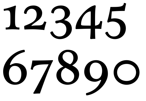
I like the monoline zero, but think it could be a hint darker.

That four is seriously weird. Not necessarily a bad thing!

Tittles' rightward placement may be overdone a touch.

Favorite bits: /E/ is great; /b/c/m/ are all terrific; I like the "upside down" /s/; /2/ is very tightly wound but wonderfully drawn.

Looking forward to text sizes and settings. I'm eager to see whether that cusp on the right side of /U/ can work without being an eye-catcher.

Thank you very much, Craig. It's great to be back. As usual, I think you've found the most important flaws in my design. That tall crossbar in 'A' is just a weird hangup I have (caused by the 'A' crossbar of Zapf's original Palatino. Will be lowered. I'll make some 'e' variations. I really like its wide open mouth, but I agree the eye lacks character. That 'y' tail is a remnant from an earlier incarnation, where 'f', 'r' and even 'y' had similar terminals. The 'y' must go too, I agree. Are the 'r' and 'f' terminals slightly too light, by the way?

It's well past midnight here, so redrawing will have to wait till tomorrow. Thanks again for invaluable feedback.

Wow, Sindre, your talent has really blossomed. My goodness, this is beautiful! Good work my friend. Let me do justice to this by coming back after a full inspection! ;)

Are the 'r' and 'f' terminals slightly too light, by the way?

/f/ I don't think so, /r/ maybe: text settings will tell.

This reminds me of two things: my own Paphos*, which I started over a decade ago but soon stopped since I realized I wasn't ready to do it right (I'm still not ready); and Bremer Antiqua**, which is of course a much higher compliment. I like this a lot, and it doesn't have to try any harder to be a "typeface in its own right".

* You can see the "j" at the far right here: http://themicrofoundry.com/s_latin.html

** http://www.typophile.com/node/66461

That said, you do have a decision to make: how conventional or not you want this to be. You could end up with a solid, charming, somewhat old-fashioned design; or you could end up with something that will make people (including you) think a little bit (even though it might still seem old-fashioned). The strangeness in the "a" is probably the best example of what might or might not need to be happening.

This -very personal- decision has to come before any specific glyph critiques can really be worthwhile I think.

> 8 points its intended size

Although the ample width might point towards such a smallish size, the vertical proportions are more significant, and there (especially in the longish descenders) I'm seeing 10-11 point.

hhp

What a pleasure waking up to such praise! Thank you, thank you, Hrant and Ben. This really is the greatest encouragement.

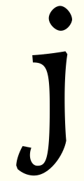
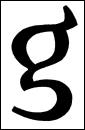
Hrant, this typeface originally had a 'j' very similar to yours, like this:

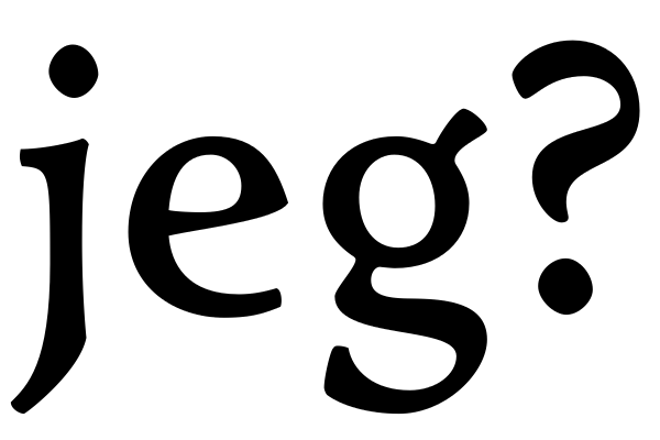
I abandoned that idea because it made the very usual (in the Nordic languages and in Albanian) digraph 'gj' close to impossible.

I've never even heard of Bremer Antiqua, thanks for that link. I'm looking forward to studying that now.

I want this to be an original typeface rather than a conventional one. And I agree that my 'a' is the ideologically most important glyph. I'll start redrawing things as soon as possible, that will be in seven hours or so.

Ben, I'm really looking forward to your critique.

Well well! I can see you've had a lot of fun drawing this! I like the way you've balanced the variables: smooth/cuspy, sharp/soft, lively/restrained. It's very artful, almost every glyph has some unexpected delight! I especially love the Pagan-cross shapes of F and the 4, which is just incredible.

I'm having to go into the realm of vague suggestions since this is already so polished, so be wary of taking my comments too seriously.

A seems somehow a bit plain. I like the spur on the apex of your AE, wonder whether that would work on the A. Also the foot serifs feel a little flat/shallow.

B is perhaps heavy on the left, meaning add a fraction more weight to the arches. Compare with D.

Tail of C looks unresolved. And the tail of J may be an area to play with.

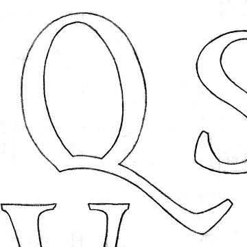
Q: This puzzles me. The overall shape fits well with the rest of the alphabet, but I'm curious whether there is a better solution for the tail. Crossing the bowl?

T arm-serifs look lighter than on E; I'd expect them to be heavier.

On U, I'd be tempted to try bringing the weight down the left slope more.

W: I think the apex needs a slightly wider top, but that would lift some of the weight there upwards, which would not look so great, so also lowering it a fraction might be the solution. In fact that right hand downstroke could do with a couple of units extra weight I think.

Lowercase

a, f, m, q, r, t and u are super. I'd personally agree that the flags of f and r could take more weight, but Craig's also right, see how it looks in text.

c is wide. Just an observation, I don't know what to think of it :)

Counter of d looks somehow oblong compared to the more oval ones in p and q.

e: yes. I'm a real fan of the inky eye, but I'd want an alternate for larger sizes, somewhere closer to the e part of /ae/ and /oe/. (I think these two may be too wide, and the vertical side to the counter of /a/ in the /ae/ bugs me. But I'd happily defer to your familiarity with these glyphs.)

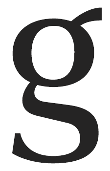
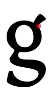
g: I'm not accustomed to the narrow tail, and to my eye the terminal seems a bit far to the right, but I'd want to see how it works in text before recommending any change.

h may be a bit wide, or not.

I'm curious about the placement of the tittles.

I don't know how, but the w seems very much to bear your signature, it reminds me of your previous typefaces, which are actually rather different. I like the way you draw w.

Loving the shape of thorn! Diacritics may be slightly too large (but only slightly, I like the weight of them). Placement of acute and grave may be too central.

Comma may be out of character?

Section sign may be falling left. It's an absolute beast to draw.

I absolutely love the numerals, but some of them feel too sharp/crisp/stripped/modern. Like comparing the 567 with the glyphs in the line above, they sort of seem like a different tone. This is probably connected with what Hrant said about the strangeness. Is the contract too vertical on 5 and 6? I fear the 4 may be too wide, but don't change the shape please! Also I wondered whether you could curve the diagonal of the 7 into a swashy terminal like the 2 and 3. 3 and 5 may need more open lower bowls.

Well I hope this hasn't put you off by seeming like there's too much to do...it's been instructive to look so carefully at what works and doesn't work for me. Thanks for sharing! :)

Thank you for yet another invaluable piece of criticism, Ben. Not offputting at all, rather the opposite.

Here's my very first partial revision. I've only concentrated on some of the most important lower case letters. More to follow.

'e' is now more related to 'a'. Have I've done the opposite of what you both suggested? Feel free to slaughter it.

's' is a litter wider, slightly more "upside down" and slightly rotated and fattened, inspired by Bremer Antiqua.

'd' was faulty, thanks for spotting that, Ben.

'g' is somewhat tweaked. I didn't quite understand your advice, Ben. Is this any better?

'f' and 'r' slightly altered.

'c' a tiny bit narrower now.

Except for the 'e' (and perhaps the 's'), these are all rather minor tweaks. Maybe I should follow Hrant's advice and think a lot more on this typeface before I continue drawing. Any way, all your input will be taken into account. Thanks again.

Er ... that 'c' really is too wide, isn't it?

My humble input would be that the diagonal stroke of the /4/ is curved in the wrong direction. I'd suggest that it be concave not convex. But only a fraction. Not that there is a right or wrong, IMHO more harmonious.

I still think it's worth trying to harden that outer contour of e at the right end of the crossbar to a point - make it akin to /G/'s beard (or even, in a way, the famous /U/ cusps). Right now it just seems too soft to me (softer now that you've sloped the crossbar--which, this problem aside, I think works well).

Well, yes, that's not quite what I was expecting with the e! Interesting, but for me not quite there yet.

I guess what I meant about g was that the bottom half of the tail wasn't quite long enough...I think it makes the whole shape look a little falling to the left, but that could also be because the top of the tail slopes quite a lot. The latest one feels more comfortable to me, but best seek others' opinions on this.

c: it did strike me as somewhat wide, but that's because I draw rather narrow ones usually. It's perfectly acceptable wide, if you like it.

Working out the /e/ will help with deciding on /c/'s width.

'e' alternatives, one sharpened, one faux-Venetian. Any of these going in any direction? This is darn difficult!

(B is tweaked as per Ben's suggestion, by the way.)

Andrew, those numerals are all very first draft. I'm almost certain that my '4' is overdone, but I think such a structure could possibly work. I'll sort those guys out after lower and upper case.

I would say the top one doesn't go quite far enough, and the bottom one goes quite a bit too far.
Maybe something yet in between, where that outer contour coming down just loses its convexity, but doesn't bump out into a spur.

You make it sound so easy. :-)

This any better? (I feel typeblind already.)

I'm picturing something (roughly) like this.


Sorry if I'm overstepping boundaries drawing on your letters - it's just hard for me to describe in words what I'm picturing.

No problem at all, obviously I was too dim to understand your description. I've wound up with approximately that shape several times myself, and must say I'm unsure if it fits my vision for this typeface. I'll try some more.

No problems, Sindre!

That a bowl is crazy similar to one of my sketches. (Off course) your type is balancing a lot more concepts simultaneously, which IMO often seems to be a cue for quality designs. I'm looking forward to some close inspection tomorrow.

One thought off the shelf: have you tried a more straight sided cusped e?

I'm unable to propose a solution to e, I'm afraid. But I know somehow it's the key to the rest of the font. Once you've nailed it, everything else will fall into place.

I think adding a beak to the "e" is part of the solution; but a total solution -in terms of the whole font- still seems distant - assuming the current "e" and "a" are in fact being taken to heart. Alternatively you could tame the "a" and "e"* and soon end up with something easy to sell (and "sell").

* In fact the original "e" seems tame enough for me.

hhp

I really like the 4. You could tone it down just a little bit, but it's a great idea. The diagonal of the Æ seems uncharacteristically straight, and I think it could take inspiration from 4.

'e' tweaking is slowly driving me mad ... this beak-shape feels alien to me, though I think it might be right. This typeface it not about doing the obvious.

The 'a' stays the way it is.

Frode, not sure I understand your suggestion, remember to show me when we meet.

Thanks for liking the '4', Kevin. I think it'll be to the numerals what my 'a' is to the lower case. But some polishing is necessary, yes.

Please be candid, Hrant. What would you have done?

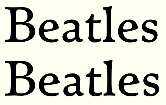
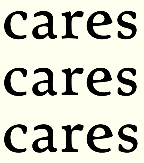
Here are three 'e' variations.

No. That beak isn't right. This is what feels right to me right now.

/s/ is a bit top large isn't it?

Yes, it is. But that's a feature, not a flaw. :-)

I like the third 'cares' /e/ best, FWIW.
(All the /e/s look a little wide to me but maybe that's just that these words put it in the midst of naturally narrow letters...)

FWIW I like the last one you said feels right. If you do narrow it, you might also move the crossbar a little higher to maintain the proportions of that counter.

I'm not holding back. :-)
I just think any ideological decision is personal so it has to come from you; all I can do is try to help reveal the issue. Until you settle on the spirit of the design any specific glyph critiques risk becoming moot.

That last "e" fits with the rest. The troublemaker -in the best possible sense- is the "a". You might actually leave it that way - for a text font it's not going to jump out; it might even become a conversation piece (like the [in]famous "g" in Meta). Or you could tame it, get over it*, and polish the font away. The hardest thing -again, in the best possible sense- would be to let the "a" trigger a full re-evaluation of the font - perhaps even hibernating the design again...

* It's a maxim of sorts that -for a text face-
one must discard the most beautiful glyph.

hhp

A different approach: The white of the eye of 'e' now is a morphed version of 'a's internal whitespace. I think this a minor breakthrough. The glyph is a little narrower too, and slightly tweaked in every thinkable way.

Hrant, thank you for encouraging words. That 'a' is the raison d'être of this typeface. So I have to make an even better glyph for discarding.

Thumbs up!

Thank you, Craig! For the idea, for your sketch, and for thumbing up the result. Now, thirty-five minutes later, I'm still satisfied. I will dream about it tonight, for sure.

I've always seen the relationship between the counters of the 'a' and the 'e.' I think more type designers should focus on this synergy. Well done, Sindre!

Thanks, Trevor. In this case, there's a strong relationship between the other halves of those two glyphs as well. The 'e' needs that huge aperture because 'a' has an exceedingly large one, without any kind of serif. I'm afraid this will have further consequences, though ...

Unfortunately I don't think that /g/ shares the same style with other letters. It seems odd and out of place. The descender simply doesn't seem right. Maybe the upper curve of the descender should be a bit more horizontal as it is now (and maybe a bit less heavy as well).

Now, thirty-five minutes later, I'm still satisfied.

How can you not smile at it, when it's smiling so big at you! :-)

I'm afraid this will have further consequences, though

Yup, time to reexamine your apertures. Hey, maybe your nice /s/ will be the beautiful letter that Hrant needs you to throw away! ;-)

Apertures reexamined. I've tried to inject more whitespace everywhere. The 'g' and the related 's' now has a faint echo of the 'a' and 'e' trick. I've chopped off most of the left-facing serifs, but not to the radical extent of Bremer Antiqua. I think this is going places, perhaps even the right ones. And no, I haven't forgotten all your helpful critique, I'm just following Hrant's advice. What do you think of this new direction, dear critics?

I followed your advice on the 'g', Robert, or rather it wound up the way you suggested as an attempt to make it more in style with other glyphs. The main reason for its slightly unorthodox shape is establishing some relation to the 's'. All letters need friends.

It did yes. I think it looks much better now although descender should go a bit more to the left to stabilize it even further (or move the right part a bit more to the left). I very much like the top part descender stroke contrast. Very playful and a bit feminine.

P.S. I never wanted you to follow my advice. I way only trying to point out things that I don't like. It's on you whether you see them the same way and agree or not. My observation about /s/ being a bit vertically unstable still stands but you said it's a feature. So it will stay. :)

It looks to me as though the c is falling right and the s falling left in the latest sample.

The 'i' is definitely falling left too.

I can't understand how thickening 'c's stem by two units can have such an effect, and I can't see it myself. I've however made the 's' more stable by moving its upper part five units to the right (back to where it was, but the new structure is kept). I guess one could say that the 'i' (and the 'l') is less balanced now, but the structure itself is now almost completely different too. What about the Bremer Antiqua if my glyphs are falling? Perhaps I've made a big mistake by doing this. When I've worked my way through the lower case, I'll upload a pdf with text settings. I think that will answer that question.

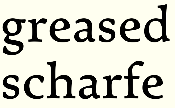
Pdf with text setting attached. No kerning at all, very basic spacing.

Er ... I realise my 12.15 pm posting (server time) sounds a little angry, irritated or agitated. That was not my intention at all, and I apologise for its harsh tone. I'm truly very grateful for all criticism. Keep it coming!

This is looking grand! I like that you've decided to go with the 'strangeness' or 'inkiness' and would like so see how it translates onto some other glyphs (for example could the right arm inner serif do with a looser connection to the arm to mark another inky change in dynamic?)

Lowercase s looks slightly too light now. You're right it is amazing how much difference a few units can make...quite a puzzle really!

I like the way the square brackets don't even have straight lines!

Thank you, Ben. I'm really uncertain about those weird serifs now, but I'm going to continue in this direction, as it initially felt slightly epiphanic.

I'm afraid I don't quite understand your suggestion, which glyph(s) are you talking about?

Yes, I've noticed the light 's'. I think that glyph (and its sibling, the 'g') needs to be too a little light in this typeface, but perhaps I've overdone it. What would your approach to fattening it slightly be? Vertical or horizontal weight gain?

No straight lines. That's a premise and a promise.

Sorry, I missed out the important bit! I was looking at the v, which seemed a little 'straight' next to the new style inky bits.

With the s, it seemed that the thins could just be a unit or two fatter, probably on the inside. What was your reasoning for making it light? I haven't come across that logic before!

New 'v', fatter 's', slightly tweaked 'i'. I'm still not sure if I understood your 'v' suggestion, Ben.

About light 's's: Never really thought about it, but I think it has to do with overall colour. Complicated, curvy letters (a, s, g) may look blacker compared to simpler glyphs from a distance than they do up close. Don't know if this is really true, or just a hangup of mine.

Yeah, I'm speaking gobbledygook. It's been a long day :)

I was imagining taking the idea of the fluid corner of the eye of the e and transposing it onto the counter of v. So the whitespace on the right serif has a larger radius/shallower notch...if that makes sense?

Two units is plenty to see an effect.

Glyphs are not vases - they don't risk falling down! This is especially true in a text face. Furthermore, imbalance can just as well mean dynamism, which to me seems part of the spirit of this design. A cobra isn't a cobra without that huge head. And a cobra is awesome. So I would be very wary of taming something like the original "s".

BTW, as you suspect, the "s", binocular "g", and any glyph that's dense needs to look too light when viewed large for it to work well at text sizes.

> No straight lines.

Assuming you haven't already, you might like to study the thoughts and work of Evert Bloemsma, who used to say "A straight line is a dead line" (although IIRC he got that from one of his former teachers).

I myself believe that balancing straight and curved is what's optimal. For one thing, death is a part of life too.

hhp

Looking great!
FWIW I don't see any "falling" that would be problematic.

The cap /R/ looks low-waisted, because the leg emerging so close to the stem makes the lower counter much smaller than the upper.

Right (thick) leg of /A/: I would trim back the serif on the left (interior) side.

I printed the text setting on my mediocre HP laser and saw these weight issues, for what it's worth (I don't know if the problem resides in the design or in my printer resolution (or hinting?)):
/b/f/t/u/ light
/i/l/n/p/ heavy

Hrant, your thoughts on glyph balance and weight distribution makes me happy. I'm a lot less experienced than you, but it seems we have drawn somewhat similar conclusions. Thank you for your cobra metaphor, I'll remember that. (I learned vector drawing from designing traditional Norwegian boats (descendents of Viking æra vessels, still built (in unbroken tradition) in the Western and Northern parts of Norway); their seemingly idiosyncratic hull shapes ("cod in the front, mackerel in the back") makes sense first when on water. I think a text face works much in the same way.)

Yes, I've studied Bloemsma, and even sketched a couple of faces based on his principles, more or less. Here are some glyphs from one of them:

I now realise that this is the true beginning of the typeface this thread is about.

My decision to use only curves in this typeface is one I made only because restrictions fuel my inspiration. Also, this is my last typeface made for purely self-educational reasons. Next time, it's serious. No such rigid rules then. (A critic once said that Richard Wagner's music is much better than it sounds. I feel the same way about Evert Bloemsma.)

Craig, thanks for printing. I've adressed the issues you brought up. No more drawing today, but I'll start refining the upper case tomorrow.

> I learned vector drawing from designing traditional Norwegian boats

Interesting.
And I can think of two other type designer you might study: Starling Burgess and
Miles Newlyn. I know of the latter's interest in boats through his Flickr stream: http://www.flickr.com/photos/69998588@N00/5582002742

> this is my last typeface made for purely self-educational reasons.

Well, if this is non-commercial then definitely
worry about ideology much more than salability.

hhp

Upper and lower case revised, pdf attached. Absolutely no kerning. Spacing still basic. Any thoughts on the letter fit?

I've tried using the turning-contrast idea on several new glyphs, most notably 'v' and its siblings. (Is this what you meant, Ben?)

Hrant, all my typefaces are non-commercial, type drawing is just a hobby. (Though the most time-consuming I've ever had.) That may change, but so far, I haven't even once thought about salability.

I like that adjustment on /v/ & kin. I wonder what a similar (but more slight) treatment would do for the caps in that family.

I like the /A/ apex.

Add a cap /U/ to your text setting - I want to see that cusp in action.

You might want to make a /Th/ ligature.

Ooh, thank you for the A!

I'm too tired to give a full crit now, but I like it very much even with tired eyes ;)

Yes, that's what I was clumsily trying to explain for the v...do you feel it's in keeping?

I'm sure others would agree you could be missing a trick by not thinking about making some of your work commercially available.

Anyway, I'll be back when I'm a bit fresher. Good night.

OK, let's do this! :-)

The "g" is nearly ideal to me. I would make the ear rise though.

It would be nice to have a more forceful "j". Is "gj" that serious a problem?

The "m" could be narrower.

The "u" is wide. Probably because it's the same width as the "n"; it has to be slightly narrower to appear the same width.

The "x" is probably too dark.

The "E" is too wide I think.

The face-punched-in "G" needs work...

The leg of the "K" is too weak.

I would make the bowl of the "P" much larger.

That "Q" is way too timid; this font needs one with a kick.

The "R" is exquisite.

I would give the "S" a smaller head.

The "U" is luscious. Don't let people convince you to change it.

As in the lc the "X" is probably too dark.

BTW, looking at your body text I got this vibe that I hadn't felt in a long time. This design reminds me of Quadraat - not because of any formal attributes, but in the way it seems to say "I've been doing this for a long time - you can trust me."

Concerning the point size:
Looking at your setting, and comparing the vertical proportions and the width to some reference designs, I think it's best suited for 10pt, and can work at 11pt. (That's assuming your lc letters span nearly the entire EM.)

hhp

Thank you very much! I have no time now, but there'll be an update tonight.

Oh boy, too exhausted after a long, long day of båtpuss (preparing your boat for the season, ancient Norwegian tradition) for anything type-related tonight, the promised update must wait till tomorrow.

You may have a slight problem with /ae/ (and possibly /k/ as well) at small sizes. Top part of the lower closed counter (and top diagonal stem of /k/) seems a bit too thin at its thinnest point. At smaller text sizes it may turn out as if printing is bad since it may come out too thin and there may not be enough ink.

Type spectacles now on.

A appears slightly light, perhaps. One place you could add weight would be the crossbar, but this might not be the look you want. I tried this in my so far very underwhelming Dutch Antiqua's A.

The tail of C still bothers me; I'm expecting a little more definition, maybe not as far as mirroring the top serif but something. Hm, not sure.

The stem of D seems light next to the large counter.

I wonder whether an Emerson style Q would work here. (Top left image in this post)

Agree with Hrant about the lc u being a touch wide; however for me the G works beautifully.

I wonder whether z could have a spur or two on the serifs or even on its angles.

Looking forward to seeing numerals and punctuation. I'm still thinking comma and quotes are too modern looking, but I'm a stickler for commas! :)

"A straight line is a dead line"

Bloemsma's ideal is nice, but the reality in digital fonts is that you're always having to cope with a grid. Lines that are long, flat, but not quite straight tend to rasterize with bumps and jogs that look like mistakes.

It's fine to avoid straight lines as part of your design concept, but if a line wants to be straight — make it straight. Don't knock it three units off plumb just on principle.

I'm a big fan of accommodating the grid* (which is NOT to say I'm a fan of inventing a grid as a feelgood or a cop-out). But if the grid in question is finer than human perception (which some people believe is anything above ~1000dpi; in any case 2400dpi seems pretty safe) then one can say it does become moot.

* Proof: I love bitmap fonts.

> Don't knock it three units off plumb just on principle.

What's a better reason than principle?

hhp

Phew, things take time. Been tinkering forever after the last round of critique. This is what I've done (see pdf):

A: A little weight added both on crossbar and stroke.
C: Slightly meatier tail.
D: Weight equalisitation.
E: A little narrower, some polish
G: Same shape, but slightly less extreme
J: Prettier curves under the baseline.
K: More tension in the foot.
M & N: Finishing polish
P: Significantly larger bowl
Q: Oh boy, oh boy. I've tried a lot of stuff, and wound up with this. Couldn't make a crossing tail model work. That's a shape I just don't understand, obciously.
R: Polish.
S: A lot of subtle tweaks.
V, W: Polish.
X: Less black, polish.
Y: Polish.
Z: Less black, polish.

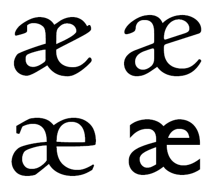
Slightly narrower (and weight-compensated) 'm' and 'u'. 'x' is lighter, and significantly tweaked. 'k' is slightly weight-tweaked. And I've made a working "æ", the old was just a leftover from several iterations ago.

Is "gj" that serious a problem?

Oh yes. 806 words in Bokmål, 2967 in Nynorsk. Grammatically correct sentences with /gj/ in every word can easily be constructed. Very, very common in Icelandic, Faroese and Albanian too.

[...] but in the way it seems to say "I've been doing this for a long time - you can trust me."

That is some compliment. Thank you! (I wish I felt the same way.)

I wonder whether z could have a spur or two on the serifs or even on its angles.

Possibly, I have doubts about both zeds, actually. Something to look into tomorrow. Along with numerals (the top terminals on 2 and 3 must go, mustn't they?) and punctuation.

¤

[...] my own Paphos [...]

After seeing that 'j', I'm very curious about that typeface. Any other bits of it you possibly could show?

I've shown the "Q" on Typophile before, so here it is again:

The logic behind the "Q" is that making the top less like an "O" is key.

I have roughs of all the basic alphanumerics,
but it's quite possible they're all wrong!

hhp

That's ingenious. The Q is a bastard of a glyph, posing as some easy-going vowel while being the awkwardest of consonants. It's wrong that it shares 'O's shape.

Paphos needs to be finished, by the way.

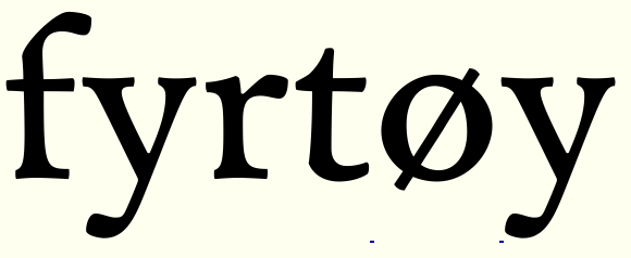
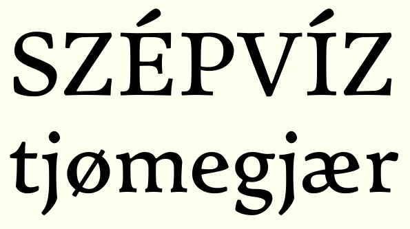
Some unifying tweaks on f, r, y. (And a working ø)

The "t" -a central character- is too tilty. You could keep the stem inclined
but maybe turn the crossbar a bit counter-clockwise to offset the effect.

BTW, thanks for the compliments and encouragement.
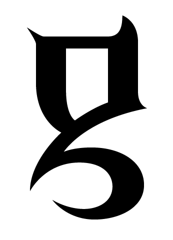
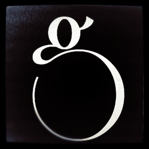
Just for that I'll show you my killer "g"... :-)

hhp

Whoa, that's a weapon for executing infidels! The negative spaces have really beautiful shapes, and somehow doesn't quite share the aggression of the strokes. I like the lemon-shaped bowl too.

Here's a (hopefully) improved 't':

Yes, I think it's the second-most-violent glyph I've ever made... :-)
Negative space: it is the female in Yin/Yang after all!

--

The "t" works now I think.

I would balance the widths more in the "æ".

Isn't the "j" too dark?

BTW, your caps settings exhibit uncommon grace and power.

hhp

I absolutely can't wait to see the italics.

We need to start coming up with names for this... :)

I love Typophile.

hhp

Glad you're finding my pangrams useful.

Latest /t/ adjustments are very nice.

Should the top horizontal of /Z/ be a bit longer (bring the top terminal leftward)?

That enlarged P bowl went a bit too far IMO.

I would consider bracketing the spur on eszett, at least on top.

BTW I gave my type history students pdf's of this and Telefon to have them practice their crit skills!

Thank you, guys. I need to rest now (getting type blind), but I will post some updates tomorrow.

[...] settings exhibit uncommon grace and power.

What can I say but thank you. Those words I'll remember.

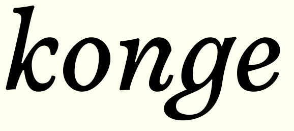
Trevor, here's an early sneak preview of the italic. (I doubt the closed 'g', really a joke, will survive.)

I agree with the 'Z' and the 'P', Craig.

It would be great fun to hear what your students make of my typefaces.

I love Typophile! (Who needs a formal education in type design? I've learnt more from this website than I've ever learnt from any teacher.)

[...] the second-most-violent glyph I've ever made

I forgot to ask the obvious question. Please?

OK, you twisted my arm. :-)
It's from Brutaal (part of the Daam Entity).

But that's not counting the question mark I made for
Font Aid II, since the violence there was self-inflicted...

Anyway, enough about me.

hhp

>I love Typophile.
Hear hear.

Loving the italic k, I had something similar going on with Nola.

Off topic, sorry...Hrant, that g is phenomenal. We should start an unexpected-g club or something. Is there anywhere we can see more of your stuff? I've only ever seen Patria and would love to see how your ideas translate into full alphabets.

Another slight update. Now it really is bedtime.

Wider 'Z', moderated 'P' bowl, lighter 'j', equalised 'æ'. The æ shape is unorthodox, by the way.

Ouch, that 'g' looks like a combined mezzaluna, sickle, leather cutter and scythe, with attached rose thorn and sharktooth. It also looks like a blackletter from another planet.

Great k, Ben! It looks like it tests if the new ice on the river is thick enough for skating on.

> The æ shape is pretty unorthodox, by the way.

Can you say any more about that? It's another letter I don't use, so I'm interested to hear your observations.

Yes, usually the stem of the a part goes all the way down, emphasing the left part of the glyph, like this:

I've chosen to keep the left curve of the e part intact instead, breaking the a stem. Caslon does this too, so I guess unorthodox was too strong a word.

I'm quite loving this. I must say, though, that I think the capitals are a bit... tame, compared to the lowercase. Perhaps you could incorporate some of the interestingness – if that is a word – of the lowercase into the capitals as well? The g does stand out a bit for me, the top bowl looks to be a bit light, and I think I would prefer a closed loo, although it's better in the last image you posted than in the earlier images. The æ looks fine to me.

I think your italic sketch is ok in itself, although I'm not sure how well it pairs with the roman. Maybe it's the axis of the contrast; slightly diagonal in the roman, but pretty much vertical in that italic sketch.

Thank you for commenting, Jelmar.

I've thought the same thing about the upper case myself. But isn't it always like that? I think this typeface needs some kind of serenity in its upper case, as so much is going on elsewhere. And it isn't that conventional, is it? I'd say U, J, G, R (and to a lesser extent the new Q, which no-one has commented on, by the way) are all somewhat progressive for a traditional text face. I tried injecting more of that contrast-trickery into the upper case alphabet, and found it lost character rather than gained. I think almost all upper case alphabets are less fun than their children. Unlike them, the adult letters have a unifying design and inner logic that needs to be there.

I'll have another look on the 'g'. I'm very satisfied with it waist down, but the upper part may need something.

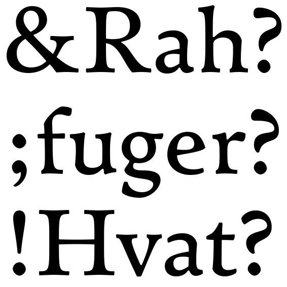
Here's an ampersand, basic punctuation and three different question marks. Please help me decide with one deserves further development.

Another thought: Not once while drawing have I been using historical models for my letters, or even looked much at other typefaces. All my previous attempts have been quite east to classify. But which category would you put this typeface in?

The ampersand is OK. Just OK.

I like the third question mark - the others are too old-fashioned.

Classification: I wouldn't worry too much, but maybe Oldstyle? Or Neo-Oldstyle? :-)

hhp

Classification... I think the proportions are fairly classical/humanistic (i.e. height to width ratio etc). But its obviously not a straight up humanist face.

I vote for question mark 1. It's better looking than 2, and more fitting than 3.

I don't worry a second about classification, I rather want this to defy classification. I've been thinking it would have to go into that hopelessly diverse transitional-drawer because of a and g, (and upper case proportions, aren't those too equalised for a renaissance face?) but then there's the ambiguous e and all those cusps ... yes, I think this is slowly coming together.

Just OK.

Then it won't do. I feel the same way; its prettiness outdone by its blandness.

I think a synthesis between question mark 1 and 3 could work. I agree that no. 3 is most interesting, but not quite right. I think I can fix that. (This is why I rarely make variants. Decisions should make themselves.)

By the way, what's your favourite ampersands, good people? I need inspiration ...

I like ampersands that are topologically simple, featuring one or more of: open top, "missing" upward arm, internal part(s) "removed".

My favorite ampersand is probably the one in Triplex Italic.

hhp

BTW, I'm all for avoiding frivolous variants, but sometimes it makes great functional sense. Example: your "j"! Have a strong one as the main form and a shy one for following a "g".

hhp

In that last image you posted, the H and R look so much darker than the lowercase characters - maybe you should look at the stroke thickness of your capitals again?

Pretty good thread on ampersands here:
http://www.typophile.com/node/39812
And more inspiration here:
http://ampersandampersand.tumblr.com/

Thank you, guys.

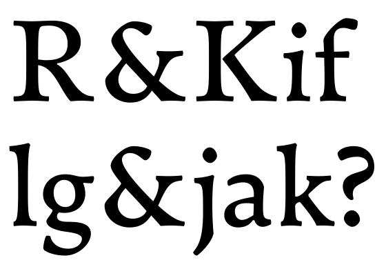
New ampersand. I've tweaked it for countless hours, and have gone totally blind. Can this structure work? Is it wrong to adjust the arm to x-height? Is it too dark?

Revised question mark.

I've been worrying a little about the colour difference between l.c & u.c. too. I'll keep that in mind.

Hrant, The problem with the old 'j' is that no other glyph has kept its traits. Originally, f, g, r, y, j had that beak. Do you really think it could work all alone? Er ... perhaps it could be made to resemble 'g' and 's'.

Ah, the new ampersand rules!

The question mark is a bit too smooth - it needs some of that funky modulation.

You may be right about the old "j". What about a Centaur-style one?

hhp

--------

Today, learn about the Armenian Genocide.

That new ampersand works beautifully.

It has shades of Golden type I'd say it;s a venetian

Thank you very much! That ampersand was a nightmare, but one I learnt a lot from. One structural problem with the ampersand is that it has to balance between upper and lower case, as it belongs to neither (or both). I tried to do that by combining the upper case cusp and diagonal with the lower case flag serif and v/k/x-arm.

I'm quite satisfied with that my new ampersand has a rather conventional outline, yet still is structurally not so orthodox. One can clearly see a rather undistorted 'et', without the glyph being too cursive nor too "literal".

Your honest and very qualified critique is invaluable! I cannot imagine how I can ever draw type this good without Typophile.

I think Centaur's j terminal looks like melting, brittle metal. That's cool, but not for my typeface. But I'll try to come up with a more distinct shape (though I quite like it as it is, I realise it might be a bit passive.)

I think I need to do something else than drawing tomorrow. Stay tuned for updates in a couple of days.

That is one insane g, Sevag! Thank you.

I've thought about making such an upwards-pointing spur on mine, by the way, but just can't get it right. Should I keep trying? By the way, what are good examples of typefaces with an open 'g'? I'm not counting Baskerville, it's aperture is purely ornamental.

Serifs:

• Gerrit Noordzij’s Ruse
• Jeremy Tankard’s Enigma.
• Robert Slimbach’s Kepler
• Colin Brignall’s ITC Italia
• Eric Spiekerman’s Meta Serif
• Typejockeys’ Ingeborg
• Cheltenham
• Zuzana Licko’s Mrs Eaves
• Steve Jackaman’s Schiller Antiqua
• Some Cochin stuff
• Dino dos Santos’ Andrade and also his Cultura
• Yuri Gordon’s AntiQuasi
• Paratype’s Bodoni by Alexander Tarbeev
• Jean François Porchez’ Ambroise
• François Rappo’s Didot Elder
• Michael Mischler and Nik Thoenen’s Catalog
• Miles Newlyn’s Democratica
• Kontrapunkt’s own Kontrapunkt

Sindre, I fully agree with you on Baskerville's "g". I have previously called its opening "apologetic", but ornamental (or cosmetic) might be even better. There is however one Baskerville revival that does it right: Fountain's "1757".

Frode, nice of you to compile such a list! Personally I only find Ingeborg's to be good enough (although the one in Tarbeev's Bodoni is OK). Sindre's is better than any of those... although maybe I feel that way because it's structurally similar to the one in my own Patria:

And Sindre, in fact the only thing I'd change in yours (which I mentioned before) would be to give it a rising ear.

hhp

--------

Today, learn about the Armenian Genocide.

I don't think Enigma's g is half bad, mainly because the aperture is so high and the link frees up space. It doesn't look like a mistake, like most other open binocular g's.

Thank you, Frode! I've been browsing your typeface list, and I have to agree with Hrant. Those g's aren't really similar to ours, they are all (even Ingeborg's) embellishments on the same old structure. Most of them treat the opening like the gap in a renaissance 'P', the stroke is continued, althoug there's no ink there. Our 'g' descenders are much more independent, and they have a terminus.

Ingeborg (that I haven't at all heard about) is irritatingly similar to my unfinished Mondegreen, by the way). While it's a good typeface, I think it suffers from slighly sloppy curves and lack of attention to micro-detail. Enigma is good, too.

It looks like the typeface from your list that has the most comparable g's to ours is ITC Italia. But the rest of it looks like a parody of William Morris' parody of Nicolaus Jenson.

Hrant, your right (again), I've now come to think that an upwards-pointing ear is inevitable.

Er ... I must have been extremely tired when I wrote that last post. Otherwise I wouldn't have made one of the most embarassing orthographical errors one can possibly make in English.

Another one for that list: Jos Buivenga's Fertigo.

Couldn't help myself. Here's a first draft of a new 'g'. I'm unsure about this.

That ear followed by a midline serif (as in /n/) strikes a sour note, I'm afraid.

Keep it simple (that's what I had to do
after trying too hard with the ear in Patria).

BTW, one inspiration for my "g" was the one
in the Italic of Zapf-International (and I have
Roy Preston to thank for pointing it out to me).

hhp

This simple? (Very quickly thrown together, but I think the structure just might work.)

Maybe a little too chipper. Try curling it the other way.

hhp

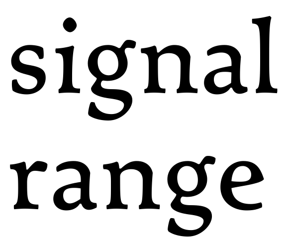
That's looking promising. Would you consider softening the underside join, kind of like you had with the "signal range" version?

Oh yes. The version I showed just wasn't fused into one outline yet. In fact, softening of corners has become quite a compulsion for me, fonts with sharp corners and straight lines now look unfinished and crude to me (though I know that isn't the case. I also know that most of my time-consuming filing and filling won't be visible at print sizes anyway.

(By the way, for a soft-cornered typeface, I must say this is starting to look pretty violent. Must be Hrant's influence. That 'j' (slightly modified now) is a scythe, the question mark a sickle, and 'e' reminds me of some kind of blade my father, the luthier, uses for scraping the inside of a carved-top string instrument.)

Another thing I'd like to ask you: What adjective(s) would you use to decribe this typeface? I really should be thinking of a name soon ...

alive, assured, assuring, authentic, comfortable, generous, literary, old-school, philosophical, respectful, tenor-voiced, warm, well-read...

(Violence certainly isn't dominant in the adjectives that occur to me!)

I don't know if it's because of the tools you mentioned above, Sindre, or whether I would have thought this anyway, but this definitely looks crafted by tools, sort of carved from wood, with the notches and organic swellings. I personally find the image of traditional Norwegian boats very evocative...perhaps there's a name somewhere in that tradition?

Maybe Nordland or Ballast for a name?

Love both of those words, and are both nautical terms.

Ah! But of course! Why didn't I think of that! That tradition (being older than recorded history) has a load of arcane terminology, with countless dialect variations. There's bound to be a name there. I'll pull out my books tonight.

I'm almost humbled by the adjectives you chose to describe my typeface, Craig. I can only say thank you. Those words certainly renew my inspiration.

Trevor, Nordland is a bit too generic, I'm afraid. It's the name of the second largest county, and in Norwegian the name doesn't imply anything marine without -båt attached to it. Besides, my ancestral farm Bremnes is in Troms, which is the neighbouring county. My ancestors would rotate in their graves. "Ballast" would possibly be more suitable for a heavy sans serif, but still of utmost importance in those boats we're talking about. The large ones have up to two tons of round stones in them. It would be a nice double entendre, though. I'll consider it, really.

> I must say this is starting to look pretty violent. Must be Hrant's influence.

Awwwww. ;-)

Name: something ancient but puerile. "Satyr". As an antidote to Centaur. :-)

hhp

Dear friends, meet Satyr. Thank you, Hrant, that name is perfect. The sound of it and the look of it. (Though perhaps not to the same extent some of its connotations, at least not to the early Greek satyrs, as they were ugly, old, sex-crazed men with horse tails. In late Antiquity, they became much nicer and better looking, though.) Actually, I wanted to give an earlier old style attempt the similar sounding (but unrelated) name Saturn, but found out that was taken by some Eurostile copy. Also, my old nom de plume as a causerie writer (and my earlier user name here on Typophile) was Satyagraha. Though yet again unrelated, I chose it for its sound and my associations to it (and literal meaning) rather than its political meaning. (Though I am indeed a fan of Gandhi's methods (and of Sanskrit, possibly the most beautiful of all the recorded Indo-European languages, especially in its earliest stage)).

I still think your idea was brilliant, Ben, and will definitely use it for future projects.

As an antidote to Centaur

I like that!

If you went with the French, Satyre, you could get that cool /e/ in there...

Glad you liked it! Just so you know though, at least in the
US most people will be thinking of the hairy, h0rny guys...
But they did play an instrument! Or two... :-)

To me it works because it's a dark, old, unpredictable thing.
But adding the "e" might be a good idea (unless you mind the
probable "satire" pronunciation).

hhp

Wonderful. I'm now visualising mischievous flute-playing forest spirits, and I'm happy with that :)

Now that is a good looking typeface!

Thank you, Brett.

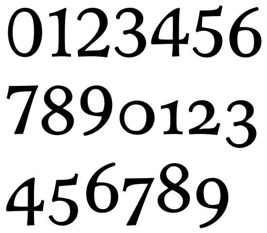
Redrawn numerals. I've tried to continue the turning contrast in as many of them as possible.

I like most of them. The "3" is fine - maybe slightly plain. The "4" rules. The "6" and "9" are definitely a bit plain, and the "8" is way too regular and clean.

The zero: although I'm aware of the need to pull it away from the lc "oh", I've never grasped the benefit of the extreme monoline form. Flipping the contrast is one of the two tricks I'd recommend (especially when you consider that many numerals have flipped contrast anyway). The other is making only the left or right curve thick.

BTW, it looks like the "1" is heavy and the "5" is light.

hhp

That zero does have a bit of flipped contrast. I think maybe that along with the widening of it may be too much -- looks like a conventional zero that has fallen over -- but a more circular form I think could work.

Did you consider making the intersection of /6/ and /9/ rhyme with that crazy stuff in your /a/ and /e/ joins? It seems like a somewhat analogous structure.

The zero looks far too geometric, and the 8 should look more like the 3. Nice start, though!

Thank you.

That last update was a little uninspired and lazy. This is much better, though perhaps a little ovedone? Unsure about 69.

About the zero: I really like the one thick side-zero (and have used it before), but I don't think it suits this typeface, it looks just too 1800. So here's a reversed and slightly rotated-zero.

I'm afraid the zero now looks even more "fallen over"...

I'm afraid I agree. But the others are pretty nice.

The 6, 9 (too boxy), and 0 (looks glaringly sideways) still need work. Everything else looks good though!

I like all of them. But maybe people are right about the zero.

BTW, consider making the "2" ascend (especially with the current millennium and all).

hhp

Oh. Man. I only just spotted this. Just wanted to say it's love at first sight, and my hat's firmly off to you Sindre. Going to go study the details…

Thank you very much, Nina. Good to see you.

Been working on the italic lately, but now it's back to the roman. Here are some revised figures, lining and old style. Any thoughts highly appreciated.

The lining zero, thanks to its narrowness, doesn't usually need a funky weight distribution to work. Especially if you go for "3/4" lining numerals (something I personally like).

hhp

Looking good. I like the "slightly kinky" eight!

This is a very nice face and I can see it used in magazines. The only character I don't like is lowercase g I prefer a closed bowl but its just my personal opinion and being a tad conservative I prefer the last closed question mark

Have a look at the height of the lining seven!

I think your "4" is extreme. Eventually you could minimize your curve ratio a bit.
For comparision the "4" of Relato with a more subtle curve ratio:
http://new.myfonts.com/fonts/emtype/relato/

>I think your "4" is extreme.

That's kind of the point, no? For me this is a book face, where due to their scarcity, numerals can afford to have a lot of character. I would, however, suggest something with the lining 4 to make it more «capsy». (A foot serif for example.)

I'd say the lining 1 needs bigger feet, and the lining 2 to make the left side of the baseline join lower. I also think the lining figs need a bit of height normalisation. To me the 8 appears small.

Beautiful work, Sindre. I'm very much taking my hats off too, all of them.

Looking absolutely delicious. The 4 and old-style 2 are marvels.

Do you happen to be looking for beta-testers? I'd love to see how it renders in text sizes on an iPad.

.

@Bendy
>For me this is a book face, where due to their scarcity, numerals can afford to have a lot of character.

Check "… 1944 …" for example. Isn't it too overwhelming? Okay, Sindre knows what to do, or not.

.

I think you might've just made the typeface I was looking for!
Beautiful work!

Wow, I'm overwhelmed by the number of comments after my last update. Thank you very much, everyone.

About the '4': Yes, it is extreme. But keep in mind that this font is intended for 10 points. This typeface will have true optical sizes (not just text and display, but korpus (10 pt), cicero (12), mittel (14), tekst (20), kanon (36). I'd really like to use those traditional names, by the way, but that's something to decide much later), and the larger the size, the more refined and less boxy everything will be (and the curves shallower). I doubt the curve of '4' will scream excess! at 10 points. But yes, I know what to do, and that is thorough testing. For practical reasons, I must do all testing on paper later in the process.

It seems my '4' (and to some extent the 'g') is a love it or loathe it-glyph. That tells me I'm doing things right.

Another thing: I begun drawing this typeface as a self-educational, strictly non-commercial one (I'm just a hobbyist), and won't think much about saleability during the drawing process. That may change, though.

No time for updates today, but stay tuned.

no hope of you having a closed bowl on the /g/

To me making the bowl open isn't mainly a stylistic decision - it comes from the belief that the closed bowl is unnatural and can even sometimes cause a hiccup in reading.

hhp

@hrant: Regarding the open vs closed /g/. An interesting point. Do you have a primary source or reference for this? There is the potential for a very simple study here.

the belief that the closed bowl is unnatural

The whole damn lowercase g is unnatural, I believe! :-)

Hrant: Every open bowl g I've ever seen has caused a hiccup for me, and I'm talking about text - not display.

> The whole damn lowercase g is unnatural

Or maybe it just needs more complex friends.
In Armenian for example we have half a dozen
characters of that complexity so none of them
feel lonely. :-)

> Every open bowl g I've ever seen has caused a hiccup for me

Maybe because you're too type-aware? We know
that type designers can't really read anymore. ;-)

Anyway I certainly agree that virtually all
open "g"s are poorly designed - because it's
a rare form it's harder to pull it off; the
closed form being established is easier
to get away with making it poorly.

BTW:
- The hiccup I believe can happen with the
closed form is especially when "g" is doubled:
the peculiar pattern repeated can be jarring.
- Have you read anything set in Patria?

hhp

The whole damn lowercase g is unnatural

Hear, hear!

HF&J's new release Ideal Sans is similar to Satyr in its absence of straight edges (the end result is quite different, of course!)

http://www.typography.com/fonts/font_overview.php?productLineID=100042

I think Satyr is on track. Two g's: Definitely! Both "gg" and "gj" are common pairs in Norwegian and often troublesome. Patria: No, not yet. Where can I see it?

Nina has set a few books in it* but I think they're all in German. Do you have #13 of Typo magazine? My article in that issue was set in Patria. There are a few other things (including a previous issue of a provincial newspaper) but nothing highly accessible. Maybe I should send you a PDF? If so please email me (no pressure) at hpapazian at gmail dot com.

* Example: http://www.ninastoessinger.com/?l=e&s=typography

hhp

Oh, yes my Patria books (3 so far) are all in German.
Drop me a line if you'd like to have a look, Frode.

Satyr: great name. Earlier on someone was saying the caps were tame in relation to the lowercase. It reminded me that Octavian is a typeface where the caps are wide – being based on inscriptional lettering – and that the narrow lowercase has a different feel.

It's a necessary paradox that the caps are essentially a different alphabet, and there's a severe limit to how much they can match the -more important- lowercase. We have to allow each case to be itself, as awkward as that might feel.

ON THE OTHER HAND... :-) I've always thought there might be a way to makes things really click between the two cases, specifically by leveraging uncial forms... Where's Victor Hammer when you need him!

hhp

Differentiating the cases has become a very conscious decision in the making of this design, I've actually exaggerated the differences, the serif treatment are different, the upper case has none of the lower case contrast weirdness.

About my open g: It stays that way. I've come to think that the s and g, the two loners of the lower case, should resemble one another. That solves a lot of problems, and looks pretty. Harder to read? Not if you're used to it, no way. I think reading Fraktur is frustratingly time-consuming (and my mind often refuses to accept that the "k" is not a "t"), but I'm one hundred per cent certain no-one thought so 150 years ago.

I'm working on the spacing now, and will post a new pdf with Latin Extended-A support and small caps in a few days.

s and g, the two loners of the lower case, should resemble one another
Someone in Ireland some time ago should have thought the same ;-)

> the s and g, the two loners of the lower case, should resemble one another.

Exactly!

hhp

I have nothing against them resembling one another sure don't they have the same parents.
Do you know the typeface Brighton have a look at the g in that. Now there's a g that resembles the s

Italics. See pdf. Can an italic meant for text sizes have such a deranged 'X'?

After being advised to do so, I have decided to make a new thread for Satyr Italic, the length of this thread makes it too impractical. So please, write any critique here.

I was just wondering if this would see action again!

Love the descenders of /p/q/.

That thickening at the joins works wonderfully at the bottom of /V/W/! /v/ is fantastic.

I wonder if top terminal of /s/ could be a touch less soft (maybe look to /f/ for a model).

I don't like the /h/m/n/.

/K/'s arm seems a little weak - is it stretching too far over, or does it need a little more black?

The /Z/, which seems to switch contrast strategy midgame, is no less daring than the /X/. Give us some words with those glyphs to judge.

Question mark seems too soft. At-sign may be too generic--could some contrast or quirkiness be introduced into its loop?

/A/ crossbar seems too high to me still.

And finally, today Satyr is released on Monokrom Type Foundry, founded by Frode Bo Helland and myself.

Thank you so much for all your help and support!

https://monokrom.no/fonts/satyr
https://monokrom.no/
http://www.facebook.com/Monokromfonts

So satisfying to see this come out.

hhp

Captured from web.archive.org on 15 Apr 2015. view this capture