
Do you guys know of any fonts -especially for text- with a "U" like this?
http://www.flickr.com/photos/joostmarcellis/5597454979/
hhp
Do you guys know of any fonts -especially for text- with a "U" like this?
http://www.flickr.com/photos/joostmarcellis/5597454979/
hhp

I would have expected Barnbrook or Licko (or even Shinn) to have designed such, but apparently not.

Infinity at Village does this on the U, but I'd never call it a text type.

Not exactly text-faces either:
http://new.myfonts.com/fonts/agfa/sackers-roman/
http://new.myfonts.com/fonts/parkinson/modesto/

TEFF Geronimo by Mário Feliciano has an almost, but not quite, similar 'U'. http://www.teff.nl/fonts/geronimo/index.html.
I'm actually working on not one, but two typefaces with such a 'U', here are some glyphs from one of them. A lot of cusps, but still intended for small text sizes.
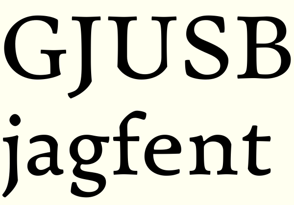

In the ballpark, based on the FTN face Numantina; it will most likely appear on myfonts.com by the end of next week...

Thanks guys! Keep 'em coming.
Nick: I was expecting something by Barnbrook too.
Sindre: I like your stuff the most! And I'd be curious to find out why you seem to have taken that structure to heart.
hhp

Sindre, it's a pleasure to see you back here. Your cuspy font is indeed delicious.
I'm working on one (Nola) that will have this kind of U, I think.
Hrant, that's a good question. Haven't really thought about it, but I'll try now. Since I started drawing type (not that long ago), I've (unconsciously) felt that the shallow curve of the 'U', abruptly transitioning into a straight stem, really doesn't relate to anything else in the upper case. It's always a little wrong, somehow. It's late invention was perhaps done by lesser minds than the genius(es) who made the masterpiece the original (upper case) Latin alphabet is. So my 'U's are just my (possibly) feeble attempt at reinventing one of the very few flawed glyphs of the upper case. (The 'J', an even later invention, is another.)
Besides, I like cuspy shapes.
Ben, thank you. Will you post your new typeface on Typophile?
Sindre, yes, you can see it here. Busy working on other ones at the moment, however... :)
Looks like we both suffer from the too many typefaces under simultaneous development-syndrome, Ben. Or is that perhaps common to all type designers? I really hope you'll continue work on Nola, though. And yes, I think it will indeed need cuspy 'U's, along with the other cusps.
Oh yeah, definitely too many on the go. But I have a focus at the moment — Mint is being prepared for publishing. I know you liked that one too :)
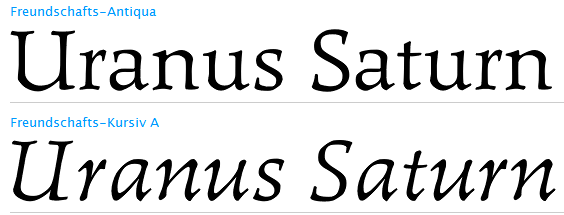
... and I just found this, which has a lot of traits in common with my attempt, it seems. The result is however quite different.

Another one, interestingly designed by a Chinese calligrapher.
> the shallow curve of the 'U', abruptly transitioning into a straight
> stem, really doesn't relate to anything else in the upper case.
I feel the same way. Those who standardized it weren't thinking straight. I myself have come to prefer the full-right-stem style (even though it might be too lowercase-like), although I've only actually used it in one Italic so far.
Periódico is a great find! Thanks. And only two months old.
And Freundschafts-Antiqua is quite fascinating - reminds me of the work of Gudrun Zapf von Hesse. I wonder why I hadn't heard of it before.
hhp
My cuspy typeface partially shown in this thread is now posted here, if anyone's interested.

Hrant: "I wonder why I hadn't heard of it before."
Cold war, I suppose.
BTW printed sample in: Korger Hildegard, Schrift und Schreiben, Leipzig 1977
Sindre, did you delete that other thread?
hhp
No, but I got some obscure server error message when posting. It's gone from the forum listing, but can still be reached here. Weird.

I get an "Access Denied" page when I click either of Sindre's links
Sigh. I can assure you the thread is still there, but is obviously only accessible to its author. This is actually the second time this has happened with this thread. Last time everything was ok 12 hours or so later, I can only hope that will happen this time too.

Every time Sindre updates the original post of his Critique thread, Akismet thinks it’s spam and puts it back in the Antispam moderation queue.
Then it has to wait until morning (Eastern US time) for me to notice it and reapprove it. Sorry.
The Punchcut folks have tried various methods of dealing with all the forum spam. This antispam module is not *too* bad, but it does have it’s weaknesses, including false positives. I don’t know why it keeps thinking Sindre’s updates are spam. I keep resubmitting and hoping that Akismet will learn.
I’ll see if I can find a workaround to the system to get it so Sindre’s thread doesn’t get pulled off line every time he updates it.
Thank you for the information, Kent. I was starting to lose my sanity over this. I really appreciate your effort in solving the problem.
Here's another:
http://new.myfonts.com/fonts/samuelstype/arnold-samuels/
hhp

Corners at the bottom of the U can be seen in some of John Downer's typefaces. SamSans, Paperback, and Vendetta. And here on a show card:
Paperback is indeed a great example. The other two though
I see as marginal, because the abruptness is a global effect.
hhp

There was a TypeID question within the last few days that included such a 'U', with very pronounced cusps. The response was that it had been done by hand, but I wonder. Wish I could find it again!
- Herb
Captured from web.archive.org on 31 Mar 2015. view this capture
