
Started sketching a new serif display face and wondered whether worth continuing/digitising. Any thoughts? Is it too similar to something else?
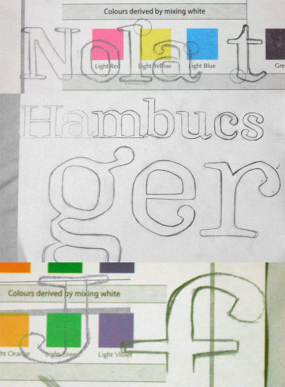
Started sketching a new serif display face and wondered whether worth continuing/digitising. Any thoughts? Is it too similar to something else?

There's a hint of Emerson in there.
Or rather, of Louis Hoell.
hhp
Aha, must be the hexagonal outline and angled exit strokes on a and u. Really digging the idea of reinventing Emerson, though this seems more of a display face, doesn't it?
Remember that a true text face looks quite funky large.
This is something Christian Schwartz demonstrated very
well in the development of the Houston Chronicle face.
http://www.christianschwartz.com/houston.shtml
hhp

I know I'd like to see more.
There is just a hint of blackletter in the forms that intrigues me.
Yes, this came out of trying to make blackletter shapes much smoother and more classical. I definitely want to keep the blackletter influence in there but not make it prominent.

Nice. Definitely would like to see more of this.
Right. Here it is, I started digitising.
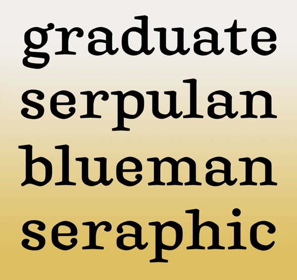
There's quite a lot going on that needs to be resolved so if anyone has helpful suggestions (including any similar typefaces I can refer to) that would be great.

hm, the only critique I have is the terminal on /e/
seems too large. I know its in line with the other terminals but maybe it could be removed and have a sans terminal like the /c/
hope that helps
looks great otherwise, love the direction this is going
I like the feeling of it — there's an interesting hint of calligraphic character
• 'a' seems a tad wide
• 'p' looks a little heavy / thick
• 's' looks too fine / delicate

Have you looked at Origami? It has some of this hexagonal character.
Thanks Craig, yes, I've seen Origami — the heavier weights may be useful. Others I may refer to are Hawkhurst and Andralis — love the head serif on that /n/!*
I'm not aware of any other hexy fonts with all these twiddles.
That /g/ needs reworking, it's quite top-heavy. Good to be working on other fonts, fresh eyes show all sorts of funny things...
*EDIT: Oh, and Lapture
Here's some more of the lowercase. I've switched to quadratic (TrueType) splines to allow more nuanced curves, and regularised the x-height. Tweaked the head serifs, foot serifs all over and remade the finials of a, d, t and u.
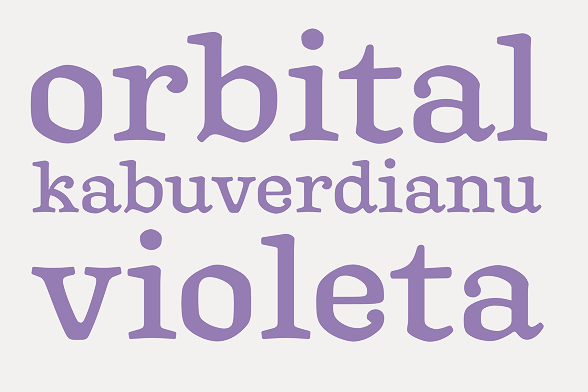

I really like this! I'm getting a slight William Morris vibe too. I'm thinking very slightly curved stems could perhaps make this even better. Hope you'll find time to carry on with this.
Cool, you mean concave (bone-shaped) stems?
Yep. Though very subtly so. Look at your hand-drawn sketches, especially the 'l'. That's just the right amount.

Just by looking at /t/ and /b/ one can tell this was based on blackletter. Nevertheless it progresses nicely and may become a nice display font.
Have you tried making the lower curve of /e/ narrower so it doesn't extend so far to the right? It seems a bit too wide unbalancing the whole glyph.
Nevertheless? Blackletter rules! For text!
http://themicrofoundry.com/ss_fraktur1.html
hhp

when I saw the single world Nola on your flickr site and before I looked at the other characters I saw a completely different face it's in my head now but I will try and sketch it out today along with a million other things. The idea of using blackletter as a reference for a friendly text face is great. Have you looked at Oz Cooper's lettering
Captured from commoncrawl.org on 21 Apr 2015. original URL