I’ve done freelance graphic design as a hobby for many years, and then went to school for it. I am now working as a tech and tutoring in ID, ILL & PS CS5.
My education taught me there are bad ways to use layout programs so I want to make sure the students I tutor can benefit from learning good habits as opposed to just taking the easy way out by letting the app decide how things should look.
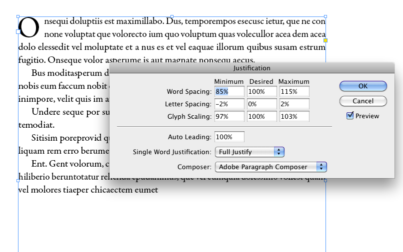
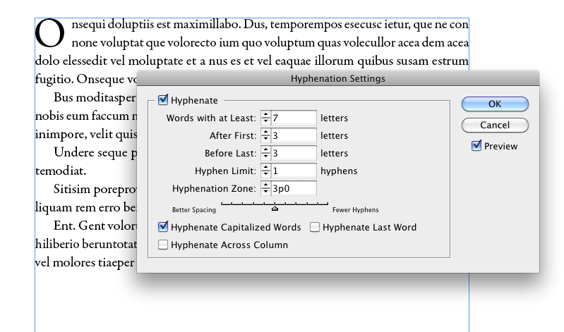
Right now, specifically, I am talking about column justification. Many of the classes (which are not graphic design but intro/overview classes) are having students duplicate layouts--which is fine--but since they aren’t teaching the software, the students will do things like use paragraph returns to justify, (to ensure each line ends with the specific word that match the layout document). They also misuse tracking/kerning/leading etc., much less know the differences or when/where/how to use them.
It’s impossible to just teach the program without going into some design aspects and would like to educate these students a bit about what makes good typographic sense. How it’s about type working with white space to create texture, and the difference between optical and measured spaces.
I haven’t done a lot of layout work myself and have yet to get a handle on the best way to properly finesse justifying a lot of text in columns but I know simply clicking on ‘justified’ in the paragraph palette makes for poor design.
I’m sure there are a number of ways to do this properly but I’ve yet to feel comfortable giving any hardcore advice and wonder if anyone would care to share their conventions here?
Thanks a million!