Typophile

Survey: justified or rag-right?

Palatine

Do you prefer a well-set right rag, or a well-set justified page (body copy, long tracts of text)?

Give reasons, if you can. I usually prefer a nice rag, but I've been improving my ability to set justified type as of late, so I find myself torn between the two styles.

It all depends on...

  • first and foremost, the column width;
  • the overall layout;
  • the number of runarounds you're dealing with; andli>
  • the typeface being used.

Too narrow a column width can create rivers of white space and/or excessive hyphenation if you justify. If it makes sense within the context of the layout to set ragged right, do so, although ragged left is far more common and, in most cases, more readable. In regard to runarounds, see the first observation. And, IMHO, some typefaces just don't look good justified.

I try to take the subject matter, typeface, whole aesthetic into account before I choose ragged or just. The legibility should be the key factor for my decision. That said, I prefer ragged.

> It all depends on…

Surely the language of the text should come high up on the list too?

Also the presence of a hyphenation dictionary - ie there not being one for the Web is a problem for justified Web pages regardless of column width.

Si

I prefer rag right. Although justified is nice on occasion. Most of the time I try to make it easier for the poor bastard who actually has to read it.

kris.

The design and the goal of the project I work on determine if I justified or not the text. A nice rag text is also nice as a nice justified text. The hardest work is to make both nice.

Oldnick:

You mentioned that "some typefaces just don't look good justified."

Would you please offer a few examples?

I like well justified text blocks but will use a rag whenever it is more apropriate than justification.

Héctor

I believe the superior spacing of rag-right always outweighs any modest aesthetic benefit of justified, and I'm glad the world of print is slowly beginning to recognize that.

It's all good.

Some of the fine art printers at the turn of the last century made full-justify a beautiful thing. But, this doesn't mean it is appropriate for anything else.

Despite Si's accurate observation about the lack of proper hyphenation tools, I prefer "justified" for use on the web because most sites are still built with tables of one sort or another. Most pages, just like the one you are viewing now are simply combinations of rectangles and squares. The rectangular look of justified text, to my eye anyway, works nicely with rectangular/perpendicular page structure. I suppose that since justified text on the web appears infrequently, few share my opinion!
DK~

You mentioned that “some typefaces just don’t look good justified.”

Would you please offer a few examples?

Scripts, whether formal or chancery...

Da Kine - Putting aside aesthetics for a moment, do you really find justified text more readable? Most do not, especially without hyphenation. Thus the logical lack of justified text on the web.

Stephen I find rags a bit distractive, but certainly sans serif faces often look better on rags since they are much more sensitive to spacing.

Héctor

>superior spacing of rag-right always outweighs any modest aesthetic benefit of justified

So far as I can see, almost all books and newspapers are justified. My hunch is that sticking to this is not just a matter of conservatism, but that justified text unifies text blocks. With the text blocks unified, the sub-heads and other navigational signals stand out more.

Another possibility is that the consistent ending location of the line makes it easier for the eye to plan and know when to jump to the next line.

So it may well be that the stubborn preference for justified text has a basis in readability, and not just aesthetics and habit.

No doubt the ragged right has more consistent spacing, but with longer lines, as in a book, I personally don't find the spacing of justified lines with hyphenation present any problem as far as readablity. (Hyphenation itself can sometimes slow you down, particularly if there is a lot of it, or across page or column breaks.)

So it may be that ragged right, at least at longer measures, is more of an aesthetic choice, and the justified more functional.--The opposite of what most here are arguing.

I most often see ragged right in shorter material, such as advertising, where navigation is handled by large spacing and placement, something not so possible in books and newspaper columns, crowded with text.

I don't know whether my hypothesis on the functionality of justified text is correct, but I'd be interested to hear others' views.

Stephen-
To my ragged eyes, I don't really sense any significant readability issues in rag vs. justified. "Of course, how many people actually read the text on websites anyway," he said, in a half-heartedly joking sort of way.
DK~

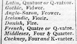
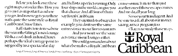
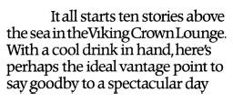
Worthy of a mention: a combination.
These two examples are taken from c.1840 and c1980.
The idea is that you start off with rag right, and then justify lines which are fairly close to the full measure.


As far as printed matter is concerned, my feeling is that the justification method has only to do with the aesthetic requirements of the text and the physical requirements of the media.

On the web, however, I would only justify all lines with very short passages where the spacing rendered by various browsers can be somewhat predictable. Here's hoping for better justification controls such as glyph scaling in future implementations of CSS.

>Scripts, whether formal or chancery…

I think the monks did a pretty good job of fully justifying using these scripts.

Si

Si - Remember, they were handwritten, not type.

Monotype’s original Gill Sans has such loose spacing that using it justified (especially with those horrendous American defaults of Quark’s, eg letterspacing) renders it almost unreadable.

bert,

Interesting you should mention letterspacing. If I understand correctly, some DTP software such as Quark or InDesign, goes further than simply varying the spacing between words when justifying text, but also makes subtle changes to the actual spaces between letters. Is anyone else bothered by this?

I have very little experience with Quark/InDesign, so I might be misunderstanding the idea.

"...but also makes subtle changes to the actual spaces between letters...."

Yes, but you have control over it.

ChrisL

I think the monks did a pretty good job of fully justifying using these scripts.

That's true, but monks would vary the width of glyphs as necessary, in addition to adjusting word and letterspacing. While InDesign's glyph scaling works well for the most part, it usually fails with scripts.

Good point William, justified text blocks do give the text the uniformity required for navigational elements to stand out without loosing the subtlety that simple spacing can give.

Plus justified text tends to be more economycal than ragged text.

Héctor

"Plus justified text tends to be more economycal than ragged text."

That is not really true. It is just an illusion. By adjusting your H&J settings consistantly between rag and justified (except for the justify command of course), you will see the same economy in both. It is actually easier to get more economy out of ragged right text. I have done experiments with my students on this several years ago when I was still teaching.

ChrisL

Well, if you adjust spacing in a rag, then you are loosing the main benefit of a rag which is consistent spacing.

Héctor

I find that right-ragged text often doesn't work* with a paragraph indent so it requires extra leading between paragraphs, and if this is on a two – or more – column grid the space needs to be at least half line space (so that occasionally, at least, the baselines align), ideally the space would be a full line space (on multi-column layouts) so you end up using more space with ragged-right, than you would with justified, indented pargraphs.
* and reduces the attractiveness of one straight side

>monks would vary the width of glyphs as necessary
So did Guttenberg

Tim

Most newspapers here (in Brazil) use justified text poorly. It may be easier to read and it may unify the text, but it is so badly done that I long for some raggged text every now and then...

ah... the beauty of a well-spaced justified text...

I like rag right. This is probably the result of too much exposure to poorly done Justified texts but practically speaking it seems safer/more pleasant for the reader to Rag.

Justification often seems to come about not as a result of desire to serve a reader but because of a twitchy, nervous, oldfashioned, english major-y or just plain compulsive book quoting client who can't be bothered to actually look at something and then trust the evidence of their own eyes. 'It say here that...'

In general rag seems more serious/less fluffy to me.

I fully believe Justification can be done well, I have been startled by the realization I have been reading well justified text more than once.

But I don't trust most folks to do it well. Rag right is so practical!

Of course sometimes text has to be Justified because of embdeded cultural reasons or just because you are busy mocking somebody's style to make a point. So intent has a role too.

Full justification is Modernist mayhem. Yes, sometimes it works, but all things being equal, rag-right -when done right mind you- is better, simply because it respects the word space (which is much more important than what space is left over at the end of a line). The Ancient Greeks did it very well.

hhp

>Modernist mayhem

Like Guttenberg, Jenson etc., etc.?

And is there any evidence that small variations in word spacing slow down reading?

Justification avoids the "interference" of having shapes and coinicidences occur at the right column edge, which can be a distraction, as the reader will interpret these as potentially significant. And indeed they may be, as statistically a short line tends to indicate a paragraph end.

By shapes, I mean, for instance, a succession of lines each of which is shorter than the previous, followed by the opposite, creating a concave indent.
By coincidences, I mean, for instance, two lines at full measure, followed by two much shorter lines of equal length.

Of course, these ragged phenomena can be removed by artfully adjusting where word-breaks occur, but that's extra work.

***

It should also be noted that symmetry is aesthetically pleasing, deriving perhaps from the most fundamental level of sexual attraction. Recent research correlating physical symmetry of people's faces against the attractiveness of their pheromones discovered that symmetrical people smell sexier. Or was it that asymmetrical people wash less? Scary stuff.

> Like Guttenberg, Jenson etc., etc.?

Oh yes, all kinds of stuff, since the Romans in fact,
who were the first to really cultivate Modernism.

> And is there any evidence that small
> variations in word spacing slow down reading?

Empirical evidence? Maybe a little bit, but probably not enough, and not nearly good enough. But considering the model of reading that makes most sense, there's very good reason to believe that varying word spaces hurts a fair amount.

And I don't know what "small" is here. In fact many justified settings result in spaces that are bigger than some of the [short] words, so not small by any measure.

> that’s extra work.

Yes. Or: justification is lazy. :-)

> symmetry is aesthetically pleasing

But I think there's a severe limit to that in
the realm of immersion (the subconscious).
Also, variance can be just as pleasing.

But yes, the correlations to our physical reality
are very fascinating, and I feel extremely relevant.

hhp

Once Hrant has decided to misuse a word, at least he is consistent in his misuse and will not be swayed from it :) Of course, the irony in this case is that 'asymetric typography' and the rejection of justification was the rallying cry and most obvious characteristic of modernist typography.

I often set text ragged-right and then, once all the text is flowed, turn on justification to see how it looks. If it looks good, i.e. even and without significant detriment to word spacing, I keep it justified, otherwise I go back to ragged-right. I don't have an ideological preference for either, but generally agree with those old monks: a nicely square text block is a happy thing, and if you can achieve it without disrupting the appropriate evenness of the word spacing (bearing in mind that we obviously have a tolerance for some variation in word spacing) then it seems merely stylistic not to. As a matter of style, there are certain kinds of texts that I would be inclined to set ragged-right: most correspondence, for example. As a matter of function, type at low resolution such as on websites usually benefits from being ragged-right simply because the pixel grid is too crude to preserve decent word spacing in justified settings.

> Once Hrant has decided to misuse a word ...

I'm just trying to correct your guys's too-narrow usage! :-)

> ‘asymetric typography’ and the rejection of justification
> was the rallying cry and most obvious characteristic of
> modernist typography.

I think the most obvious characteristic was Das Grid.
And don't blame me if their lust to blindly counter
precedent caused them to violate their own ideas!

Little boys playing.

> If it looks good, i.e. even and without significant detriment to word spacing

The problem is that mere formal aesthetics is no measure of the deeper functionality required; just looking at a gray block says nothing [useful] about what's inside it, about what happens when you actually try to access the content.

And when you say "we obviously have a tolerance for some variation in word spacing", I would say that sure, we have huge tolerance. We can even read long columns of NotCaslon with a single word on each line. But what is GOOD?

hhp

>the rallying cry and most obvious characteristic of modernist typography.

Actually, the initial phase in the 20s and 30s was all justified. As in El Lissitzky's "Isms of Art".
Very ordered in a de Stijl kind of grid.

However, the postwar International Style was all about the rag.

Based on carefully weighing (or weighing carefully?) the merits of rag vs. justified, I'll quote Master Gill:

"Even spacing is of more importance typographically than equal length.
Even spacing is a great assistance to easy reading, hence its pleasantness, for the eye is not vexed by the roughness, jerkiness, restlessness and spottiness which uneven spacing entails, *even if such things be reduced to a minimum by careful setting.*"

While there are some applications for fully-justified text, we might all be better off reading a nice rag.

Gill was da man.

BTW, I'm not opposed to some word-space variation, sometimes.
As long as: it's very small; it's greater than the default, not less;
and it helps do something useful, like avoid a given hyphenation,
or maybe even make a way-too-short line a bit longer. I just think
varying word-space to enforce a pretty line at the end is dumb.

hhp

It's deceptive, hrant, it really is.

I've been reading justified text for most of my life, without ever really noticing it. I've read some ragged-right text, but mostly my own work. It's only now that I'm noticing how much faster and more comfortably I can get through tracts of ragged-right text. Now that I'm paying attention to this weighty subject, I feel cheated. My reading was actually slowed down, and for years on end, through no fault of my own.

I'm horrified to learn that for the better part of my life I've been startlingly less efficient than I could have been.

;-)

My take on justified vs rag type is about industry as much as asthetics. With most of the banks I've had as clients, don't allow hypenation and if you can hypenate a block of copy you better not justify the copy. The other consideration is a good editor. If your copy is creating rivers in your justified text your copywriter or editor should be able to make edits to make the layout work. So (in my opinion) its not a either or but a product of a creative team.

The trick to dealing with rivers: reduce leading.

***

For all those proponents of rag-right:
Why is it that the two most-read forms of publication, newspapers and novels, employ justification? Not only that, but newspapers have always had far too narrow columns for optimum word spacing. But just try and design a newspaper with a rag-right column, and you will be taken for an idiot by both publisher and readers.

Nick isn't that because justified type takes up less space. But I haven't seen a justified newspaper article where there isn't a bad river somewhere due to either word spacing and narrow margin. I still think a creative team would solve the problem.

> The trick to dealing with rivers: reduce leading.

Interesting strategy: destroy readability (by making word spaces appear larger than the leading, and reducing reliable line-returns to boot) so people won't realize the problem is the damn Modernist gray square.

"Even Color, Ohmmm, Even Color, That Is Always The
Goal, Ohmmm" chanted the big-chested but dim blonde.

> Why is it that the two most-read forms of publication,
> newspapers and novels, employ justification?

R[e-r]ead the first thing I wrote in this thread.

> you will be taken for an idiot by both publisher and readers.

I didn't realize we were discussing popularity.

--

Dan, I agree that teamwork helps a lot; but when the writer is really good at his job, you don't want prettiness messing up the content. When the writer sucks, sure, change his wording to make things less ugly. But that's not the point.

hhp

"isn’t that because justified type takes up less space"

But it doesn't. All it does is take the space that would be at the end of a line in rag and spread it out among the word and letterspaces in that line. There is no saving.

ChrisL

"chanted the big-chested but dim blonde"

male or female?

The reason most newspapers use justified composition is that they have been doing it that way for ever and are quite used to it and don't ever think about changing. It has nothing to do with Modernism, space-saving, or readability, it is just habit.

ChrisL

More importantly:
> you will be taken for an idiot by both publisher and readers.

You really think readers would notice, much less have a strong reaction? Readers do react to change, but without considering if the change is good or bad. It's like a knee-jerk reaction, best smiled at and ignored. It's what's happening to readers in spite of them that's useful to consider.

But as for publishers, yes they do grasp the details. The thing is
they might as well shouldn't, since they don't grasp the foundation.

> male or female?

I did put an "e".
But only because big breasts on a man are... unfashionable.

> It has nothing to do with Modernism, space-saving, or readability, it is just habit.

But I think it's a habit borne of Modernism.

And media which are traditionally rag-right could be said to be that way due to a combination of: smart individuals in those fields; and dumb luck.

hhp

"I did put an “e”.
But only because big breasts on a man are… unfashionable.

you also said chested not breasted
my point is:
I'm not amused, and I don't see the need for this kind of thing.

I generally prefer rag-right, both in my own work and in my reading material, with one big exception: novels.

The current PG Wodehouse Penguin paperbacks (the British version, I think) are nicely set, but they're rag-right and I find it very distracting. Maybe the line length is too short, but it starts to look like The Odyssey or some other epic poem.

Also, I find that The New Yorker does a good job of justifying their narrow columns by disregarding other typographic niceties like multiple consecutive hyphens, etc.

On the other hand, they put an umlaut in "cooperate."

What besides humor is OK to use when trying
to say that Modernism is all about looks?

The lust for even color is the bane of craft.

hhp

The lust for even color is the bane of craft.

Ragged settings give a more even colour.
The advantages of a justified text block lie elsewhere.

> Ragged settings give a more even colour.

But at a level that doesn't concern the typical Modernist, who is looking at the overall, often at extended-arm's-length, sometimes even squinting. But of couse that's not reading.

> The advantages of a justified text block lie elsewhere.

I'm open.

hhp

Newspapers aren't set in rags because rags would difficult navigation and content integration by adding visual noise... In the case of a newspaper, navigation is more important than even color... and the
relative legibility benefits of setting a regularly spaced text are lost against the narrowness of the column.

Novels are not commonly set in rags because the same visual noise issue, people gets very inmerse and the last thing you want is an assymetrical crooked vertical line running on every page.

Jusfification is more economycal (now) because some lines are actually spaced negatively and you don't need a blank line between paragraphs or very big indents (more noise), and also because it's more commonly hypentated.

Héctor

"...because some lines are actually spaced negatively "

Rag right can also be spaced negatively but evenly.

ChrisL

>the narrowness of the column.

Less of a slalom for the eyes, so despite the moguls, a faster route?

Yes you can space a rag negatively but then the benefit of even space dissapears. (I think I said this before on this thread).

Héctor

> people gets very inmerse

People don't get immersed looking at a gray rectangle.
They get immersed [partly] by not having to guess how
far ahead the next word is.

> Less of a slalom for the eyes, so despite the moguls, a faster route?

This sounds entirely anti-saccadic.
Please, it's been over 100 years already.

> then the benefit of even space dissapears.

Not really.
And a slightly narrow space is less bad than a variable one.

hhp

"Yes you can space a rag negatively but then the benefit of even space dissapears. (I think I said this before on this thread)."

You can negative space ragged right composition EVENLY which is my point. Track the whole thing to the same minus amount.

ChrisL

">> The advantages of a justified text block lie elsewhere.

I’m open."

Well, Hrant, if you are open then what's wrong with the possible advantages that I, Hector, timd, and Nick Shinn have mentioned in this thread: I mentioned that consistent line endings might help the eye plan where to make the last fixation on a line, and when to jump to the next line. Also that aligment left and right helps navigation signals like subheads stand out.

Hector concurred with this second hypothesis. And timd pointed out that paragraph indents can sometimes look awkward with rag right text, so necessitating a full space between paragraphs. Nick Shinn pointed out a related phenomenon--that uneven rags can be distracting to the eye, seeming to give false visual queues.

Of course I see that ragged right text allows you to have even word spacing, and I agree this is an advantage. But I see the advantages to justified text mentioned above.

I don't see what 'modernist' aesthetics--and I really don't know what you mean by the term--has to do with the advantages or disadvantages of justified text under different conditions. It seem to me that it has specified advantages, and disadvantages or it doesn't. Then you can make your choice given the advantages or disadvantages, given your purpose and aesthetic preferences.

"You can negative space ragged right composition EVENLY which is my point. Track the whole thing to the same minus amount."

Of course, but the point is that variability makes justified text more economycal, even when you track negatively a whole amount of text a justified paragraph will vary spacing to fit an extra word or part of it once in a while (even below the negative track) which can't be done with a good rag.

"People don’t get immersed looking at a gray rectangle.
They get immersed [partly] by not having to guess how
far ahead the next word is."

I think you are subestimating the power of human perception... anyhow I don't want to get into speculative discussions. The thing is that a rag creates a visual disctractor which is not welcome in newspapers and mostly not desired in extended continuous texts.

I don't have anything against rags, but there are situations where they are more apt than justified paragraphs and situations where not.

Héctor

oops

>This sounds entirely anti-saccadic.

Not really. In a narrow column there is less space for side-to-side eye movement (saccadic or otherwise) to occur. Therefore the meaningful field of vision of reading (foveal and immediately parafoveal, during the span of conscious awareness) is constrained to a more vertical dimension. More straight down = less slalom.

But I can't prove this, it's just an idea. Perhaps there are instead upwards saccades that slow things down. However, it should be possible to conduct experiments to determine an optimum line length, or whether ragged is faster than justified -- the same type of tests that Kevin Larson did for ClearType, which determined that it was 5% faster. Having said that, I don't think maximizing speed of reading is that crucial a priority, or that mechanical efficiency is the best criterion to apply to typography.

> Please, it’s been over 100 years already.

Does this kind of scathing comment add anything to the discussion?

> consistent line endings might help the eye plan where to make the last fixation on a line

There's no reason to think that we plan "last fixations".

> and when to jump to the next line.

This is done simply when the parafovea tells you.

> aligment left and right helps navigation signals like subheads stand out.

This is non-immersive.

> I don’t see what ‘modernist’ aesthetics ...

Modernism likes Regularity, for example a straight line on the right; or even better: straight, orthogonal lines on all four sides. A nice, tidy square that doesn't beg for extra attention, the damn selfish thing, taking up valuable time from my messed-up life...

> variability makes justified text more economycal

Only if you make a certain (false) assumption about hyphenation.

> I don’t want to get into speculative discussions.

I fear it's already too late.

> there are situations where they are more apt than justified paragraphs and situations where not.

Agreed.
Just as long as we agree that justification is
mostly a superficial formal device, while a rag
is more in tune with the human subconscious... :->

> In a narrow column there is less space for side-to-side eye movement

Columns that are narrower than one saccade do indeed suck. Columns that are wider than one saccade are all the same.* And I still don't see how justification might help anything (besides appeal to some people's aesthetics).

* I mean at the level of the single line.

> Perhaps there are instead upwards saccades that slow things down.

Huh?

> it should be possible to conduct experiments to determine an optimum line length

I think this is actually pretty close to impossible. There are some variables that seem extremely hard to account for, such as the experience of a given reader, not to mention that the actual content affects saccade length...

> or whether ragged is faster than justified

This should actually be a lot easier to measure.
But still harder than Kevin has managed.

> I don’t think maximizing speed of reading is that crucial a priority

I think it's just as fine/pointless as creating yet more disposable fashion.

> Does this kind of scathing comment add anything to the discussion?

1) You call that scathing?!
2) It's just annoying to see vestiges of the
fallacy of continuous flow during reading.

hhp

Just a quick comment that many newspapers do use ragged right: I'm looking at a UK Guardian which happens to be on my desk and the shorter and less formal the piece the more likely it's ragged right, although I can't determine a hard and fast rule.

>This is done simply when the parafovea tells you.

And how does the parafovea know? If I remember correctly I read that testing that covers up later portions of the line affects how the eye makes the saccades. The parafovea I would think could see easily the right edge, or perhaps the brain fixes an orientation based on a first look at the text block.

>This is non-immersive.

So what? When I turn a page I look at the page spread first, and see subheads, photos etc and I bet everyone else does too. We switch back and forth between looking at the page for orientation and reading.

>Modernism likes Regularity, for example a straight line on the right

You use 'Modernism' in your own private way, but that doesn't mean others have the prejudices you ascribe to them. As has been noted, those who proclaimed themselves modernists in typography for a long time, and maybe still, preferred rag right.

In any case my point holds: the question, "How does rag right or justification affect the reading process?" is an issue separate from aesthetic considerations. Aesthetic considerations are important, but a separate issue.

Modernism was a recognition, at the level of theory, of a change at the level of material production. It was the intellectual expresion of the growth of mass-produced typography. Mass production brought about a division of labour between designers (who specified an original) and typesetters (who executed the original over and over). The preoccupations of modernists were efficiency of form, logical specification of design, new forms for new (modern) functions. Tschichold’s New Typography is a clear and energetic expression of all this.

Wordspaces:
Adrian Frutiger calls wordspaces ‘boundary instruments’, ie, they mark the end of one word and the start of the next. Ernst Hoch proposed that every wordspace means the same thing, therefore every wordspace should look the same. I have a lot of sympathy for this argument. I would say this is modernist thinking: that appearance should correspond with meaning.

The only argument I’ve seen in print for justified setting was in
Notes on Book Design by Derek Birdsall. He suggests -- and I’m not entirely convinced -- that an even right hand margin helps to maintain a regular back and forth from one line to the next.

Fully-justified text is an aesthetic construction/form/device that forces the natural spaces between words to vary in order to achieve a straight margin on either side of a block of text (usually the right side.)

Ragged-right (or rag-right, etc.) text does not alter the spaces betwen words, leaving instead a "ragged" margin, where lines might end at varying distances from the margin.

I'm not a typographer, typesetter, or a designer (though I do design what I produce on the page.) But something tells me that there is something wrong with justified text, when the rule for optimum comfort and efficiency in reading is that word-spacing must be even, and it must be tight. Justified text, even when adjusted, ignores that rule as a matter of course, in order to achieve some kind of gravitas, or air of order and neatness. The natural spaces between words, the very even spaces that allow the eye to move easily across the line without fixating for a brief yet perceptible moment on the unusual distance between two words, is subjugated to an aesthetic. And this aesthetic does not offer variety, interest, or a reprieve of any kind (in the case of long tracts of text.) Instead, it tries to promote exact order, straight, unyielding angles, and an air of "professionalism", whatever that means.

All this, often at the expense of tight, even wordspacing.

I find this, even on principle, rather disturbing. The very idea that word spacing must be adjusted and "put back in order" somehow under these conditions so that some semblance of readability remains in this aesthetic straitjacket, seems to fly in the face of common sense. And I see it in my own experience. No matter how accustomed I've become to reading justified text, I always have an easier and more pleasant time (even if it is only slight) reading a well-set rag. And it doesn't take a lot of work to achieve a fairly smooth rag.

I've been trained to prize one thing above all when it comes to readin' and ritin': Readability. Anything that compromises this must have a damned good justification for its existence, or should be avoided altogether.

Am I becoming a zealot of some kind?

>an even right hand margin helps to maintain a regular back and forth from one line to the next.

This is what I was also suggesting. My feeling is that there are trade-offs--advantages and disadvantages to ragged right and to justification. And so what is best depends on the context. Sometimes it doesn't make much difference, sometimes ragged right is definitely better, and sometimes justified is definitely best.

I'm not experienced enough to know how to define these guidelines very fully, but I would say that in general books with a single column of ample measure are best justified.

By the way, Hrant's view above that "Columns that are wider than one saccade are all the same" goes against the view of most, including Bringhurst and Felici, that for single column text 2 1/2 lower case alphabets is the ideal measure, and varying from it too much hurts readability. I have tested this for myself, and am satisfied that they are right, and that this is an important feature of good typography.

>And it doesn’t take a lot of work to achieve a fairly smooth rag.

Have to disagree with that, and the points made about consistent spacing on ragged right. I (and I know I'm not the only one) have often applied tracking or kerning (negative and positive) to lines of text, especially if I am trying to avoid hyphenation, (the amount I am prepared to track depends entirely on the font). This, along with the time spent looking at possible turnovers/takebacks and avoiding orphans and widows, adds up to more work in the long run than justified text, which makes me question the ‘economy being equal’ point that Chris (and others) have made. Even without the tracking/kerning, checking for turnovers/takebacks etc. makes good-looking setting in ragged right a deal more work.
Tim

Equivalent or natural spacing is and should remain the standard for typographical formatting. This standard has a perceptual processing and an aesthetic dimension. On the scale of word and line, unjustified setting preserves the optical integrity of the word or line, facilitating effortless perceptual processing and unencumbered eye movements. And the eveness of colour at the text-block level is monumentally appealing.

Well-written expository prose, though, is carefully structured according to paragraphs and sections. Justified texts with appropriate indentation and subheading mechanisms do a very good job of conveying basic discourse-structure and discourse-type to the reader. Is it loosely conceived or tightly structured?

In the grounding texts of a people or in the fictional texts of a literary tradition, justification helps differentiate between the narrative portions and dialogue, or between the narrative portions and mythopoeic glosses or versified intrusions.

In my Globe and Mail justification helps me distinguish between stories biased toward hard news and stories biased toward opinion.

In my Globe and Mail there are as many problems with the rag as there are with the justification. On short measures sometimes lines become too short, to the point where it becomes difficult to distinguish them from the last line of the paragraph endings. Elsewhere a particle like 'to' or 'in' or 'at'(or a hyphenated 'or-') hangs far beyond a preceeding or / and subsequent line, and turning it would create a pocket of whitespace, or a concave shape that is both ugly and can be confusing to our reading-ware. So there is a lack of care because of the press of production time, but also inherent difficulties. This levels the playing field somewhat.

So the benefits of keeping a justified text option in the typographic toolkit are text-presentational and gestural-atmospheric benefits. Much of what justification provides has a subconscious impact on the reader's approach to the text. I have problems when one dimension of the reading / text-presentational equation is placed over against another to the point where attentivenes to the one becomes villified or seen in inherently oppositional terms.

My fourier experiments convince me that there is a margin of variability in spacing before the optimum distribution of role-architectural components (from a 'visual wordform resolutional' or 'perceptual processing' point of view) on the horizontal axis begins to break down, and seamless processing suffers.

The main argument for always using rags over justified paragraphs seems to be that even word spacing is better to legibility. But if we ponder other factors such as the election of a good typeface, good printing conditions, good page design, good typesetting, etc... it seems to me that a perfect word spacing is not as important as it would seem (of course that a bad word spacing will ruin any text).

Sometimes using a rag will induce some visual distractors that will overwhelm the benefit caused by the good word spacing a rag can give.

Héctor

First, an important recap:
> I don’t think maximizing speed of reading is that crucial a priority

Actually, you're totally right. As I said in my Daidala interview, virtually everything type designers do is of trivial importance. To me there are two areas that really matter: good "safety" typography, like on medicine jars; and preserving cultural authenticity of threatened scripts (basically fighting Latinization). In my book Latinization is the single worst thing a type designer can ever do. I know because I used to do it - and to my own script no less.

--

> And how does the parafovea know?

The parafovea pretty clearly indicates when there is no more information on the line [to be disambiguated]. That's why we never saccade beyond the end of a line, even if the previous fixation is far from the end.

> The parafovea I would think could see easily the right edge

Sure, but it can see the end of a single line just fine too (as long the leading isn't negative or something). Now, if saccades were dozens of characters long (which they never are) then yes, a larger marker (in the form of large "wall" at the end) would help.

> perhaps the brain fixes an orientation based on a first look at the text block.

That's too macro.

> We switch back and forth between looking at the page for orientation and reading.

Sure, but when in deliberation performance is pretty much moot (like John was saying about "tolerances"). It's in long-haul immersion that the right edge (ie word space variance) matters.

> Aesthetic considerations are important, but a separate issue.

I think it is indeed important to see the distinction, but just as important is the need to integrate the two eventually. When we like how something looks, we're more likely to read it, and continue reading it (although once we're reading immersively it doesn't matter). The question is, how aesthetically pleasing do people find Das Box? Enough to justify the loss in performance?

> I would say this is modernist thinking: that appearance should correspond with meaning.

But when forced to choose between the macro appearance of the text block versus the micro appearance of fixated text, a Modernist will go for the former almost all the time.

>> an even right hand margin helps to maintain a regular back and forth from one line to the next.

There's no reason to believe this.
Sufficient leading enables this just fine.

> ... is subjugated to an aesthetic.

Bingo.

> goes against the view of most, including Bringhurst and Felici, that
> for single column text 2 1/2 lower case alphabets is the ideal measure

You ignored my asterisk.

> especially if I am trying to avoid hyphenation

I dislike hyphenation* a lot. But sometimes it's
useful, so I would recommend being more flexible.

* I mean end-of-line hyphenation. The hyphenation
of compound words (like "re-adjust") I'm a big fan of.

But yes, making a smooth rag (especially when one
doesn't have the luxury/gall to rewrite the copy)
is no piece of cake at all.

> In my Globe and Mail justification helps me distinguish between
> stories biased toward hard news and stories biased toward opinion.

Do you think laymen do this too?

> keeping a justified text option in the typographic toolkit

Totally, do keep all options.
Just know what they actually do.

> Sometimes using a rag will induce some visual distractors that will
> overwhelm the benefit caused by the good word spacing a rag can give.

Yes. But justification will ALWAYS ruin word spacing.

hhp

The question is, how aesthetically pleasing do people find Das Box? Enough to justify the loss in performance?

The issue is not trading the birthright of performance for the lentil stew of aesthetics, but mindfulness of multiple dimensions of functionality. I tried to argue that justification has its owm subliminal functionality, and Hector is correct in saying: sometimes using a rag will induce some [pe: 'sub-attentive'--equals your 'unconscious'] visual distractors that will overwhelm the benefit caused by the good word spacing a rag can give.

Why do you keep acting as if everyone is talking just about aesthetics and deliberative attention?

>Why do you keep acting as if everyone is talking just about aesthetics and deliberative attention?

It's his schtick and he'll beat you to death with it :-)

> Why do you keep acting as if everyone is talking
> just about aesthetics and deliberative attention?

No, I think some -probably most- people here are talking about both the deliberative and immersive aspects of this. But relying on an incorrect reading model naturally throws off a proper grasp of the latter; while the former is mostly a matter of taste. We're all humans with emotions about things (like Regularity) and our opinions derive largely from these emotions - which however other people don't [need to] share - the important thing is to worry more about what other people need rather than what you or I prefer. For example I can see myself using justification sometimes - but I can't see myself ignoring the fact that this reduces readability. Just like how I make some of my glyphs intentionally less readable in some ways, to promote aesthetics. When one harms something, the least one can do is admit it. Most annoying is when somebody pretends to care just to be more accepted by his peers.

hhp

And Peter, I repeat the question:

> In my Globe and Mail justification helps me distinguish between
> stories biased toward hard news and stories biased toward opinion.

Do you think laymen do this too?

hhp

I'm unimpressed with the kind of grammar and typography employed by newspapers (usually.)

Case in point, The Globe and Mail (yes, that's right): A little over a month ago there was a long article, showcased on the front page, about the rising economic power of China. A salient feature of the article was a comparison between Canadian and Chinese imports/exports.

The headline: "Where We're At."

I immediately tossed the paper aside, no longer interested in "where we're at." Where we ARE, in fact, is in a dismal state of affairs when it comes to grammar, not just typography.

Which leads me to my next problem: so-called "hard" news is justified, while "soft" opinion pieces or editorials are typically left rag-right. This is all as if to suggest that rag-right is unprofessional or too casual and unimportant to be taken seriously. As if the rag can't be massaged and adjusted. While the mock-professionalism or the palpable desperation for gravitas exuded by justified type will grab our attention.

I notice no difference in "importance" communicated by the structure of rag-right vs. justified text. It's just easier to read ragged-right text, that's all.

Do you think laymen do this too?

In the post you took that from I wrote: "Much of what justification provides has a subconscious impact on the reader’s approach to the text." I might have added that it has an impact on how the text is received as well.

in a dismal state of affairs

There is a lot of good typography and a lot of bad in the world of books and magazines and newspapers. I don't agree that the antithesis between good and bad lies between justified and un. On the whole the Globe and Mail, and many other newspapers in it's league, are well done, not the least because there are several very decent newspaper types around. By well-done I mean respectful of the needs of the reader.

Do your really think that the intention of the Globe and Mail is to signal that the opinions of Peggy Wente are unimportant or to be taken with a grain of salt?

I agree it has a subconscious effect (everything does).
But I doubt that justified versus rag translates to a
distinction in the type of story being read.

hhp

"But I doubt that justified versus rag translates to a
distinction in the type of story being read."

It is useful in signaling or underwriting differences in discourse modality in many different contexts.

>differences in discourse modality

Designers use them together, to create contrast and complexity in layouts.
Justified is more likely to be used for main text, where it creates a more structured page, which is important considering the mess of advertising. Rag is more flexible, used for "in brief" snippets, and for sidebars and infographics which may have non-standard shapes, eg text wrapped round close-cut images.

Christian, you seem to be treating evenness of word spacing in absolute terms: it should be identical on every single line. Why? The purpose of word spaces is to delineate the beginning and end of words and so to cue fixations. I can see a very good argument for all the spaces on one line to be as even as possible, but a slight variance between the word spacing on different lines so long as they remain within our functional tolerance* is perfectly defensible.

*When I wrote much earlier in this thread that it is clear that we have a tolerance for variation in word spacing, I did not mean, as Hrant seemed to understand me, that we have a toleration, i.e. that we put up with it. I meant that we have a functional tolerance within which I challenge you to find any significant measurable difference in speed or accuracy. Even word spacing is very desirable, and this is why we are able to identify bad justification so easily. But this evenness is not an absolute, and that is plainly demonstrated by the fact that even in ragged right setting the actual white space between words varies depending on the letters at the beginning and end of the words. Letters with particularly large inherent whitespace, such as T, are best kerned to the wordspace slightly, but I have not seen a single typeface or piece of typesetting in which some wordspace-absolutist has gone to the trouble of making the optical space between all words on all lines identical. We have a functional tolerance for some variation in word spacing, and if justification can produce results within this tolerance, then it is good.

When it comes to reading, it is fruitless to search for the optimal or the absolute. In microtypographic terms, reading is an activity that takes place on a plateau. Once one has climbed to a certain level of readability, further typographic refinements simply move one horizontally: they alter the terrain (the reading experience) but don't actually get you noticeably higher in terms of speed or accuracy. There is no peak, no summit to be achieved.

This thread has been interesting but frustrating, because we have a lot of different analyses of the merits of justification vs rag, but no evidence. Can we bring evidence to bear, lacking systematic tests? I think we can. Readers, including designers, evidently find no big burden in reading either type of text, as is evidenced by the fact that they are mixed in the same publication, as has been pointed out.

In other words, both are so widespread that I don't think we can simply dismiss the persistence of justified text by conservatism. If readers and designers experienced a big difference, conservative aesthetic tastes wouldn't hold them back from demanding and supplying rag text. Thus whatever the functional differences--and I do think there are functional differences in some circumstances--they must have a small impact. So while I think that the plateau which John argues for has some hills and scenery, I think the evidence shows that the moutain peak for rag text that some are arguing for is contradicted by the reactions of readers.

John,

The notion of "functional tolerance" is a reasonable one. It makes sense.

As for the idea of a "plateau" of sorts: it has been suggested that once an individual has reached a certain level of proficiency, they do not read word by word, but rather, phrase by phrase.

More food for thought.

"...I challenge you to find any significant measurable difference in speed or accuracy."

On several occasions here on Typophile, I have asked for data which shows how much better or worse a given typesetting attribute affects reading. I have received summary conclusions but never a usable measure. I know I am banging my head against the wall but I will ask again in the context of this thread:
If I were to read two 100 page books of the exact same text, with all typography exactly the same except one was set rag and one set justified, how much faster or slower would I read each than the other? Having found that out, I would ask if that was a significant enough amount of time to be concerned with?
The underlying question is, is it a problem? I might find that the difference is so small that it is not an issue. The same kind of data would be helpful for all typesetting variables (sans vs serif, etc.).

ChrisL

This article is worth reading:

‘The end of the line: a survey of unjustified typography’1996, in Information Design Journal, 8 (2): 125-152 by Paul Stiff

I can't remember exactly what it says, but it does mention some research which shows that fixed wordspaces might be better for less able readers.

> I would say this is modernist thinking: that appearance should correspond with meaning.

> But when forced to choose between the macro appearance of the text block versus the micro appearance of fixated text, a Modernist will go for the former almost all the time.

A formalist might. But not all modernists are formalists, surely.

Is there a contradiction between macro and micro? If you start from the smallest space and work out -- counter / letterspace / wordspace / linepace etc, the text as a whole will be readable and free from misplaced emphases (rivers, sloppy line endings, etc).

"data"

Chris, I doubt the data will be forthcoming because too many of the variables not relevant to the issue--but factors in speed--can't be controlled.

Another problem is that for competant readers the bottleneck is not at the perceptual (visual wordform resolution) and mechanical (eye-movement) end, but at the cognitive processing or sense-following end. This can be inferred from tests on numbers.

If we were able to compare the computation costs in the visual cortex in neural activation terms of natuaral versus adjusted spacing, we might find something like an inflection point, where for a range of adjustments things stay on a plateau, and with more dramatic adjustments neural "work" increases at a steeper rate.

Unfortunately testing of neural activity ain't there yet.
Kevin's tests on spacing might reveal something about spacing that we can hang our sense of the importance of space-craft on. From this we might be able to infer ranges of tolerence, and an assessment of the impact of justification.

> I have not seen a single typeface or piece of typesetting in which
> some wordspace-absolutist has gone to the trouble of making the
> optical space between all words on all lines identical.

And you think this is [only] because it's a bad idea?
Everybody is lazy to some extent all of the time.

Actually, I agree that there are tolerances (although I don't know what they are exactly). But in a typical piece of typesetting, justification causes word spaces to go way beyond them. So the ability of justification to maintain the tolerances is purely hypothetical; it almost never happens. In contrast, the ability of the right-rag to maintain the tolerances (for example by not worrying about optically equalizing spaces between differently bounded letters around blank spaces) seems pretty much assured.

And I would for example point out that people (well, at least designers) do in fact complain about the space between the terminal "f" of a word and the initial "T" of the following word being too small.

> There is no peak, no summit to be achieved.

Very true. But the plateau is in fact slightly inclined.
This doesn't matter all the time, but when you're building
a tall building, it does.

> Readers, including designers, evidently find no big burden in reading either type of text

They also extremely rarely report difficulty reading a [good] sans
for a long time. But you yourself think serifs help readability, no?

> I don’t think we can simply dismiss the persistence of justified text by conservatism.

Conservatism? When did I say that? I blame it in large part on Modernism.

> The underlying question is, is it a problem?

Your approach would make sense, and the quesion is a central one.
But: different things are a "problem" to different people. So to
some extent it's pretty much guaranteed to be a problem.

> fixed wordspaces might be better for less able readers.

I would instead think that it helps proficient
readers more, if only during immersive reading.

> But not all modernists are formalists, surely.

I would instead say that people are Modernist to different extents.

> If you start from the smallest space and work out

The true Modernist goes the other way.

hhp

>They also extremely rarely report difficulty reading a [good] sans
for a long time. But you yourself think serifs help readability, no?

Good point, but I think practice largely supports me on this point as well. With shorter lines, well leaded, sans approach serifs in readability. This is where you find them, by and large. For example, if you check the NY Times best seller list, I bet none of the novels for many years are in a sans. And I bet you will be hard put to find even a non-fiction book in a sans. People are used to reading sans, but they don't like it in extended texts.

> they don’t like it in extended texts.

But they don't explicitly complain about that. In fact when asked which is more legible, people will generally choose sans! Especially at the individual letterform level.

I ascribe the tendency to choose a serif face for longer texts to anecdotal experience on the part of typographers; heck, THEY don't even really know why serif is more readable! But in the case of justification, the apparent easthetic Modernist appeal of Das Box generally over-rides the smaller (in comparison to serif-versus-sans) performance benefit of rag.

hhp

Peter,
THANK YOU! That is the most coherent and sensible reply on the subject I have yet to hear on Typophile. It makes me wonder what all the fuss is about if we clearly are unable to get a useable measurement yet.
I guess what I take from this is that typesetters should make formatting decisions primarilly on other factors until there is realdata to help decide such things.

ChrisL

>I have asked for data

Chris, have you come across Colin Weildon's book?

http://www.amazon.com/gp/product/1875750223/103-5805148-9591856?v=glance...

It ain't lab science, but it is somewhat objective.

The daddy of them all was Scientific Advertising by Claude Hopkins, who pioneeered the split-run (in direct mailing) to test the relative merits of different copy techniques.

David Ogilvy also did a few tests at O&M (Confessions of an Ad Man).

"But in a typical piece of typesetting, justification causes word spaces to go way beyond them."

I would have to know what you mean by typical.
I have been assuming we are talking about competant or fine typesetting.

"if you check the NY Times best seller list, I bet none of the novels for many years are in a sans."

I am sure that major publishers of novels have canned set-ups for their books. It is just part of their work-flow and makes good economic sense. Since a sans will read no better in a novel than serif, what is the impetous to change the work-flow? Even if the sans were to read a small amount better, there is no marketable value in changing. I don't think there is a soul on this earth, except for type freaks like us, who would select one novel to purchase over another just because it was either in a sans or a serif typeface. "If it ain't broke, don't fix it"

ChrisL

FYI, Weildon's work has been roundy trounced by virtually everbody. He's the new Cyril Burt - you know, the guy who used to fudge his data to support anecdotal opinions...

There is no really good data - yet.

Typical typesetting: get some copy, put it in a rectangle, hit Justify. Tweaking the default settings? Maybe. But certainly not at the level of individual lines.

hhp

"have you come across Colin Weildon’s book?"

Thanks for the book tips Nick. I will check them out.

ChrisL

Chris, if you want a good book on empirical typographic testing, the high water mark is Tinker's "The Legibility of Print". But even that hasn't gone nearly far enough. Kevin is our main hope now.

hhp

>Weildon’s work has been roundy trounced by virtually everbody.

Such as?

Such as you.
I mean the real you, not the one that pretends
to give a hoot about empiricism or readability.

hhp

"Typical typesetting: get some copy, put it in a rectangle, hit Justify. Tweaking the default settings? Maybe. But certainly not at the level of individual lines."

I consider myself a typical and decent typographer.
In any given year I am given miles of copy.
Typically I flow it into a rectangular grid, lock to a baseline grid and about 75% of the time I hit justify.
(When I set up the typographical specs for the project I dramatically adjusted the default settings and did several cycles of testing, often using film output.)
When I have completed my layout (magazine) or formated the text (book), I scan the columns and textblocks for gappy lines and problem paragraphs. I am good at spotting problem lines, and if I miss some, my copy-editor will point them out. I usually don't open the spacing to fix the problems, I usually tighten within very constrained parameters. If problems remain I do my adjustments line by line. If problems still remain I ask the editor if anything can be done about it.

So when I am tweaking type in a justified context, most of my attention is on spacing. Within the typographical parameters I have set I believe I can acheive spacing within tolerence 99 percent of the time, or better. If not, my specs or the choosen type is at fault.

When I am setting unjustified text, I do not have to worry about the spacing. I need to worry about line endings and the rag. The amount of work is about equal, and about 5 percent of the time I have to be satisfied with rags I don't like, even in wide columns.

In both cases my perceptual processing read-ware picks up the slack without to much complaint.

"Chris, if you want a good book on empirical typographic testing, the high water mark is Tinker’s “The Legibility of Print”."

Hrant,
I read that in 1963 when I was in design school. We had to do readability research as part of our typography class at Carnegie Mellon. We also had several lectures by Martin Krampen from the HfG Ulm. He was a crossover perceptual psychologist/ linguist/designer who taught our class for one semester as a visiting professor. The second semester we had Gui Bonnsieppe fro Ulm as well. They were both very research based to the point of aethetics being completley ignored in teaching design. You may have liked them except for the fact that they would fall under the dreaded "Modernist" label:-)

Most of Tinker's research was old then. Do you mean that we have gone nowhere since?

ChrisL

post deleted

"The amount of work is about equal..."

I think you are right. A good typographer wants the job to be well set and takes the time to do it right. A well set rag is not a given by default any more than justified text.

ChrisL

Peter, I don't think you're typical. And that's a compliment.

> Do you mean that we have gone nowhere since?

In terms of typographic research, I haven't seen anything as methodologically sound as the Patterson and Tinker stuff. Mary Dyson has done solid work in the onscreen realm, but most everything else has been misguided in proportion to how close it is to answers typographers need. See for example Ole Lund's damning review of sans-versus-serif studies.

hhp

Hrant: And you think this is [only] because it’s a bad idea?
Everybody is lazy to some extent all of the time.

I don't think it is lazy to avoid a labour intensive and time consuming exercise if the payback from all that time and labour is insignificant. That isn't laziness, it is just good sense.

It depends on how you define lazy. Like when Franklin says "Necessity is the mother of invention", I like to add: "And laziness is its father." But I agree it's also good sense.

hhp

>the data will be forthcoming because too many of the variables not relevant to the issue—but factors in speed—can’t be controlled.

This is not a sound objection. Innovative theorizing and experimental design can cut through complication. For example I read that Kevin McCarthy reported at ATYPI that he was able to distinquish good design by the ability of the readers to apply knowledge in the text.

Chris, I don't say my argument is conclusive or anything, but I do think that the prevalence of justified text in books is telling. Because people are so used to reading sans in other contexts, I don't think it's plausible that if there were an economic advantage, or even economic indifference, conservatism would be so overwhelming.

"if there were an economic advantage, or even economic indifference"

There would have to be a clear economic advantage for publishers to think about switching. It just makes good business sense.

ChrisL

William, did you mean this Kevin McCarthy?

Yes, the one who spells his name Larson. Annoying, that. :)

Sorry for messing up the name.

> the real you, not the one that pretends
to give a hoot about empiricism or readability.

Hrant, you really are a piece of **** (that's "work", BTW) the way you constantly slander people. FYI, I am not a hypocrite.

Now about you, Mr "expert" on readability.
Where is your research? (Reading other people's doesn't cut it.)
What has been your experience as a typographer?
Which typefaces have you published that have been used for extended text in books, magazines, or newspapers?

You're a phoney.

Nick and Hrant I suggest sharpened Z's at fourty paces. Pistols and swords are so passe

I think you have been innecesarily rude to others in this trhead Hrant.

Héctor

>There would have to be a clear economic advantage for publishers to think about switching. It just makes good business sense.

There are books published in sans serif only--just none with extended text that are best sellers. My feeling is that there has been a kind of market test, which is a test of readers. Many readers feel, evidently, that sans look 'modern' and fashionable, as they now have widespread use in advertising. If there were no liability in reading, I think we would see sans used in best selling novels and non-fiction books. Also I think this is true across languages, which argues even more strongly that it is a matter of readability.

>there has been a kind of market test, which is a test of readers.

That's particularly true for those with reading difficulties. I've had a look at the selection of large-print books in my local library, with regards to typeface, and they're all traditional serifed faces. I don't recall if any were rag right, but I think I would have noticed if they had been.

Funny, all the large print stuff I have seen is in Arial of all things.

ChrisL

I remember a series of large print books in a local library set in Clarendon, justified with indents and line breaks.
Tim

> you really are a piece of **** (that’s “work”, BTW)

Oh yes, Typophile must have censored "work"... and using a custom syntax... and not the second one? This is just like those phoney smileys you place on occasion. Such a clever boy, calling somebody a piece of ess-h-i-t but denying it to avoid certain (one-sided) people calling him "rude". And then he says he doesn't like being called British.

> Where is your research? (Reading other people’s doesn’t cut it.)

Please say that to Peter too.
You know, the guy whose Typo 13 contribution you simply adored.

> What has been your experience as a typographer?

What is Carter's experience as a typographer?
What do you think of Carter and his work?

> Which typefaces have you published that have been used
> for extended text in books, magazines, or newspapers?

Maral, Ardahan, Kar, Arasan, Nour, Patria.

> You’re a phoney.

That table won't flip.

> I think you have been innecesarily rude

On the contrary, I've been very gentle. And I haven't been blind, making assumptions contrary to everything I've seen and read over the years, giving the benefit of the doubt to somebody who isn't friend or family, setting myself up to be duped.

Don't get me wrong, I certainly don't think Nick is a bad person, not at all. But making good display fonts implies nothing about a person's other faculties. I learned that the hard way almost exactly 5 years ago, when I trusted the judgement of another display-font designer who thinks too highly of himself, and suffered -and continue to suffer- persecution* not unlike now (although admittedly much worse). BTW, this just hit me: is it possible that text font designers are more humble, or at least more ambivalent and pensive? If so, maybe it's because they have seen the frightening darkness deep down, as opposed to merely dancing merrily on the ice, admiring their own reflection underneath... on the surface.

* For example, in another thread Paul said he preferred not to use Mrs Eaves - but the Shinnistan troopers stood down.

> there has been a kind of market test

You really think publishers have been testing
to see if readers accept sans for long texts?

hhp

"You really think publishers have been testing to see if readers accept sans for long texts?"

I think publishers do market testing, not legibility testing. Sans end up being used where the publisher feels it fits the market better (more high-tech, modern. etc.).

ChrisL

> Sans end up being used where the publisher feels it fits the market better

Sure - but is that "testing"?

hhp

> Please say that to Peter too.

Peter is a working typographer.
You haven't gained any knowledge of readability through working as a typographer, typesetter or graphic designer, you haven't done any research on readability, and have not published any latin-script typefaces to test the typographic community's response to your theories-in-practice.

And yet you denigrate my text faces (many commissioned, many published, many licensed, and read by millions) by calling me a "display type designer". Well sure, I've done a few of those too, which you claim to admire -- damning with faint praise.

>everything I’ve seen and read over the years

Exactly. No practical experience.

If you are going to call me a hypocrite because you (wrongly) believe that my interest in readability is not borne out by my typographic output, I suggest you look in the mirror and ask yourself what practical efforts your theories have led to.

When are you going to stop riding second-hand on other people's efforts, stop your interminable hammering away at the same old agenda, and engage the real world?

>humble

Hrant, your pride is constantly on display, as you pat yourself on the back for being a fighter, and insult people left right and centre without apologizing. So Hector says you've been rude in this thread, and your typical macho response is Huh, that was me being gentle!

> Peter is a working typographer.

You were talking about a certain definition of "research", which you implied was required to claim expertise in readability. Peter and I are no different in that respect. And you know it. And Carter has very little experience in typography, but do you think he doesn't know what he's talking about? You dodged that question once, but type designers -text type designers- are nothing if not persistent...

> Exactly. No practical experience.

I was talking about you. Practical experience?
Do I need to marry you to have opinions about you?
What "practical experience" do you have with me
that you can state I'm a "clueless idiot"?

> that was me being gentle!

Relative to my standards, not yours. And relative
to your standards you probably think you're being
totally honest, fair and honorable.

Such a clever boy, distracting from the real issues.
Well, I have to admit, it does work with some people.
But I'm not Nick enough to leverage that.

hhp

This may be off-topic now, but with respect to ragged text, some contriubtors to this thread (and others) have said that indentation doesn't look quite right with ragged-right paragraphs. A bit of leading will do instead.

Is this advisable? I recall that Tschichold (or was it Gill?) commented that only the slightest marker need be made to indicate a new paragraph.

So, when dealing with long tracts of text, should one indent, or employ a bit of leading to indicate a new paragraph?

Thoughts?

>Relative to my standards, not yours.

Hrant, rudeness is not determined by a private standard set by you or me. It is what a society evolves as proper courtesy. Frankly, I think your comments are rude by the standards of any society I've ever spent time in. If you want to be rude, that is your decision. But don't be too surprised if your complaints about getting the same back don't meet with a lot of sympathy.

So, when dealing with long tracts of text, should one indent, or employ a bit of leading to indicate a new paragraph?

Be a real man: use a pilcrow :)

> rudeness ... is what a society evolves as proper courtesy.

Indeed. But you misgauge this society. It is not any of our
little villages. I thought you had finally figured that out.

For example, in my village, calling somebody a piece of ess-h-i-t but covering it up is really bad, in fact worse than calling him that and not covering it up. BUT, I don't complain about that; I only complain when somebody is one-sided. And most of all, I don't raise complaining to an artform. That also happens to be a Bad Thing in my village.

To me, Fairness is much more important than Tact. But I don't expect that of anybody else, even if frankly I do try to get others to be more like me. I don't throw primadonna hissy-fits, complain to the managers in the background, threaten to leave, leave and come back, keep whining and posturing, etc. I find those things... rude.

> don’t be too surprised if your complaints about getting
> the same back don’t meet with a lot of sympathy.

I'm not surprised. I've been surrounded by provincial
thinking in many parts of the world since childhood.

This is a predominantly western environment here (mostly for reasons of relative affluence), so I totally expect the pretend-to-be-nice angle to show up more than the brutally-honest one. Fortunately for me, and for type, it's not so much a western environment that you can generally get your way. Ergo: don't complain in vain, it distracts from the content.

> use a pilcrow

I second that.

hhp

>You dodged that question once,

OK, let me try again.
The topic is readability.
Now, most people can read, and one can also read about readability.
That's a start.
But knowledge without experience doesn't count for much, especially in a practical discipline like typography.
There are many ways to get experience of readability, ie to advance ideas by testing them in practice, get feedback, and hence acquire wisdom.
For instance, Kevin Larson tests his ideas in scientific experiments.
Peter Enneson is a typographer who has set a ton of type in umpteen faces, every which way to Christmas. He knows how to make publications readable.
Matthew Carter's fonts are everywhere, so he has had ample opportunity to see which ones are successful, both commercially, and by his own standards.

You've had some experience with Armenian fonts, and the odd thing has been set in Patria, which will presumably be your first latin type design, although the type has not been published. I'm not discounting the relevance of your Armenian work, but the type market and type community here on Typophile is mainly using the Latin alphabet, and few of us are qualified to assess its merits (Armenian, that is).

I'm sure I speak for more than myself when I say, when are you going to stop theorizing about readability, and put your theories into practice?!

For myself, I would also like you to do that, because I believe that part of the reason you are so bitter is because you feel you are an outsider. This has nothing to do with your ethnicity, which you hide behind. When you have published one or two typefaces, you will feel less animosity to the rest of us who have the usual practical experience (see above), and hopefully will not be continually dissing your favorite whipping boy.

>calling somebody a piece of ess-h-i-t

Actually, the word that first came to mind was "scum", but I thought I'd make it a little joke, y'know, like your thing about the busty blonde.

BTW, I never start the dissing, I'm always countering your venom.

> The topic is readability.

No it isn't. And you know it isn't. One of the topics -the one you've dodged twice now- is: do you need to be a proficient typographer to design good fonts? You previously implied that's the case. But when I brought up Carter, you started dodging. You're so obsessed with striking me down that you say stupid things*. What's funny is, saying stupid things is how you got yourself into this mess.

* And there's a pattern here. Don't ask Gerry about Greek type?!

> when are you going to stop theorizing about readability,
> and put your theories into practice?!

But I'm already doing it! The thing is, you're not
capable of seeing it - your reflection is in the way.

> part of the reason you are so bitter is because you feel you are an outsider.

I certainly am an outsider, and I always will be. Indeed, it has nothing to do with my ethnicity, it has everything to do with my nature. A nature that, among other things, precludes your faults. But I'm not bitter, I just have allergic reactions to posers and bad craft. And I'm on really good terms with a lot of other people here* to the point of considering them Friends - but of course your coping mechanism will prevent you from accepting that. BTW, joining your perceived little club (which I would never do) would be nothing less than an insult.

* Including people YOU are also on great terms with. How do you explain that?

> I’m always countering your venom.

1) False.
2) Get over it.

hhp

>> I’m always countering your venom.
>1) False.

Well, not always, that would be a full-time job

>2) Get over it.
Sorry, you don't have carte blanche to insult me.
Check this thread, and you will see that you started it, as usual, by calling me a hypocrite:
"the real you, not the one that pretends to give a hoot about empiricism or readability."
When will you learn that such insensitivity is hurtful and socially unacceptable, not, as you seem to believe, a virtue?

>But I’m already doing it!

Then let's see some pdfs on your web site, demonstrating how you put the principals into practice. And yeah, join the club of real type foundries that actually publish fonts.

Hrant is right. My efforts at providing the typographical community with a model of perceptual processing in reading relevant to their efforts and compatable with their attunements should be subjected to the same scrutiny as his.

some contriubtors to this thread (and others) have said that indentation doesn’t look quite right with ragged-right paragraphs. A bit of leading will do instead.

As one of the posters who said that, I suppose I should stand by it. With justified text a slight marker, whether a pilcrow or a small indent (and combined with the short measure that ends the line above), is enough to indicate the step from one paragraph to another. On the other hand with right ragged there is such interference from the rag that an indent is not as obvious. I think that a quick scan through this thread reveals the efficacy of a line space. Ultimately though the answer is whatever serves the reader best.
Tim

Even with a fairly well-controlled rag, the indent seems to get a bit lost.

Some leading (as opposed to a full line space) looks quite nice. Although for an actual book with facing pages, leading would throw off the register. No?

Also, think of the effect a full or half line space whould have in a newspaper page or magazine spread setting.

I generally only use full or half-line spacing with unjustified texts when the material is point form, never in continuous expository text. The breaks between the paragraphs make them seem to self-enclosed and don't reflect sufficiently their lexical dependencies on the paragaph before and after.

> the indent seems to get a bit lost.

Thinking about how an indent actually works, I wonder if this is merely a macro phenomenon, and inconsequential during actual use: when the reader does a line-return at the end of a paragraph, and naturally ends up smack on top of the indent, won't he simply know what happened even if the indent is small? On the other hand, I can see how potential macro confusion could be relevant during a scan/search task (as opposed to reading). But how common is that, and how much does the user actually suffer?

hhp

When it comes to ranged-left/ragged-right alignment, I find the commonly used one-em indentation of the first paragraph line insufficient. In order to work, it better be significantly deeper. To me, the practice of Typographische Monatsblätter of 1970s is a good model. And, of course, they never set the first paragraph after a heading without indentation when they used r-l/r-r alignment.

In my own work I often use half-line paragraph spacing in r-l/r-r setting. In justified setting my preference is for paragraph indentation equal to line spacing (no indentation after headings, though).

"merely a macro phenomenon"
"inconsequential during actual use"

While awareness of paragraph structure might play little or no role in discrete foveal visual word form resolutional events, I suspect visual paragraph-boundary cueing in the peripheral field plays a significant role in sense-following during immersive reading.

Nothing mere about macro.

>Nothing mere about macro.

I certainly agree; I gave some guesses above on how the macro might influence the micro. These may be right or not, but I am pretty confident that the marcro plays an important role, for this reason: we always scan the macro page first--except maybe if there's a carry over hyphenated word. Then after catching the word or first line, we look at the whole page. I don't think the brain consistently makes moves that are functionally useless. Since this is so consistent, I think it must be an important factor.

And that is basically why justified type holds sway in longer texts, I think, in spite of the damage it does to word spacing.

At several points in the thread the term 'subconscious' has been bandied about. Here's the thing: When you write subconscious you seem to be suggesting that your model of the human mind hails from a Jungian form ( muddy at best ) or a new-age offshoot of a Jungian model ( usually even muddier still ).

Prior to Jung, Freud used to the term unconscious. To Jung the unconscious was a term applied to 'the collective'. The Subconcsious was a term appling to an individual.

"1912 FREUD in Proc. Soc. Psychical Res. XXVI. LVI. 315 The term unconscious, which was used in the purely descriptive sense before, now comes to imply something more. It designates not only latent ideas in general, but especially ideas with a certain dynamic character, ideas keeping apart from consciousness in spite of their intensity and activity. 1925 C. E. M. JOAD Mind & Matter iv. 111 This greater part is known as the unconscious mind, or simply as ‘the unconscious’. The theory of the unconscious is based mainly on the work of..Freud." -OED

"The personal unconscious, of which I also speak as the ‘subconscious’, in contrast to the absolute or collective unconscious, contains forgotten memories, suppressed..painful ideas..apperceptions sometimes described as below the threshold (subliminal). - Jung" - OED

When you write 'subconscious' I can guess that you probably mean to refer to some process occuring in the mind without the mind being consciously aware of it - but then thats what 'unconscious' means. I am not saying that we all have to be Freudian. But the Freudian model of the mind is the one I think you are working with ( Conscious & Unconscious mind) rather than the Jungian one ( Anima and Animus, The shadow, Synchronicity etc.)

Of course there is also the popular conflation of the terms but ultimately I think the intent of the writers use in each case was to urge or suggest a more scientific or analytical perspective or tendency; in which case I suggest 'unconscious' is the term of choice because it means something more precise. 'Subconscious' is all about the waving of hands and pop psychology.

Of course you might mean something that is almost but not quite conscious. In which case 'Subliminal' might be the word...

About Macro--now that I think of it, didn't Kevin Larson actually test the influence of good marcro design on readability--can someone report about his paper at ATYPI? Did it include justified text?

ps. I don't think use of the term 'subconscious' implies any acceptance of Freud's or Jung's controversial theories. The Oxford concise defines 'subconscious' as "concerning that part of the mind which is not fully conscious but influences actions etc." Hrant is using the term correctly!

"Hrant is using the term correctly!"

LOL :-)

ChrisL

"Unconscious" can't work because it sort of implies dumb.

> we always scan the macro page first

Yes, one sees many beautiful women in the street. But it's when you start spending time with one that the reality, the relevance, comes out. And then there's marriage, for which thankfully I can't think of a parallel in typography. :-)

hhp

"And then there’s marriage, for which thankfully I can’t think of a parallel in typography. :-)"

A description would be unjustified. :-)

ChrisL

Good one! Ragged it sometimes is.

hhp

"Yes, one sees many beautiful women in the street."

Formatting issues on a macro level are not first and foremost about aesthetics, they are as much about navigability, orientation, and cueing the immersive reader while he or she is immersed to breaks in the unfolding of an argument or plot. And the cueing is sub-attentive.

(I am concerned to counter the impression that macro issues are about asthetics, inconsequentialities, and in the conscious domain, and microtypographical issues are about functionality / readability and in the subattentive domian.)

I'm wondering if you acknowledge this Hrant. I take it many on this thread do. Isn't the beautiful blond(e) a red herring?

Of course macro matters. Everything matters.
But she certainly is distracting.

hhp

> “Unconscious” can’t work because it sort of implies dumb.

This is a mistake. There is of course Unconscious as in knocked out or asleep but also there is the historical meaning - the part of the mind that is not consciously accessible. And thats probably what you mean. And what do you mean by 'dumb' anyway? Thats a term that can mean many things. What Unconscious doesn't mean is 'no mind at all'. That would be Nonconscious.

> accept

I am not saying that anybody should accept any theory in it's entirety. What I am saying is that there are differences in the theoretical models and the models persist ouside of the details of the theories. Jung's model probably isn't the one you probably are working off of when you say 'subconscious'. You are probably working of of Freud's. Working off a model doesn't imply wholesale acceptance of a theory. In fact, nobody is swallowing Freud's theory in toto today. Not even the most ardent Freudians. And they do exist. But on the other hand we are all still using his model of the mind. The only people still trafficing in Jung's model - by design or not - are Humanities professors.

All I am really saying is that there are models out there & when you write 'subconscious' I don't know for sure what model you mean to use. I can guess given popular use but it's a vague way of communicating. When you write unconscious it's clear.

Now that I think about it, Hrant does like to regard type as masculine & feminine which is Jungian & not at all analytical or scientific.

> I don’t know for sure what model you mean to use.

I guess I'm not using a formal model. I tend to base my terminological choices on what I think the "audience" reads into the terms. I do this by observing and thinking. For example, I believe that "unconscious" conveys an element of ignorance, while immersive reading has none of that; "subconscious" does not convey any ignorance - it does convey "hidden" which is in fact great; as for "non-conscious", that's not as bad as "unconscious", but negativisms generally make for bad terminology (think of how disliked the term "non-Latin" rightly is). Also, psychologists -at least ones who don't have the sense to realize I'm not addressing them in particular- are not a big part of the audience here, so I don't have to worry about Freud versus Jung versus Santa Claus.

> Hrant does like to regard type as masculine & feminine
> which is Jungian & not at all analytical or scientific.

I like to regard a bunch of other things that way too! And a big chunk of life is "unscientific", so... Don't discount intuition, "common sense" and the unquantifiable. Those are, after all, what make us most human.

hhp

This is fantastic!

We've gone from the nuances of setting justified vs. ragged type, to breasts, to an interesting little feud, to Jungian theory.

It's wonderful to hear Hrant defend the unquantifiable & intuition. Cool.

> I’m not using a formal model

Perhaps not deliberately, but you are assuming a commonly accepted ( freudian ) model of some sort. If you realize it or not is another question. Maybe you are not conscious of doing it. ;-) I don't think it makes you repressed though. ( double wink ) The point is that there is an intellectual history.

If I talk about the middle class that doesn't make me a Marxist. But the idea of class is Marx's. You don't have to subscribe to all of Marx's ideas to think that he made interesting points or to think some of his ideas are intellectually useful.

> “subconscious” does not convey any ignorance - it does convey “hidden” which is in fact great.

Hrant, I will be content to disagree. I think both terms conveigh the idea of hidden - one does it better & more precisely than the other.

Anyway I will drop now it since as Christian R. Szabo gently reminds me - it's off topic. Or start a new thread if Hrant want me to. And I do admit that english changes as a result of use. Jazz means new things every 20 years.

Eben, thanks for bringing this up. Several times over the past couple of years when Hrant has spoken of the 'subconscious' I've been tempted to challenge him to prove the existence of this, um, thing. But I think Hrant is tired of my challenging him to do things. :)

I don't think I believe in the subconscious.

>I don’t think I believe in the subconscious.

Looking on the internet, 'subconscious' does not seem to be a technical term in psychology, except for psychoanalysis. However, it is used commonly for any mental process we are unaware of that affects us, as the Oxford Concise definition indicates. So while there may be a better term for those features of a typeface that affect the reader unawares--such as Eben's suggestion 'subliminal'--the term 'subconscious' is not a misuse of words.

Alfred Adler's objection to Freud's notion of the unconscious was that it is too much like a "demon from the deep" which comes up and acts on its own. Adler believed strongly in the importance of the unconscious in emotional psychology, but expressed its role in his phrase "we know more than we understand." By this, he meant that our feelings and actions are organized around purposes that we may not understand ourselves--such as proving we are better than the other fellow by defeating him in argument! In this sense, I do believe in 'subconscious' purposes.

Also for seriously disturbed persons, such as those suffering from delusions, Freud's "demon from the deep" may not be so far off base. But for people in the more normal range, I think Adler has it more right.

I am going back on my promise - sorry.

>I don’t think I believe in the subconscious.

John, Do you not think the mind is busy doing things it is not conscious of? Or is it that the idea of the subconscious isn't substantial. Or something else altogether?

Just in case it's the 1st case let me ask you this: Doesn't visual research show us that the mind busily fills in gaps in our vision ( litterally ) so our universe seems more coherent? If you want I can dig up an article of some kind & email it to you. Reading is similarly is a skill that is so ingrained that it allows us to loose focus on what we are doing in a litteral sense so that we can concentrate on the meaning of what we read. And then there is driving. Sometimes that activity can dip below conscious thought without stopping or killing you. That is just immersive activity.

But it suggest to me that yes, there could be a part of the mind that we don't recognize conscously that nevertheless does important work. I don't pretend to be able to charcterize that part of the mind but I think the idea seems sound as a working idea. And again, it's an idea descended from Freud. An idea ( according to me ) best refered to as 'the unconscious' as you already know.

>demon from the deep

Thats a quibble with a charctacterization not with the basic model.

> we know more than we understand

A recharacterization of Freud's model - but not a new model.

> psychoanalysis

Psychoanalysis is a form of psychiatry not psychology - but it obviously influenced both professions. And almost nobody outside of some folks in NYC and it's enviorons practice it anymore. It isn't the professional term of art I am interested in but the intellectual model in use by the public - or the lack of one.

And none of this need be about belief. I am not interested in scoring points or promoting a dogma. I am advocating intellectual clarity & precision. That clarity can coexist perfectly with an open or even a skeptical point of view.

Moreover when I quip about Hrant defending intuition it's because I am curious. On the one hand he decrys an arty approach to type design by 'aaartists' I think he said (or something similar). But then he promotes 'intuition' - a very fruity arty sort of idea. I don't fault him for it. Holding two seemingly contradictory ideas firmly in firmly in mind doesn't make you a hypocrite - it is a necesary state. For instance, the world looks flat & the sun seems to go around the earth. I know that's not the case but I also know it does look that way. So I am still interested in how he resolves what looks to me (superficially) like a contradiction.

Also, I don't really buy the Jungian opposition of the intuitive female arty & the male scientific & rational. It strikes me as a model that obscures more than it reveals.

"A quibble" "not a new model"

Adler acknowledged that he was developing ideas original with Freud, but his views seem to me significantly different from Freud. Adler's differences with Freud on the nature of the unconscious are reflected in a different way of understanding psychology of the emotions, and their impact on action. The differences are not important for the psychology of reading--nor are Freud's views for that matter.

Are we not talking about unconscious as just meaning things we see or do that we are either not aware of or not controlling by deliberate decision? As readers, we may be conscious of our deciphering of words on the page but we are unconscious of the saccadic eye movements or any of the connective processes that transform image of glyphs on a page to meaning in the mind. I don't see any value in philosophical differences in Psychotherapists in the reading equation.

ChrisL

"used commonly for any mental process we are unaware of that affects us"

Unless we have been made aware of them through disciplined probing we are unaware of the neurophysical, motor, attentional and anticipatory mechanisms underlying perceptual processing in reading. They remain hidden.

My complaint with calling all of this 'subconscious' is that that might obsure the identity and specificity of these mechanisms, keep veiled in mystery their actual functioning, or deflect attention away from their proper scrutiny. Yet an important factor in all these mechanisms is that they proceed without overt deliberation.

Where I agree with Hrant is that it a mark of responsible action in the type-design domain to be mindful of these underlying processes that proceed without deliberative effort, because they are more determinative of, or foundational to, readability than questions of aesthetics might be.

>are more determinative of, or foundational to, readability than questions of aesthetics

Peter, I think you may be separating readability and aesthetics a bit too much. I suspect in some cases they may have common foundations. For example, the eye seems more sensitive to verticals being out of true than horizontals. This is probably because a beam or tree that is leaning can fall on our heads, so seeing 'leaning' is a survival trait. But then 'vertical' gets the emotional overlay of being strong, "upright," honest, and has an aesthetic dimension. But at the same time, because of the survival aspect, our brains are I think wired to quickly see verticals, so they may be slightly more efficient--eg roman vs italic.

All of this is speculation, of course, but it has enough plausibility to me that I don't think one should assume that aesthetics and quick recognition are completely separate matters.

"I think you may be separating readability and aesthetics a bit too much. I suspect in some cases they may have common foundations."

Thanks for pointing this out William. I think you are right.

>they may have common foundations

Le style, c'est l'homme.

> but you are assuming a commonly accepted ( freudian ) model

Common accepted by whom? The people I'm addressing? I have to doubt it.

> Maybe you are not conscious of doing it.

Good one. :-)

> But the idea of class is Marx’s.

Not if a person had the idea independently.
Being born earlier is just dumb luck.

> I think Hrant is tired of my challenging him to do things. :)

Conveniently, I disagree. :-)

> I don’t think I believe in the subconscious.

Wow. I can understand arguing about what to call it, and certainly what it is, but saying it doesn't exist is just... scary. Perhaps there's a religious impediment? The good news is that you seem to be leaving room to change your mind. I hope you do.

> ‘intuition’ - a very fruity arty sort of idea.

Hey, I like certain fruits. But I'm no vegetarian. Kbbeh nayeh is just too good. As I've said before, Art is an integral part of mankind - without it we would go crazy, or at least become Discovery Channel fodder. My problem is when self-expression becomes an explicit purpose in the act of Design, where instead serving others is the more honorable goal.

> I don’t really buy the Jungian opposition of the
> intuitive female arty & the male scientific & rational.

I myself am unlcear on exactly what makes for masculinity or feminity (and I don't expect to ever really figure it out). But the important thing to admit and work with is that the two are different*. The trick is to use that understanding to help people, not to strike them down. Leverage the difference, celebrate the variety.

* In fact the brain structures are known to be different.

Le style? C'est infentile.
Hey, I'm a poet! Should I start wearing pink? ;-)

hhp

One thing that I find most fascinating about the conscious versus subconscious realms is that there is a migration from the former to the latter. When we do something often enough, it becomes (at least in part) a subconscious thing. Think of how some people report physically trying to hit Command-Z after breaking a cup; I myself have tried to see behind me by looking to the left... at the mirror of my motorcycle, that isn't there. And once I tried to slide the pointer off the monitor to something on the table (I was trying to point something out to a coworker) and for a fraction of a second -long enough to utter a profanity- actually got frustrated why the damn thing wouldn't go beyond the bottom-left corner of the screen!

But something changes, or at least can change, when the migration happens. For example in reading we got from compiling individual letters to leveraging the parafovea and taking in (greater-than-letter) boumas.

How does this migration work?
It seems Extremely Relevant.
And goddam fascinating.

hhp

>When we do something often enough, it becomes (at least in part) a subconscious thing

My old teacher Popper wrote about this phenomenon. His view was that everything that can become routine, does, and goes unconscious. Consciousness is to deal with what is not routine, what is changing in the moment. In fact, that is the main function of consciousness, and if I remember rightly he conjectures that consciousness evolved because of this need.

I agree with you this question of the interaction of conscious and unconscious, and the switchbetween the two is really fascinating. How about that, we agree on something!

>Not if a person had the idea independently.
>Being born earlier is just dumb luck.

Even if someone never read Marx, or even knows who he was, the idea he/she will have of 'class' will most likely have been influenced by Marx's, because his concepts are widespread, even if in diluted or distorted versions. Same applies for Jung and Freud. One can't ignore that their ideas are everywhere, at least in western society, and we "learn" them from outside sources, even if in a quite "un-conscious" manner.

Hmmm. Now that I think of it, that is probably what is going on with the 'macro' look at the page before reading. We have a conscious glance at the page, and it immediately goes unconscious and is incorporated into our subconscious mechanism for scanning the page. Hence the advantage of justified text :-)

I came across some research (done at MIT, I think) a decade at least ago, which I have always remembered -- sort of, because I've forgotten who did it, and can't find it.

Anyway, the researcher did a dozen or so experiments to determine the duration of consciousness, ie the shortest and longest time-spans that one can be aware of consciously.

The shortest was determined by playing two notes close together in time, shortening the distance, until it wasn't possible to determine whether it was one or two notes.

I forget what the "longest' experiments were, but the result was 4 seconds. After that, it's all memory.

That 4-second duration must have some bearing on reading. Presumably typography helps by increasing the amount that can be perceived in that "macro-look' time frame.

Anyone know of that research? or follow-ups?

> consciousness evolved because of this need.

I like that.

> the idea he/she will have of ‘class’ will
> most likely have been influenced by Marx’s

That's a good point.

> We have a conscious glance at the page, and it immediately goes
> unconscious and is incorporated into our subconscious mechanism
> for scanning the page.

But maybe much of it gets discarded, basically because it's useless?
The subconscious is nothing if not brutally efficient.

> I have always remembered — sort of, because I’ve forgotten who did it

Huh, reminds me of Cohen: "I can't forget that I can't remember why."
Great line, that.

> I forget what the “longest’ experiments were, but the result was 4 seconds.

Interesting.
I too would be interesting in finding that research.

> Presumably typography helps by increasing the amount
> that can be perceived in that “macro-look’ time frame.

Or maybe good typography takes into account how
little relative relevance that period can have.

hhp

> Presumably typography helps by increasing the amount
> that can be perceived in that “macro-look’ time frame.

In comparison to writing.

An interesting experiment would be to see if someone could read their own writing as fast/well as a text typeface. That would require making a good script font of the writing, or finding a good calligraphic impersonator, to make fresh text the writer hadn't written.

ns: "Presumably typography helps by increasing the amount that can be perceived in that “macro-look’ time frame."

hpp: "Or maybe good typography takes into account how little relative relevance that period can have."

Four seconds eh? About the time it takes to saccade our way through a sixteen word[13] sentence[14]--no[15] regressions[16]. Each sentence a complete thought. (And then there's the average length of my compound sentences.)

Hrant, don't let your subconscious reaction to Nick's contributions blind you.

I wouldn't be able to read some of my own handwriting, even if it were rendered into a script font -- Arial narrow would win out (in readability) every time. ;)

K.

>But maybe much of it gets discarded, basically because it’s useless?
The subconscious is nothing if not brutally efficient.

Hrant, I think you're forgetting that reading is not just getting the meaning of individual words quickly, but interaction with the information and ideas of the author. I believe this is where Kevin Larson found the difference. The people who read the same material with good typography were able to better use what they read--a proof of better comprehension. And this makes sense as good typographic lay out is a lot about matching the visual structure to the information and ideas in the text.

The ragged vs justified isn't about structure, but the 'macro' look is a lot about structure, as well as maybe where the text is in the visual field.

On identifying where the text block is, and begins and ends. There is good evidence that we are amazingly good at using this information. Images bounce all around the back of the eye, but the brain sees a fixed scene out there in the world, where an amateur movie of the same scene will have the picture jumping all over the place, with our eyes unable to correct. So discard this useless information? No way.

> In comparison to writing.

Oh, OK. But also good/bad typography - why not?

> to see if someone could read their own writing as fast/well as a text typeface.

That would indeed be interesting. And ironically it would depend on how fast/well the person wrote the stuff! :-) I know I have trouble reading my own handwriting (more than a few hours after I've written something) in a way that I never do with typographic material.

The effects of Familiarity are really greatly limited.
Probably because we're so good at adapting.

> Hrant, don’t let your subconscious reaction to Nick’s contributions

Maybe we should ASSUME that I don't care...

hhp

I think we should ASSUME that I don’t care…

The point of my post was: that 4 second time frame might have a great deal of relevance after all.

Compared to the many minutes and even hours we spend immersed?

hhp

Nick's post suggested a 4 second window before information moves from the foreground into the background (memory). This 'window' is about the space of time it takes, under conditions of efficient perceptual processing, to read a sentence of average length. If sentences are the basal units of propositional meaning, it seems to me this temporal window should not be dismissed.

I want to add something to the topic. I would never use justified text with a a monospaced font like a typewriter-font. And I prefer justified text in books, set in a humanist serif font. I dont know if that's because I am used to that or because I just like it when it looks clean and tidy. Everything else in a book annoys and distracts me.
And I guess it was Hans Peter Willberg saying that you can't scientificly compare the legibility of typefaces because it depends on so many different factors. You will always find a way to ruin a good typeface.
I use my eyes to judge and choose what looks best.

John, Do you not think the mind is busy doing things it is not conscious of? Or is it that the idea of the subconscious isn’t substantial. Or something else altogether?

There seems to me something worryingly Platonist about 'the subconscious'. We have come to speak about this theoretical construct as if it were substantial, and many non-specialists simply presume its existence as a result of the popular use of the term.

I do think the mind is busy doing things that it is not conscious of, and these things are unconscious. The fact that they may have effects of which the mind is conscious does not make them any less unconscious that those things that are ineffective. We are conscious of the results without being conscious of the causes. We don't need this additional construct of the subconscious as a kind of vague no-mans-land between conscious and unconscious activity.

Nick’s post suggested a 4 second window before information moves from the foreground into the background (memory).

Memory is complicated and not necessarily background. Studies of brain activity show that the parts of the brain associated with memory -- i.e. the parts that show increased activity when subjects are asked to remember something -- are active in the perception of motion. This suggests that awareness of motion is at least partly from memory of the previous state of a moving object. This is sort of alarming when I think about how forgetful I can be :)

Of course, this is background activity in terms of our being unconscious of the activity itself, but we are very much aware of the effect.

> it looks clean and tidy

I don't see how a humanist serif is like that at all.
If you want clean and tidy, you use something like Futura.

> you can’t scientificly compare the legibility of typefaces

I agree that it might be impossible to get a "font-X is Better than font-y" result. But it's certainly not impossible to get insights into readability via scientific testing (including the comparison of specific fonts). And not only is it possible, but it's useful.

> many non-specialists simply presume its existence as a result of the popular use of the term.

I instead think they do so because it's clear there is something there.
When a person doesn't see it, it's because his consciousness is blocking it.

> We don’t need this additional construct of the subconscious as a
> kind of vague no-mans-land between conscious and unconscious activity.

I agree. Feel free to equate subconscious and unconscious. :-)
Just as long as you don't think it's a "no brainer" area,
so to speak. As for vague: Yeeeees.

{You removed that last big paragraph...}

Two is everything is two.

hhp

> One can’t ignore that their ideas are everywhere, at least in western society, and we “learn” them from outside sources, even if in a quite “un-conscious” manner.

Exactly. We are exposed to them and without ever thinking 'do I think this model of x holds water?' we accept them as a given & go on basing new ideas on the shared cultural assumptions.

> There seems to me something worryingly Platonist about ‘the subconscious’.

I agree actually. But my main point is that to you it is possibly platonist, To Hrant it is equivalent to unconscious, so somebody else yet another definition & so on. It's a murky muddy sort of term. Until it gains better definition it will fail to be all that useful.

> this temporal window should not be dismissed

Agreed.

As far as we know has anybody done tests that compare rag vs justified texts? If so it would be important to look at the texts too to see if the justification was a hash job or well done.

> An interesting experiment would be to see if someone could read their own writing as fast/well as a text typeface.

That would be interesting if ( and I think this is increasingly not true ) the person had spent a decent amount of time reading his or her own handwritting. Just because you make something doesn't mean you are familiar with it as a product - or as a user. Ultimately I bet that more objective factors would trump the effect familiarity in handwriting.

>Or maybe good typography takes into account how
little relative relevance that period can have.

I am inclined to agree. But we won't know until studies are done.

What strikes me about the debate about indentation or rag vs justified is the extent to which any of these methods if it is well done is pretty marvelously effective. And they make me eager to read a text. The reverse is fully true as well. Given me a sweet justified text over a botched rag anytime.

Which means that for me the important things have to do with appropriate font choice line spacing paper & the like. That said, if all other things are equal, rag is what I like to set & read the best. I must like my words neat & tidy more than I like my paragraphs to be flat on both sides.

The problem is far from boiling down to pure esthetics or paper-saving.

A review article titled 'Typographics' appeared in the Scientific American magazine in the early 1980's, which mentioned, among other interesting things, tests demonstrating the human-engineering significance of typesetting a text in way that supports a uniform reading pace. It was found out that a reading process, which was not smothly rythmic like a lullaby melody, led to stresses and might eventually become harmful to the reader's nervous and/or ophtalmological state. A pronounced ragged-margin layout generates similar consequences.

Hence, the more uniformly the word spaces and line endings are distributed the better for the reader.

My personal years-long practice as an engineer and a researcher having to work a lot with the technical literature just confirms the above observations.

Much of the discussion at this forum tacitly implies English (except for a few references to Armenian). However, there are languages like my native Russian or, say, German, which abound with long words so that you will get either word spaces or line end positions jumping drastically from line to line unless words are hyphenated. Thus what may appear acceptable if not preferrable in English can be unfit for other languages.

For me this is a rather sensitive issue since for more than a decade I've been involved in a project in the course of which a great number of bilingual (English-Russian) documents are issued and many of them are finally formatted by the Americans. Setting the English version unhyphenated flash left, they insist on us applying the same typesetting rules to the Russian. So far all my attempts to convince my opposite numbers that this is inconvenient and is not good for my colleagues' mental/eye health have failed.

> they insist on us applying the same typesetting rules to the Russian.

Sounds like most non-Latin type design. :-/

hhp

My guess is they are afraid to make a mistake with hyphenation in a language they don't know and are taking the easy way out. I worked on a joint Russian-American publication for quite some time. It took years to get everyone happy. That was before opentype and built in foreign language hyphenation in software so I assume it would be much better now.

ChrisL

nothing profound from me, folks, just my two cents.

this is why i love typophile. i'm getting the education i never had. full disclosure: i'm a newbie here and most of my work is in motion graphics & animation. typography has only played a minor role in my overall time spent (though of course major if and when required).

i never formally studied design; i was a painting and animation major. i tend to approach design "as a consumer", which brings me to my response to this thread: as a reader i prefer justified, and analyzing the reasons why has been fascinating.

my first gut feeling is that justified is usually more pleasing to the eye, which is closely related to - but not exactly the same as - "easier to read". on further consideration i wonder if, as a consumer, i "expect" justified type as an indication of professionalism, based on expectations conditioned over time. arbitrary in a sense, but well conditioned.

i like the occasional surprise of seeing clever combinations on a page, and i have both combined and sought editorial revision in various assignments.

on screen and on page also present very different experiences. i find on screen reading very taxing no matter what the layout, as i am required to gaze into a light source.
and so many html defaults end up as bizarre and fragmented, complete with ads and boxes and spacing anomolies, until the eyes is led on a labyrinthine journey just to read two paragraphs. amazingly, i've seen a few magazines begin to emulate this chaos.
to my eyes the symmmetry and formality of well justified print is a real pleasure by comparison.

ultimately, as many here have noted, column width, page width, font, leading, etc. all play a part. so context is everything ? including history, familiarity, language...

This thread is too long. But for the purposes of the survey, when setting long bodies of text I prefer justified. It's neater. Must be my book-typesetting background.

Captured from web.archive.org on 15 Oct 2013. view this capture