Typophile

An Ideal Page: Line length, Leading, Margins, Page Size, Etc.

Tiffany Wardle0 votes

In his book The Elements of Typographic Style, Robert Bringhurst sets forth what he considers to the be the ideal for setting text. He states:

- 45 to 75 characters line length (measure); specifically 66 including spaces; Single Column
- 40 to 50 characters; multi-column
- 85 to 90 characters; discontinuous text; generous leading
- 40 characters (minimum); justified
- 12 to 15 characters; marginal notes; English

He also discusses the ideal page to great detail on pp. 171–176.

I'm hoping to find other authors who've written down their ideals. What have you found as you've read? Would you share your findings? Even just the books and page numbers would be helpful.

Thanks!

Miss Tiffany,

I don't much go in for prescriptive descriptions of interior design. I would recommend Rich Hendel's On Book Design. Or my favorite, The Art of the Printed Book, which shows solutions from over 400 years, encompassing varying fashions and notions of "ideal."

Small examples:

The largest set of problems an interior designer faces are problems occasioned by the text itself. If you say "See spot run" over and over, a number of ideal characters per line can be used. But the evenness of word spacing is controlled by the number of spaces in the line, not the number of characters.

Another small example is the sheet, if the book to be run on a sheet-fed press. Does a 6-1/8 x 9-1/4 trim cost the same as a 6x9? It does from several book printers, so the extra size of the sheet allows different margins. And that space can be used for a number of things.

I know. The response to the above could be, "Well, so what? Suppose everything works out" What's ideal?" But it is the same answer: the ideal is determined by the text, given the constraints of manufacturing. Were it otherwise, IBM could design a computer that not only won at Jeopardy!, but replaced book designers. Then where would we be?

Sorry! What is discontinuous text?

Look at Zapf's original work in the late 70's for digital design. Way ahead of his time, even for those who hate Optima and Palatino.

Charles: I'm not using this information to design a page. I'm simply collecting what they have prescribed. Thank you for the information though!

Bendy: Texts, such as a bibliography or a list; anything that isn't continuous such as you find in a novel.

Michael: Did Zapf set forth his ideal measurements in those books?

I really should get/read that book.

edit: I meant Elements.

I see: lines can afford to be longer if they're not intended to be read consecutively.

Charles: the evenness of word spacing is controlled by the number of spaces in the line, not the number of characters.

Interesting that the ideal number of characters would correlate to the evenness of word spacing. I rather thought the ideal line length would correspond to a comfortable number of words to parse in one go, i.e. cognition taking precedence over aesthetics.

Tiff,

Oh, I knew you weren't asking this information to design a book, you already know how.

Uncharitable of me, but I thought you were going to spring it on poor, unsuspecting students.

But to take a "the glass is really a little more than half full" flight of fancy, maybe you're going to write an article entitled "People who describe the ideal text page, and other useless endeavors."

If so, let me know and I'll buy a copy.

Sadly, I have no chapter and verse to contribute.

* * *

Bendy, try reading Wilfrid Sellars or Immanuel Kant. That'll put to rest the notion that comprehensibility rests on something like so many characters per line.

This isn't for students either. It is strictly research to gather data. I promise.

To try and make up a little for intemperate assumptions --

Book Typography: A Designer's Manual, by Michael Mitchell and Susan Wightman, Libanus Press.

Try pages 16-52. It's there, but all mixed in with other stuff.

Charles knows way more about this than I do, but for what it's worth I am a believer in the "2 1/2 lower case alphabets" ideal for single column text. This is in Felici and amounts to the same thing as Bringhurst. I do find something that wide inviting for extended reading, and wider off-putting.

I am talking about printed books with extended text.

I heard Bill Hill at TypeCon saying that that width is ideal because more causes us to turn our heads, rather than just our eyes, so that we are more likely to lose the line. I don't know where Bill Hill got it, though.

In multi-column and lay-out with more white space there is more flexibility.

The other rule I have read that I believe is that sans, compared to good serifed text fonts, usually require shorter lines and more leading to be readable, for more than a few lines.

ps. I think that stating the rule in terms of "characters" can be misleading because the i and m are both characters, but one a lot wider than the other...

Of course, one of the characteristics of the ideal book, or the book beautiful, is the point size of the type. And the typeface itself is a concern as well; thus, if one is going to use generous leading, one shouldn't use a typeface with ruthlessly shortened descenders.

One book I have, "A Composition Manual", published by the Printing Industries of America, gave, in the specific case of 10 point type, leaded 2 points, a list of recommendations from various authorities:

Readability tests by Lukiesh and Moss: 13 pica ems
Sherbow's type charts: 15 pica ems

The usual theory in printing at the time is cited as 1 1/2 alphabets, or 40 characters, which seems to be equivalent to 17 pica ems in the sample displayed.

A reader preference test is cited as yielding 19 pica ems.

A Dr. Javal and a Professor Huey advocate 21 pica ems (Dr. Javal as a maximum).

Two alphabets are then noted as the ideal of some other printers who dissent from the usual 1 1/2 alphabet rule of thumb. This appears to be about 22 1/2 pica ems.

Lessons in printing published by the International Typographical Union give 22 to 24 pica ems as the ideal.

Scientific studies conducted in Britain are cited as establishing the rule that the ideal line length should not be over 24 pica ems.

Someone checked the width of lines in typical textbooks, and found they range from 21 to 25 pica ems.

And finally, Professors Patterson and Tinker are cited as recommending the range of 14 to 31 pica ems.

So, at least at one time, collecting a lot of sources for this was considered reasonable.

And, of course, if one wishes to see a paradigm of "The Ideal Book or Book Beautiful", which "is a composite thing made up of many parts"... Ecce Mundus: Industrial Ideals and The Book Beautiful by T. J. Cobden-Sanderson, published by the Hammersmith Publishing Society might serve.

Although the second essay therein was more definitively published by the Doves Press, if I recall correctly. Ah, yes.

But William Morris wrote an essay with a similar title, which began, "By the ideal book, I suppose we are to understand a book not limited by commercial exigencies of price"... but it continues on to say "I would therefore, put in a word for some form of gothic letter for use in our improved printed book. This may startle some of you;"... and I am indeed startled, although not truly surprised, as I am aware of his Troy and Chaucer types.

Are these line width recommendations for single or multiple columns?

The recommendations are for one column, with the idea being that if you have to go over them, it's time to split the page up into more columns.

Incidentally, the book in question, because it was printed on 8 1/2 by 11 pages, was in a two-column format.

The book itself was set in 11 point Monotype Baskerville with 2 points leading. Each column was 20 pica ems in width (3 1/3 inches).

A book I highly recommend on the subject:

"Detail in typography" by Jost Hochuli, recently re-edited by Hyphen Press.

http://www.hyphenpress.co.uk/books/978-0-907259-34-3

It deals, among other things, also with line lenght and type spacing.

Everything written by Hochuli about typography/mise en page should be taken in serious consideration. I also suggest his "Designing books: practice and theory".

http://www.hyphenpress.co.uk/books/978-0-907259-23-7

Maybe not the most authoritative source, but worth a mention:

Indesign Type – Professional Typography with Adobe InDesign,
Chapter 14 – Pages, Margins, Columns, and Grids, p. 240

"As a rough guide, aim for 40 to 70 characters (including the spaces) per line.
That’s a big range, so there’s plenty of scope. More than 70 characters and
“doubling” can occur — the eye returns to the left column edge only to read
the same line again. If you are obligated to work with a measure that is too
wide, you can improve its readability by increasing the leading of your type."

Charles, yes, as your example with Kant shows...the content clearly affects readability.

I'm not a scientist nor a book designer, and maybe I misused the word 'cognitive'. So having agreed that content is a primary factor, I'd want to also say that ideal readability involves physiological factors, such as the number of (eye) saccades and/or language units per line, as well as aesthetic factors, such as even spacing and typeface choice. Maybe I was hasty in giving preference to physical processes...all these factors are all interrelated of course.

Sorry, Tiffany, going off topic.

I always wondered how the 70 character rule as a healthy maximum could possibly be implemented on the standardized paper sizes A4 and US-Letter. With standard margins of about 2.5cm – or one inch – and a bit plus/minus at top and bottom the character count is somewhere between 89 and 96 characters a line for A4 (12 point text size). Which advice do professionals give here to ensure a good reading experience? Thank you

>character count is somewhere between 89 and 96 characters a line

One of my pet peeves also.

I suspect that the A4 and US letter-size are products of the typewriter age. And indeed if you use Courier, with say 1 inch margins, you get around 65 characters, if I remember rightly. But especially with Times New Roman, you get far more, as you say.

One solution is to use fairly large type, with a large left margin, and ample right margin. Wide type, like Century Schoolbook can also help fill up the measure without too many characters. If designing stationary with a letter head and information, you can make use of the left margin.

The margins, the leading, the column width... all these things are under the control of the typographer.

As the typographer does not have the option to turn a treatise on general relativity or celestial mechanics into a detective story or a Western, the comprehensibility of the content (or even the language in which the text is written!), although indeed far outweighing the layout of the page in determining readability, is all that the typographer may control and can legitimately address.

So there is no fault in not lamenting what one cannot change.

Personally, I tend to hate long line lengths, where I have to turn my head to read. I have much less issue with short lines. This is surely affected by point size so character count and leading are not the only factors. I find that line length is determined mostly by other layout and fitting concerns. This is not true when doing a straight text novel but I have never done one of those. When reading a straight text book, I tend to like the way Unger's book "While You Were Reading" is set. I can read the text easily without getting whiplash and can hold the book at a nice comfortable distance.

I am not much for "magic" combinations of proportion, length, size, and leading but I do like a nice healthy margin to separate the text from the background clutter of the world. This is my opinion and is not science by any means. It seems there have been fashions of setting that have come, gone, and returned. There have also been technological reasons like newspaper fitting and simple things like physical galley dropping. It must be a bitch to carry around a galley of type that is 10 inches wide! In magazines and newspapers, you have the positioning of ads and graphics to consider so they tend to be multi column. Itis like cooking, the more ingredients you have, the more complicated the apportionment process.

Jan Tschichold's new typography might have something on that.
I know he said that the perfect page for a story book has the proportion of 2:3 and their is a mathematical way to find the perfect (in his opinion) text block for that page, I can't remember how exactly (divide the page into 9 equal horizontal columns...) but i know that the book "the fundamentals of typography" shows you how, its not next to me now so I cant tell you which page it is.

Ellen Lupton discusses the topic in her essay from 2003 (I found lots of references to this). The article has a bibliography with a few additional sources also. http://elupton.com/2009/10/science-of-typography/

Some research has also been done that may go against Bringhurst's suggestion for line length for online reading.

http://psychology.wichita.edu/surl/usabilitynews/72/pdf/Usability%20News...
"This study examined the effects of line length on reading speed, comprehension, and user satisfaction of online news articles."

And another one looking at online reading:
http://www.humanfactors.com/downloads/feb03.asp

I'm always skeptical of these kinds of scientific studies on typography. They don't take into account the qualitative and subtle artistic requirements of typography, which are just as important, and likely have as much impact (or more) on how "readable" something is. that said, I think looking at all sides of the issue is valuable.

I just checked Hochuli, Detail in Typography. He has "between 60 and 70" characters for English, a little longer for German. (p. 34 English edition) Checking Felici, Complete Manual of Typography, he mentions (p. 120) three "more commonly proposed guidelines":

"1. Optimal line length is between one and a half and two and a half times the length of the lower case alphabet.
2. Optimal line is nine or ten words (figure 5 1/2 characters per word.
3. 27 characters is the minimum line length, 40 the optimum, and 70 the maximum."

He also mentions an outer limit, too long most of the time of "a measure (in picas) three times the size of type (in points)."

Bringhurst (p. 26 second edition Elements of Typographic Style) says "Anything from 45 to 75 characters is widely regarded as a satisfactory length of line for a single-column page set in a serifed text face in a text size. The 66 character line (counting both letters and spaces) is widely regarded as ideal. For multiple column work, a better average is 40-50 characters."

It seems that the most experienced book designers, like Charles and Mitchel & Wightman, don't want to give numbers, noting the many variables.

Isn’t “optimal” a superlative?

> 1. Optimal line length is between one and a half and two and a half times the length of the lower case alphabet.

Taking Miller Text, 11 pt (just as a random example), that would yield anywhere between 17p7.68 and 29p4.8 (or between 2.94 and 4.9 inches) — almost a 2-inch difference in line length. That’s quite a wide range for something that’s supposed to be a superlative.

Ain’t rules and numbers fun?

If one is going to eschew ragged-right setting as an option, too many hyphens are distracting. So if a guideline for column width is only going to be used as a rule for deciding when to split the page into two columns, as the size of type is out of the control of the typographer (it being, presumably, the minimum one can get away with), then a broad range, like 1 1/4 alphabets to 2 1/2 alphabets, which encompasses a factor of two, makes sense.

Let us then take, not 1 3/4, not 1 1/4, but... 1 5/8 alphabets as the optimum line length. 2 is a bit long, 1 1/2 is a bit short, but the shorter one is closer to the optimum. 1 1/4 to 2 1/2 are the acceptable range.

So, as the part of the page left after the margins gradually widens, we know what to do.

When that width passes 2 1/2 alphabets, we split the page into two columns at 1 1/4 alphabets.

When it reaches 4 1/2 alphabets, that leaves us with two columns at 2 1/4 alphabets which we can split into three columns at 1 1/2 alphabets. But perhaps the point at which we should go from two columns to three is a bit earlier than this.

When it reaches 6 alphabets, we pass from three columns at 2 alphabets to four columns at 1 1/2 alphabets.

To conserve our forest resources, margins are also unlikely to be as generous as they ideally should be. Personally, I tend to think of anything over 3/4 inch as ostentation, but there is a time and place to wallow in that. A short book of fairy-tales for children, for example, should be made to look like William Morris or someone of similar tastes had printed it.

While I am partial to crystal goblets, I also think there are exceptions, and not every book should fit this pattern. There are times when it is entirely appropriate for a book to have a noticeable and distinctive look that fits its contents, and yet does not obstruct reading.

Of those I quoted, my own feeling is that Hochli has it best for a single book column: between 60 and 70, with 65 or 6 being ideal, as Bringhurst has it. This assumes adequate leading. A character is defined as about 1/26 of the lower case alphabet.

The Non-designer's Type Book, Robin Williams, p 38. ISBN 0201353679

The Complete Manual of Typography, James Felici, 115-120. ISBN 0321127307

inPrint, Alex Brown, p 68; 82. ISBN 0823025446

page numbers are for line length/measure. There is more on Leading, Margins, Page Size, etc.

The 1923 Manual of Linotype Typography is remarkably prescriptive (or should that be descriptive?) in showing specimen pages from books of various sizes, made up with type. The page trim dimensions are listed, as are the type specs, and the various margins are clear to see. At the front of the manual are comprehensive specs for book make-up.

I'm struck by how tall and thin many of the formats are.

This is a gorgeous book and very inexpensive to acquire, compared with the famous ATF Big Red.

Thanks everyone! All very helpful.

"This is a gorgeous book and very inexpensive to acquire, compared with the famous ATF Big Red."

Yes, very nice.

My public library here in Ottawa used to have a copy, and I'd take it out every few months, but some drip stole it...grrr.

Just as the 1923 Big Red made headlines when it was available in a digitized form on the Internet Archive (the 1912 book, and its 1917 supplement, are there too, and in quality scans), that book is also available there. It is well scanned, but it's only available in DJVU format, which is a trifle inconvenient.

While I agree there are no "magic combinations", one could, even if unseriously, give a specific set of measurements as a starting point. However, one of the most fundamental attributes of a typeface can't properly be specified for the purpose.

If I were to say that the ideal book were set in 11 point type with 3 points leading, I would also have to specify the typeface. Because, of course, the crucial variable isn't the size of the type in points, but its x-height.

In metal type, it might be 11 point Caslon 540 with 3 points leading... or 13 point Jenson with 1 point leading, because some typefaces have very short and stubby descenders, and others have long ones - and extra leading takes the place of the missing descenders.

Incidentally, I have the answer now: the ideal column width is 1 3/4 alphabets. I can say this, because I have looked upon the ideal book, and measured its column width - by retyping its text in a similar typeface under two alphabets of that typeface.

Of course, this is unserious, as it just represents one opinion about the matter, but at least it shows what 1 3/4 alphabets looks like.

Checking more carefully, though, and going back to the source, I find that what is possibly a better candidate for the honor of being the very prototype of the ideal book plumps for 1 1/2 alphabets:

John (Quadiblock),

If you are a user of type and practice what you write, I'd hazard a guess you only work on fine-print books.

What's wrong with fine-print books? Well, nothing, except that finishing them is a more a matter of exhaustion on the part of the humans involved than satisfying some predetermined notion of "perfect typography."

Look at any "fine print" book. I'll bet you can find things that could be done better. Why are they still there?

It's not so much that I only work on fine-print books, but that I would assume that they do represent the ideal, even if it is an ideal that is seldom considered worth the effort.

William Morris noted that one wouldn't typeset a scientific treatise in the manner of a fine-print book. I would suggest that there is still at least one place for fine-print books, even today, however. Large type, generous margins, and a typeface as gentle on the eyes as possible, with some suggestion of antique character, would seem entirely appropriate to a children's book about dragons and castles and the like. Since books for small children are usually short, and they are usually set in large type in any event, designing them to fine-print standards ought not to affect their affordability.

So I can't claim to practice what I preach. But as musical texts on harmony and counterpoint are wont to reiterate, one must first know the rules well before one is equipped to break them without disaster; and, so, while knowing that 1 1/2 alphabets is an ideal, whether of beauty or legibility, may be small comfort to the typesetter of a textbook on quantum mechanics who must make do with three, at least he will thereby know enough to split his page into two columns rather than to force his reader to endure lines that are five alphabets in length.

Thus, in my example of Morris, above, I showed where his note on the founding of the Kelmscott Press was set with a width of 1 1/2 alphabets. But he also countenanced 1 3/4 alphabets, as in his "The Story of the Glittering Plain":

However, one can also get quite far from fine-print books to the domain of computer manuals, and we will find that when a large company like IBM feels that enough copies of a manual will be printed that actual typesetting is justified, even then the same rules of legibility will be heeded; and so, two columns were used, but with a width of 1 7/8 alphabets each, in the first edition of System/360 Principles of Operation:

It's not so much that I only work on fine-print books, but that I would assume that they do represent the ideal, even if it is an ideal that is seldom considered worth the effort.

And that it is an ideal which is far from fixed. Not only does any tenuous consensus about "what is right" change over time, the consensus breaks down within a time period whenever examples are brought out.

By the way, I knew a designer who went from designing university press books to designing childrens books. She was terribly unhappy, because what she had learned to be "good typography" could not be done in childrens books.

A few more sources:

Eric Gill's Essay on Typography (page 88/89) "Practiced readers do not read letter by letter or even word by word, but phrase by phrase. It seems that consensus of opinion favors an average of 10-12 words per line"
Spiekerman's Stop Stealing Sheep and Learn how Type works (page 129) "The lines should be long enough to get thoughts in"

I like both of these quotes, because the real principle is not about some mathematical formula or rule for line length, it is about allowing the reader to read phrase by phrase, or thought by thought with as few interruptions as possible. An interesting idea that the typographic line length becomes almost an element of punctuation, and affects the way a document is read, just like a line break in poetry or a punctuation mark at the end of a sentence.

another source:
an essay by Jan Tschichold in his collected »Schriften« (two vols., Brinkmann & Bose, early 1990s). From what I remember, he addresses the relationship between measure and paragraph breaking. He argues that while it's obviously easier to get a decent-looking paragraph (fewer holes, less hyphenation) using, say, an 18-pica measure as opposed to a 9-pica measure, there are cases where (for a given font), say, a 12-pica measure will yield a better paragraph breaking than a 13-pica one. He lists a couple of examples, along the lines of: »for a 9pt Monotype Baskerville, use a 15-pica measure rather than a 16-pica one« etc. In case I find a copy at the libraray, I'll scan a couple of his illustrations; maybe someone's interested...

It certainly is true that narrow columns require the ability to hyphenate. Since, at least for a time, word processing software or typesetting equipment could not include a hyphenation dictionary, if it was desired to enter body copy for which the size of the type or the width of the column might be altered (or even where the text might be edited), it was necessary to use a column wide enough so that, at need, one could achieve acceptable results even without hyphenation.

Having shown examples of famous works with narrow column sizes, now I want to show some with wider columns. Telling the student that the rule is 1 3/4 alphabets, but it is not to be taken too seriously, is not really enough. Some guidance as to line length is needed to give an explicit scale to the printed line; one can't rely on every student having an instinctive feel for the matter. But just saying this isn't a strict rule leaves ambiguity. Instead, the next step is to investigate what is the acceptable range for line widths.

This famous example of a "fine-print" document is 2 1/4 alphabets wide, and yet is held to be one of the finest specimens of printing (this is not an image of the original, I have merely retyped the text in a similar font, preserving the line breaks, and without justification, to determine the width in alphabets):

Here is some text from Hansard's Typographia: An Historical Sketch, which also measures at 2 1/4 alphabets, although it is intended to be merely good but plain printing:

And now here is an example of something that I thought might be seen as too wide, although, at 2 3/4 alphabets, it turns out that this is not true by much, if at all: the famous Frankford Arsenal Handbook of Optics, MIL-HDBK-141:

So now, at least, it becomes possible to give some practical guidance: anything from 1 1/2 to 2 1/4 alphabets is excellent, and after about 2 1/2 alphabets, it's time to begin thinking about alternatives. After about 3 alphabets, one is starting to get into trouble.

And another example of something on the long side is also 2 3/4 alphabets wide, Simon Newcomb's account of his theory of the motions of Neptune:

Thus, it's even hard to find actual historical examples that go beyond 2 3/4 alphabets, which can be considered indicative.

Here is an actual historical example, but still an artificial one, due to how it was chosen, as I will explain below, of a line with a width of 4 alphabets.

This is from Williams' Syllabic Dictionary of the Chinese Language. For the most part, where there is textual matter, the page is split into two columns. This includes the Introduction to the work, but not the Preface, which extends in a single column across the page.

The Preface is, therefore, set in a larger type. The text in the example, however, is from an extended quotation from within the Preface, which is thus in a smaller type than the surrounding text.

Thus, those who typeset the book were under no illusions that a line width equivalent to 4 alphabets was desirable, but it was considered tolerable for a short bit, and preferable to disturbing the over-all layout of the book and the page.

Nils, I would be very interested to see anything you wish to scan/share.

One thing I find frustrating—strictly because it really doesn't help what I'm researching—is that these people mention characters per line OR line lengths. Very few mention both and include point size.

@Miss Tiffany:
these people mention characters per line OR line lengths. Very few mention both and include point size.

Well, I was puzzled by the standard applied in the reference I cited. It cited several authorities that only mentioned one, but they were able to show a comparison chart and equivalence line lengths to characters per line. They had assumed a specific point size, 10 points, and I suppose that helped them, but I have to suspect they may have been guessing in some cases.

But, as I noted, while something like point size is needed if you want to convert between "alphabets" and "pica ems" (A Composition Manual actually just said picas, but other references always use the term "pica em" for a pica as a horizontal distance; I don't know if that's more correct or archaic, though), point size itself just doesn't cut it.

Some faces are condensed. Some faces have a larger x-height than others.

Now, it could be that there are two independent constraints on line width - one relating to the amount of text in a line, the one I've been investigating, coming to the conclusion that the range 1 1/2 to 2 3/4 alphabets is appropriate - and another relating to the absolute width of a line.

After all, if one assumes that a book is held at some standard distance from the eyes, it's the absolute width of the column that determines how much eye movement is necessary.

You are quite right, Tiffany, even 60 characters of 18 point makes my head spin like in The Exorcist.

In the old days, every type book, most assuredly the Haberule missive, gave "Characters per pica" of all the known typefaces. There were not so many then ;-) It was assumed a person could easily figure from pica length alone.

I figured I would have to look at Typographical Printing-Surfaces by Legros and Grant to get sufficiently detailed information.

That book notes an absolute physical limit on line length of four inches, to limit the amount of accomodation the eye must make between focusing on letters in the center and at the ends of the line. That applies to type 10 points and above, and would be reduced for smaller sizes.

@charles_e:
By the way, I knew a designer who went from designing university press books to designing childrens books. She was terribly unhappy, because what she had learned to be "good typography" could not be done in childrens books.

When I saw the title page of this book I had thought that I had a counterexample for you, but the rest of the book did not continue in the typographical vein I had expected.

This book is an example of an old children's book with reasonably good, if plain, typography.

>if one assumes that a book is held at some standard distance from the eyes

That raises an interesting question: do we instinctively change the distance of the book from our eyes when there is larger or smaller type? I don't know, but I would guess that we do. I suspect that there is a narrow comfort range for the visual angle of a word, and we instinctively adjust for that. Given that we hold books pretty close, a few inches one way or another will change the visual angle a lot.

This ought to be pretty easy to test, by giving people reading material, not telling them what is tested--or tell them to focus on content--and check how far they hold books with differently sized type.

It depends which glasses (or none) I'm wearing, and how far down my nose they are!

I know that in my childhood, we were cautioned not to let a book get closer to our eyes than 14 inches!

nick said:
> I'm struck by how tall and thin many of the formats are.

reminiscent of bringhurst.

the actual physical object,
not the contents therein,
although i'm sure there
was some motivation to
practice as one preached.

-bowerbird

>That raises an interesting question: do we instinctively change the distance of the book from our eyes when there is larger or smaller type?

I was just working on that, not for size which I assume we set up to read for text... and our eyes, not our hands, do the rest of the adjustment.

But here are two snaps from an ebook layout experiment I'm working on where different renderings, (ct vs std) cause (me at least) to seek a different distance for the first image, (around 25% farther away than usual) as it seems to change appearances from closer to farther.

vs. the second, which seems more comfortable at a range of distances and does not seems to change appearance.

(I'm working on the ironing out the spacing differences.)

here's a bunch of related thoughts on the topic...

***

reflect on those "pocket books" which advertise
"the same pagination as the full-sized version".

sometimes you can also find the same book in
an "oversized" edition, with identical pagination.

how is this miracle achieved? changed font-size.

yet all of 'em are "readable", in fairly equal degrees.

***

this is probably why "the ideal" has typically been
specified in terms of numbers of characters per line,
because that's the essence of the important variable.

***

so, is pagesize one of the features we can vary
when we're specifying the "ideal"? or is it fixed?
if it's fixed, what is it fixed at?

***

and, of course, the choice of the _font_ is going to
have an impact on the number of characters which
will fit within a measure of any specific length, so
does the font-choice enter into our "ideal" spec?

***

our notions of "ideal" have been influenced by
the actual examples we came across in our lives,
but those instances were constrained by the _cost_
of laying ink on paper, so the "ideal" was tainted...
the question was more "how much can we squeeze?"
rather than "what is the optimum we can achieve?"

***

my notion of "the ideal page" is one that is digital,
so readers can adjust it to their personal preference.

so, have any such experiments been done?

let people adjust page/window-size, font, font-size,
margins, leading, font-color, ink/background contrast,
paragraph indents, and whatever else you might want,
and then see what the values are across the population,
and how much variability there is within the population,
as well as the consistency across time for each person.

i think that would be interesting research...

-bowerbird

Hey bb. Happy New Year. Long time, no speak.
I agree. And the amazing thing is that - as long as users agree to be 'test pilots' - such feedback can be obtained with trivial code.

Interesting indeed.

@lindenhayn, I would like to see that Tschichold example, if you find it. He was a master of spacing.

My own experience is that the ideal line length varies from writer to writer. Once I imitated exactly the page specs of a book designed by David Bullen for North Point Press, because I thought it would be appropriate to the book I was designing; but with a different author who used his words differently, it turned out to give me quite a lot of loose lines – entirely unlike the effect in the North Point book. Same typeface, same point size, same leading, very likely much the same spacing and hyphenation; different effect.

On another occasion, I was designing a bulky book of essays by a highly intellectual critic known for his polysyllabic elocution. I was using FF Quadraat, a slight condensed old-style design. I was expecting to have to make the lines fairly short in order to keep the paragraphs from bogging down, but I found that, because his writing style was so headlong, it leant itself to a surprisingly long line.

richard said:
> Hey bb. Happy New Year. Long time, no speak.

yeah, i thought you were gonna be in l.a. a while back?

> And the amazing thing is that
> - as long as users agree to be 'test pilots' -
> such feedback can be obtained with trivial code.

you betcha.

except i've been doing line-length experimentation
on _unwilling_ subjects for a long time now... ;+)

***

but you know what's funny?

back in the old days, say 1998, we recognized that
we needed to have a reflowable format for the web.

because, quite obviously, the size of their viewport
was something that was adjustable by end-users...

web designers were advised they had to "let go"
of their old insistence on "pixel-perfect" layouts.

but here we are, in 2011, and those designers have
grabbed back a lot of flexibility we thought we had.

i would say that _most_ web-pages these days have
a design where the main body of their text is shown
in a column which has a fixed width. including _this_
very page that you happen to be reading right now...

so the very flexibility that we assumed we'd imposed
has now been stolen out from underneath us, so that
new things like the iphone or ipad often throw us into
situations again where the web just doesn't work right.

horizontal scrollbars! who would have ever thought?...

-bowerbird

@Tiffany, @John:

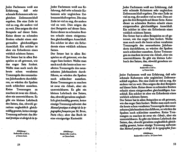
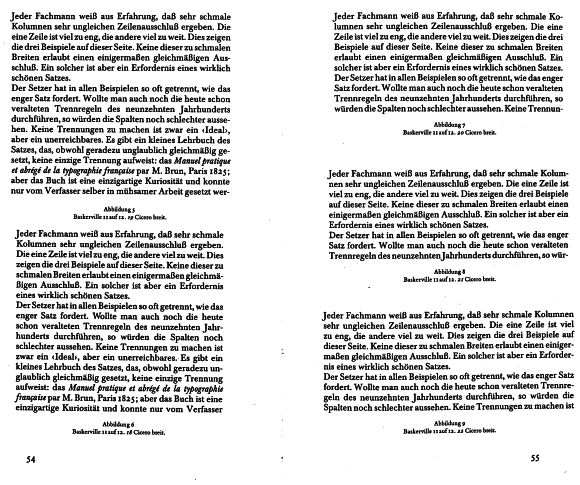
I found, scanned, and started translating the Tschichold essay I mentioned. It was first published in Switzerland, 1972, IIRC, and later on became part of the collection published by Brinkmann & Bose. As far as I know, there is no (official) English translation yet. It's only 2.5 pages long, plus lots of figures. Here is a first, rough translation of its central parts [I know, I should really get a De<->En typographic dictionary]...

cheers
Nils.

--------------8<-------------------------8<-------------------------8<---------------


Looking at figures 1 to 3, we could draw the conclusion that a wider measure will always yield a more even word spacing. This is only true in a very broad sense. My study will show that a width difference of a mere cicero can result in a major difference in word spacing.
Figures 4 to 6 use the same type size as figures 1 to 3, but the measure is wider. It's no surprise that the 16-cicero measure doesn't look perfect -- what is surprising, though, is the fact that even a 19-cicero measure does not yield even word spacing. Using an 18-cicero measure, the paragraph looks a lot better! So in this typeface (and in the German language!), an 18-cicero measure is better than a 19-cicero one.
Even 20 and 21 cicero (figures 7 and 8) are not much better than 19 cicero, which is even more surprising. It takes a 22-cicero measure to get a pleasant paragraph. We see that, for [11-point] Baskerville and the German language, 22 cicero is the \enquote*{best} measure.
In German language, that is! I remains to be seen if the same holds true for English or French. [...] And our results are only valid for Baskerville. A different typeface of the same optical size, using the same measure, will not always, or rather: will never yield an equally good result. [...] The whole issue is pretty complex, even mysterious, and depends on a number of factors. There will hardly ever be a definite, universal answer.

Figures 1 to 4: 11-point Baskerville; 8, 9, 14, and 16 cicero measure

Figures 5 to 9: 11-point Baskerville; 19, 18, 20, 21, and 22 cicero measure

@bowerbird

My thinking about scrolling pages/reflowable content has turned 180 degrees.

The iPad, with it's ability to "throw scroll" (I don't have a better word for it, anybody?) had a lot to do with that.
While there might be some content that lends itself to 'carding' pagination, there isn't much.
Users can and should be given control over the layout. But defaults still count for a lot.
The universal adoption of Zoom as the default size/resize mechanism has changed the game. Pixels aren't what they used to be.
Now, if you want a font size change you have to include the code for that within the page. That's a big change that has gone largely unremarked. My understanding is that Webkit even has a CSS property for turning off zoom. (Memory is failing me on the specifics.) And in that case, we are back to a fixed 'optical' size - if the author wants to saddle the user with that without options.
Bad idea, IMHO.
But min-width/max-width has some legitimacy, I think. As a starting point.

My eye doctor - a retinal specialist - is using iPads affixed to the wall for his eye testing charts. (Progressive dude, obviously.)

Mobile and the problems inherent in tiny screens are going to take awhile to sort out.
Authors and users alike are going to be climbing a learning curve that's going to go on for a long time to come. It's just beginning, really. And - as the old cliché has it - we ain't seen nothin' yet!

(BTW - I was in LA for SOTA conf but time constraints made a side trip impossible. And other personal stuff diverted my attention. See if you can come to New Orleans this year.)

Rich

It would seem to me that 18 ciceros are not in general "better" for German than 19 ciceros, it's just that, by accident, the large words in the specific text example used happened, coincidentally, to fit better in 18 ciceros. Had the long words fallen in slightly different locations, 19 ciceros might have been an accidental sweet spot.

I am surprised that an acclaimed and hence competent typographer would fail to realize this. I can only conclude that his background is entirely artistic and aesthetic, and he isn't familiar with such matters as the behavior of statistics as the sample size becomes smaller.

lindenhayn said tschichold said:
> an 18-cicero measure is better than a 19-cicero one.
> Even 20 and 21 cicero (figures 7 and 8) are not much
> better than 19 cicero, which is even more surprising.
> It takes a 22-cicero measure to get a pleasant paragraph.
> We see that, for [11-point] Baskerville and the German language,
> 22 cicero is the {best} measure. In German language, that is!
> I remains to be seen if the same holds true for English or French.
> [...] And our results are only valid for Baskerville.
> A different typeface of the same optical size, using the same measure,
> will not always, or rather: will never yield an equally good result. [...]
> The whole issue is pretty complex, even mysterious, and depends on a
> number of factors. There will hardly ever be a definite, universal answer.

quadibloc said:
> it's just that, by accident, the large words
> in the specific text example used happened,
> coincidentally, to fit better

johndberry said:
> My own experience is that the ideal line length
> varies from writer to writer. Once I imitated exactly
> the page specs of a book designed by David Bullen
> for North Point Press, because I thought it would be
> appropriate to the book I was designing; but with
> a different author who used his words differently,
> it turned out to give me quite a lot of loose lines –
> entirely unlike the effect in the North Point book.
> Same typeface, same point size, same leading,
> very likely much the same spacing and hyphenation;
> different effect.

dilworth said:
> Spiekerman's Stop Stealing Sheep and Learn how Type works
> "The lines should be long enough to get thoughts in"

so...

...are we starting to get the picture yet?

let me throw in some heresy for y'all to attack...

given that the pagesize is fixed, and the measure is fixed,
sometimes the best thing to do is change the typesize of
a specific paragraph, as little as 5-hundredths of a point,
to get a more esthetic paragraph-wrap... discuss _that_!

-bowerbird

p.s. no, your eyes cannot tell, and neither can anyone else's...

Thus spake quadibloc:
> the large words in the specific text example used
> happened, coincidentally, to fit better in 18 ciceros

I can't find a word in Tschichold's examples that I would consider large -- by German standards. There's a couple of things I like about German, but its compound words are definitely not among them...

»These things are not words, they are alphabetical processions. [...] Of course when one of these grand mountain ranges goes stretching across the printed page, it adorns and ennobles that literary landscape -- but at the same time it is a great distress to the new student, for it blocks up his way; he cannot crawl under it, or climb over it, or tunnel through it. So he resorts to the dictionary for help, but there is no help there. The dictionary must draw the line somewhere -- so it leaves this sort of words out. And it is right, because these long things are hardly legitimate words, but are rather combinations of words, and the inventor of them ought to have been killed.« (Mark Twain)

The reason Tschichold's study is (probably) obsolete today is the fact that today we have Knuth's paragraph breaking and Zapf's font expansion algorithm...

What is the optimal line length when reading text?
Bob Bailey, Ph.D., Chief Scientist for HFI

http://www.gieger.com/research/optimal_line_length.pdf

Wow, Steve, that is hardly even close to agreement and far from conclusive! Does that qualify as good science in Bob Bailey's book?

The data varies all over the place.
What good is inches on a screen? They could at least use pixels and define a resolution.
User preference is thrown out but not examined?

Perplexed and disillusioned.

.

You're right Chris. I guess the point in posting the PDF was that rules are not fixed, and there are so many variables, even depending on the era. I guess the point that "longer line lengths require greater lateral eye movements" is sort of obvious, but not often couched that way.

From my reading, it seems that the current, "usually" agreed upon maximum line length is seven inches, regardless of characters per inch, font size, number of words, etc.

Or maybe it should be measured in degrees of lateral eye movement.

Ain't no way I would tolerate a seven inch line length without getting whiplash. 3.5 seems a fair amount to me, depending on the particulars of course.

richard said:
> the amazing thing is that -
> as long as users agree to be 'test pilots'
> - such feedback can be obtained with trivial code.

i went and dug this up, back from may of 2007:

> http://z-m-l.com/go/doublebreak12.html

i have a 23-inch monitor, so i don't know
what this might look like on other screens,
but along the bottom are links that will
bump the pointsize to a specific value,
anywhere from 4-point to 18-point...
(19-point and 20-point are available too,
if you enter the u.r.l. in the address-box.)

of course, the browser's zoom also makes
a difference, as will browser window-size.

you'll notice on the left the lines are broken
consistently (as per the original p-book),
while on the right the lines are rewrapped...

if you're interested, i have other sandboxes.

-bowerbird

p.s. i maintain that a 2-up facing-page display
will work nicely for any person on any monitor.
size the type to your preference, and tell me if
you think i'm wrong. (or if you think i'm right.)

Nils, you read my mind. I was going to ask if it was available in English. Thank you for translating it.

And to everyone, thanks for continuing to contribute. And the discussion is interesting too.

gosh, i hate to be the glass-half-empty guy, but
i was just about to post a question asking where
is there a community that _would_ be interested
in dialogs of this type? does anyone know of one?

where people want to do experiments, collect data?

where is today's young hermann zapf hanging out?

-bowerbird

@Tiffany: To what end are you gathering this information?

Mr. Bowerbird. Am I wrongly interpreting your words or are you just a negative person? What is wrong with collecting a little research?

Christopher, I can't tell you right now, but I promise when it is finished I will share a link here.

tiffany said:
> Am I wrongly interpreting your words

there is no wrong way to interpret a rorschach blot.

> or are you just a negative person?

you understand what it means to interpret a rorschach blot, right?

> What is wrong with collecting a little research?

i'm all in favor of research. and dialog and discussion.
and collecting data, and testing hypotheses, _and_
just spouting opinions at the drop of a hat as well.

that's why i asked if anyone knows where all of that
is being done in regard to topics similar to this one.
because i would like to go there.

-bowerbird

ok, well, i wanted to see if anybody else would bring this up...

but i guess not...

here's a link for y'all:
> http://www.alistapart.com/articles/a-simpler-page/

the guy gets a lot of stuff wrong. a lot. wrong wrong wrong.

but you might find his distinction about 3 reading "ranges"
to be interesting, at least from the standpoint of this thread.

they are bed (near), knee (medium), and breakfast (far),
each with different settings for margins, font-size, etc.

i think the labels are superfluous, and suggest that we
_not_ think that we can make decisions on things like
margins and font-size for people, but rather instead
give them the ability to control those things themselves.

but there you have the reference...

and here's another one...

several e-book viewer-programs out there today offer
a "multi-column" option. a.d.e. (adobe digital editions)
_forces_ the feature on you, whether you want it or not.

the kindle, at least, lets you decide for yourself if you
want multiple columns, but if you toggle that feature on,
_it_ makes all the decisions regarding the feature itself.

the decision as to how many columns (1 or 2 or more)
is made by considering the font-size and window-size,
so somebody has already made concrete decisions on
the very variables which you are discussing here, so it
might be useful to you to go and visit those decisions...

and if you think you have anything meaningful to contribute
to the people who have made those decisions on such topics,
then you might want to engage them in conversation. or not.

-bowerbird

p.s. as for my input, i think their line-lengths are too long.
but personally, i want to control font-size and line-length
_for_myself_, and not have somebody else decide it for me.

but personally, i want to control […] line-length

I wouldn’t have guessed it ;-)

Obviously, on an e-book reader, it would be crazy for it to behave like some web sites do, and allow books to have characteristics that make them very awkward to read - like page formats that require you to scroll back and forth when reading each line, unless one chooses to display the page at an unreadably small size.

But making the book's text able to dynamically reflow creates the problem that formatting is very restricted. A good page markup language might be able to support all the features of a conventional book, even "when starting after a drop cap, do the first line in all capitals, the second line in small caps, and then go to lower and upper case; oh, and do the first paragraph as one column, and the rest of the text in two columns in smaller type". But then what about books that use type graphically, that do anything original or unconventional?

Or reading PDFs that are made up of page images of old books? Maybe there, what is needed is a map of how the text is on the page, so that two-column pages will automatically jog over when reading by repeatedly pressing the page down button.

riccardo said:
> I wouldn’t have guessed it ;-)

the thing is, i've found that most people agree with me,
in that they would rather control a variable than be
subjected to the state of having someone else control it.

so, for example, i bet you, riccardo, would rather
control your line-lengths than have me control them.

and as i said, it's extendable to a general principle:
people usually prefer to control things that affect them.

-bowerbird

quadibloc said:
> Obviously, on an e-book reader, it would be crazy for it
> to behave like some web sites do, and allow books to have
> characteristics that make them very awkward to read -
> like page formats that require you to scroll back and forth
> when reading each line, unless one chooses to
> display the page at an unreadably small size.

.pdf was one of the earliest e-book formats, and yes,
if you create a .pdf at 8.5*11, with 1-inch margins, and
use 12-point type, and your end-user displays it on
some e-book hardware, you'll get exactly that situation.

which made people cry out for a "reflowable" format...

so we've developed beyond the _most_ primitive state.

you might want to look at two programs in particular,
both because of their widespread currency out there,
the kindle reader (which is available on most platforms)
and adobe digital editions (which is available on many).

these programs are only about 3 steps ahead of you and
your "obviously we don't want this kind of thing" stage,
when they _should_ be more like 33 steps ahead of that,
but they _are_ 3 steps ahead, so go get yourself caught up.

> even "when starting after a drop cap, do the first line
> in all capitals, the second line in small caps, and then
> go to lower and upper case; oh, and do the first paragraph
> as one column, and the rest of the text in two columns
> in smaller type".

i believe the mentality these days, and for a good time to come,
is that this kind of request would be filed in the bin that has the
big sign above it reading "ornamental", with the even-bigger sign
above that, which says "eschew".

there would just be so many situations where that _didn't_ work
that the only way you could install something like that would be
to make it a user-option. but then you have to face the hard fact
that even though this is the type of thing that gives typographers
wet dreams, the reaction it would pull from an end-user would be
more along the lines of an irritated and puzzled look that asked the
rhetorical question "why would i ever need something like _that_?"

moreover, even if you wanted to present it as a user option, how
would you go about _presenting_ that option for their perusal?

this is, indeed, the question that's often the most pressing one...
it's usually quite easy to program a function to pull off a feature,
even one like the one described right above. but what is often
_extremely_ difficult is the development of an intuitive interface
to let an unsophisticated user understand and specify the option.

> But then what about books that use type graphically,
> that do anything original or unconventional?

an e-book viewer-program is an app that displays an e-book...

to save our time and energy, we often want to create a single app
that will display any and all books that use the same file-format...
for the most part, these apps must, by definition, be "conventional",
because they will (to some extent) treat all the books the same way.

but for a book that is unconventional, you just build a one-off app.

> Or reading PDFs that are made up of page images of old books?

you answered your own question there. .pdf is a great format for
a fixed-page book, which is just what a bunch of scans would be...

> Maybe there, what is needed is a map of how the text is on
> the page, so that two-column pages will automatically jog over
> when reading by repeatedly pressing the page down button.

i'm not sure i understand the preoccupation with two-column pages.

but yes, you can layer in the text _behind_ the scan on a .pdf page,
which makes the .pdf _searchable_, in a way that pure-scans are not
(since the scan is just a _picture_ of the text, and not the text itself).
this is what is done at octavo.com, which is a product of john warnock,
who is the guy who cofounded adobe and invented the .pdf format...

or you can take another approach, and _replicate_ the paper-book
in electronic form, with a "cloning" that creates an _exact_reprint_...

for examples of this, see the "digital reprints" from jose menendez:

> http://www.ibiblio.org/ebooks/Mabie/Books_Culture.pdf
> http://www.ibiblio.org/ebooks/Cather/Antonia/Antonia.pdf
> http://www.ibiblio.org/ebooks/Einstein/Einstein_Relativity.pdf

again, these are .pdf e-books which clone the paper-book...

(the einstein book is especially fun, because jose has inserted
corrections to some mistakes made by the original publisher.)

one interesting thing you should know about the "reprints" is
a click on any page-number (in mabie and einstein) summons
the _scan_ of that page -- from google -- for your reference,
with the .pdf page side-by-side with the scan in your browser,

this means there is a very tight coupling between the versions.

it also means you can verify the two versions are highly similar
(right down to the end-line hyphenated words being retained),
and if you pull up a few pages you'll see for yourself it is true,
except, of course, the .pdf doesn't have any "broken type", or
crooked pages, or pictures of the scanner's thumb in a corner.

the problem with jose's e-books are that we only have them
in the .pdf format, so it's not possible for us to "remix" them,
by -- for instance -- editing them, or creating another .pdf
that has a different pagesize, or font, or leading, or margins...

-bowerbird

so, for example, i bet you, riccardo, would rather
control your line-lengths than have me control them.

Well, yes. In fact, your hard-returns prevent me to control them! ;-)

riccaro said:
> your hard-returns prevent me to control them! ;-)

precisely! downright irritating, ain't it? ;+)

-bowerbird

p.s. but you will find that you cannot control the
line-length on this site anyway. you can't even
modify the column-width of the major column.
if you size the window smaller than the column,
you get a horizontal scroll-bar. really! just try.
a horizontal scroll-bar! i kid you not. unbelievable.
there should be a law against a design that needs
a horizontal scroll-bar. it's a crime against nature.
indeed, unless you're a c.s.s. expert, you probably
cannot even tell me what line in what file you would
have to change in order to change the column width.
we made a _very_ bad mistake when we allowed the
technocrats (bureaucrats who want technology to be
as convoluted and difficult as possible) to run the show.
we should have cut their hands off instead. seriously...

But we digress: in a printed book I can adjust the distance. In a browser I could zoom text only until the reflow gave me my optimal size/lenght ratio (that is, if the text isn't chopped ;-).
But nowadays the trend seems toward zooming the entire page and not just text. So we're back at scrolls.

riccardo said:
> in a printed book I can adjust the distance.

and?... that doesn't change the line-length...

> In a browser I could zoom text only
> until the reflow gave me my optimal size/lenght ratio

if/when the column-width is defined in ems,
as it appears to be defined on this very page,
zooming the text won't change the line-length.
(if we define "line-length" in terms of characters.)
try it on this very page. you'll see that the sentences
have linebreaks in almost or exactly the same places...

> (that is, if the text isn't chopped ;-).

that's a rather large caveat right there... :+)

> But nowadays the trend seems toward
> zooming the entire page and not just text.
> So we're back at scrolls.

horizontal scrolls. a.k.a. crimes against nature. :+)

-bowerbird

I certainly hate having to pan across the page.

I have not come across a study that investigates the influence of lining compared to old-style figures on human performance. There has however been extensive research involving how people look at numerals in math problems. If you are interested in some further reading see:

Terry, P. W. (1921). The reading problem in arithmetic. The Journal of Experimental Psychology, 12(7), 365–377.

Sadly, this paper did not look at comprehension, but a well written and fun read none the less.

While it could be argued that old-style figures are superior to ranging figures for the same reason that lowercase is superior to all-caps, I don't think the strong modern preference for ranging figures can be overcome.

After all, people don't try to read and comprehend long masses of digits. An individual number stands out more clearly from the surrounding text, and is thus more quickly recognizable as a number, if it is in ranging figures. In many places where numbers are used, uniformity is expected, and a clear distinction between numbers and lowercase letters is needed in algebraic formulae.

Of course, sometimes, digits are mixed with capital letters. In that case, oldstyle figures would be more distinct, but at least, since capital letters tend to have square corners, and digits tend to be rounded, and narrower than capital letters, and so the weakness in this area is limited.

i think those last two posts are in the wrong thread.

-bowerbird

i said:
> is there a community that _would_ be interested
> in dialogs of this type? does anyone know of one?
> where people want to do experiments, collect data?
> where is today's young hermann zapf hanging out?

well, here's one place...

http://explorationsintypography.com/

-bowerbird

it's funny. i thought typographers would have
all kinds of thoughts on these issues, and that
it would be a good thing to come talk with you
and get your input, so i could do a better job
with the e-book programs that i am creating...

but you guys got nothin'... absolutely nothin'...

-bowerbird

One point raised above that I didn't completely address, because I see it was raised by someone writing about an individual author with a polysyllabic style, before we came to Jan Tschihold's book, is the question of other factors.

I was looking at the question of the ideal line length in the context I thought it was initially raised - what is best for the reader, if it can be achieved. That a shorter line is harder for the printer to hyphenate is his problem, and so if a particular writer, or a particular language, makes it harder to break lines so as to achieve even spacing... that affects the ease of achieving the ideal, not what the ideal is.

But the narrow columns occasionally used when text is wrapped around images, or in some newspapers, are indeed criticized as too narrow specifically because horrendous spacing is occasionally needed. Assuming hyphenation is possible, though, this sets in at widths line one alphabet, or 3/4 alphabets, significantly below 1 1/2 alphabets.

German may have very long words in it, but it doesn't have very long syllables.

@bowerbird:
It's not clear what the typographers here (of which I am not one) could have written which would have been useful in relation to the issue which you raised.

The question of whether text in E-books should flow or not relates to their fundamental design. And so debating that issue can hardly provide hits on how someone preparing an E-book for use on a specific platform could do a better job.

quadibloc said:
> The question of whether text in E-books
> should flow or not relates to their fundamental design.

that's not the question.

but there isn't enough interest here to
pick apart the issues for analysis, so
i'll just let it rest.

in closing, i give you this:

that's a screen-shot.

i appended that as digital text, with the numbers at the end of the line giving
the number of characters in that line. do you think these lines are optimal?
if not, tough, because you're out of luck. you can't change them. just try...

-bowerbird

I was looking at the question of the ideal line length in the context I thought it was 86
initially raised - what is best for the reader, if it can be achieved. That a shorter line is 93
harder for the printer to hyphenate is his problem, and so if a particular writer, or a 87
particular language, makes it harder to break lines so as to achieve even spacing... that 89
affects the ease of achieving the ideal, not what the ideal is.

But the narrow columns occasionally used when text is wrapped around images, or in 82
some newspapers, are indeed criticized as too narrow specifically because horrendous 86
spacing is occasionally needed. Assuming hyphenation is possible, though, this sets in 88
at widths line one alphabet, or 3/4 alphabets, significantly below 1 1/2 alphabets.

@bowerbird:
Thank you for the reminder that the shoemaker's wife is doing without good shoes. It certainly is true that this very forum is displayed using a web format that fixes the layout... and fixes it at a line width which is wider than considered good practice, to boot.

What is the point of a web design that preserves one's typographic style in its pristine purity for the viewer, when that style is not particularly good?

quadibloc said:
> the shoemaker's wife is doing without good shoes.

i only wish that that was the case, and that
_she_ was the only one who was suffering...

what is really happening is the whole darn town
is now going without having _any_ shoes at all...

and you shoemakers are huddled in the corner,
autistic, refusing to engage with anyone at all...

adobe digital editions? awful reading experience.
kindle apps? awful reading experience.
web-browsers? awful reading experience.
ibooks? awful reading experience.

even tools like readability and instapaper
-- specifically designed to overcome the
obstacles thrown up by the other places --
have a raft of problems.

the shoemakers should be ashamed, but
autistic people rarely make much sense...

it's a good thing that humans are flexible,
and can walk even without having shoes...

-bowerbird

Ah. It is not this web site, but the whole world that is suffering?

Yes, it is not just this web site. But books printed on paper are still what the vast majority of the world's people use to read. E-books are a toy for the rich, who can afford to pay new hardcover prices for a lousy reading experience.

Fixing the problem, though, isn't up to typographers. They haven't got the power to tell Apple how it should make the iPad work. I suppose the typographers could offer some sort of polite, respectful advice to the programmers, who could then produce better designs for their employers. But typographers can't do miracles.

In this case, the miracle would be a display screen that fits in your pocket, and which is 8 1/2" by 11" in size. Maybe e-book readers already let people use landscape mode, though; that would clearly help a little.

Why, I've just had a creative idea that could improve Adobe Reader, at least. How about being able to choose a size smaller than "fit width", but which which pages down to the top of the next page when that is possible without missing text, even if it means moving down a bit less than a whole screen?

Even small mercies like that would be helpful.

When there is a device that folds into a shirt pocket, folds out to A4 and has a resolution of 50 dots per millimetre (a bit over 1200dpi)...

A bloke can always dream, you know.

@Té: Readius eInk mobile device. We’re getting there. You might also be interested in Sony’s flexible display.

Oh, I am interested, no worries. I do find e-papers and OLEDs to be geekasm devices, after all.

quadiblock said:
> Ah. It is not this web site, but
> the whole world that is suffering?

you make it sound so dramatic. but, well, yes,
the world-wide-web is what i am talking about.

> But books printed on paper are still what the
> vast majority of the world's people use to read

more people read more off screens all the time,
and less off paper, and the trend lines are _stark_,
so the outcome is known, and totally unmistakeable.

and i would question the mode of the "majority"
-- most certainly the "vast majority" -- even now.

_especially_ if we include _china_ in the equation...

(because, you do know, china is a part of the world,
and they have a lot of people there. and their leaders
looked at the situation, and realized that there weren't
enough trees in the world to print all the textbooks that
would be needed to educate all their children, and then
set out to become the world's leader in electronic-books,
an accomplishment which they have _already_ attained.)

> I suppose the typographers could offer some sort of
> polite, respectful advice to the programmers, who
> could then produce better designs for their employers.

those programmers are often criticized because they
haven't consulted typographers and book-designers,
to soak up the hard-won lessons of the past 500 years.

but i have been here, trying to talk to you typographers,
for 2 years now, and none of you have anything to say...

even every once in a while, when a juicy topic like this
happens to surface, none of you do very much with it,
and you seem not to notice what is right underneath
your noses, until i take a screenshot of it and post it...

i'm not asking any one person in particular to care,
i'm just remarking that in general, no one seems to.

***

flexible expanding screens are a long-running dream
that have been used to hoax many an investor, so
i would put those out of your consideration until they
actually start appearing, since when they finally _do_,
they will be unbelievably overpriced, just to pay off
all the investors that have been forced to stand in line.
it will be another 10-20 years after their first sightings
that they become cheap enough for the average person.

-bowerbird

I would like to come back to this discussion for a question on how as a layman would best deal with standard paper sizes, like A4 or US letter, if there are no guidelines given how a certain document need to look like.

I have some examples here for A4 where I tried to implement the ideas of letter and alphabet length per line. The leading I estimated myself.

A. 2 columns. Margins are on the side 1.6 cm on top 1.9 cm in the bottom 2.5 cm (= 1inch). Line length is around 50 letters. Text is set in 12/13.5.

B. 1 column. Margins outside: 4.7cm. Letters/kine: 63-70. Text: 12/13.75

Both A and B would fit the recommendations by Bringhurst.

The next two layouts don't:

C. Margins: 4.1cm. 71-79 letters/line. Text is set 12 to... don’t remember, 14.5 to 15.

D. “Standard margins”: 1 inch or 2.5 cm. 84-93 letters/line. Text is set 12 to... don’t remember, 14.5 to 15.25.

I am afraid that every other layout than variant D would just seem odd to a given random reader.

Variant D has longer lines than any of the recommendations I read here, as far as I understood them. Variant D would be closest to how most people would treat a page in a word processor.

What do you think? What would be an appropriate layout that would not look odd to a random reader. Thanks

I would like to come back to this discussion for a question on how as a layman would best deal with standard paper sizes, like A4 or US letter, if there are no guidelines given how a certain document need to look like.

I have some examples here for A4 where I tried to implement the ideas of letter and alphabet length per line. The leading I estimated myself.

A. 2 columns. Margins are on the side 1.6 cm on top 1.9 cm in the bottom 2.5 cm (= 1inch). Line length is around 50 letters. Text is set in 12/13.5.

B. 1 column. Margins outside: 4.7cm. Letters/kine: 63-70. Text: 12/13.75

Both A and B would fit the recommendations by Bringhurst.

The next two layouts don't:

C. Margins: 4.1cm. 71-79 letters/line. Text is set 12 to... don’t remember, 14.5 to 15.

D. “Standard margins”: 1 inch or 2.5 cm. 84-93 letters/line. Text is set 12 to... don’t remember, 14.5 to 15.25.

I am afraid that every other layout than variant D would just seem odd to a given random reader.

Variant D has longer lines than any of the recommendations I read here, as far as I understood them. Variant D would be closest to how most people would treat a page in a word processor.

Variant A has very small margins already. The line length would be in a good range. The general layout might be unexpected though for a ‘random office document’. With US-Letter the margins here could be bigger. I did not want to increase the margins more, as I thought the line length would be then too short.

What do you think? What would be an appropriate layout that would not look odd to a random reader. Thanks

P.S.: Typeface is Cycles Eleven, although I don't think it matters here. I am looking for recommendations suiting any serif typeface that is not as condensed as Times, any classical text face.

there's a reason books aren't usually printed at a4/u.s.-letter size.
use 5*8 as your pagesize, and print 2-up pagespreads in landscape.
you'll also find that that size works much better as a .pdf onscreen.

-bowerbird

I came across a comment in a fairly heated discussion about 'ideals' in typography on a blog post.

People look at 55 +- 10 as desirable because they believe it looks less assuming, and they think they can read it faster.

What people think isn’t always in line with the truth though…

In reality, people read longer line lengths faster, thus making longer line lengths more optimal.

The trick is, you must start an article with a shorter line length so you get people to start reading your stuff. Then, you widen your content out so they can continue reading it as fast as possible.

(You might think people will stop reading, but copywriters have long known that once you get people to read the first few sentences, they’re more likely to finish what they started).

Here Derek presents some evidence from studies that conclude longer line lengths are actually quicker to read,

“Line length has also been found to affect reading rate on screen (Duchnicky & Kolers, 1983; Dyson & Kipping, 1998). Both studies, although using different display technologies, found that longer line lengths (about 75 and 100 characters per line, respectively), were read faster than very short lines.”

“Reading time was converted to words per minute. Results from a one-way within subjects ANOVA showed that there was a significant main effect of line length on reading speed, F (3, 57) = 3.45, p = .02, η2 = .15. The 95 cpl (M = 178.82, SD = 41.83) articles were read significantly faster than any of the other line lengths (35 cpl M = 167.21, SD = 33.66; 55 cpl M = 167.38, SD = 33.96 ; 75 cpl M = 169.44, SD = 33.48) (Figure 1).”

“Youngman and Scharff (1999) used 12-point type and found that with no margins, when compared with 4 and 6 inch line lengths. Again, an 8-inch line length elicited the fastest overall reading speed. users preferred the 4-inch.”

Thoughts, Typophiles?

Good or bad, I’m really excited to see some new blood throwing it down about science and type.

Thanks, can you give links? Generally speaking, typographers view the range of good line measure as dependent on vertical spacing, word spacing, and type face. The margins and how many columns are also a factor. The rule of thumb is two and a half lc alphabets for single column text, so in other words roughly 65 average characters. This is both in Bringhurst's and Felici's guides to typography.

As I've recently found, the work of Luckiesh in the late '30s adds additional variables to reading speed as important, particularly, fatigue as measured by increase in blink rate. In his tests readers were less fatigued by shorter lines than the standard recommendation. So there may be a conflict between speed and ease of reading. Luckiesh also distinguished between natural, unhurried rate, and maximal rate. Again, these may point different directions as far as line length. Most work since Luckiesh has not been as revealing on these issues, as they tend to not include and control for enough important variables. (My and Peter Enneson's brief account of Luckiesh's work is here on Typophile, and in the recent issue of Printing History.)

Optimal line length depends on layout.

Longer line lengths are slower if they increase the possibility of going astray between lines.

If there is more leading, or paragraphs with fewer lines, that likelihood decreases.

A page layout of really long lines, separated into three-line paragraphs, would, I predict, read very quickly.

In particular, the reader would pick up considerable speed along the straights, before going into the hairpins.

Page-width decks of 100+ characters, three or four lines deep, are quite manageable.

Captured from web.archive.org on 21 Sep 2019. view this capture