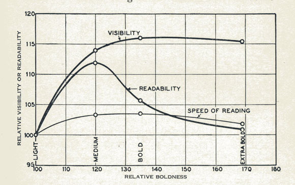
In my talk at TypeCon last Friday I outlined some of the history on readability. The basic thing I found out is that the notion of readability as ease of reading was introduced by Matthew Luckiesh, who did a series of scientific tests on readability, with the aid of Linotype, in the late 1930s. His ideas are explained in his book with Frank Moss, Reading as a Visual Task (1942).
The distinction I believe entered into the English of designers through the influence of people from Linotype.
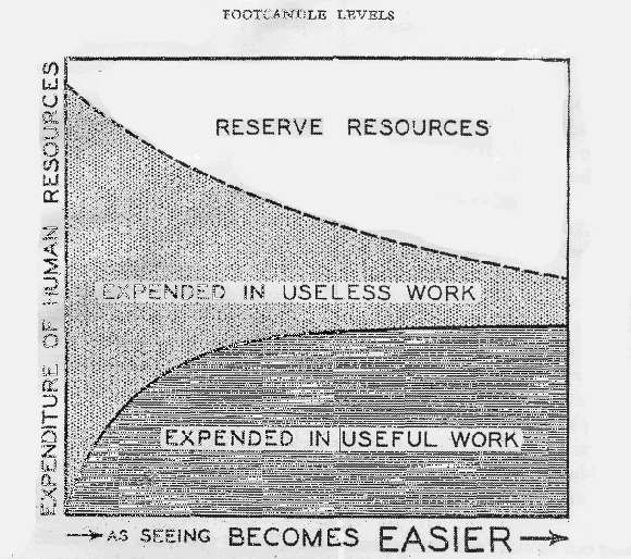
The key thing to understand about the distinction is that "readability" is not a measure of performance, such as speed or comprehension, but rather of the psycho-physical costs of performance. In other words, "readability" refers to the effort required for reading, or the fatigue produced by reading.
Luckiesh measured reading fatigue a numbers of ways, but the most sensitive of these was by increase in spontaneous blink rate. Blink rate is suppressed for the task of reading, but that suppression breaks down increasingly as time passes, and for less readable material.
Blink rate as a measure of reading fatigue was attacked by researcher Miles Tinker, and as a result Luckiesh's work was largely lost.However, a 1994 review of the dispute by fatigue researcher John Stern concluded that Luckiesh and Moss were right all along.
The most important lesson of Luckiesh's work is, I believe, that to scientifically understand what typography is best for reading under what situations requires more than one measure, and these different measures at times come into conflict with one another.
There is a lot more to be said, and I hope that Luckiesh's work will now become part of the discourse of both designers and researchers. Those interested can get an initial taste in my article that has just appeared in the July 2011 issue of Printing History.
ps. I'm starting this as a new thread instead of continuing this one.