I have very specific questions about some glyphs from the font I'm developing. Any help is highly welcome.
.
Question 1: New Sheqel.
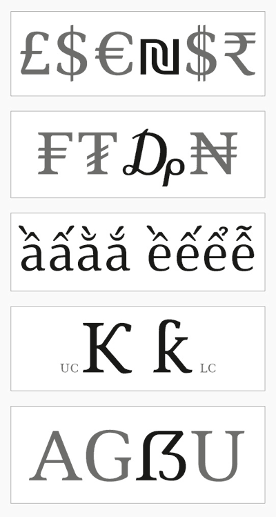
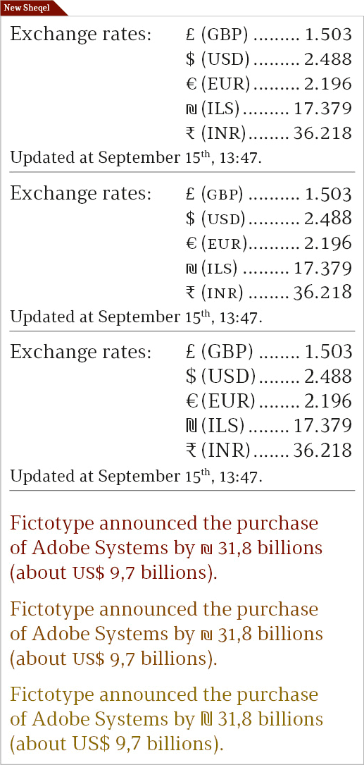
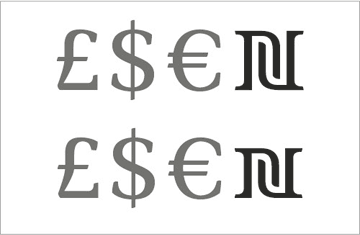
Which must be the height for Israeli's New Sheqel in a Latin script? I see New Sheqel is quite small in Times New Roman, a font with Hebrew script. But it follows general currency height in Greta Text, a font without Hebrew script. I believe the height must align to Hebrew glyphs if they are present, but it can align with Dollar, Euro and others symbols when Latin alphabet is used. Is this supposion true?
.
Question 2: Drachma.
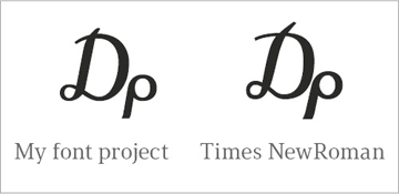
Drachma symbol is calligraphic and very similar in most fonts. In my project, I did some small changes to achieve a result coherent with font general approach –and also use the same angle of italic style. This small redesign is allowed according to Greek standards?
.
Question 3: Vietnamese circumflex+grave.
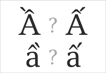
In Vietnamese, the combined accent circumflex+grave uses grave at right or left? I found both ways in various fonts, but it seems that to put grave at left is better.
.
Question 4: K hook.
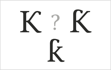
K with upper hook is used in some African languages. For uppercase K, there are fonts with the hook at the stem and others with it at the upper leg. Any idea about the correct/best choice?
.
Question 5: German Sharp S.
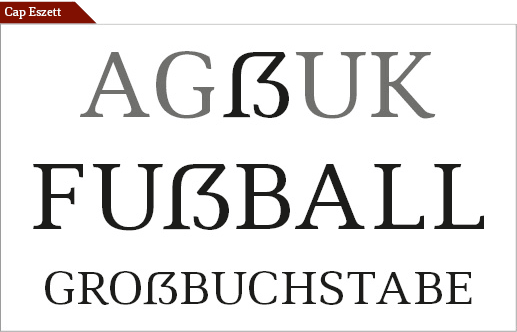
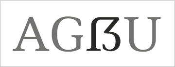
Actually, two questions here. First: is the sample below a good design to German sharp S? Second: German sharp S as a single glyph uses Unicode 1E9E, while SS digraph uses 00DF. Is a good idea to adopt an OpenType substitution from Uni00DF to Uni1E9E when German language is in use?
.