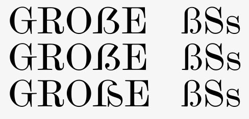
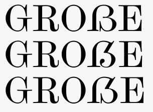
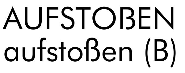
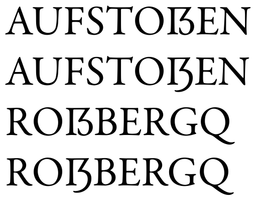
Andreas Stötzner and the German DIN committee submitted a proposal to the ISO 10646 working group that uppercase ß (germandbls, Eszett, sharp s) should be added to Unicode/ISO 10646.
U+1E9E is the envisioned codepoint.
The proposal can be viewed at:
http://std.dkuug.dk/jtc1/sc2/wg2/docs/N3227.pdf
It is important to note that according to the proposal, even after adding this character to Unicode, the standard uppercase mapping for "ß" will remain "SS". This encoding effort is not about changing existing application or even spelling rules -- it is simply an effort to encode a character to be used in an "alternate" spelling which some people use (and currently have problems with properly encoding the text). It is an observed fact that "uppercase ß" exists, even if the official rules don't envision it.
I believe it is an interesting effort, and it would be reasonable to discuss what the best possible shape for the new character would be.
Some links in German:
http://www.signographie.de/cms/signa_9.htm (published by Andreas Stötzner, I recommend reviewing all the PDFs published there.)
http://de.wikipedia.org/wiki/Versal-Eszett
Some German type designers posted some of their design proposals for an uppercase ß at:
http://www.typeforum.de/modules.php?op=modload&name=XForum&file=viewthre...
I find many of these design proposals structurally flawed -- they don’t look like uppercase letters. They look like lowercase letters enlarged to match uppercase. The graphical structure of the Roman uppercase is very different from lowercase. If one were to invent a new uppercase letter, it would have to stylistically match the Roman uppercase. If Unicode really decides to encode uppercase ß, type designers should imagine what the uppercase ß would have looked from the very beginning, rather than trying to work out of the existing lowercase ß form.
Note that the history of "ß" is somewhat surprising. The letter developed in a two-wise way: as a ligation of long s and round ("normal") s, and as a ligation of long s and z. The German language adopted unified spelling rules only in 1901. Before that, both in the middle ages and in the humanist period, German spelling differed much. For example, "Thor" and "Tor" were equal variants of spelling the word meaning "gate".
Sharp s was denoted by different writers differently (as ſs or ſz, which looked like ſʒ). The graphical shape of the ß ligature developed independently in these two ways.
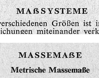
This dichotomy still shows itself in a small minority practice of uppercasing ß as "SZ" rather than "SS". Incidentally, this practice is understandable for most German readers (though not actively practiced), i.e. "GROSZSTADT" or "MASZGEBLICH" is understandable as the uppercasing of Großstadt or maßgeblich.
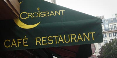
See http://www.flickr.com/photos/adamt/490566363/ for an example.
One interesting issue is that in the 1996 spelling reform the status of ß as a single letter has been finally confirmed. In the previous spelling, the general rule was that short vowels are denoted by following them by doubled consonant letters while long vowels are followed by single consonant letters. So writing "met" always indicates a long "e:" while "mett" indicates a short "e".
In case of "s"/"ß", it was confusing. Following a vowel with a single "s" always denoted a long vowel, following a vowel with a doubled "ss" indicated a short vowel, but following a vowel with "ß" did not give clue whether the vowel was short or long. So "Ruß" was actually pronounced "ru:s" as if the "ß" stood for a single consonant letter, but "Nuß" was pronounced "nus" as if the "ß" stood for a doubled consonant letter.
The 1996 spelling removed this uncertainty by changing the spelling of all "ß" into "ss" when the preceding vowel was to be pronounced short. Today’s spelling of "Nuss" or "dass" underlines that the vowels are to be pronounced short.
The uppercasing of "ß" as "SS" but also as "SZ" defeats this clear rule. If I uppercase the word "Rußpartikel" into "RUSSPARTIKEL" or even "RUSZPARTIKEL", suddenly the natural way of pronouncing the "U" changes from short to long, so the reader is confused. The confusion is even bigger now, after the reform, because the special "undefined" treatment of "ß" no longer exists, so readers are used to "ß" being always treated as a single consonant letter, not as a ligature of a doubled consonant.
To remain logical, consistent and reader-friendly, "ß" needs (at some point) to assume a single graphemic shape in the uppercase.
I strongly feel that uppercasing "ß" as "SS" is now -- especially under the new rules -- a temporary anachronism. "ß" is a single CHARACTER (as per orthographic perception). It has functionally liberated itself from its historical background (which was a ligature of ſs or ſz).
Today, "ß" is no more a ligature of "ſs" than "ä" is a ligature of "ae". The transition process from "ae" to "ä" has been completed about 200 years ago, and the transition process between "ſs" to "ß" is happening now. Encoding the uppercase "ä" as "A ZWJ E" (or something like that) would make as little sense as encoding the uppercase "ß" as "S ZWJ S".
I believe that "SS" is an anachronic, still-in-use but slowly-to-vanish poor man’s solution to write the uppercase "ß". I believe that it should be an exciting task for type designers now to come up with a new form. In my opinion, this issue is definitely not one that is completely solved. We’re in the middle of a slow transition period for "ß". The 1996 reform started it and showed the direction.
I myself once had the idea that Scedilla (U+015E, Ş) would be most appropriate for denoting uppercase ß.
After all, Ş is historically an S with a subscribed z (that at this time looked like ʒ). Since ß is a ligature of either ſs or of ſʒ, uppercasing it as Sʒ, or, effectively, Ş, would historically make sense.
Using this notation, "Gauß" or "Roßberg" would be uppercased to "GAUŞ" or "ROŞBERG".
Similarly, the umlaut in "ä" or "ö" is historically a superscripted "e", so historically "ä" and "æ" are two different ligations of "ae", and "ö" and "œ" are two different ligations of "oe".
Since German readers are currently used to uppercasing ß as SS, i.e. they write "GAUSS" or "ROSSBERG", I even thought of a compromise: the SS remains doubled but for added distinctiveness, a subscribed z (i.e. a cedilla) is added after the first S. In other words, "Gauß" or "Roßberg" should be uppercased as "GAUŞS" or "ROŞSBERG".
Historically, this would make sense. The cedilla would here have a similar function to the trema in Spanish or French: "GAUŞS" would make clear that it comes from "Gauß" while "GAUSS" would make clear that it comes from "Gauss".
"ROŞSBERG" does not look very awkward to a German reader. The addition of a diacritic does not dramatically change the reading pattern but still adds a distinctive mark that is, indeed, needed. If I were to design a glyph that should go into U+1E9E, it would probably look like ŞS, or perhaps just SS, depending on the style of the typeface.
An alternative approach is to look at the existing uppercase-to-lowercase relations within the Latin alphabet and try to derive a shape for the uppercase ß which maintains the same relations.
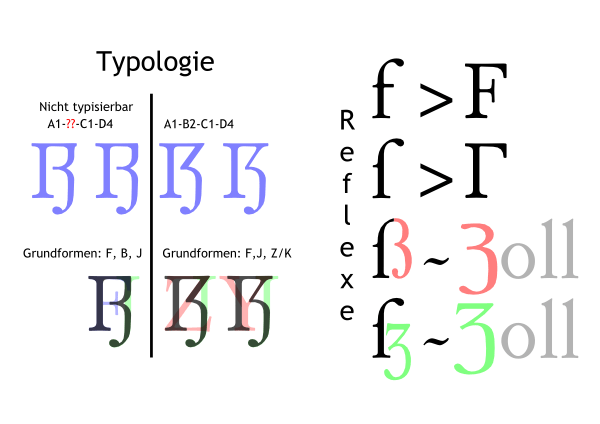
In most of the middle ages and the period up until the 19th century, the long s ("ſ") and "f" were closely related, "f" being simply a "ſ" with a stroke going through. The same, very primitive graphic relation exists between the prototypic shapes of the Greek letters gamma (Γ) and digamma (Ϝ). Since the minuscule "f" always has been a "ſ" with a middle stroke, then the capital "F" might also be considered an uppercase "ſ" with a stroke going through. Of course an uppercase long s never existed, but this relation may be helpful when constructing the uppercase ß.
Because I think that *if* the Latin alphabet ever used or needed another capital S, the preferred shape could be that of a gamma (Γ). This is a simple, effective shape that maintains a stylistic relation to the lowercase long s that is typical of other uppercase-to-lowercase relations.
If we look at the relations between Aa Ee Ff Mm Pp, we will notice that sharp, edgy connections in the uppercase are related to more smooth, round connections in the lowercase. If "F" developed into "f" in a cursive hand, then it is very easy to imagine that a cursive rendition of the "Γ" shape might, indeed, look very much like "ſ".
This is an important observation when thinking about the shape of an uppercase "ß": I assert that the shape of uppercase "ß" must be "edgier" than the lowercase. In short, I think that the left part of uppercase ß should be "Γ".
What about the right part? Here, I would call to exploit the double origin of "ß", which developed paralelly as a ligature of "ſs" as well as of "ſz" (where the "z" historically used the "ʒ" shape, so "ſʒ").
These days, the lowercase "ß" is typically derived from the ligated form of "ſs". For visual dissimilation purposes -- to strongly set apart the lowercase and the (new) uppercase "ß" I would derive the uppercase "ß" from a ligation of the hypothetical uppercase "ſ" (i.e. "Γ") and the shape of "the other" origin of "ß", i.e. of the historical "Z" shape.
In short, I believe that the best graphical rendition of an uppercase "ß" would be be a well-designed ligature that incorporates these shapes: "ΓƷ"
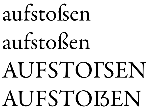
I have made a small simulation using Garamond Premier (please excuse my poor drawing abilities):

http://www.twardoch.com/tmp/germandbls_garamond.png
The first line shows what the historical origin of ß looks like, i.e. long s followed by a round s. The second line shows the current shape of ß as we know it. The third line shows what a hypothetical uppercase long S might look like ("Γ"), which is just a mental exercise. The fourth line is my proposal for the uppercase ß shape.
Andreas Stötzner has proposed an elaborate document that tries to explore all possible combinations of drawing an uppercase ß:
http://www.signographie.de/cms/upload/pdf/Signa9_Kombinatorik_SZ_3.0.pdf
My proposal corresponds to the scheme A1-B2-C1, which I has the most "uppercase" appearance of all those presented there.
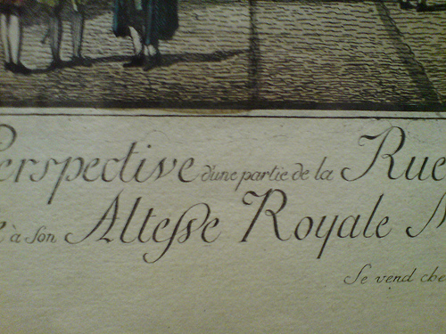
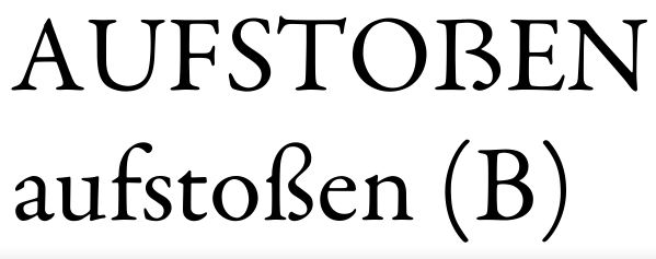
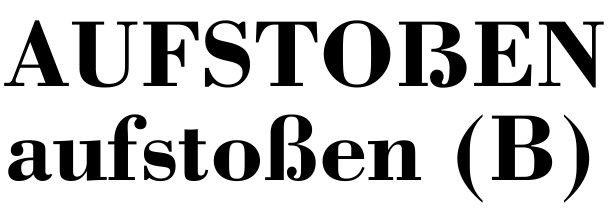
On a related matter, at the exhibition "Neue Baukunst. Berlin um 1800", which is on display at the Alte Nationalgalerie in Berlin until May 28, I have discovered a fantastic calligraphic lowercase "ß" shape, in which the "long s" part connects to the BOTTOM and not to the top of the following "short s". Please take a look:

http://www.flickr.com/photos/adamt/490547406/
This got my imagination going.
Regards,
Adam