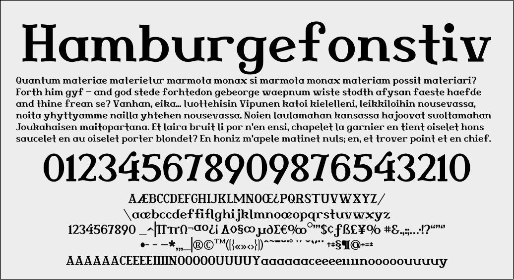
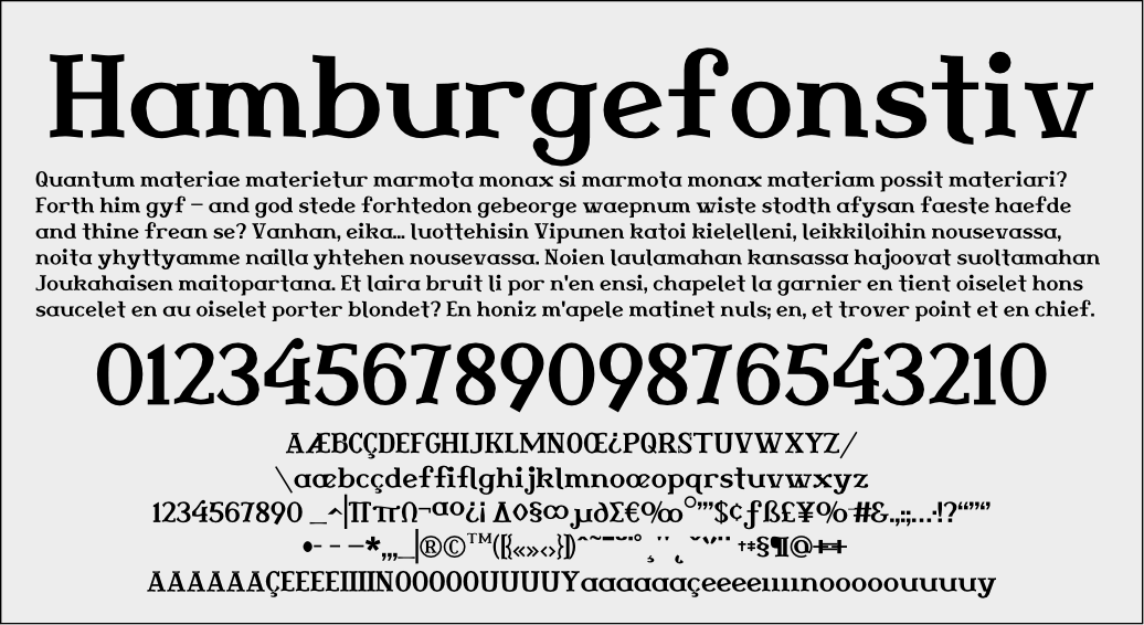
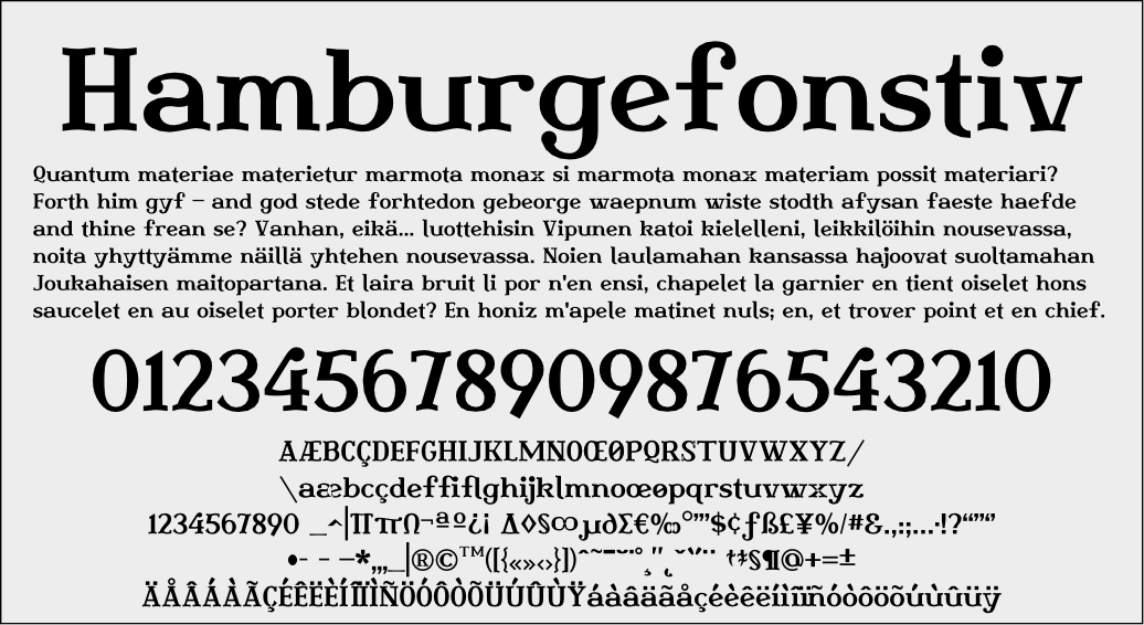
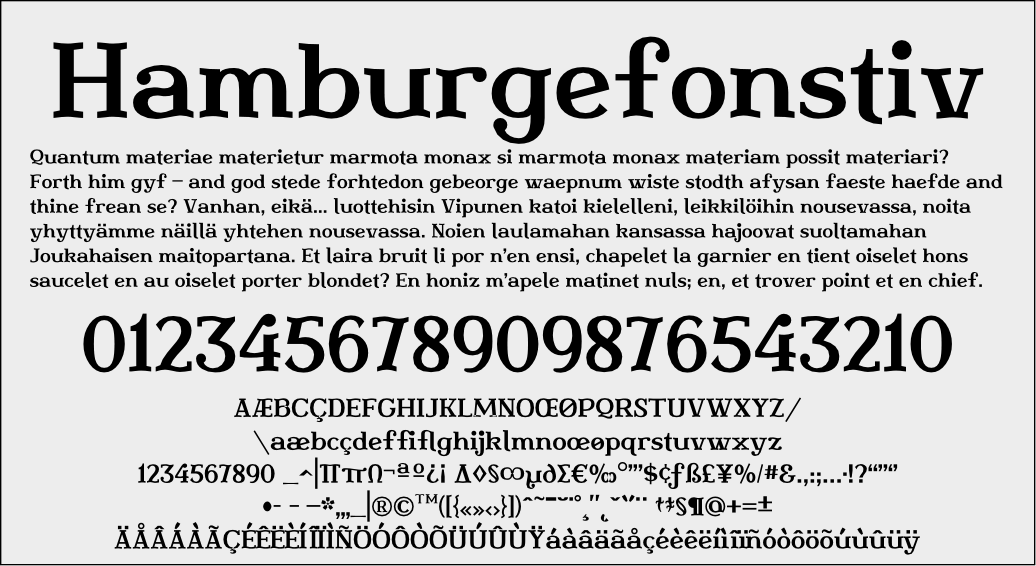
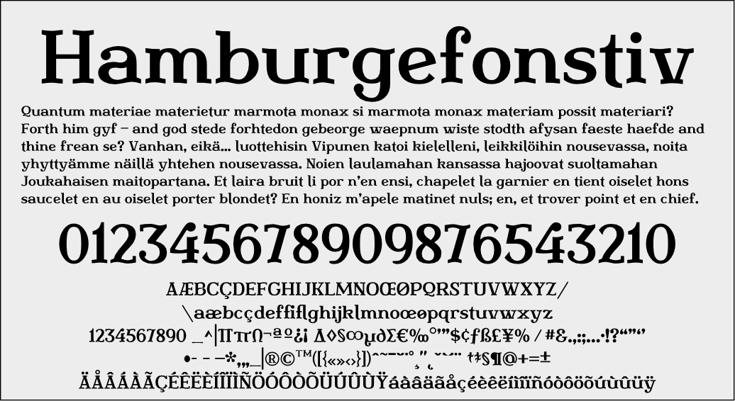
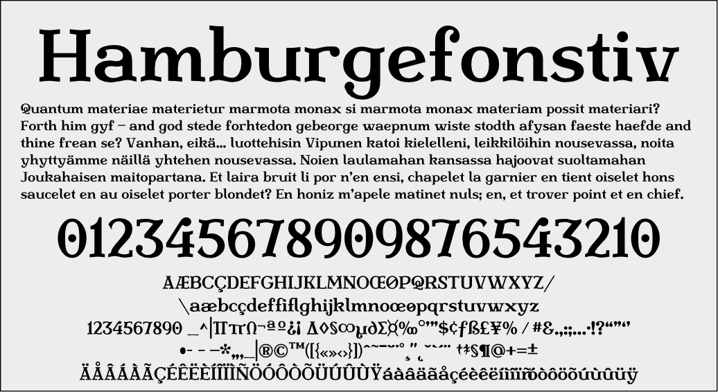
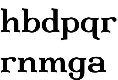
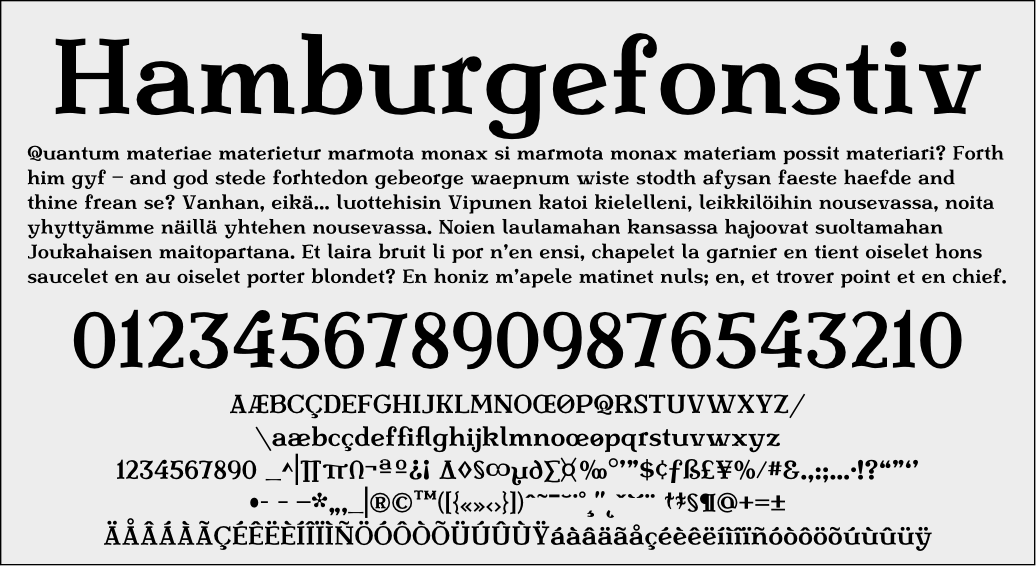
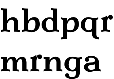
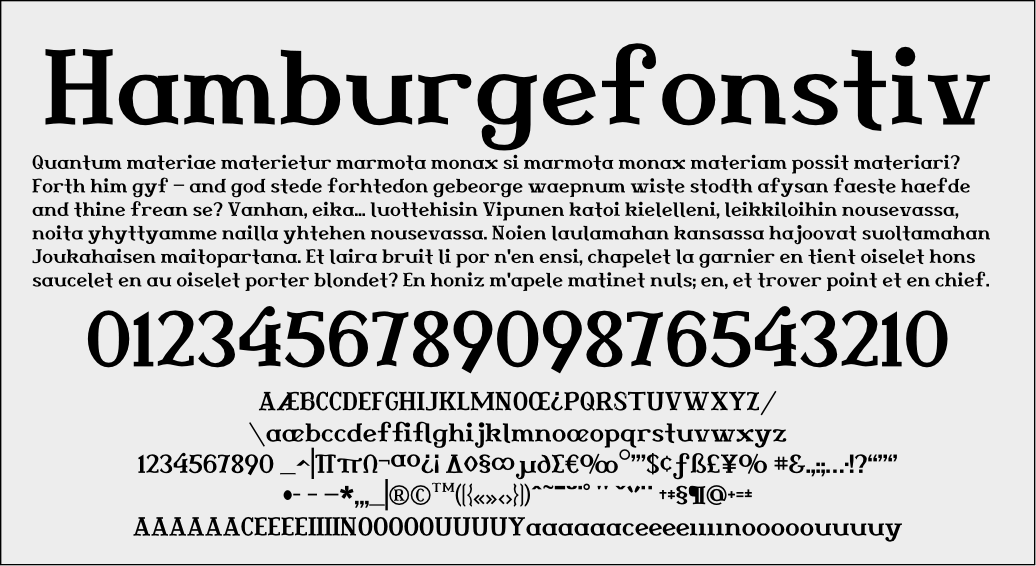
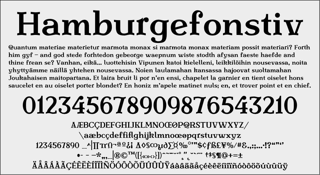
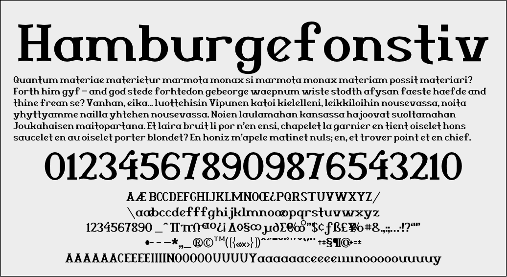
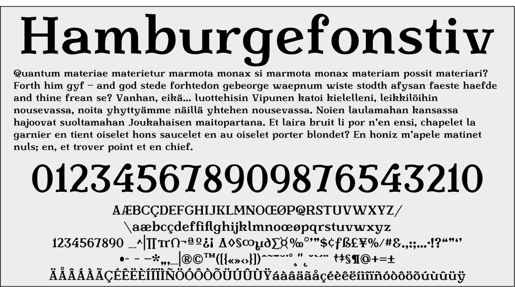
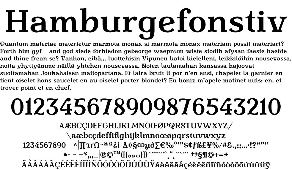
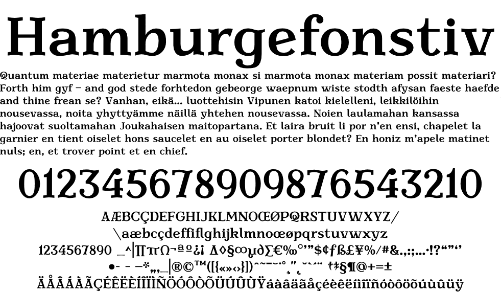
edit: For those of you joining the thread in progress, the most recent PDF files are at the bottom of the list of attached files in this starting post. They all have version numbers, in case you lose track. I'm keeping the earlier ones around for historical documentation of the project, but you should feel free to skip ahead to the most recent PDFs and come back to the old files at your leisure.
--JP, 4-18-07
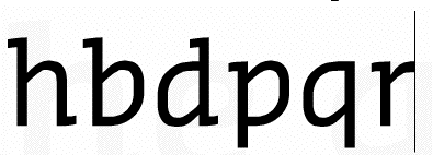
edit: This project has come a long way since I started sharing it with the community here. As it nears completion, at least in this weight and style, I need just a little more advice to turn that last corner. Eben Sorkin has been an immense help, far greater than I have a right to expect from any one person who I am not paying. The constructive advice of other experts (and I know you're hiding around here somewhere) would be greatly appreciated.
—JP, 2-14-07
----------
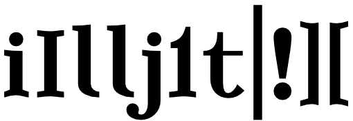
Here is yet another project I abandoned long ago. I'm trying to retrace my steps to how I created it and why I gave it that name. It looks more like a slightly circusy wood type with some modern attributes than anything Macedonian.
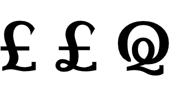
Indeed, it needs a lot of work yet. My initial output is what Fontographer expells as an EPS of all characters, which for some reason breaks some of the points apart so I can't apply a fill without tediously fixing everything.
I welcome any and all suggestions and comments, including on finding a new, more appropriately evocative name for the thing.