Hey all,
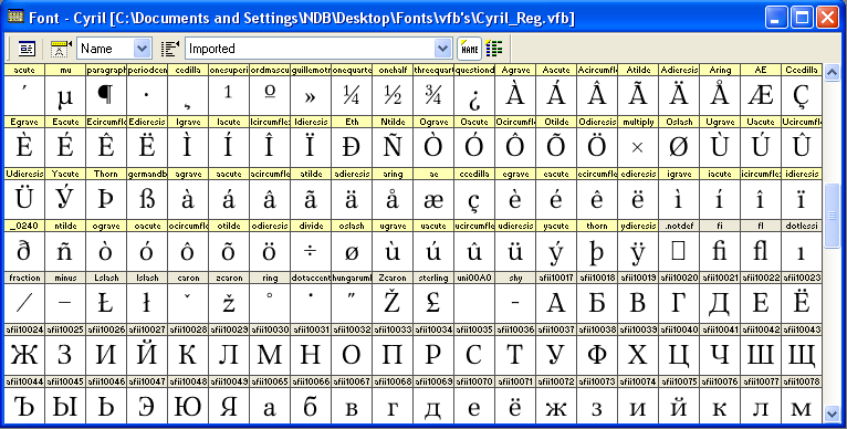
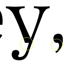
I'm a recently-registered member, and I'm 16 years old, and I have a font of my own. It's called Cyril. The original inspiration came when I was browsing through letters for some reason and the Russian ka really grabbed my attention. I sketched out a font on looseleaf paper around it (this has become how I sketch out all my designs). After a while I realized what I'd drawn was much too bold, so I drew another one, refining it a lot on the way. Then I penned it in and used a trial version of Font Creator 5.0 to digitize it. That took a long time, and if there's anything else you know of that I can get on a limited budget I'd really welcome suggestions. In fact the trial period ran out on it just after I finished most of the letters in an italic I drew up to go with it, but not much of the punctuation or any numbers, so that's somewhat incomplete and I can't finish it. I can't figure out how to re-download the trial version, either, so I can't do much of anything. But I'd like to see how what I have meets with others, so I'm putting it up for critique.
(Let's hope I can figure out how to upload this right.)
| Attachment | Size |
|---|---|
| Cyril1.pdf | 105.86 KB |
| Cyrilit1.pdf | 99.87 KB |
| Sampil.pdf | 23.4 KB |
| Sampil2.pdf | 17.58 KB |
| Sampil3.pdf | 20.06 KB |
| Sampil4.pdf | 28.16 KB |
| Sampil5.pdf | 74.64 KB |
| Sampil7.pdf | 80.07 KB |