
This shows some of the rendering errors resulting from overlapping shapes thai I haven't yet unified. Please try to ignore those. Aside from that, this thing has problems I can't put my finger on. Please help.
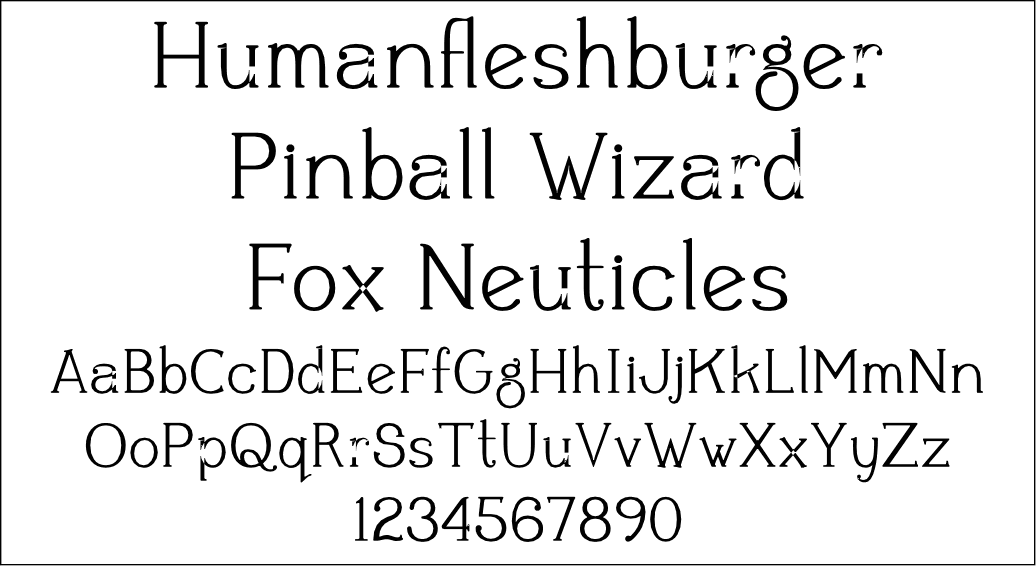
This shows some of the rendering errors resulting from overlapping shapes thai I haven't yet unified. Please try to ignore those. Aside from that, this thing has problems I can't put my finger on. Please help.

Well, the S has the weight in the wrong place--should usually thicken in the center. Check out other s's for examples. Also, the top right curves on the m and n taper oddly. Curves should be thickest at the sides and thinnest at top, if you are going for a vertical stress--your zero has it right. In general the letters need to be more consistent with each other.
Underware has a good tutorial on letter design
Also the wiki has some good links
http://typophile.com/wiki/Drawing_How-To
http://typophile.com/wiki/How-To
Eron

This reminds me of stuff by Divide By Zero. It's kind of quirky and fun. I agree with Eron about the 'S' and 's'. I don't mind the 'm' and 'n' - I think they fit the character of the font well.
Overall, there's a lot of problems with contrast. Some glyphs ('7', '0', 'O') have a lot of contrast, while some ('X', 'x', 'M') have little to no contrast. Some glyphs have weight issues as well - the '2' and 'Z' seem kind of fat.
I think your best shape is the 'g'. Try to get the other characters to be more consistent with it and each other.
- Lex
You really think so, Lex? I wasn't really satisfied with the "g" myself. It doesn't seem to have much relation to the other characters as they do to each other, at least as I see it.
I've made the suggested changes to the "S" and "s", but I'll wait until morning to post another image. I have a few other fonts I'm working on that I'd like to get some feedback on too. Thanks for your help.
Dang, I'd almost forgotten about this. I really should get back to it. Agamemnon is almost done (but it sure does look like I stole the a from this one), I think. Perhaps it is time to turn my attention back to this one, you think?

That 2 has eaten something heavy & it's collecting at the base... I have issues with the lc c - it doesn't belong here for some reason.
Indeed, the c has the same weird nose that the e does.

The top terminal of the 's' and also that of the 'r' get a bit thin, maybe. The dot of the 'i' could be placed a bit more upward, I think. The 'j' as well of course.
I think the 'n' in itself is ok, but maybe a bit wide, when compared to the other glyphs. It has a very large space between the two strokes. I like the 'q' and the 'x' a lot. The capitals might be a bit too geometric? They lack the.. freedom of the lc, if you know what I mean. They are much more 'serious'.
A pet peeve I have with many fonts is the tendency of the "r" and "n", with tight kerning, slight over-inking, or even a modestly blurry monitor display, to combine to form what looks like an "m". I try to design those three letters with enough mutual distinction so that will not happen.
You may be right that I went a bit overboard with the "n" in this case, though.
Yeah, I understand. I usually like it too when those characters are all individually drawn, instead of being chopped up versions of each other.
I've finally come back to look at this too, and I see a total load of crap! I don't think it can be saved.
In the two years since I started this I have learned a lot, much at the guidance of all you good folks on this forum, and I have a much better eye for knowing something wrong when I see it, but I still have something to be desired when it comes to setting things right. To get what I set out to do here, a simple light serifed text face, I think I'll have to start from scratch.

I'd say this one is more savable than the other, but more because I guess because I see potential uses for this font more than the other. Take a break from Agamemnon and see what you can do with this. When you rework this for a bit, it'll clear your mind and give you renewed vigor for Agamemnon.
Especialy if you add swash variants to this one, it could be a great display font.
«El futuro es una línea tan fina que apenas nos damos cuenta de pintarla nosotros mismos». (La Luz Oscura, por Javier Guerrero)
You really like this one? The proportions look all over the place to me. I tried tweaking it around a while ago and gave up in frustration.
What would you use something like this for?
If it weren't for the fl lig the top two lines look fine to me in the sample.
You'll kill me for saying it, but it's a very sorority-esque font. Would also work well I'd think with cards and products for things like baby showers and wedding showers or anything else you'd find at a shop for women (decorating and stuff I mean not that kind of women's shop! haha)
«El futuro es una línea tan fina que apenas nos damos cuenta de pintarla nosotros mismos». (La Luz Oscura, por Javier Guerrero)
Ligatures on this were decidedly premature, absolutely.
To market this as a feminine products font, wouldn't it need a more feminine name? I'm terrible about coming up with things like that. Even the word "bridal" just makes me think of horses.
Captured from commoncrawl.org on 27 Apr 2015. original URL