Typophile

Helvetica oblique - Helvetica bugs for ever

Uli Stiehl0 votes

One of the most striking peculiarities of font users is the fact that most font users do not care about the most elementary quality requirements of fonts.

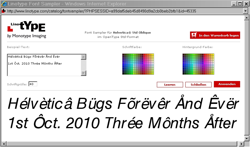
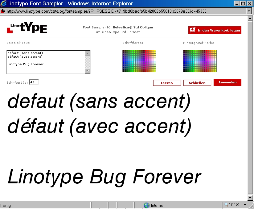
Have a look at this picture:

www.sanskritweb.net/temporary/Helvetica-oblique.gif

Although Helvetica oblique has been available in all PostScript printers for more than 25 years and therefore is one of the most often used fonts, no font user ever noticed nor cared that the accented and non-accented letters have different side bearings with the consequence that Helvetica oblique is unusable for quality composition in languages with accented letters, e.g. French, German, etc.

A font user may be compared with a person who does not notice nor care that the black string on his left shoe differs from the white string on his right shoe.

Uli, aren't you making the mistake of equating font users in general with those who use a particular cut of a particular typeface?
In the days when I used Helvetica, I always used the Neue version. I suspect that most "quality" compositors would do the same.

> Uli, aren't you making the mistake of equating font users in general...

No.

If Typophile users cared about the most elementary quality requirements of fonts, at least some of them would disapprove of what is depicted above. But nobody does.

If Typophile users cared about the most elementary quality requirements of fonts, at least some of them would disapprove of what is depicted above.

It’s untrue, that nobody cares about those bugs. But Linotype generally does not care as much about the technical quality of the fonts as many much smaller foundries, especially not about the technical quality of the old fonts.

If they are also available from Adobe and if they are really the same with regard to the number of glyphs (for example), which is not taken for granted, you should buy the Adobe versions. In case of Helvetica Oblique, available from Adobe, the side bearings are more consistent. The same is true for the hinting (in case of other fonts).

Adobe even provides bug histories of some (if not all) of their fonts. Every foundry should do that. A simple list with the status of bugs and the version of the font, in which a bug was fixed. This requires correct version numbers. Many foundries don’t seem to care much about correct version numbers.

Additionally I would expect to be informed per mail, when I licensed a font, for which an update is available. I think, this is also not a common practice.

@ Uli

If you agree in what I wrote above, you admit, that fonts are software.

> If you agree in what I wrote above, you admit, that fonts are software.

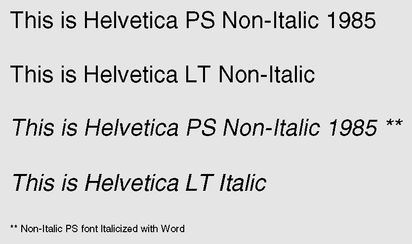
Even if fonts were "software" (I will not embark on this preposterous discussion here), it should be remembered that Helvetica oblique was identical with Helvetica Roman in 1985, when Adobe claimed to have "created" Helvetica oblique.

The slant was made by the word processor:

see www.sanskritweb.net/temporary/Helvetica-oblique2.gif

or by the printer driver or the distiller:

see www.sanskritweb.net/temporary/Helvetica-oblique3.gif

The "Side Bearing Feature" (SBF) was added later, when Linotype and Adobe "created" a "new" oblique version of Helvetica Roman thereby adding the SBF as a "Unique Selling Proposition" (UPS).

But nobody does.

If you are in business, it's not a good idea to criticize your competitors' products in a public forum.
You will probably have to rub shoulders with them at industry events.

And then there is the "glass houses" thing -- nobody puts out 100% perfect products all the time, and criticism is likely to come full circle.

As a font producer, the best thing is to set a high standard.

So the "Ban Comic Sans" initiatives will have to come from Typophile font users, rather than Typophile font makers.

But what can they do to remedy such snafus?
("Snafu" is a WWII-era acronym meaning "situation normal all f*cked up")
I suspect they realize that there is little they can do to change the system, certainly not be merely complaining individually about what everyone knows is not a "quality" font in the first place, so why bother?

If you want to change things, you have to organize and campaign, it's not enough just to bitch and whine, which will merely create a bad vibe and alienate potential allies.
If you don't want to change things, but just want to grandstand beating up on easy targets, because it makes you feel superior, well, that's the impression you give, and it's counterproductive to what you perhaps think you care about, because people will just dismiss you as a crazy hothead, and your cause along with you.

Although Helvetica oblique has been available in all PostScript printers for more than 25 years and therefore is one of the most often used fonts ...

No need to get all upset about this ... Originally (as in "25 years ago", though I have a feel that's a bit exaggerated), PostScript printers such as the lauded LaserWriter had precious little memory. And a very large part of it was desperately needed for full-page rasterizing, so its programmers came up with a couple of shortcuts. One of them was the "Helvetica Narrow" trick, which has haunted software writers ever since -- only recently, even Adobe's own InDesign. The other one was obliqueing Helvetica and Courier (which was even further humiliated by having its strokes thickened for a faux-bold version, and then double that for faux bold italics).
Since then, available memory has increased and computers became much faster. No need anymore to distort a perfectly good Helvetica.

Nick:

There are numerous technically flawed fonts. Therefore it would not be worth the trouble to mention the technical flaws, e.g. the wrong side bearings, of any technically flawed font.

But Helvetica is not ANY technically flawed font. Helvetica is the most widely used, the most widely bought and the most widely advertised sans serif font of the world.

Therefore, it should be expected that, among those innumerable Helvetica font buyers, there is at least ONE font buyer who noticed that Helvetica accent letters have wrong side bearings. But nobody of these dimwitted font buyers ever noticed this technical flaw of Helvetica.

Helvetica is also featured by special exhibitions. Therefore, it should be expected that at least ONE of these "font experts" who run Helvetica exhibitions, e.g.

www.helveticaforever.com/en/index.html

should have noticed that Helvetica accent letters have wrong side bearings. But nobody of these dimwitted "font experts" who run Helvetica exhibitions ever noticed this technical flaw of Helvetica.

Nick:

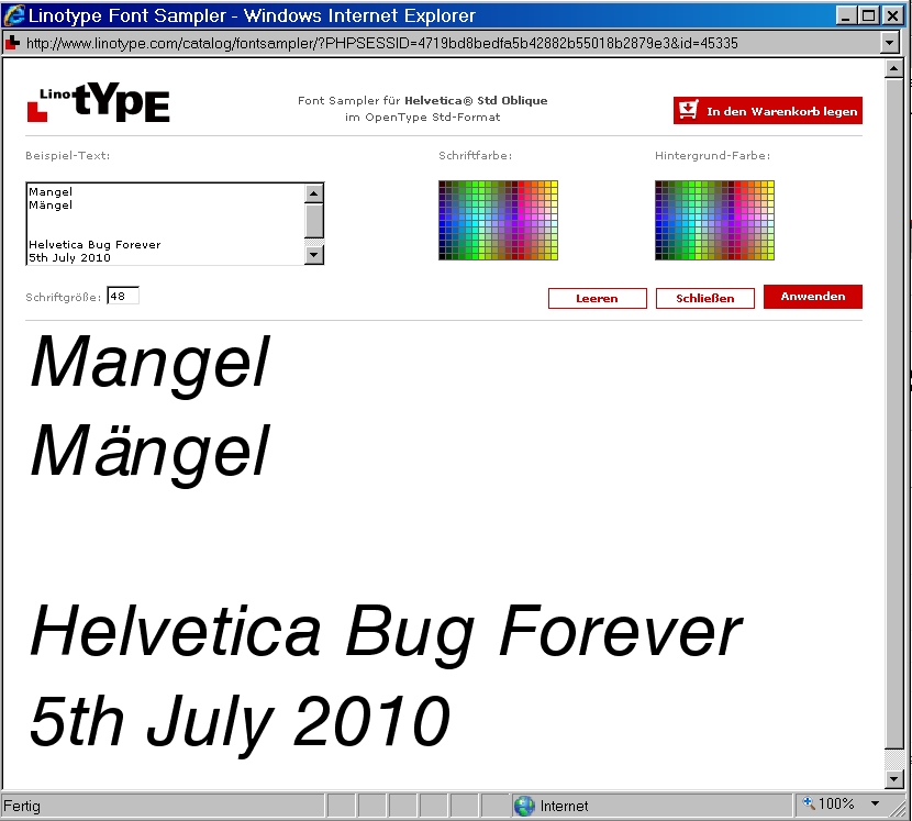
Have a look at this screenshot:

www.sanskritweb.net/temporary/Helvetica-oblique4.jpg

In Germany, "Mangel" (singular) denotes "bug" ("fault", "defect", etc.),
and "Mängel" (plural) denotes "bugs" ("faults", "defects", etc.).

If laymen compare "Ma" in "Mangel" with "Mä" in "Mängel", the side bearing bug is conspicuous even to bloody laymen, who know nothing about fonts.

But neither the font makers at Linotype nor the font makers at Adobe nor the many thousands of Helvetica font buyers ever noticed this conspicuous side bearing bug relating to all accented letters of Helvetica. That's why I say that font makers and font buyers are dimwits.

And here a screenshot of the Helvetica bug for French:

www.sanskritweb.net/temporary/Helvetica-oblique5.jpg

@ Uli

Although on the Adobe website the same bug is displayed, the sidebearing bugs are fixed in the Adobe OT versions of Helvetica Oblique.

> bugs are fixed in the Adobe OT versions

I know Adobe OT versions featuring the bugs

> on the Adobe website the same bug is displayed

WYSIWYG

@ Uli

WYSIWYG

In this case they have added the bug in a version later than 2.030 (FontFolio 11).

> they have added the bug in a version later than 2.030

The bug already existed before, e.g. in FontFolio 10, e.g.:

"Version 1.040;PS 001.000;Core 1.0.35;makeotf.lib1.5.4492"

But in the Adobe version 2.030 of Helvetica Oblique it is fixed. So y either don’t g, w y actually s, or they have refixed the bug.

In the Helvetica shipping with Mac OS I don't see a problem. Are you sure you are not to nervous about the whole thing? Maybe it is your browser? Try Firefox, works on every system. It seems like you use IE6, well it could be it doesn't handle the website correct, hm, couldn't it? Not everybody's web-tech got stuck at the evolutionary stage of your personal web-site. I wonder why you take this whole font (forging, piracy, bankruptcy stories) business so serious btw. (and why you feel the need to swear about font buyers), but that is nothing for anybody else to figure out.

Mac OS Helvetica:
Version ––– 6.1d18e1
Unique name ––– Helvetica Oblique; 6.1d18e1; 2009-06-29
Copyright ––– © 1990-2006 Apple Computer Inc. © 1981 Linotype AG © 1990-91 Type Solutions Inc.
Trademark ––– Helvetica is a registered trademark of Linotype AG

Screen from Linotype

I find it suspicious that you "care" so much about fonts and don't even activate clear-type...

> Maybe it is your browser?

No. It's because you selected OpenType Com for screen display.

- For OpenType Com, which retails at 58,31 €, the bug was removed.

- For OpenType Std, which retails at 34,51 €, the bug was not removed.

You must pay more than 50 bucks to get a non-bugged Linotype font.

That's why I say that font makers and font buyers are dimwits.

Except for Americans, British, Canadians, Australians, &c.
We've excised accents from out language, don'tcha know.
Which may explain this problem, if Anglophones were involved in production of said fonts, and not paying enough attention to "foreign" characters.

I think your remarks are offensive and non-constructive. Why moan on a forum like this about dimwits and bad bad foundries selling bad bad products for a too high price. No one is telling you to use Helvetica, and if others want to use it the way it comes that's up to them. Why insult them. Rather than moan you could try to improve the situation yourself, by contacting the foundry and sharing your observations and try to work with, rather than against them to make the fonts better. You don't have to approve with everything foundries do, but moaning about it here is hardly gonna make the situation any better. And insulting other users is nonsensical and pointless. Why waste your time?

When I discover a bug or an unexpected behaviour in a font (Yes, it happens. Not all the time, but every now and then – fonts are complex pieces of software after all), I directly contact the foundry. So far, my experience is very good. Type designers and distributors are very responsive, they appreciate user feedback. Usually, I receive an apology and fixed font files in no time. Try to find this level of support and service in other fields. No, I don’t use Helvetica Oblique.

According to my researches, Helvetica fonts with the bugs described above have been sold during the past eight to ten years by both Adobe and Linotype and by other font outlets (FontShop etc.). Considering that Helvetica is one of the most-often used fonts, innumerable persons and companies have bought these faulty Helvetica fonts.

A font user may be compared with a person who does not notice nor care that the black string on his left shoe differs from the white string on his right shoe.

It's more like the stitching not quite matching on a pair of shoes that are used rarely.

Like all software, fonts can have bugs so I think it's important to only buy from vendors who offer an upgrade path and a way to report bugs to someone who can fix them.

typodermic:

Frank W. (and formerly Bruno S.)

see www.sanskritweb.net/forgers/chevalier.htm

and other Linotype people regularly visit my font forgers website

see www.sanskritweb.net/forgers

And this Typophile forum is also regularly visited by Linotype people.
For instance, this thread about the defective Helvetica was visited yesterday at least twice by Frank W. and other Linotype people:

213.61.7.196 - - [05/Jul/2010:08:38:33 +0200] "GET /temporary/Helvetica-oblique4.jpg HTTP/1.1" 200 218863 "http://www.typophile.com/node/71858" "Mozilla/5.0 (Windows; U; Windows NT 5.1; de; rv:1.9.2.4) Gecko/20100611 Firefox/3.6.4 (.NET CLR 3.5.30729)" www.sanskritweb.net
213.61.7.196 - - [05/Jul/2010:08:38:57 +0200] "GET /temporary/Helvetica-oblique2.gif HTTP/1.1" 200 9490 "http://www.typophile.com/node/71858" "Mozilla/5.0 (Windows; U; Windows NT 5.1; de; rv:1.9.2.4) Gecko/20100611 Firefox/3.6.4 (.NET CLR 3.5.30729)" www.sanskritweb.net
213.61.7.196 - - [05/Jul/2010:08:39:13 +0200] "GET /temporary/Helvetica-oblique3.gif HTTP/1.1" 200 19328 "http://www.typophile.com/node/71858" "Mozilla/5.0 (Windows; U; Windows NT 5.1; de; rv:1.9.2.4) Gecko/20100611 Firefox/3.6.4 (.NET CLR 3.5.30729)" www.sanskritweb.net
213.61.7.196 - - [05/Jul/2010:08:39:19 +0200] "GET /temporary/Helvetica-oblique.gif HTTP/1.1" 200 29877 "http://www.typophile.com/node/71858" "Mozilla/5.0 (Windows; U; Windows NT 5.1; de; rv:1.9.2.4) Gecko/20100611 Firefox/3.6.4 (.NET CLR 3.5.30729)" www.sanskritweb.net
213.61.7.196 - - [05/Jul/2010:11:51:55 +0200] "GET /temporary/Helvetica-oblique.gif HTTP/1.1" 200 29877 "http://typophile.com/node/71858" "Mozilla/5.0 (Macintosh; U; Intel Mac OS X 10_6_3; de-de) AppleWebKit/533.16 (KHTML, like Gecko) Version/5.0 Safari/533.16" www.sanskritweb.net
213.61.7.196 - - [05/Jul/2010:11:54:16 +0200] "GET /temporary/Helvetica-oblique2.gif HTTP/1.1" 200 9490 "http://typophile.com/node/71858" "Mozilla/5.0 (Macintosh; U; Intel Mac OS X 10_6_3; de-de) AppleWebKit/533.16 (KHTML, like Gecko) Version/5.0 Safari/533.16" www.sanskritweb.net
213.61.7.196 - - [05/Jul/2010:11:54:38 +0200] "GET /temporary/Helvetica-oblique4.jpg HTTP/1.1" 200 218863 "http://typophile.com/node/71858" "Mozilla/5.0 (Macintosh; U; Intel Mac OS X 10_6_3; de-de) AppleWebKit/533.16 (KHTML, like Gecko) Version/5.0 Safari/533.16" www.sanskritweb.net
213.61.7.196 - - [05/Jul/2010:11:55:17 +0200] "GET /temporary/Helvetica-oblique5.jpg HTTP/1.1" 200 226145 "http://typophile.com/node/71858" "Mozilla/5.0 (Macintosh; U; Intel Mac OS X 10_6_3; de-de) AppleWebKit/533.16 (KHTML, like Gecko) Version/5.0 Safari/533.16" www.sanskritweb.net

inetnum: 213.61.7.192 - 213.61.7.207
descr: LINOTYPE LIBRARY GMBH
person: Bruno Steinert
address: LINOTYPE LIBRARY GMBH
address: DU PONT STR. 1
address: 61352 BAD HOMBURG

It is funny that Bruno S., who was dismissed a couple of years ago, is still mentioned as the person responsible for the Linotype outfit.

Now that it is known that Linotype has been selling a faulty Helvetica font during the past ten years to innumerable font buyers, Frank W., Bruno S. and other Linotype people should start to pay damages to all those innumerable font buyers, who received this faulty Helvetica font.

I guess you're just going to swing punches at anything that moves, huh? Enjoy your thread.

Paranoia is a hard thing to get rid of. Try to get some professional help. And remember: there are worse things than font piracy in this world, hunger, war, violence etc. Why not direct your unlimited energy somewhere where it would really help people.

Queneau:

> Paranoia

You should work in the Linotype sales department. Whenever Linotype customers complain about defective Linotype fonts, you tell them they suffer from paranoia or schizophrenia or alzheimer or, to use my word, from dimwittedness.

Ten years and one month after

One month ago, I described the so-called side-bearing font bugs contained in the OpenType version of the standard Helvetica font which has been sold during the past ten years to innumerable dimwits who waste money on defective Linotype fonts.

Frank Wildenberg regularly visits this Typophile website and also my own font forgers website. For instance, a few days ago, he re-visited my website concerning my documents about Bruno Steinert's greatest enemy, Harvey Hunt:

213.61.7.196 - - [19/Jul/2010:18:32:39 +0200] "GET /forgers/teipel.pdf HTTP/1.1" 200 91949 "http://www.google.com/search?hl=en&client=safari&rls=en&q=harvey+hunt +berthold&aq=0&aqi=g1&aql=&oq=harvey+hunt+bert&gs_rfai=" "Mozilla/5.0 (Macintosh; U; Intel Mac OS X 10_6_4; de-de) AppleWebKit/533.16 (KHTML, like Gecko) Version/5.0 Safari/533.16" www.sanskritweb.net
213.61.7.196 - - [19/Jul/2010:18:34:04 +0200] "GET /forgers/berthold.pdf HTTP/1.1" 200 713723 "http://www.google.com/search?hl=en&client=safari&rls=en&q=harvey+hunt +berthold&aq=0&aqi=g1&aql=&oq=harvey+hunt+bert&gs_rfai=" "Mozilla/5.0 (Macintosh; U; Intel Mac OS X 10_6_4; de-de) AppleWebKit/533.16 (KHTML, like Gecko) Version/5.0 Safari/533.16" www.sanskritweb.net

One moth ago, Frank Wildenberg also read this Typophile thread, but he did not care to remove the Helvetica bugs. Why should he bother to correct the defective Helvetica fonts? None of the dimwits, who buy Linotype fonts, ever noticed the technical defects of the Helvetica font or of any other defective Linotype fonts.

None of the dimwitted German font buyers,

see www.sanskritweb.net/temporary/Helvetica-oblique4.jpg

None of the dimwitted French font buyers,

see www.sanskritweb.net/temporary/Helvetica-oblique5.jpg

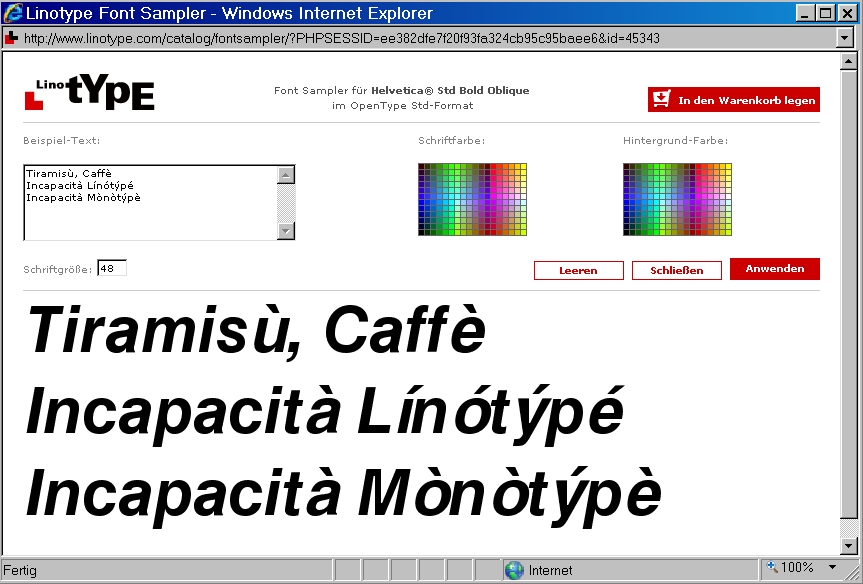
None of the dimwitted Italian font buyers,

see www.sanskritweb.net/temporary/Helvetica-oblique6.jpg

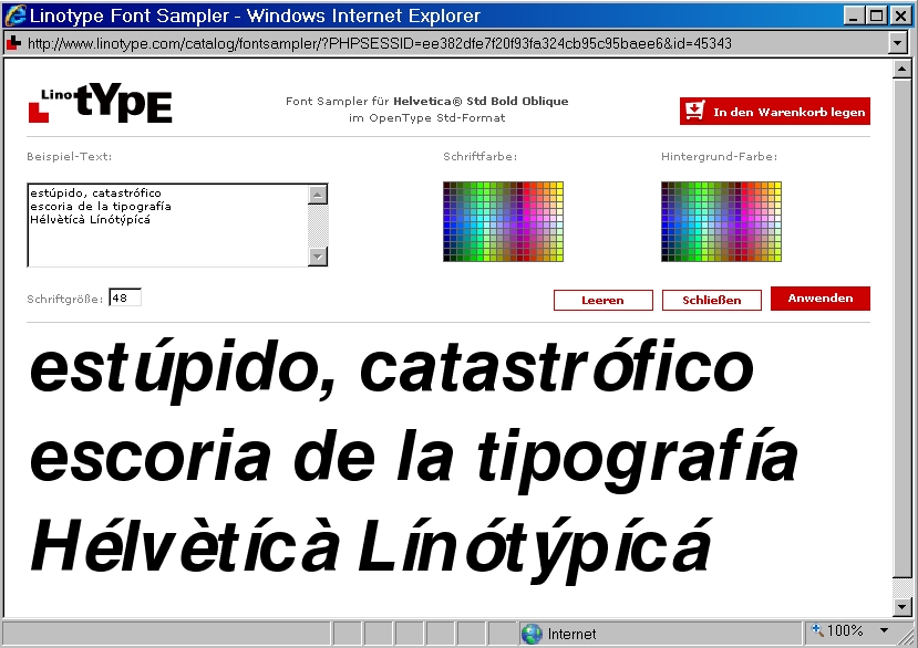
None of the dimwitted Spanish font buyers

see www.sanskritweb.net/temporary/Helvetica-oblique7.jpg

ever noticed that Linotype has been selling defective Helvetica OTF fonts during the past ten years. Therefore, neither Bruno Steinert nor Frank Wildenberg ever cared about removing these Helvetica bugs, because they know that the dimwits who buy Linotype fonts will never notice such Linotype font bugs.

Helvetica bugs for ever - Linotype bugs for ever

see www.sanskritweb.net/temporary/Helvetica-oblique8.jpg

A bug cannot be "removed from" a font. The font must be replaced, like a light bulb.

Cheers!

A bug cannot be "removed from" a font. The font must be replaced, like a light bulb.

I assume, that’s a joke.

A bug cannot be "removed from" a font. The font must be replaced, like a light bulb.

Haha, good one!
If they only where that cheap to buy... (but not to sell ;)

If you change the metrics so that accented letters are the same sidebearings as non, you may have better spacing for new work but will cause reflow problems of legacy documents created using the older fonts. Since no one buys Helvetica Oblique per se, and their are thousands of alternatives for anyone with a discerning enough eye to care, why would it be worth it to retrofit all those old fonts? The people who really care about good typography would just choose a different cut. Think of yourself like any merchant. You have a given amount of resources, do you spend them on products that have long since been passed by or do you work harder on new products for the current market?

dezcom:

> but will cause reflow problems

This was not the problem here.

Technically speaking, the "advance width" (sum of left side bearing + glyph bounding box + right side bearing) of the accented glyphs of the OpenType version of Helvetica remained unchanged, but the side bearings of the accented glyphs had been faultily and arbitrarily shifted.

I see.

I uploaded a pictorial report for font-buying dimwits:

www.sanskritweb.net/forgers/helvetica-forever.pdf

@ Uli

1. As I already have written, the bugs are fixed in the Helvetica, that Adobe offers. So you should be more precise with the info in your PDF.

2. In the preview of the website of Adobe the same problem is displayed.

3. You cannot know, if the bug is not yet fixed in the version, Linotype provides. It may be, that the bug is not yet fixed in the font version, that is used by the type tester.

Ten years and two months after

Today is September 1st, 2010.

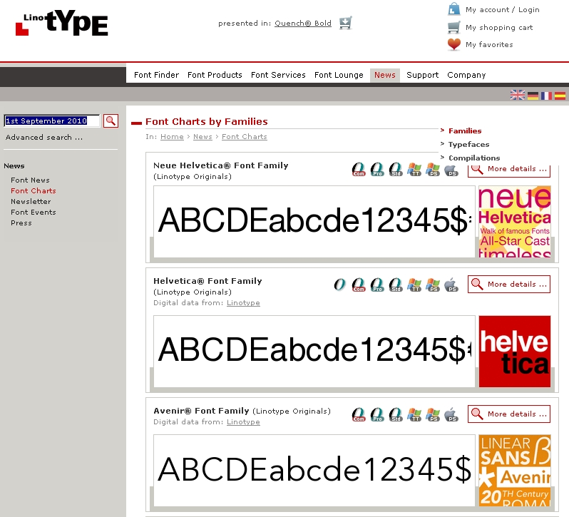
Even ten years and two months after releasing the OpenType font format, the bug is not yet fixed in the Helvetica Std OTF font sold by Linotype, Adobe and others.

And what is more, this defective Helvetica Standard OpenType font is still heading the Font Charts.

see www.sanskritweb.net/temporary/Helvetica-oblique1.jpg

This proves that dimwits crave for buying defective fonts.

The more defective the fonts, the more dimwitted the buyers.

You are an ignorant, Uli. Have a look at my previous post. It is partly untrue, what you are writing here.

Arno Enslin:

... font version, that is used by the type tester

Your hypothesis about the Font Sampler is bizarre. Look here:

www.sanskritweb.net/temporary/Basic-Commercial.jpg

Which font is displayed here according to your hypothesis?

The font Basic Commercial or the version Akzidenz-Grotesk?

It's not only the side bearings... Look at the angle

@ Uli

I wrote, that certain bugs are fixed in certain fonts. This means, that I have these certain fonts in certain versions here. And I checked them. So there is nothing bizzare. I did not claim anything here, which I have not checked, while you are talking about online typetesters.

Even if Linoytpe fixes the most obvious bugs in Helvetica, this does not mean, that they create a better kerning for their fonts and fix the less obvious incorrect side sidebearings. You were talking about a very obvious bug.

The condition of Stempel Garamond is not better than the condition of Helvetica with regard to the side bearings and the kerning.

>It's not only the side bearings... Look at the angle

Well, if ÍIeé were a word, I'd worry about it. Is it a word?

> Well, if ÍIeé were a word, I'd worry about it. Is it a word?

This is a real word (denoting "pupil" in French):

www.sanskritweb.net/temporary/lyceen.jpg

The "bug history" of Helvetica oblique and Helvetica bold oblique is hard to trace. In the PostScript language beginnings in the 1980s, the oblique versions did not exist at all as real fonts, but were generated by slanting the upright version to the right by 11.5 degree with this internal command:

/Erode{ 11.5 dup ... dtransform ...)

The bug-ridden OT versions of Helvetica oblique and Helvetica bold oblique are not these artificially slanted old PostScript versions, but someone tampered with the upright versions in a horrible way affecting the side bearings and the slanting angle as well, as correctly noted by Micha Mirck.

/Erode{ 11.5 dup ... dtransform ...)

Sorry, not correct. I have checked again:

Helvetica Oblique used this font matrix equivalent to 12 degree slant:

/FontMatrix [0.001000 0 0.212557E-3 0.001 0 0] readonly def

The oblique font embedded the normal font with this matrix:

/FontMatrix [0.001 0 0 0.001 0 0] readonly def

And Helvetica Narrow Oblique used this distorted matrix:

/FontMatrix [0.00082 0 0.000174297 0.001 0 0] def

Helvetica Narrow Oblique was generated internally by the normal font, i.e. by Helvetica Roman as the upright font. The distorted font matrix slanted and squeezed the normal Helvetica font.

@ Berlow. Is is imporant that it is a real word???

I haven chosen these 4 glyphs for 2 reasons. One is the angle, but there is also another difference. If you would slant the e, it will look different from the e in the é.

@ Micha

The bugs are likewise fixed in Helvetica available from Adobe.

@ Arno...
yes, I know. And for me this is not about bashing LT. I'm just surprised about 2 things.
One; how could this error got into the font.
Second; This is not some obscure font that is sold maybe twice a year, and this is the first time read about it. I'm also a LT partner and I don't know to how many companies this font has been licensed to, but I have never heard anyone complaining about it. And remember, in Dutch we use diacritics.

Hélvèticâ Bügs Fõrëvêr Ånd Êvër

1st Ôct. 2010 Thrée Mônths Åfter

www.sanskritweb.net/temporary/Helvetica-oblique0.jpg

Uli, Does the relentless and ineffectual bitterness ever get tiring for you?

What do people do, when they find out that when they use Helvetica to print something in italics, that the accented letters aren't spaced properly on both sides?

I would have thought, like Uli, that at least some licensors of that font would have complained to Linotype by now, and Linotype would have fixed the problem. After all, Helvetica is a very popular typeface. So, whatever one may think of Uli's posting history in general, it seems like he has a very valid observation this time: either Linotype doesn't fix bugs, even when its users are screaming bloody murder... or nobody seems to care. This is pretty fishy.

However, there is one possibility. Let's imagine that, instead of Helvetica from Linotype, it was Dutch 801 from Bitstream that had this bug. Dutch 801 happens to look just like Times Roman. Times Roman is a really popular typeface.

What would happen, then, if someone bought Dutch 801 from Bitstream (or got it included with WordPerfect or Corel Draw), and experienced this shocking bug? Why, he would just use Times Roman as included with both the Windows operating system and OS X for italics in future!

Hello, Arial Italic. Hello, Swiss 721 Medium. Hello, Nimbus Sans.

Maybe Linotype hasn't been selling too many copies of that particular font, even if other fonts for very similar typefaces are selling like hotcakes.

I wonder if Linotype even knows about this thread. You'd think they'd at least drop a comment or something.

1) typodermic:

> I wonder if Linotype even knows about this thread.

As proved above (5.Jul.2010 10.17pm and 1.Aug.2010 1.05am),
Linotype in Bad Homburg (Germany) repeatedly downloaded

- this thread typophile.com/node/71858
- the pdf document helvetica-forever.pdf
- the jpg files Helvetica-oblique1.jpg, etc.

Linotype visits my own website and the typophile website regularly.

Examples for September (213.61.7.196 = IP of Linotype Bad Homburg):

213.61.7.196 - - [02/Sep/2010:08:54:29 +0200] "GET /forgers/helvetica-forever.pdf HTTP/1.1" 200 547832 "http://www.typophile.com/node/71858" "Mozilla/5.0 (Windows; U; Windows NT 5.1; de; rv:1.9.2.8) Gecko/20100722 Firefox/3.6.8 (.NET CLR 3.5.30729)" www.sanskritweb.net

213.61.7.196 - - [02/Sep/2010:08:55:52 +0200] "GET /temporary/Helvetica-oblique1.jpg HTTP/1.1" 200 262205 "http://www.typophile.com/node/71858" "Mozilla/5.0 (Windows; U; Windows NT 5.1; de; rv:1.9.2.8) Gecko/20100722 Firefox/3.6.8 (.NET CLR 3.5.30729)" www.sanskritweb.net

etc. etc. etc.

2) quadibloc:

> What do people do, when they find out that when they use Helvetica to print something in italics, that the accented letters aren't spaced properly on both sides?

Since Linotype font buyers are dimwitted, they never find out.

That's why Bruno Steinert never cared to remove the Helvetica bug.

Why should you remove bugs never noticed by dimwitted customers?

A non-dimwitted person would never buy a defective Linotype font.

But dimwitted Linotype customers crave to buy defective fonts.

Therefore Helvetica is still on the Linotype bestseller list:

http://www.linotype.com/de/37/fonthitlisten.html

Muckraking is an honorable profession, though widely reviled. It's worth noting that although as the saying goes "You attract more flies with honey than vinegar," many muckrakers eschew honey because they are too angry about the subjects they're writing about. Uli falls into this pattern. This approach loses him a certain percentage of his potential audience, who are put off by his tone and manners.

Nevertheless, the issue he is highlighting certainly does merit some public discourse, especially on a site dedicated to typographic quality. If there were even one remarkable thing about this topic, it would be worth discussing, but there are a handful: (1) that the sidebearings of the accented characters are off, (2) that the slopes are off, (3) that the unaccented characters, if their slope is adjusted, still does not match the distorted characters, which suggests (4) that the accented characters were inserted from a different font rather than created directly from the unaccented characters, (5) that these defects in this most popular and most publicly discussed typeface have nevertheless not been part of that discussion, and (6) that Linotype did not repair these embarrassing problems the moment they learned about them.

Uli mainly goes wrong in overgeneralizing his conclusions.

Certainly, it is disappointing that vendor response to these revelations has been inconsistent, but Uli's argument would be strengthened if he were gracious enough to acknowledge and praise Adobe for their progress. Even if he wishes the main page were also adjusted, even if he wished they'd dealt with it sooner, even if he wished they'd never offered a defective font in the first place, the fact remains that the improvement they've made is a step in the right direction, and it is basic good manners for anyone, let alone muckrakers, to praise the good as well as condemn the bad, lest they come off as merely bitter and aggressive. Still, his reaction doesn't change the validity of his initial observations. Had Uli expressed his reaction to the vendors as disappointment rather than calling them dimwitted, we would be hard pressed to disagree.

Likewise, it is disappointing that after so much has been publicly said about Helvetica, these clumsy flaws would nevertheless have remained largely undiscussed. For example, compare how much more attention has been paid to the degree to which Arial's design is copied directly from Helvetica; that has been a widespread Internet meme, a topic for countless articles and blogs, yet these errors in Helvetica Oblique are more problematic since they actually damage the font user's ability to properly set text. Further, even Anglophones have had plenty of opportunity to observe these flaws, since we live in a multilingual world and often need to set words (including names) from languages that require those accents, yet we've missed it. We must set aside the idea that these are obscure problems that it would be unreasonable to expect educated font users to notice. Only those with no typographic pretensions at all would find these problems to be obscure, especially since in English grammar we set words and expressions from other languages in italic, which increases our odds of running into these problems.

As much as I appreciate the loyalty of font designers toward their customers (actual and potential), I think we can all agree that the vast majority of font users are genuinely ignorant not only of the niceties of typography but of the basics as well. Had Uli expressed his criticism of font users in terms of widespread ignorance about typography rather than being "dimwitted," here too we would have found it difficult to argue.

The challenge for us upon encountering Uli's observations expressed the way he did is to sift past his anger and our own reactions to it so we can focus on the real typographical value he's adding to this discussion. Aside from the namecalling, he's right. It is a typographically disappointing state of affairs that such clumsy errors could be found in perhaps the most famous typeface of the twentieth century, that so few people would notices, and that the errors would not be immediately acknowledged and removed by the foundry. If Uli feels outraged about this and wishes to express that emotion publicly, he's certainly welcome to.

For my part, I feel more hopeful.

First, Typophile is part of a typographic renaissance, a renewal of interest in good typography. Uli's muckraking on this and other issues is also a part of that renaissance, in which many of us are in our various ways breaking with some unfortunate practices of our recent past to try once again to achieve a high standard of typography. The disagreements, defensiveness, and taking offense occurring around these discussions are par for the course within any passionate community that sets itself at odds with common practice, and are ultimately not as important as our common goals and our progress toward them.

Second, I see much improvement in recent years from foundries. The number of foundries dedicated above all to great typography is higher than in recent decades. Even the foundries who justly deserve criticism for their handling of the specific issues under discussion, such as Linotype's handling of Helvetica Oblique, have shown marked improvement. Consider how much more carefully designed and executed Optima nova is. One is unlikely to find any of Helvetica Oblique's defects in Linotype's Platinum series faces. Good, conscientious typography is no longer to be found only in a handful of superstar designers or isolated foundries.

Certainly there remains more room for improvement.

I'm sure we'd also like to see Linotype repair Helvetica Oblique, not just lavish their improvements on new font lines. But most of all, if we want to see the state of typography in the world improve we need to do something about the nearly complete lack of typographic education for font users. More than anything else Uli wrote about this issue, the complete absence of public notice of these defects in such a famous typeface is a sign of the times. We still have a long, long way to go.

I have one other question. The fonts from Linotype may look funny on the screen. But a post in this thread noted that the same font would line up properly if more advanced screen display software, which cost money, was installed. But the same font. If I understood the post correctly.

Now, if those fonts don't produce bad spacing when one uses them to produce printed output on a laser printer, or a .PDF file - the "end product" where quality is critical - then the fact that things look funny in on-screen previews is something else that might be deemed inconsequential.

On top of the previous point that I raised, which is that the typeface Helvetica is so popular that many people will have the cheaper imitations instead of having purchased the original face. (Also, a lot of Helvetica-based typography just doesn't use italics, with bolding preferred for emphasis, if I remember correctly.)

So there may be other explanations besides people not caring.

toad42:

Very prudent*** comment.

Thanks

*** "witted" in my parlance.

Strange - is it only me, or this error only in the OT Std version? The OT Com version seems fine, or what would you people say?

Not wanting to rake over old coals, but it seems like this might be the best place to put the following question: are Helvetica Neue's numerals too short?
Our typesetters have just put a zero into a postcode; it looked too small at certain zoom levels, but I know Acrobat can deceive, so I zoomed in as far as possible and used a dialog box as a ruler (also printed it out and measured that): the zero and the four are definitely just slightly shorter than cap height - the zero should at least be taller than the four, surely. Seems a bit odd to me.

> Seems a bit odd to me.

Been that way forever though.

dtw:

If you use Arial, "4" and "T" will have the same caps height, but "0" (= zero) is higher than "4" and "T", due to overshoot (the top of "0" is rounded).

If you use Neue Helvetica, "T" is higher then "4", and "0" (= zero) is a high as "4".

>Uli: Well, quite. Arial in this case does what one would expect (and what any of us would do if we were designing a font with lining numerals), but Helv. doesn't.

dtw:

Just for fun, I checked "Nimbus Sans Novus", which is a URW clone of Neue Helvetica.

If you use Nimbus Sans Novus, "4" and "T" will have the same caps height, and "0" (= zero) is also as high as "4" and "T", hence no overshoot for rounded top of "0".

It seems a feature of any and all versions:
http://myfonts.us/td-ri4k07

Is there a law that says lining figures must measure the exact height of caps? This just seems like a design decision to me as an attempt to reduce the dominance of the figures when used with mixed and lowercase text. It makes sense to me with that kind of face.

Since many grotesques don’t have old style figures (anyone care to explain why?), the lining figures are designed to "reduce the dominance" in text. What Dez said.

"many grotesques don’t have old style figures (anyone care to explain why?)"

My guess is that the type in question came out before opentype and the developers kept them as they were even with the latest releases to have backwards compatibility and minimize reflow issues.

"many grotesques don’t have old style figures (anyone care to explain why?)"

Most grotesques did not have them in metal, either. Modern typefaces (the "moderns" of the 19th century) were created with lining figures, not oldstyle figures. Maybe because they were primarily used for large, display settings. Or maybe because of some style grounds. Anyway, since grotesques are also children of that time, they follow that fashion.

"many grotesques don’t have old style figures (anyone care to explain why?)"

Grotesques don’t have old style figures because old style figures don’t work well when drawn to the proportions of grotesques. Old style figures need more space below the baseline than the short descenders of grots commonly allow. And because grots have always been common in advertising it’s been more important that they have figures appropriate for all caps settings than for book typography.

I might also note that when grotesques first emerged they were caps-only.

"many grotesques don’t have old style figures (anyone care to explain why?)"

Some discussion here:
http://www.typophile.com/node/63847

>Chris (and after): fair enough. But if one were planning to make the numerals shorter "to reduce the dominance of the figures when used with mixed and lowercase text" surely one would make them significantly shorter - like the hybrid numerals we get now sometimes - rather than just marginally shorter, which looks like a mistake, even if it isn't one... ?

Dave,

Remember the bad old days of 256k limit? Remember that the early digital type was taken from the original drawing for metal type?

There were reasons like:

• You didn't have enough slots for multiple sets of figures and Expert sets were but a small portion of the pie;
• Better to then have one figure size as a compromise than no boat in the water;
• Legacy drawings were ready to go compared with all the corporate decisions needed to add more;
• The first one to jump the pond wins! Meaning LinoType/Adobe were quick-off-the-mark with ready to roll accepted and proven favorite types, which would maintain continuity with what users already were accustomed to;
• "Do it now" was better than "Should have done it and missed the gravy-train years" of selling type. Business decisions drive business, not best practices.

Sounds very much like webfonts nowadays, Dez.

I'll bet you are right, Frode.

I always find myself wanting to do stuff that people say can't be done, be it grotesque osf's or anything else for that matter. Great to see a two-story italic a in Carter Sans, Dan!

Oh, thank Matthew! He drew that italic a. I don't know if I would have been bold enough to make it double story. I do like the way it looks, though.

This thread was started one year ago in July 2010.

Today, one year later in August 2011, I checked:

The Helvetica Bug is still there:

www.sanskritweb.net/forgers/Helvetica-oblique.jpg

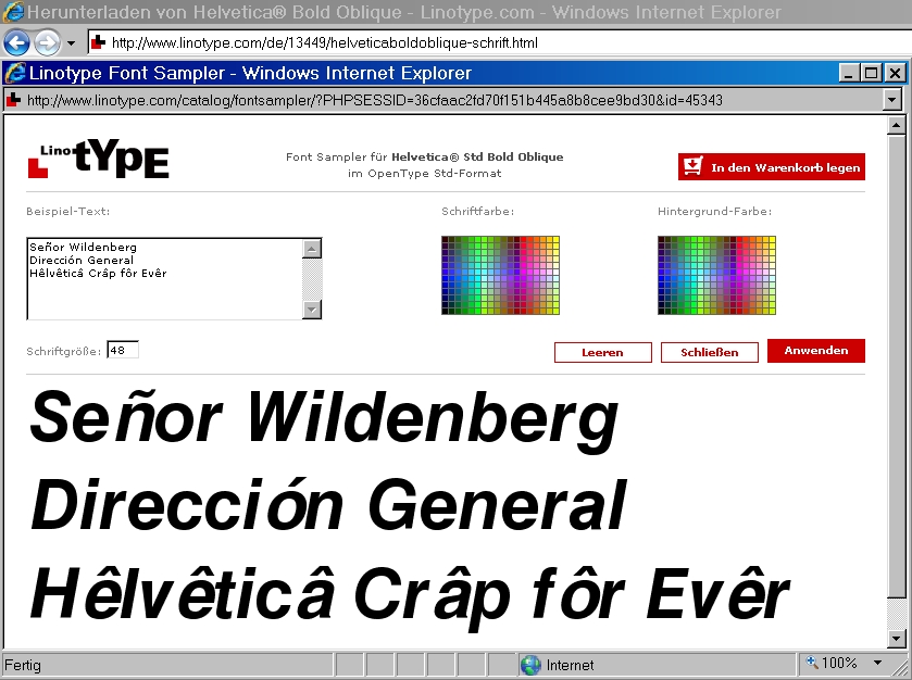
I would have been surprised, if "Señor Wildenberg" or anyone else at the Linotype outfit had removed the Helvetica Bug during the past years. Nobody at Linotype cares. Why should they care? Consider what I stated at the top of this thread: "One of the most striking peculiarities of font users is the fact that most font users do not care about the most elementary quality requirements of fonts." So, why should Linotype and other font makers care to remove font bugs?

For your own Helvetica Bug experiments, consult these files:

Font Bug Website:

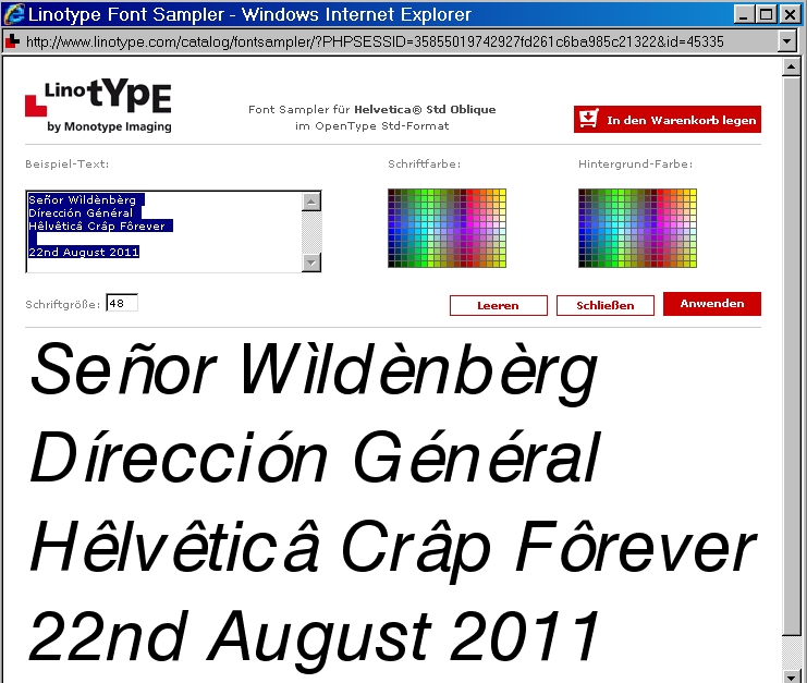
www.linotype.com/de/45334/helveticaoblique-schrift.html

Select "Helvetica oblique OpenType Standard CFF"

Accented Test Text:

Señor Wìldènbèrg
Dírección Général
Hêlvêticâ Crâp Fôrever

Last-Year Screen Dumps:

www.sanskritweb.net/forgers/Helvetica-oblique.gif
www.sanskritweb.net/forgers/Helvetica-oblique0.jpg
www.sanskritweb.net/forgers/Helvetica-oblique1.jpg
www.sanskritweb.net/forgers/Helvetica-oblique2.gif
www.sanskritweb.net/forgers/Helvetica-oblique3.gif
www.sanskritweb.net/forgers/Helvetica-oblique4.jpg
www.sanskritweb.net/forgers/Helvetica-oblique5.jpg
www.sanskritweb.net/forgers/Helvetica-oblique6.jpg
www.sanskritweb.net/forgers/Helvetica-oblique7.jpg
www.sanskritweb.net/forgers/Helvetica-oblique8.jpg
www.sanskritweb.net/forgers/Helvetica-oblique9.jpg

Well done Uli, have a biscuit. I am surely not the only one waiting with baited breath for the inevitable 2 year update.

Ah, Uli, he's been quiet of late. I almost miss his rants.

Keep going, Uli. I'm really curious about how this story will end. Fixing this bug would take me, and probably any font designer a few minutes.

Typodermic:

I think you could fix the bug in less than one minute by copying the correct font metrics values from the correct PostScript font to the defective OpenType font.

Correct PS T1 font: LT_51251.pfb, LT_51251.pfm, LT_51251.afm
Defective OTF font: HelveticaLTStd-Obl.otf

Captured from web.archive.org on 15 Jul 2018. view this capture