
Can anyone suggest a font for a newspaper, that looks friendly and is well legible. I was thinking about Expo Serif, Fedra Serif or Novel Pro.
It doesn't matter whether it's a sans or serif.
Can anyone suggest a font for a newspaper, that looks friendly and is well legible. I was thinking about Expo Serif, Fedra Serif or Novel Pro.
It doesn't matter whether it's a sans or serif.

http://new.myfonts.com/fonts/adobe/utopia/
A fleshed-out family, and very easy to read...

It doesn't matter whether it's a sans or serif.
Yes, I think it does, if you want readable and newspaper.
I'd suggest you look at the Guardian faces, for instance:
http://commercialtype.com/typefaces/guardian
and Swift:
http://www.gerardunger.com/fontstore/store-swift.html

I second Novel and add another suggestion: FF Nexus by Martin Majoor.
Thanks guys!
Utopia could be an option. I really like the Guardian faces, I certainly keep those in mind. Swift is a good one.
FF Nexus could also be a very good option, but I don't think it had the friendliness I'm looking for.

Friendliness in a newspaper font?
The Wall Street Journal gets it from Comic Sans.

Although I adore the Fedra family, it includes an ampersand which … needs getting used to, in my opinion. Don’t know if there is an alternative to this et-glyph inside.
Comic Sans is a great idea. Why didn't I think of that ;)
I don't see a very unusual ampersand with Fedra actually.

Rainer, Fedra has a crazy number of ampersands actually. Twelve I think. :-)
Edit: See here: http://www.typotheque.com/fonts/fedra_serif_b/expert_set

I am a fan of Sumner Stones work when it comes to clean and elegant serif fonts. He made a newspaper font some time ago called stone print.
Stone Print at Myfonts.com or Stone Print at Sumner Stone Foundry.
Apart from that a newspaper I was working for a bit here uses Utopia and I think it is a great newspaper font.
If you want to go modern, don't miss Eudald News, Expo Serif or Greta Text.
Is there a way to edit the comment after a certain time?
I just wanted to tell, that Stone Print has only a limited number of characters, so although it is designed for newspaper, it is maybe not the best fit for every kind of newspaper. (Foreign movies, economics?)
@ Nina: You're right. They are a bit unusual, but I don't mind. I'm not sure how readers will look at it.
@ Flooce: Yes there's a way to edit I think. I've done it a few times. When you post a comment there's an edit-link under the comment.
Thanks for the suggestions. To bad I can't view them printed. They are great newspaper fonts, but I think they look more static rather than friendly.

"I think they look more static rather than friendly."
If you don't like any of these suggestions, as good as they are, and really want friendly, how about the comfort food of fonts, Souvenir Light?

Few more ideas, in order of descending friendliness: Pratt, Houston, and Malabar.
It's not strictly a newspaper type, but the header's new face, Williams Caslon, has a fine journalistic pedigree with warmth to spare.
@Nina & Michiel: I was referring to the Fedra Sans Ampersand shown on identifont. As I am not owning a licence to this font, I wasn't sure about alternatives to this. Thanks for the showing.
Well I suppose it depends whether you are looking for a headline or text typeface. I'd suggest H&FJ's Chronicle Text as a well rounded face, though, for both. Friendly enough too.

I find Myriad to be friendly in a newspaper setting. Maybe that is a boring suggestion, but Myriad (like Utopia) tends to just work.
Thanks again for the ideas. Mmm... not ITC Souvenir. I guess I like a modern look more.
I'm not impressed by Chronicle Text.
Myriad might work, but it's not really my idea of a newspaper font. It could work though and I might even check it out.

Harfang Pro by PSY/OPS seems cut out for the job of newspaper typeface. It's language support might be a bit limited, but I guess it could be customised to include wider support. I'm sure the designer would be willing to cooperate.
Sorry, no link, as it doesn't seem to work somehow... anyone know why?
Thanks. I have the same problem with the links. Don't know why.

Stuart is similar to Expo Serif and has a wide set of OT features. It's not exactly a newspaper font, but it may be adequate to your project. Charter and Cordale are also interesting choices. Harfang is another one to watch.
The font I'm developing my also be an option, although I'm unsure how much friendly one can call it.
To add a link, simply put the URL separated by a | with the link to be shown, both between double brackets. This way, but with two brackets instead of one:
[http://www.typophile.com/node/67787|This is the link text]

When using the link format Igor just demonstrated, there is a bug in the forum software that prevents it from working properly at the very start of a comment. You can work around this by adding a leading space. Or just use html <a> tag.
Harfang is nice, but it is not a news face.
It is too tightly fitted/kerned for text, and has too much personality (too large details) for headlines.
Fedra is not really a news face either, which is why Peter Bil'ak produced Greta.
For text, one must consider the large amount of press gain that occurs on newsprint paper.
For headlines, one must consider the length of extenders in multi-line settings, and how the face sets when tracking is reduced, among other things.
Further to my comment on Comic Sans, I *seriously* question your pursuit of "friendliness". Faces which you deem friendly, such as Expo and Novel, are too soft and shapeless for news design, which requires instead styles which are dispassionate and authoritative.
For many reasons, news type is one of the narrowest, most conservative areas of typography. Unless you have some experience in the genre, it's best to not stray too far from the conventions.
Nick, I completely agree with you. But as Michiel rejected some true newspapers fonts and is interested in Expo Serif and Novel, maybe his layout demands something which is actually not a propoer newspaper font.
Michiel, if you add further info about your newspaper project our comments would be more precise.
Michiel, my previous comment was theoretical, based on experience.
However, there is only one way to tell if an idea will work in practice, and that is to give it a try.
As the old English adage goes, "The proof of the pudding is in the eating".
It's a small newspaper about christian news. Its a weekly newspaper with pretty much only old people reading it. The idea is to make it more of a church magazine for every church who want to participate. But it will still be printed as a newspaper.
I always liked Gulliver as a newspaper font. It looks smooth and friendly when printed. I also like Swift. In comparison with that the old serif fonts look static and journalistic. I wouldn't like that to be the style. But it also has to look good printed.
You could give Calluna a try, I don't know if it will work as a newspaper face, but I think it could, it has a good range of weights, is affordable and has wide language support. And it is dutch ;-) which might just make it a right fit.
There is a local liberal city newspaper here where I live, which ironically uses a font developed for body text in a bible. I think it is a neat font and can recommend it, as I am a reader of this weekly paper. The thin paper and hard printing conditions typical for bible printing results in a need for a more solid design. This is a similar brief as it would be for a newspaper font, so no wonder a paper actually picked it up. It is unique enough to stand out, but still very legible, although in this sample paper I wouldn't mind a tad more leading. As you have a christian newspaper in planing, this font might actually just a very good pick.
Why does news design require styles which are dispassionate and authoritative, Nick? I’ve noticed the trend, but I also tend to find it a little boring. I agree about Novel not being much of a news face though. It’s more bookish. Nexus could work, IMO. One of the most acclaimed newspapers in Norway use another of Majoor’s faces: Scala.
I just came across Alfon while surfing Terminal Design’s website but unfortunately their EULA prohibites religious use.
Why does news ... require styles which are dispassionate and authoritative, Nick?
Otherwise, it would just be gossip.
Let me rephrase that:
I understand that newspapers must be authorative, but is that a reason not to have a personality?
Isn't "dispassionate and authoritative" a personality?
It fits the sharp and slabby Scala, which sure ain't no soft 'n' fuzzy friendly face.
Nothing off the arris there.
It might help if you post a scan or PDF of the current newspaper. What's the size, is it a broadsheet or tabloid? Do you need to cram a lot of text onto each page, or is this more of a magazine-style layout with lots of white space? You mentioned Gulliver and Swift, these fonts have short ascenders and descenders which allow you to maxmize lines per column. Most newspaper fonts are designed this way. But if space isn't an issue, you can choose something more traditional.
Also, the point size of the text and leading make a huge difference when it comes to readability, especially for "old people" as you say. They would probably appreciate something solid like Poynter from Font Bureau.

>I just came across Alfon while surfing Terminal Design’s website but unfortunately their EULA prohibites religious use.<
Our EULA only asks that you get our permission to use our fonts for political or religious uses. I doubt a church newspaper would encounter much of a problem in that regard.

>especially for "old people" as you say. They would probably appreciate something solid like Poynter from Font Bureau.
Which is not actually why we call it Poynter Old Style. ;)
Cheers!

Dan Milne's Tasman is an excelent newspaper family:
Thank you all for the suggestions. I think I have more than enough for now.
I really like the Tasman font.
Hi Michiel,
Contact Dan Milne and ask for the specimen he made. It worths having it. It is beautiful specimen and display Tasman in its full splendor.
Cheers.
R.
>I really like the Tasman font.
Wow, so i do.
Ramiro — I don’t see any contact info for Dan at the Type and Media site. How would one get in touch with him?
After a litte googling: try here: http://danmilne.fastmail.fm/
No idea if it still is an up to date address, as the website seems pretty dead
Hi all.
Thanks for your interest in Tasman -- and your kind words. I haven't developed the family much since completing the course at KABK, but I hope to return to it in the second half of this year.
I've uploaded a PDF which includes a discussion of the design process and a specimen.
The contact details at the site above are correct.
Dan
Dan — Very impressed with this design. Thanks for sharing the more elaborate PDF specimen.

^ seconded!
I'd be wary of Tasman for news text.
It has low contrast and a tight fit, which, when substantial press gain is considered, and the effect of news printing being grey on grey, will produce a dull and heavy effect (see below). Also, the consistent widths of the lower case letters, the squarishness of the curves, and the narrow space character, further contribute to a lack of sparkle. The soft and nuanced finish which imparts friendliness when the face is inspected closely is a display quality, and will be problematic in text practice, especially for your particular audience.
However, the short capitals and old style figures add interest, and it could be an OK magazine face, if the fit is opened up here and there.
Think of your readers. What's friendly for them will be something familiar. Resist the temptation to experiment with faces that are not proven in newspapers.
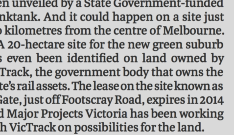
I've uploaded an image to let you see what the press is doing with the current newspaper (design). I don't see an extreme change in the quality. How about you guys?
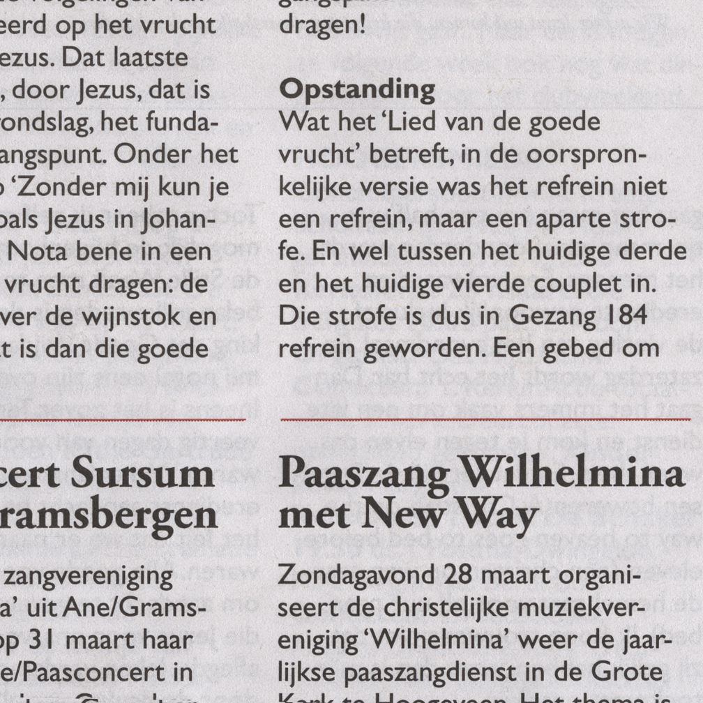
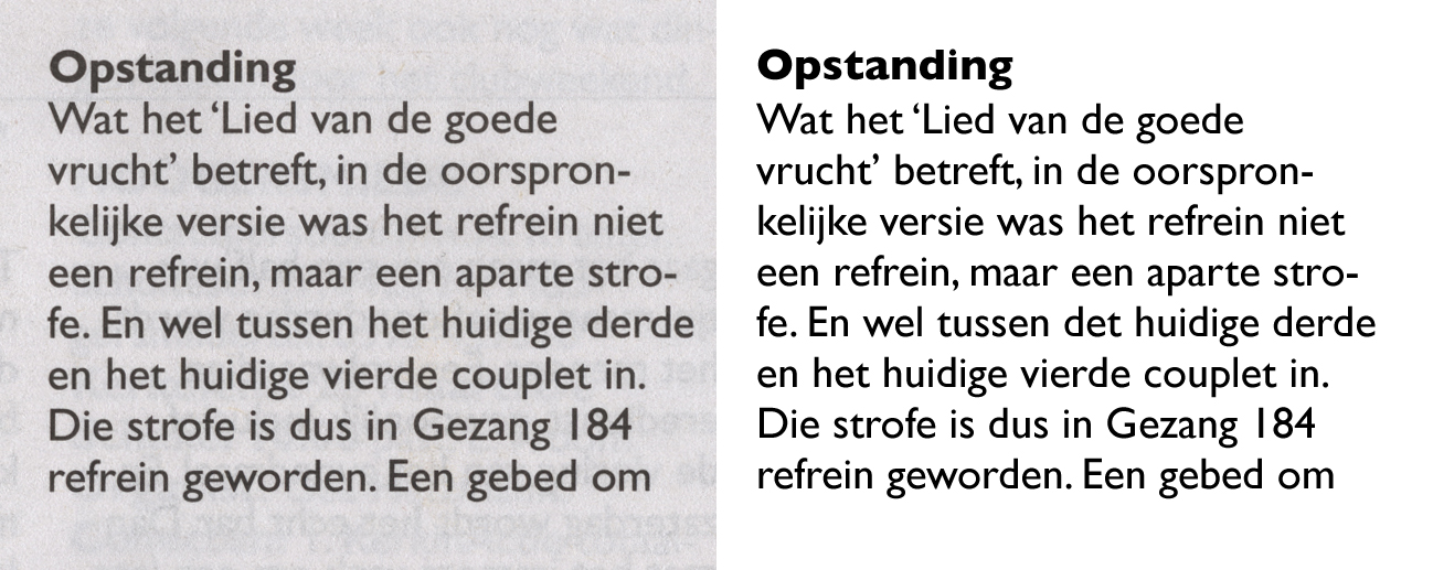
My company has chosen for Gill Sans eventually. There had been research with our audience and this typeface was the considered most readable. We stick with the old.
However, for headlines, introductions and suchlike they've agreed to use Yoga Serif. A good choice in my opinion.
Captured from web.archive.org on 13 Oct 2013. view this capture


