Typophile

Andre Simard is proud to announce the released of the Harfang family

André Simard

May 4, 2010
I'm proud to announce the released of Harfang, my most recent typeface family. This second typeface — ITC Migration Sans was the first one —, was created with the invaluable advice of Xavier Dupré, Chris Lozos and of course Rod Cavazos (PSY/OPS Type Foundry).

My goal for Harfang was to create a serif typeface that would be easy to read at text sizes, while having a strong personality at larger sizes. The initial design had a purely rounded style, but with each development pass I introduced some angularity. The final result is a typeface that is easy to read in long texts, advertising copy, annual reports and the like; but one that also provides a crisp and stylish appeal in more prominent display settings. I chose the name Harfang (Harfang des neiges — Snowy Owl or Great White Owl) because after my first typeface, Migration, I wanted something with a thematic relation. On a more personal level, Harfang is the avian emblem of Québec and recalls the long winters and the breathtaking white landscapes of the place I call home, Abitibi.

Finally, many thanks to my wife Constance and my daughter Jade. —André Simard
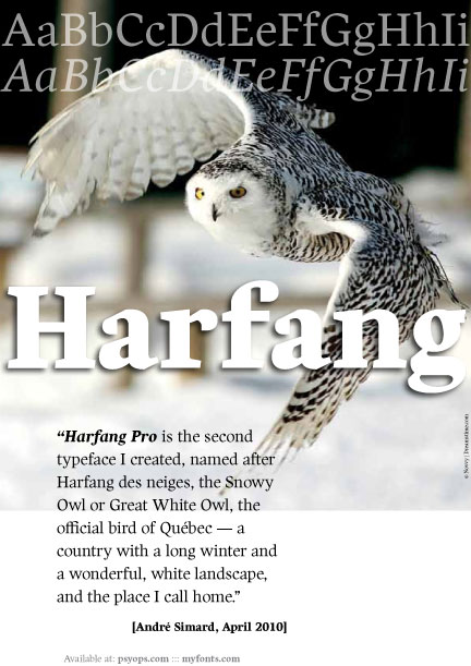
http://www.psyops.com/html/spec_harfang.html
http://new.myfonts.com/fonts/psyops/harfang-pro
Also at Fontshop

For those who want to see more

BRAVO, André!!! May Harfang fly for you!

Thanks Mr. Dezcom! I hope it will fly for long time too :^)

Congratulations, André! That looks great overall. I love the hairlines.

I'd like to point out, however, that Québec is not a country, no matter how much the PQ wants sovereignty.

Hedera > I'd like to point out, however, that Québec is not a country, no matter how much the PQ wants sovereignty.

— LOL — I should have put the word “country” in quotation marks.

Thanks for your comment on the Harfang.

I finally found out how to create a link to a pdf file :^)

So, For those who want to see more

Congrats!
To me, the roman /f/ is particularly nice.

Craig: Thanks for your comments.

Several people have made this comment too. I am happy about that.

I love the numbers, especially Oldstyle.

Dina: Thanks for your comment. The design of these gave me much pleasure.

I like this. Well done.
P.S. Snowy owl in Finnish is Lapinpöllö (Lappland owl).

What a fine concept. Bravo!

>Tomi: Thanks! Lapinpöllö? — a very pretty bird too!
>Danny: Thanks you for your kind remark!

I love PSY/OPS, and this is great!!!

Thanks you Froylan.
I agree, PSY/OPS is a very good foundry and Rod is a really passionate person.

This is excellent! And a steal at $160. You've built great depth and character into these characters :)

Instant add to my wish list.

--
penn

Thanks Penn.

Great job! Congratulations.

Thanks Mr. Freiberger!

For those who could be interested, MyFonts choose Harfang as “Text family of the month

YES!!!

Harfang is also available at Fontshop for those interested.

Bravo, André!

Update released: Harfang Pro Version 2.0. The new edition includes Central European support and even better hinting.
— A bit late, but better than ever ;-)
http://psyops.com/news/
http://new.myfonts.com/fonts/psyops/harfang-pro/

Feel free to send me sample of works where you used Harfang. Thanks

Captured from web.archive.org on 14 Jul 2014. view this capture