Typophile

The "Adobe Text" typeface, and some other x-heightable issues.

Adam Shubinsky

I noticed that the Adobe Typblography, has announced the new font bundling scheme for CS5.

The details are available here:

http://blogs.adobe.com/typblography/2010/04/useful_details.html

It appears though that there is a new Robert Slimbach font that Adobe intends to release (as a registration incentive), called Adobe Text.

Does anyone have any additional information available regarding this particular family. From the little information available on the Adobe type blog, it would appear to support Latin, Greek, and Cyrillic, and I assume that it would contain the full Adobe range of optical sizes. Nonetheless, it would be nice to have someone (possibly from the Adobe team) provide us with some insights into what else we may expect.

Seems Yves needs to extend his epic Big Fleischmann Bake-Off … ;)

Yes. I'm surprised by the statement ‘Adobe Text can be classified as a Transitional design’: this is very clearly a baroque typeface, so even in the crude classification that includes ‘transitional’ this would be considered oldstyle.

Roman seems a Minion with higher x-heigh, more counterspace and less calligraphic influence (especially the straight serifs). Italic resembles very much Utopia. Anyway, it seems to be another good work from Slimbach.

I think that it would be a stretch to think of it as a Fleischmann revival—it seems at this point to be an interpretation of sorts at best.

John though is spot on, it does appear to be a Baroque typeface, and as such it should become a fine counterpoint to Slimbach's prior Renaissance work.

As for the "Transitional" label that adobe attached to it, I suspect that it owes more to Marketing strategies than to correct taxonomy.

> "especially for longer passages of text"

Nope, sorry. The x-height is too big.

----

Today, learn about the Armenian Genocide.

hhp

Hrant,

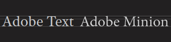
A side-by-side comparison of Adobe Text and Minion.

OK. And?

hhp

"Adobe Text" is such a generic and overreaching name. Why not at least call it "Adobe Serif", so the sans-serif counterpart -- the "successor" of Myriad, which I now blind assume Slimbach has also started working on -- can be named "Adobe Sans"?

"Adobe Text" suggests that this will instantly replace Minion as Adobe's own CI serif typeface -- possibly for the eternity? InDesign CS5 has reportedly changed its default font from Times New Roman to Minion -- why not Adobe Text?

...so the sans-serif counterpart -- the "successor" of Myriad ... can be named "Adobe Sans"?

I would imagine that will be named "Adobe Font" :-)
Not to be confused with Neville Brody's Typeface One, &c.

I see more Kis styling than Fleischmann, myself. But yes, I agree with John, classification-wise, this would be late oldstyle (perhaps Dutch oldstyle or Baroque oldstyle, depending upon one’s chosen taxonomy).

Looks solid. I’ll be interested to see better and more extensive samples.

I do predict some potential confusion from the unfortunately generic name.

“What’s that text set in?”

“The text is text in in design.”

“What?”

“I said, the text is set in Text in InDesign.”

“Oh.”

And can we look forward to a full range of optical sizes — Text Caption, Text Text, Text Subhead, and Text Display?

Hrant,

I guess that my point was that I am not sure if the typeface's x-height is a problem. I don't believe that the x-height variable alone is a good enough indicator to determine extended-text suitability.

There are a few typefaces with a rather large x-height, that work very well (when used correctly) in extended text settings. Iowan is one example that comes to mind.

I was not aware that a large x-height makes the font inadequate for long texts. Surely, very large x-height may cause this –but it seems that any "very" measure in type design causes the same.

Some fonts with a x-height higher than Minion are very good for long texts, in my opinion –Utopia, Iowan, Lyon, Publico and Glosa, for example.

Maybe am I missing some obvious point in this matter?

In my view it depends on the point size. Something like Utopia is best for newspapers, and was in fact designed as such. But a newspaper face is not a "versatile workhorse".

A large x-height takes away from the extenders, which are much more important to readability than might seem.

hhp

Thanks, hrant. I'm developing a font for technical texts (scientific, legal and so on). As it has a large x-height maybe it will be better suited for magazines and newspapers and less for books.

Hrant, I am curious, is this extender importance due to the word shape (Bouma) theory of reading?

By word shape I mean the idea the the external outline (envelope) of the words assists us in achieving swift word recognition during the reading process.

Igor, you might want to consider just what is meant by "large x-height". The Computer Modern typeface, for instance, is considered to have a large x-height. It also has very prominent serifs on its extenders, which can go some way to remedying any problem that may be associated with "short" extenders.

Thanks, Nick. My project uses somewhat short extenders, so I guess it falls into the not-so-legible-for-long-texts group –although this was not my initial purpose. :)

Adam, pretty much. Just like how all-caps is harder to read (except, tellingly, when the point size is extremely small).

Igor: Palimpsest is handsome (reminding me of Slimbach's early work) but I would indeed classify it as a magazine face. BTW, I think the descenders should be relatively a bit shorter than the ascenders.

hhp

Based on the minute snippet here, I'd say this could be by far Robert's best work yet, and the modest name to me denotes the very serious attitude I think I detect, especially knowing Robert's great difficulties with font naming. Robert (with whom I have not spoken in a decade!) told me over a hundred times that Times was his favorite typeface. I'm guessing that this is his mature effort to come to grips with it, philosophically if not literally. This could be very intriguing.

Maybe it would be better named "Adobe Encyclopedia." I agree with Hrant that a large x-height makes straight text not set at a small size harder to read. It also makes caps-small caps a bit awkward, and the old style numbers (aka text figures) harder to draw -- not that Slimbach isn't up to that task.

Yes. I would imagine that 'Text' is intended for relatively small text. And I remember that Robert admired the metal era use of Times by the Encylopaedia Britannica. And who knows? Maybe the x-height will change on the optical axis? I belong to the Mono metal school of thought, which suggests that x-height increases as size of the design gets smaller. But there is the postwar Lino theory that display faces should have very high x-height and that small text faces need a low x-height -- handily illustrated by the Palatino/Aldus/etc. group of fonts. I've never known what to make of that. Perhaps it was Zapf's influence?

Are you sure Lino thought that? In the case of Palatino vs Aldus, the former was not supposed to be a text face at all (and in reality only really works well small and tracked looser). And when it comes to display, choice of proportions moves firmly into the realm of style only.

hhp

Hrant, I have a slight problem with the assertion that x-height bears any relevance to the readability of text. Perhaps we subjectively believe that we read typefaces of modest x-height better, because those are the typefaces that we are most accustomed to.

If extenders were important in facilitating the reading process, would it not follow that alphabetic systems that have no extenders or very few extenders (e.g. square Hebrew), would inherently be less readable?

As for the argument that all-caps are harder to read, that may be true for the modern reader who is not accustomed to reading text in all caps to begin with. I doubt though that the Romans were slow readers, and it would seem logically reasonable to expect that training someone for a certain period of time, to read in all caps could, in theory, yield reading speeds similar or identical to lowercase reading, for that individual. Although I will check the research literature later today to see if there was any empirical research done on this particular subject.

Interestingly, I have just finished a book set in Plantin (which isn't shy on x-height), and found it to be very readable and inviting.

Precisely my point, Hrant. Aldus, the low x-height typeface, was thought best for text, and Palatino, the higher x-height typeface, was thought best for larger sizes. The Hunt Roman has an even higher x-height than Palatino, and it is only available in 14, 18, and 24 points.

Bill, I think the relative proportions of Palatino to Aldus have more to do with fashions in display typography than what was ‘thought best for larger sizes’.

The steps necessary to achieve optimal readability at various smaller sizes are to a large extent determined by optics and output medium. At display sizes, what one does is more a matter of style. The lighter, smaller x-height display types to which are refer are a particular, elegant or classical style of display typography. Palatino is something more rugged and when used as intended -- not least in Zapf's own books -- always manages to evoke the 1950s for me. And then, of course, there are Koch's display types, which demolish any notion of linear relationship of proportions across increasing sizes.

Well, John, when I say 'thought best' that is shorthand for Lino's promotional material, and of course you are right that fashion is a factor. But - - - Palatino evoking the 50s ? ? ? Zapf thought his designs were for eternity (perhaps, even, deriving from the wellsprings of eternity!), and quite beyond dating to a specific decade, much less a century. He would be very angry indeed! Nevertheless, I think you are right. I don't see Palatino as you do, but I certainly see Optima as pure early 60s - - modernity's last innocent expression of belief in itself, the UN when it was still supposed to work, and before bloat. Does your view of Palatino embrace its many variants, such as Hunt and Zapf Renaissance? Doesn't Aldus have an earlier feeling? Anywhere from Thomas Mann . . . back to Ronald Firbank?

Speaking of fashion, what I like about Robert's new face is fashion's apparent absence. Again with the proviso that I am only judging from the tiny snippet here, it seems to be as typographical as possible, all mannerism purged, all ego ablated - - an intelligent effort by a superb technician to achieve profoundly utilitarian neutrality.

...profoundly utilitarian neutrality...

O brave new world, that has such fonts in it!

@Henry

Adobe Serif and Adobe Sans already exit… they are the ‘fallback’ fonts for Reader and Acrobat.

Well Nick, one can but hope! Until proven otherwise, it's possible.

A note on the genesis of Adobe Serif: Fred Brady told me it was adapted from PMN Caecilia. I have never compared the two to test this.

Am I alone in finding @So-and-so a tacky form of address? It makes me cringe every time I see it.

@Bill, you are not alone.

Slimbach is a fabulous designer of text types, so it is dangerous to pronounce before seeing this in use. I do wonder about the big-eyed, relatively large e, though.

[Bill Troop]: @So-and-so a tacky form of address?

Regarding "@" used to identify the author of a quote.
What is the correct usage (as documented in literary standards guides)?
Without looking it up, and not being an editor, I'm assuming it's square brackets around the person's name, all in roman, foolowed by a colon, as above. Am I right?

**

Well Nick, one can but hope!

Bill, you missed the irony, and the literary allusion (Huxley).

Adam, I'm an ardent opponent of the We Read Best What We Read Most mantra. And/so I believe vertical proportion is one of the pillars of what determines a font's readability.

> would it not follow that alphabetic systems that have no extenders
> or very few extenders (e.g. square Hebrew), would inherently be
> less readable?

Yup. Sorry.

> I doubt though that the Romans were slow readers

1) You don't really have a basis for such doubt.
2) Saenger's "Space Between Words: The Origins of Silent Reading" nicely explains that the invention of the wordspace (by the Irish, in the 8th century) enabled silent, hence high-speed, reading. So the Romans never even left home base in terms of reading ability.
3) Remember, the Romans had a cursive, variable-height writing style for reading anything beyond a couple of lines on a monument.

> I have just finished a book set in Plantin

What point size?

> Aldus, the low x-height typeface, was thought best for text,
> and Palatino, the higher x-height typeface, was thought best
> for larger sizes.

What John said: ignore the display cut - that can be anything that style allows. Would you call Aldus's x-height "small" of its own? I wouldn't. And I'm guessing that if Zapf made different -text- optical sizes of Aldus, the smaller ones would have a larger x-height and the larger, smaller (just like Monotype, and pretty much everybody else).

> Zapf thought his designs were for eternity

Oops.

> Am I alone in finding @So-and-so a tacky form of address?

On this, I'm with you and Maxim. It smells like old plastic.

--

BTW, assuming Adobe Text does have optical sizes, maybe that sample is in fact from a smaller size? Although the color, contrast and letterspacing don't really match the proportions for that...

hhp

Nick: ...and the literary allusion (Huxley).

Actually Shakespeare, from whom Huxley got the line:

O, wonder!
How many goodly creatures are there here!
How beauteous mankind is! O brave new world,
That has such people in't!

Miranda, The Tempest, Act 5 Scene 1.

On readability and the x-height, I think this is a very difficult issue to pronounce on, because reading comfort of a text block is influenced so much by type size, measure, and leading. I do think that in book type settings, with wide measures, short ascenders are sub-optimal. But in short measured, tightly leaded columns common in newspapers and magazines shorter ascenders seem to work all right. But you could also argue that these settings are sub-optimal for the sake of economy.

The most insightful comment on this I have read on this is Walter Tracy's. He wrote that "for my own taste, if x to h is a proportion of about 6 to 10, a face will look refined and be pleasant to read. If the x-height is much less than that, the face may be stylish, but will be unsuitable for long text. A larger x-height is conducive to dullness." (Letters of Credit, p. 51)

I think that current fashion for large x-height is often overdone. For optimal setting, large x-height may not really gain you anything, as you end up needing more leading for a given point size. But the need for leading also is influenced by how dark the type is, so I don't know of any hard and fast rules on this.

By the way, the Irish didn't invent word spaces, but at best revived them or introduced them into Latin. They are in the dead sea scrolls, many centuries before.

.

Actually Shakespeare

Actually no.
I was alluding to Huxley, not his source.
Huxley's Brave New World, with its "profoundly utilitarian" engineered class-structure of cloned human drones was the ironic opposite of Shakespeare's.

But lest anyone get the idea I am overly critical of Adobe, I should mention that its invention of PostScript enabled this brave new typographic world populated by myriad foundries ...how many godly fonts are there here, how beauteous fontkind is!

"profoundly utilitarian" sounds very useful if you are looking for a hammer, but of limited use otherwise.

Hrant, you come out against the so-called "we read best what we read most" mantra, yet that mantra is fully consistent with the way our brain and mind functions and perceives. We always perceive best what we perceive most. Our brains are designed to operate in certain environments and to adapt to the specific features that may be unique to that environment. If I take a subject and force them to view the world up-side-down (through the use of a binocular device that flips the incoming signal), such a subject would, after a while, become fully adapted to the new image of the world and will literally come to see the world correctly. Similar effects have been demonstrated for other senses too, such as hearing. This "mantra" merely draws on what we already know about our cognitive faculties, and there is no reason to believe that the reading process is any different.

As for the proposition that alphabetic systems with few or no extenders are less readable (since they lack a proper bouma); in the absence of any (even anecdotal) data that demonstrates that Hebrew, Chinese, and various Indian scripts (to name a few) are less readable than a mixed case Latin script, or alternatively, that Latin script readers are more efficient and nimble readers than others—such a proposition could be seen to be a form of script chauvinism.

Extending on this "chauvinism" theme, the claim that the Irish invented word space is simply incorrect. As william had already mentioned, the Dead Sea Scrolls were written with word spacing (150 BCE ~ 70 CE). What I think that what I can add to his comment, is that word spacing was most likely imported into Hebrew sometime during the Babylonian Captivity period (i.e. sometime after 597 BCE), from a probable older source or tradition.
We have a general tendency in the West to view the world through the narrow prism of a specific historical narrative, often forgetting that throughout history the various cultures of the world came into direct and indirect contact with each other, cross-pollinating each other with ideas.

The bottom line is that I would like to propose that the "common sense" rule which states that a large x-height reduces readability, is overreaching. It may be true for a certain typeface, but untrue for another (I am not referring to extreme cases though, extremes by definition are rarely conducive to anything), and there are many other design factors that influence readability much more than x-height.

Adam, we are physical beings, with certain limitations. We cannot get so used to anything that it becomes totally moot. Try eating grass. If you eat enough of it, you don't suddenly become able to sustain your life with it; you die. Cows on the other hand can handle it - in fact they need it.

Similarly, the degree to which a font can be[come] readable is not infinite. No matter how much you read FF Extra, it will not be a book face. The human visual system and cognitive mechanism have attributes. All else being equal, fonts that leverage these attributes are inherently easier to read that ones that don't.

> such a proposition could be seen to be a form of script chauvinism.

Something that certainly exists, but I for one cannot be accused of. You might want to read my essay "Latinization: Prevention and Cure".

The Irish invention of wordspacing: I meant in the realm of Latin. Did they get the idea from another culture? Maybe. Evidence?

hhp

>Evidence?

I think the Irish monks would have seen manuscripts in Syriac and Hebrew, but I don't know. I also would guess that all Semitic alphabets—which is to say, the first alphabetic scripts—had word spacing, or dot separation of words from very early. Because they don't use vowels, picking out words in an unbroken stream of letters might be pretty taxing.

I have interest to learn more about objective, technical criteria about legibility. Do you (you = all fellow Typophilers) have references about studies on this theme? I think it's very hard to separate cultural heritage, common sense and technical criteria, but I suppose there are studies already made on this.

An example: William referred to Tracy's 60% rule. Is this based on historical evidence, empirical data, academic studies etc.? (I'm not saying this rule is valid or not, just want to know how rules were built.)

TIA

The scientific literature on legibility is sparse and does not seem to have attracted any towering intellects. The most important modern achievements in legibility are not theoretical, but practical: the typefaces Verdana and Georgia. These were produced empirically and instinctively.

There is nothing absolute about Tracy's 'rule', which might just as well have been 55% or 65% or 70%, depending on the decade.

X-height is a very loaded subject. One reason is that sociological factors are seldom absent from the discussion. High x-height is considered crass and commercial. Low x-height is considered refined, classical, tasteful, etc. This unproductive dialectic has been going on since long, long before the class (whoops, I mean x-height) wars of the 1960s. It will continue for the simple reason that paper has always been too expensive for publishers, and less paper can be used when smaller, higher x-height typefaces are employed.

The class-taste war elements of the discussion are what account for the over-emotional feelings of those on the side of lower x-heights. Indeed, it is always the low x-height people who are emotional. The high x-height people just laugh their way to the bank.

The only people who discuss x-height are people opposed to high x-height. The reason is that learning about x-height has been an important part of their aesthetic development. One of the great truths we learn as we become cultivated persons knowledgeable about type is that high x-height is bad, low is good. It is an article both of fact and faith.

It's all so damned silly!

>"profoundly utilitarian" sounds very useful if you are looking for a hammer, but of limited use otherwise.

Then I take it you regard a hammer to be a tool of limited use? Others would disagree. Nietzsche, for example, liked to philosophize with a hammer. Indeed, he even wrote a how-to guide anent.

>The only people who discuss x-height are people opposed to high x-height.

Really? I discuss it almost constantly, (some say to the point of x-heightability),
yet I have no opposition to any x-height whatsoever.

Cheers!

Dash! I knew I'd get in trouble with that 'only'.

>Tracy's 60% rule. Is this based on historical evidence, empirical data, academic studies etc.?

A lot of classical book typefaces are around this ratio, but they do vary by optical size—which in those metal foundry days was the same as size, period.

I expect David would say that the x-height should be suited to the intended use, and therefore should vary according to the brief. That would be my view too, except that for ideal reading comfort, period, I like Tracy's rule. When you cram more type on the page than is ideal, then the x-height needs to grow, in text size. On display type, I don't think there are any general rules, as it depends on the overall design of the page. On this issue, I admit it's hard for me to disentangle the aesthetic and readability sides of the question.

> The high x-height people just laugh their way to the bank.

But the bank is not where people live.

hhp

>Tracy's 60% rule. Is this based on historical evidence, empirical data, academic studies etc.?

It is someone's theory based on common practice at the time. What is normal workflow to achieve economy of printing combined with reasonable readability was more an issue of typical trade practice than anything empirical.
I find issue with taking away the other variables. Sans serifs today typically have shorter ascenders and descenders than a typical roman book face so it stands to reason that we would lead them more to find the sweet spot in leading.
To me, the only fair comparison is to measure efficiency with readability. An example would be to have a constant page size, margins, and line length but make the number of characters on a page the same. This would level out the efficiency or economy of a typeface but allow the tester to set point size and leading in any way that would yiield the same density of text per page. It would be possible to set as an example, Helvetica at 9pt on 13 leading with Garamond at 10.5 pt on 12pt leading (assuming this would be even on efficiency) and compare the two from an ease of reading standpoint.

>It is someone's theory based on common practice at the time

The ratios are close to a golden ratio, so perhaps "theory" reinforced it. I suspect, though, it was common practice because it looks good, and is still pretty economical, not because of any theory. With sans the lack of a terminal on the ascender to my eyes affects what looks good as far as ascender height. That flag on a serif ascender seems to want to fly a little higher than the pole on a sans.

>This would level out the efficiency or economy of a typeface but allow the tester to set point size and leading in any way that would yiield the same density of text per page.

Exactly. Morison observed that higher x-height requires more leading, which seems obvious today but wasn't always so. But how much leading the designer can allow will always depend on the particular economies of a specific publication. What is more distressing is to see so many young graphic designers today who have no idea about any of this as it is no longer part of their curriculum.

"so many young graphic designers today who have no idea about any of this as it is no longer part of their curriculum."

Bill,
You are right. I would hope that an instructor of any value would see that there is a correlation between fitting text, economy, and readability. There must be give and take between acceptable variation from optimum and the bottom line.
I admit that I learned much more about such things on the job. I was handed a given amount of text in typewritten manuscript and asked to end up with an economical yet printable book that readers would easily read or at least not object to reading. It was the typical layout jigsaw puzzle with some givens and some variables. This should be much easier to do in today's computer world than my old Haberule characters-per-pica calculations and blue pencil markings. We did not have the option of resetting everything a half point smaller in the bygone era. Todays teachers should have it easy with the tools available to students.

>X-height is a very loaded subject. One reason is that sociological factors are seldom absent from the discussion.

Bill, I think that your comments were both insightful and correct. It seems to me though that part of this argument can be traced to conceptual differences, viz. what the typographer envisions when they are thinking of extended text. It wouldn't surprise me if most of the resistance to the notion of high x-height emanates from typographers who think of text primarily in terms of books. Walter Tracy was certainly thinking of books when he made his comment about preference. Nonetheless, most printed matter today are not books, and Tracy's 6 to 10 proportions may very well backfire (readability wise) if they are applied into a column setting.

We do after all already apply, implicitly or explicitly, one set of typographical heuristics for book setting, and another for say magazine work. Therefore, perhaps some of these typographic "common sense" rules/slogans should be rephrased accordingly. Thus, let us not say that a "large x-heights is not conducive to the readability of extended text" but rather "large x-height may reduce the readability of text in a book setting."

A great deal of disagreement would dissipate if we increase the contextual and semantic precision of our intentions, otherwise we may be arguing about apples and oranges.

I hope this makes sense.

I say leave it to the typographer to decide on a setting for the document at hand.
All the type designer can do is optimize the readability/legibility/whatever, of a font, irrespective of its x-height.
It's not like there is only one template for one medium, there are multiple genres in multiple media.
In any media there are exceptions to the norm; for instance, the newspaper Frankfurter Allgemeine has Janson for its text type.

Adam:
Certainly -it shouldn't be a secret- optimal x-height depends on point size (most of all, but other factors too). That's why I asked what point size you used for Plantin. The main argument really is: for a given point size, is there such a thing as an overly-large x-height? To me that's an obvious Yes. The only people who don't think so are the "readability relativists" (the WRBWWRM peons) with whom it's not worth arguing about much at all.

> All the type designer can do is optimize the
> readability/legibility/whatever, of a font,
> irrespective of its x-height.

That's decidedly false. A text font must be designed with at least a rough range in mind. All of a font's attributes, like color, letterspacing, and certainly vertical proportions, depend heavily on that decision.

hhp

> In any media there are exceptions to the norm; for instance, the newspaper
> Frankfurter Allgemeine has Janson for its text type.

I am rather sure that the Frankfurter Allgemeine uses Times Ten its text type. Perhaps you're thinking about another German newspaper, one from outside Frankfurt? Frankfurt has two other dailies, but neither of them use Janson, either. The Frankfurter Neue Presse uses Sabon Next, and the Frankfurter Rundschau has ITC Charter as its text face.

All of a font's attributes, like color, letterspacing, and certainly vertical proportions, depend heavily on that decision.

Well OK, say you have designed a typeface, and you produce two variants, one with small x-height, and one with large. How would you vary attributes such as color, letterspacing, and vertical proportions, between the two? Can you show samples which demonstrate your theory?

Perhaps you're thinking about another German newspaper, one from outside Frankfurt?

Probably. Not sure which.
A German newspaper with a slightly different text face Die Welt, Poynter Oldstyle (I checked!).

> How would you vary attributes such as color, letterspacing,
> and vertical proportions, between the two?

Color, letterspacing and x-height are all inversely proportional (although not linearly) to intended point size. So darker color and looser spacing go hand-in-hand with a larger x-height (which, together, target smaller text sizes). This BTW is why Helvetica and Mrs Eaves are not really text faces: the former (ignoring its lack of serifs for the sake of argument) is too tight for its large x-height (the weight however one can vary nicely) while the latter (ignoring its village-idiot spacing for the sake or argument) is too loose for its small x-height. And adjusting tracking is no magic bullet, since it ruins "boundary conditions", like the right side of the "r" (especially in the uneven Mrs Eaves).

BTW, this is not a "theory" - it's common practice among the top foundries, past and present. And it's not due much to fashion, but very much how humans see and read.

hhp

>I hope this makes sense.

Yes, it does, and for what it's worth, I think the 60% suggestion is about right for most typefaces intended for immersive reading at 9-12 pt. I can't imagine that metal Caledonia is much lower than that, but I always find it annoying to read now -- the ascenders seem too high; yet it used to be one of the most widely used of all typefaces in the US. Again, fwiw, I usually increase x-height below 9 pt, and decrease it above 12 pt.

Hrant, the Plantin (light) appears to have been set at 10/13.

Funnily enough I am literally in the middle of reading the May issue of the Harvard Business Review. They changed their layout this year switching from Le Monde Journal to Guardian Egyptian in the process. I am finding their new layout to eminently readable and highly appropriate to the subject matter (even though Guardian Egyptian has a generous x-height).

As for the WRBWWRM peons, I am partially one of those… I do agree though that there are hard limits to the x-height continuum, and that the adaptation process is not a one way stream viz. human perception adjusting to glyphs (and/or words). Instead, I believe that what we have is a two-way feedback system in action—we get accustomed to a certain type of input, on the one hand, but also actively seek to alter and tweak that very input, and make it better suit our temporal needs.

Perhaps typography resides in the nexus between this give and take.

BTW, this is not a "theory" - it's common practice among the top foundries, past and present.

Even if it could be proven to be common practice, the idea that "Color, letterspacing and x-height are all inversely proportional (although not linearly) to intended point size" is still, quite literally, a theory. I was not using the term in a derogatory manner.

Is this in fact your theory, or have others previously formulated it?

Adam, that makes sense I think.

Nick: I've arrived at it through a combination of observation, discussion and analysis. And by "discussion" I largely mean listening to people (both dead and living) who have been there, done that. Certainly the tight relationship between a font's various attributes is not rarefied knowledge - it's the meat & potatoes of text face design, and I can take zero credit for it.

hhp

For what it's worth, Tracy developed a lot of type for newspapers, and actually illustrates his discussion with an example of two newspaper types. So he was not thinking only of text fonts for books.

William, you are right of course—mea culpa.

> for what it's worth, I think the 60% suggestion is about right for most typefaces intended for immersive reading at 9-12 pt. I can't imagine that metal Caledonia is much lower than that

Bill — According to the MLCo master sheets, the proportion of x to h in Caledonia 10 pt is 0.5856; in 11 pt, it is 0.5788. I don’t have the specs for 12 pt.

> but I always find it annoying to read now

By “now,” I hope you mean the current digital New Caledonia, and not that you’ve become annoyed now with metal Caledonia.

FWIW, the same proportion in New Caledonia is 0.5687. I might presume this correlates to the original 12 pt proportion; but as I said, I can’t verify at this time.

> I might presume this correlates to the original 12 pt proportion

Makes sense, especially since 12 has been the usual source size for digital revivals.

BTW, working from that assumption:
0.5856 / 0.5687 = ~1.03, so the x-height of the 10pt was about 3% larger than the x-height for the 12pt. In a typical digital font that equates to about 15 em units, which is quite significant, especially when you consider we're talking about an "intended target" difference of only 2pt.

Kent, do you have the numbers for weight and -less likely- letterspacing?

hhp

Hrant: So darker color and looser spacing go hand-in-hand with a larger x-height (which, together, target smaller text sizes).

I'm not sure that was always the case.
In this comparison of Times with Perpetua (both Monotype faces) taken from Geoffrey Dowding's Factors in the Choice of Type Faces, Wace, 1957, the Times is slightly heavier than the Perpetua, but is more tightly fitted. This is a feature of the angled stress of rounded letters in the old-style, which enables a closer fit without hot-spotting, and nothing to do with x-height.

Certainly x-height isn't the only thing that affects decisions of color and spacing. Also, looking across different designs can be misleading. Not to mention the effects of variable printing, especially in the metal age; in this case for example look how uneven it all is (like the "a" in Perpetua).

What you should look at is the various sizes of Times and Perpetua, preferably in their respective specimen booklets. The smaller sizes are consistently darker, looser and have larger x-heights.

hhp

Yes, I'm well aware a single typeface was generally darkened and opened up at smaller "optical" sizes and the x-height enlarged, and that's a practice I've followed in my own type designs.
That's where your theory is strongest.
But when one compares different typefaces with different x-heights, as you say, other factors affecting colour and spacing come into play.

Yes, but the -technical- factors that matter in a single typeface must also matter across typefaces. They shift around, but remain central. Style cannot obliviate technique.

So:
> All the type designer can do is optimize the
> readability/legibility/whatever, of a font,
> irrespective of its x-height.

The x-height cannot be isolated - it is at the
heart of readability/legibility/whatever!

hhp

Kent, I'm afraid I did mean metal Caledonia - - shocking as the confession may seem! When I say I like 60%, what I really mean is that I like 62 or a little higher. Could just that little bit extra of height in Caledonia be what is upsetting me? I'm not saying there's anything the matter with it, I'm just saying that for me, it is no longer comfortable to read Caledonia, or some of the other generously proportioned Linotype faces. I don't have the problem with Monotype metal; not even with Bembo. What I'm finding is that I'm just not comfortable with some of the Lino metal ascenders, in a way that I would not have been aware of even 5 or 10 years ago. Speaking of Lino ascenders, Charles Ellertson had the very generous idea of producing a public source Janson, and I have been doing a little clean digitization for him as I can. One thing I noticed when looking at various cuts is that Lino Janson PS descenders are slightly higher (by about 1.5%) than Lino Janson metal. I found this additional ascender height very annoying. Kent, it's difficult to write this is it goes against everything we learn and respect, but it is the way I feel now.

Another factor: as a general rule, for a digital typeface that should look acceptable at anywhere from 6 to 24 points, that pretty well implies a reasonably high x-height, because otherwise the small point sizes won't look at all good. I'm not saying that's a good thing, of course: nobody believes in size-specific type as much as I do.

Style cannot obliviate technique.

Style is part of that to which technique is applied, and hence the results of the techniques will differ according to style, which is what Nick's spacing comparison of Times and Perpetua demonstrates. Within each family, the techniques of optical sizing and spacing have parallel progression, but the results compared across typefaces differ because the style -- the characteristics of their forms -- enables them to differ.

Bill — Thanks for the clarification. You needn’t apologize. One’s impressions are what they are. It is interesting to me that your opinion has shifted in this way. I’d be interested to know some other factors, like which size(s), whether the short or long descenders are in play, and how much leading is applied. But that assumes you have specific instances in mind, as opposed to just a general impression of late.

Hrant — I have a wide range of data for 10 and 11 point. Not sure how you would want letter-spacing quantified for comparison purposes. We could take comparative alphabet lengths as proportion of point size. We could compare specific sidebearings. With only two data points available, I’m not sure exactly what the purpose would be. I don’t think that we’d find anything that goes against the general accommodations that we’ve all acknowledged.

Bill: ...for a digital typeface that should look acceptable at anywhere from 6 to 24 points, that pretty well implies a reasonably high x-height, because otherwise the small point sizes won't look at all good.

6–24 pt? The extremes of the range might be okay, because 24pt is into display size and the ruggedness of an enlarged 6pt type might be considered a stylistic feature. [I'm reminded of Luc's description of the ‘punkish radiance’ of monospaced coding fonts used at display sizes.] It's at the intermediate text sizes that things will fall apart badly.

I'm designing a text face that needs to work well at two specific sizes: 9 and 11 cicero points (slightly larger than postscript points), within known inking tolerances on known paper stocks, and with as many press tests as I want. It's just about the ideal condition in which to be designing a typeface, but that two-point spread of sizes has a massive impact on the x-height and stem weight requirements. [Spacing is less of a concern, because the smaller size can be tracked slightly if necessary.]

Shouldn't the title of this thread be changed? :D

The title of the thread was amended.

(unashamedly inspired by David Berlow's comment…)

Capital of you, Adam :-)

>6–24 pt? The extremes of the range might be okay, because 24pt is into display size and the ruggedness of an enlarged 6pt type might be considered a stylistic feature. [I'm reminded of Luc's description of the ‘punkish radiance’ of monospaced coding fonts used at display sizes.] It's at the intermediate text sizes that things will fall apart badly.<

What you say is at odds with the direction the type design industry has taken since phototype. The primnary design goal of 99.9% of all phototype (and digital) text masters is to produce a text face that is acceptable (not funky) at 6 and 24 points, and optimal at either 12 points (Lino and nearly everyone else) or 9 points (much of Berthold photo and digital type). Over forty years, the industry has been quite successful in that the results have been embraced by nearly every publisher. Every major foundry effort to sell size-specific masters to the printing industry has failed. All of this occurs at the cost of absolute quality. As you are discovering,

>I'm designing a text face that needs to work well at two specific sizes: 9 and 11 cicero points (slightly larger than postscript points), within known inking tolerances on known paper stocks, and with as many press tests as I want. It's just about the ideal condition in which to be designing a typeface, but that two-point spread of sizes has a massive impact on the x-height and stem weight requirements. [Spacing is less of a concern, because the smaller size can be tracked slightly if necessary.]

optimum design even between 9 and 11 points requires radical tinkering, and few publishers today are interested. As you get deeper into the project, I'm afraid you'll see that spacing will be more of a concern than you now think it is. Tracking in the end never works because it applies the same value, in proportion, to each sidebearing. What you will find is that each class of letter (o, straight, various others, and same for caps) will require a quite different amount of correction. Most publishers simply gloss over such fine points, but where specific typeface designs are being made, so, also, should specific spacing be made. Dave Farey once asked Matthew Carter at what point in the typeface production he does spacing. Carter's correct reply was, 'When I'm designing the letter.'

@Nick & Dan
I just stumbled over this thread now, a couple of months after your talking about if any Frankfurt paper used Janson as its text face. Nick was right, the Frankfurter Allgemeine DOES in fact use Janson, and to a gorgeous effect. Won "best designed newspaper" award several times if I remember correctly.

This is the SUNDAY EDITION, though. It has a completely different design (and a completely different editorial staff, for that matter).

Since this thread got bumped, I'll point out that Adobe Text is now available on Typekit.

Good to meet you at Typecon, Christopher!

Back atcha!

Captured from web.archive.org on 5 Apr 2015. view this capture