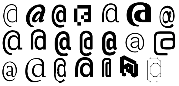
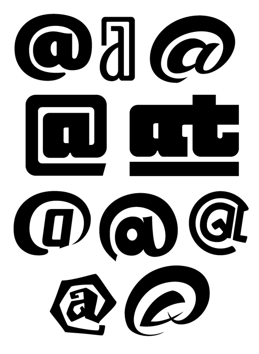
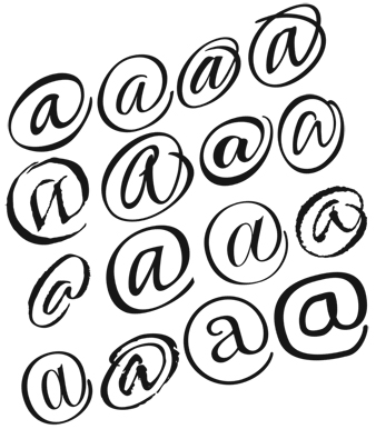
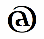
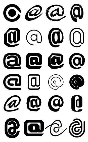
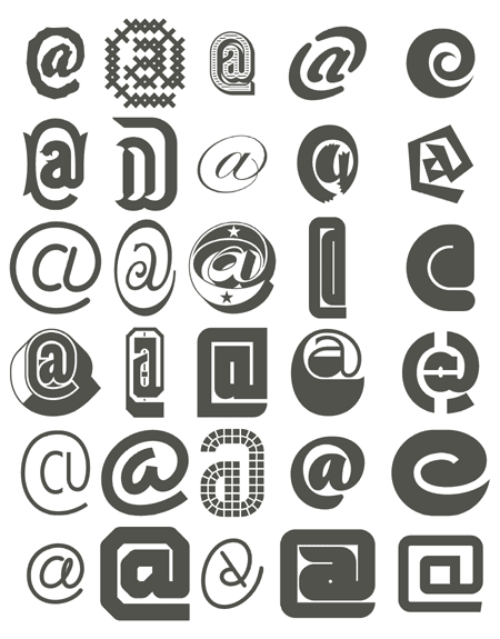
I truly and vehemently hate the generic @ glyph. In too many fonts it seems to have been copied from an older font, and pasted into new one.
The first different @ I saw was in DIN, and realised that @ does not have to look like that.
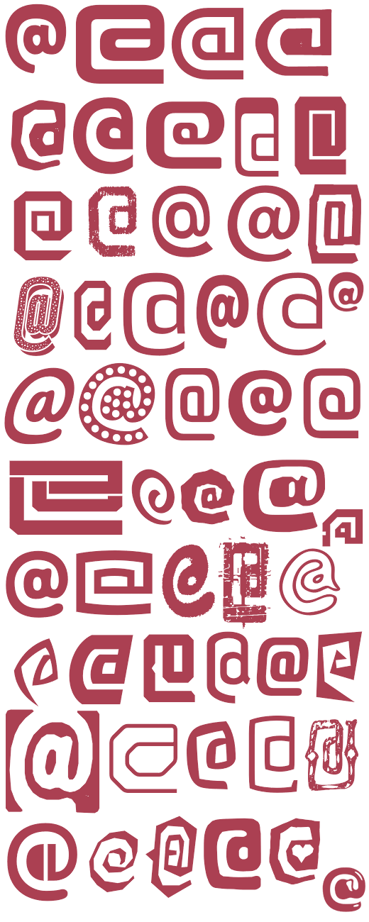
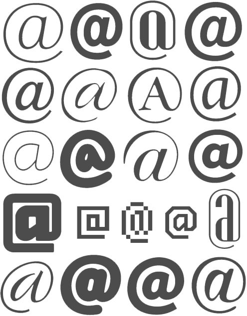
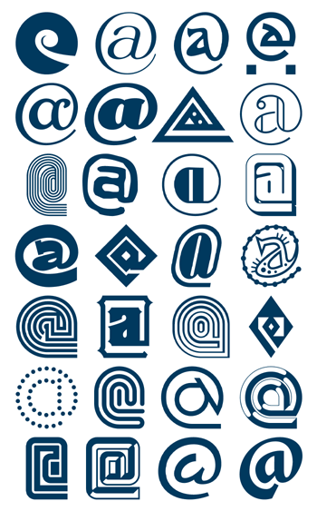
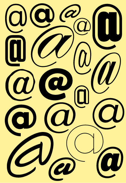
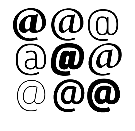
So, I would like you to show different variants of this generic form.
Here are some of mine: