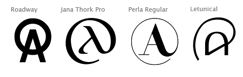
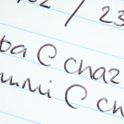
So I got to thinking that the at sign really shouldn't be aligned with the uppercase, since its primary use is in e-mail addresses, which are always correctly written in lowercase.
MS Character Design Standards however says:
Height alignment : Visually centers on the uppercase height, dependent on the typeface design.
Spacing : Visually center between uppercase H and O.
As an aside, this doesn't help me know what size to make the glyph and so I'm not fitting its upper and lower extrema to any particular heights. Instead its top is around three-quarters of the distance between the x line and the cap line, and the bottom around the same between the baseline and the descender line. This leaves the /a/ part floating in space around the centre of the x-height, which looks fine to me. Any thoughts?
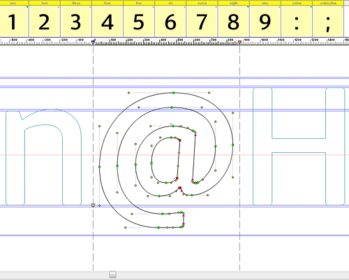
PS not sure what that flat curve was doing in there, it's been eliminated now ;)